Category Archives: New Homes

A Review of the Capistrano Tract at Stonegate East

Location: On Sand Canyon Ave., between Jeffery and Irvine Blvd. is the Village of Stonegate East.

Builder: Irvine Pacific Homes by the The Irvine Company.

Exploring the homes of Capistrano:

The Capistrano homes are two-story duplexes between 1823 sf to 1956 sf. Three plans are offered, and the price range is mid-$500,000 to low-$600,000. Various options for the elevations, as many as seven for Residence 2 ensure a unique property. According to the sales agent on site, Residence 1 is no longer available, but they have Residence 2 and Residence 3 available.
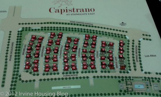
The townhomes/duplexes at Capistrano are housed in Stonegate East village. This is a rectangular space between Highway 133, SandCanyon, Irvine Blvd and Spring Meadow. Some of the houses back Sand Canyon and Spring Meadow. Noise and air quality will still be affected greatly, considering there is Highway 133 in the vicinity.

(From www.irvinepacific.com)

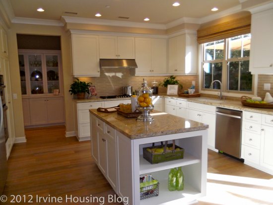
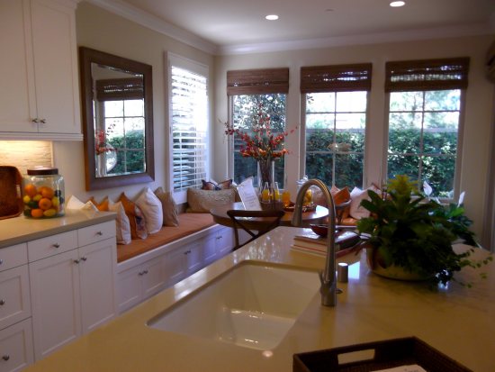
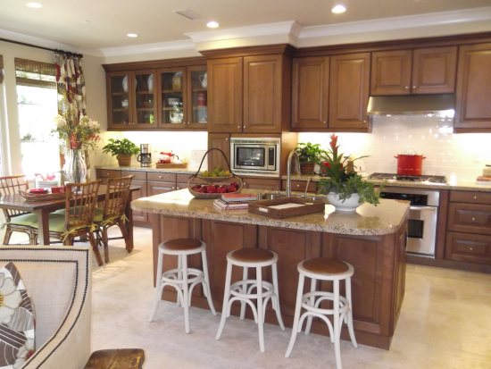
All three floor plans have generous island space, home management center, granite slab kitchen counters with 6-inch backsplashes, Stainless steel double basin kitchen sinks, white Thermafoil finish cabinetry with under the cabinet task lighting, stainless steel appliance package for the kitchen. The Thermafoil finish might emit fumes for the first few months, but clean up and maintenance will be easier than wood cabinetry.

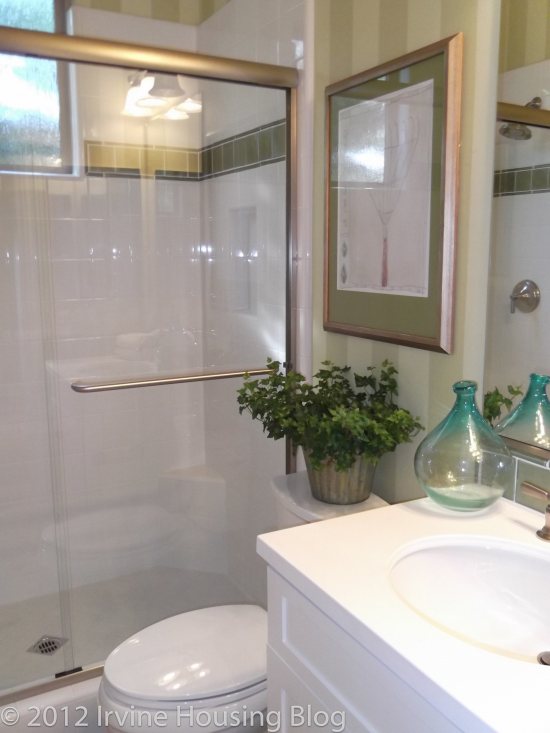
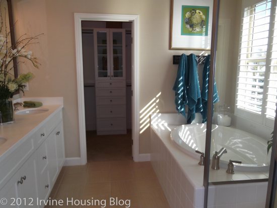
The Master Suites have Kohler tubs with ceramic tile surround, separate shower with clear glass enclosure, dual sinks with cultured marble countertops, backsplash and Kohler polished chrome faucets. Cultured marble countertops are inexpensive and look good, but they need daily cleaning.

The kitchen and entry have ceramic tiles, bathrooms and laundry have vinyl, carpet in other living areas.

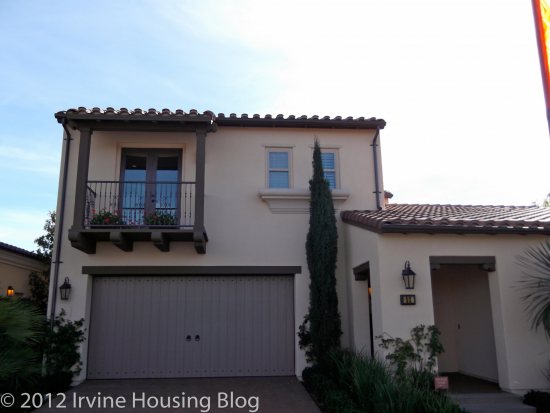
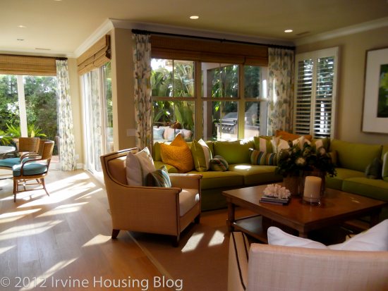
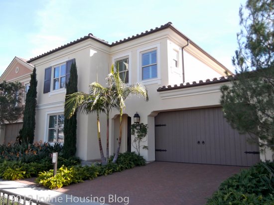
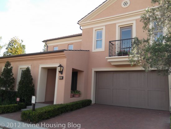
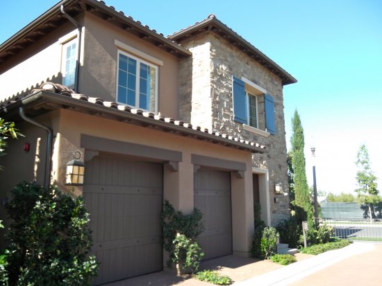
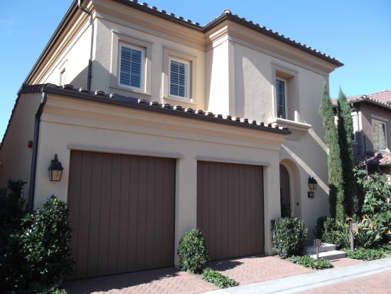
The elevations are typical Irvine Santa Barbara/ Formal Spanish and Early California styles. California rooms are a feature in all the plans, and the model homes that I visited had lovely play of light and shade in these spaces. The weather in Irvine would put that space to a lot of use. The roof tiles are fire resistant concrete. The windows are energy efficient, and they have high efficiency air conditioning/gas furnace/ tankless water heater/radiant barrier roof/bathroom fixtures.

The houses will be ideal with a young family of four. Not all of the schools are walk-able, even though the elementary school (Stonegate Elementary as per the information sheet provided by Irvine Pacific) is touted as walk-able, it’s almost a mile. The upper elementary school kids are capable of walking or biking a mile, but it will be almost unrealistic to expect younger children (K-3) to walk or bike for a mile early in the morning.

Freeway 5, 405, 133 and 241 are close to the community, making commute easier. Woodbury Town center is across the street, and that includes all necessary services and shopping. Within five miles are Orchard Hills Village Center, Trabuco Grove Shopping Center, Irvine Spectrum Center and the Market Place. There are plenty of bike routes encouraging biking in the area.

Here is the breakdown of HOA and Mello-Roos for the Capistrano houses:

Property tax: 1.05% of sales price

AD tax (Mello-Roos): $1579 per yr

CFD tax(Mello-Roos): $1700 per yr

Other taxes: $156 per yr

Overall tax: 1.7% approximately

HOA due are $251 per month. (Stonegate East HOA- 125, Capistrano HOA -126)

Fixed annual cost would be Mortgage + Property Tax + $6447 (Mello-Roos and HOA)

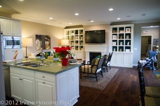
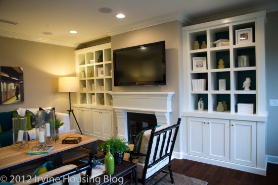
Here is an overview of the three plans offered, with some pictures:

Plan 1:

Offers three elevations, in three similar color palettes.

Area: 1823 Sq ft approximately

3 bedrooms, 2.5 bathrooms

These houses are offered at mid-$500,000.

One of the houses in this plan, 26 Loquat is currently renting for $2950 according to public records.

One of the houses in this plan, 35 Bromeliad was sold for $549,715 according to public records.

Fixed monthly cost of this house assuming the sale price of $549,715 would be Mortgage + 1018.25

Assuming that someone bought this house with at $550,000 with 20% down payment at the current rate of 4.25 (0 Points, One West Bank) for 30 Yr Fixed, the mortgage would be $2165.

Monthly cost of owning would be = $3183 (Not including the interest lost on the down payment, the various insurances required by mortgage companies, closing costs)

A detailed calculation using the NY times Rent Vs Calculator says that after the sixth year, owning would be cheaper than renting at the sixth year.

According to the Sales Agent, this plan is sold out.

Pros:

– California Room

– Home Management center

– Laundry upstairs, close to the bedrooms

– Tech room upstairs that makes the perfect home office/homework station

– Two sinks in the secondary bath room

– The wall to wall counter in the kitchen

– Wall of windows in the Great Room, Dining Room and Master bedroom for ample day light.

Cons:

– The Kitchen Island with Dishwasher that opens towards the stove. Impossible for two people to work in tandem in the kitchen.

– The powder room downstairs is far off the living spaces.

– The coat closet door and garage door open into a constricted corridor between entry and living spaces.

– The secondary bedrooms are very tiny, and the closets are too small to hold the clothes and toys of a child.

Since this plan was sold out, there are no pictures of the model house, but here is the link to the builder, Irvine Pacific’s website:

Plan 2:

Offers seven elevations, in seven similar color palettes.

Area: 1904 Sq ft approximately

4 bedrooms, 2.5 bathrooms

These houses are offered at high-$500,000.

One of the houses in this plan, 37 Deergrass was sold for $571,121 according to public records.

Fixed monthly cost of this house assuming the sale price of $571,121 would be Mortgage + 1018.25

Assuming that someone bought this house with at $570,000 with 20% down payment at the current rate of 4.25 (0 Points, One West Bank) for 30 Yr Fixed, the mortgage would be $2238.

Monthly cost of owning would be = $3256 (Not including the interest lost on the down payment, the various insurances required by mortgage companies, closing costs)

Suitable comparable property in the community couldn’t be found for rent vs. own comparison.

According to the Sales Agent, this plan is sold out, almost. (I expressed interest in buying one of these plans and the sold magnets moved mysteriously)

Irvine Pacific’s website shows one home available prices starting from $570,121.

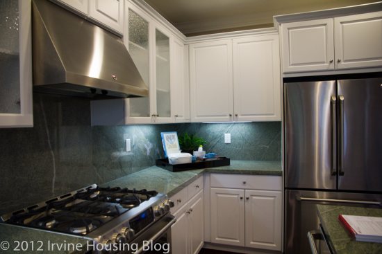
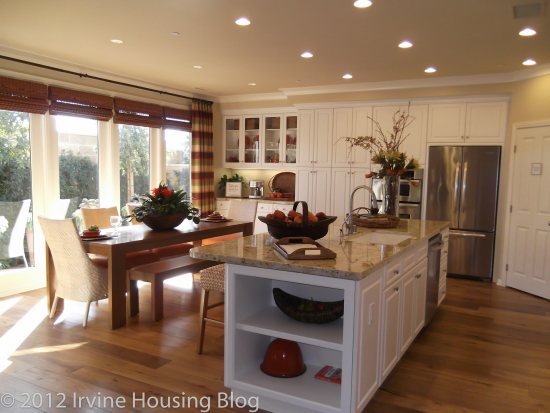
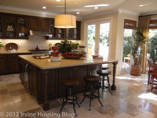
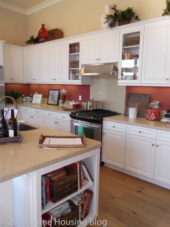
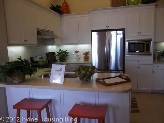
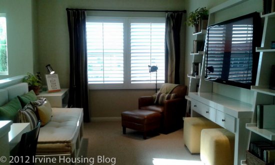
Here is the link to the builder, Irvine Pacific’s website: http://www.villagesofirvine.com/Villages-and-Neighborhoods/Stonegate-East/Residence/Capistrano/Residence-2. If you see last picture of the kitchen, you will notice the lack of space for two people to work in tandem in the kitchen. Irvine Pacific must really think kitchen is one man/woman domain considering the repetition of the same layout in most of their kitchens!

Pros:

– Spacious entry room without doors colliding into each other

– Powder room close to living spaces

– Home Management Center

– California Sun Room!

– Loft upstairs that can be the family room

– Laundry room upstairs

– Closet size in the secondary rooms is acceptable

– Windows for ample natural daylight

– Two sinks in the secondary bathroom

Cons:

– The kitchen island with dishwasher and stove opposite of each other of course!

– Pantry, refrigerator, sink and stove locations don’t make it easy for the cook with a tight work triangle, but the lengthy counter with cabinets makes up for it.

– The staircase opens very close to the entrance making it hard to keep track of who entered and who exited.

– Master Bath looks like everything is just crammed in. Lacks spacious and airy feeling.

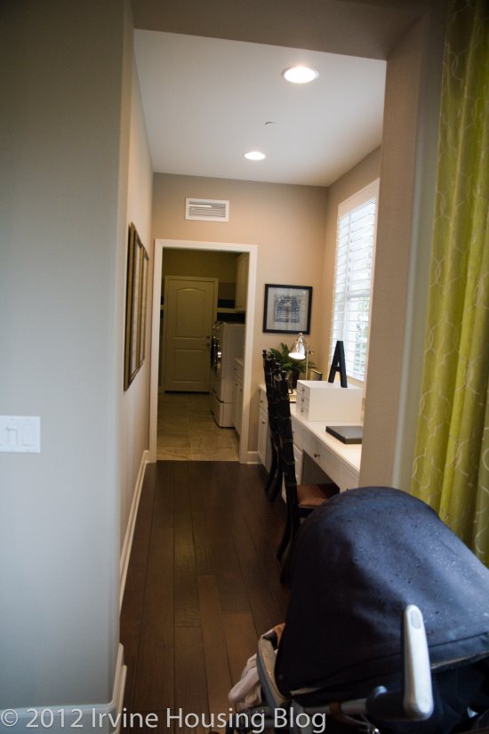
– If the loft is turned into a bedroom, there will be a long corridor from the staircase ending into the laundry room giving it a dormitory feel.

Here are a few pictures:
Plan 3:

Offers four elevations, in four similar color palettes.

Area: 1956 Sq ft approximately

4 bedrooms, 3 bathrooms

These houses are offered at low $600,000.

One of the houses in this plan, 28 Flowerstalk is currently renting for $3350 according to public records.

One of the houses in this plan, 25 Bromeliad was sold for $601,121 according to public records.

Fixed monthly cost of this house assuming the sale price of $601,121 would be Mortgage + 1018.25

Assuming that someone bought this house with at $600,000 with 20% down payment at the current rate of 4.25 (0 Points, One West Bank) for 30 Yr Fixed, the mortgage would be $2361.

Monthly cost of owning would be = $3380 approximately (Not including the interest lost on the down payment, the various insurances required by mortgage companies, closing costs)

A detailed calculation using the NY times Rent Vs Calculator says “If you stay in your home for 6 years, renting is better. It will cost you $45,971 less than buying, an average savings of $7,662 each year”.

Another calculation at the Irvine Pacific website, assuming we stay in the house for ten years, and there is zero appreciation, 2% increase in rent annually, rest of the parameters same as above:

Result Returned

Rent

Buy

Value of Home after 10 Years of Appreciation:

$601,121

Remaining Balance After 10 Years:

$382,148

Home Equity:

$218,973

Payments**:

$440,178

$283,886

Property Tax:

$111,895

HOA Dues:

$30,120

Down Payment:

$120,224

Tax Savings (at 28%):

-$64,017

Net Payments:

$440,178

$482,109

Minus Home Equity:

-$218,973

Total Cost After 10 Years:

$440,178

$263,136

Total Savings for Owning 10 Years:

$177,042

Of course, the Irvine Pacific website does not include lost interest on downpayment, costs associated with the maintenance of the house, the insurance cost that would definitely put a dent in that $177k savings over the period of ten years of owning.

If you have made up your mind to buy, and want some reassurance from a third party crunching the numbers in your favor, use the Irvine Pacific calculator. If you are still dillydallying, leaning towards not buying, use the NYT calculator. The number crazy people like me can always use both, and add their own expenses/ savings to the list and come up with their own number. The banks aren’t paying much in interest, the stock market is going through crazy ups and downs that need constant monitoring, so some people might not have second thoughts before locking that amount in the downpayment for the house.

Coming to the floor plan of the house,

Pros:

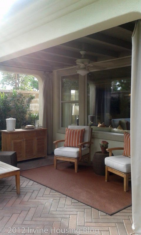
– California Room! I just loved this concept. May be it was the time of the day I visited, or the well maintained and well planned little yard of the model, it was just an amazing space to spend a morning reading your favorite book, sipping coffee.

– Laundry upstairs, close to the bedrooms

– Two sinks in the secondary bath room

– The wall to wall counter in the kitchen

– Wall of windows in the Great Room, Dining Room and Master bedroom for ample day light.

– Bedroom downstairs, with an attached bathroom, and the entry opens into the great room rather than the long corridors.

Cons:

– The washer in the laundry room shares a wall with secondary bedroom, assuming there isn’t much sound proofing, there will be a lot of noise when the washer is running.

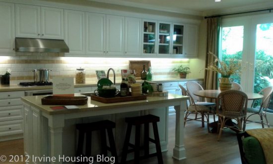
– The Kitchen Island with Dishwasher that opens towards the stove. My gripe continues.

– The work triangle in the kitchen isn’t too convenient either.

– The coat closet door and garage door open into a constricted corridor in “launch room” a tiny space between garage and kitchen. Too far off for the guests to drop their coats, and too close to the kitchen- the smells of the heavenly cooking won’t spare the jackets/coats.

There are four more homes available in this plan, starting from $599,579.

Here is the link to the builder, Irvine Pacific’s website: http://www.villagesofirvine.com/Villages-and-Neighborhoods/Stonegate-East/Residence/Capistrano/Residence-3

Here are a few pictures:
Schools:

When I plug in one of the addresses from the community in “My school locator” on the IUSD website, these are the displayed results.

Elementary School:

As of now, Stonegate Elementary will be the assigned school for this area, but the online school locator tool for IUSD lists “Portola Springs Future School” as the assigned school starting 2014.

Stonegate Elementary (K-6)

100 Honors, Irvine CA 92620

API Rank 10, API Score 954

Cultural Diversity: 46% Asian, 31% White (Data from www.greatschools.org)

Median teacher experience is 15 years and the student to teacher ratio is 23:1

Distance from home: Approximately 1.1 miles.

For more information about the school: http://www.iusd.org/sg/

Middle School:

As of now, the Middle School would be Sierra Vista Middle School. But, 2012-2013 academic year will bring the changes. The new middle school, “Jeffery Trails” will open in September 2013, and accept students from the communities of Stone Gate. It will be located at the corner of Jeffery and Trabuco.

For more information on the new school : (http://www.iusd.org/district_services/facilities_planning_and_construction/documents/PA40MiddleSchoolsite.pdf)

Sierra Vista Middle School (7-8)

2 Liberty, Irvine CA 92620

API Rank 10, API Score 948

Cultural diversity: 47% Asian and 36% White (Data from www.greatschools.org)

Median teacher experience is 17 years and the student to teacher ratio is 29:1

Distance from home: Approximately 3 miles

For more information about the school : http://www.sierravistams.org/

High School:

Northwood High School

4515 Portola Parkway, Irvine CA 92620

API Rank 10, API Score 908

Cultural diversity: 45% Asian and 43% White (Data from www.greatschools.org)

Median teacher experience is 10 years and the student to teacher ratio is 23:1

SAT Scores for 2011: Math: 579 Reading: 640 Writing: 603

Graduation rate: 95%

Distance from home: Approximately 3 miles

For more information about the school : http://www.northwoodhigh.org/

Parks:

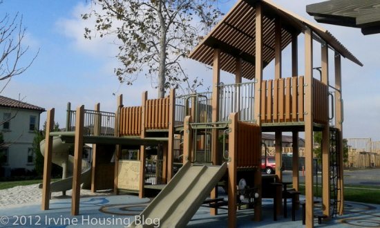
Bluebird Park will be the primary park for the community. It is located in the center of the community, making it accessible to people from all sides, and the size is good enough to serve the community.
Personal observations:
Price is an important factor for many while buying a home. While not all these houses are brand new as the Capistrano houses, here is what $550,000-$600,000 would get in other Irvine Villages based on the recent sales:

1. 25 Night Bloom, Irvine CA 92602

4 Bedrooms, 3 Bathrooms/ 1750 SF

Sold for $575,000. (TUSD Schools with Irvine addresses, Detached Condo)

2. 214 Tuberose, Irvine CA 92603

4 Bedrooms/ 2.75 Bathrooms/ 1850 SF

Sold for $602,000.

3. 24 Land Grant, Irvine CA 92618

4 Bedrooms/ 3 Bathrooms/ 2077 SF

Sold for $604,400. (Detached Condo)

4. 37 Wild Trails, Irvine CA 92618

3 Bedrooms, 3 Bathrooms/ 2092 SF

Sold for $525,990.

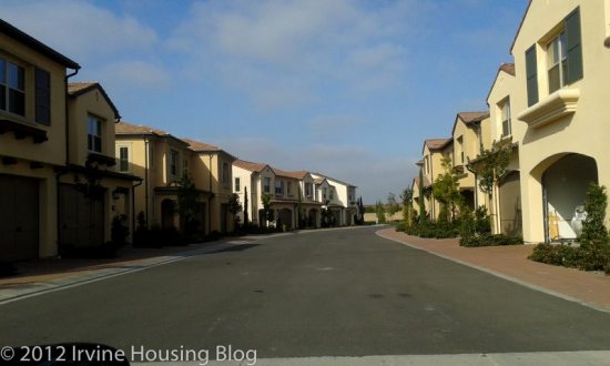
All of them have their own set of pros and cons, and comparatively, Capistrano homes aren’t as overpriced as some other new homes are. But then, location plays a very important factor here. Capistrano homes are sandwiched between freeways and very busy streets. Air quality and noise levels will be a major concern for anyone planning to live in this community long term. The tall walls might not completely block all the motor vehicle exhaust from entering the community, and since this community is geared towards families with young children, it might be a huge risk for the residents.

Various health studies have shown that living close to major highways and very busy streets might elevate the risk of asthma and reduced lung function in children. Also, there have been associations with cardiac and pulmonary mortality. Most of the studies were conducted in the communities living in 200m of a highway.

The floor plans are good enough, with minor complaints about the kitchen work triangle. The bedrooms and closets in the first plan are very small. The California room will be my favorite aspect of the house. Master bathroom layout of the Residence 3 is designed very well, there is almost no wasted space. The tech room is another favorite. As someone who works from home a lot, I find it easier to be in an open space than be cooped up in a room. Some people like the long unending counters, but I feel it’s easier to work in the kitchen with L or U shaped counters.

What is your favorite part about the homes at Capistrano, Stonegate East?

What “con” did you notice? What would be your ideal blend of the three plans?

Do you agree with the proposed price tag?

Are you assuming that the HOA will remain low in the coming years?
A Review of the Esplanade Tract (Plan 4) at Woodbury

Hello readers, I'm Nilam and was one of the first original fans of IHB (might have something to do with the fact that I'm married to zovall/Omkar). I've lived in Irvine since 2003 and am very happy to call the city home to our family of three, which includes our one year old daughter. While I have no formal real estate training, I love to write and learn about our community, and do so from the perspective of a mother and wife. I'm a stay at home mom these days but in my former life, I was a web marketing executive at an insurance company and hold an MBA from the University of Arizona and a BA from UCLA (go Bruins!).

Recently I took a tour of Plan 4 in the Esplanade tract in Woodbury. I really wasn't interested in the smaller units so I spent my time in the Wisteria model.

For some, it might seem strange that a home of this size would be attached. I felt that way too, until I moved to Irvine and drank TIC's Kool-Aid became familiar with the more recent home offerings. Land squeezing in Irvine has been discussed to death on this blog so I won’t belabor the point. Honestly, I was just happy to see this square footage at this price (go ahead – judge away – but I haven't seen too much in Irvine with this kind of pricing on a new home of this size in a while so I was curious). Here’s a link to the homes and here are the facts:

Village: Woodbury

Tract: Esplanade

Model: 4: Wisteria

Square Feet: 2074

Bedrooms: 3

Bathrooms: 3

Price: Release 5 span from $535,575 (may have builder incentives available)

Base Property Tax: 1.05% of sales price

Mello Roos: $4623 per year

Association fees: $105 for Woodbury community, $193 for Esplanade tract

Builder: Taylor Morrison

While I normally find something off about model homes and their décor, I must say, this one was impeccably furnished/finished. So much so that when I first walked in I was enamored. Let’s start downstairs.

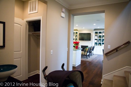
Upon entry, you come into a short corridor. To your right are the stairs to the second floor (Please excuse the stroller).

To the left, an entry to the first bedroom and ¾ bathroom (no tub but very nicely finished shower). The bedroom is a decent size and faces the front of the house.

Past the bedroom and stairs is a great room that I really liked. It includes a kitchen with a large island spilling over into a family room with a dining area off to the side. The family room and dining area are lined with windows and since there are no walls separating these areas, they really add light to the space. The kitchen didn’t have a walk-in pantry but the cabinet space and counter space seemed ample and I likes me some space in the kitchen.

Whoever decorated this model did an outstanding job. I walked into that room and thought, “Wow. This is a space I’d love to live in.” It felt big and I liked it! But then I kept looking…

On the other side of the great room is the home management (?) center (fancy term for a couple desks along the wall) in a skinny corridor followed by a utility room. The utility room is also long and skinny; the washer and dryer are lined up along one wall and had a sink on one side and a counter on the other. Beyond that is the door to a side by side two car garage.

The garage had additional space for storage. Did I mention it was a side by side garage? Sorry, that really appeals to me because our current garage is tandem and I am amazed at the ways my body has contorted to get in and out of our car. But back to this model.

Off to the side of the living space is a small (and I do mean small) courtyard. I found this disappointing. For 2074 square feet; it would be nice to see more outdoor space and in the description I had read before visiting, it seemed like there would be some space for a little one to play around in. Well, at least the little one could stand around out there.

Despite the airiness of the great room, the layout of the home gives a slightly awkward feel upon entry because it is obvious that the home is long and thin, which reminds you that the layout is a condo. It’s clear that the design was meant to fit this condo mold, rather than a home that was designed in an ideal way. The more I thought about it, the more I realized that the decor was what I liked, not the home. It's actually kind of like a submarine, long and skinny.

On to the second floor! At the top of the stairs, there is another awkward view of the long skinny floor plan. When I saw the plan on paper, the space seemed more awkward than it did in reality but it's still strange.

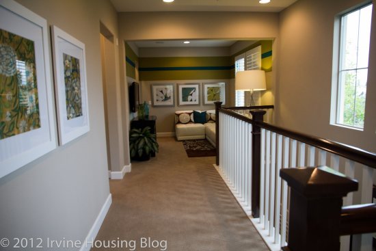
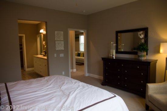
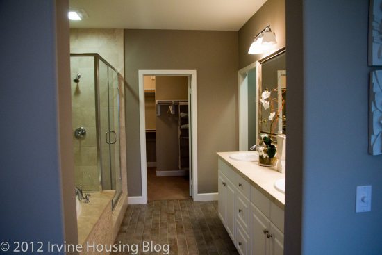
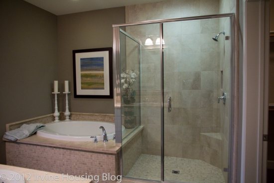
The master bedroom was a decent size with a nicely upgraded bathroom attached. The shower stall is large and the model had attractive earthen tiles next to a full sized tub. Beyond the bathroom is a nice square walk-in closet. The master also has a Juliet’s balcony that didn’t really add to the bedroom in my opinion. Maybe if there was a view, or an area to sit, it would make more sense. Or maybe if we were in Verona, and there was a gentleman calling, it would make more sense. In this place, it didn’t. All in all the master was nice but not particularly outstanding.

The loft wasn’t huge – the designer had placed a flat screen on the wall but the space seemed small for that. It might serve well as a playroom or hobby studio.

Off of the loft is a linen closet and the third bedroom. The third bedroom was larger than I expected. This full bath was also nicely furnished and the space itself is pretty good and didn’t feel cramped.

Here are some of the pros and cons to this model as I see ‘em:

Pros:

• Large rooms

• Great room is open and airy

• Side-by-side garage

• Pricing is decent compared to other homes of this size

• Corner unit (only share one wall)

• None of the living space is above or below anyone else’s unit

Cons:

• Long, skinny plan is awkward

• Very small outdoor space

• Bedroom downstairs is not ideal for families with multiple young children (although if your in-laws are visiting, this might be a pro!)

• No powder room for guests

While there were some really nice things about this home, it wouldn't be a fit for our family. Have you visitied Esplanade? What do you see as the pros and cons?

A Review of the Maricopa Tract at Stonegate

Hello IHBers, I am Cubic Zirconia.

One day while researching on the house that we wanted to put an offer on, I stumbled upon IHB, and then religiously followed every post by Irvine Renter. It gave me a good insight on the market condition then, and what to expect in the near future. We moved to Irvine in 2008 from Pasadena, and I have two daughters who go to Irvine schools in Tustin Unified. I have a Masters Degree in Architecture, and worked full-time creating cookie cutter retail stores (Longs Drug Stores mostly) while funding the dream of the cookie cutter house. I write also, thanks to the economy, I write more and design less these days. Real Estate for me is more about the location and schools than the floor plan and the size of the backyard.

Maricopa Tract at Stonegate

Location: On Sand Canyon Ave., between Jeffery and Irvine Blvd. is the Village of Stonegate.

Builder: Irvine Pacific Homes by the The Irvine Company.

Village of Stonegate consists of attached and detached neighborhoods. Here are the five neighborhoods offered:

1. Santa Clara – 1129 to 1322 SF

2. Santa Maria – 1386 to 1614 SF

3. San Mateo – 1636 to 1804 SF

4. San Marcos – 1824 to 2011 SF

5. Maricopa – 2262 to 2974 SF

The elementary, middle and high schools are under IUSD, with all API rank 10 schools and API scores above 900. They offer three floor plans, and a choice of three different elevations for each plan. The community is not gated.

Exploring the Homes at Maricopa (Community Overview):

The Homes at Maricopa are housed in Stonegate, and feature the largest floor plans.

None of the houses back to major streets. They offer three floor plans, and three elevation choices to each plan.

Pricing Sheet as of 1/6/12

All three floor plans offered have a bedroom/ den downstairs with an attached full bathroom, and at least three bedrooms upstairs. The ‘great room’ is also a constant, with ample windows to light up the rooms in natural daylight, doing complete justice to the Irvine weather.

Granite countertops and backsplash, stainless steel appliance and Kohler smart divide sinks, under cabinet lighting and recessed lighting are standards for all the kitchens, and they all feature an island. Except for the Plan 1, all of them have a sink in the kitchen island.

All bathrooms have white cultured marble countertops and Kohler sinks. The secondary bathrooms upstairs also have his and her sinks like the Master bathroom, making it easier for two kids to get ready at the same time. All the laundry rooms have a sink and cultured marble countertops with a six inch backsplash.

All the living rooms have crown moldings, recessed lights and multimedia ports. Also, upgrades have fireplaces, which I doubt will be used much in California weather, but nevertheless make lovely additions to the space.

It will be an ideal home for a family of four, with guests that would need the optional fourth bedroom. Teenage children and older parents come to my mind.

The distance to the elementary school is walk-able, but the middle school and high school are a little far, might not be an easy distance for most kids to bike or walk to school. A family with children in different schools might have to do some serious route planning, with the elementary school starting at 8.15am, middle school at 7.57am and high school at 8.00am.

The freeways 5, 405, 133 and 241 are all in close proximity.

Woodbury Town Center that has almost all the essential stores and services, including Hoag Health Center and LA fitness gym are within walking distance. Within five few miles would be Orchard Hills Village Center, Trabuco Grove Shopping Center, Irvine Spectrum Center and The Market Place. You can also bike to these places.

Here is a break up of Taxes and HOA, with Mello-Roos:

Property tax: 1.05% of sales price

AD tax (Mello-Roos): $2346 per yr

CFD tax(Mello-Roos): $1700 per yr

Other taxes: $156 per yr

Overall tax: 1.5% tax.

HOA due are $110 per month.

Fixed cost for any house in this neighborhood per month would be: Mortgage + Approximately $460 in Mello-Roos (Community Facilities Districts- CFD and Assessment Distrcits –AD) and HOA (Home Owners Association) +Property tax/12 (The current tax is 1.05% of the Sales Price).

Here is an overview of the three plans offered, with some pictures:

Plan 1:

Offers three elevations, in three different color palettes.

Area: 2262 Sq ft approximately

3 bedrooms, 3 bathrooms

Den/ optional bedroom downstairs, and all the other bedrooms are upstairs.

These houses are offered at $786,400.

Fixed monthly cost of this house assuming the sale price of $786, 400 would be $1148 (Property tax + Mello-Roos + HOA).

As with all the houses, this house has a bedroom with a full size bath downstairs, and three bedrooms upstairs. The entry room is inviting, and uncluttered, with only a coat closet and entrances to the great room and optional den/bedroom. All the rooms are well lit, and the Great room has a wall of windows opening into the backyard.

Pros:

  • Bedroom downstairs, with attached bathroom. Useful when parents visit, which most Asian parents do, and also for teenage/adult children needing privacy.
  • Home management center is located between kitchen-laundry-garage, which makes it an ideal spot to dump the paperwork /bills/ keys and all the little things that need attention.
  • The nice flow of area between living and dining. Even though it’s a Great Room, the plan is such that there is a visual break of spaces.
  • Flow of unobstructed daylight throughout the house

Cons:

  • Balcony in the secondary bedroom would be a problem if you have young children. (Plan 1C offers a balcony free option)
  • Laundry is too far from the bedrooms, have to lug around the basket all the way to the other end of the kitchen. But if flooding occurs, it’s downstairs- wouldn’t damage much!
  • Smaller backyard compared to the size of the house.
  • Not a good sized closet; in a house this size, there should have been two- his and hers.

Here are a few pictures of the Plan 1 residence, taken from the model home.

Guest Bedroom:

Guest Bath:

This is the secondary bedroom upstairs. It’s a size suitable for one child, and has a balcony!

The kitchen with recessed lights and all stainless steel appliances, and island. The backsplash is lovely!

The living room with wide windows opening to the patio.

Den:

Downstairs Bathroom:

The Master bedroom, just big enough to house a queen bed and two oversized bedside drawers and a reading chair with a lamp on the other side. Ideally I would like to see a small retreat, or some extra space to make a his/her spot for some personal time.

Master Bath:

Plan 2:

Offers three elevations, in similar color palettes.

Area: 2577 Sq ft approximately

3 bedrooms, 3 bathrooms

Den/ optional bedroom downstairs, and all the other bedrooms are upstairs.

These houses are offered between $866,400 to $872,927.

Fixed monthly cost of this house assuming the sale price of $866,400 would be $1218 (Property tax + Mello-Roos + HOA).

As you enter, you will see the standard den/optional bedroom on your left. The entry is a cluttered space with den, staircase, full size bathroom, garage and the great room opening into it. The Great room is rectangular, and as with other houses at Maricopa, has a wall of windows for light. The dining space is off the kitchen, and the kitchen island houses the sink and the dishwasher. The island is big enough to seat four people. The Home Management center is a part of the Dining space, and makes it a good place to work on homework. Laundry is upstairs, very conveniently located between the bedrooms. The master bath is very spacious, lot of natural lights, and location of the tub between his and her sinks increases privacy.

Pros:

  • A bedroom downstairs is always desirable.
  • The size of the Great room is in sync with the rest of the houses.
  • The bedrooms upstairs are all close to each other, making it easier for people with young children.
  • Laundry upstairs, between the bedrooms.
  • Spacious Master bathroom.

Cons:

  • Kitchen space planning- the dishwasher, when being loaded will obstruct cooking.
  • Optional balconies both open through the secondary bedrooms again, and even though there is a balcony free option, I would love to see a balcony off of Master bedroom.
  • Small closets, compared to the size of the bathroom. With some more planning, they could have played around with the space and created bigger closet, or his and her space.

Here are a few pictures of the Plan 2 residence, taken from the model home.

Master bedroom, again with space just enough for a Queen bed and two oversized bedside drawers, and a small reading space.

Walk-in Closet

The secondary bedroom is small, but I like the height of the window on the wall. With a twin bed and two bedside drawers, the lamp wouldn’t be obstructed with the window.

Third Bedroom

View of the Kitchen Island, which leaves me wondering, how would two people work together here, if one is cooking and one is doing the dishes? The dishwasher clearly obstructs the cook’s reach of pantry and refrigerator.

Kitchen Pantry

Well lit living room, and an obstructed view of the backyard.

Den

Plan 3:

Offers three elevations, in three different color palettes.

Area: 2974 Sq ft approximately

3 bedrooms, 4 bathrooms

Den/ optional bedroom downstairs, and all the other bedrooms are upstairs.

Bonus Family Room/ Optional bedroom.

These houses are offered between $937,620 to $943,879.

Fixed monthly cost of this house assuming the sale price of $937,620 would be $1280 (Property tax + Mello-Roos + HOA).

This plan adds a bonus room with an option of a bedroom with the den/optional bedroom downstairs. The bonus room turned into another bedroom would clutter the upstairs, with a door to the bedroom facing you as soon as you climb up the stairs.

This model provides the option to turn the second bedroom into a retreat for the Master bedroom. A Master bedroom with a retreat would be a great option to have, giving ample space for the “masters” to have their own private space to make hobby space, or a small personal library, or even an office space to work from home. The Master bedroom planning is a little weird, the closets flank the room on both side as you enter, and the bathroom is on the other side of the room. It is also the first room from the staircase.

Pros:

  • Option of the Master bedroom with a retreat will make the master suite spacious and give ample personal space.
  • Optional retreat also enlarges “her” closet, bringing it to a desirable size.
  • The bonus room serves as a great family room for the family to hang out, or even the kids to do homework, play their musical instruments, play video games and watch TV, or just play with their toys.
  • The plan might work well for a couple with older children, with ample privacy to all residents.
  • Walk-in pantry has well planned storage.

Cons:

  • Optional fifth bedroom instead of the bonus room would cram the bedrooms, and hurt the spacious look of the house.
  • Secondary bedroom has the balcony.
  • Dishwasher between the stove and refrigerator.
  • The huge great room that is one big rectangle, with a smaller rectangle of a dining space jutting out. Somehow not very inviting.
  • The distance from entry room to the living room is long, with too many distractions- staircase, den/optional bedroom, bathroom, garage, laundry.

Here are a few pictures of the Plan 3 residence, taken from the model home.

The Secondary bedroom with a desk height window to help do homework in daylight.

The Bonus/ Optional bedroom.

Downstairs Bedroom

Guest Bath

Kitchen

The Living Room

The Master bedroom, again just big enough to house a Queen bed and two bedside drawers, a chair and lamp in the other corner.

Master Bath

Schools:

Here is a brief overview of the schools that will serve Maricopa at Stonegate.

Elementary School:

Stonegate Elementary (K-6)

100 Honors, Irvine CA 92620

API Rank 10, API Score 954

Cultural Diversity: 46% Asian, 31% White (Data from www.greatschools.org)

Median teacher experience is 15 years and the student to teacher ratio is 23:1

Distance from home: Approximately 0.5 miles.

For more information about the school : http://www.iusd.org/sg/

Middle School:

As of now, the Middle School would be Sierra Vista Middle School. But, 2012-2013 academic year will bring the changes. The new middle school, “Jeffery Trails” will open in September 2013, and accept students from the communities of Stonegate. It will be located at the corner of Jeffery and Trabuco. The distance would be approximately 2.5 miles. The “home to school” distance changes, but not greatly to the children in this community. Previously it was roughly 2.8-3.0 miles for Sierra Vista Middle School.

For more information on the new school : (http://www.iusd.org/district_services/facilities_planning_and_construction/documents/PA40MiddleSchoolsite.pdf)

Sierra Vista Middle School (7-8)

2 Liberty, Irvine CA 92620

API Rank 10, API Score 948

Cultural diversity: 47% Asian and 36% White (Data from www.greatschools.org)

Median teacher experience is 17 years and the student to teacher ratio is 29:1

Distance from home: Approximately 3 miles

For more information about the school : http://www.sierravistams.org/

High School:

Northwood High School

4515 Portola Parkway, Irvine CA 92620

API Rank 10, API Score 908

Cultural diversity: 45% Asian and 43% White (Data from www.greatschools.org)

Median teacher experience is 10 years and the student to teacher ratio is 23:1

SAT Scores for 2011: Math: 579 Reading: 640 Writing: 603

Graduation rate: 95%

Distance from home: Approximately 3 miles

For more information about the school : http://www.northwoodhigh.org/

Parks:

Meadowlark Park will be the primary park for the community, and it’s still under construction. It is a decent sized park, which would provide ample space for the children of the community to play, and also make up for the tiny backyard that comes with the house.

Personal observations:

While all three plans are spacious and luxurious, I find them a bit overpriced.

Location is everything. The homes are built such that they don’t back to major streets, and they are walk-able from the shopping center and park. Close proximity to the freeways is also a plus. But as a representative of a typical Irvine family with kids, I don’t think I would go to Trader Joes and come out with a bag light enough to walk with, and I don’t think I will be happy pulling the car out of the driveway, devising a quick route to drop kids to Middle school and High school opening within three minutes of each other (pick up will be another story!). So location doesn’t cut it for me.

My space planning complaints are limited to the remote laundry room in Plan 1, dishwasher disturbance in Plan 2 and Plan 3, “enter the closet” Master bedroom of Plan 3, and of course the balconies of the secondary bedroom. With a young child, I would be scared the curious mind would fall off the balcony. With an older child, I would be worried about uninvited visitors.

Home Management centers are great, away from the television, or even the living space providing private corner in the great room. Backyards are small, but the optional trellis makes it an interesting space to have a small gathering. The entrances are well defined, and not hidden somewhere in the back overpowered by the garage and driveway. There is enough space to personalize, put out some plants, or even a small bench with a few cushions.

My perfect blend would be the Plan 1 great room and living-dining spaces, a plain kitchen island, a small Home Management center close to garage, and the Plan 1 entry room double the size, Plan 2 extra Home Management center for homework purposes, walk in pantry, laundry room location, and the Plan 3 Master Suite with retreat, his and her closets close to the bathrooms, not at the bedroom entrance, with the plan 3 Bonus room.

Construction work is still going on in the neighborhood. There will be noise and dust, and visitors to the new houses. The next phase is planned for release around September. The landscaping work is in progress, so is the park. It might take a couple of years for the landscaping to mature and blend with the neighborhood. But that’s something everyone expects with a new house.

What is your favorite part about the homes at Maricopa, Stonegate?

What “con” did you notice? What would be your ideal blend of the three plans?

Do you agree with the proposed price tag?

Are you assuming that the HOA will remain low in the coming years?
A review of the Santa Clara tract in the village of Stonegate

Located off of Irvine Blvd and Groveland, the Village of Stonegate (Stonegate Overview PDF) offers 5 housing tracts: Santa Clara, Santa Maria, San Mateo, San Marcos and Maricopa. Their tagline is “intimate yet connected” and I think that’s an accurate portrayal of the area. It seems to be nestled in its own corner but has close access to Woodbury Town Center, Orchard Hills Village Center and is about 15 minutes from the Irvine Spectrum. The housing development is walking distance to Stonegate Elementary School and not far from Sierra Vista Middle School and Northwood High School. Much like the rest of Irvine, the Village of Stonegate is marked by convenience.

Since Santa Clara (Santa Clara Community Overview PDF) is the smallest of the 5 tracts, it’s ideal for singles and couples. The Santa Clara floor plans are referred to as “flats” which in my opinion is a euphemism for small. However, after viewing the models I think “flats” is an appropriate description and they did a nice job working with the space. The smallest of the 3 floor plans (All floor plans available here) is Residence 1, which is 1,129 square feet. In retrospect it’s not a lot of space, but somehow it feels roomy. I think it can be attributed to the idea of the “great room” which is heavily prominent throughout all three residences. The great room gives you the freedom to define your living space. I can appreciate the benefit of unrestricted design, and I think it’s a selling point.

Estimated property taxes and special assessments:

Base Property Tax: 1.05% of sales price

AD Tax: $1,350 per year

CFD Tax: $1,700 per year

Other Taxes: $156 per year

Overall Effective Tax Rate: Approximately 1.9%

The HOA dues are approximately $306 per month, which is comparable to other new developments. After looking at the well-manicured neighborhood, I think you’ll get your money’s worth.

Residence 1

Number of bedrooms: 1 bedroom + den

Number of bathrooms: 1.5

Square footage: 1,129 sq ft

Garage: 1 car

Base price: $339,300

I immediately liked walking through the door into Residence 1. It has a bit of an apartment ambiance to it, but on the flip side there are no stairs to contend with. It’s my feeling that the great room concept forces your furniture placement between the dining and living room spaces. You could comfortably fit a table that seats 6-8 people in the dining space. What I didn’t like about the dining space was that it was smack dab in the middle of a high foot traffic area. It literally borders the entry way. Some creative thinking might alleviate that quality, but I feel like it downgrades the overall attractiveness and makes it more comparable to apartment style living.

All the residences come with stainless steel appliances as part of the standard kitchen package. The kitchen counter space was workable, but it would’ve been nice to have at least another 1-2 feet of extra countertop. It isn’t a deal breaker. They’ve configured the kitchen countertops to accommodate 2 barstools facing the sink. There’s not a lot of space, but if you’re the grab and go diner, it won’t be an issue for you. I was impressed with the cabinet storage. I think having a designated pantry is a plus. However, the microwave is built into the pantry and sits at waist level. It’s the most awkward spot to put a microwave. It’s like the builders ran out of space and were forced to stick the microwave somewhere, so they built it into the pantry. I’ve never seen anything like it. It’s a conversation piece at best. Access to the one car garage is off the kitchen as well as a door masking the stackable washer and dryer (available as an upgrade).

The master bedroom is fairly decent sized. If you strategically configure your bedroom furniture, you could make it comfy and cozy. The bedroom has large windows, which limits wall space, but I’m willing to sacrifice the wall space for a little sunlight. Don’t worry, there’s plenty of wall space for your dresser and you can still mount your television.

The walk in closet is standard, but there were only bars and shelves on one side with a bunch of empty wall space. That’s an easy fix.

The master bathroom is unimpressive. It’s functional. It has the typical “hallway” feel. There’s a dual sink vanity, a shower/tub combo and the toilet is not separate from the main bath area. They made a valiant attempt to separate the toilet by pushing it back into a recessed corner. It’s disappointing that the shower isn’t separate from the tub. I’d expect to have that feature in newer developments.

Residence 1 advertises the floor plan as 1 bedroom + den. Do not consider turning the den into a bedroom. It won’t work. The space is too small, the closet isn’t functional, and the second bedroom would share a wall with the master bedroom—a big problem in my book. Here’s the kicker: the den (or second bedroom) is only separated from the dining room by wooden shutters. This made me say the big NO to this floor plan.

The wooden shutters give this space no privacy. Unless you’re living by yourself, there’s always going to be a noise factor. This room is sandwiched between the dining room and the master bedroom. I don’t like the idea of having the dinner table so close to the den. It didn’t feel right and I think it created a chasm in the flow of the house.

The guest bathroom has a very small vanity with no counter space. It’s a shower/tub combo. It’s very cookie cutter. This floor plan is advertised as a 1.5 bathroom flat and you definitely feel the .5 in this bathroom. It’s purely functional and lives up to its purpose.

Sorry Residence 1, but you’re off the list. If I’m going to pay $340,000+ for you, I want to feel like I’m living in more than just an apartment with an oddly placed microwave.

Residence 2

Number of bedrooms: 2 bedrooms

Number of bathrooms: 2

Square footage: 1,305 sq ft

Garage: 2 car

Base price: $415,300

Residence 2 was my favorite floor plan. When I walked through the door I immediately imagined myself coming home from work and walking up the staircase to the comforting view of my home. I LOVED the attractive, bright, open view of the entire space. I almost felt like I was home and upon first glance was ready for move in!

I was really impressed with the kitchen. It’s spacious, plenty of counter and cupboard space, and a nice island with extra storage. The island has a nice stainless steel sink, but you can upgrade to the double wide basin. The model displayed a small built in desk and bookshelf nook. It looks out of place because it feeds off the kitchen countertop. I’d rather nix the desk and have the extra cupboard and counter space. There is no full length pantry, but there’s ample space to store your dry goods.

The oversize windows in the living room are what make Residence 2 so inviting. As much as I enjoy the illuminating open concept look and feel of this floor plan, I didn’t like that there is no distinction between the living room and dining areas. This is the negative side to the great room concept. The buyer will have to get creative and define the space. Area rugs can work wonders, and so can well-placed furniture. If you do it right, you and your guests won’t even notice that it is one blended area.

Off the “dining room” is the patio. You can easily fit a table and four chairs out there with a small grill. I like that the patio is immediately off the dining area simply because if you are entertaining a large group of guests, you can open the sliding glass doors and instantly create a connection between the balcony table and the dining room table.

For me, one of the biggest selling points was the bedroom layouts. The bedrooms are on OPPOSITE sides of the house. This is a huge plus. It’s great for privacy. The second bedroom is not very large, but it’s doable. It’s ideal for a roommate situation, or can be used as a child’s bedroom.

The second bedroom has an ensuite. Granted, it’s a small bathroom, but it’s fully equipped with a shower/tub combo. The vanity has very little counter space, which is a buzz kill for me. If it’s a kid’s room it probably wouldn’t be a problem. On the whole, this bedroom received a passing grade. The only issue with having an ensuite in both bedrooms is the lack of a guest bathroom. Someone in the house will have to keep their bathroom and bedroom clean when guests come over.

The master bedroom is an adequate size and is built to accommodate the typical bedroom furniture setup. The walk in closet is nothing special.

The most depressing and disappointing feature about the master bedroom was that there is no tub in the ensuite. It was nearly perfect: walk-in shower, dual sink vanity, toilet located in a separate room. No tub. Major bummer. I would’ve at least built a shower/tub combo, and the design center might allow the original homeowners to have that option. There is no excuse for not including a tub in the master ensuite.

When looking at the big picture, Residence 2 is a house I’d consider buying. My word of caution is to really determine which upgrades you’d like to invest in. I really loved this house, but the model has the bells and whistles and I had to stop and consider how much extra money I’d have to pump into this place. If all the upgrades are pushing me into the $430s-$450s, I’m going to buy somewhere else. Because this is an open space floor plan, I’d recommend getting hardwood floors. Unless you upgrade the floors, you’ll have a house full of carpet with vinyl in the “wet” areas. I’d also take advantage of the opportunity to upgrade to recessed lighting and crown moulding. Any blinds, shades or shutters in the model are not included in the home, and I think if I was buying the house I’d have them install those features.

Residence 3

Number of bedrooms: 2 bedrooms

Number of bathrooms: 2

Square footage: 1,322 sq ft

Garage: 2 car

Base price: $400,300

Residence 3 was very bland in my opinion. Your living space is upstairs, with access to the garage immediately off the entry way. The top of the stairs brings you immediately into the kitchen with a view of the great room. While it feels like the floor plan is an open concept, there is a wall that sections off the kitchen from the living room. After visiting Residence 2, I wasn’t partial to having an enclosed space. It made the home seem darker to me.

The kitchen is lackluster. Don’t get me wrong—it’s sufficient, but there’s no island and not as much counter space as I’d like to have. There’s definitely enough storage. A couple of the cabinets are high and may require a step stool, but there’s also low storage to help keep frequently used items easy to reach.

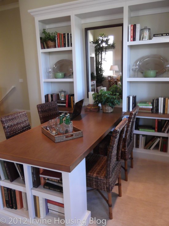
The living room and dining room had more of a distinction than Residences 1 and 2. There was a big enough space between the two areas where I could visualize the separation. I didn’t see an issue with the sizes of the living room/dining room areas. I think they both offer enough space. In the model, they built this strange dining room table contraption and I wasn’t quite sure if I liked it. Built into the wall was a set of recessed bookshelves, and jutting out from the bookshelves was a matching table with coordinating bookshelves on the end caps. It was like a Murphy bed—but a dining room table/storage eyesore. It was the most curious piece of furniture I’ve ever seen! That would be the first thing I’d get rid of. Don’t build that in my house!

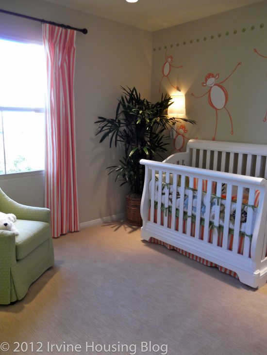
The second bedroom was cookie cutter tiny. It’s funny how they always showcase the second bedroom as a nursery! The closet follows suit—unsuitable for an adult occupant.

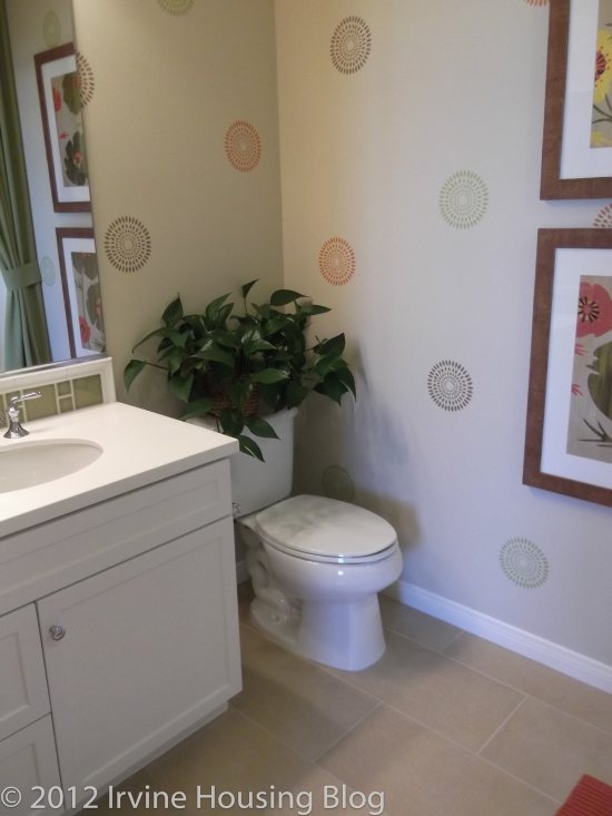
The guest, or 2nd bathroom has the single sink vanity with 1 cabinet and two drawer storage, with modest counter space. It has a tub/shower combo and the toilet is positioned next to the vanity. Honestly, I don’t want to be overly critical with the second bathroom because it serves its purpose and if you upgrade and get the backsplash you could make it look nice.

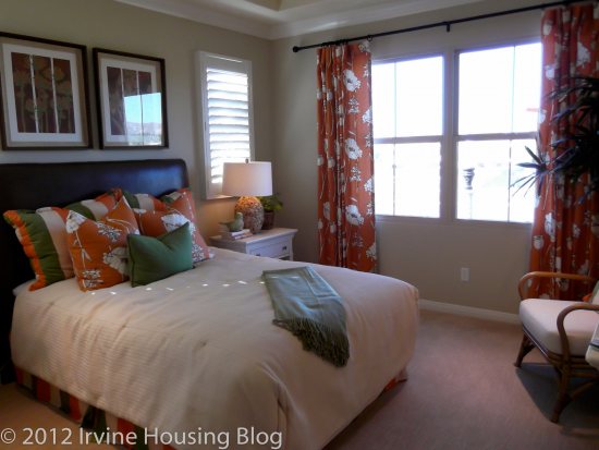
The master bedroom received a passing grade. It is large enough for a King bed, a couple of nightstands and dressers, and perhaps a chair if you position things well. It was very bright and had small windows flanking each side of the bed. I liked it.

The master bathroom on the other hand has a narrow, “hallway” type of feel. It has a very large stand-alone shower, but no tub. I’m getting used to disappointment. The vanity is the same as the rest of the floor plans—his and her sinks with ample storage. The bathroom has a decent size walk-in closet. I could really do some damage filling it up. In this particular closet I think I would invest in the upgraded organizer and put the optional mirror on the door. I think there’s enough space to merit investing in these features.

There are a couple of other noteworthy features that I’d like to mention.

  • The two car garage contains a big cut out under the stairway for designated storage space. It adds a big plus to the functionality of the home. You can also opt to have the overhead cabinet organizer installed.
  • The second point is the balcony. The balcony is wonderful. It’s narrow, but spans the length of the great room. You could get several chairs out there, maybe a few bistro tables and a grill. I imagined myself reading a book out there during the summer.

If I had to sum up the space, I’d give it a 3 out of 5 stars. It’s big enough for a single gal like me. I’d turn the second bedroom into my office. I’d grin and bear it while taking a bath in the guest bathroom tub. Since I don’t spend too much time in the kitchen, I’d look past its dullness. A few key decorating pieces would spice it up. I’d be happy here.

Happiness aside, I will say that the price tag is fairly hefty for this size property. The average price for this floor plan will start around $403,040 for approximately 1,322 square feet. I’m not willing to part with my pennies for this place.

Pricing Sheet as of December 20, 2011

Standard and Upgrade Options

Calculator for Plan 3

Final Thoughts

I enjoyed touring the Santa Clara tract. It taught me that I could live with an open space flat concept. It also taught me that I would have to compromise on having a tub in the master ensuite. As I think about the homes, and think about the upgrades that I’d have to invest in, I worry that I’m not getting the best bang for my buck. I would definitely live in Residence 2, but it needs the upgrades and that can get expensive. Let’s just say that after reviewing Santa Clara, I’m keeping my options open.

A review of Siena in Laguna Altura

Note by zovall: This post is written by Wendy Larson. She toured the models at Siena and has provided her thoughts on the community and floor plans. We'd love to hear your comments on Siena as well as her first post.

The Laguna Altura community (Overview PDF) is located where the 133, 405 and 5 freeways meet in Irvine. Situated just off Laguna Canyon Road, the property is surrounded by stunning canyon views, and is removed far enough from the freeways to still have the ambiance of a quiet nature retreat. There are four tracts in this development: Siena, San Remo, Cortona and Toscana.

The neighborhood has something to offer almost any type of homebuyer—particularly singles, couples and families. The community is perfect for people who enjoy spending time outdoors. There are three parks, pools and plenty of places to take your pooch out for a stroll. Be aware that you are in the canyon and there may be coyotes around, so keep your pets on a leash and indoors at night. Having an outdoor cat would concern me in this neighborhood.

Laguna Altura is convenient to many recreational amenities such as Laguna Beach, hiking and bike trails. The Irvine Spectrum is minutes away from the community, but there is no grocery store “just around the corner.” The closest shopping center is Quail Hill which offers the typical grocery store, pharmacy, and bank amenities. If dining is important to you, you’re limited to the Irvine Spectrum and Quail Hill. Laguna Beach and Aliso Viejo aren’t a far drive if you’re looking to expand your palate.

The Siena tract (Siena Overview PDF) is the smallest of the four communities. It offers 3 residences ranging from 1,618-1,788 square feet (Floorplans PDF). Each residence is offered in a Tuscan, Classical or Italianate style. The Tuscan style has the most charming appeal, featuring a partial rock surfaced exterior.

Phase 3 Pricing PDF

Pros:

  • New, gated community
  • Homeowners can customize property
  • Beautiful location
  • Private backyards
  • Attached garages
  • Build it Green™ certified
  • Energy efficient air conditioning, gas furnace and tankless water heater

Cons:

  • No fireplace
  • Small bedrooms
  • Inadequate closet space
  • High kitchen cabinets
  • Construction will continue for 2-3 years

General overview

In my opinion, the Siena tract is better served for singles and couples without families. My recommendation is based upon the size of the bedrooms, closets and backyards. The second and third bedrooms in the Siena tract are tiny. While they are suited for babies and small children, the space does not offer any room to grow. I can imagine a young boy playing with Legos in the room, but when he grows up to be a teenager, there’s no room for an Xbox. Let’s be practical. Your living room will become a game room before you know it.

Residences 1 and 2 offer a loft option as the third bedroom. I think the loft option makes the space more practical, adding a private seating retreat, but at the price of losing a bedroom. After viewing the small bedrooms and tiny closets, I determined that the only way to make these houses function was to turn one bedroom into a guest room and the other bedroom into an office. I couldn’t imagine anyone past the age of seven living and growing up in these bedrooms. Teenage girls need more closet room than Siena has to offer. In just a few years a family would feel the strain of needing more space.

For singles and couples, the space is ideal. The living area is large enough to feel comfy and there’s not much to clean or maintain. Create a separate space in the second and third bedrooms to give yourselves privacy, or use the bedrooms to make your house more suited and functional to your lifestyle. The Siena tract offers more workable space for singles and couples.

The Siena tract is currently in phase 3 of development, which gives original homeowners the ability to personalize their residence. This is a big bonus. New homeowners have the option to choose the interior design elements. The design consultants at the Irvine Pacific Design Center located in Woodbury Town Center will assist buyers in choosing cabinetry, countertop preference, tile, furnishings and any optional features.

Siena residents are part of the Laguna Altura Community Association. The proposed monthly HOA dues are $295.00 per month. An extra $300 a month tacked onto your mortgage may seem like a bit much to stomach, but the community is well landscaped, and you can be sure that it will always remain clean and appealing. The association dues are comparable to many properties in Orange County. The estimated property tax breakdown is as follows:

Base Property Tax: 1.03% of the sales price

AD Tax: $3,063 per year

CFD Tax (Mello-Roos): $1,700 per year

Other Taxes: $156 per year

Overall Effective Tax Rate: Approximately 1.8%

Below are reviews of each residence (in the order the homes were laid out on the model tour):

Residence 3

• 3 bedrooms

• 2 ½ baths

• 1,788 square feet

• Base prices starting from $630,000

Residence 3 opens to a small entry way, with immediate access to the stairs. You can access the garage from the entry way. There’s a powder room and a huge walk-in coat closet with extra room for storage.

Residence 3 features a large gourmet kitchen which overlooks the living room. The kitchen has an oversized island, ample storage and includes a stainless steel appliance package. The island can accommodate 3-4 barstools for extra seating. It houses the dishwasher and has a double wide sink, which will be much appreciated by those who cook and clean dishes often. The pantry and cabinets span the entire kitchen and it’s almost overwhelming. The homeowners have the option to build a glass display hutch which is a nice element because it breaks up a wall full of nothing but cabinets. The upper cabinets are quite high, making the top shelves difficult to reach. Luckily, there’s plenty of lower cabinet space available.

The dining area is an extension of the kitchen. The windows overlook the back yard and provide nice light, making the space seem airy and bright. You can comfortably seat 4-6 people around a table in this space, but squeezing anything past 8 people would be uncomfortable. It is a functional, not formal dining space.

The living room, or great room, is a decent size. There’s enough wall space to mount a large flat screen television and can accommodate larger furniture. There is no fireplace in this property. The living room contains a long built in desk with overhead storage. The only downside to having a desk located in the living room is that you must keep it free of clutter at all times.

The master bedroom is an adequate size. It can accommodate your typical bedroom furniture set and a king-sized bed. The master bedroom has large windows to let natural light through, making the space appear larger. The ensuite bathroom has a separate tub and shower, with double sinks. The toilet is in a separate room for extra privacy. The master bedroom has a walk-in closet, but it did not provide the “wow factor” I was expecting. Two people could easily fill up the closet space, and battle each other for more territory.

The second and third bedrooms were quite small. You could fit a daybed or twin bed with a dresser and possibly a night stand in each room. The closets in both rooms were disappointing.

The guest bathroom follows suit with a double sink vanity and separate room for the toilet. It contains a shower/tub combo. It serves its purpose. Near the guest bathroom is the laundry room which can accommodate a full washer and dryer. There’s overhead storage in this functional space.

The backyard is large enough to entertain 6-10 people. The backyards are not landscaped with the purchase of the house. The models showed brick and grass flooring. I believe that stone or brick would be the best option. Storing a mower for such a small yard would be a hassle. You can create a nice seating area facing the dining room and have extra space for an outdoor table and grill.

Residence 2

• 2-3 bedrooms

• 2 ½ baths

• 1,672 square feet

• Base pricing starting from $605,000

Residence 2 was my favorite floor plan. Perhaps it was the enlarged entry way that made the ambiance more inviting. Like its sister properties, access to the garage is off the entry way. There’s a powder room to the right and a coat closet. The coat closet is located off the stairs and does not have the storage space found in Residences 1 and 3. The downstairs layout of Residence 2 is reminiscent of Residences 1 and 3—except the kitchen and living room setup is flipped. The kitchen is considerably smaller, but the recessed lighting makes it appear larger. The homeowner has the option to build a home management storage cabinet into the full height of the pantry. This feature would maximize your space and keep your kitchen pantry organized. The kitchen has the same amenities as the other two kitchens—stainless steel appliances, island, ample cabinet space. The dining area is offset of the kitchen and offers a unique option to build a banquette with storage. This is a great feature that adds charm to the space, particularly because the banquette is built below the window, making it a delightful nook to read a book in.

As with Residence 1, Residence 2 has the loft option. This space is big enough for a bedroom, and you can have a nice set of double doors, but there’s no closet so you couldn’t even consider making it into a bedroom. Leave it as a loft or turn it into an office.

The master bedroom is adequate. The ensuite has the tub/shower combo option, or the homeowner may opt for a walk-in shower only. The toilet is sectioned off into a separate room, where you have the option to build extra storage. The dual sink vanity has enough his and her storage. The walk-in closet is standard regulation and two people could fill it up quickly. The second bedroom is big enough for a twin or daybed. The closet is tiny.

The laundry facilities are located on the second floor. However, there are two options:

  1. Stackable washer and dryer with storage and countertop
  2. Full sized washer and dryer with no storage

Residence 2 seemed less clinical out of the 3 properties. It felt more like a home than a house. However, it is the second largest of the Siena tract, but feels like the smallest.

Residence 1

• 2-3 bedrooms

• 2 ½ baths

• 1,618 square feet

• Base prices starting from $590,000

Residence 1, although smaller, features a similar layout to Residence 3. Upon walking through the door, you have immediate access to the stairs, the same walk-in coat closet, powder room and garage access. The difference between the two models can be felt in the size of the kitchen and living room.

The kitchen has an island that can accommodate 3 barstools. There is a double wide sink and a dishwasher. The cabinet layout is very similar to Residence 3. There is less cabinet space, but it is more than sufficient. You also have the option of adding the glass hutch. As with Residence 3, the cabinets are high, so keep a step stool handy or utilize the lower cabinet space first. The dining area is a replica of Residence 3, and I would say that you can have a 6 person maximum seated at your table.

The living room is smaller with less seating space. There’s not as much empty wall space, so an alternative would be to have furnishings that can fit your television. It’s still a comforting space with lots of light. The built in desk is noticeably smaller, but can accommodate a desktop computer.

At the top of the stairs is the optional loft. The homeowner can choose to build a desk and entertainment storage cabinets, which would make the space ideal for an entertainment room. The loft is spacious enough to fit a sofa and a couple chairs. The loft option is more practical than turning this area into a bedroom. Otherwise, you have another small bedroom directly at the top of the stairs.

The master bedroom has little space to spare. You can squeeze your king bed into this room with a dresser and nightstand. The bedroom does get a lot of light, so the tight space isn’t as noticeable. The master bathroom has two options:

  1. Enjoy a large walk-in shower without a tub
  2. Build a shower/tub combo

It’s disappointing that the master bathroom does not offer a tub and stand-alone shower. The vanity has double sinks with storage, but the space between the vanity and shower is cramped. The walk-in closet is standard size. The homeowner can elect to build the closet organizer storage drawers, which would maximize the space.

The remaining bedroom and guest bathroom are nearly identical to Residence 3. The rooms are small and the closets are inadequate.

Other than the magnificent views of the location, there were very few things that stood out within the homes that would justify paying the purchase price. In my opinion, the Siena tract is over-priced. If I’m going to spend upwards of $600K I’d expect to see larger bedrooms and practical closets.