Category Archives: New Homes

A Review of the Las Colinas Tract at Portola Springs

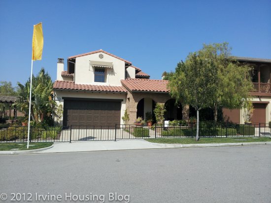
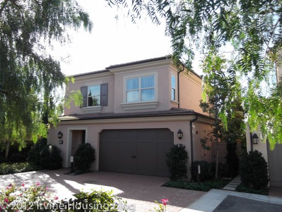
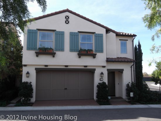
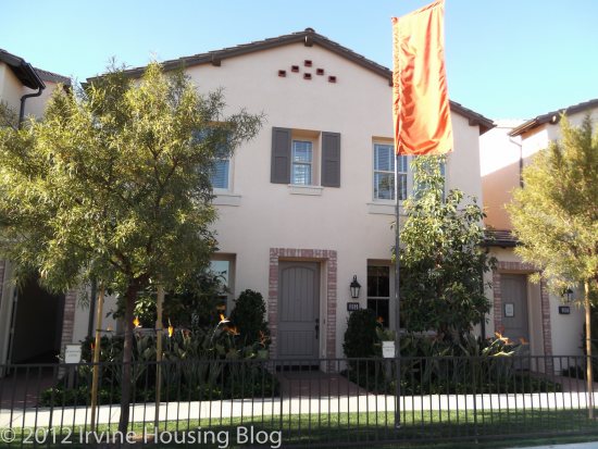
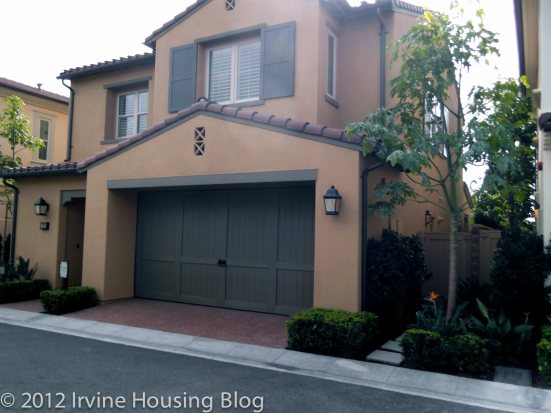
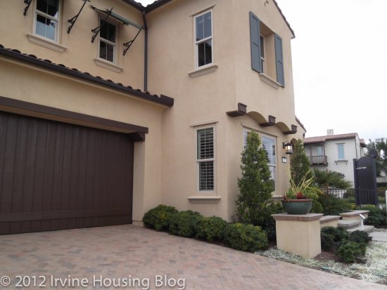
Las Colinas is one of the larger (and pricier) tracts in Portola Springs. They’re currently in their final phase and have about seven properties left. I reviewed the property on a beautiful Saturday morning. Clear blue skies put me in the buying mood for some reason, so my review may have a positive twist. I noticed that the neighborhood was quiet, which was almost an eerie feeling since I’m so used to loud neighbors. The demographics in this neighborhood were different than the other Portola Springs communities. I saw the age 40+ crowd walking their dogs or jogging. I observed this very quickly since I’m used to seeing kids everywhere in the other neighborhoods. Indeed, the Las Colinas housing feels like it’s not built for families. The aura and atmosphere felt like it catered to an older, more established homeowner. I could never imagine skateboarding ramps or Hop Scotch chalk drawings on the sidewalks. Maybe that’s why this neighborhood appealed to me.

The builder of this tract is Taylor Morrison. Their motto is “homes inspired by you.” I tend to agree with their tag line. Out of all the builders that I’ve seen, Taylor Morrison is my favorite. They have hits and misses, but overall I like them the best because they’re the most practical and share my love of big bathrooms. The neighborhood does have its down side. It’s constructed like a quarter slice of a piece of a pie—literally. Depending on where your lot is positioned, you could experience street noise from Portola Parkway. Granted, there is a berm of trees and shrubs shielding you from the ugly street view, but if you get one of those loud construction trucks barreling down the street, you’re going to hear it. The outermost houses border Ridge Valley, so no matter where you go you’ll hear some street noise. Welcome to California.

Would I live here? Yes—if the house was given to me. If I had to sink money into it, I’d choose to bypass this property. It’s too big for someone like me. Even if I was married I still couldn’t imagine living in the space, unless I did a large volume of entertaining and had house guests often. Pricing ranges in the high $900,000s but you’re probably looking at well over $1 million if not higher. I’m not sure I can justify the price. I’d want a bigger lot size for that chunk of change. I’m sure it’s comparable to other properties, but I’m a dreamer and still holding out for that “gem” of a property that gives me more bang for my buck.

Pricing

Community Overview

Site Map

Floorplans

Residence 1X (La Cumbre)

Number of bedrooms: 4 bedrooms

Number of bathrooms: 4 baths

Square footage: 2,988 sq. ft.

Garage: 2 cars

Base price: $996,885+

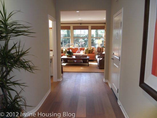
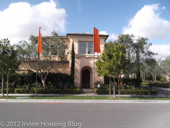
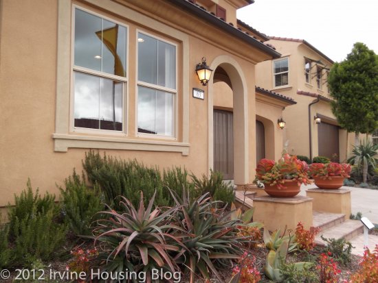
The entry to Residence 1 surprised me. You’re greeted by a series of architectural arcades that give the illusion of length. The rounded arches are Romanesque, which would typically attract my attention, but my initial instinct was that it made the entry seem cold. It’s grand and luxurious. Maybe Daddy Warbucks would like it, but my preference is cute and charming. Right away my guests will experience the comfort of my home without having to walk down a stretching hallway. To the right of the door is what they refer to as the “Loggia.” Basically it’s an extra seating area with a view of the backyard. It’s functional if you entertain a lot and want to offer guests seating. My personality profile says it’s impractical for my lifestyle—not matter how cool it is to say your house has a “Loggia.”
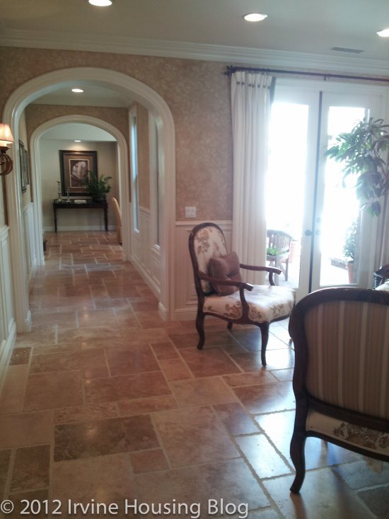
Once you walk through the arcade, you’ll spot the formal dining room. It’s a nice feature to have a separate space dedicated to dining. We spend a lot of time eating in front of the television, so having a separate space to enjoy your meals is attractive to someone like me. However, practicality dictates that somehow we’ll still find a way to eat near a television (it’s part of our lifestyle), so I’m not sure if I would use this space other than for “show.” I’m just being realistic.
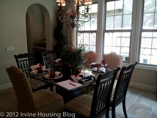
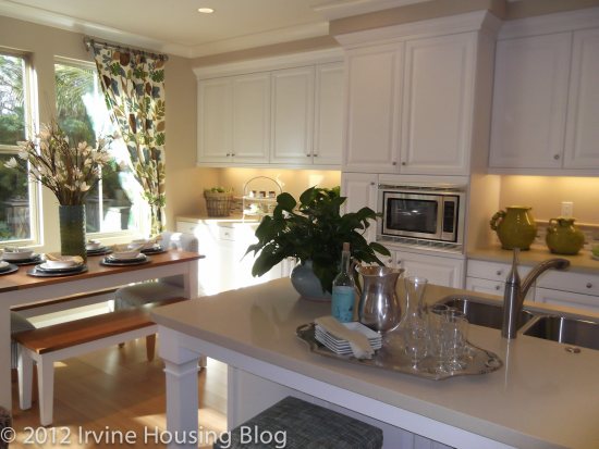
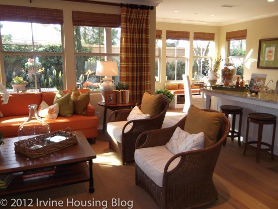
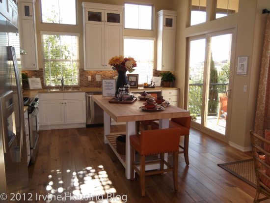
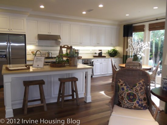
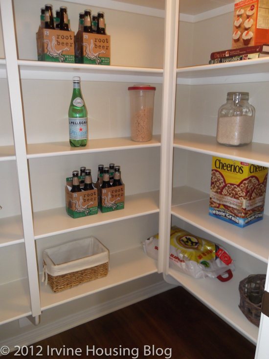
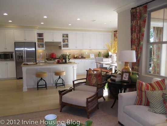
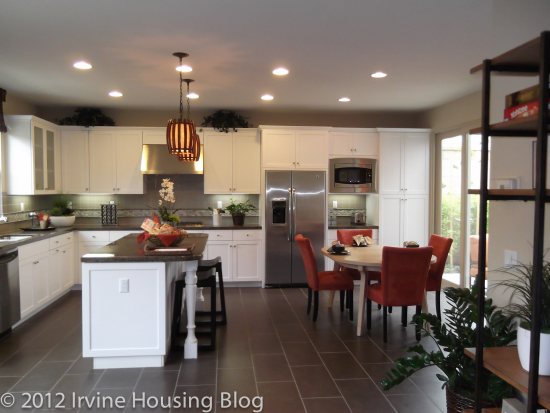
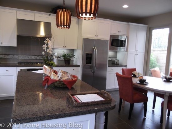
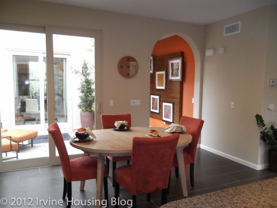
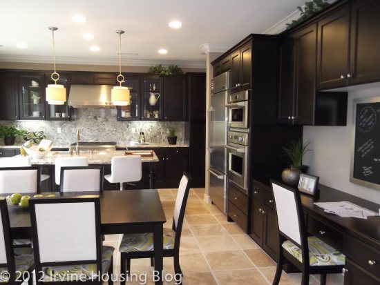
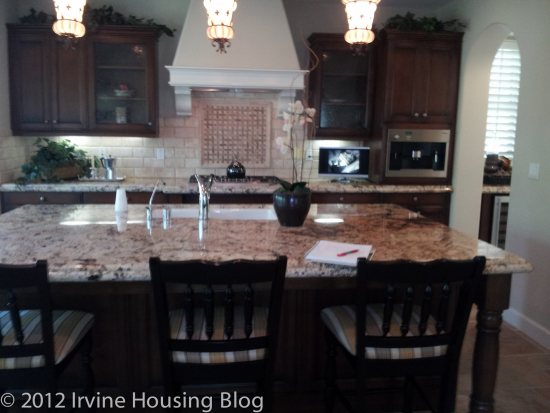
The kitchen wasn’t as large as I expected. It was nonetheless beautiful with a huge island. The island is perfect for bar style seating, and is even big enough to serve dinner for 2-4 people. The one element that shocked me was the minimal overhead cabinetry. Remember my post from Laguna Altura? My complaint was that there was too much cabinet space, which created a “too much kitchen” feel. Residence 1 has a smaller amount of upper cabinet space, but compensates by providing adequate lower cabinet storage. I liked this concept. There is a large pantry. It’s shelving, not a walk in. I don’t eat that much food but it would be ideal for 2-4 people. Nestled near the window is a space that the builders call a “Morning Room.” I prefer to think of it as the informal dining room. You could seat a rectangular table for 6 people. They carved out a nice space and I could see myself sitting there on a Saturday morning, drinking my glass of OJ and enjoying the view of my backyard.
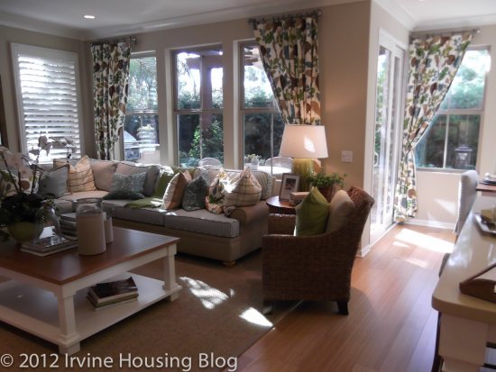
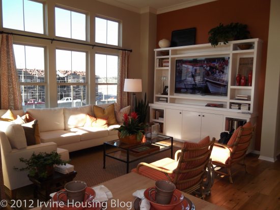
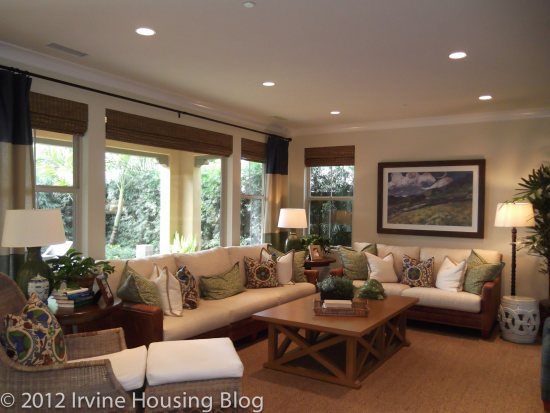
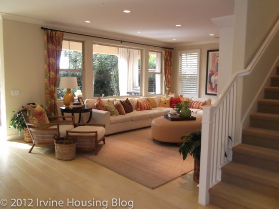
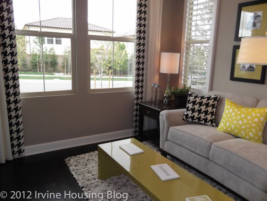
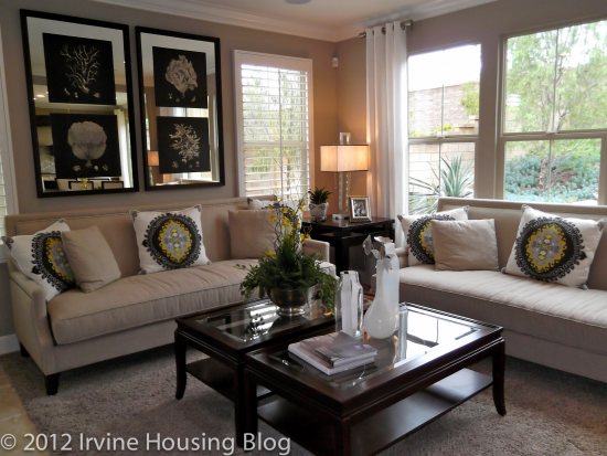
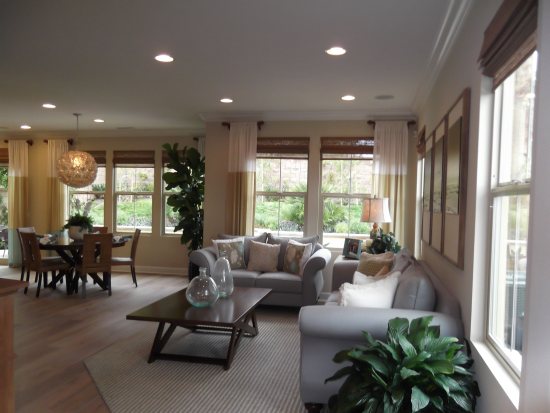
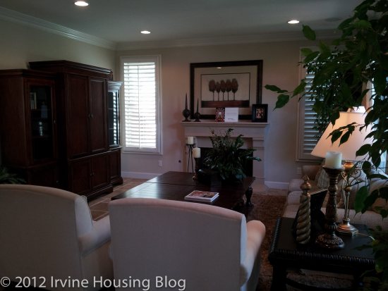
The living room isn’t as large as I thought it would be. I’d opt to have a fireplace installed to make it a little extra cozy. The living room is shaped like a square, so the furniture fits just right. I think it’s a sufficient space and will offer plenty of seating with room for a large coffee table.
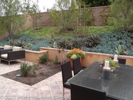
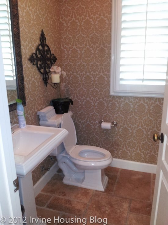
The other features on the ground floor include the powder room (small and functional) and an under the stairs storage closet. The backyard isn’t what I expected size-wise. It was rather narrow and small. The model’s backyard was “L-shaped” and extended past the Loggia. They had a fountain that could be viewed from the Loggia, but I still felt like it was a tight squeeze. Somehow they were able to fit a kid’s swing set back there—kudos to them.
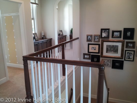
The master bedroom is located at the top of the stairs. If the house doesn’t have a lot of foot traffic, this might be acceptable. If I had kids with elephant feet stomping up and down the stairs while I’m napping, it would bother me.
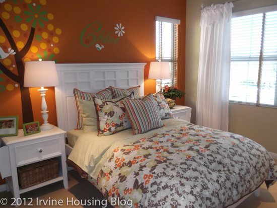
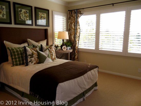
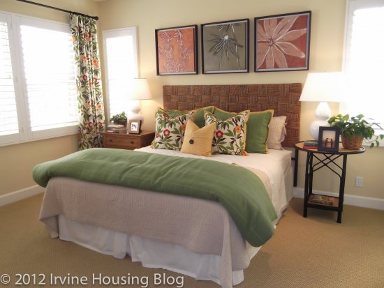
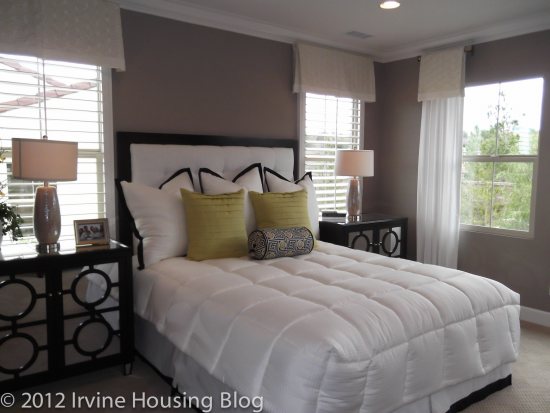
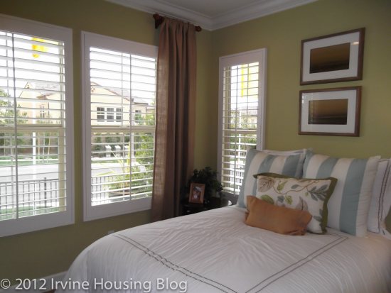
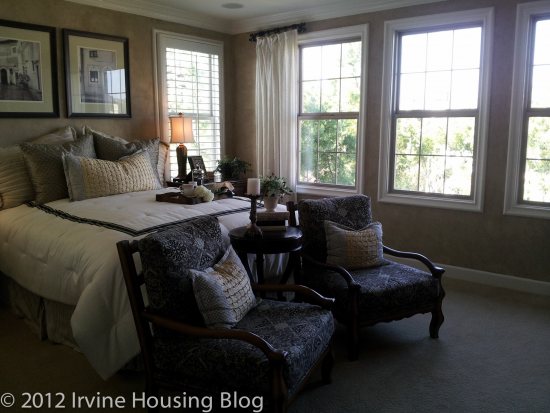
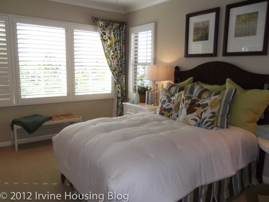
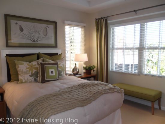
I enjoyed the master bedroom. I felt like it had a pleasant aura to it. Maybe it’s because there were plenty of windows and the model had a view of the backyard. It was just the right size for me. The only down side that I saw to the master bedroom was the sliver of wall space, where your headboard would typically go. If you have a King, Queen, or Cal King bed you’ll be hard pressed to fit a headboard on the wall since it’s wedged in between two windows. If you turn on HGTV you’ll find a plethora of options to give you the illusion of a headboard. It’s not a deal breaker for me.
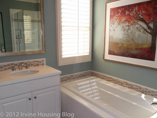
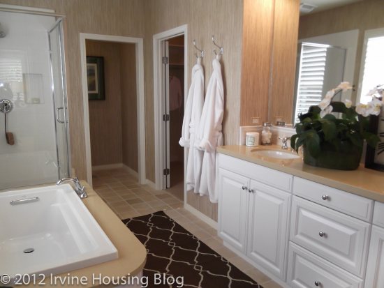
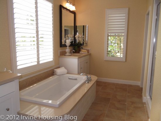
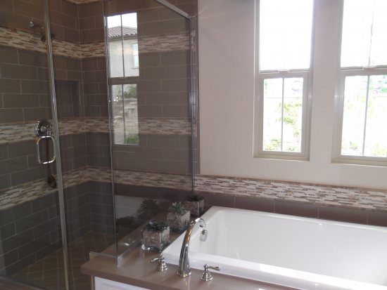
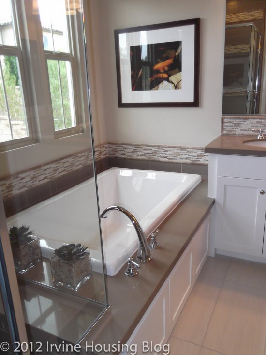
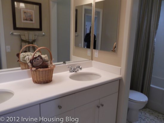
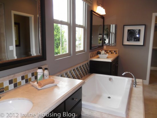
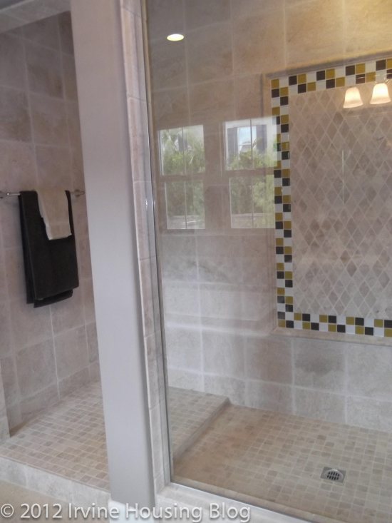
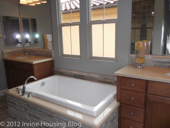
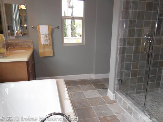
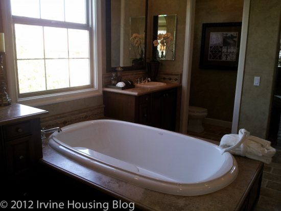
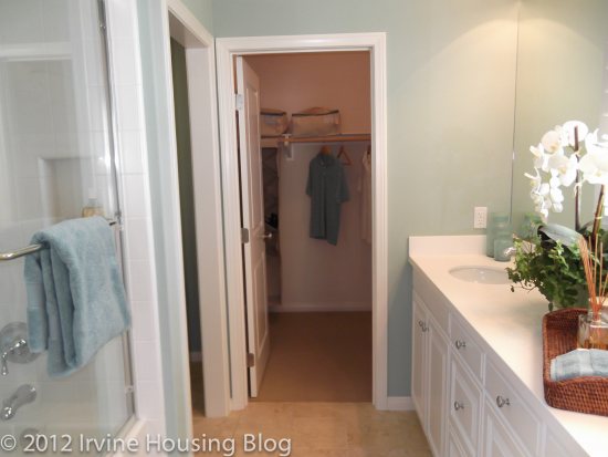
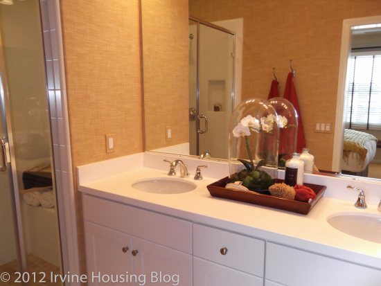
The master bathroom has a split sink vanity with an oval tub sandwiched between them. This is a reoccurring feature in Taylor Morrison’s designs. I wished the vanities had more countertop space. I was a little disappointed in that. The walk in shower is skinny, but gets the job done. It was very nice, and less to clean. The bathroom also included a large walk-in closet. I’d have lots of fun filling up the space with my wardrobe! Tip: I’d opt to get the mirror upgrade installed on the closet door since there aren’t any full length mirrors elsewhere.
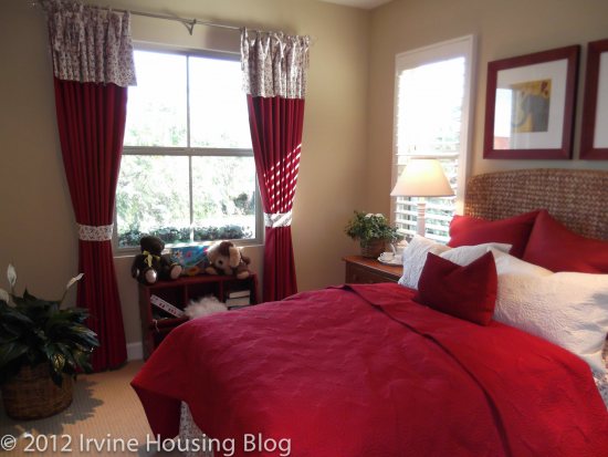
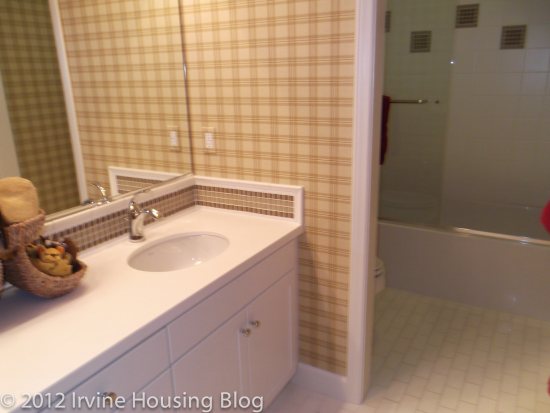
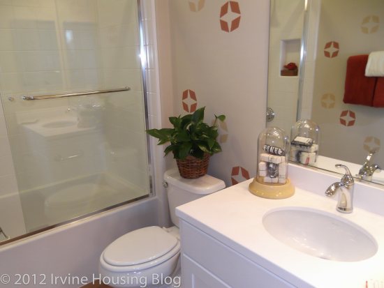
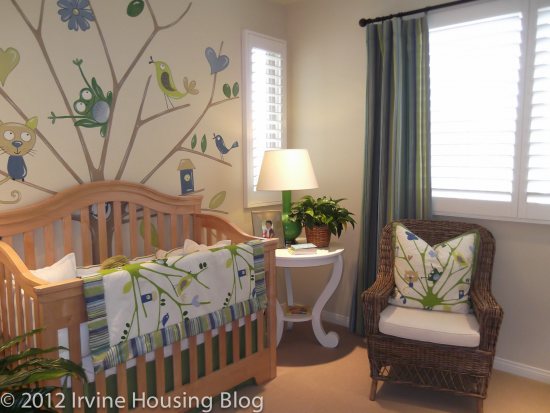
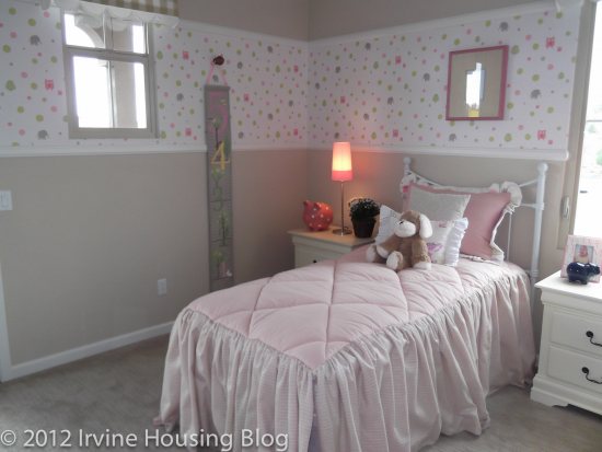
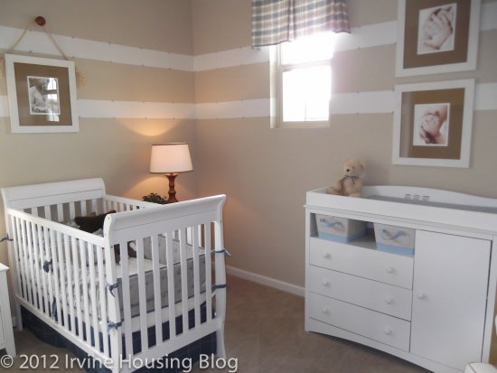
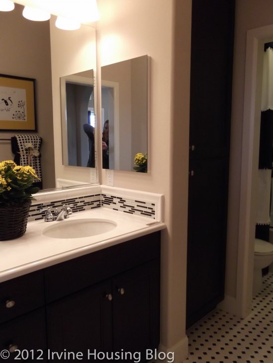
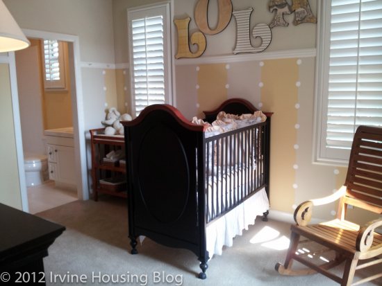
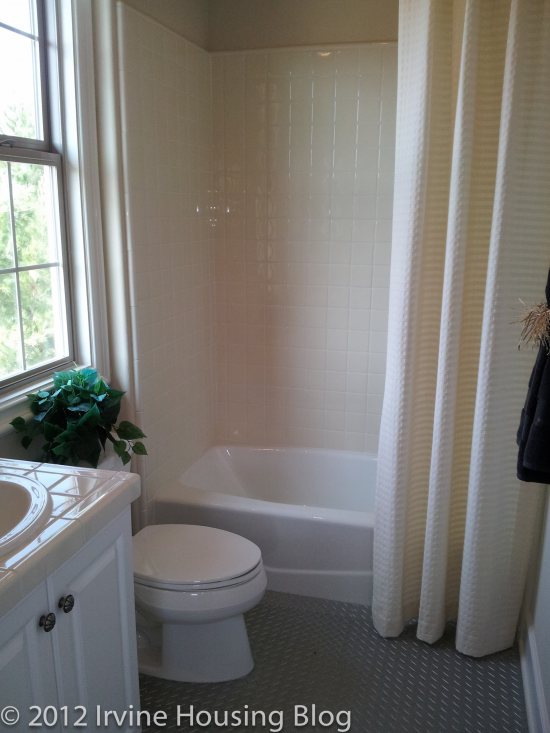
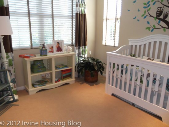
The second bedroom is a decent size. The model has it set up as a nursery, but there’s definitely room for growth. The room includes its own bathroom and a spacious walk in closet. The bathroom has a tiny vanity and a very narrow tub. I was wondering if I was too tall to fit in it. It doesn’t seem conducive for an adult bath retreat. There is a tiny balcony accessible off the second bedroom. I call it the “Romeo Balcony” because you can literally take one step out the door and not be able to go any further. It’s perfect if you have a Romeo serenading you in the moonlight. Otherwise, I see no purpose for it!
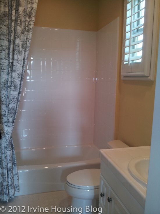
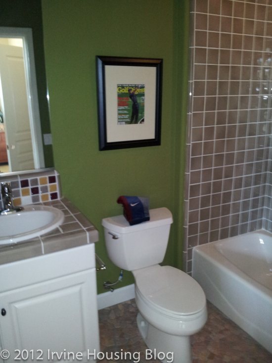
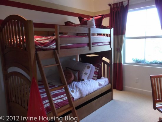
The third bedroom is also an acceptable size. There are dual split closets, which I was pleasantly surprised with. The model also featured a third closet, just in case you have an overflow of clothes. The ensuite mirrors the bathroom in bedroom 2, so there isn’t any wow factor to the bathroom. On the plus side, the bedrooms have their own bathrooms. The negative is the cramped space, small vanities and narrow tubs.
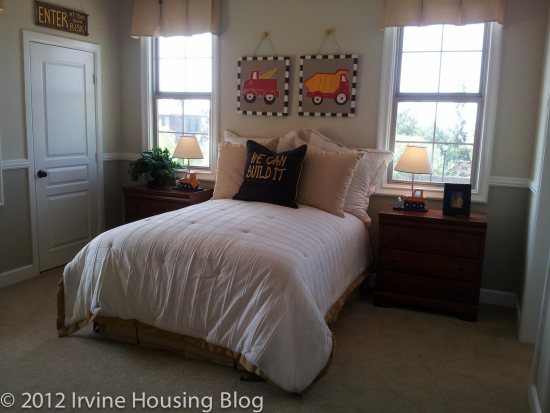
Residence 1 has a nice layout, and my complaints are only grumblings. There wasn’t anything blaringly wrong with this place upon my first sweep through, but like any house it has to fit your lifestyle. Residence 1 does not fit my lifestyle or personality.

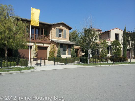
Residence 3 (El Morro)
Number of bedrooms: 4 bedrooms

Number of bathrooms: 4 baths

Square footage: 3,109 sq. ft.

Garage: 3 cars

Base price: $1,008,675+

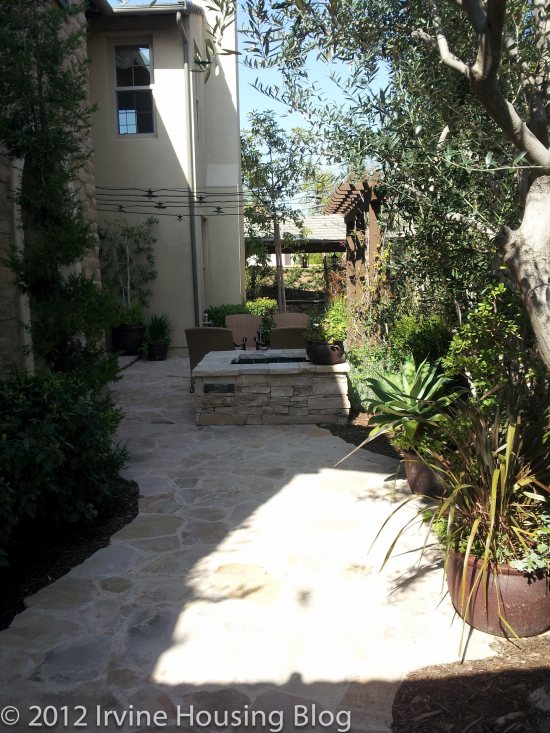
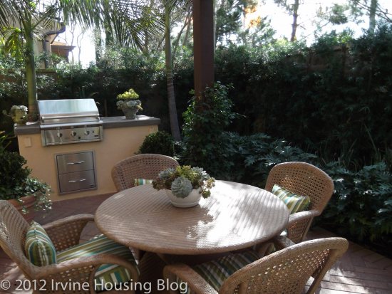
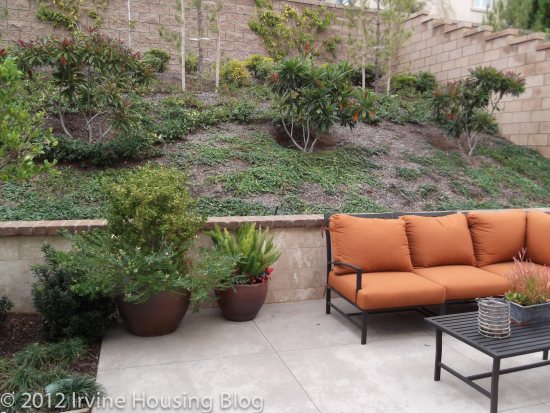
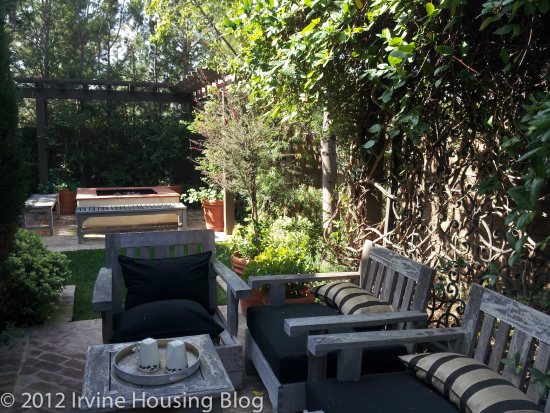
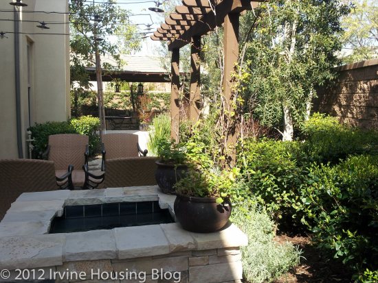
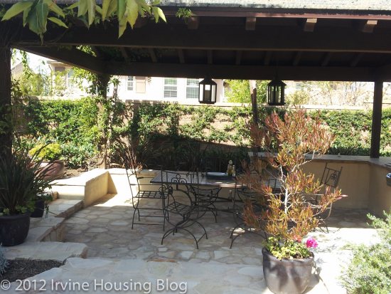
When I walked through the outside wooden door to Residence 3 I almost gasped. It was like entering a garden paradise. It was beautiful. The backyard functioned as a front yard. Dual purpose! The actual front door to your house is accessed off the garden. I wanted to buy the house just for this feature. Every day I’d walk through my entry just to see how wonderful my outdoor living space was. It almost felt like I was in an Italian Villa. They had a fire pit, fountain, BBQ, and a huge covered dining room. It’s perfect for the Summer, if you do a lot of entertaining. The lovely landscape of course is how the model features the space. You will inherit a pile of dirt. Hopefully you’ll be able to create something very similar to achieve the same effect. My smile was HUGE. Love it! Love it!
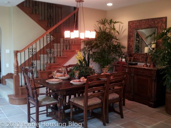
To the right of the entrance is the formal dining room. It’s a great space. It’s at the foot of the stairs, which I’m not thrilled with, but in my honest opinion this space is more for show than for practical eating habits.
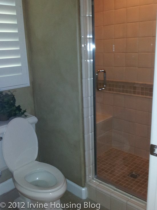
To the left of the entrance is a small guest bedroom and bathroom. When I say small, I mean small. I could barely squeeze in to get a picture. There are dual split closets which are a nice feature, but I didn’t find room for a television. You can stick overnight guests here, or make the space into something else.
The great room/living room isn’t overly grand. It’s just the right size to suit my tastes and has a wonderful view of the backyard. There’s a fireplace in the great room, which adds an extra element of coziness to the space.
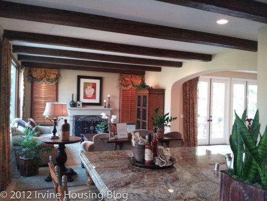
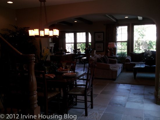
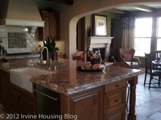
The kitchen didn’t have as much counter space or storage as I thought. The island is huge, and accounts for a big chunk of cabinet storage, but for the price I’d pay for the house I’d expect a larger kitchen. I also would’ve liked to have seen a double oven. I’m pleased with Taylor Morrison’s kitchen designs, and I’m not trying to be overly critical. It’s a workable space.
Off the kitchen is the conservatory. It’s a rectangular room that almost has a lodge feel to it, especially if you opt to have the fireplace built into it. I’m still trying to figure out exactly what I’d do with the room. The model features it as a dining area with additional seating. It would be nice on those cold California nights to dine by firelight! I almost feel like having two fireplaces on the ground floor is excessive. I’d rather see the second fireplace in the master suite.

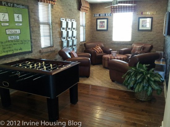
At the top of the stairs is the bonus room, which can either be turned into a bedroom or another space such as an entertainment or billiard room. It’s actually really nice. I wasn’t expecting this unique layout at the top of the stairs. Unless I have a large family, I’d turn this space into something really unique. I could have a lot of fun decorating. It leaves room for creativity and because the layout is so open, I feel like you’re not restricted to turning it into a bedroom.
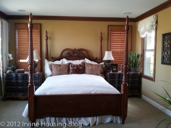
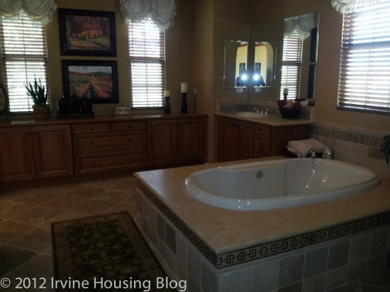
The master bedroom is lovely—very nice. The attached master bathroom is huge. I’m very particular about my bathrooms and I did not like this bathroom. It was very chic and sexy, but because it was so big that I became a little turned off. The tub is surrounded by lots of counter space. In all practicality I’m imagining my daily beauty routine with all the bottles, shave gel, razor, loofah etc…and if I leave any of them out, the entire bathroom would look junky. I’d either have to be immaculate, diligent about putting my beauty items away, or find a clever way to conceal them! The bathroom has an entire wall of linen cabinets/storage. It’s really nice and looks pretty, but I’d be hard pressed to fill them up. I’m not THAT high maintenance!
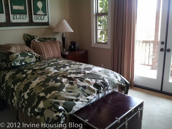
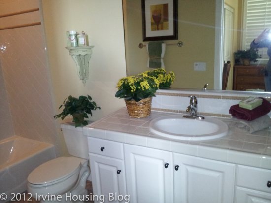
The second bedroom had a “boxy” feel to it. The closet was too small. The bathroom was slightly larger than bedroom 3, but the narrow tub is wearing on me. I wasn’t impressed with bedroom 2.

The third bedroom was a decent size with a standard walk-in closet. Bedroom 3 has access to a deck. My experience with bedroom decks is that you either spend a lot of time on the deck or no time on the deck. Since the deck is long and narrow perhaps a bistro table with two chairs or another petite furniture configuration would work best out here. The one thing I didn’t like about the third bedroom was the small wall space between the bathroom and closet. You can fit a small dresser, but where’s the space for a television? I was thinking about the televisions in my house and wondering if they could fit in this space. Even my smallest tv might be a stretch.
One other cool feature that I wanted to mention was the study loft, located in between the bonus room and master bedroom. The model featured it with shelving, hinting at a library but I’m sure you can find other options for this space if you’re not a bibliophile.
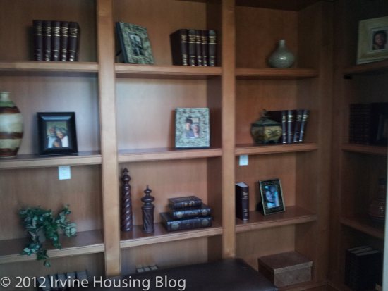
My overall impressions of Residence 3 are positive. Would I choose to live here? No. Why? Because it’s simply too big for me. I don’t need a conservatory or a library. I would LOVE to have my backyard configured like the model. However, seeing as every plant I own dies within two weeks, I’d definitely have to hire a gardener to maintain my property. These are extra expenses resonating in my head. I think the builders did a decent job at defining Irvine luxury, but as the French would say “c’est pas mon truc!” (It’s not my thing!).

Discuss below or at Talk Irvine.
A Review of the San Mateo Tract at Stonegate

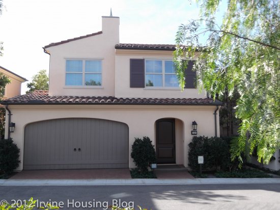
Déjà vu! San Mateo at Stonegate is the spitting image of the Siena tract at Laguna Altura. I’m not surprised, but am a little disappointed particularly because my original assessment of Siena at Laguna Altura was overpriced. I stand by my opinion. San Mateo is significantly cheaper than Laguna Altura and if I had to choose between the two locations, Stonegate or Laguna Altura, I’d choose Stonegate. I like the neighborhood better and you’re not surrounded by freeways. San Mateo is close to an on premises soccer field and Hummingbird Park. I was impressed with the park and soccer field. Summertime would be fun in this community.

Estimated Property Taxes and Special Assessments:

Base Property Tax: 1.05% of sales price

AD Tax: $1,694 per year

CFD Tax: $1,700 per year

Other Taxes: $152 per year

Overall Effective Tax Rate: Approximately 1.7%

Siteplan

Revised Exterior Renderings

Floorplans

Pricing

Residence 1

Number of bedrooms: 3 bedrooms

Number of bathrooms: 2.5 baths

Square footage: 1,636 sq. ft.

Garage: 2 cars

Base price: $561,000

Over half a million dollars for this? I don’t think so! I’m comparing the floorplan brochures from San Mateo Residence 1 at Stonegate and Siena Residence 1 at Laguna Altura and they’re identical. Siena Residence 1 started at $590,000 so San Mateo seems more reasonably priced if we were comparing. Rather than cheat and copy my Laguna Altura posts, I’m going to make a few observations about this property and try to rekindle the positives about this floorplan.

After reviewing some of the other models at Stonegate, I really appreciate the use of the great room in the San Mateo tract. Residence 1 has a distinction between the dining space and the kitchen. The living room area is a decent size. I think to further create a distinction between the dining space and kitchen I’d invest in the upgrade and get the hutch. Now that I think about it, the hutch does provide a nice countertop and convenient cabinet space. It’s a necessary design element. Anything else would just look silly.

The kitchen is smaller than the other plans, but I still think that it’s an adequate space. The rule is that bathrooms and kitchens sell houses, and I think this kitchen would suffice. There is no full length pantry, which is kind of a bummer, but you still have plenty of cupboard space to store dry goods. I also enjoy the amount of light the windows in the living and dining areas bring in to the space. The backyard is small, but nice. I could fit everything out in the space that I need: seating and a grill. The model has a very well-manicured backyard, but remember when you buy this place you’re inheriting a lump of dirt. A big dog might be cramped in the backyard, but at least you have a backyard for them to wander out in. Essentially, I can’t complain about the ground floor in this plan. I could easily see myself using this space. The upstairs is a whole other story.

Residence 1 includes the loft option. I’m advising that you keep this space as a loft. It would make an awesome entertainment area, or even an office. You can choose to have the upgraded cabinetry and I think I’d opt to have this feature. I would make it into a nice lounge area. There are plenty of options if you utilize this space as a loft. If you turn it into a bedroom, you’re limiting yourself to an oddly shaped room—and you know the closet will be tiny!

The master bedroom is not as big as I’d like it to be. If you choose to upgrade, you can have some nice crown moulding and a ceiling fan. It gives the space a more comforting touch, but I’d need to see the price tag before I sign off on it. I still wish that the master bathroom was larger with a stand-alone shower. Disappointing bathrooms are becoming the theme, or common thread within these tracts. The master bath has a shower/tub combo and the toilet is in a separate room. At least they hit one of my requirements.

The second bedroom is large enough for a child, with no room to grow. The closet is small—no surprise there. I think the size of the second bedroom is what kills this deal for me. It just feels cramped. I’m sure plenty of families will choose this home to raise their kids in, but I personally would want to have my child in a larger room for when they hit the teenager years. I suppose you could make it work.

My biggest complaint about the Siena tract at Laguna Altura was that the bedrooms and closets were too small. Since San Mateo is the exact same floorplan, my opinions haven’t changed. It’s too bad—a little extra square footage would make a huge difference.

Residence 2

Number of bedrooms: 3 bedrooms

Number of bathrooms: 2.5 baths

Square footage: 1,660 sq. ft.

Garage: 2 cars

Base price: $571,473

San Mateo Residence 2 compares to the Siena tract Residence 2 at Laguna Altura, except the space is flipped. Residence 2 is my favorite floorplan because it feels more inviting. The entry way is larger and it makes a difference in the look and feel of the place. The powder room off the entry way offers a great storage space underneath the stairs. There’s a surprisingly large coat closet located off the stairs.

As I said in the Residence 1 overview, San Mateo maximizes the great room concept and Residence 2 is a reflection of Residence 1. One of the reasons this floorplan is my favorite is because of the optional breakfast banquette in the dining area. This is the only unique feature to the house and it would be on my upgrade list. I like that the kitchen is smaller than some of the other floorplans in Stonegate. Residence 2 doesn’t have the cabinetry that canvasses the entire wall of the kitchen and sometimes this opens the space up. The hutch option is replaced by the banquette in this floorplan. I much prefer not to have seemingly endless amounts of cupboard space. The kitchen offers a pantry as an optional feature. I could take it or leave it.

The second bedroom is actually a nice size. I could probably live in this space. The closet would be a challenge, but I don’t think this size of this space was unreasonable. It’s probably similar to the size of my current bedroom. I don’t think I would have an issue putting my furniture in here. The master bedroom is a nice space as well. I think that the master bedroom and master bathroom have an apartment feel to them. You have the option to choose a shower/tub combo or just a stand-alone shower. The toilet is in a separate room. I liked the walk-in closet. I’d opt to have the mirrors built into the door.

The second bathroom was great. It didn’t feel like a hallway, which is probably why I liked it. The toilet isn’t separate from the shower/tub area, but it wasn’t a deal breaker. The one thing I started to notice in these models is that the shower/tub combos have high ceilings, so you’ll have to find a long shower curtain!

Although this is my favorite plan, I still wouldn’t buy it.

Residence 3

Number of bedrooms: 3 bedrooms

Number of bathrooms: 2.5 baths

Square footage: 1,804 sq. ft.

Garage: 2 cars

Base price: $597,000 SOLD

There’s really not much to say about San Mateo Residence 3, mainly because it’s sold out. It’s significantly cheaper than the Laguna Altura Siena Residence 3, which started at $630,000. The San Mateo Residence 3 is larger than Residence 3 at Laguna Altura and the difference can be felt in the bedroom size. It has all the downstairs amenities as the other two San Mateo models and the upstairs is a major improvement. If I had a family I would consider this property.

The master bedroom was big—or bigger than most of the other tracts in Stonegate. I would really enjoy the space. The icing on the cake was finding a stand-alone shower and tub in the bathroom that didn’t feel like a hallway. I almost didn’t know what to do with myself! A bathroom that felt like a bathroom! The walk-in closet was acceptable. Finally!

The other bedrooms were livable. Bedroom 2 had some nice sliding glass closet door mirrors. I don’t like things that slide, but I’d make an exception in this bedroom. The larger bedroom make this space more family oriented and if you purchased this property it is somewhere you could stay for a while to raise your family. Well done Residence 3.

Overall, this floorplan left a great impression on me. No wonder it’s sold out!

Summary

I think Residences 1 & 2 are overpriced for the quality of space. Residence 3 impressed me and I would consider spending the money if I lived in a household with dual incomes. Remember, Stonegate pre-qualifies through Wells Fargo, and if you compare the income calculations sheet I snagged at Santa Clara, the mortgage payments were still over-the-top. The payments seemed hard to stomach at Santa Clara, so I can only imagine how much they’d be at San Mateo which is around $200K more than Santa Clara.

Discuss below or at Talk Irvine.
A Review of the Santa Maria Tract at Stonegate

Santa Maria is the second smallest tract in the Village of Stonegate. These residences are considered townhomes. I’m going to come right out and say it: I didn’t really like these floor plans. If I had to choose between Santa Maria and Santa Clara, I’d choose Santa Clara. The Santa Maria properties are larger, but I thought that they lacked charm and were overpriced.

Estimated Property Taxes and Special Assessments:

Base Property Tax: 1.05% of sales price

AD Tax: $1,607 per year

CFD Tax: $1,700 per year

Other Taxes: $156 per year

Overall Effective Tax Rate: Approximately 1.8%

Floorplans

Pricing

Options

Residence 1

Number of bedrooms: 2 bedrooms + den

Number of bathrooms: 2

Square footage: 1,386 sq. ft.

Garage: 2 cars

Base price: $432,000

The Residence 1 model had a most unwelcoming entrance. The model displayed a feature where you had to be buzzed in through a door. Once inside door 1, you see the front door. I felt like I was trapped in between the two doors and the walls extend up so high that it made the entrance dark. I was expecting a portcullis to drop down and be taken prisoner in the castle. This is not how I want to welcome guests into my home.

When you enter Residence 1 you’re greeted by three doors. I felt like Alice in Wonderland wondering which door to choose: laundry, garage or coat closet. Walking up the stairs was a big disappointment, because I was immediately confronted by the deal breaker—you must choose between a butcher block island or a dining room table. Granted, the island is large enough to function as a table and that’s how the model presents it. You’re almost forced to choose the island. If you opt for a table instead of the island, you’re losing counter space and your table is smack dab in the center of the kitchen. I give this floor plan the big NO.

The kitchen has tall cabinets. I was satisfied with the storage capacity. You have an optional built in desk that you can select in lieu of more cabinetry. I envision this desk becoming a junk collector and I’m not sure it belongs in the kitchen. Needless to say, my review of the kitchen is two thumbs down. I can’t get past the island—butcher blocks require maintenance and I just don’t like the concept of having my food prep area the same as where I eat. Unacceptable.

The den is petite. You would definitely have to turn it into an office. The guest bathroom is sufficient. It reminds me a little of a hotel. The vanity isn’t full sized, and it only has two drawers. It’s a tub/shower combo. It serves its purpose with no bells and whistles.

I found the second bedroom small, but it wasn’t surprising after seeing Santa Clara’s floor plans. The closet isn’t big, but perhaps you can fit a child’s wardrobe in it. The closet has hanging wooden doors that slide on a track. I had this closet setup in my last apartment and I hated it. Maybe I had a bad experience that turned me off of sliding doors forever.

The master bedroom is a decent size. I actually really liked the master bedroom. The walk-in closet is ok. I don’t think there’s enough bar space, but you can always configure your hardware to suit your needs. I thought the master bathroom was small. The dual vanity is acceptable space-wise, and the toilet is in a separate area. There’s a nice walk-in shower, but no tub.

Final Thoughts:

Overall I think that the floor plan was poorly designed. I wouldn’t live here.

Residence 2

Number of bedrooms: 2 bedrooms

Number of bathrooms: 2.5

Square footage: 1,483 sq. ft.

Garage: 2 cars

Base price: $458,000

When you walk into Residence 2, you have an open view of the kitchen and great room. The great room is spacious and you can easily define the living room from your dining space. The model showcases an optional hutch in the dining room area, and I think I’d choose this upgrade for the house. It helps extend the kitchen.

I wasn’t impressed with the kitchen. It felt a little small and short on counter space. It had plenty of cabinet storage. The microwave, however, was built into a corner between the cabinets and countertop. It seemed like such a waste of space and it was a very awkward placement. It’s the first thing I saw when I walked through the door…an oddly configured microwave.

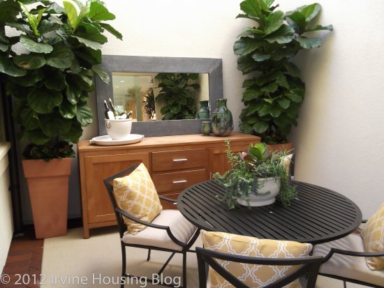
There is an enclosed outdoor atrium. Perhaps they were trying to mimic the Roman villas with the atrium in the center of the household. I’m not quite sure how I feel about this space. On the one hand, it is kind of cool. On the other hand, you’re walled in. When you look up at the extended walls it gives off the vibe that you’re in the bottom of an endless pit—but at least you can see a patch of blue sky. Private or claustrophobic? You decide.

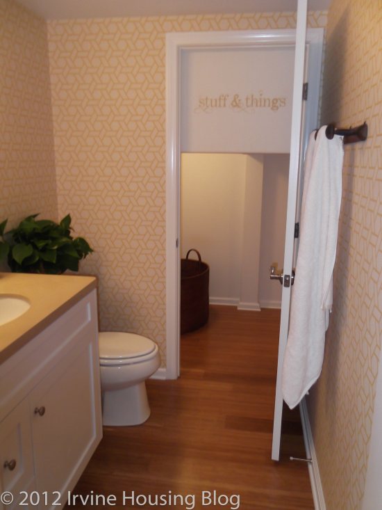
The downstairs powder room contains a toilet, vanity and miniature door leading to a storage area. I think that having an under the stairs storage space is a bonus to the house, it just looks odd in the bathroom and once again I felt like I was wandering through an Alice in Wonderland house.

Down the hallway past the powder room are the stairs. The model showcases an optional basket storage/home management desk in the landing. I actually liked the basket storage and home management setup. I’d consider adding this feature. I think it’s a great place for it. There’s a lot of linen cabinet space down the hallway, which is very nice.

I wasn’t disappointed in the second bedroom. I think it could easily accommodate a Full bed, although a Queen might be a stretch. Every square foot counts! There is a very tiny ensuite in this bedroom. It has a shower/tub combo and a small vanity. I couldn’t live in this space, but a child could.

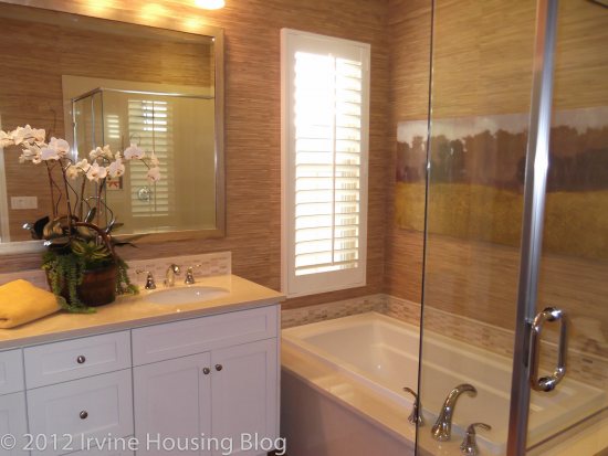
The master bedroom was suitable. It had a nice walk-in closet and showcased the optional organizer. The master bathroom had a tub separate from the stand alone shower. The toilet is in a separate room, which is a huge plus in my book. The dual vanity is standard and would accommodate my arsenal of beauty products. The master bedroom with ensuite passed my inspection.

Final Thoughts:

After my initial walk through of Residence 2 I decided that it wasn’t for me. The storage, atrium and tub in the master bathroom are unique features, but not enough to win me over.

Residence 3

Number of bedrooms: 3 bedrooms (or optional den at bedroom 3)

Number of bathrooms: 3

Square footage: 1,614 sq. ft.

Garage: 2 cars

Base price: $505,000

When you walk into Residence 3, you have an open concept view of the great room and kitchen. The first thing I noticed in the model was the awkward placement of the dining room table. It’s sandwiched between the kitchen and the living room. I feel like it blocks the flow of traffic. On the flip side, instead of eating your meals at the coffee table so you can watch television, you can now actually sit at your kitchen table and enjoy your quality programming.

The kitchen was suitable, and I don’t have any complaints. The island has a lot of surface area, there’s plenty of counter space and lots of cupboard storage. If I had one piece of advice to tell the builders, I would recommend that they offer a double oven in the kitchens. Maybe they could make it optional, but around the holidays a double oven is always appreciated.

The courtyard, or patio, is accessed off the kitchen. The homebuyer can make it into a decent space. It’s large enough to have some patio furniture, including a 6 seater table, and a grill. Remember, the courtyard will come pre-packaged as a mound of dirt, and you’re probably looking between $3000-$5000 to make the courtyard into the pretty paradise showcased in the model.

Residence 3 offers a bedroom on the first floor. You have the option of turning it into a loft, which I would recommend. I won’t lie: I don’t like having a bedroom on the first floor, just off the entry. I don’t feel like it’s private and I have an issue with security. However, in this floor plan I will admit that it is nice to have a full bathroom across from the downstairs bedroom. The bathroom is tiny, but it has everything you need—with the exception of a tub!

At the top of the stairs is an optional desk with low linen storage unit. I don’t think there’s really much else you can do with this space, so you may want to think about opting for the upgrade.

The second bedroom can accommodate a twin or daybed. The closet is acceptable. It would be a challenge to fit my wardrobe in there, but for a child it could work. I liked that the second bedroom had an ensuite. It’s a shower tub combo with a medium-sized vanity. It looks like your typical apartment bathroom. It passes the test.

I was pleasantly surprised with the master bedroom. It’s a decent size, and the model showcased an optional recessed crown moulding in the ceiling. It adds depth to the room and makes it unique, so you may want to consider upgrading. There are glass double doors that lead to the deck. It’s not a huge deck, but it might be nice to walk out there on early Summer mornings. The walk-in closet is enough to house my clothes, so I’m satisfied with the space. The ensuite has a double sink vanity and a stand-alone shower adjacent to a spacious tub. The toilet is in a separate room and you can choose to have extra storage cabinet built in. I like the large linen cabinet in the master bathroom. I’d rather see a linen closet in a common area, but if you opt to have the low linen cupboard built in the landing at the top of the stairs, that would solve the problem of having others come in your bathroom to snatch a towel or set of sheets.

Final Thoughts:

I strongly feel that this model felt like apartment living. It’s very chic, but I just couldn’t get attached to it. I didn’t like the cramped dining area, and I’d be forced to turn the 3rd bedroom into a den because I prefer not to have a bedroom on the first floor. I can’t justify paying $500,000+ for a townhome I wouldn’t be happy in.

Discuss below or at Talk Irvine.
A Review of the San Marcos Tract at Stonegate

zovall: We still have a couple Stonegate tract reviews left to post.

I made the mistake of visiting San Marcos, the last tract in Stonegate, AFTER I reviewed Las Ventanas at Portola Springs. I think in comparison, the builder (Taylor Morrison) at Portola Springs got it right and Stonegate got it wrong. I’ve seen all of the other tracts at Stonegate, so San Marcos had relatively little to offer me. I wasn’t expecting any pleasant surprises, and indeed, San Marcos contained the recycled features from the rest of the Stonegate tracts. I think that San Marcos deserves a fair shake, so I don’t want to knock it off your radar completely. Residence 2 was unavailable for viewing, so I’ll only give you Residences 1 and 3. Something tells me that Residence 2 wouldn’t wow me, so I won’t lament not being able to see it.

Estimated Property Taxes and Special Assessments

Base Property Tax: 1.05% of sales price

AD Tax: $1,889 per year

CFD Tax: $1,700 per year

Other Taxes: $156 per year

Overall Effective Tax Rate: 1.6%

Community Overview

Pricing

Floorplans

Options

Residence 1

Price: From $626,500

Bedrooms: 3

Bathrooms: 2.5

Garage: 2 cars

Square Footage: 1,824 sq/ft

Despite my negative bias against Stonegate, I enjoyed the living space in Residence 1. The huge window overlooking the “California room” and backyard really made the space work for me. I like the open feeling, which is why the great room concept throughout the Stonegate tracts appeals to me. To clarify, the “California Room” is basically a section of the backyard with exposed rafters and a ceiling fan overhanging a cement patio. It’s a charming space and I think it adds a nice element of flair to the backyard.

I think after reviewing Las Ventanas at Portola Springs, I’ve finally pinpointed what I don’t like about the Stonegate kitchens: too much cabinetry. In San Marcos Residence 1, I felt like the cabinets swallowed up the entire kitchen. This was indeed the theme throughout all Stonegate tracts. However, there were a few unique features in the Residence 1 kitchen that I liked: the walk-in pantry and the optional wine refrigerator. The walk-in pantry is very nice. I think it appeals to me because I lack pantry space in my apartment, so anything is better than what I have. You could stock your pantry and bunker down for the Winter—it’s quite spacious. The wine refrigerator is a must for wine lovers. I don’t drink, but if I did I’d upgrade. I think it adds a touch of class and breaks up the white cabinetry.

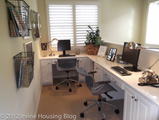
There’s a “Tech Space” at the top of the stairs with an optional built-in wrap around desk. You might as well spend the money to upgrade to the built-in desk because I’m not quite sure what else you’d do with the space. It is truly built to be a “Tech Space.” I think it could work as an office, but if you work from home and have kids, you’d better schedule your conference calls when the kids are at school. There is no door to shut for privacy.

The master bedroom is a fairly decent size, but I didn’t like that it’s located just off the top of the stairs. However, I did like that bedrooms 2 and 3 are located opposite of the master suite. You win some, you lose some. I actually liked the master bathroom. It didn’t feel like a hallway, it was a nice size, the walk-in shower wasn’t facing the vanity mirrors and the toilet was in a separate room. The walk in closet located in the bathroom is huge. It’s a very nice space and I could have a lot of fun finding clothes to fill the closet with!

Bedrooms 2 and 3 weren’t too bad size-wise. For the price, a small part of me would expect larger bedrooms. On the positive side, the third bedroom had a nice walk in closet. Bedroom two had a closet that seemed slightly bigger than those offered in the bedrooms in other Stonegate tracts. I’m still complaining about the closets, I know. But let’s get real Stonegate!

The second bathroom isn’t too small, but it’s also not big either. It’s a shower/tub combo with the toilet next to the tub. It’s exactly what I would’ve expected from Stonegate: dual sink vanity and mirror.

Overall, my impressions of Residence 1 basically made me yawn. I’d seen it all before, so there was nothing left for me to get excited about. I’m going to go out on a limb here and say that San Marcos is overpriced, but it also seems to be the most popular. I think I would invest my money elsewhere.

Residence 3

Price: From $696,500

Bedrooms: 4

Bathrooms: 3

Garage: 2 cars

Square Footage: 2,077 sq/ft

I think I liked Residence 3 more than Residence 1, even though they are practically the same. I like having an optional loft (at the sacrifice of bedroom 3). Since the bedrooms tend to be small in the Stonegate tracts, I’d utilize a loft more than a tiny bedroom. Because of this option, I could imagine myself in Residence 3 as opposed to Residence 1.

When you enter Residence 3, the staircase is just off the right and you have a nice view of the living room. Being able to see your living room when you enter your house is comforting—at least for me. The kitchen and living room feed off of each other, and the dining “space” is set up right in front of the sliding glass door leading to the backyard. I felt like the table blocked the kitchen cabinets, and I wasn’t too keen on having to move a chair every time I needed to access the lower cupboards. The whole downstairs is nearly an exact replica of Residence 1 with an exception of a 4th bedroom downstairs. It’s unfortunate though, that the 4th bedroom shares a wall with the garage.

I’m neutral on the master bedroom. It didn’t wow me, but it was certainly big enough. However, I liked the master bath. The tub split the two “his and hers” vanities and there was a deep walk-in shower. The walk-in closet was wonderful.

Bedroom 3 is the optional loft. It’s big enough for a bed, but it would be a squeeze. Also, it shares a wall with the master. Our regular readers know just how much I hate that. It’s becoming a deal breaker for me. Bedroom 2 is typical of the rest of Stonegate. It’s not huge, but it’s workable with a nice walk-in closet.

The second bathroom is basically a rectangle. When you have a rectangle, you have a hallway. It’s no different than any of the other bathrooms in the Stonegate tracts. In retrospect, I’m not sure why I’m expecting the upstairs bathrooms to be more than functional. I guess they serve their purpose. The two elements that I’d like to see in the second bathrooms are a linen closet and to have the toilet separate from the shower/tub combo. I guess that’s the difference between a “want” and a “need.”

I would’ve liked to have seen a fireplace in Residence 3. I want more bang for my buck. That was disappointing.

If I had to choose between the neighborhoods of Portola Springs and Stonegate, I would probably go with Stonegate. I think it has a better proximity to the freeways and amenities. It’s not flush up against the 133. There are parks, a soccer field, and it’s a nice area to cycle or take walks. Despite the positives of the Stonegate neighborhood, it’s not the place for me. It’s very chic, but I can’t justify the purchase price. Goodbye Stonegate.

Discuss below or at Talk Irvine.
A Review of the Las Ventanas Tract at Portola Springs

Las Ventanas (Community Overview) is the first tract I’m reviewing in the Portola Springs Villages. Portola Springs is bordered by the Great Park and the Irvine Ranch Land Preserve in a seemingly remote pocket in Irvine. The closest schools are Stonegate Elementary, Sierra Vista Middle School and Northwood High School. The villages have direct access to the 133 and 241 toll roads with the 5 freeway nearby. Residents living in the Portola Springs Villages are privy to community parks, a lighted soccer field, playgrounds, basket ball and tennis courts, as well as access to hiking trails. It’s truly a self contained private community that appears to be far removed from the busier areas in Irvine. Las Ventanas will have a total of 86 homes in the development.
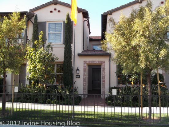
I instantly saw the huge contrast between Stonegate and Portola Springs. It’s almost as if the builders (Taylor Morrison) fixed all my complaints about Stonegate and Laguna Altura. The ambiance in all three tracts was inviting and I immediately felt like I was “home,” which is important to me. Unlike Stonegate, I was highly receptive to Las Ventanas. Portola Springs is a family oriented neighborhood. In fact, most of the visitors viewing the models were young couples with small children, or very pregnant women looking to move into a larger space to accommodate a new baby. I am none of the above, so these homes were too large for me, but I’m still excited to share with you my observations about the properties.
Base Property Tax: 1.05% of the sales price

AD Tax: $3,197 per year

CFD Tax: $1,700 per year

Other Taxes: $169 per year

Total Effective Tax: 1.75%

HOA: $150 per month

Floorplans

Pricing

Options

Siteplan

Residence 1

Price: From $634,900

Bedrooms: 3 + den

Bathrooms: 2.5

Garage: 2 car

Square Footage: 1,871 sq ft

Upon entering Residence 1 you’re immediately greeted on the right by the den. The windows in the den face the outside of the house, bringing in an abundance of light. The model showcased the space as an office. My only concern is that if you turn this space into an office, you’ll have to keep it clean because it’s the first thing you and your guests will see when entering the house. The feature I really enjoyed in the den was the sliding glass doors (optional French doors) leading to a small square courtyard between the kitchen and den. It was unique and cozy. I could imagine myself sipping some lemonade on a lounge chair during the Summer. I didn’t expect a sweet surprise so early in the floorplan. It made me excited to see the rest of the house.
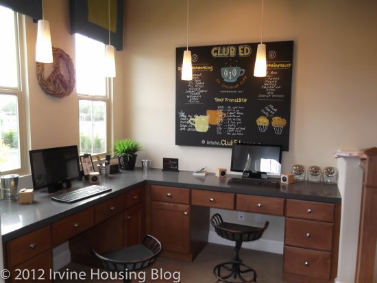
The backyard was much larger than what you’d get at Stonegate. You’ll inherit a lump of dirt in the backyard and you’ll have to landscape it how you’d like. There’s enough room in the backyard for grass, and you can plant some bushes or flowers on the slope. I’m not keen on landscaping, so I’d choose to lay brick or some kind of flooring instead of grass and plant low maintenance shrubs/bushes for the elevated slope. I cringe at the thought of yard work, so for me simple and easy is the way to go. There are tons of options to customize the backyard and make it your own. I’d put lots of seating and a manly barbeque in the backyard. If you have animals, there’s enough space for them to roam. Just a word of caution for cat owners–you are in a nature preserve so beware of coyotes.

The kitchen and dining areas feed into each other in a large rectangular formation. The dining room table in the model sits in front of the doors to the courtyard, giving you a pleasant view. There’s enough space for a six-seater table, but it is somewhat close to the cabinetry. It’s not a deal breaker, and could be resolved with a table suitable for the space. I’d choose to upgrade to the recessed lighting in this area. The kitchen includes stainless steel appliances, with the exception of the counter-depth stainless steel refrigerator. That was kind of a bummer. You are almost forced to upgrade. I think the kitchen has adequate counter space, particularly if you include the extended island. There’s plenty of cabinet storage and a full pantry. You can customize your backsplash if you upgrade, and I’d consider this option if the price is right. I like having choices.

The great room is square-ish and you’d have no trouble fitting an L-shaped sofa and perhaps a couple of chairs. You have the option to include a fireplace–which is a must for me. I actually like having a square space because it makes it easier to place furniture. I really like the feel of the great room and enjoyed the open concept. I think it adds a lighter feel to the downstairs.

There’s a powder room located at the base of the stairs. It’s tiny, but you have everything you need to get the job done: a toilet and sink. I didn’t like the location of the powder room. It’s too close to the kitchen and I don’t like the idea of having potential odors wafting from the toilet into the kitchen. That was a negative for me. Maybe an air freshener would alleviate this problem.

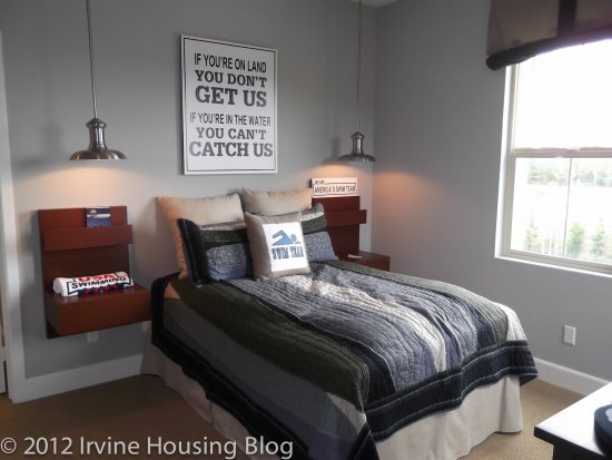
The size of the bedrooms are impressive compared to Laguna Altura and Stonegate. They are much more spacious and have more practical closets. The bedrooms are square and offer room for children to grow. If I was a mother I’d feel comfortable planting my roots in this house knowing that my children wouldn’t outgrow their rooms. The first bedroom has access to a small balcony. The second bedroom has it’s own walk-in closet and charming windows.

The master bedroom is spacious enough to suit my tastes and I think that it allows the homeowner the opportunity for personalization. It’s a lovely space with lots of light. I’d be happy sleeping there! For our regular readers you know how particular I am about my master bathrooms. Well, brace yourself: This passed the Wendy inspection! There’s a stand-alone shower and large tub. The toilet is sectioned off in a separate room, and the vanity has enough counter space for my morning routine of make-up, hair dryer and straightening iron. Although the master bathroom was smaller than I’d like to have, it is a workable space. My impression of the master bedroom package was very positive. What a relief and a breath of fresh air compared to Laguna Altura and Stonegate.

The second bathroom is small and narrow, creating the familiar hallway effect. It’s a squeeze, but functional with a dual sink vanity. The toilet is almost flush up (no pun intended) against the shower/tub combo. If I were to offer a critique of the bathroom, the close proximity of the tub to the toilet would be my only complaint.

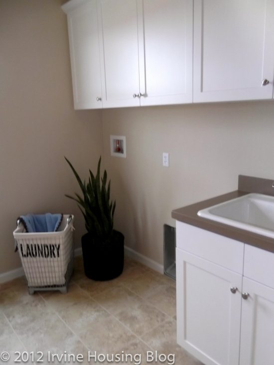
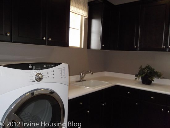
The upstairs features a full size laundry room with cabinets, a marble counter and optional sink. There’s plenty of space in the laundry room to store cleaning supplies, hampers or any additional items the homeowner would like to hide from view. If I had a cat this is probably where I’d put the litter box.Yes I know, a litter box in the laundry room–just keep the clean clothes separate from the box and don’t leave laundry baskets around for the cat to jump in!

Although Residence 1 is the smallest floorplan of the 3, I think a family could comfortably live here. My impression was really positive and I felt like the house factored in practical living habits–like the need for larger closets in the bedrooms. However, with tract housing, one big concern in my mind is the noise barrier. We’re all very smooshed here in California, and I like my quiet. So it bothered me that I was able to hear the voices from the sales office through the walls within the house. The sales office is attached to the house, but being able to hear a downstairs conversation in the sales office while in an upstairs bedroom makes me very suspicious. It made me wonder if I could hear an upstairs toilet flush while lounging in the great room downstairs. I call this phenomenon the “hotel effect” because that’s something you would expect to hear in a three star hotel room. I think I’m going to have to add the “toilet test” to my review criteria.

Residence 2

Price: From $671,905

Bedrooms: 4

Bathrooms: 3

Garage: 2 car

Square Footage: 2,075 sq ft

Residence 2 has a bedroom immediately off the entry way. The model features the space as a den. I’d hesitate turning the space into a bedroom because it’s located on the ground level, right off the front door. I don’t like the idea of having a bedroom window facing the sidewalk. There is a petite half bathroom located just off the bedroom which is a nice feature. Perhaps this could work for a roommate situation. Either that or you could stick your guests in that room–which might not be such a bad thing.

When I entered Residence 2 I felt like I was home. The structure strongly appealed to me, perhaps because the design elements reflect my personal tastes making it feel more comfortable. I was keen on the layout and compared to the other models I’ve toured this is the best one I’ve come across. However, many of the features in the model are upgrades: the flooring, built-ins, window coverings, crown moulding (in some areas), and enlarged base boards. I kept thinking of the increasing dollar signs.

The kitchen was beautifully designed and I loved the Maple espresso cabinetry. The homeowner obviously has the option to choose their design elements, but the dark wood made the space chic, clean and modern. The cabinet space was just right. I think Laguna Altura and Stonegate have too much cabinetry in their kitchens, and I felt like I was sacrificing full-length pantry space in those tracts. This kitchen was much more proportionate and didn’t haphazardly place their microwaves in the middle of the cupboards like Stonegate. The homeowner has the opportunity to upgrade the stainless steel appliances. There’s a lovely kitchen window that faces the backyard which makes the space feel open and light. There’s plenty of space to fit a 6-8 seater dining room table.

Much like Residence 1 sitting in the living room is like being in a big square. You have the option for a fireplace–part of me is miffed that the fireplace isn’t included. There’s a media niche so you can mount your flat screen television, which I thought was a nice element. It makes the room more streamlined.

I loved the backyard. It’s Wendy-sized. I’d feel comfortable having a couple of dogs–or kids. If you entertain often, you can easily create a pleasant atmosphere out there. As I said with Residence 1, landscaping would be a concern for me, so I’d opt to keep it as simple as possible or have someone come and maintain it for me. I wouldn’t lay sod–storing a mower for such as small space would seem like a waste.

The upstairs bedrooms are acceptable, and probably similar in size to the master bedroom in my apartment. Bedrooms 2 and 3 share a wall.

It’s a big plus that the master bedroom is separated from the other rooms. The master bedroom is not overly large, but sufficient for its purpose. I think I slobbered a bit when I entered the master bathroom. Part of me didn’t believe my eyes. It was absolutely lovely. The walk-in shower is huge. There’s a ton of custom design in the model. It looks very chic, but I’m suspicious of the price tag for the upgrades. The only downside to having a large shower is more to clean, particularly if you have grouting from the upgrades. If you have a lot of toiletries in the shower, you have nowhere to hide them since the shower is encased in glass. This also creates less privacy. Additionally, the vanity mirror faces the shower, so if someone is getting ready at the vanity while another person is showering you’ll have a free peep show. This may be a good or bad thing! However, the two vanities are separated by the tub, and the second vanity mirror doesn’t have a direct view of the shower. My only critique is the layout of the shower/vanity. Otherwise I was very happy with the bathroom.

The second bath was decent. There is a nice linen closet. The shower/tub and toilet are located in a separate room. The only thing that I didn’t like was the layout in regards to the hallway. The bathroom is off the hallway and if you’re getting ready at the vanity, people can walk by and see you (unless you close the door). It’s not that big of a deal, but because the bathroom is narrow, I almost felt like it was an extension of the hallway. Maybe that’s what bothered me the most.

The laundry room is similar to Residence 1, with the option to upgrade to the Maple Espresso cabinets and laundry sink. I personally am not sure that I need a sink in the laundry room. It’s not at the top of my upgrade list. I’ll admit, having a decent sized laundry room is a bonus. I’d almost feel spoiled.

Out of the three residences, Residence 2 spoke to me. I liked practically everything in the house and didn’t find too much to critique. There were no deal breakers for me and I didn’t feel like I was sacrificing anything.

Residence 3

Price: From $707,790

Bedrooms: 4 + den (optional loft in lieu of bedroom 4)

Bathrooms: 3

Garage: 2 car

Square Footage: 2,304 sq ft

Residence 3 is the largest floor plan in Las Ventanas, and it’s also the most expensive. Just like Residence 2 there’s a small bedroom with a half bath on the first floor. I loved the open concept. The floor plan was more like a wrap around layout. The living room is visible upon entering Residence 3 and if you turn the corner a bit, you’ll find yourself in the dining and kitchen area.

Like the other two models, the kitchen has a nice flow to it, and there’s a larger, more distinct space for the dining room. What I liked about the kitchen was that there was plenty of lower cabinet space.

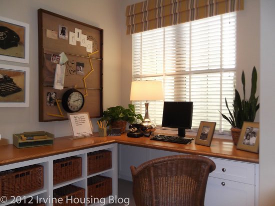
Residence 3 offers a loft and “tech center” at the top of the stairs. The loft is perfect for an entertainment room and I wouldn’t make it into a bedroom. It shares a wall with the master bedroom and it’s a bit small. I really liked the tech center. It’s a built in desk that wraps around in an “L” shape around the wall. The reason I liked it so much is that the office space is located upstairs, hidden from view of house guests (unless they go upstairs).

What was unique about this floorplan was the split space off the staircase. On one side you have the two upstairs bedrooms sectioned off by a small common area, and on the opposite side is the master suite. I thought this was a very well done for privacy. It can work for roommates and families. There’s a deck located off of bedrooms 2 and 3, but it is only accessible from the common area between the two bedrooms.

The master bedroom is a decent size. The master bathroom is smaller than Residence 2, but I can’t complain about it. The bathroom separates the vanities, and you still have a full view of the shower like Residence 2.

When all was said and done, I was pleased with the floorplan. The tech center and loft were pluses for me. My sister has two boys who do nothing but play video games, and as I think about their growing household an entertainment room would be a selling point for her family.

After reviewing my first tract in Portola Springs I can’t wait to see the rest. I’m hoping to be pleasantly surprised. The pricing is hard for me to stomach, but compared to house in Turtle Rock that I reviewed last week (18711 Paseo Picasso), which was built in 1973 and offered at $675,000 I’d rather invest in the Portola Springs property. I suppose it’s all about perspective.

Discuss below or on our companion thread at Talk Irvine.