Category Archives: New Homes

A Review of The Field Tract at Lambert Ranch

Today, I start a series highlighting the three tracts within Lambert Ranch (community overview), a brand new gated community in the hills above Irvine, bordered by Portola Springs and the 133 and 241 toll roads. Catering to families, the community has numerous parks, pools, and the Ranch House recreational center to allow members of the community to come together. It even features a Children’s Adventure Park, a new .75 acre park designed for children by children. The nearest schools are Stonegate Elementary, Sierra Vista Middle School, and Northwood High School. Lambert Ranch will have 169 homes.

Lambert Ranch is promoting what they call “life space.” This offers flexible living situations such as adjacent plots, separate guest houses, or private quarters within a home. This flexibility makes it easy for multi-generational families to live together, or to set up a private home office or studio.

What sets Lambert Ranch apart from every other new community in Irvine is the absence of Mello Roos taxes. This is a huge annual savings and may make a brand new home affordable for a family that can’t manage the extra tax in other communities.

I have the pleasure of visiting each tract and giving you the scoop on the different homes. This week, I’ll review The Field.

Base Property Tax: 1.05%

Overall Effective Tax Rate: Approximate 1.09%

Homeowners Dues: approx. $300/month

Residence 1

2,730 – 2,930 Sq Ft

Downstairs Bedroom

4 Bedrooms, 4 Baths, Great Room, Loggia, 2 Car Garage

Optional 2nd Loggia, Conservatory

Starting from $889,800

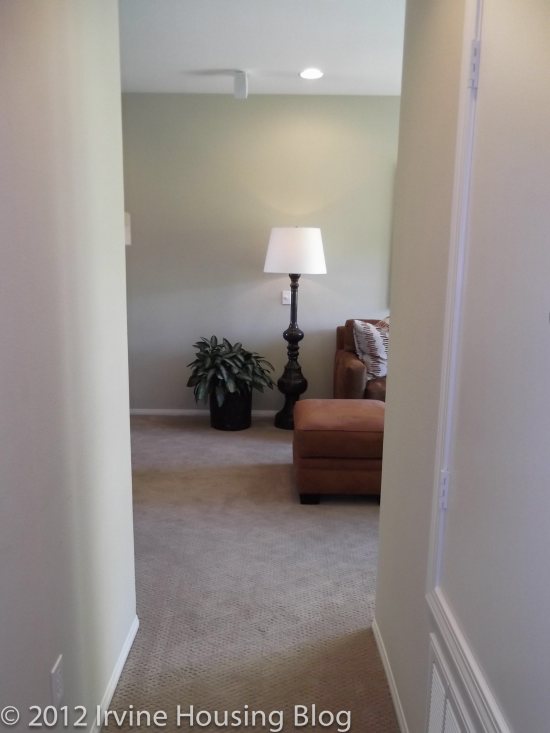
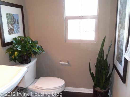
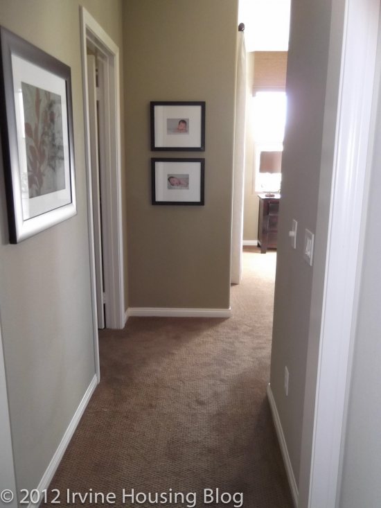
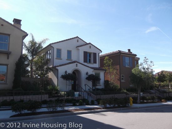
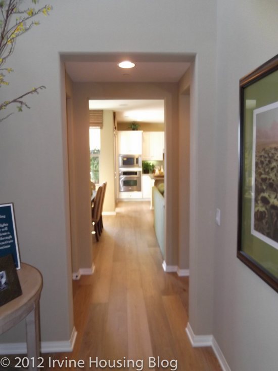
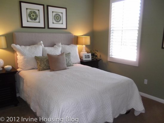
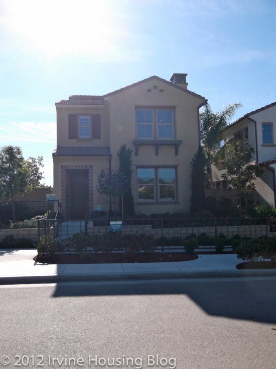
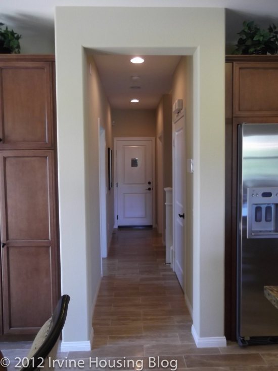
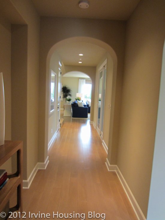
When I entered Residence 1, I was greeted by a long hallway with a glimpse of the great room at the back of the house. To the right is the first floor bedroom and bath. I noticed right away how bright the bedroom is, a trend that I saw carried out in pretty much every room of every house in The Field. The room is a nice size that would work well as a bedroom or office. The bathroom is not private, as it’s the only one downstairs, but it is accessible from the bedroom.
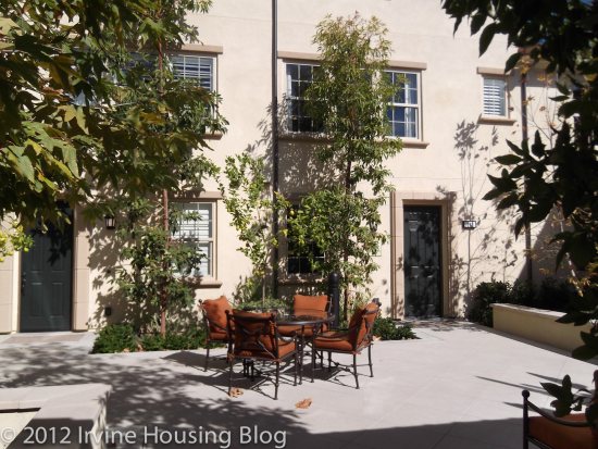
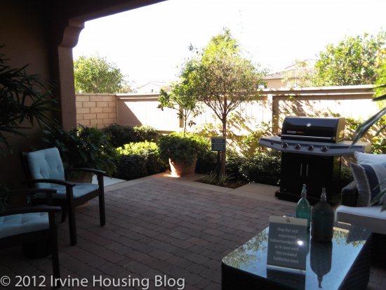
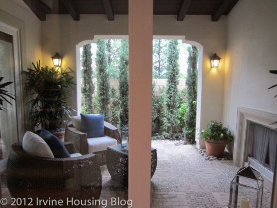
Past the bedroom is the loggia, a pretty courtyard with a fireplace and one open wall. With the right furniture, you can create a very cozy space to entertain, read or just relax.
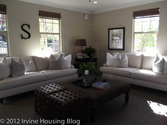
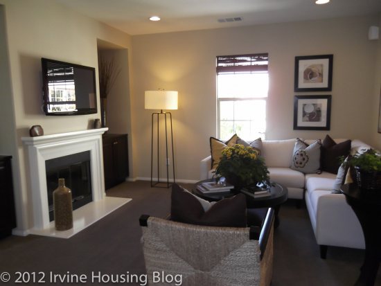
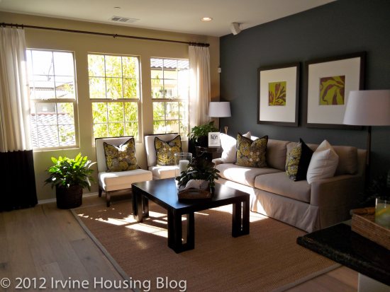
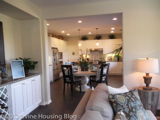
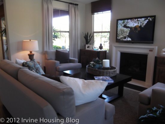
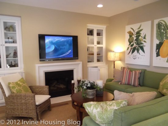
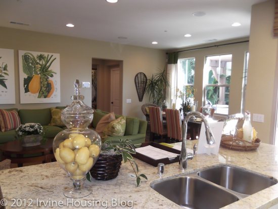
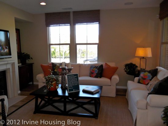
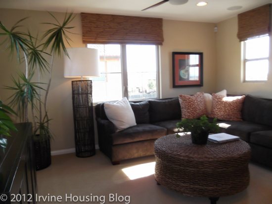
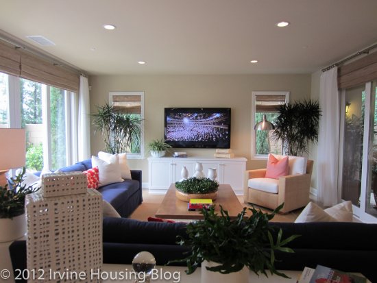
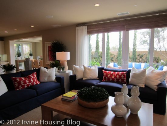
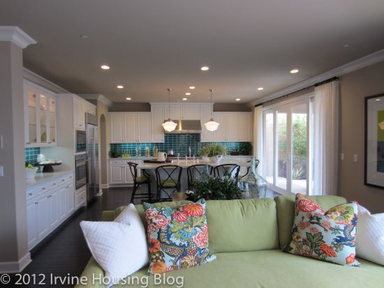
At the end of the hall is the great room, with the living area on the right and the kitchen to the left. The space is large, bright and beautiful. The living area has windows or doors on three sides (one set faces the loggia), but still can be set up with an L-shaped couch or a sofa and love seat. Having a nice set up in the family room is important to me, and I didn’t feel like the windows restricted the set up at all. While a fireplace is available, the model features a set of cabinets instead, which I actually prefer. We never use our fireplace and I like the idea of replacing it with something more useful.
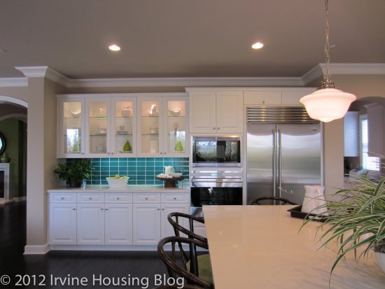
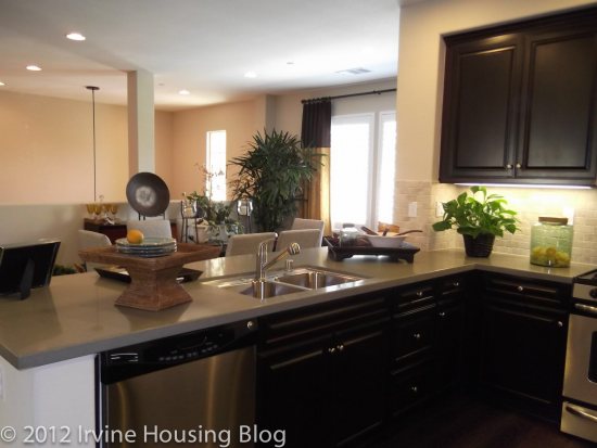
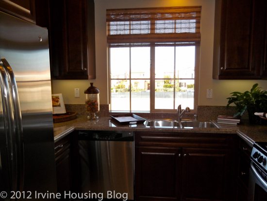
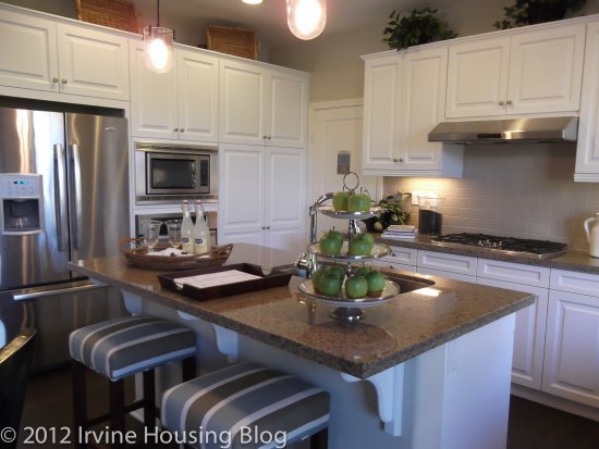
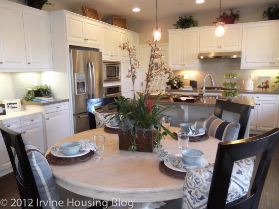
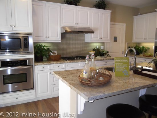
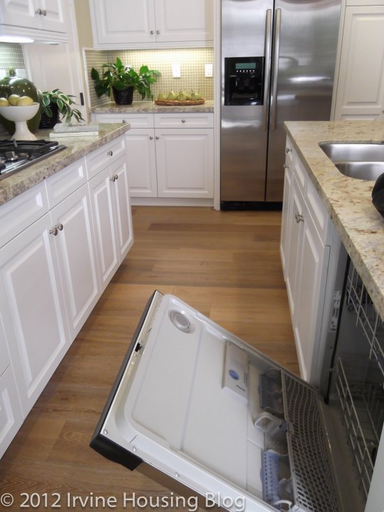
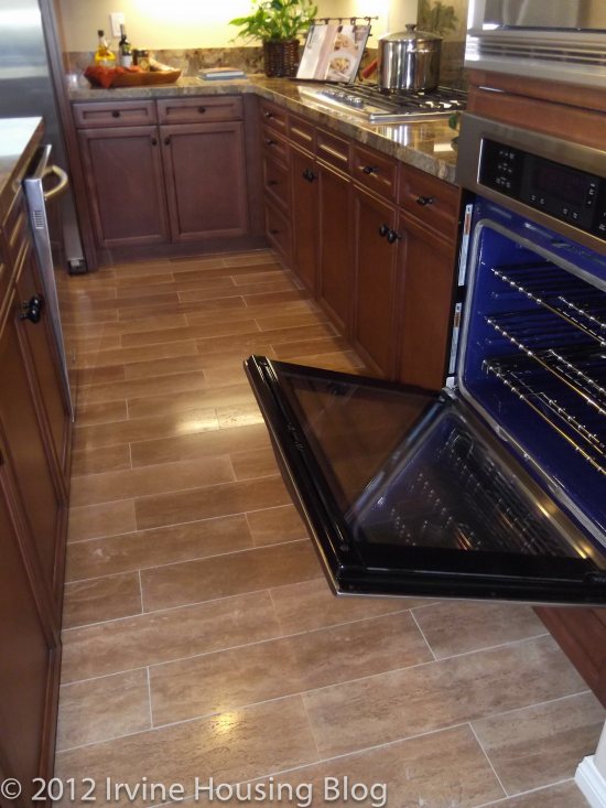
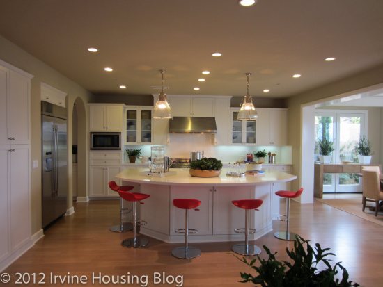
The kitchen is huge, including a large island with space for several bar stools. The stainless steel Wolf brand appliances, including a single oven and 48” six burner stove, and the granite countertops give the kitchen a sleek look. There is ample counter space, lots of cabinets, and a large walk-in pantry through the “home room.” I have never heard of a home room before, but it seems to be equivalent to a mud room, or a place to store shoes, coats, backpacks, etc. between the garage and the kitchen.
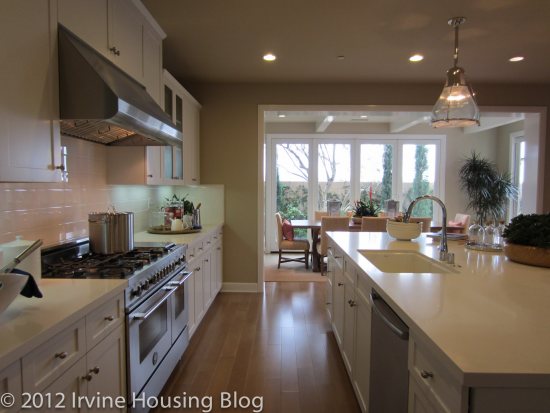
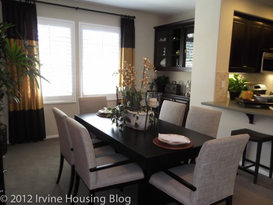
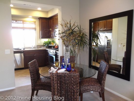
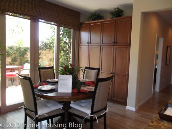
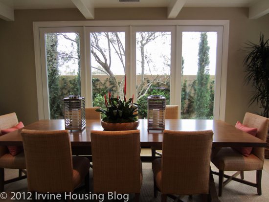
The kitchen feeds into a dining area with windows all around that face the backyard. While there is enough space for a large dining table, it doesn’t feel like a room that is so formal you could only use it on special occasions.
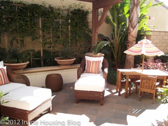
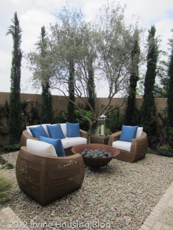
The backyard is not too big, but there is room for kids to play or to have a nice seating area.
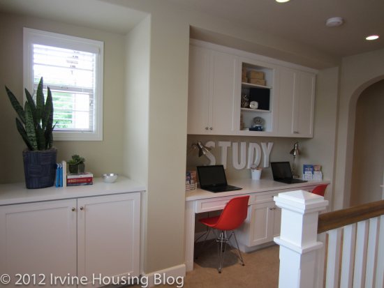
Moving upstairs, the first thing I saw was a small computer area with a built in desk and several large cupboards. While this is common in many new homes, I don’t really like it. I can’t imagine really using the space as an office and I think it would probably just accumulate junk.
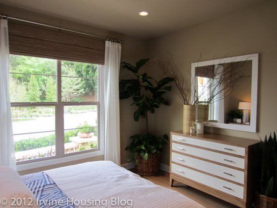
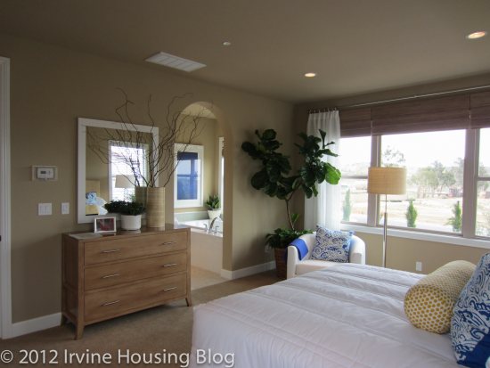
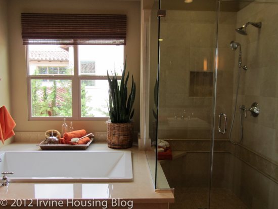
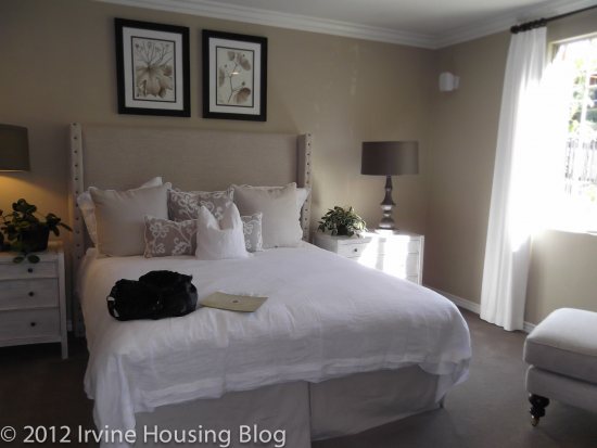
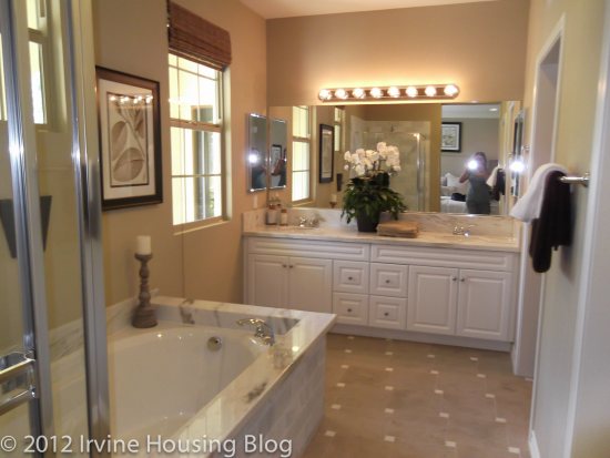
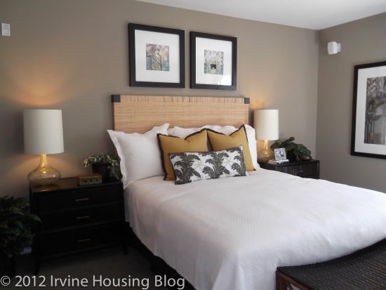
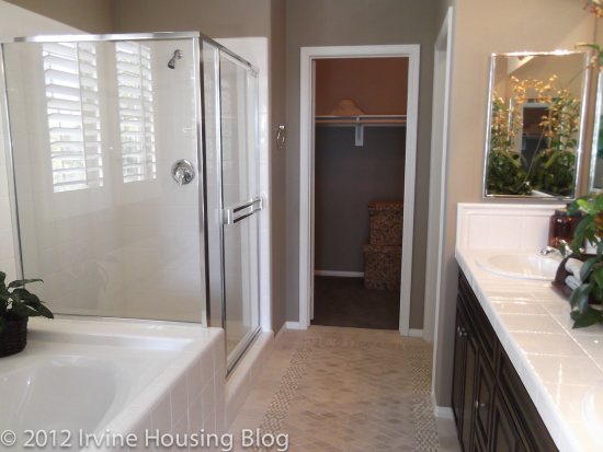
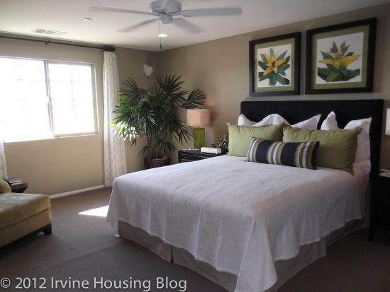
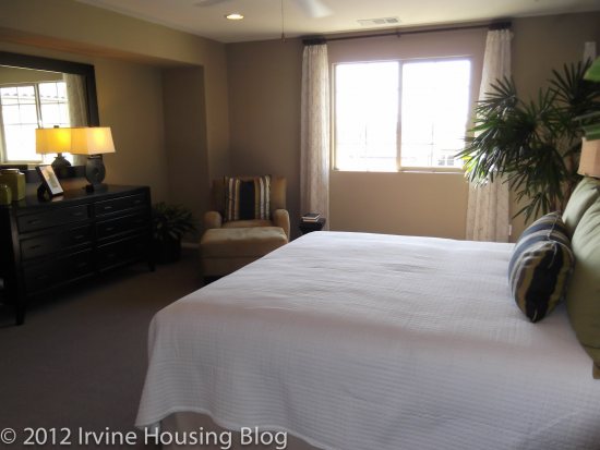
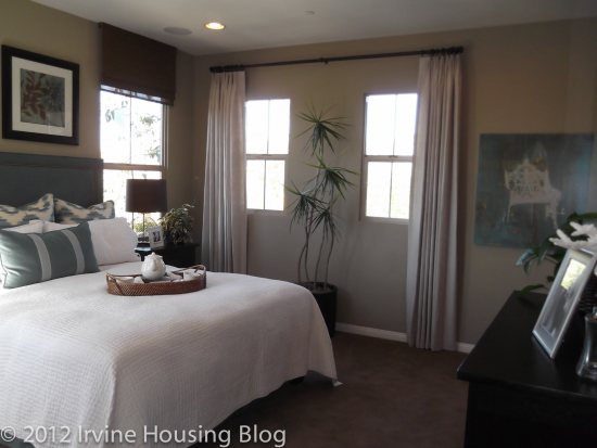
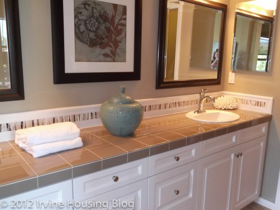
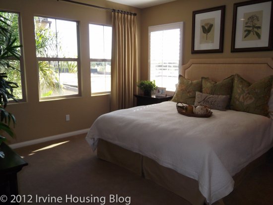
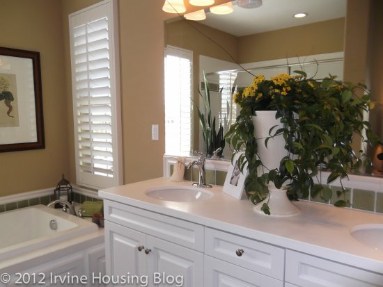
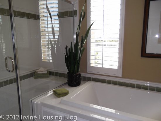
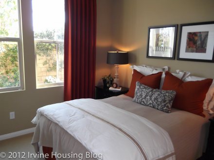
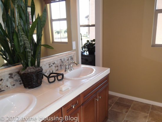
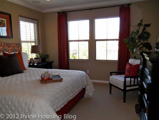
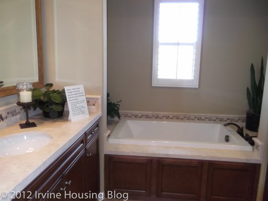
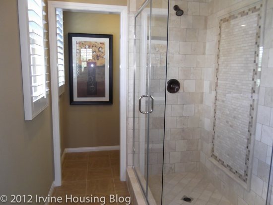
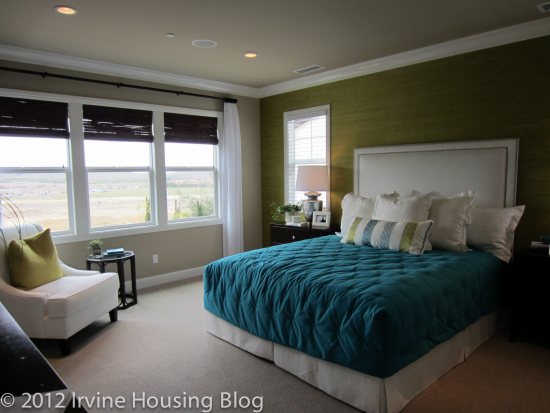
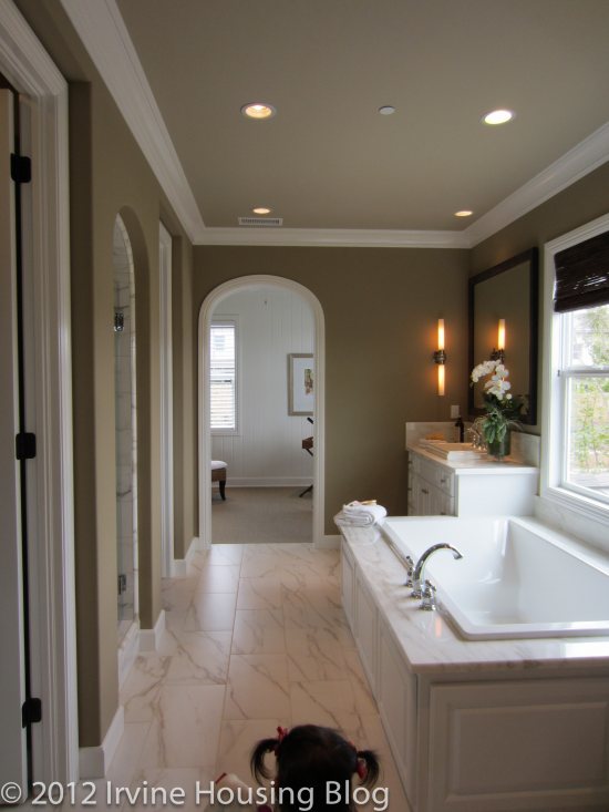
One of my favorite things about this floor plan is that none of the bedrooms share walls with each other, so there is less noise and more privacy. The master bedroom has windows on three sides and an arched doorway leading back to the bathroom and closet area. There is a large bathtub, dual sinks, and an average-sized shower stall with a bench. I would prefer a larger shower, but this is bigger than the ones I have seen in other new homes.
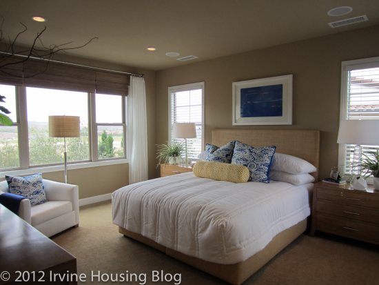
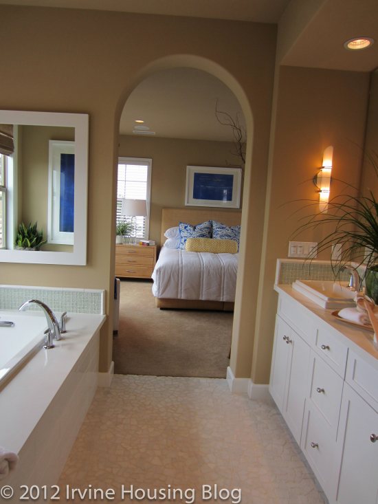
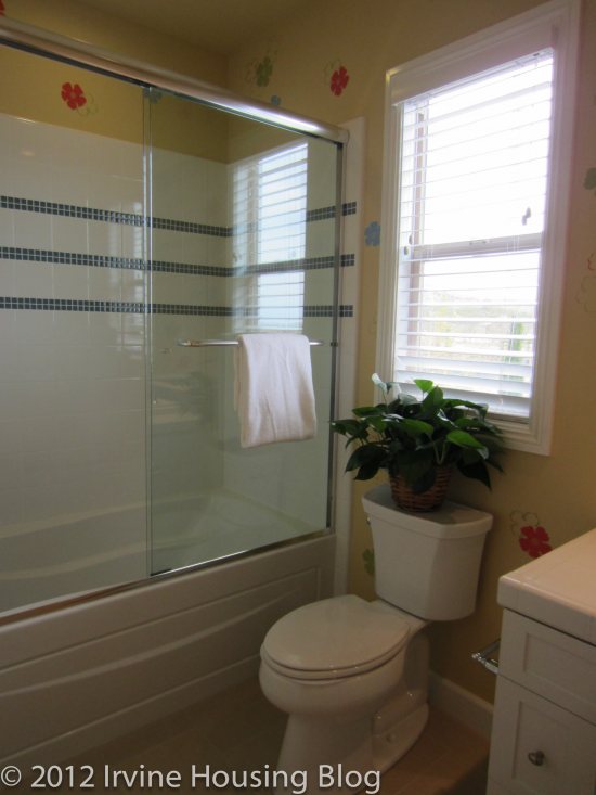
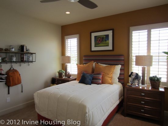
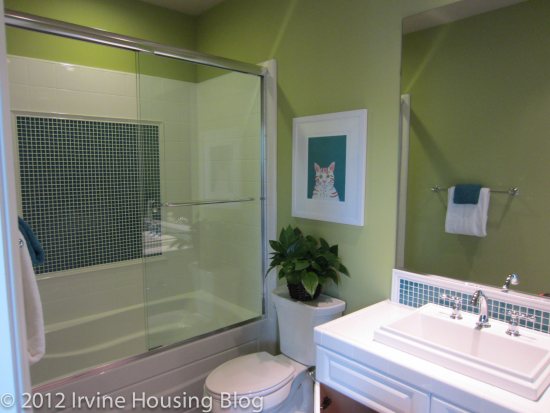
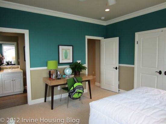
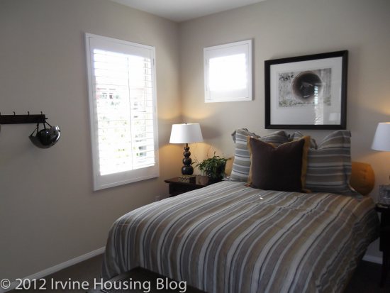
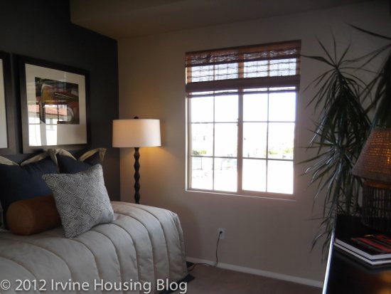
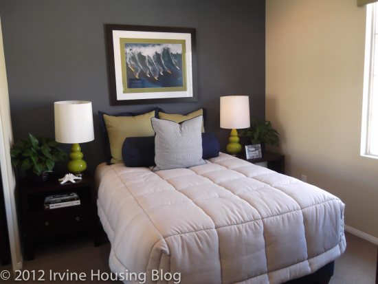
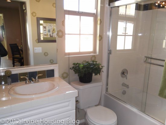
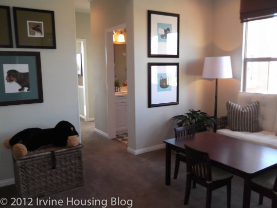
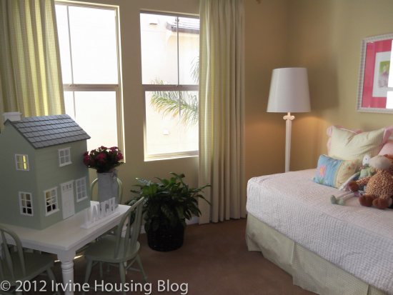
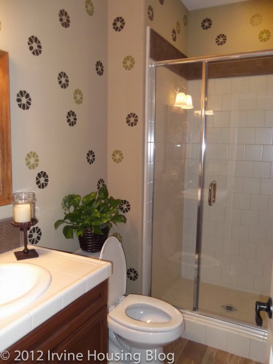
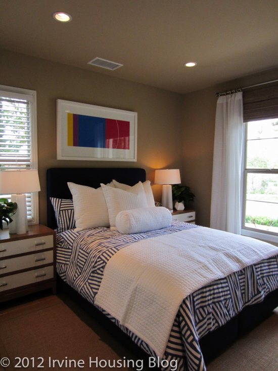
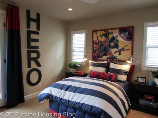
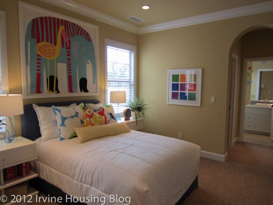
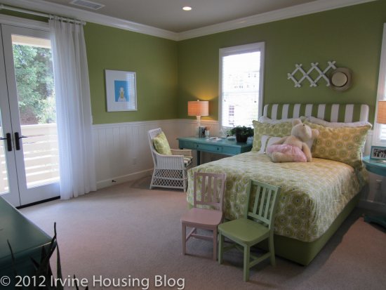
Both secondary bedrooms upstairs are big, with multiple windows and private en suite bathrooms. I noticed the size of these rooms immediately and was happy to see that The Field moved away from the trend of creating enormous master bathrooms and closets at the expense of the other bedrooms. Each of these bedrooms also featured a walk-in closet. The en suite bathrooms each have a single sink and a tub/shower combo and, while they are fairly small, they are adequate for one person.
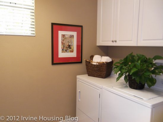
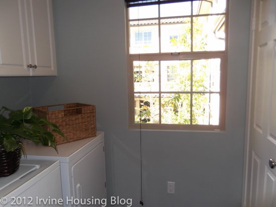
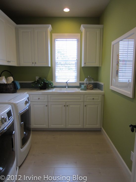
Last, but not least, is the upstairs laundry room. It has a large utility sink, ample counter space, and plenty of room for an ironing board, folding table, or drying rack.
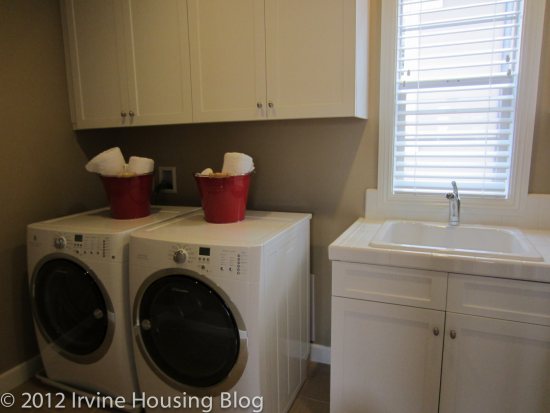
Overall, I had a very positive impression of Residence 1. I loved all of the windows and the large rooms, and can easily imagine raising a family there. An alternate Residence 1X is available, though there isn’t a model. The footprint is almost identical, but it has an extra half bath downstairs, a porch replacing the loggia, and a bigger loft area at the top of the stairs.

Residence 2X

3,020 to 3,276 Sq Ft

Downstairs Bedroom

4 Bedrooms, 4.5 Baths, Great Room, Loggia, Bonus Room, 2 Car Garage

Optional Private Quarters, Conservatory

Starting from $950,800
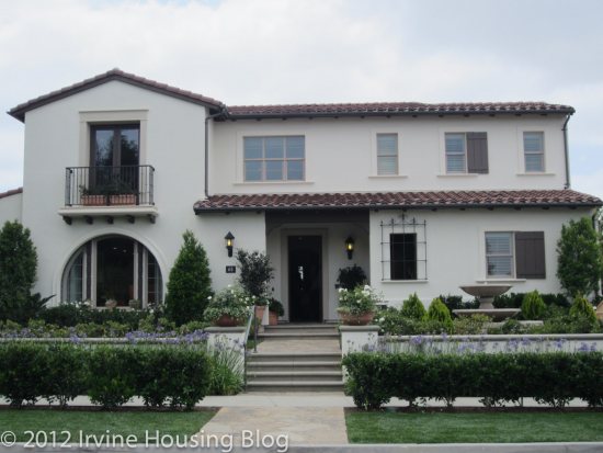
Residence 2X is actually the first model I saw in The Field and the one currently housing the sales office. It is also my favorite of the three.

The first thing I noticed was that this home has two front doors – one leading into the foyer and another into the downstairs bedroom suite. The second door is an option and may be a nice feature for someone using the space as a separate residence or for someone who sees clients in a home office. Another interesting feature of the house is that the garage is at the back of the house with a side entrance. I’m not sure if I would like this or not, since I am used to the garage facing the street, and it’s kind of hard to tell since the model has a sales office in place of a garage.

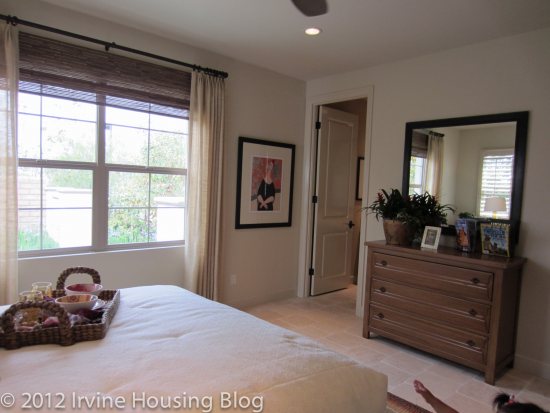
The downstairs bedroom in this model is the nicest of the three residences. It is a large room featuring a walk-in closet, a small foyer with arched doors, a wetbar with mini fridge and a private bath. As is the case throughout the house, there are large windows so the room is bright and airy. While I was in the bedroom, I heard a few other people commenting on how the room felt so big and private; one compared it to a hotel suite.
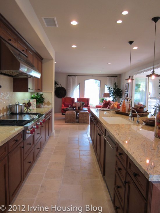
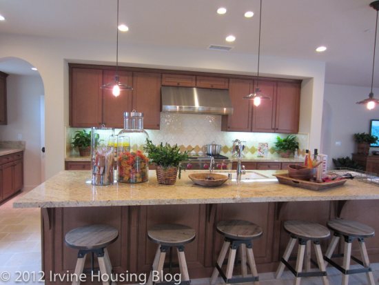
The great room is at the other side of the house, with the living area facing the front and the kitchen at the back. The kitchen felt huge, with the counters and most appliances in a large L and a very long island with barstools in the middle. The only sink is in the island, along with the dishwasher. The dining area is off to the side with no separation from the kitchen. There is room for a formal dining table, though I would probably prefer a more casual look since it would be used every day. An optional fireplace can be included in the dining area, but the model has extra long counters and cupboard space instead. To the side of the kitchen is a “home room” and large walk-in pantry.
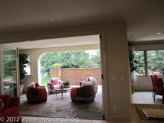
The great room is square with windows on one side facing front and optional bi-folding doors to the loggia on another. The dining area also has access to the loggia. It’s a nice extra seating area, though my preference would be for another room inside the house that would get more use. However, if I did have a loggia, I would rather have sliding doors than bi-folding ones so I could include screens to keep the bugs out.
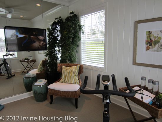
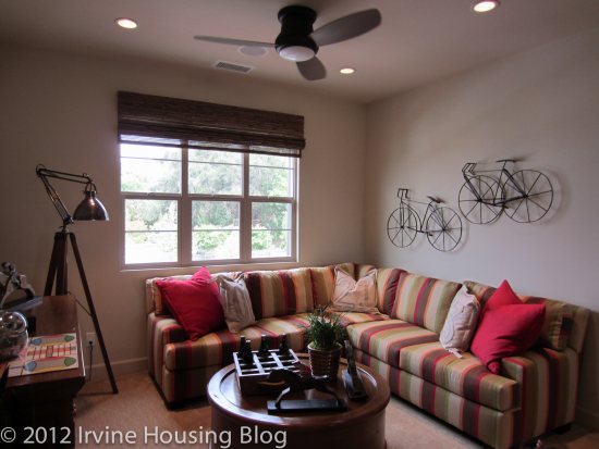
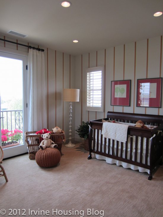
Moving upstairs, I first saw a laundry room with a big sink and lots of space. All three bedrooms feed off of a common bonus room. The bonus room isn’t huge, but it is versatile and can work as a playroom or an office. As in Residence 1, none of the bedrooms actually share walls and each has its own en-suite bathroom. Only the master bedroom shares a wall with the bonus room. The secondary rooms are very large with lots of windows. One has a balcony facing the side of the house.
The master bedroom has a front-facing balcony. It isn’t a huge room, and probably only has room for one dresser, but the enormous walk-in closet eliminates the need for another one anyway. The master bath features a tub and separate shower stall, as well as two separate sink areas. My only complaint about it is that I like a little more separation between the bedroom and the bathroom, either with the closet or a small hallway.
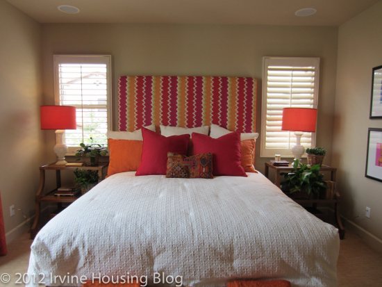
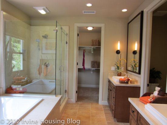
Overall, I really liked the layout of Residence 2X. There is an alternate Residence 2, but there isn’t a model. Its main difference is a lack of the separate powder room downstairs and the addition of a fireplace in the living room. The master bedroom also lacks a balcony in the standard Residence 2 (prices start at $898,800).

Residence 3

3,027 – 3,407 Sq Ft

Downstairs Bedroom

4 Bedrooms, 4 Baths, Formal Dining, Great Room, Loggia, 2 Car Garage

Optional Private Quarters, 5th Bedroom

Exercise Room with Expanded Closet, Conservatory

Starting from $950,800

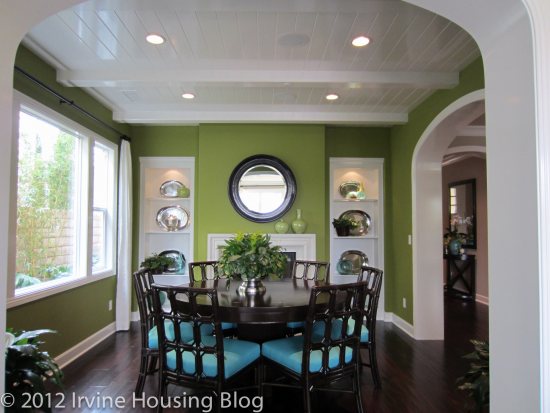
At 3,027 to 3,407 square feet, Residence 3 is the biggest model in The Field. Downstairs, it is nearly identical to Residence 1, with one key difference. Residence 3 has a formal dining room, though in a somewhat awkward location, I think. With arched doorways into the hallway and the great room, it feels too far away from the kitchen. There is a loggia off the back of the kitchen where Residence 1 had the dining area. If you want casual seating in Residence 3, your only options are sitting at the island or putting a small table between the kitchen and great room. I prefer the kitchen-adjacent dining room in Residence 1 more than the layout of Residence 3.
This model has a bonus room at the top of the stairs and a huge laundry room. As in the other models, the secondary bedrooms upstairs are both large with en suite bathrooms and several windows each. They have average-sized closets with folding doors and one room has a front-facing balcony.
The master bedroom felt a little bigger than in the other models, so I liked that. Through the bathroom is an additional retreat, or exercise room, that creates extra living space within the master suite. It is big enough for a desk if you want office space, but also makes a nice sitting room or in-home gym. The only thing I don’t like about it is the location, since you do have to go through the bathroom to get to it.
Overall, the three different models (five if you count the “X” versions of Residences 1 and 2) have a lot of similarities. Each features a downstairs bedroom facing the front of the house and three bedrooms upstairs, all with en suite bathrooms. They all have a loggia in lieu of a formal living room. All three also offer some sort of bonus space upstairs (Residences 2X and 3 have a full bonus room while Residence 1 has the computer area).

I envision this community quickly becoming popular among young families. The large secondary bedrooms and lack of Mello Roos tax are very appealing. The community Ranch House and adjacent pool reminded me of the popular Woodbury Commons area, The smallest floor plan offers 2,730 square feet of living space, so these homes have plenty of room for growing families. None of the homes had very large backyards, but I don’t see that deterring too many people from buying in this neighborhood.

I am looking forward to reviewing the other two tracts in Lambert Ranch in the coming weeks.

Discuss below or on the companion thread at Talk Irvine.

A Change in Trend for Irvine Housing: No New Mello Roos?

An IHB post from last week was about one of Irvine’s most recent housing development, Lambert Ranch. As Zovall stated in that post, a sneak preview of the homes in this new development occurred recently. Some TalkIrvine participants attended the preview and gave some interesting and differing opinions. You might want to take a look at their comments.

Today's post is another twist on this new housing development in Irvine.

Lambert Ranch might start a new trend in the financing and marketing of new homes in Irvine. Mello-Roos taxes on homes in new Irvine developments has been a given for some time now. And this given usually means a big increase in the homeowner’s property tax bill.

However, the Lambert Ranch developer, The New Home Company (TNHC), “has announced there will be no Mello-Roos taxes at Lambert Ranch, making the development the only new home community in Irvine to offer no additional tax assessment.” Partner and CEO Larry Webb goes on to say, “Families have a hard enough time paying normal real property taxes, let alone the special taxes imposed by Mello-Roos.”

Many of you know about Mello-Roos taxes, but for those who don’t, here is a brief history:

With the passage of Proposition 13 in 1978, the property tax money that had been available to build infrastructure and provide services (for example, schools, roads, and libraries as well as police and fire protection) was reduced. One of the results was that cities and local governments required that developers bear more of the burden in providing the infrastructure and services that would be needed in new communities. Passage of California’s Mello-Roos Community Facilities District Act in 1982, which lets developers obtain the funds needed to pay for the infrastructure and services through the sale of bonds, was seen as a partial solution to this problem. The obligation to repay the bonds is usually transferred from the developer to the homebuyer and shows up as an additional fee on the homeowner’s property tax bill.

So will TNHC recoup the cost of providing the needed services without the aid of Mello-Roos taxes by charging higher housing prices? CEO Webb commented on this:

“Some of the cost may be passed to the homebuyer. However, this does not significantly impact the cost of the home. In fact, our prices will be comparable per square foot with projects in Irvine that are subject to Mello-Roos fees. And buyers in those communities will have to pay these fees every year.”

This seems like doublespeak to me. First he seems to say that the overall cost will be higher, and then he seems to say that the overall price will be comparable to new developments in Irvine that have Mello-Roos fees. I’ll let you compare overall costs between Lambert Ranch homes and homes in other recent Irvine developments. After you factor in the costs with and without Mello-Roos taxes, you can come to your own conclusion. And for those of you who make this comparison, please let me know what your conclusion is.

TNHC describes their Lambert Ranch development as “private family residences in the hills of Irvine.” The development, which will include three neighborhoods (The Field, The Grove, The Hill) as well as three pocket parks, the Ranch House recreational center, and the .75 acre Children’s Adventure Park, goes on sale this month.

For some history on Lambert Ranch, which includes Ray Lambert’s purchase of the land in 1915, see an Orange County Register article.

Lambert Ranch then…

Lambert Ranch Now…

Photos courtesy The New Home Company and the Sapetto Group via The Orange County Register

Discuss below or at Talk Irvine.
A Review of San Carlos Court at Portola Springs

Recently I was driving through the Laguna Niguel community. I was on my way to a friend’s house, but decided to take a detour and scope out some of the neighborhoods. As I poked around several neighborhoods, I noticed the friendly atmosphere. People waved at me as I drove by. They smiled—even though I was a complete stranger. I know they didn’t recognize my car, but they still made me feel welcome. It was an amazing feeling that I haven’t felt since I was a kid growing up in the Orange Hills area. Neighbors interacted with each other—it was a novel concept. I’ve lived in Irvine for nearly fifteen years, and not once did I really know my neighbors. Most of the time I didn’t want to know my neighbors (and I’m a highly sociable gal). This got me to thinking: what is so different about Portola Springs versus this little neighborhood in Laguna Niguel? My answer was simple: The neighbors weren’t on top of each other. There may not have been a lot of space in between the houses, but there was enough comfortable distance that created privacy. Some neighborhoods in Irvine have this aura—but Portola Springs seems lacking.
I visited San Carlos Court (Overview) on the same day which reaffirmed my observations. San Carlos Court at Portola Springs is a collection of eight different residences centered around a common courtyard. The set up in theory would be cute and has the potential to be family oriented, but my primary concern was privacy. It felt too close for comfort. If anyone remembers the television show Melrose Place back in the 90s, the residents could never seem to hide secrets from each other. That’s how I imagine these places—particularly since new developments seem to be built with paper thin walls. Hopefully you’ll have mild mannered neighbors and this won’t be a problem, but I’m guessing that you’ll be able to hear every party, every dog barking, and every stereo blasting within the walls.

Floorplans

Options

Pricing

Residence C1:

Price: $474,990

Estimated Tax Rate: 1.05%

Square Footage: 1,736 square feet

Bedrooms: 2

Bathrooms: 2

Garage: 2 car

HOA dues: $306 per month (WOW!!!!)

CFD’s/ Mello Roos: $3,390 per year

The model is the only the residence left of the C1 floorplan. I think it is one of my favorite designs, and would suit me well. However, I’d say upfront that it’s over-priced, so I would not choose to live there. The entry way splits the kitchen and the dining room. You have a clear view to the entrance of the living room. It’s different than I’ve seen in previous floorplans, so I rather liked the layout. The dining room was very spacious with lots of windows. The model features an optional buffet/desk that you can have built under one of the windows. I think it added a practical feature and I would choose the upgrade.

I won’t lie—the kitchen is small and the layout is in an “L” shape. The cooking appliances are set up in the typical “triangle” space. Only the stove and dishwasher are included with the house. The granite countertops are standard, which is a plus. There’s a nice pantry, big enough to accommodate a single person or two people.

I really loved the living room. It was big and completely separate from the kitchen/dining rooms. Off the living room is a patio—C2 is the only residence that has an outdoor patio. Included in the living room is a closet. The model features the upgrades—a fireplace and built in media center. It’s very nice.

The hallway is ADA compliant, which makes it feel less cramped. To the left is the second bathroom which is nicely designed. It has a tub/shower combo, a small vanity and a toilet in between the tub and vanity. It’s a square space, and one of the best designed second bathrooms that I’ve seen.

The master bedroom and bath are fantastic. If the price of the house was $100K less (and the taxes weren’t about $9000 per year), I would’ve considered buying. The master bedroom is huge. It’s more than I imagined for a house this size. The master bath sold me on this property. It was everything I wanted. It was large, with a separate tub and shower. There was a separate toilet, an ample walk-in closet and a dual sink vanity. I fell in love with the bathroom, and it is the only plan that offers this design. The only thing I didn’t like was the vanity light fixture which cheapened the space.

The second bedroom—or what is considered the second bedroom is small. I’d consider turning it into an office, because fitting bedroom furniture would be a stretch. It can be done, but it is cramped. It is located directly across from the master bedroom, so I hope those walls have an appropriate sound barrier.

At the end of the hallway is the laundry room with access to the garage. I liked having a separate space for the laundry, hidden at the back of the house.

Overall, my impressions were positive of this model. It seems smaller than 1,736 square feet. I would’ve rather had a smaller living room and dining room in exchange for a larger second bedroom. I can see how noise might carry in the house, but if you’re single without a family it would suffice. It’s not ideal for a roommate situation.

Residence C2:

Price: $442,990

Estimated Tax Rate: 1.05%

Square Footage: 1,901 square feet

Bedrooms: 2

Bathrooms: 2

Garage: 2 car

HOA dues: $306 per month

CFD’s/ Mello Roos: $3,390 per year

I loved the entry way in C2. It was nice to have the living area viewable at the top of the stairs. It created a welcoming effect. I know in other models I complained that having stairs directly off the entry way wasn’t ideal, in C2 this design worked. There’s a huge closet under the stairs that wraps around for extra storage.

The dining room was spacious. It’s rectangular in design and I think you could fit a six to eight seater table in the space. The dining room was separated by one of the kitchen countertops, which made food within reach of the dining table.

The living room was smaller than C1. It was just “ok” for me. It’s basically a square space, so fitting typical furniture wouldn’t be an issue. You can have an optional media and fireplace built into the house and I would opt to add these features. I have a piano, and I’m not sure that I could fit it plus my furniture in the living room. I might have to put it in one of the bedrooms, or squeeze it in the optional buffet area located in the dining room, which would leave less space for a table.

The kitchen is great. It’s a perfect size and highly functional. I appreciated the large pantry and lower cabinets. I felt like there was enough counter space to accommodate my cooking habits.

The laundry room was a decent size. It fits a full size washer/dryer and it had some storage.

The guest bath is small. The vanity has counter space, but it is not a dual sink set up. The tub is extremely narrow and disappointing. It felt like there was shower room only. The bathroom does have a handy linen closet, which I can appreciate.

The second bedroom is acceptable, but I was wondering where to put the television because the bed faces the glass closet mirror doors. I wish it could accommodate both the closet and television. Maybe you’re more creative than me, but I didn’t immediately see a resolution to this problem.

The master bedroom is a decent size, but suffers from the same television problem. Instead of facing a closet, it faces some windows. It seemed rather impractical.

The master bathroom was narrow like a hallway. It was nice, but smaller than I hoped. It contains a long and narrow walk-in closet, which was probably the best feature in the room. The shower is separate from the tub and the toilet is in a separate room.

If someone gave Residence C2 to me I wouldn’t refuse it. It’s a house that I could live in if I could resolve the television situation in the bedrooms.

Residence BR: (Townhome Living)

Price: $352,990

Estimated Tax Rate: 1.05%

Square Footage: 1,293 square feet

Bedrooms: 2

Bathrooms: 2

Garage: 2 car

HOA dues: $306 per month

CFD’s/ Mello Roos: $3,390 per year

Residence BR was terrible. I didn’t like anything about it. Residence BR has a large entry, but the laundry room is the first thing you see. This seemed like a very unwelcoming clinical entrance to the house. As you climb your way up the stairs, you’re confronted with a blocked view of the living space by a short narrow hallway with an ugly utility closet that houses your water heater. It was truly awful.

Once you get past the blockage, you see the unimpressive living room, which runs into the apartment style dining room. This set up is exactly what you’d find in an apartment. I’m definitely not shelling out the money for apartment style living.

The kitchen was a deal breaker for me. It was tiny—smaller than the kitchen in my 860 square foot apartment. There was no counter space and nowhere to move. The pantry was located in the dining room and you wouldn’t be able to fit more than a four-seater table in the dining space. There was also no microwave, and since counter space is nearly non-existent I’m not sure where I’d heat up my left over spaghetti.

Around the corner from the kitchen is the second bedroom. It was really small—Laguna Altura small. I’m not quite sure where you’d stick the television. It would have to be wall mounted. A child would easily outgrow this room. The adjoining bathroom wasn’t much bigger. The vanity had no counter space and the tub was narrow.

The master bedroom was located on the third level. The ceilings were low and I felt claustrophobic. It was smaller than I expected. The only thing I liked about the master bedroom was that it was on a different floor than the second bedroom. However, the bedroom door is at the top of the stairs, which creates a basement effect. It didn’t appeal to me in the least. The master bathroom is disappointing and small. It’s a rectangular space with nowhere to move. The vanities are separate from each other and didn’t have adequate counter space. At least the toilet was located in a separate area.

One word to describe Residence BR: UNSATISFACTORY!

Residence D

Price: $433,990

Estimated Tax Rate: 1.05%

Square Footage: 1,720 square feet

Bedrooms: 3

Bathrooms: 3

Garage: 2 car

HOA dues: $306 per month

CFD’s/ Mello Roos: $3,390 per year

Residence D is a rectangular floorplan, so I entered the house with nightmare flashbacks of Casero. Just like Residence BR, the laundry room was located on the first floor. Off the entry is the third bedroom. It was “petite” to say the least. Obviously you can’t do your laundry during sleeping hours. I liked that the third bedroom had an ensuite, even though the bathroom was small. It’s adequate for guests, but I wouldn’t put my children down here, particularly because they are close to the front door and the master bedroom is on the third floor.

As you walk up the stairs, you immediately see the dining room. The space is just “ok.” I don’t imagine more than a 4-6 seater table since it’s located directly off the stairs.

The kitchen at first glance appears larger than it actually is. There’s plenty of cabinet space, but counter space is a precious commodity that isn’t in abundance. If you want to open your oven or dishwasher, be prepared to navigate around a small space. The island creates a narrow walkway. If you’re not careful, you could fall over your oven door. This is annoying, but not a deal breaker.

I liked the living room. Although it practically stems off the kitchen, there is a decorative scalloped wall that defines the space. The model shows a large area rug that helps distinguish the space between the kitchen and living room. The size of the living room was excellent. It wasn’t too big, nor was it too small—for being a rather rectangular floorplan it was just right.

The second bedroom was typical of the other plans. It felt cramped, but might work for a teenager who doesn’t have a lot of stuff (what teenager doesn’t?). You could only fit a Full bed, and I think a daybed would better suit the space. Surprisingly the closet was fairly decent and I don’t think fitting a child’s wardrobe in the closet would be an issue. The bathroom is adjacent to the second bedroom and is your typical size guest bath: small tub, small vanity, toilet wedged between both. Nothing special.

The master bedroom was huge, and I loved it. You have to walk up another flight of stairs to get to it, and I still felt like I was walking up basement stairs, but on the whole I’d consider it livable. I wish that the bathroom was larger. The vanity was smaller than I hoped. The tub is nearly flush up against the vanity. How disappointing. I’d like to mention that upon exiting the master bedroom you’re confronted with a high, narrow view that I found intimidating. It made me feel like I was going to fall. It’s a long way down.

Residence D was not without its faults. I feel like I’d have to make a lot of compromises if I was purchasing Residence D. I didn’t see any deal breakers, and would classify the minuses as a minor inconvenience. I think for the price I’d rather search for another property, particularly since this is a “townhouse living” property. I’m not convinced it’s worth it.

Discuss below or on the Talk Irvine thread.

Lambert Ranch – Private Preview

Lambert Ranch is a new development that is being built by The New Home Company. It is located/surrounded by Portola Springs and here is a rough idea of the location (click for a bigger image):

The grand opening is on April 28th, 2012 but they had a private preview event this past weekend. There are a few members in the TI forums who visited and had some feedback:

From kalbi:

Just got back. Checked out The Grove (starting at $1.2 M). Lots are small. Approx 6000 sq ft with about 4300 sq ft in living space. Yard is practically nonexistent. The tour guide was focusing on the “courtyard” as the yard. Love the downstairs for the most part, love the kitchen island in all floor plans and the great room. Also like the casita (Plan 3 has a HUGE separate casita). Upstairs left much to be desired. All secondary bedrooms are rather small. Master bedroom itself is also rather small, bathrooms are decent size.

Also, you can see the 241 from the models as well as the landfill.

The Hills start at the low mil. Bedrooms are a tad bigger than The Grove bedrooms but again, rather small.

Overall impression, decent floor plans but would not buy there because of the price and location.

They have one rec room for the association called the “ranch house” with pool and ping pong table. No tennis courts. I guess ping pong for the asians? 😉

From Arman:

Having looked at 100+ model homes over the past several years in Southern California, these are some of the most impressive I've seen. The Hill was nice, but the Grove was quite unique. What's great about these model homes is that every floorplan is different from every other floorplan in the community, unlike Laguna Altura, for example, which are variations on each other, and were exactly the same as floorplans used in other Irvine Pacific developments. As a group, the homes in Lambert Ranch are quite large as well, something else that is unique in today's economy. Will these sell? Who knows. But, if someone's looking for something new and something of this size in Irvine, it's about the only option available. With Orchard Hills MIA for the foreseeable future (and certainly not opening in 2013 as was advertised on the Irvine Company website a couple years ago), I don't know what else may be in the pipeline that may offer something of similar size or quality in the central OC area.

Any thoughts from anyone else who visited?

Discuss below or on the active TI thread.

A Review of the Casero Tract at Portola Springs

I knew from the moment I walked into the sales office and saw the floorplans, I wouldn’t like the Casero properties. The floorplans are rectangular, which created awkward angles and wasted space. The houses are geared towards children—young children, but even still I wouldn’t raise my family in any of the houses. As I was touring the properties I kept thinking about the prices. $600K+ for this? Tragic! Consider the hefty Mello Roos! You’re looking at well over $4K in taxes per year, which is tough for me to swallow. It wasn’t what I expected and I think if I had to choose between a house at Laguna Altura and Casero, I’d choose Laguna Altura. I think the builder (Standard Pacific Homes) got it wrong.

Floorplans

Pricing

Options

Estimated Property Taxes and Special Assessments:

Base Property Tax: 1.05% of sales price

CFD Tax: $4,103 per year

Other Taxes: $156 per year

Overall Effective Tax Rate: 1.74%

Homeowners Association: $153/month

Residence 1

Price: From $590,888

Bedrooms: 3 + loft option

Bathrooms: 2.5

Garage: 2 cars

Square Footage: 1,909 sq/ft

Upon entering the house, you’re immediately standing in the living room (AKA the great room). Your eyes are drawn towards the dining/kitchen area as a focal point, so it’s best to keep these areas clean if you have guests. The model features a built in media/wine center on the back wall of the living room. Because this is a high traffic area and you’re limited to what can be done with the space, I’d invest in the upgrade. The living room is a lot smaller than I thought it would be. I liked the fireplace, but noticed that there wasn’t space left over once you fit your furniture in the room. You are forced to mount your television over the fireplace because there is nowhere else to put it—or a t.v. console of any sort. Wall space is limited, so hanging pictures or artwork might be a challenge.

The kitchen and dining room blended together, but were distinctly separate from the living room by a wall. This space would’ve been a mess without the wall. At least wall gave it an appearance of space organization. I don’t have many complaints about the kitchen. The cabinets are white Thermofoil or a maple chestnut color. When you take a close look at the cabinets, they’re very nice and look pretty but I wonder about durability after 3 years. There’s tons of storage, all the amenities are there (upgraded of course!) and it’s functional. My recommendation for this space is that you invest in the recessed lighting. It creates consistency throughout the space.

Residence 1 has a very nice outdoor area referred to as the California Room. It’s spacious enough for seating, grilling and general lounging about. If you’re creative you might be able to have your child’s birthday party in the California Room, provided that the guest list is short and doesn’t include many adults.

Just before walking up the stairs is a powder room. It’s petite, but thankfully away from the kitchen.

The master bedroom is located just off the top of the stairs. The entry to the master bedroom felt like too much wall with weird angles. I didn’t like walking into the master bedroom. There was nothing special about the master. It was bland. There were a lot of windows, which brings in the much needed extra light. It had a good size walk in closet, but the bathroom was awkward. It’s set up like a long hallway with a small room housing the tub and shower. The vanity has ample counter space because of the hallway feel, but on the whole I’d pass over this bathroom. The tub had paneling and upgraded “surrounds” that reminded me of the kitchen cabinets. It wasn’t well done at all.

There is a common area between the master and remaining bedrooms. They refer to this space as the loft, but I think common area is a better description. This would be perfect for a play area for the kids (except watch out for the stairs!) or a game room. The living room isn’t large enough to provide an X-Box Kinect friendly play area, so this is where you’d have to hook it up. I like that there’s a space separating the master suite from the other bedrooms, but I still wasn’t partial to the layout.

The second bathroom is located just off the loft. It’s a nice dual sink vanity that the kids can share, but the layout is extremely narrow. I felt cramped. The tub is also very narrow. Your children can fit in the tub up until age 12—after that, it’s showers or really uncomfortable baths.

Bedrooms 2 and 3 share a wall. Both rooms are square. Both rooms are small. You can fit a twin bed and a couple pieces of furniture in these rooms. The closets are small and might be a bit rough during the teenage years.

There is a laundry room with a full size washer and dryer. It’s small, but if you opt for the cabinet and counter upgrades you’ll be happy with it.

First impressions are important when purchasing a house. My first impression was that Residence 1 completely missed the mark.

Residence 2

Price: From $617,888

Bedrooms: 4 + loft option

Bathrooms: 3

Garage: 2 cars

Square Footage: 2,023 sq/ft

Residence 2 had a terrible entry. You enter into a narrow hallway with nothing gorgeous to look at. It was like an arcade of hallway doors, with nothing promising at the end. This was almost enough to make me turn around. I wasn’t off to a very good start.

The downstairs bedroom (bedroom 4) isn’t too bad. The size is ok, but the bed faces the closet and the cable was wired in the wall on the side of the bed. I’m not quite sure how that’s going to work—other than having to strategically place your television. I really expected better. The guest bath is a full bath and is typical to apartment living. The tub felt a little narrow, but this is a common theme to the Casero property. This is a good space for guests to stay. If I had a tween or teenage child I don’t think I’d feel comfortable putting them in this room since it’s so close to the front door.

The kitchen, dining and living rooms felt too small for me. The living room mirrored Residence 1 with the exception of the optional built in media cabinets. There is definitely more wall space in the living room at Residence 2, but I still think you’re forced to mount your flat screen over the fireplace. Mounting the television over the fireplace creates a crisp look, so it’s not a deal breaker. My furniture wouldn’t fit in this place, and I live in an 860 square foot apartment. If I’m paying $600K+ I want my furniture to fit.

The dining area is surrounded by windows, but it’s narrow. You’ll need to invest in a long rectangular table, because the space isn’t built for anything else. It’s also a high traffic area and there’s not much space in between the dining and living room.

The kitchen is just “alright.” There’s not a lot to say about it because nothing really stood out to me. There’s not a whole lot of space to move. In fact, if you open the dishwasher you almost block traffic! I liked that the cabinets didn’t extend to the ceiling so you can decorate on top. The kitchen gives you everything you need. It’s functional and I wouldn’t dismiss the house out of disappointment in the kitchen.

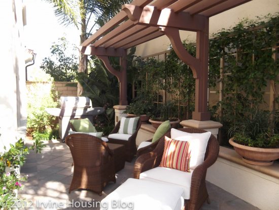
The backyard was lovely. It was big enough for someone like me, but I don’t have small children running around so it’s tough to gage exactly what is a comfortably sized space. The backyard extends along the side of the house, and the model features a really nice seating area. Let’s be practical. Usually trashcans are kept along the side of the house. I just don’t see this space used for entertaining.

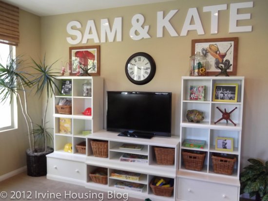
At the top of the stairs is the “Sam & Kate” room. I call it the Sam & Kate room because of the big letters the designer choose to decorate the room with. Technically, it’s the loft. You can have an optional built in media center/desk built in. I’d turn this space into an entertainment room or an office. The designer chose to showcase it as a children’s play area. I’d be concerned as a parent if I had little kids because this space is just off the top of the stairs. I’d have to baby gate it.

The second bedroom is big enough to fit a full bed. Once again, the bed is facing the closet. This is the same problem I had with the downstairs bathroom. It’s not set up to fit my lifestyle. I don’t want to face my closet. The closets are adequate, but not ideal.

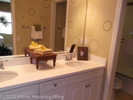
The second bathroom is unacceptable. There was little room to stand. The toilet is nearly flush against the tub. The tub was narrow and it sloped, which prevents you from stretching your legs. The sinks were small. I can’t understand why they can’t get these bathrooms right! Very disappointing.

Bedroom 3 can accommodate a full size bed. It had great closet space, but once again you’ll have to run the cable line to a more suitable position. I would’ve liked to have seen the builder extend bedroom 3 out a little further by shortening the Sam and Kate room. I’d rather have a larger bedroom and a smaller loft. The big thing that turned me off of bedroom 3 was that it shared a wall with the master. This nixed the floorplan for me.

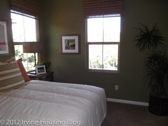
The master bedroom is actually a decent size. I liked the lighting, and there was a great walk in closet. However, the master bathroom was too small. I was really surprised to find the master bathroom so petite. It was large enough to have a dual sink vanity and the tub separate from the shower, but I wasn’t satisfied with the space. It felt cramped like an apartment.

In general, I felt the upstairs of Residence 2 was too crowded. I can’t pinpoint why I’m so adverse to it, but it may have to do with the rectangular floorplan. It felt long and limiting. I’ll take Residence 2 off my list.

Residence 3

Price: From $661,888

Bedrooms: 4 + bonus room

Bathrooms: 3

Garage: 2 cars

Square Footage: 2,330 sq/ft

My feelings about Residence 3 are very similar to the previous properties. Long narrow hallways, crowded living/dining/kitchen areas and small bathrooms didn’t make this floorplan worth it. For the price I’d pay for Residence 3, I’d expect to have a house that utilizes the square footage better. I almost felt like the height of the interior increased the uncomfortable layout. “Third time is a charm” certainly didn’t apply here.

When you enter the house, I immediately felt the narrowness in the layout. The living room is a near replica of its sister properties. I don’t want to disparage the living room too much, or give the wrong impression. It’s an adequate space, but once the furniture fills up the room, you’re left with walking room only. For a housing tract that appeals to families, I would’ve thought that the builders would’ve considered little ones playing with big Tonka trucks in the living room. It’s not suitable for that. I honestly wouldn’t know where to put a Christmas tree in this house. If you rearrange furniture you could probably put it in the living room, but it defeats the purpose when you have to shove things around.

The dining room feeds into the kitchen. It’s situated in front of the sliding glass doors to the backyard. You can look at this two ways:

1. How nice to have sunlight while eating!

2. The dining room table blocks the entrance to the backyard.

Option 2 describes this space best.

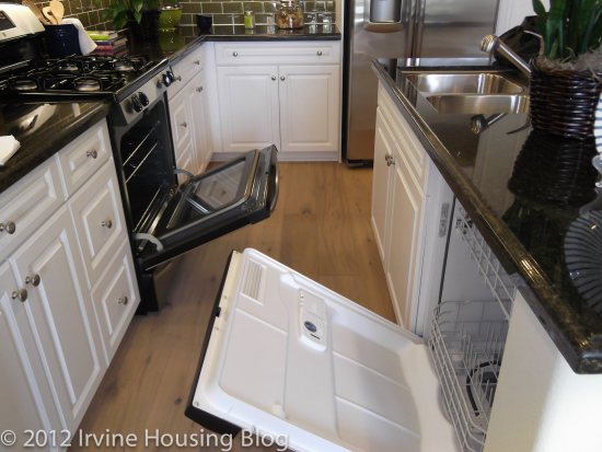
The pantry is located in the dining room. I never understood why you’d build the pantry in the dining room and not the kitchen. Obviously I can walk to the pantry from the kitchen. It’s not that big of a deal, but it feels awkward. Pantries should be in the kitchen. End of story. Just so you get an idea of how much space you have to walk between the island and appliances, I snapped a photo with the oven door open. You can judge whether this is a wide enough space for you to work in.

The downstairs bedroom (bedroom 4) felt smaller than it actually is. A full bed would fit here, but I’m wondering where I’d put a dresser. I could barely squeeze in there to get a picture. You have the same situation with the bed facing the closets. This room was a buzz kill for me. The downstairs bathroom (bathroom 3) only has a shower and almost no counter space on the vanity. I can live without a tub in bathroom 3. It’s a nice to have, but not a must have.

The second floor has two bedrooms connected by a common bathroom. I liked this concept, particularly if you have children. This won’t prevent children from fighting over the bathroom, but at least it is easily accessible. It’s a shower/tub combo with a dual sink vanity. I think the bathroom serves its purpose and it would be acceptable to me.

The sizes of bedrooms 2 and 3 weren’t too bad. They do not share a wall, but they suffer from the same tragic disease of forcing the bed to face the closets.

The master bedroom has a huge walk in closet. It’s probably the biggest walk in closet that I’ve seen in all the properties I’ve toured. I somehow envision this becoming your children’s overflow closet. The master bedroom is a decent size. I was impressed compared to the other properties. The master bathroom, however, did not strike my fancy. It felt oddly shaped. The vanity formed a nearly 90 degree angle with the tub (or that’s how it appeared) and it looked smooshed together. The tub surrounds (AKA counter space) are an upgrade. I think you need them. That same hideous paneling is featured on the tub. I’d figure out how to get rid of that. I liked that the vanities faced each other. This allowed for a lot of counter space.

If you’re inclined to travel up one more flight of stairs, you’ll end up in the bonus room. This is a unique feature to Residence 3. The builder suggests that the homeowners use the space as a game room for watching movies or a retreat to spend time with family and friends. It’s featured as a lounge noir type of feel in the model with a full service wet bar. I personally would probably not use this space. It’s a nice feature, but I can watch television at an awkward angle from my bedroom. I like this space because you can make it your own and turn it into anything you want—except a bathroom. It might work well as an office if you don’t mind climbing two flights of stairs to get to it.

Casero was disappointing. I felt like the builders didn’t consider “practical living” in some circumstances. The bedrooms needed to have a different layout, the bathrooms needed larger tubs and more breathing room, and furniture has to fit in the rooms. In my opinion, the builder got it wrong.

Discuss below or at Talk Irvine.