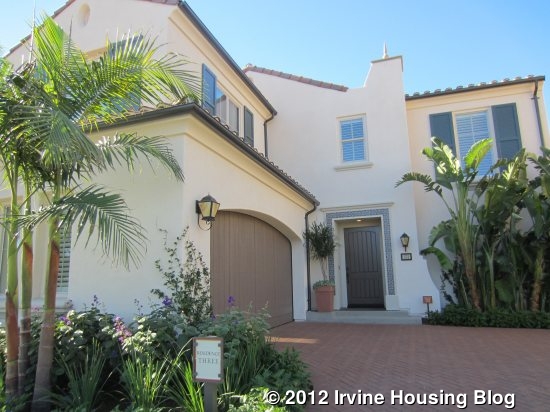
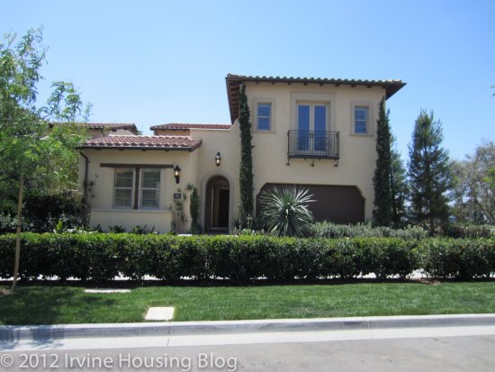
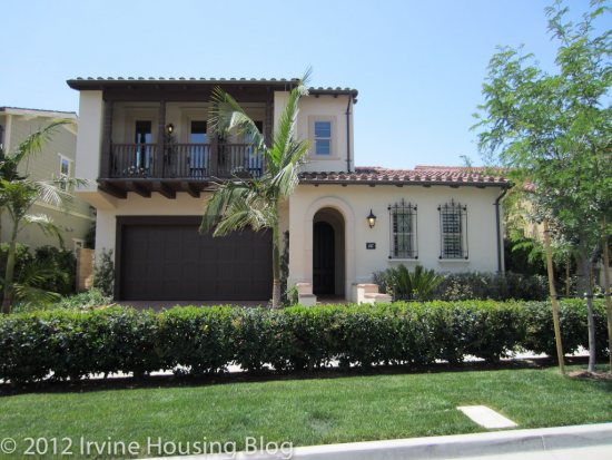
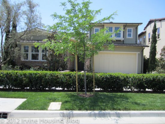
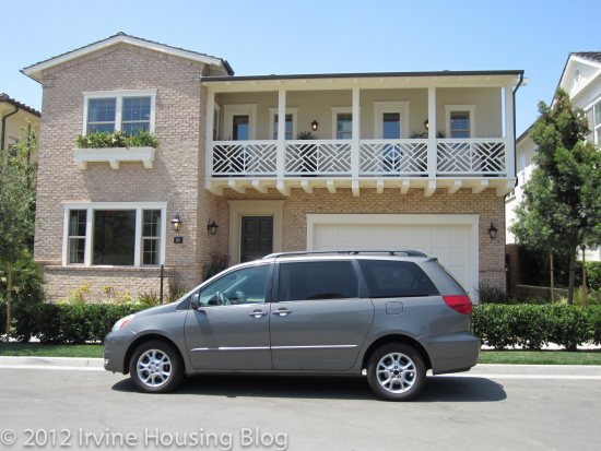
The models are open at Mendocino, one of Stonegate’s newest communities. Located at the westernmost end of the village, Mendocino will have 133 homes and is currently in phase 3 of 20. The earliest move-in dates are April/May 2013. The nearest schools are Stonegate Elementary, Sierra Vista Middle School and Northwood High School. Jeffrey Trail Middle School, scheduled to open in September 2013 will serve Stonegate in place of Sierra Vista. Residents will have access to all of Stonegate’s swimming pools and parks, including two planned future parks located just north and just west of the Mendocino homes. The neighborhood is a short walk from Stonegate Elementary School and is located about halfway between Irvine Blvd and Portola Parkway.
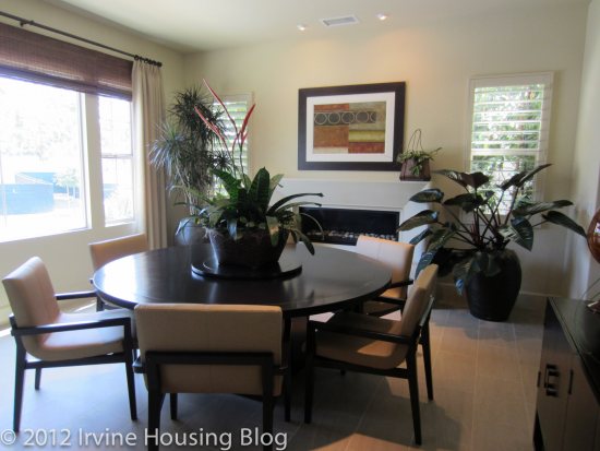
None of the homes have a traditional formal living room or dining room. Each provides a choice of indoor or outdoor living in the form of a conservatory (fully indoors), California Room (partially enclosed outdoor room), or the standard trellis outdoor area. Each model shows a different option, so I will discuss them in more detail below. All homes have a two-car garage.
Base Property Tax: 1.05%
AD Tax: $2,246 per year
CFD Tax: $1,700 per year
Other Taxes: $160 per year
Overall Effective Tax Rate: Approximately 1.6% (amounts are estimates based on info currently available from the City of Irvine and Irvine Unified School District)
Homeowners Dues: $110 per month (proposed)
Link to Mendocino Floor Plans (PDF 11MB)
Residence One
2,221 Sq Ft
3 Bedrooms, 2.5 Baths, Loft, Optional 4th bedroom at loft, Optional Conservatory or California Room
Starting from $769,000
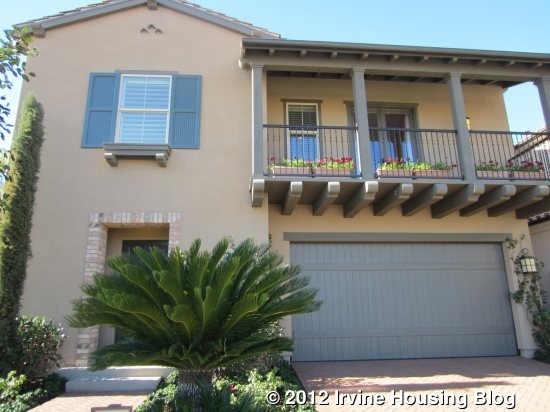
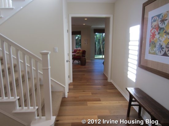
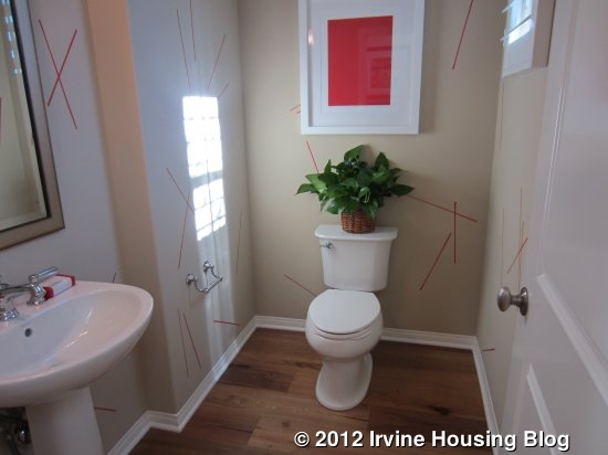
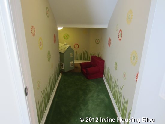
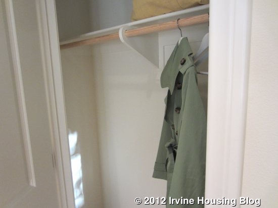
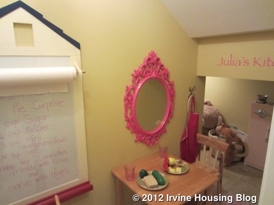
This is the first model I viewed and the smallest in the tract. Upon entering, there is a large foyer with a powder room off to the left and a staircase also leading up from the left side. There is a bit of wasted space leading to the powder room; I might consider putting a shoe rack or small table here to catch some of the clutter that gets left when we enter the house. I opened the closet underneath the stairs, expecting to find a standard coat closet, and was treated to a huge storage space! It was so large, that the model has it set up as a cute playroom/reading room for small children, with chairs and a mural on the wall. It goes all the way to the back of the stairs and wraps around, creating a very large storage area. It would be perfect for storing rarely used items (luggage, holiday décor, etc). An optional built-in cabinet and bookshelf are available right next to the front door.
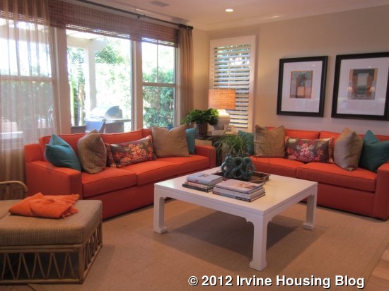
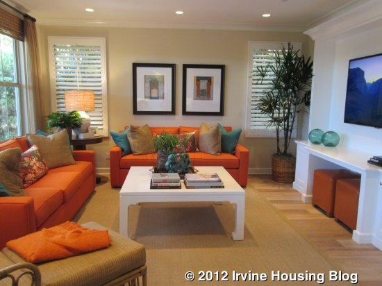
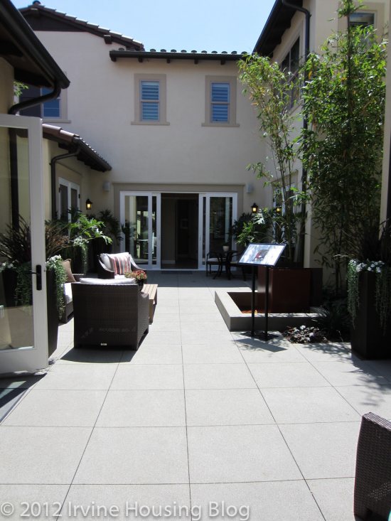
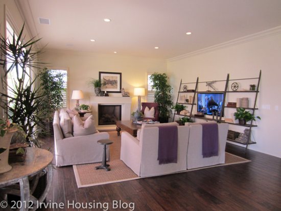
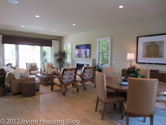
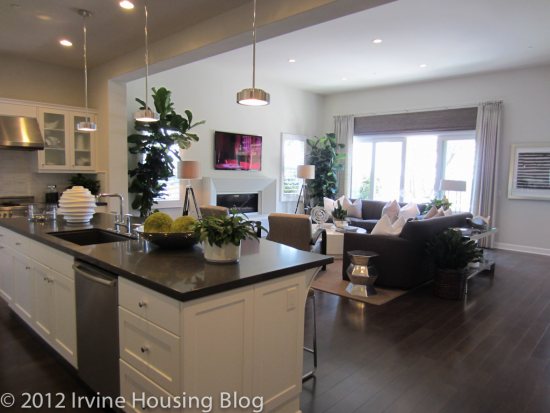
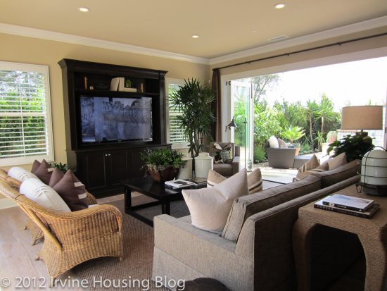
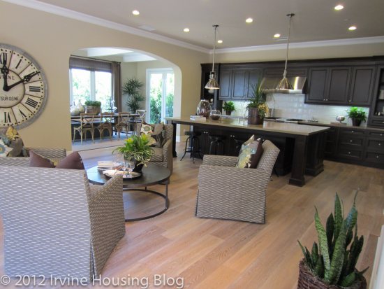
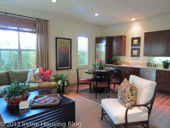
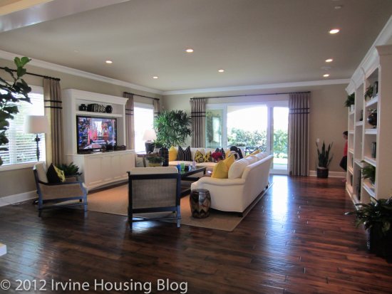
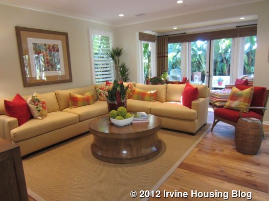
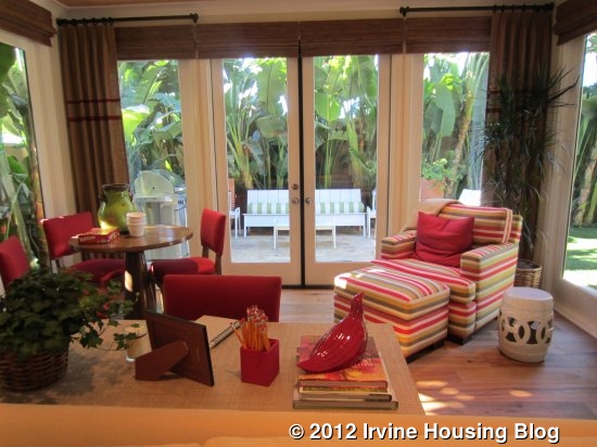
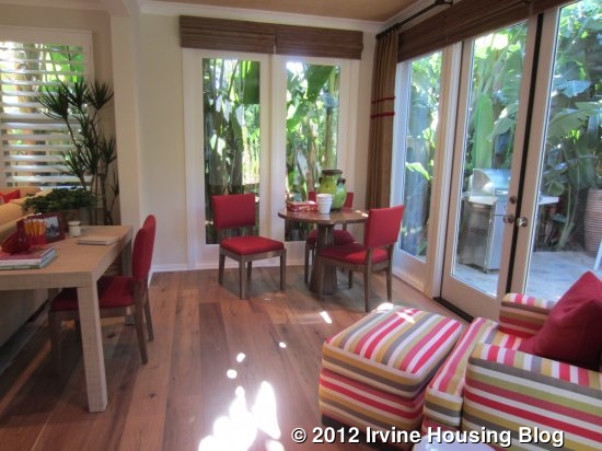
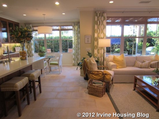
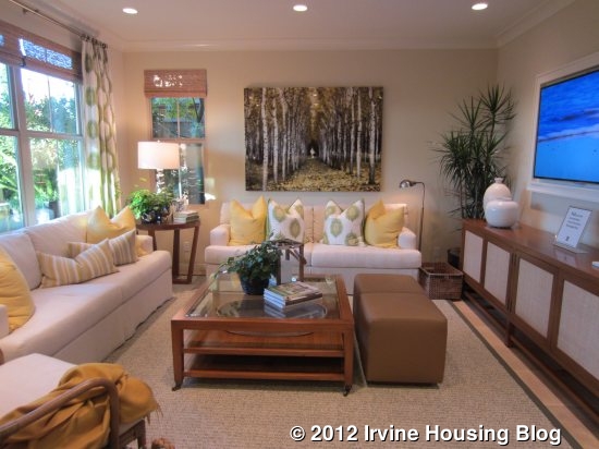
I walked through the foyer and into the great room. This combination family room/kitchen is the only living space downstairs. The family room is large with an optional fireplace at one end. Behind it, is the indoor/outdoor living area mentioned above. In this model, they have it set up as a Conservatory, a room that is 100% indoors and basically just an extension of the family room. It’s a pretty space surrounded by windows and French doors that provides great extra living space. For a family with small children, it is a perfect play area – close to the kitchen but still allowing for a (relatively) clutter-free family room.
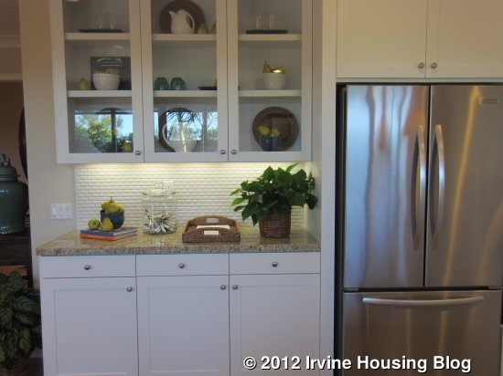
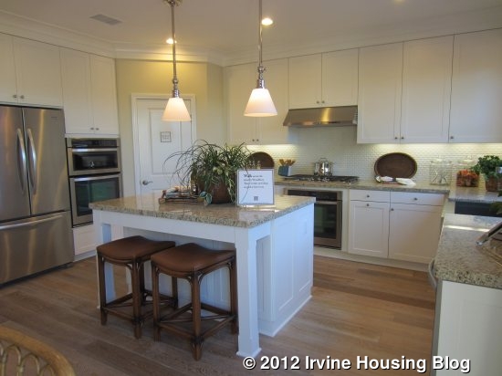
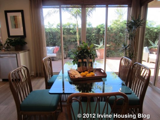
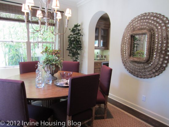
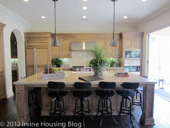
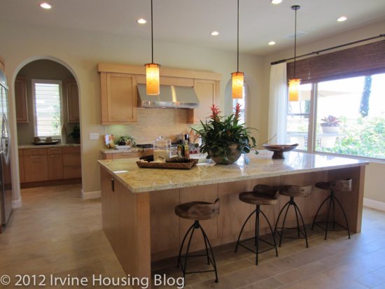
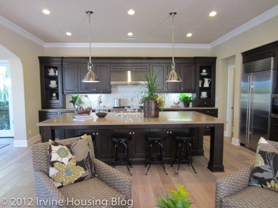
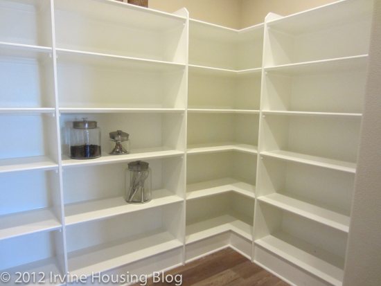
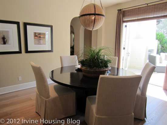
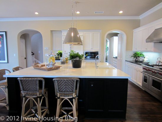
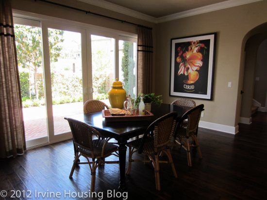
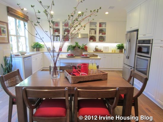
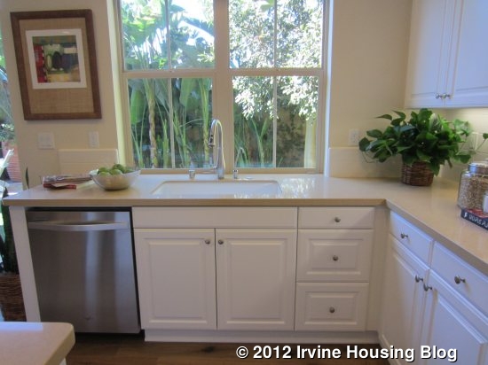
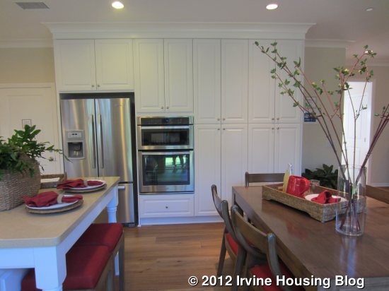
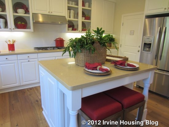
The great room flows directly into the kitchen. A space for a dining table divides the two rooms. Because it’s the only dining area in the house, it does offer enough space for a large or more formal table but wouldn’t feel too empty if a smaller table was used. The standard home package offers Whirlpool stainless steel appliances, including a five-burner cooktop, microwave/oven combo, dishwasher, and Kitchenaid® hood. It also features white thermafoil cabinets with concealed hinges and adjustable shelves, granite slab counters with 6-inch backsplash and a full backsplash at cooktop, a Kohler white, cast iron Smart Divide sink and stainless steel Kohler Faucet, and a refrigerator space pre-plumbed for an ice maker. This model has the standard kitchen, while the others had some upgrades. A large island provides plenty of counter space and room for bar stools on one side. There are several full-height pantry cupboards in this model. Access to the garage is directly off the kitchen, not down a hallway or in any sort of alcove.
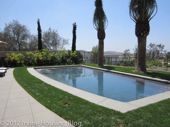
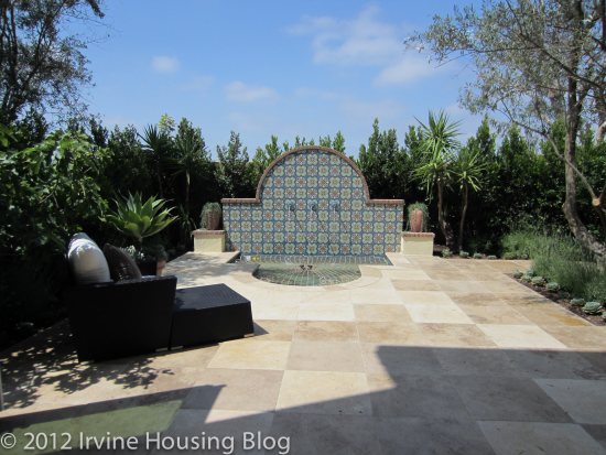
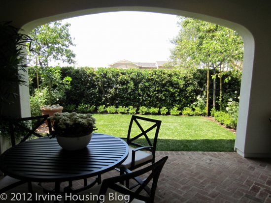
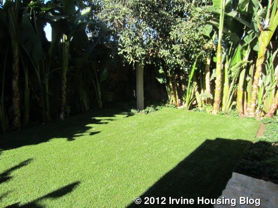
The backyard is long and narrow, with room for a grassy area and a patio. Overall, it is a pretty small lot.
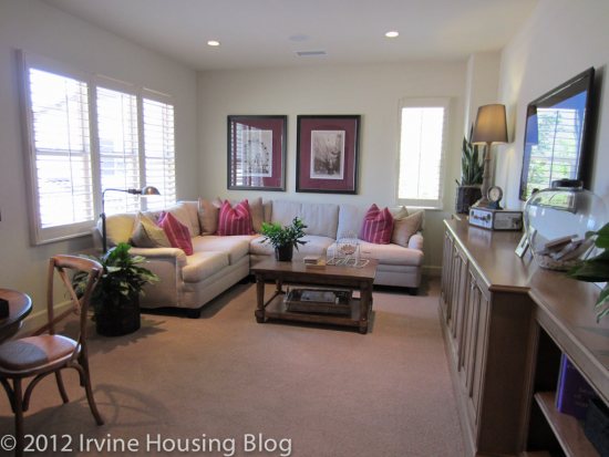
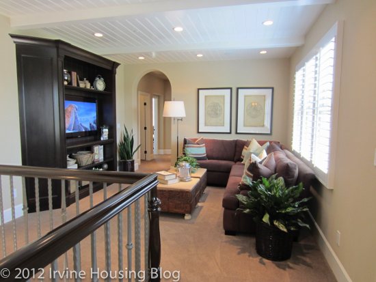
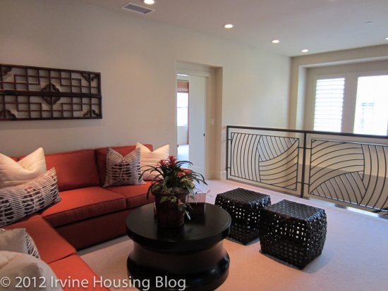
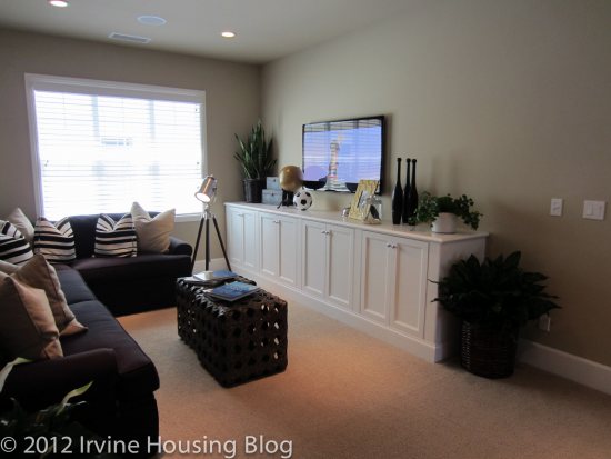
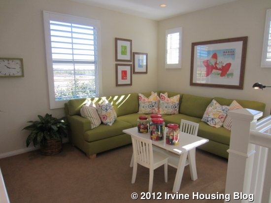
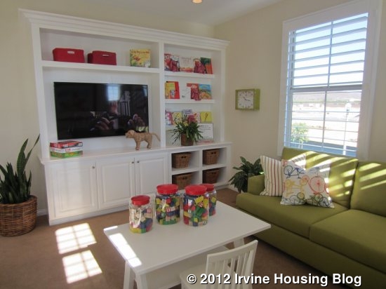
A loft at the top of the stairs provides an additional living area in the home, though it could be made into a fourth bedroom if desired. It’s a nice sized space and is definitely bigger than a media center area at the top of the stairs in other new homes. This is truly its own room.
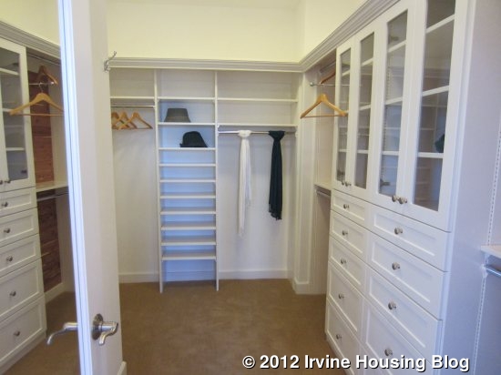
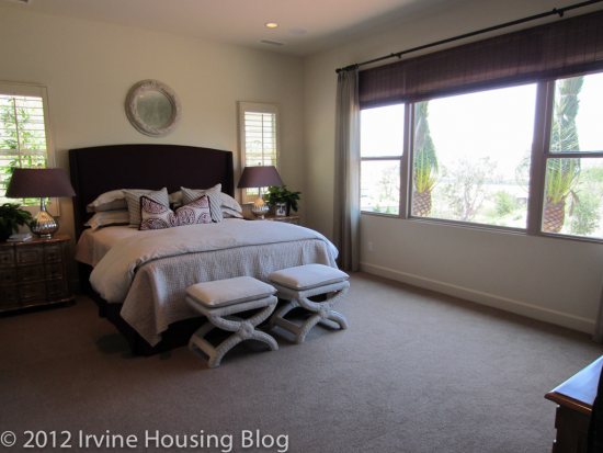
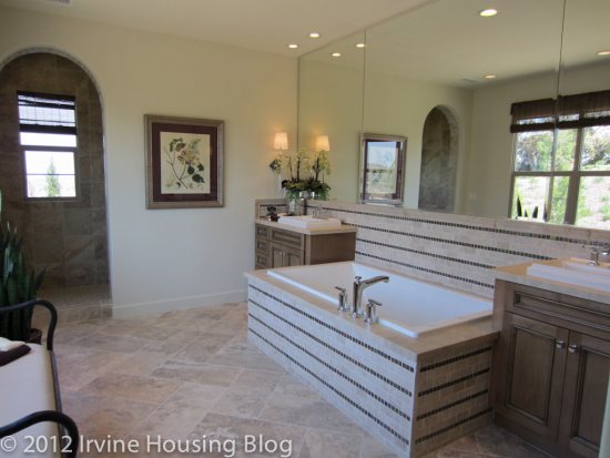
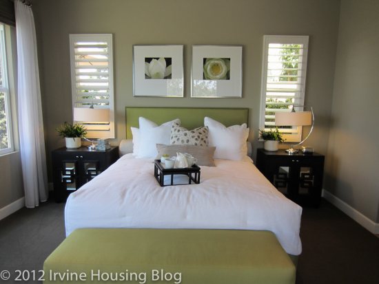
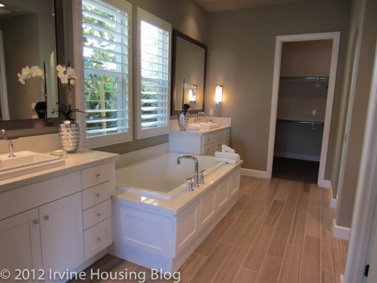
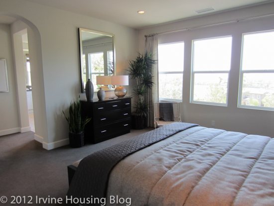
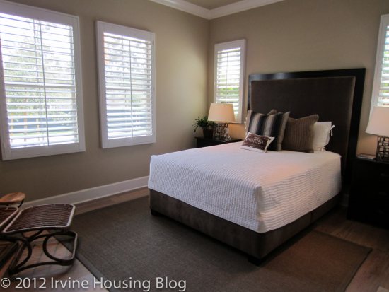
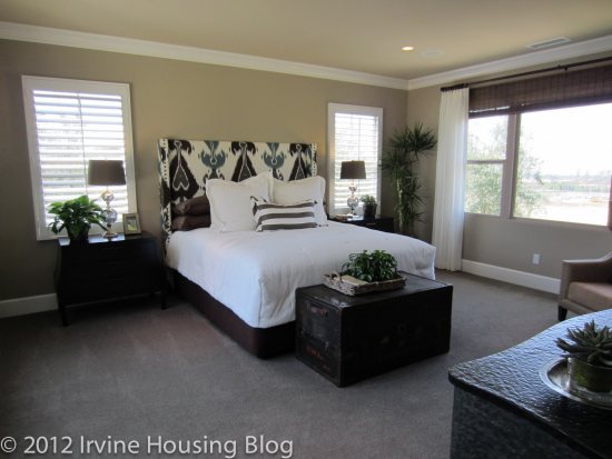
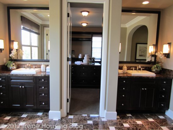
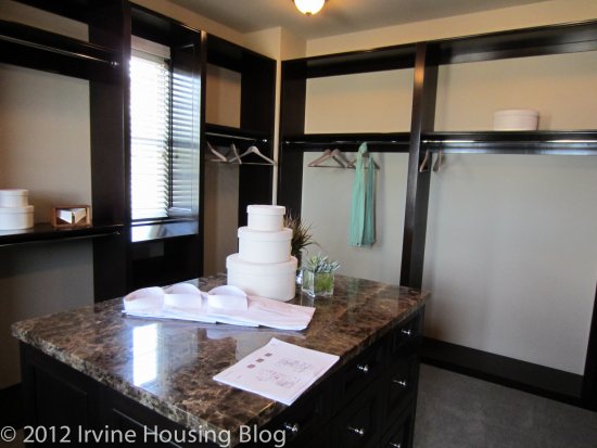
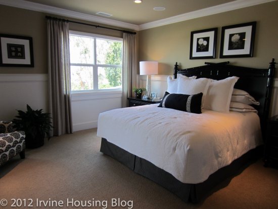
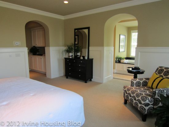
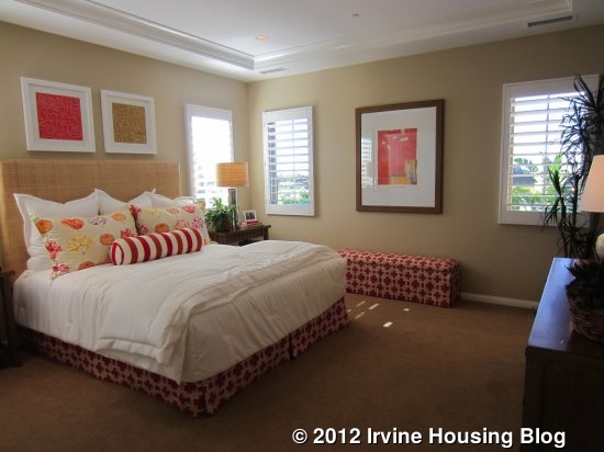
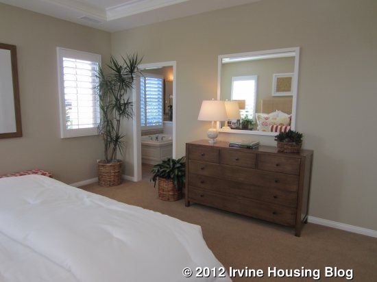
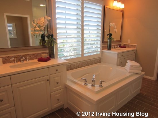
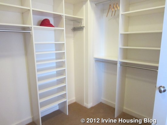
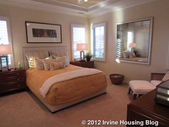
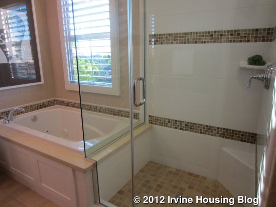
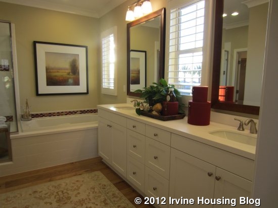
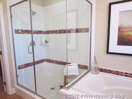
On the other side of the stairs is the master bedroom. It’s a good sized room, but smaller than the master bedrooms in most new homes. It doesn’t have a retreat or really even have room for a big chair or sitting area. It has windows on two sides (two windows on each wall) and an option for a built-in dresser on a third wall. An open doorway leads directly into the master bath. It features split sinks, divided by the bathtub (standard is a Kohler tub with 6” x 6” ceramic tile). A separate shower on the other side comes standard with matching tile and a clear glass enclosure. The shower is a good size and, like the rest of the bathroom, comes standard with Kohler polished chrome faucets. The water closet has an option for built-in cabinets above the toilet, providing a nice space for storage. At the back of the bathroom is the large walk-in closet, which is spacious without being huge.
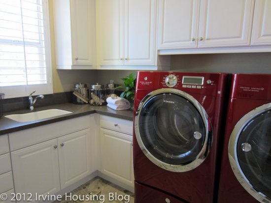
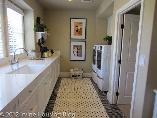
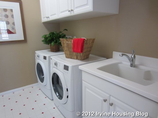
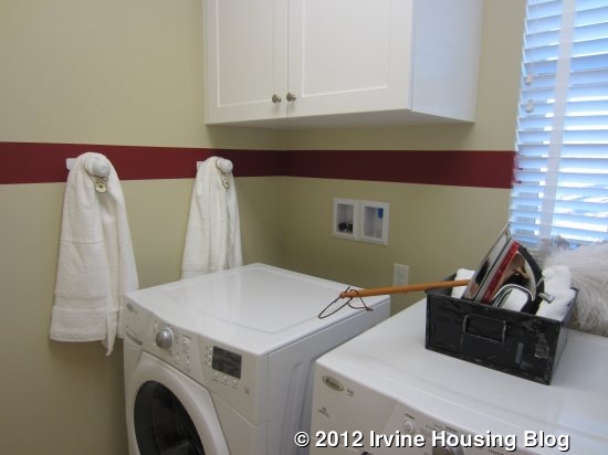
Just past the master bedroom is the laundry room, which has side by side machines and a sink. It lacks a counter but does have standard upper cabinets and optional built-in linen cabinets. Since there isn’t another linen cabinet upstairs, this is a good option to consider. The door is designed to automatically close, which I found very annoying (this is the case in all three models). If I was carrying around large baskets of laundry, I wouldn’t want to worry about the door slamming shut on me. I also thought it closed rather loudly.
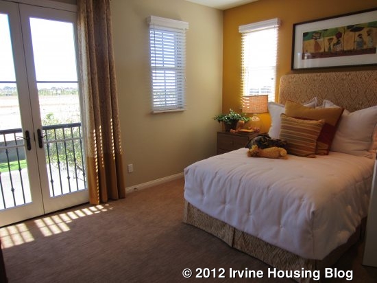
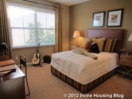
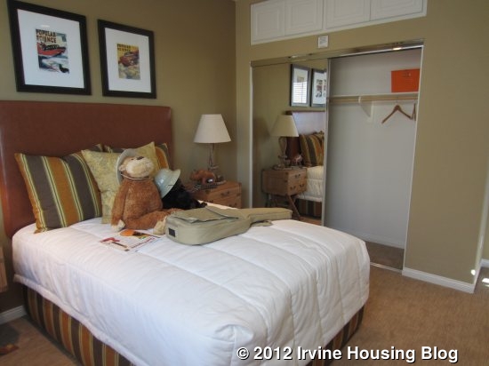
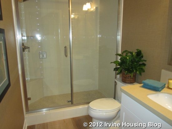
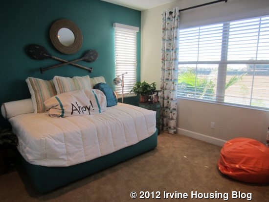
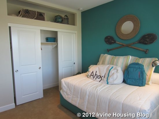
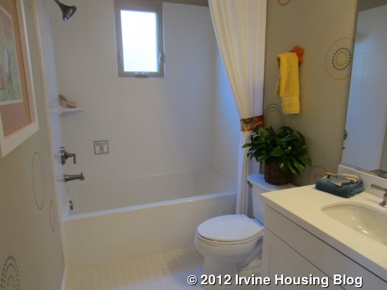
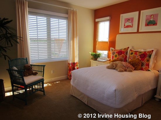
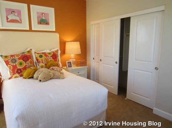
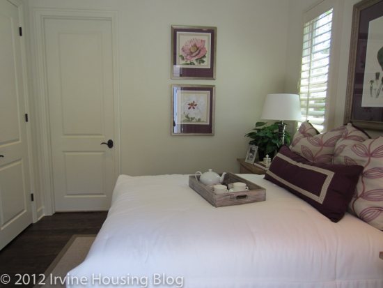
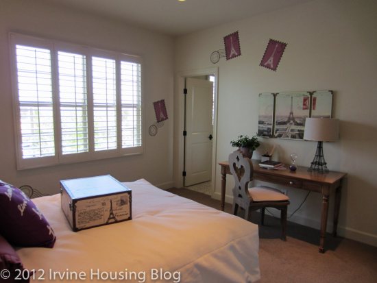
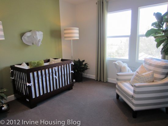
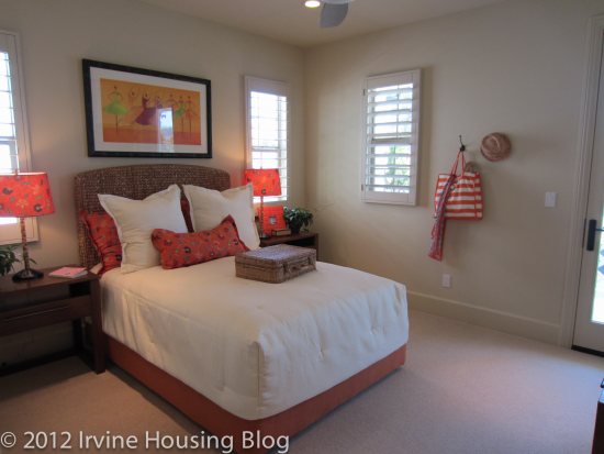
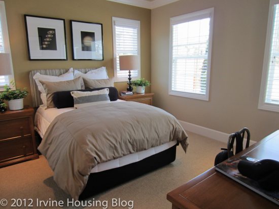
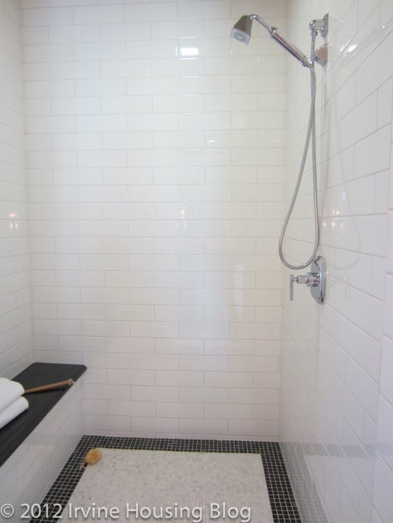
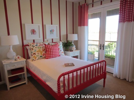
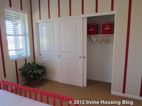
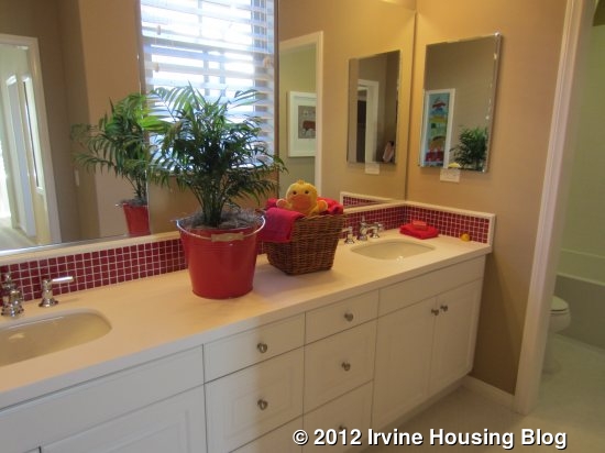
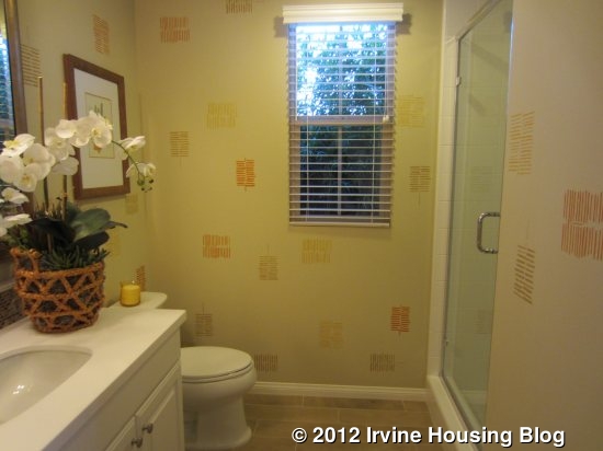
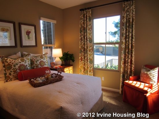
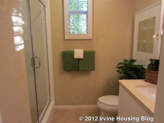
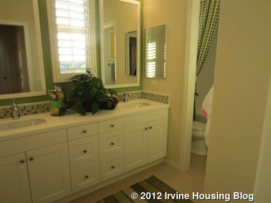
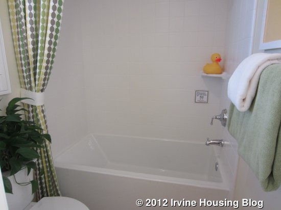
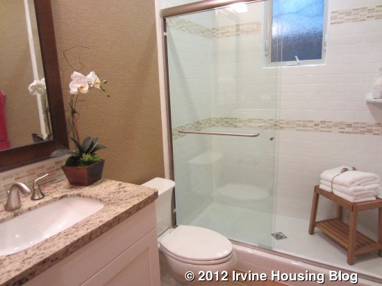
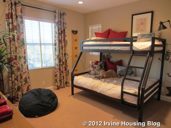
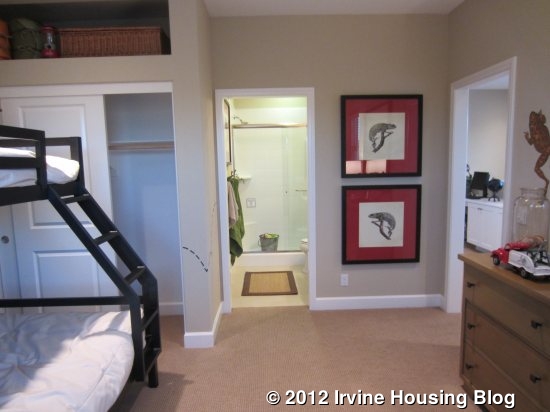
The two secondary bedrooms are a nice size, with plenty of room for furniture and no odd architecture that would make it hard to actually place the bed, as is sometimes the case in new construction. Each has a three-door sliding closet and an option for small built-in cupboards above for out of season storage. One of the rooms has a long, narrow balcony facing the street. These rooms share a bathroom (located at the end of the hall) with two sinks. The toilet and tub/shower are divided from the sinks by a door. In all models, this bathroom comes standard with a tub/shower combo but can be built with just a shower (see photo of the downstairs bath in residence three).

Residence Two
2,381 Sq Ft
4 Bedrooms, 3 Baths, Optional Conservatory or California Room
Starting From $819,000
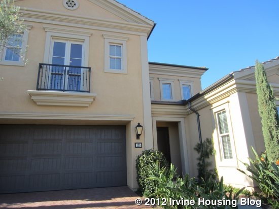
If you visit Mendocino, please note that Residence Two is actually the third model (farthest from the sales office).
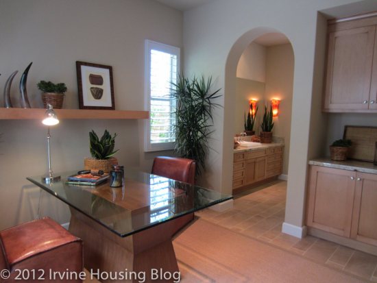
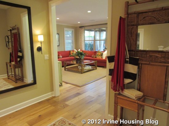
The standard Residence Two has a front entry with a more narrow entryway than the other models, but still wide enough for a table, as seen in the model. To the right are a full bathroom and a bedroom (the bathroom is outside the room). A bathtub is not an option in this model. The bedroom has windows facing both the front and side of the house and is smaller than the bedrooms upstairs. It has a small walk-in style closet, but isn’t actually big enough to walk into.
The storage closet beneath the stairs isn’t nearly as good as the one in Residence One. It opens to a narrow coat closet and, while it leads to a very big storage space underneath the stairs, it’s incredibly hard to access. Large items might not fit through the narrow opening and the ceiling slopes lower more quickly.
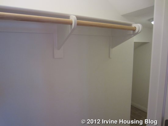
An alcove at the bottom of the stairs shows an attractive built-in bookshelf, though it’s not really a good place for display items since it’s basically in the middle of the hall.
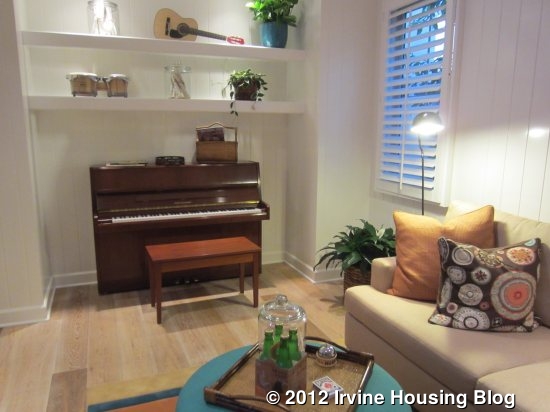
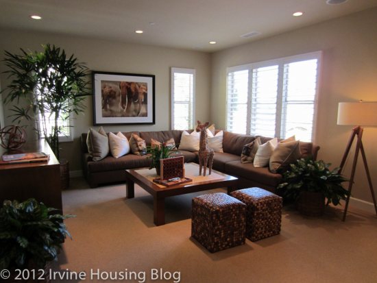
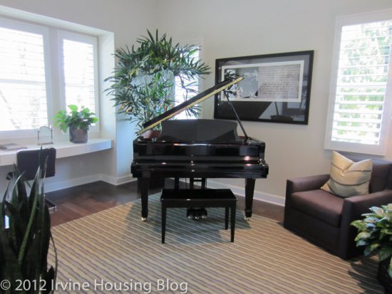
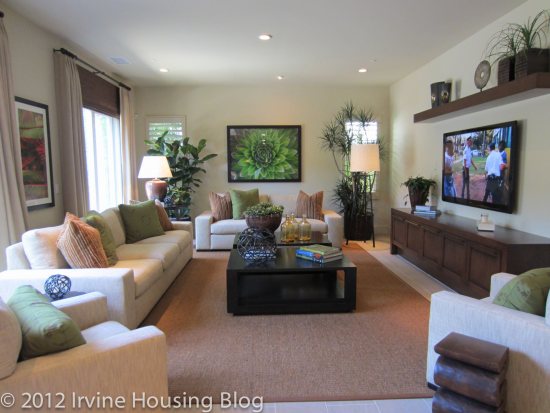
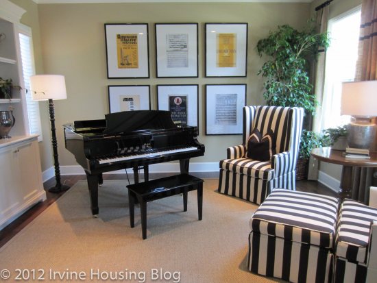
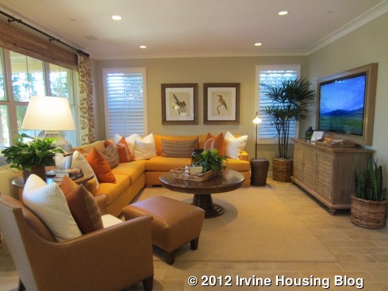
The great room in this model is bigger than in the other Mendocino homes. It has an alcove to one side just the right size for a grand piano (as seen in the model), but that would also make a good space for a desk, children’s art table, china cabinet, or any single piece of furniture. The rest of the room is pretty basic, with an optional fireplace at one end (not shown).
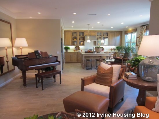
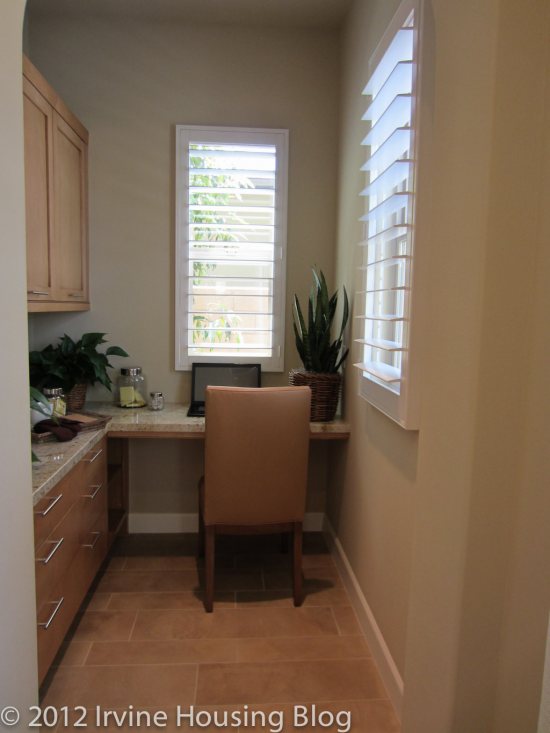
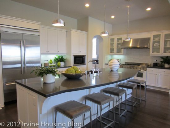
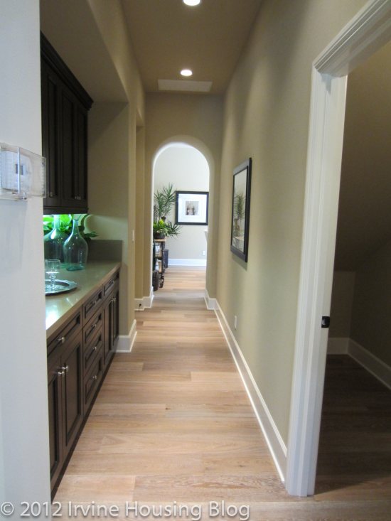
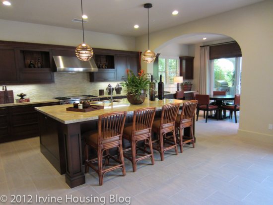
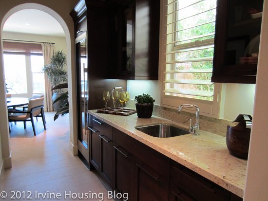
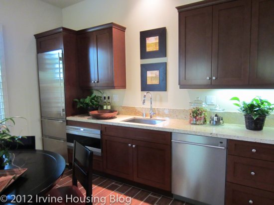
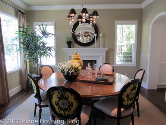
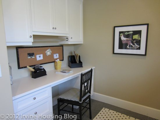
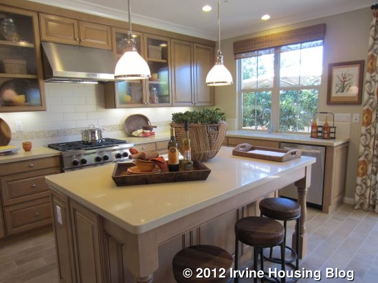
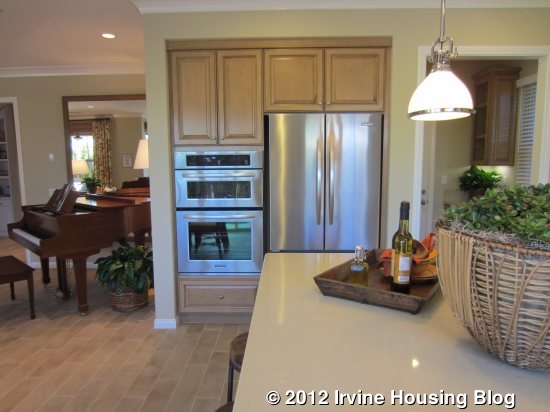
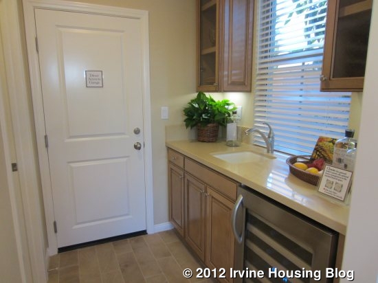
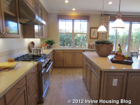
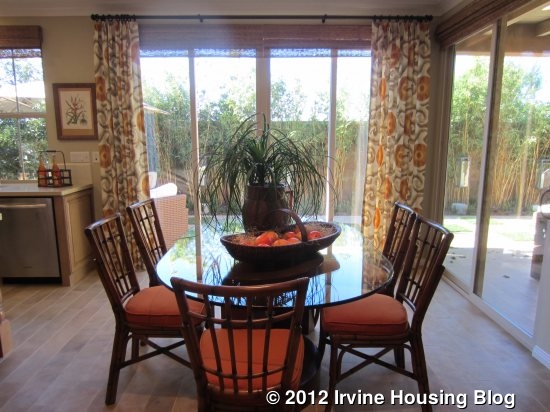 Again, the great room flows right into the kitchen, with the space divided by the home’s only dining area. A large center island with bar stools offers another eating space if desired. This model shows upgraded appliances with one-piece six burner stove and below, plus a second oven next to the refrigerator. It also has upgraded cabinets. Unlike the other models, this one offers a butler’s pantry between the kitchen and the garage. As shown, it has a wine fridge and sink, along with counter space and a few cupboards. Alternatives for this area include a home management space with a built in desk or a standard launch area, which appears to just have a long counter and cupboards below. All three options include a large walk-in pantry.
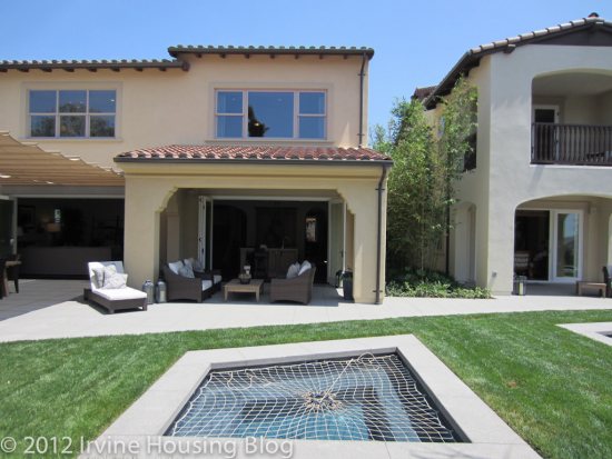
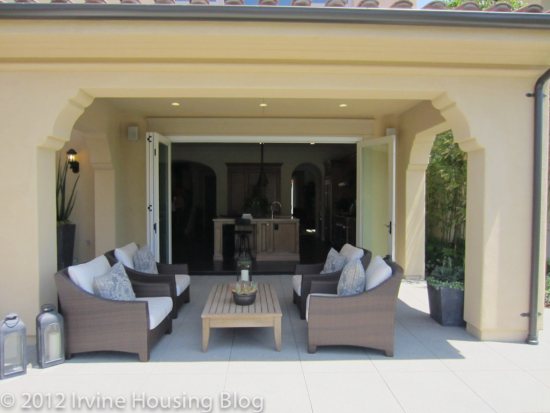
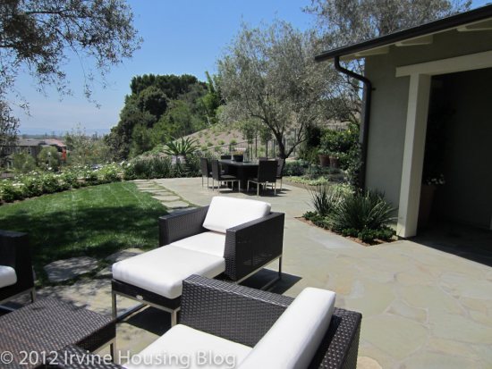
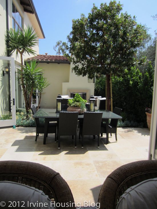
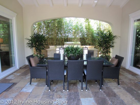
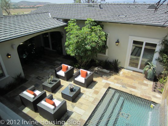
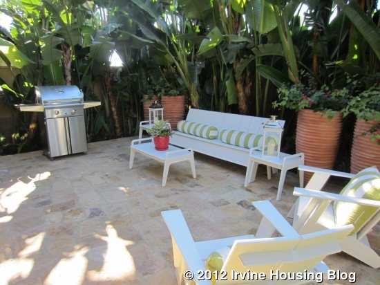
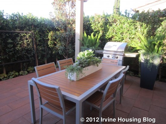
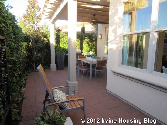
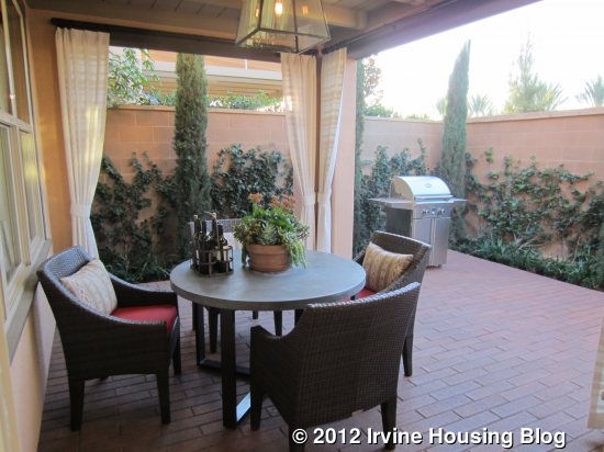
The backyard is long and narrow, as in Residence One. This one demonstrates a California Room, which has two walls that are built out a bit more than in the trellis version, but still has two walls that are open. It has a full roof, including a ceiling fan and recessed lighting. This option is best for people who like to frequently dine or entertain outside and want a place where they can be protected from the weather.
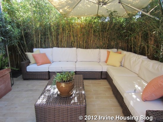
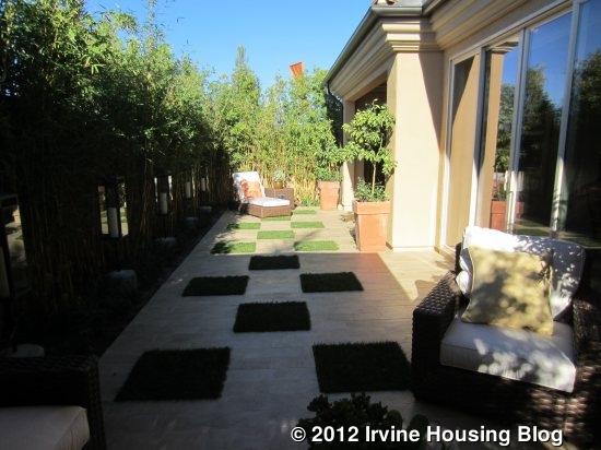
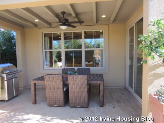
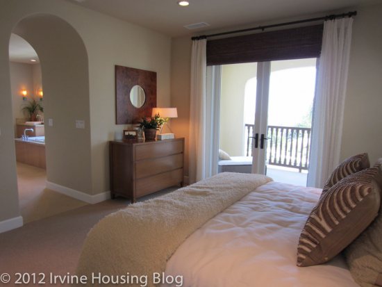
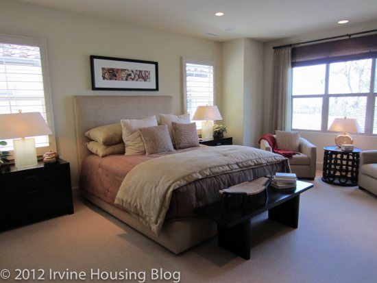
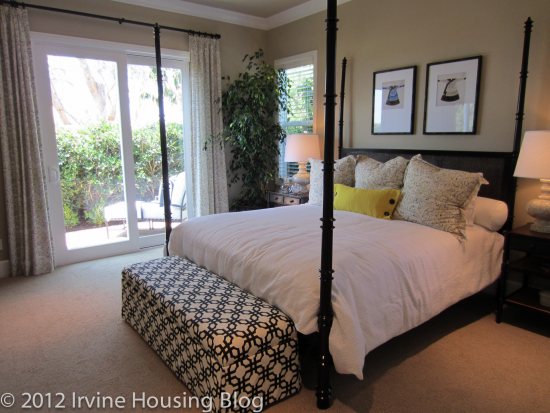
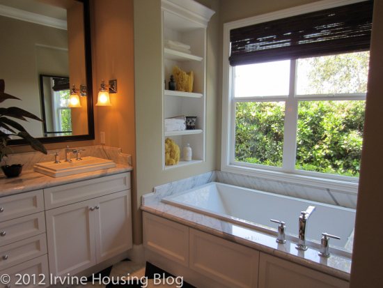
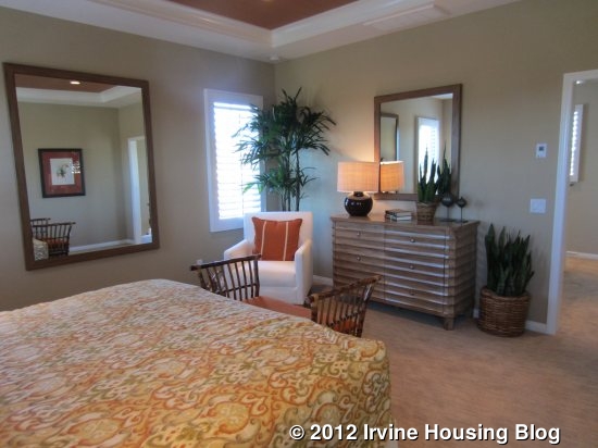
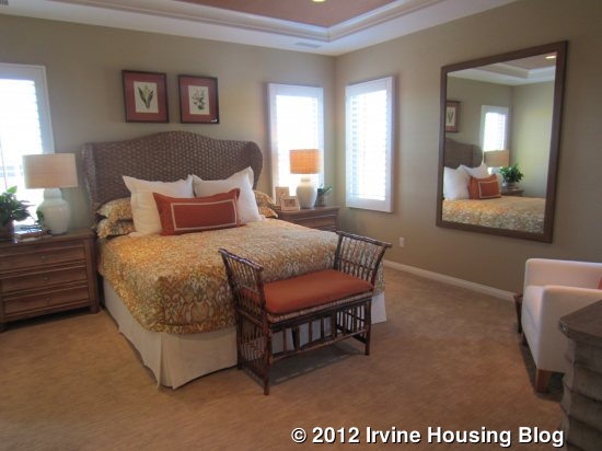
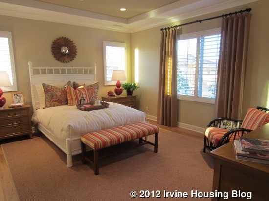
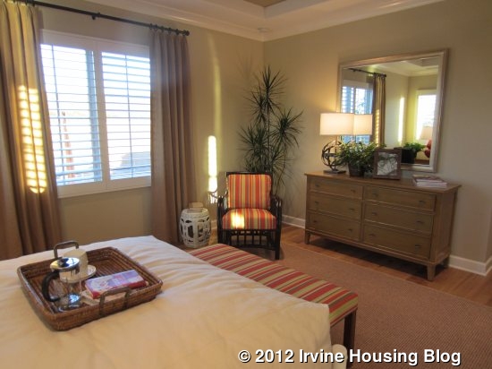
Moving upstairs, the landing area is the smallest of all models. It does not have an option for a built in tech center and certainly isn’t big enough to be used as a room. The master bedroom is off to one side. The room is pretty basic and an average size for a master, without any notable features. The master bath has a very long counter with two sinks. The model shows an optional highboy cupboard between the sinks, but I think it’s too cumbersome. It has a separate bathtub and shower. The walk-in closet is big, but not huge.
__watermark.jpg)
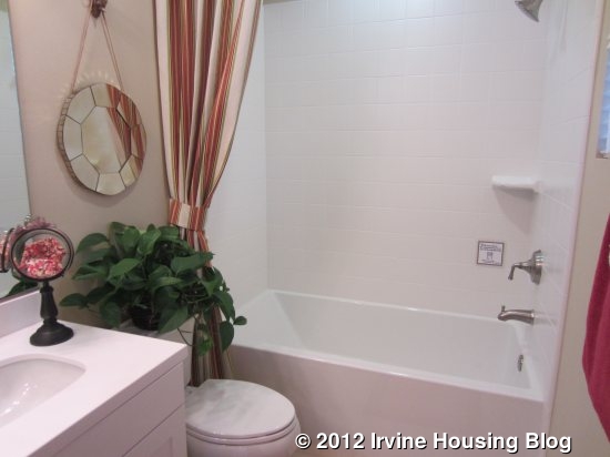
As you walk down the hall toward the secondary bedrooms, the bathroom is on the right and the laundry room is on the left. Unlike in Residence One, there isn’t an option for a built-in linen cupboard, but there is a separate linen closet at the end of the hall. The bathroom has two sinks and the toilet and shower area is separated from the sinks by a door.
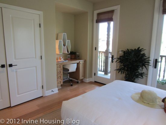
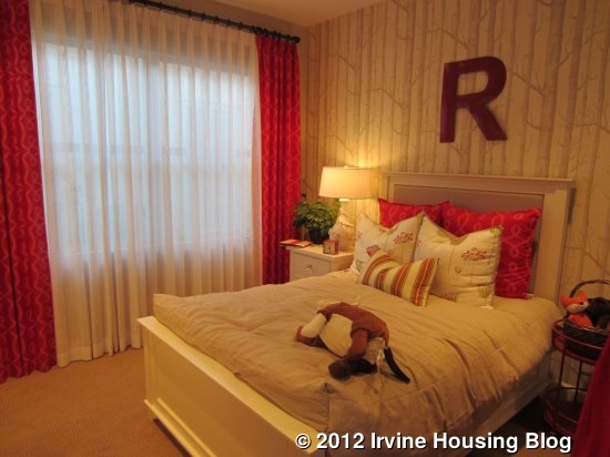
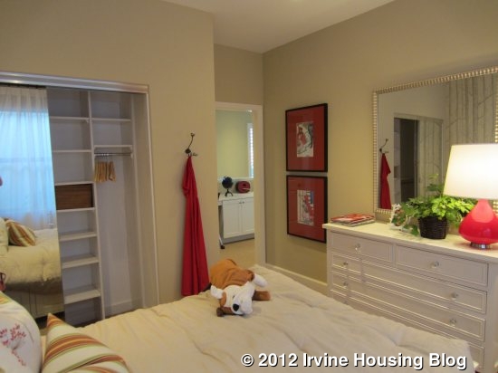
The bedrooms are on either side at the end of the hall and are about the same size as each other. One has a walk-in closet and French doors, though there isn’t an actual balcony. It just has a railing to give the appearance of a balcony. The other bedroom has a much smaller closet (just two sliding doors) and optional storage above.


Residence Two X
2,452 Sq Ft
4 Bedrooms, 3 Baths, Optional Conservatory or California Room
Starting from $842,500
There is not a model of this residence. There are a couple of key differences from the standard Residence Two. In this model, the entry is on the side of the house, rather than the front. The stairs go straight up, rather than turning 90 degrees. As a result, there is a coat closet downstairs and a separate storage area underneath the staircase. The downstairs bedroom has a standard closet instead of a walk-in and the layout of the downstairs bath changes a bit. Upstairs, there is a now a long landing area that could probably have a built in desk or bookshelves. There are no other changes upstairs.
Residence Three
2,441 Sq Ft
4 Bedrooms, 4 Baths, Optional Den or Suite at Bedroom 4 (downstairs), Optional Conservatory or California Room
Starting from $839,000
**This model is temporarily sold out**

If you go to visit Mendocino, please note that Residence Three is actually the second (center) model.
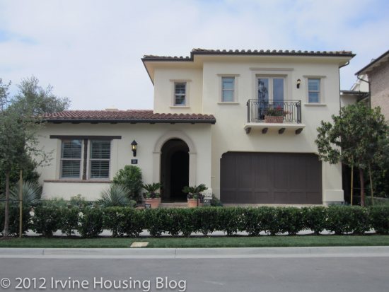
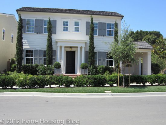
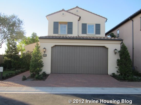
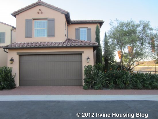
Residence Three is the largest of the models, though it is 11 square feet smaller than Residence Two X (not modeled). The garage is at the side of the driveway, rather than straight ahead. It makes the driveway feel more like a yard/play area, but I always think it would be a pain to park the car that way.
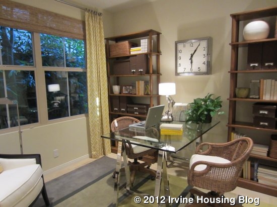
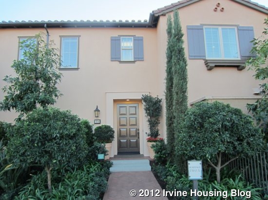
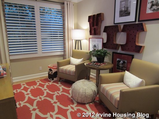
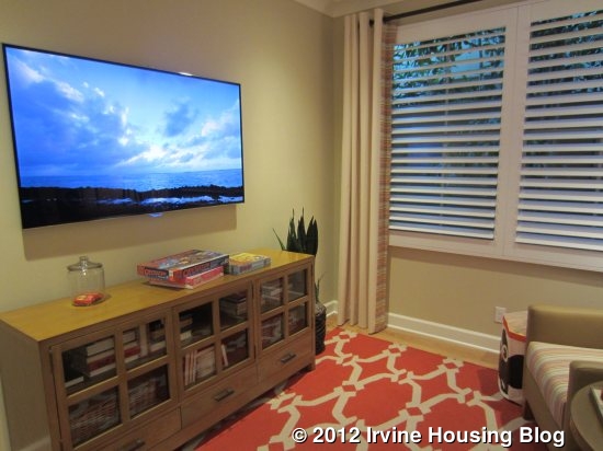
The entryway is large, with the stairs to the right and a full bathroom and downstairs bedroom or den to the left. As in Residence One, the storage area under the stairs is huge. As mentioned above, the downstairs bathroom in this model shows the optional shower rather than the standard tub/shower combo. The room is set up as a den in the model, but can be a fourth bedroom with a standard, sliding closet. A third option allows for a bedroom with an en suite bathroom, in which the existing bathroom converts to just a powder room (no shower). Because it’s set apart from the other rooms downstairs, it would also make a great home office.


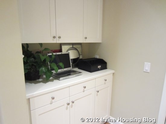
Access to the garage is just outside the bathroom, with an option for a small built-in cupboard next to the door.
Straight through the entryway is the great room. A fireplace is available but isn’t shown in the model. Windows on two sides provide plenty of light, but there really isn’t anything remarkable about the room. It is adjacent and open to the kitchen, but doesn’t flow into it quite as well as in Residence One.


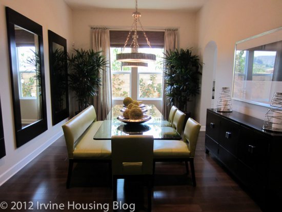
Again, a single dining area provides the option for either a casual or formal dining table. Large sliding doors lead out from the dining area to the backyard. This model shows an oven below the cooktop (two separate pieces, not a combo range) and a second oven next to the refrigerator. It also has a square island with room for barstools on one side. A walk-in pantry in one corner provides ample food storage and a huge, upgraded sink is featured.


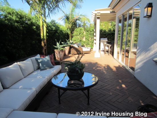
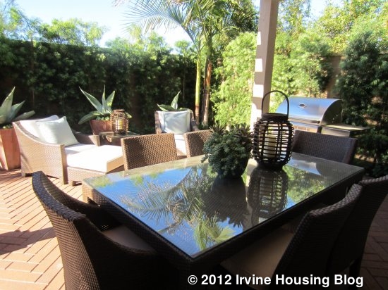
The backyard is similar in size to the other models, with a long narrow layout. In this model, they demonstrate the standard trellis setup, which is basically just a basic patio cover with slats. It is still nestled against the house, sharing walls with the great room and dining area, but open on the other two sides. This option is the least like an indoor room and is best for someone looking for a casual backyard and also doesn’t need or want the extra space inside.


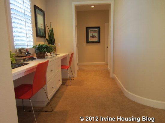
Moving upstairs, there is room for an optional tech center at the top of the stairs. Unlike in Residence One, this is not a full room, but really just a built-in desk with room for two work stations. To one side is the master bedroom; the other rooms are down a hall past the tech center.

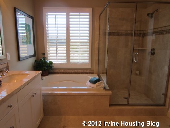
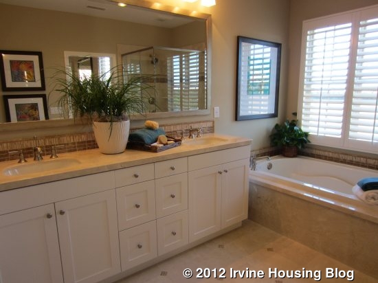
The master bedroom is quite similar to those in the other models. It is just a big, square room with nothing interesting about it. The bathroom features side by side sinks, a tub, and a good size shower. The walk-in closet is a little bigger than in the other models.


Down the hall, the laundry room is straight ahead and the two bedrooms are set on either side, each down a small hallway of their own. In this model, both bedrooms feature private bathrooms with one sink, a tub and/or shower, and a toilet. This is the only model where the secondary bedrooms have private, en-suite bathrooms. Each bedroom has a standard three-door closet and optional storage above (one shows an open space, as opposed to the cupboards shown in Residence One). The rooms are mirror images of each other and are a good size.


Overall, my impression of the Mendocino community is pretty neutral. I am used to going to new model homes and swooning over all of the creative design features and the luxurious master bedrooms. These homes have none of that. The master bedrooms are all very generic and don’t have the retreats or sitting areas seen in many new homes. Also, I felt like there was a lack of family living space; aside from the great room, these models only have bedrooms or closed off dens (the loft in Residence One being the exception). I think choosing the Conservatory over the California Room or Standard Trellis would alleviate that problem, as it does provide an additional room downstairs. Unfortunately, choosing the Conservatory makes an already small backyard even smaller.
I do like the kitchens in each of the models. They are all spacious with big islands, plenty of storage, and ample counter space. I think it’s nice that all of the secondary bedrooms are fairly large and have two or three windows, and that all models have an upstairs laundry room with a sink. While these homes are certainly nice, there just isn’t anything special about any of them.
Starting prices for these homes average approximately $345 per square foot, and that is before upgrades. I imagine these homes will sell, as many people like the prospect of a brand new home, but I don’t see anything particularly compelling to draw buyers to the neighborhood.
Discuss at Talk Irvine: http://www.talkirvine.com/index.php/topic,3254.0.html


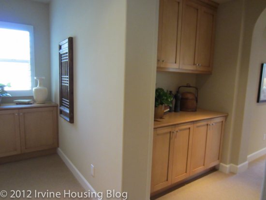
 Garage access is just beyond the bathroom. An optional built-in set of cabinets and counter space provides a “launch” area for mail, keys, purse, etc.
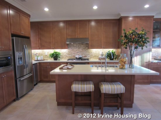
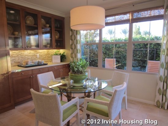
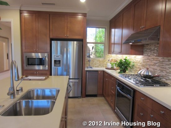
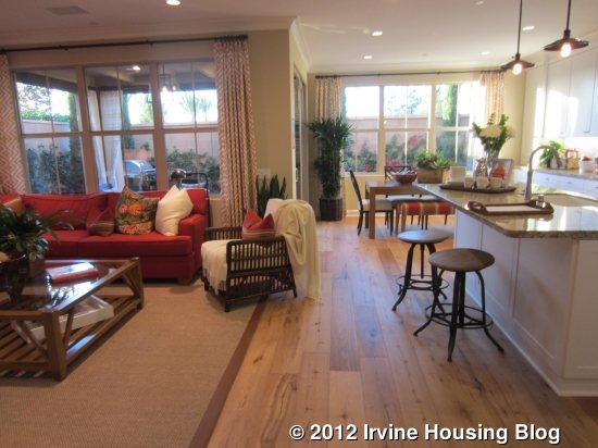
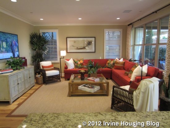
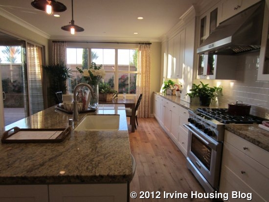
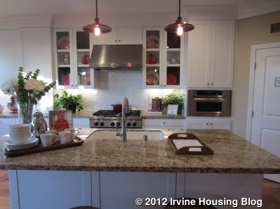
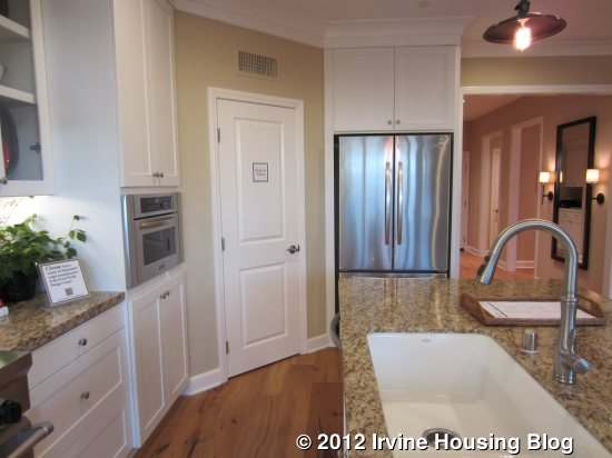


 Again, the great room flows right into the kitchen, with the space divided by the home’s only dining area. A large center island with bar stools offers another eating space if desired. This model shows upgraded appliances with one-piece six burner stove and below, plus a second oven next to the refrigerator. It also has upgraded cabinets. Unlike the other models, this one offers a butler’s pantry between the kitchen and the garage. As shown, it has a wine fridge and sink, along with counter space and a few cupboards. Alternatives for this area include a home management space with a built in desk or a standard launch area, which appears to just have a long counter and cupboards below. All three options include a large walk-in pantry.


__watermark.jpg)
