Category Archives: New Homes

A Review of the Roundtree Tract at The Great Park

At the end of September, ten new sets of models debuted in the Pavilion Park area of the Great Park Neighborhoods. This week, I will introduce you to Roundtree, the second smallest and least expensive of the ten developments. Built by Lennar, each model includes four bedrooms (all with one downstairs), at least three bathrooms, a California Room and a two-car garage. They have released two phases, each with two homes of each model. Roundtree is the only Pavilion Park neighborhood to offer four unique models rather than three.

Lennar markets the home as “Everything Included” and signs throughout the houses claim “YES!” to let you know which features are standard. Smaller signs indicate upgrades. Some of the standard amenities include ceramic tile flooring at entry, kitchen, baths and laundry; Mohawk wall-to-wall carpeting in all living areas and bedrooms; polished chrome hardware and engineered stone countertops in all bathrooms; and fiberglass secondary tubs and acrylic master tubs. In the kitchen, all homes come with white thermafoil cabinetry; granite counters with a 6” backsplash and full backsplash at cooktop; stainless steel GE appliances including built-in, self-cleaning wall oven, gas cooktop with five burners, Advantium microwave/hood and Energy Star dishwasher; and a stainless steel two-compartment undermount sink.

These homes also pride themselves on their green technology. Some of the standard features include CertainTeed AirRenew drywall that actively cleans the air; central air; high performance low-E glass; cool roof tiles on concrete roofs; tankless water heater; programmable thermostat; water conserving toilets, faucets and shower heads; low VOC interior paint; and pre-wiring for ceiling fans and electric/hybrid vehicle charging systems.

Though I’m presenting the homes in order from 1 – 4, the models are actually arranged as 1-4-2-3 (from right to left). The configuration of models one and three lend themselves better to corner lots.

Basic Neighborhood Financial Information

Approximate HOA Dues: $193 per month

Approximate Tax rate: 1.1%

Approximate Mello Roos: Residences 1 & 2: $4,981; Residence 3: $5,380; Residence 4: $5,902

Base Price from $765,990 (Residence 1) to $860,990 (Residence 4)

Floor Plan, Roundtree Residence 1

Floor Plan, Roundtree Residence 2

Floor Plan, Roundtree Residence 3

Floor Plan, Roundtree Residence 4

Sales Brochure

Residence One

2,053 Sq Ft

4 Bedrooms, 3 Bathrooms

Base Price from $765,990
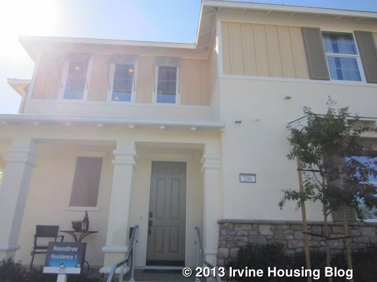
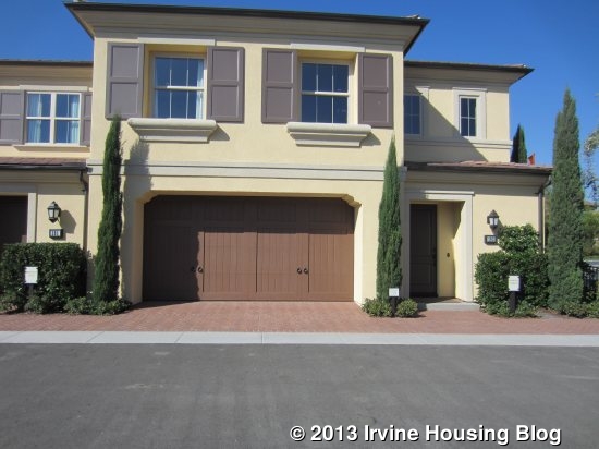
In this home, the front door is on one side of the house and the garage is on another, leading me to believe it will typically be located on a corner. A front porch wraps around to one side of the house.

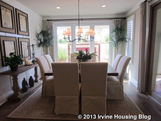
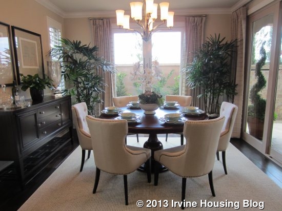
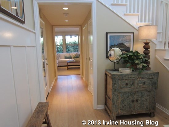
When I entered the home, the stairs were immediately to my left, a bedroom was down a hallway to my right, and a hallway straight ahead led to the kitchen and great room. The dining area is visible from the front door. As the kitchen doesn’t have a separate breakfast nook, this is the only space for a dining table. It has plenty of room for a large, formal table if desired. Access to the garage is along the back wall.
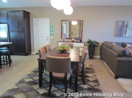
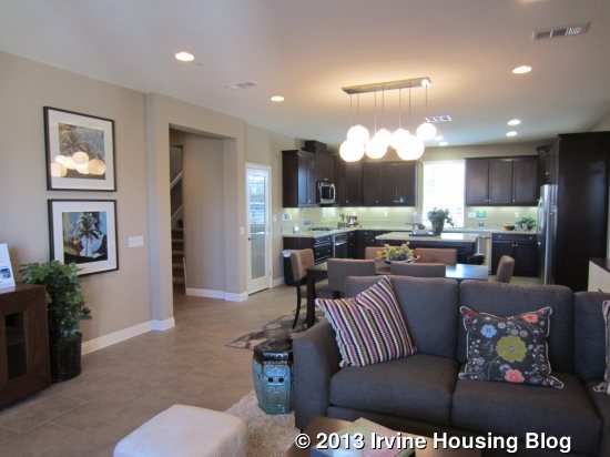
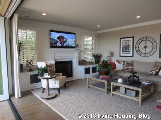
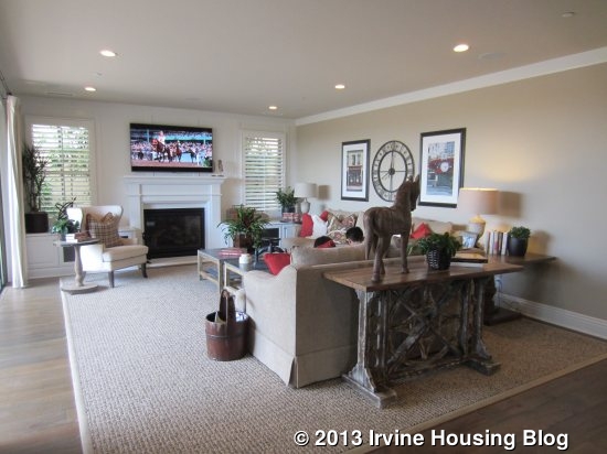
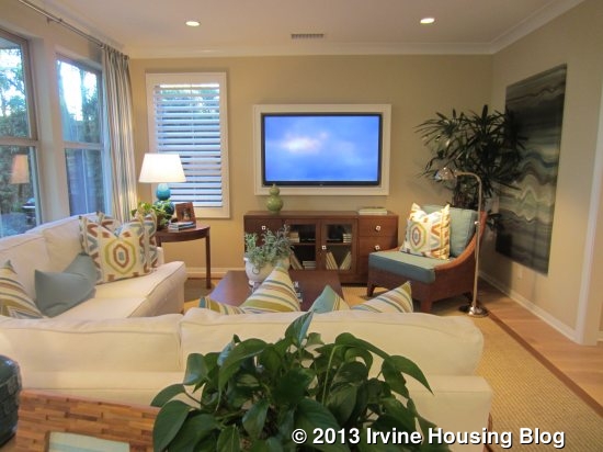
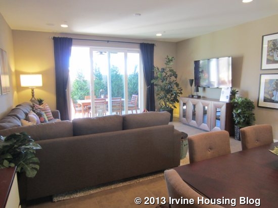
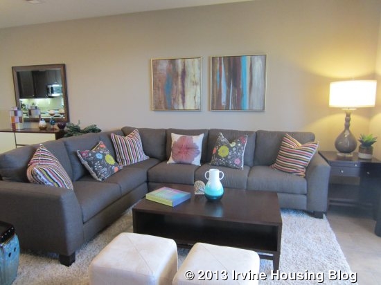
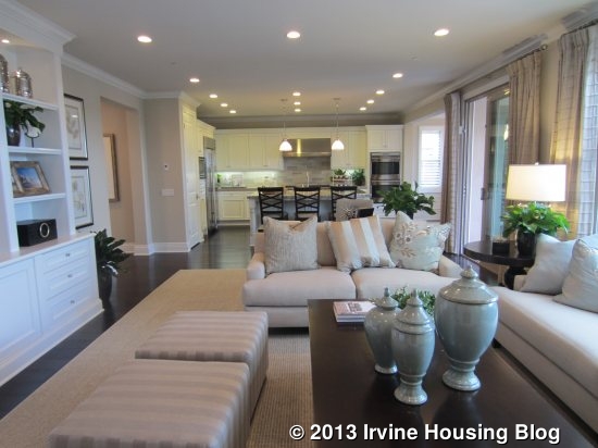
The great room is to the right. It is a large room with the flexibility to arrange it comfortably in a couple of different ways. One wall has a sliding door to the backyard, which are the only windows in the room.
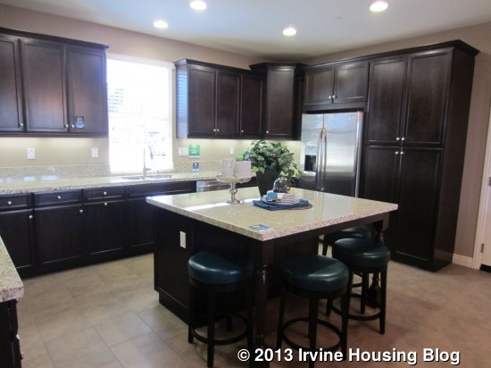
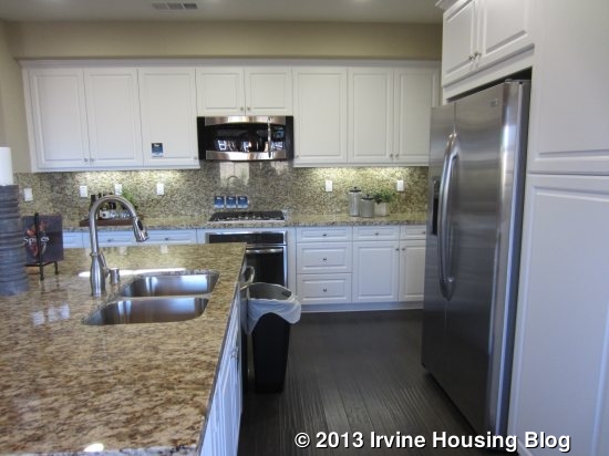
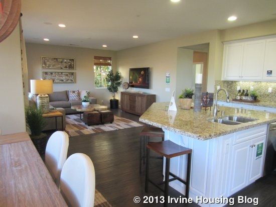
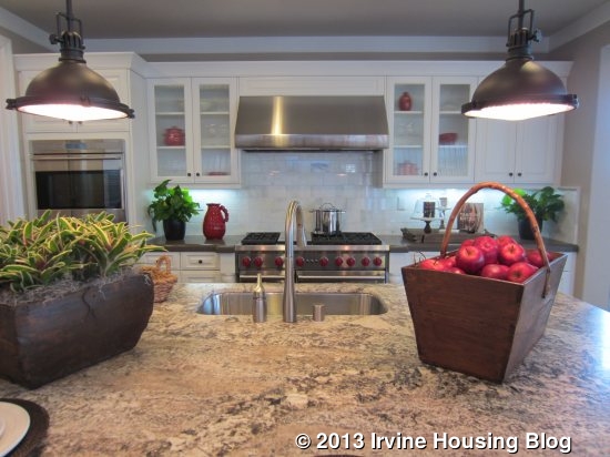
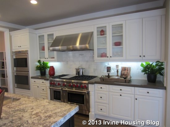
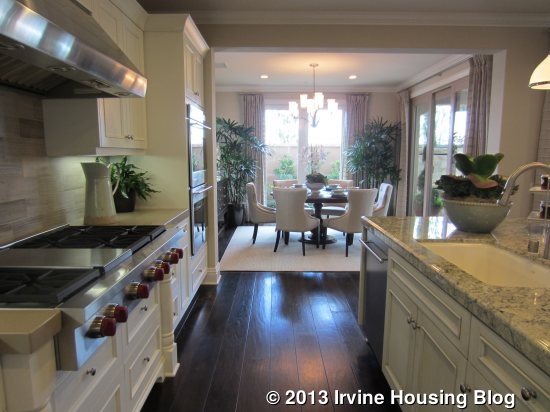
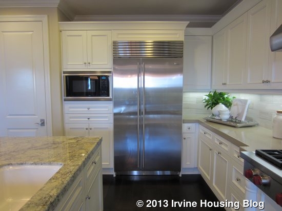
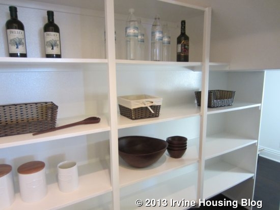
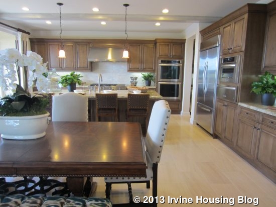
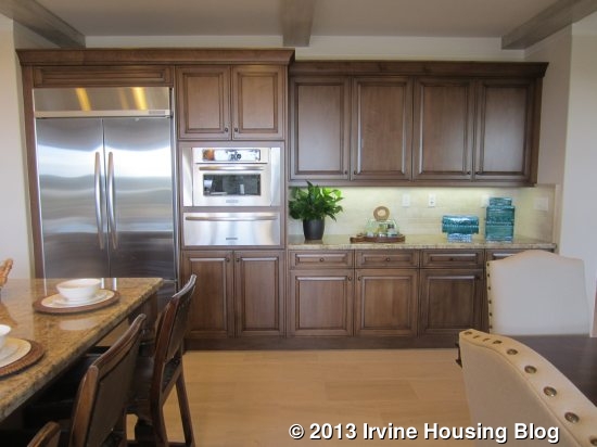
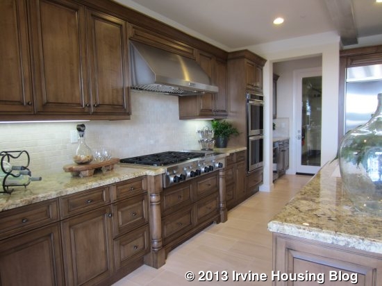
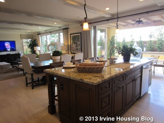
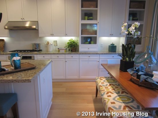
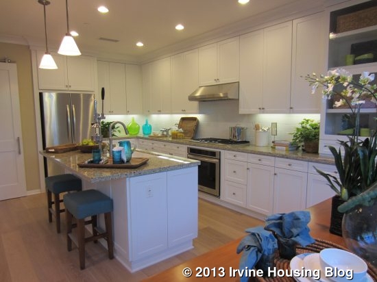
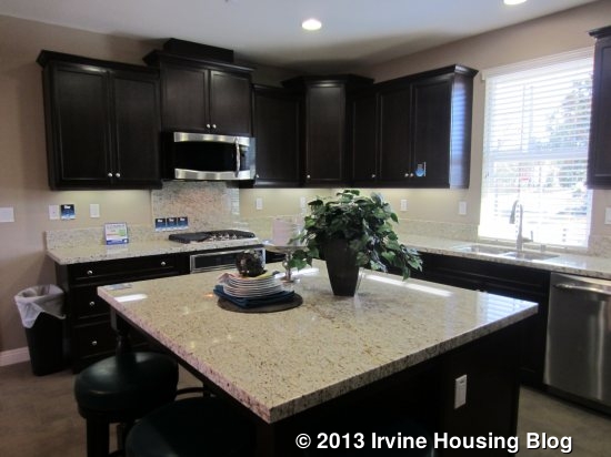
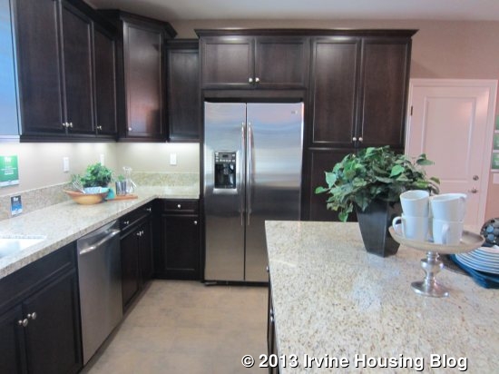
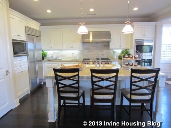
The kitchen has a big, square island with bar seating. This model shows upgraded, espresso-colored cabinetry arranged in a U-shape around the island. It has plenty of drawers, cabinets and counter space. In addition to two pantry-height cabinets, there is a large walk-in pantry with additional storage under the stairs. The cooktop and oven are on the left, the sink is in the middle, and the fridge is on the right. There aren’t any appliances in the island. A big window looks out to the street.
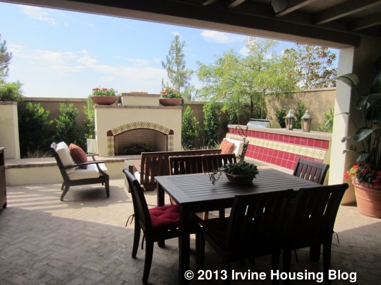
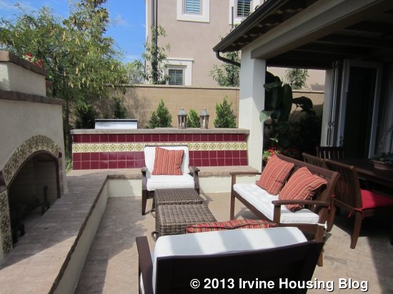
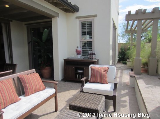
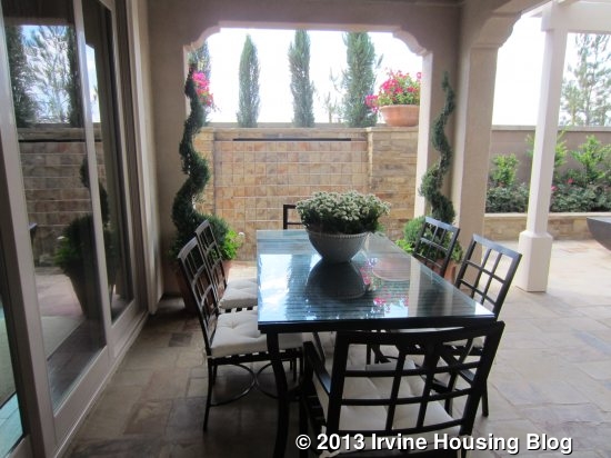
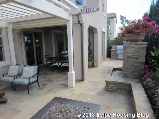
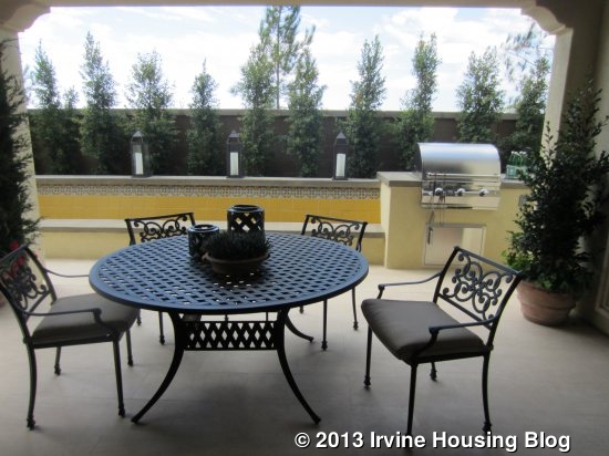
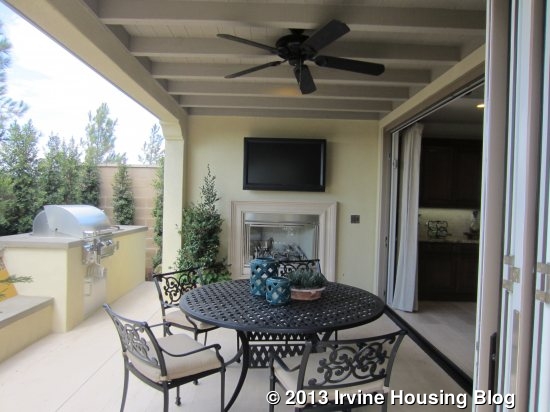
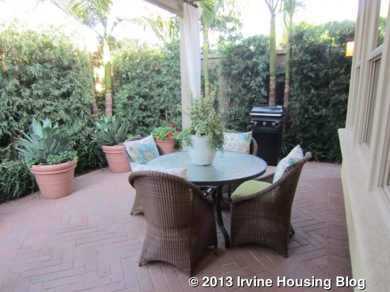
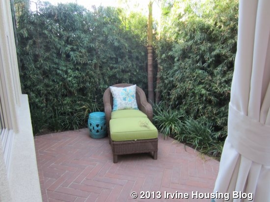
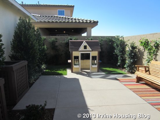
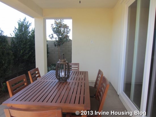
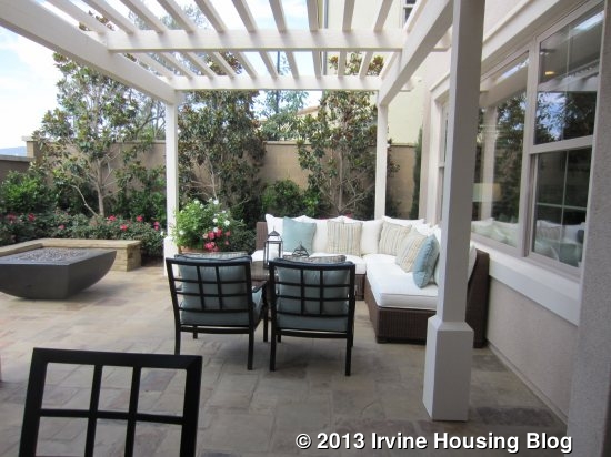
The backyard in all models features a California room that makes a nice outdoor entertaining space. The yard also has an open space that is fairly small, but big enough for a garden, a play area, or a BBQ and seating.
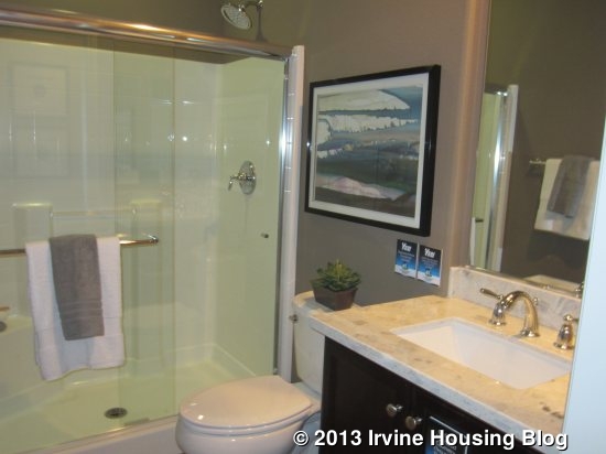
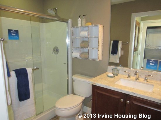
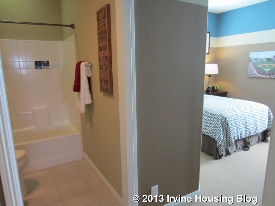
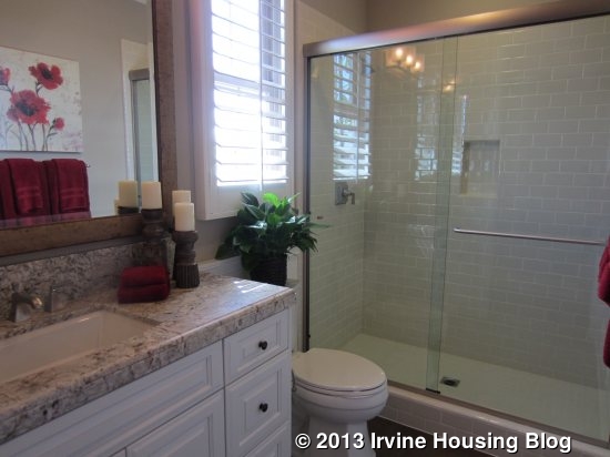
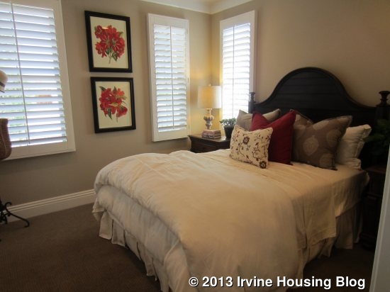
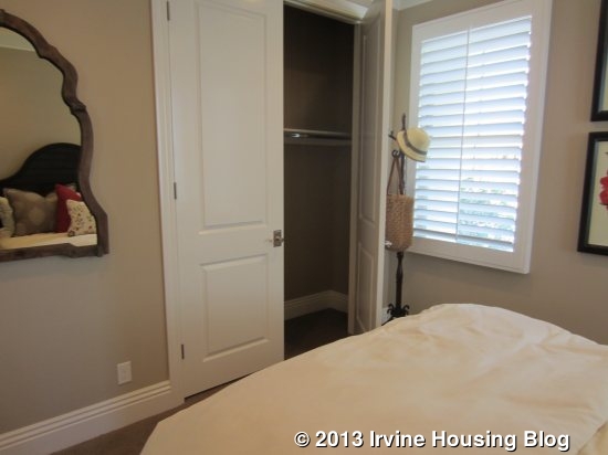
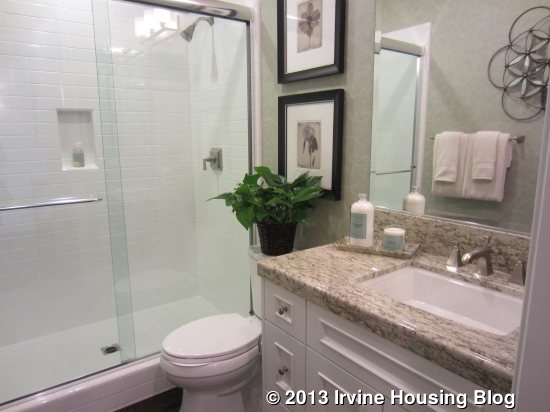
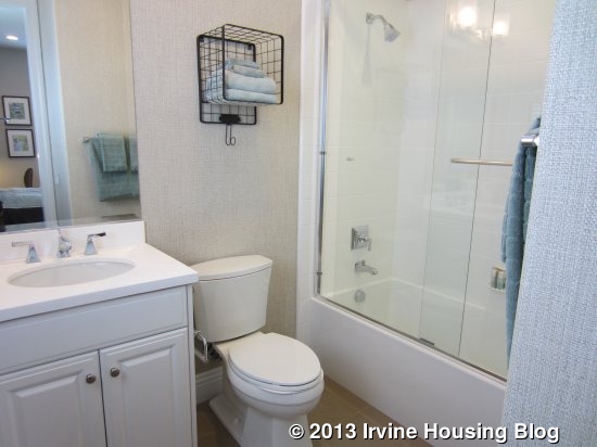
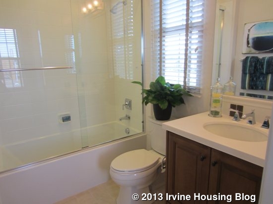
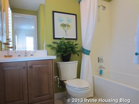
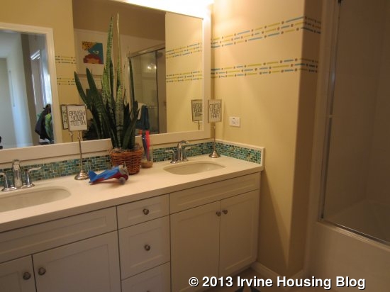
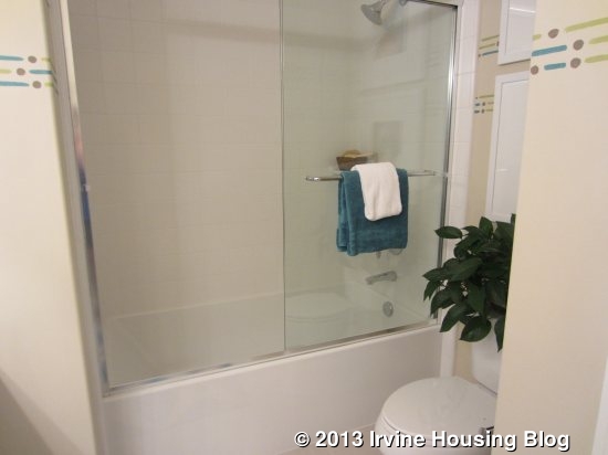
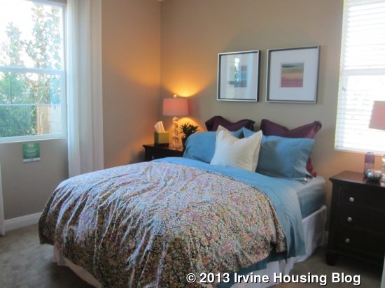
The downstairs bedroom is pretty small. It has a two-door sliding closet and windows on two sides. The adjacent bathroom has a single sink without a lot of counter space and a shower but no tub. Throughout Roundtree, all of the secondary baths had somewhat poorly designed showers. The tile (plain white squares) doesn’t go high enough, so the shower heads are actually mounted on the wall. They also have fairly low enclosures. It makes the bathrooms look cheap and unfinished.
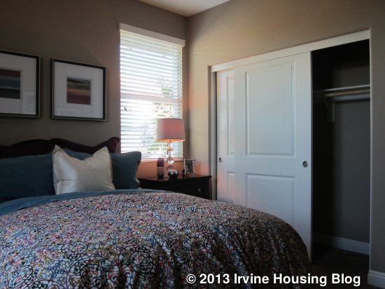
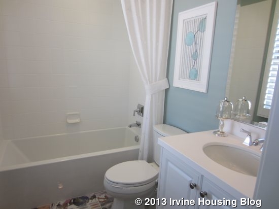
Upstairs, there are three bedrooms and a laundry room. The two secondary bedrooms share a bathroom that, like downstairs, has a small sink area. This one has a shower/tub combo, but still has the wall-mounted shower head.

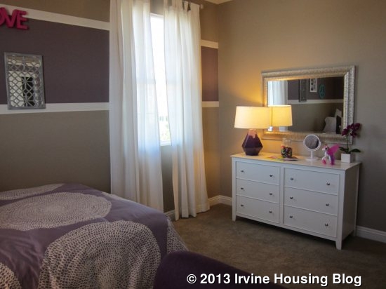
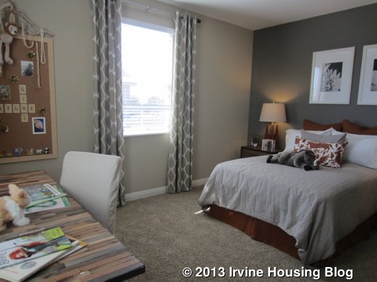
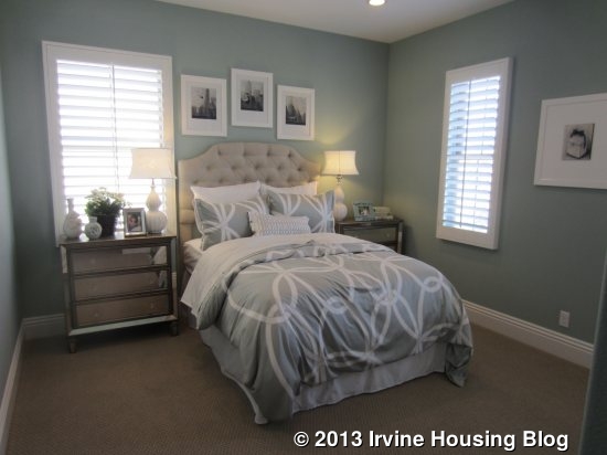
The bedrooms are set at opposite corners of the house. Both have two-door sliding closets and windows on two walls. The bedroom at the front of the house is noticeably larger than the one at the back.
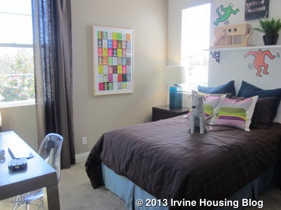
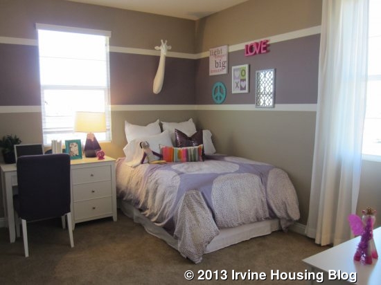
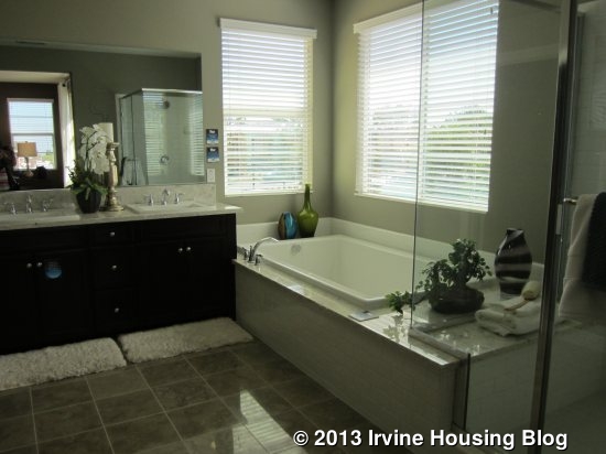
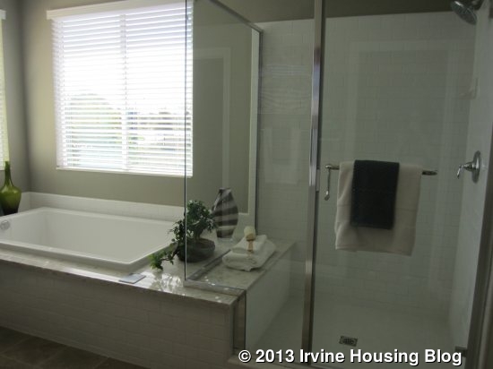
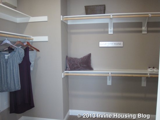
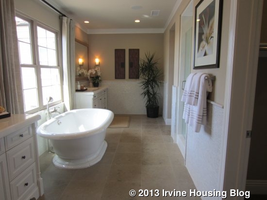
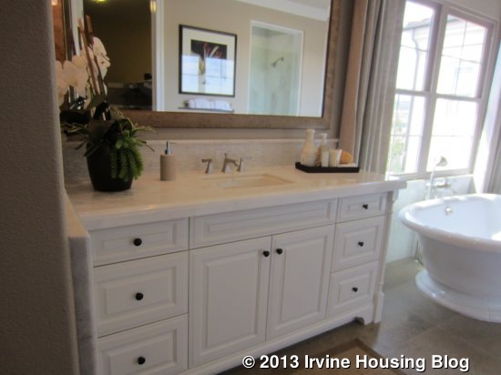
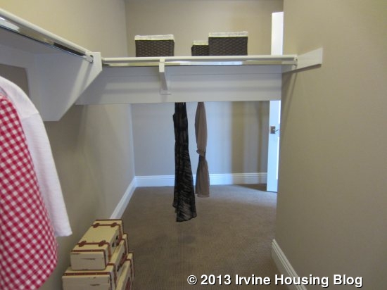
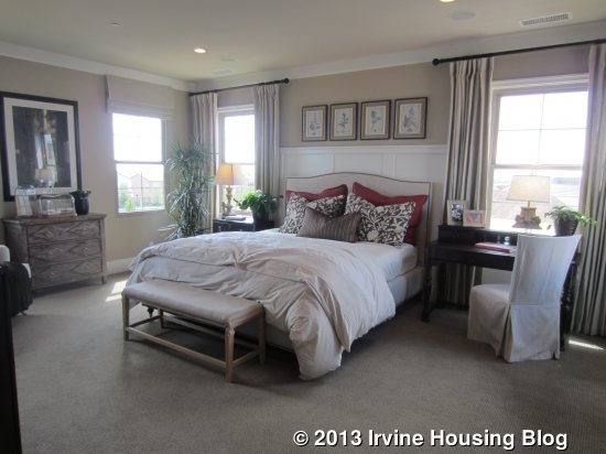
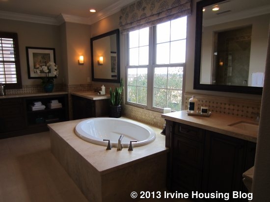
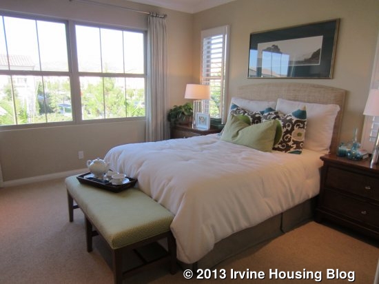
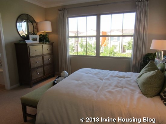
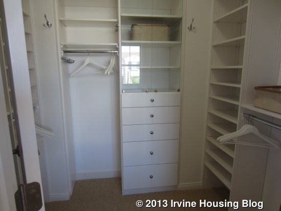
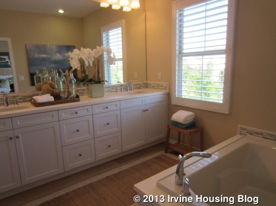
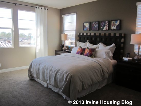
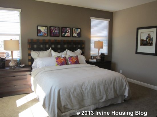
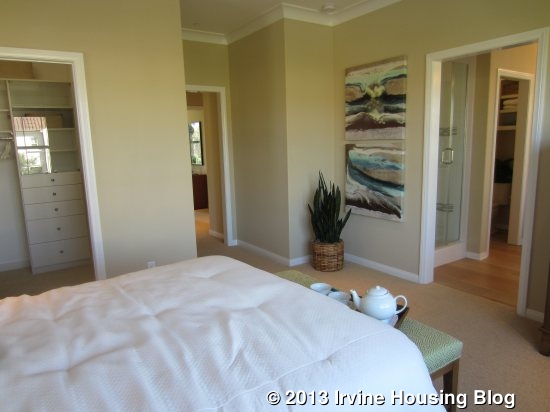
The master bedroom is also at the back of the house and actually shares a wall with the other bedroom (the masters have more separation in the other three models). It is an average-sized, square room with two windows each on two sides. An open doorway leads to the master bath. The shower is immediately on the right. Fortunately, in the master, the tile goes high enough to accommodate the shower head; the enclosure is also higher. The seat in the shower is engineered stone and is actually the same slab as the one that surrounds the adjacent bathtub. There are two sinks, but only a small amount of counter space between them. One big walk-in closet sits across from the tub.
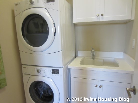
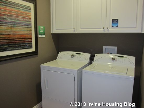
The laundry room has space for side-by-side machines with three cabinets above. There isn’t a counter or sink. The upstairs also has a linen closet and a space for a table or small desk.
This house lacks a coat closet downstairs, which I think is a major design flaw. There is only a small space in the entry to put a bench, shoe rack or coat hooks. I also don’t like that the garage access is in the kitchen/dining room without any hallway or drop zone to give it some separation. Plan 1 is the smallest of the Roundtree residences and, though a couple of the bedrooms felt small, the living area felt spacious.

Residence Two

2,160 Sq Ft

4 Bedrooms, 3 Bathrooms, Dining Room, Loft

Base Price from $799,990
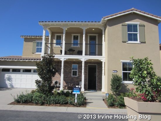
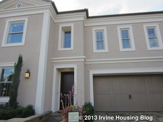
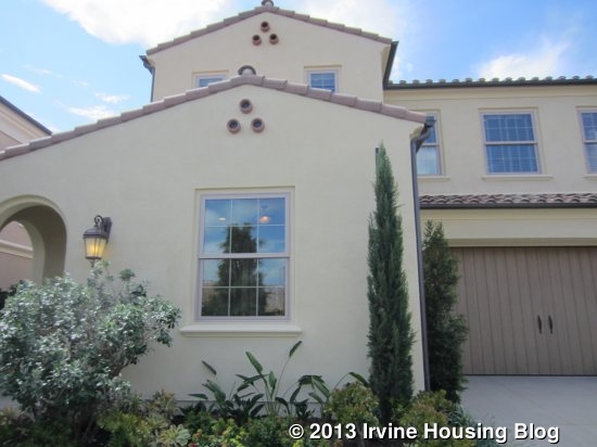
Residence Two has my favorite exterior, with a big porch at street level and covered deck above. The house has more depth and style than the others, which are all pretty flat across the front.

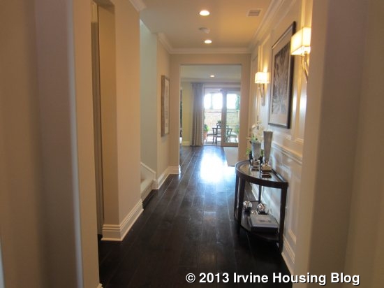
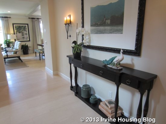
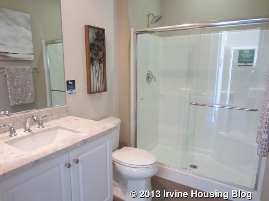
The entry has upgraded flooring and a large coat closet with storage under the stairs. As in the first house, the stairs are immediately to the left of the front door. The downstairs bath is also just off the entry. This one has a linen cupboard outside the bathroom itself. The bathroom is just like in plan one, with a single sink, little counter space, and an awkward shower.
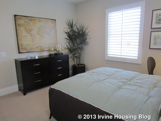
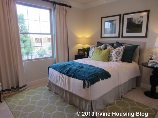
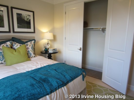
The downstairs bedroom is at the front of the house, overlooking the street. It is on the smaller side and has a two-door sliding closet.
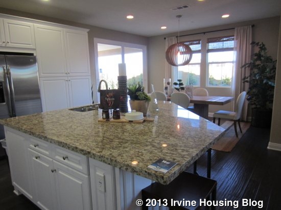
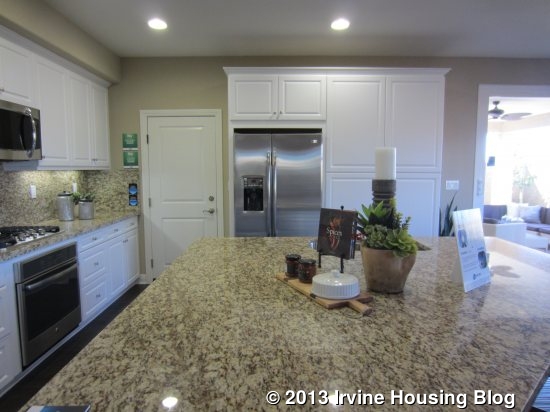
The kitchen is just beyond the entry and, again, to the left side. It has a pentagonal island with seating on three sides. The sink and dishwasher are also located in the island. Only one wall of the kitchen has counter space, which is long and split in the center by the oven and cooktop. Another wall has the fridge and two pantry-height cabinets. The door to the garage is right next to the refrigerator.
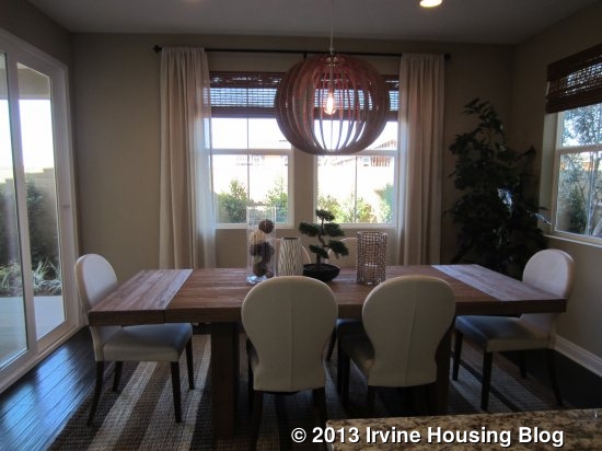
The dining room is just behind the kitchen. It has windows on two sides and a sliding door on the third.
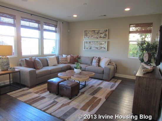
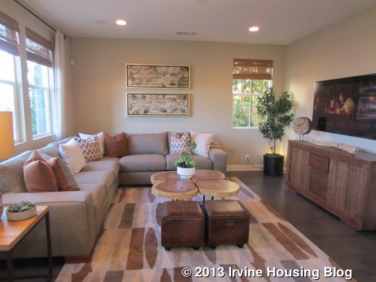
The family room is to the right of the kitchen. It has three windows facing the backyard and another window looking out to the side. It is a nice size and totally open to the kitchen.
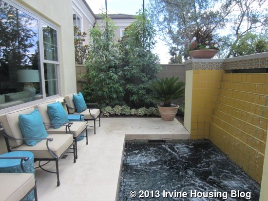
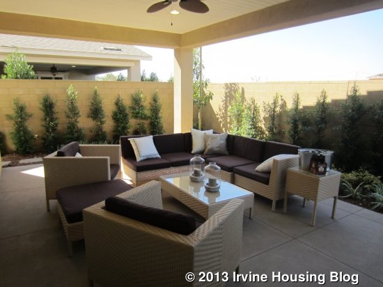
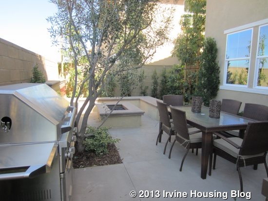
The California room is just off the dining room. It is more separated from the rest of the yard than in residence one, so it isn’t quite as nice for entertaining or for simply sitting and watching while others are in the yard. The other half is comparable in size to plan one and shows a fountain and fire pit.
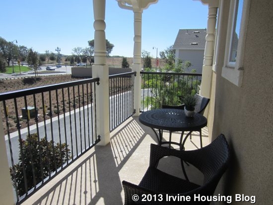
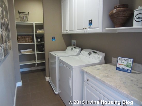
Upstairs, there is a small loft area at the top of the stairs with access to the covered deck. It makes for a nice sitting area. The laundry room is off the loft. This one has a small counter area and a big linen closet, making it much nicer and more functional than the one in plan one. I don’t know if it’s an option, but there is space to put in a sink instead of the counter.
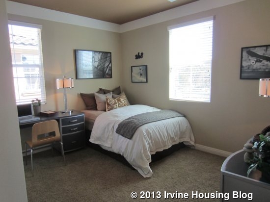
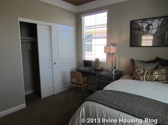
The two secondary bedrooms are at opposite corners, both with windows to the front and sides of the house. The one on the right is a bit smaller (comparable to the bigger one in plan one) and the one on the left is even bigger. As in the other home, they have two-door sliding closets.
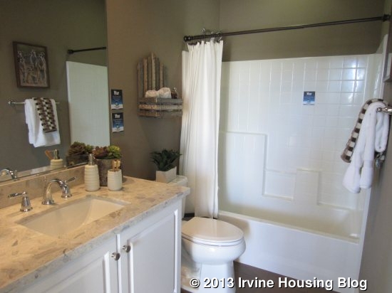
The shared bathroom upstairs has a single sink and a shower/tub combo. The counter area seems slightly bigger than in plan one, but the shower still doesn’t have full-height tile.
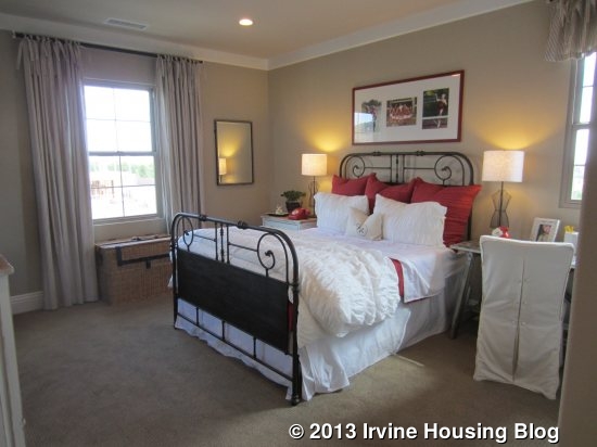
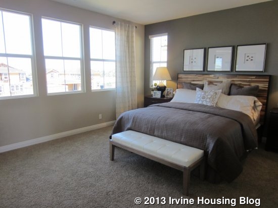
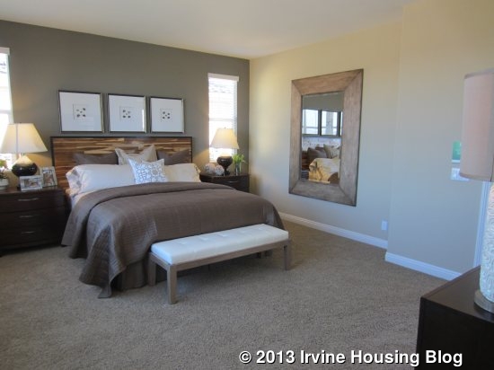
The master bedroom is at the back of the house, adjacent to the laundry room. It has a full wall of windows looking out to the backyard and two more facing the side.
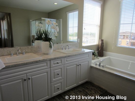
The master bath is almost identical to the one in plan one. The biggest differences are a slightly larger vanity and a smaller closet.
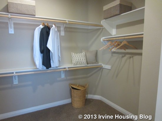
I like the layout of this house more than the first one. The bedrooms are bigger and more separated, and the loft and deck areas are great additions. I didn’t like the backyard as much, since the separation makes the California room feel isolated.

Residence Three

2,372 Sq Ft

Main Home: 3 Bedrooms, 3.5 Bathrooms

Private Suite: 1 Bedroom, 1 Bathroom, Private Living Area, Kitchenette, Optional Laundry

Base Price from $849,490
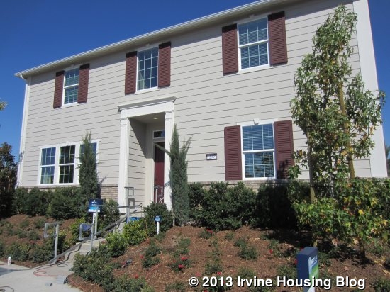
Residence Three is the most different of the tract, featuring a private suite and an additional full bathroom upstairs.

Entry to the private suite is on the side of the house, next to the garage. Like Residence One, this house must always be located on a corner, as the main entrance is on a different side of the house and directly accessed from the street. This will help avoid any confusion from people trying to enter at the private suite.
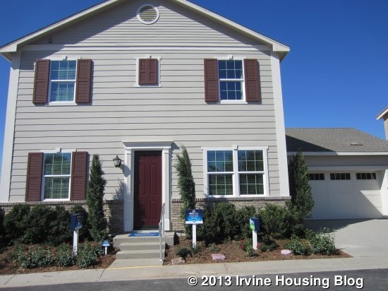
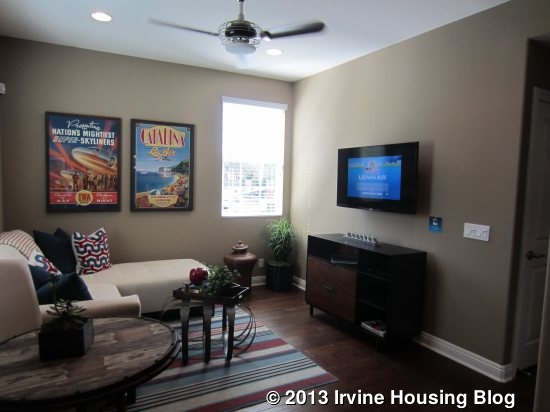
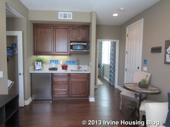
The suite has a bedroom on the right and a full living room, including a kitchenette, on the left. The bedroom is similar in size to those in the other models, but this one has a private, en suite bathroom (shower, no tub). There is also a small, optional space for a stackable washer and dryer. The living area is a nice size. It isn’t as big as the family room in the main house, but can comfortably fit a sofa, coffee table, etc. A kitchenette to one side includes a mini fridge, sink, microwave and a few cabinets and drawers. It even has a coat closet with extended storage under the stairs. If you have frequent long-term visitors, have extended family living with you, or want to rent out a portion of your home, this is a perfect way to offer privacy and comfort.
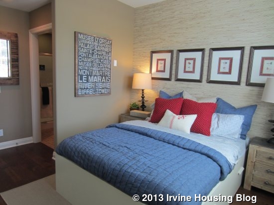
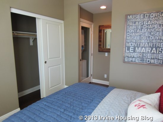
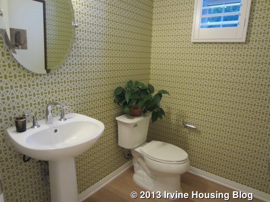
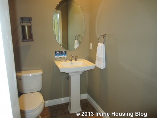
Whether you enter the main house from the front door or through the private suite, you end up in the same entry hall. It has a coat closet and a powder room with a pedestal sink. The stairs are located here as well.
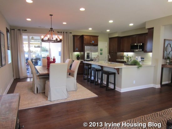
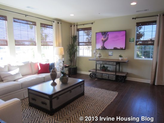
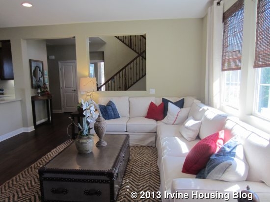
The main living area is on the opposite side of the entry. A big family room faces the front of the house, with additional windows on the side. It lets in a lot of light. Though the builders market the home as having a dining room, it really feels like more of a great room to me. The space for the dining table flows directly from the family room without any true separation. As in most homes, the space can lend itself to either a casual or formal table. Sliding doors from the dining room lead out to the California room.
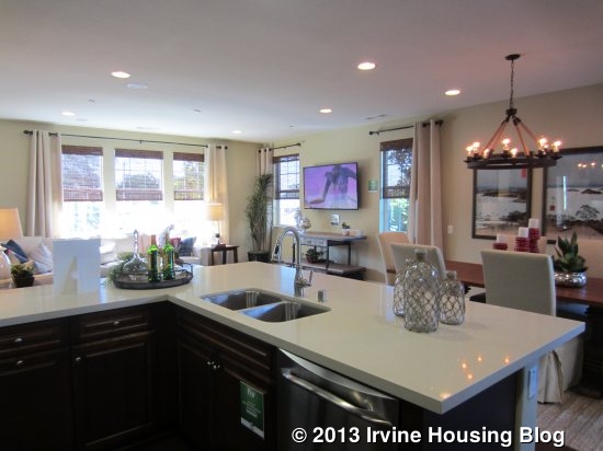
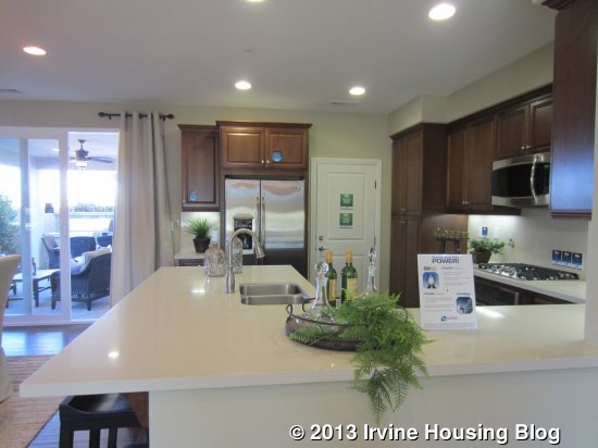
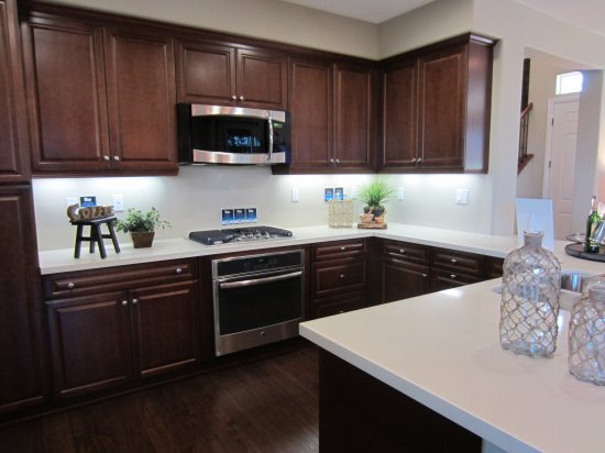
The kitchen in this home is also quite different from the others. It lacks an island and, instead, is a U-shape with a peninsula. It creates more separation between the dining and family rooms, but is still open to both. The sink is in the outer portion of the U with the stove across from it; the fridge is on the back wall. As in the others, the garage access is right next to the fridge. The peninsula also has bar seating.
Upstairs, there are three bedrooms and three full baths, as well as a laundry room. Like residence two, this laundry room has a small counter space and a linen closet at the back.

The two secondary bedrooms are both to the right as you come upstairs. The bedroom at the back of the house is slightly larger and has a walk-in closet. This room also has an en suite bathroom with a single sink and a shower/tub combo. The other bedroom is at the front of the house (with an additional window on the side) and has just a standard, two-door sliding closet. The bathroom is also en suite, but is more accessible from the main hallway. It shows optional cabinetry and has a shower/tub combo.
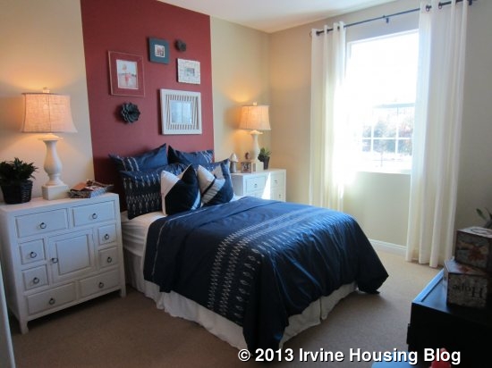
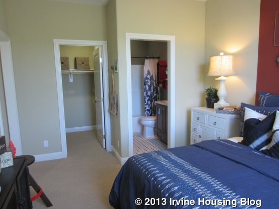
The master bedroom is alone on the left side of the house, facing the back and side. It is similar in size and layout to those in the other homes.
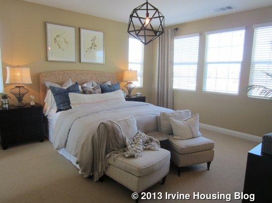
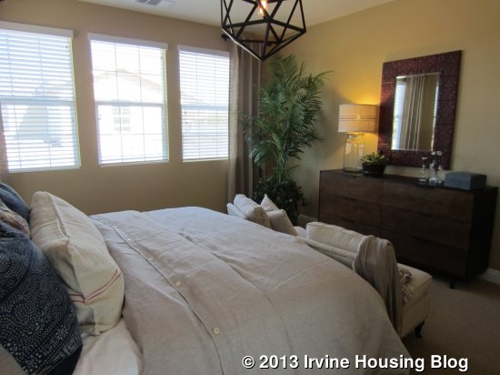
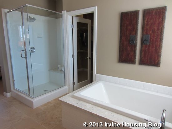
The master bath does have some differences. This is the only model where the shower and tub are not connected; rather, they are located on either side of the walk-in closet. The vanity area is the same.
I think the private suite will be very appealing to certain buyers, but may feel excessive to those who don’t have a true need for it. I do like the way it is laid out. My biggest complaint in this home is the kitchen, as I do prefer a more open kitchen with an island rather than one with a peninsula.

Residence Four

2,472 Sq Ft

4 Bedrooms, 3 Bathrooms, Office

Base Price from $860,990
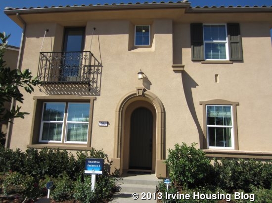
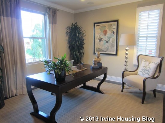
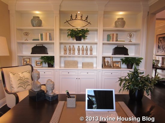
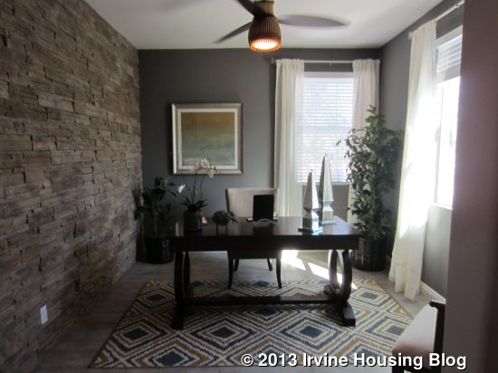
Residence Four is the biggest of the bunch and the only one to have a separate office downstairs. The office is just off the entry, facing the street. It is a good size for an office or would work well as a small sitting room.
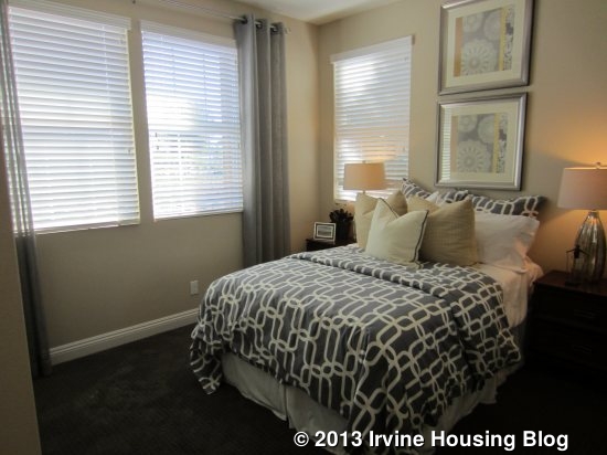
A small bedroom sits at the other side of the entry. Like the others, it has a standard, two-door closet. There isn’t a lot of space for anything other than a bed and nightstands.
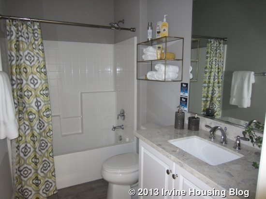
A full bath is adjacent to the bedroom. This is the only downstairs bath throughout Roundtree that has a bathtub. There is a coat closet with storage under the stairs next to the bathroom.
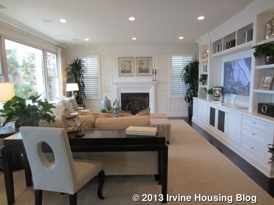
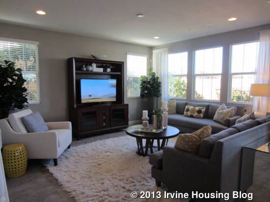
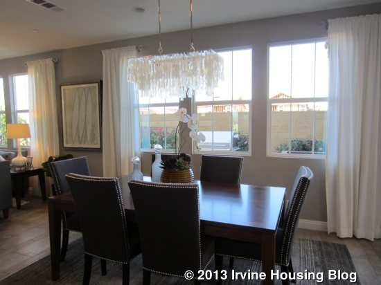
The family room is at the back of the house, just beyond the stairs. It is similar to all the others, with three windows facing the back and two more on the side. As in residence three, the home is marketed with a separate dining room, but it really just flows cleanly from family room to kitchen, creating a great room effect.
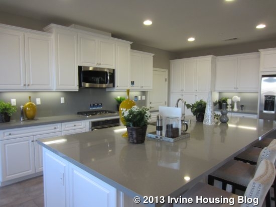
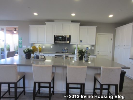
This kitchen has an island that is longer and narrower than any of the others, and has bar seating on one side. The sink and dishwasher are in the island, with the cooktop and oven directly behind it. The fridge is off to the far side. This kitchen feels bigger than any of the other Roundtree homes. It has three pantry-height cupboards and an extra counter area by the fridge. The garage access is right next to the pantry.
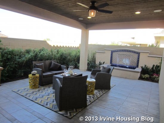
The California room is right off the dining room. This one takes up almost the entire backyard. The only other space is really more of a side yard, though it is wide enough for a grill and a small patio or garden.
Upstairs, there are three bedrooms, two baths and the laundry room. The laundry room has two sets of linen cupboards just outside it and a small counter inside.

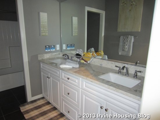
The secondary bathroom is the only one in Roundtree with two sinks and a separation between the vanity and shower area. It has a shower/tub combo with the low tile seen throughout the tract.
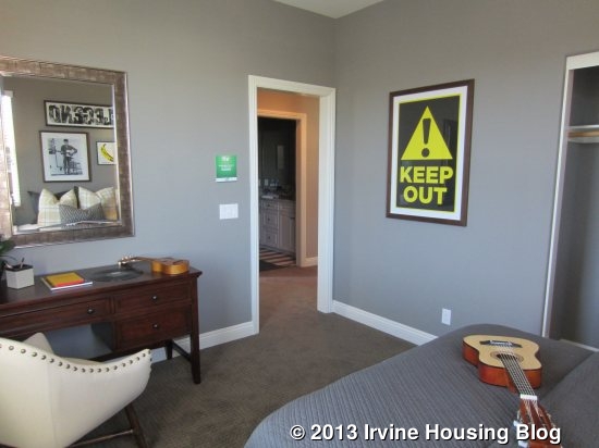
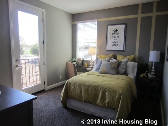
Both secondary bedrooms are at the front of the house, with windows looking to the street and sides. One has a standard, two-door closet. The other has a walk-in closet and a tiny balcony that is really too small to use.
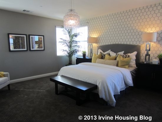
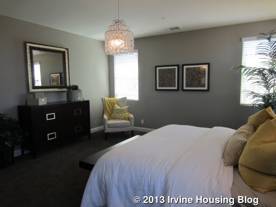
The master bedroom in residence four is bigger than in the other three homes. It is at the back of the house with a nice separation from all other rooms.
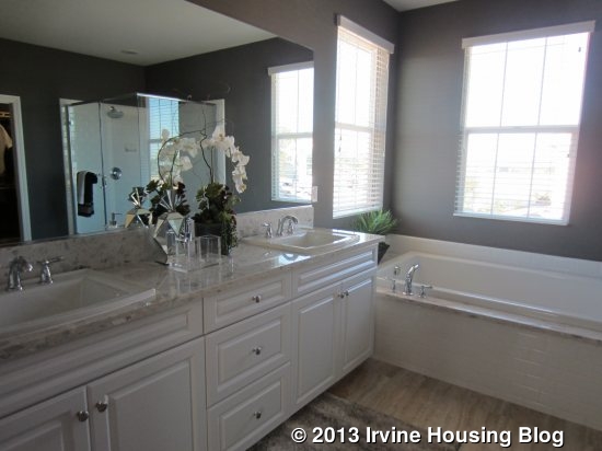
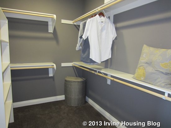
The master bath has the same shower-tub setup as residences one and two. This setup feels brighter to me than the one in residence three and I like it more. The vanity here is also a little bit longer, with more space between the sinks. The walk-in closet is comparable to the others.
At 400 more square feet than residence one, this plan feels bigger and more spacious. The kitchen is bigger and it has the extra office downstairs. I also like the larger master bed and bath.

Overall, these homes are all pretty similar to each other. With the exception of plan three’s private suite, there isn’t really anything special about any of them. The differences in floor plans are minor. They all have similar backyards, with a California room taking up most of the space. A negative for many buyers is that all models have only a two-car garage. I also think the design of all secondary baths is poor, as they need more counter space and better designed showers.

Over the next couple of months, we hope to review all 10 of the Pavilion Park neighborhoods. I am excited to see how they compare to Roundtree, especially the ones most similar in size and price.

Discuss on Talk Irvine: http://www.talkirvine.com/index.php/topic,10952.0.html
A Review of the Arcadia Tract at Stonegate: Residence Three

For an overview of the Arcadia Tract and a review of Residence One, click here. For a review of Residence Two, click here.

Residence Three

3,202 Sq Ft

4 Bedrooms, 4 Baths, Bonus Room, Optional Wine Room or Prep Kitchen at Home Management Center

Base Price from $1,262,900

The layout of Residence Three varies a bit more than the other two, but the gist of the house is the same. Like in Residence Two, this one has a more open view from the entry and the stairs are a bit closer to the front than in the other homes. The downstairs bath is actually tucked behind the stairs, rather than coming before them. A hallway leading to the bath has a nice linen cabinet (shown with upgraded glass doors). The bath has a single sink and a shower, no tub. The cabinets, counters, and tiles are all shown without upgrades. The downstairs bedroom has three windows (two front, one side) and the same French door closet as most of the others.

Heading toward the back of the house, I passed a closet with a huge space under the stairs (like Residence One) and the garage without extra storage (same as Residence Two).

As in Residence Two, the great room is on the right, the kitchen is on the left and the dining room is behind the kitchen. The loggia extends behind the great room, as it does in Residence One. The great room is shown with the upgraded 15’ accordion door to the loggia, basically leaving one entire wall open to the outside. The fireplace has an upgraded surround and built-in cabinets on either side.

The kitchen, again, is very similar to the other two in terms of layout. This one has many upgrades, including a Wolf appliance package and 48” range, giving you four separate ovens (plus the microwave). It also has upgraded Caesarstone countertop, tile backsplash and edge detail, upgraded cabinet finish and doors, Kohler single bowl stainless steel sink, and more. The island also looks a little wider than in the other houses.

The dining room has access to the backyard and the loggia and is pretty much the same as in Residence Two. The only key difference is a lack of windows on the side wall. This is because Residence Three has an added room on that side. The standard feature is a home management center that comes with built-in cabinets and desk. The option shown in the model is a Prep Kitchen and small wine fridge. The prep kitchen has a full size fridge, range, dishwasher, sink and several cabinets, all upgraded from the standard prep kitchen. Additional options for this space are a combination home management center with a wine room at the back. One option has the wine room accessible only from the home management center; the other option has it only accessible from the dining room.

The backyard is more similar to Residence One, with a very narrow area on one side and a small space behind the loggia on the other. This one has a huge outdoor fireplace and a built-in barbecue.

Upstairs, the layout is a bit different, though the rooms are the same. The bonus room is actually to the side of the stairs, rather than in front of them, so it has a more open loft feel. The room is large and square, as opposed to long and rectangular. I like how open this one is and it’s definitely my favorite of the three bonus rooms.

The master suite is at the back of the house, but is laid out differently. When you enter the suite, the bathroom and closets are immediately to your right, rather than being at the back and accessed only through the bedroom. The his and hers closets are more equal in size and, again, have separate doors but are connected inside. In the bathroom, the countertop and backsplash are upgraded, as are the shower walls, floor and ceiling. This one has an upgraded freestanding bathtub as well, which I personally don’t like as much as the standard soaking tub.

Because the bathroom is separate, the master bedroom actually only shares one wall with the rest of the house. This gives it windows on three walls (five total windows) and brings in a lot of light. The room is really big and basically has four full walls, so there are many choices in how to arrange the furniture.

The laundry room is across from the top of the stairs and is just like the other two. It also has additional linen cabinets just outside it. Beyond that is the entrance to one of the bedrooms, which is just like all the others. Two windows face front, one to the side, and an attached bath. The counter is actually a little bit larger than those in the first two homes. The other bedroom has windows on three sides and the bath has the same small counter as found in the other homes.

This home is distinguished by the home management center/wine room/prep kitchen, the open bonus room, and the different layout of the master suite.

Overall, the homes in Arcadia are beautiful, well laid out, and functional, but they lack originality. Highlights are a downstairs bedroom in each model, a private bath for all bedrooms upstairs, and a bonus room in every home. The covered loggia is a great feature if you like to entertain or would regularly use the indoor/outdoor living feature and leave the accordion door open. However, the downside is that the backyards on these lots are tiny and the loggias take up most of the space. Another negative is that all homes only have two-car garages.

If you’re in the market for a luxury home and you like the Stonegate community, these houses will be a fine choice. They aren’t exciting or different than other homes at the same price point, but they are all really nice. There wasn’t much I disliked at all, aside from the lot size and garage. These are by far the biggest homes in all of Stonegate. Are they nice enough to draw you to the community, or would you opt for something at a similar price point in a neighboring community?

Discuss on Talk Irvine: http://www.talkirvine.com/index.php/topic,4221.0.html

A Review of the Arcadia Tract at Stonegate: Residence Two

For an overview of the Arcadia Tract at Stonegate and a review of Residence One, click here

Residence Two

3,143 Sq Ft

4 Bedrooms, 4 Baths, Bonus Room, Optional Office at Bedroom 4

Base Price from $1,206,900

There are very few differences between this home and Residence One. When you enter, you do see all the way down the hall, rather than looking right at a wall. The downstairs bedroom is immediately to the left of the front door and has the option to be an office instead. The only key difference would be the lack of a closet (French doors, no walk-in). The model shows an office with an upgraded, built-in bookshelf across one wall. The downstairs full bath (no tub) is adjacent to the room in both options. The model has upgraded cabinets and counters but kept the original shower tile and hardware. A small coat closet is also located off the little hallway.

As you walk toward the back of the house, you pass the stairs on your left and garage access on your right. This garage doesn’t have an extra storage area. The kitchen and great room are at the back of the house. They are nearly identical to Residence One except that the kitchen is on the left and the great room on the right. The great room has an upgraded fireplace surround and built-in media with additional flat screen outlets. The center row of recessed lighting is also an upgrade.

The kitchen is very similar to the other model as well. This home shows an upgraded Wolf appliance package, countertop, backsplash and edge, along with upgraded cabinet finish and door styles. The highlight of the kitchen is the walk-in pantry, which extends (with a low ceiling) all the way under the stairs. There isn’t a butler’s pantry.

This home has a formal dining room behind the kitchen. It has a door to the backyard on one wall, a slider to the loggia on another, and two windows on the third, so it gets a lot of light. The room is wide enough for a large table and has space for a buffet or china cabinet.

This home has a smaller loggia, so the backyard is a bit bigger, but is still quite small. A patio behind the dining room makes a nice spot for a grill. There is room for a large seating area next to the loggia.

Upstairs is also basically the same: bonus room immediately in front of you, master suite to the left at the back of the home, and two secondary bedrooms at the front. A built-in linen cabinet midway up the stairs is a standard feature of the house. The laundry room again has side by side machines, a deep sink, and several cabinets. The bonus room is shown with an upgraded built-in desk and media center and recessed lighting.

The master suite is a bit larger than in the first house, but is otherwise similar. It has a huge window on one wall and a small one on another. The wall paneling, ceiling treatment and recessed lighting are all upgrades. The his and hers walk-in closets are connected, but have separate doors and some division between them. The bathroom, like in Residence One, has dual sinks divided by the soaking tub and a separate shower. The model shows upgraded cabinets, counters and backsplash, and a jetted tub.

The two secondary bedrooms are basically the same. One has an entry hallway with a two-door sliding closet. The room has two windows facing the street and a third facing the side. The private bath is exactly like those from Residence One – sink with small counter and a shower/tub combo. The bathroom is shown without any upgrades. The other room is identical to Bedroom 2 from the first house, except there is a large window facing the street instead of two small ones. The bathroom is identical as well.

Highlights of this home are the huge pantry in the kitchen, the added dining room, the bigger yard, and the bigger master suite (including larger closets).

Discuss on Talk Irvine: http://www.talkirvine.com/index.php/topic,4212.0.html
A Review of the Arcadia Tract at Stonegate: Residence One

Last week, I reviewed Stonegate’s new Cambria tract, featuring three different models of townhomes. This week, I visited the new Arcadia tract in Stonegate, a neighborhood of luxury homes. Built by TRI Pointe Homes, each model includes four bedrooms (all with one downstairs), four bathrooms, a bonus room and a two-car garage. Arcadia is at the north end of the community and will be most easily accessed from Portola and Jeffrey, once the roads all go through. While the website lists all homes as temporarily sold out, approximately eight new residences will be available this Saturday, August 10.

A few of the standard amenities in each home are a gas fireplace in the great room; marble countertops in all bathrooms; ceramic tile in entry, kitchen, and all baths; crown molding in some rooms; choice of Thermofoil or maple stain in master bath; his and her dual vanities; Kohler oval soaking tub and separate shower; choice of Thermofoil or maple stain in kitchen; under-cabinet lighting; granite countertops with 6” splash and full splash at cooktop and a KitchenAid Architect ® Series II stainless steel appliance package that includes a 48” cooktop with griddle, 48” hood, 30” double convection oven, microwave, 4-cycle dishwasher, and a 42” refrigerator opening pre-plumbed for water and ice. Prices range from approximately $1,181,900 for Residence One (2,909 square feet) to $1,293,900 for Residence Three (3,202 square feet).

A planned park adjacent to the community will include a Jr. Olympic Pool with Spa and Wading Pool, Tot Lot, Shade Structures and Barbecues with Picnic Tables. The community is a short walk to Stonegate Elementary School and the community park (large playground, barbecues and shaded picnic tables, tennis, sand volleyball, and basketball courts; baseball and soccer fields).

Basic Neighborhood Financial Information

Estimated Property Taxes: approximately 1.45%

Homeowners Dues: approximately $120 per month

Sales Brochure

Residence One

2,909 Sq Ft

4 Bedrooms, 4 Bathrooms, Bonus Room, Storage Area in Garage

Base Price from $1,181,900

I like the exterior a lot on this model, as the front has a longer walkway and a small porch. However, inside the home, the first thing you see is a wall, rather than an open view of the interior. To the right is the downstairs bed and bath; the rest of the home is to the left.

The downstairs bedroom could have a private entrance off the front portico, but isn’t modeled with one. It has a big window facing the street and plenty of space. The closet has paneled, French-style doors, but isn’t a walk-in. The crown molding and recessed lighting are upgrades.

The adjacent (not attached) bathroom has a single sink and a shower (no tub). The model shows upgraded counters, backsplash, shower walls and floor, brushed nickel shower enclosure, glazed cabinets and knob.

Moving toward the back of the house, you’ll pass the stairs and then the coat closet. The closet is huge, extending all the way under and around the back side of the stairs. The hall then opens up to the great room and kitchen that span the back of the house.

The great room is to the left. Huge windows cover most of the back wall and there are two smaller windows on the side wall. A 42” gas fireplace comes standard with the house and includes a log set and remote control with painted “manly” precast concrete fireplace surround. The model shows an upgrade to a “stone world finish, Milano color” and added built-in bookcases on both sides. The crown molding and recessed lighting are standard; the ceiling beams are upgrades. A multi-media outlet comes standard on the side wall, as does a flat screen outlet over the fireplace, giving you flexibility in how to set up the room.

There is space for a large dining table between the great room and the kitchen. Unlike the other two models, this home lacks a formal dining room. The kitchen cabinets and counter extend through the dining area. The model shows the optional 15’ glass accordion door leading out to the loggia to create an indoor/outdoor living experience. The loggia has an optional fireplace and is shown with an upgraded flat-screen TV outlet. The loggia dominates the yard and leaves room for little else. There is a built in BBQ directly behind it and a narrow patio area – including a fountain in the model – off to the other side. The space is attractive, but very small.

The kitchen reminds me of pretty much every new house I have seen lately. A large center island dominates the room and offers seating for four. The sink and dishwasher are also in the island. The model shows the standard appliance package and adds a built-in refrigerator, warming drawer and upgraded counters, backsplash, and cabinet finish. In addition to the ample space in the kitchen, there is a butler’s pantry (shown with upgraded wine fridge and cabinet finish/door styles) and a walk-in pantry between the kitchen and the garage.

While all the homes in Arcadia have a two-car garage, Residence One is the only model to have a small extra storage area in one corner.

Upstairs, the house has a bonus room and three additional bedrooms. The top of the stairs has a hallway area, with rooms leading off in three directions. Straight ahead and open to the hall is the bonus room, with a big window looking out to the side and a full wall of upgraded, built-in bookcase cabinetry.

To the left of the stairs are the laundry room and master suite. The laundry room has side by side machines, a deep sink, and many cabinets for linen storage. Aside from the doorknob and the actual washer and dryer, the room is shown without any upgrades.

The master suite has a small entryway to separate it a bit from the hallway. It opens to a good-sized room with a full wall of windows facing the backyard and two smaller ones on the side wall. Linen cabinets plus separate his and hers closets offer plenty of space. The master bath is past the closet and has separate sinks with a large soaking tub between them. The separate shower is large and includes a seat. The bathroom’s many upgrades include cabinet finish, countertops, backsplash, shower walls and floor, tub deck and apron, extended shower wall height to ceiling and shower enclosure. The model also includes the optional vanity/cabinet at the far end of the bathroom.

The other two bedrooms upstairs are at the front of the house. One bedroom (listed as Bedroom 3) has more style than any of the other secondary bedrooms across all models. It also seems a little larger, but that might just be due to the setup (I don’t have numbers for actual square footage). It has two windows facing the street and is shown with a full wall of built-in desk and cabinets beneath them. An open doorway leads back to the closet and bathroom. This closet has sliding doors, whereas most of the other secondary bedrooms have French-style doors. The en-suite bathroom has a single sink with very little counter space and a shower/tub combo.

The other bedroom is pretty standard and is similar to most of the other secondary bedrooms. It has two small, high windows overlooking the street and another, slightly larger window facing the side. Like the room downstairs, the closet has French-style doors but isn’t a walk-in. The attached bathroom is laid out just like in the other bedroom.

Residence One is a beautiful home with large rooms and a very functional layout. It’s very similar to other new Irvine homes in this price range and didn’t have anything to really make it stand out from the rest. I used to walk into new homes and be “wowed” by the gourmet kitchens and fancy bathrooms, but now they all kind of blend together and I know what to expect before I even open the door. The downstairs bedroom will appeal to many buyers, though the two-car garage may deter others.

Discuss on Talk Irvine: http://www.talkirvine.com/index.php/topic,4211.0.html
A Review of the Cambria Tract at Stonegate: Residence Three

Click here for an overview of Cambria at Stonegate, related documents, and a review of Residence One

Residence Three

1,690 Sq Ft

3 Bedrooms, 2.5 Bathrooms

Base Price: $627,20

Residence Three is always an end unit and is found on the right side of a two-, three-, or four-unit building. A 3R is on the left side of a four-unit building (which is the only difference between a three- and four-unit).

This model is also quite similar to the other two, but does vary a bit more. The entry is more open, with a little nook tucked in by the stairs. It has a big closet with low-ceilinged storage at the back. The powder room is arranged with the sink and toilet side by side, rather than opposite each other on either side of the door. It feels much bigger this way than in the other two homes.
The hall opens to the great room which, like the others, has a wall of windows at the back and a small window on one side. It is shown without any upgrades. In the standard model three, the great room is on the right and kitchen on the left, which is the opposite of the other two residences.
Again, the kitchen is almost identical. Like Residence One, the counters and cabinets extend all the way to the back wall. They upgraded to show glass doors over the counters in the dining area. It shows an upgraded Kitchenaid appliance package, including a 36” cooktop over a separate oven, rather than the standard 30” slide-in range. The dining area is the same, with walls at the back and a door to the back patio. The biggest difference in Residence Three is that it has an option for a real pantry (though the microwave would be inside it). The model shows this option and includes the barn-style door enclosure.

The only difference in the back patio is that the bigger and smaller sides are reversed.

Upstairs, this model is set up very much like Residence One. There are two secondary bedrooms without an option for a loft. Both rooms have standard closets and this model shows the optional storage above them, with cabinets in one and an open space in the other. The rooms are the exact same size, each with a window facing the street, but are mirror images of each other.

Their shared bathroom (not attached) has two sinks and a shower/tub combo with an option for just a shower.

The model shows the upgraded laundry room with sink, though the standard comes with a linen closet instead. The machines are still stacked and there are cabinets over the sink.

The master bedroom is also basically the same, with big windows at the back and two small ones on the side. In this home, the closet is off the bedroom itself, rather than at the back of the bathroom. The model shows upgraded built-ins in the closet and crown molding in the bedroom.

The master bath comes standard with a separate tub and shower. Unfortunately, this means the shower is a lot smaller than in the other two homes and there isn’t an option to change the layout. I think the shower is much too small. The sink and counter area is the same.

At almost 200 square feet bigger than Residence One, this house does feel a bit more spacious, but it doesn’t really feel that much bigger. The bigger entry, nicer powder room, and true pantry are nice changes from the other two models, though I wouldn’t like having the microwave inside the pantry. I also like that Residence Three is always an end unit.

Overall, these are basically three different versions of the same floor plan. If you like one, you’ll probably like them all. I like the general layout and it feels like a single family home on the inside even though it’s actually attached. The base prices are reasonable and many of the standard features are nice enough that upgrades aren’t necessary. The homes are most similar to Stonegate’s Santa Maria tract. Cambria has bigger patios, a garage at the front of the home, more square footage in each model, and, in my opinion, a better overall layout of the home. Santa Maria, on the other hand, has an optional downstairs bedroom in some models and is in a better location within Stonegate (closer to the school and community park, farther from any major streets).

Both Cambria and Santa Maria are now selling and have similar price points. Which neighborhood would you choose, and why?

Discuss on Talk Irvine: http://www.talkirvine.com/index.php/topic,4188.0.html