Category Archives: New Homes

A Review of the Beachwood Tract at Pavilion Park

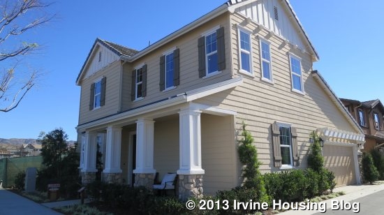
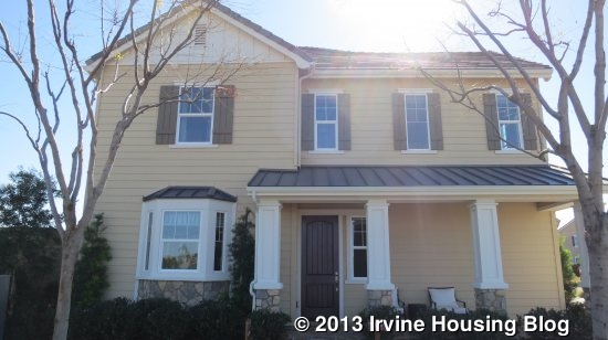
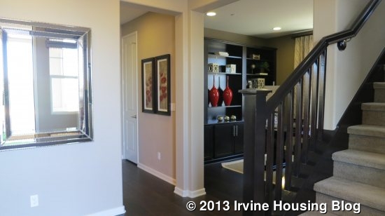
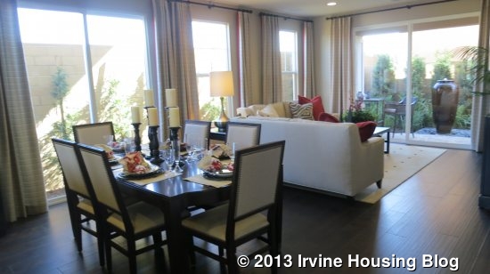
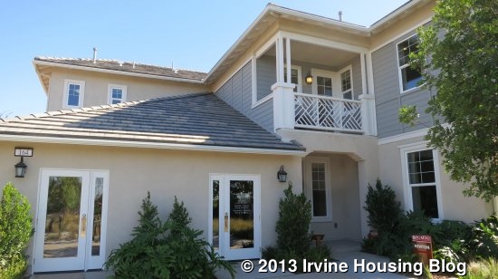
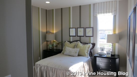
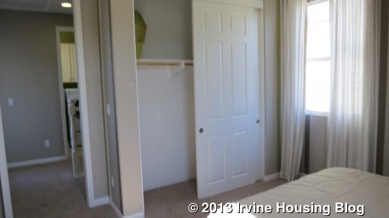
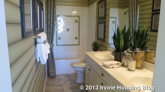
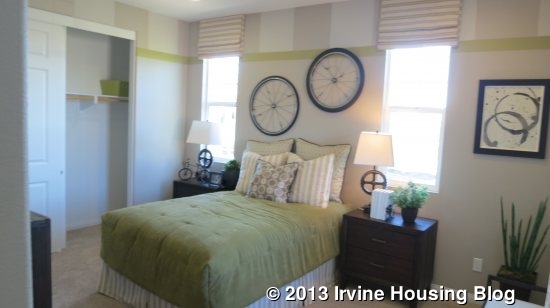
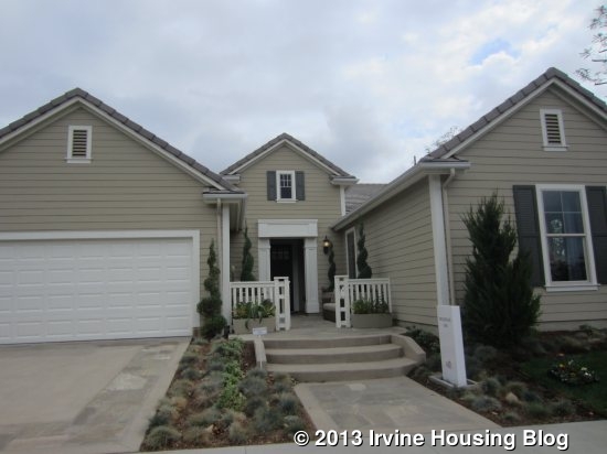
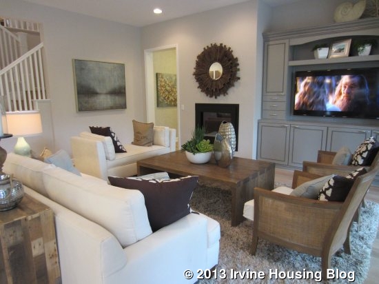
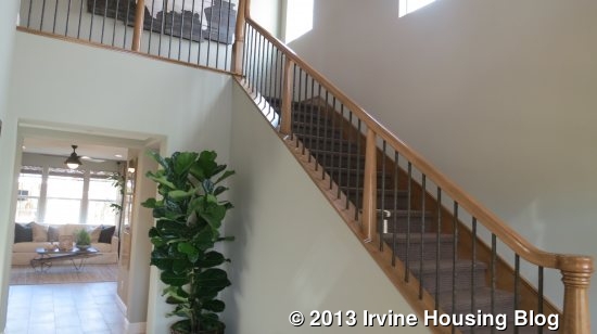
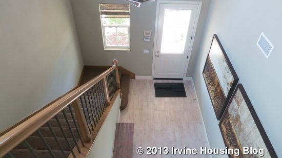
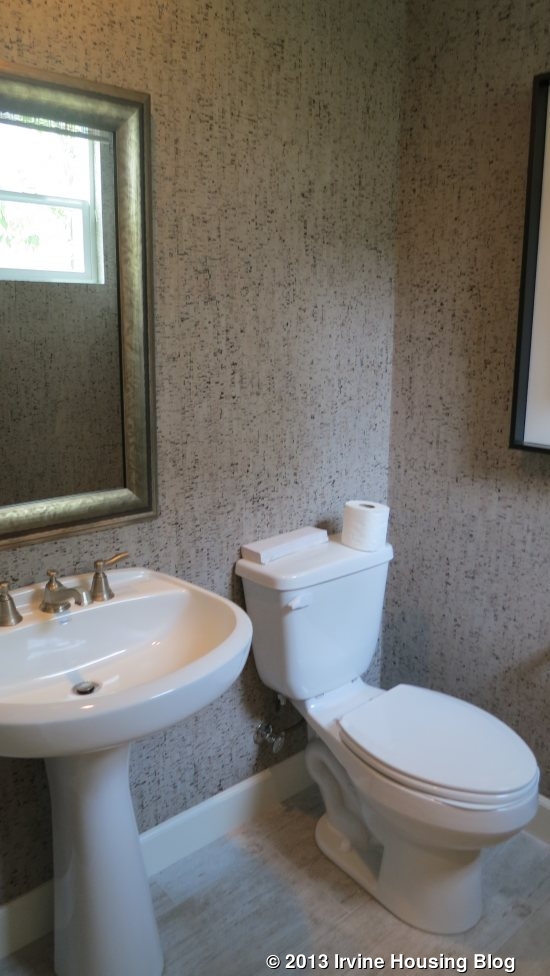
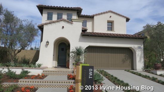
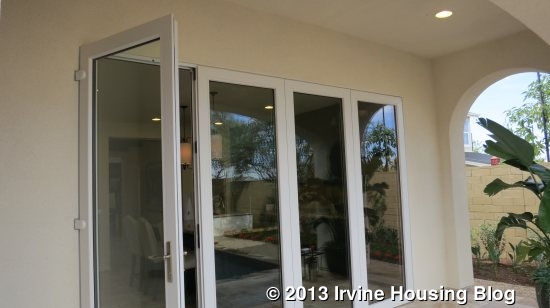
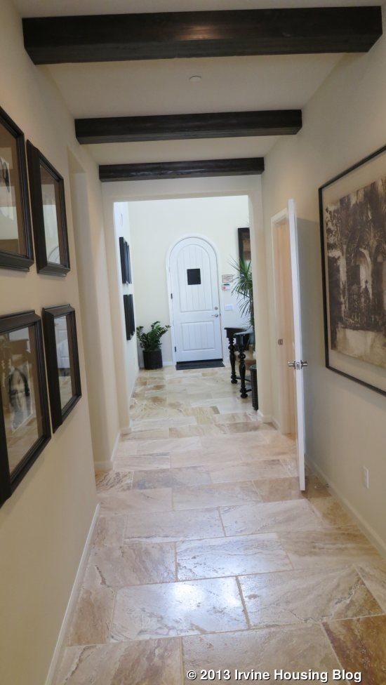
This week, I will introduce you to Beachwood, another new home collection in Pavilion Park, the first of the Great Park Neighborhoods. Like the Roundtree homes I wrote about a few weeks ago, Beachwood was built by Lennar. It is the fourth smallest of the collections and features three unique models. Beachwood is one of only two collections to feature a single story home (Hawthorn, which I also recently wrote about, is the other). It also has one model with a private residence on the first floor. All homes have a two-car garage.

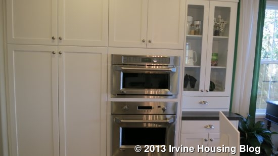
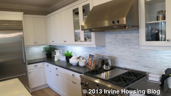
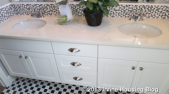
Lennar markets the home as “Everything Included” and signs throughout the houses claim “YES!” to let you know which features are standard. Smaller signs indicate upgrades. Some of the standard amenities include ceramic tile flooring at entry, kitchen, baths and laundry; Mohawk wall-to-wall carpeting in all living areas and bedrooms; polished chrome hardware, white thermafoil cabinetry, and engineered stone countertops in all bathrooms; acrylic tubs in master baths and fiberglass tubs in secondary baths; and prewiring for ceiling fans in all bedrooms. In the kitchens, standard features are white thermafoil cabinetry; granite counters with a 6” backsplash and full backsplash at cooktop; stainless steel GE appliances including built-in, self-cleaning wall oven, gas cooktop with five burners, Advantium microwave/hood and Energy Star dishwasher; and a stainless steel two-compartment undermount sink. These standard features are identical to those in Roundtree.

Again, Lennar is proud of their commitment to green technology. Some of the standard features include CertainTeed AirRenew drywall that actively cleans the air; central air; high performance low-E glass; cool roof tiles on concrete roofs; tankless water heater; programmable thermostat; water conserving toilets, faucets and shower heads; low VOC interior paint; and pre-wiring for ceiling fans and electric/hybrid vehicle charging systems. There are many other green features and these are also the same in both Roundtree and Beachwood.

Unlike many builders, Lennar doesn’t offer alternate configurations to the floorplans or different ways to set up a room. You don’t have the choice of a den vs a bedroom, an enlarged laundry room, or anything else along those lines. What you see is what you get. While it’s nice to keep things simple, it does eliminate the flexibility found in many other home collections.

Although the models for Beachwood are located midway down Compass (the main street of models), the actual tract is farther back in the neighborhood (towards Portola), behind the Birch Trail collection. There are 90 lots in the Beachwood collection, including the models, and they are projected to be released in 10 phases. Phases 1 and 2 have been released and will be ready for move-in at the end of November and December 2013.

Basic Neighborhood Financial Information

Approximate HOA Dues: $193 per month

Approximate Tax rate: 1.1%

Approximate Mello Roos: $4,443 – 5,902 per year

Base Price from $815,990 (Plan 1), $904, 990 (Plan 2) $918,390 (Plan 3)

Schools: Canyon View Elementary, Jeffrey Trail Middle, Northwood High (all subject to change; Great Park has a K-8 school scheduled to open in 2016, as well as plans for a high school)

Residence One

1,767 Sq Ft

3 Bedrooms, 2 Bathrooms

Base Price from $815,990 ($462/sq ft)
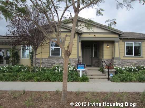
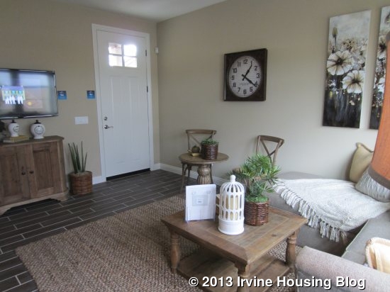
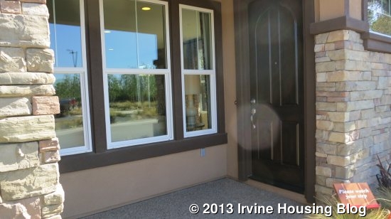
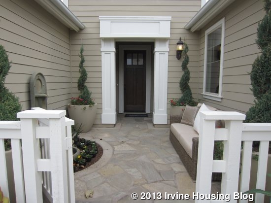
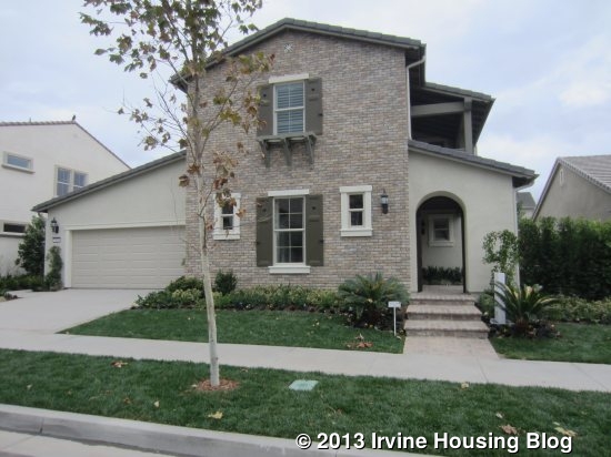
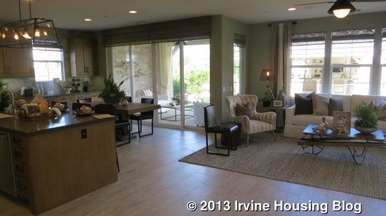
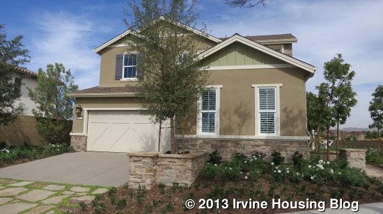
Residence One is a single story home with Spanish, Farmhouse and Craftsman elevations (the model is Craftsman). They market it as having a front porch, but the area is really very small and couldn’t fit more than a single chair or small bench. When you enter the home, you look right at a wall. The kitchen and great room are to the right; the bedrooms, baths and laundry to the left.

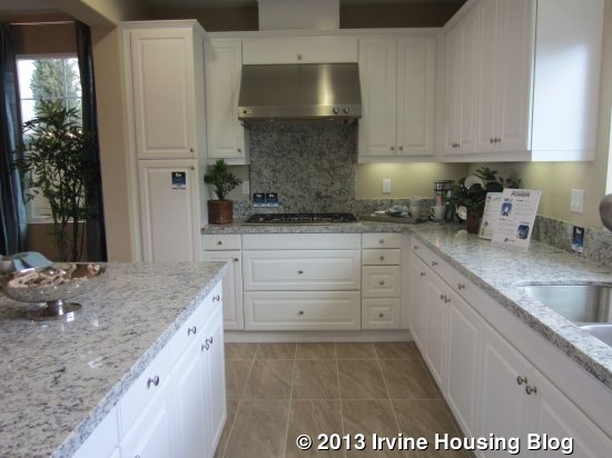
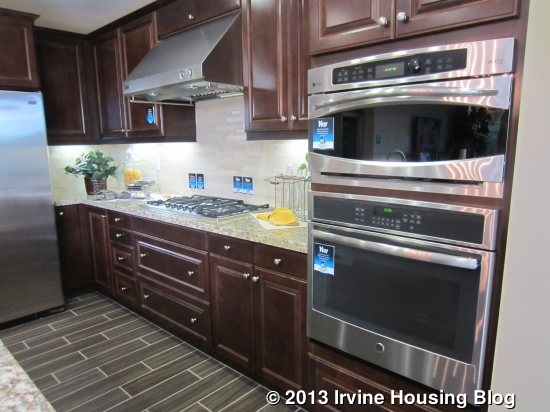
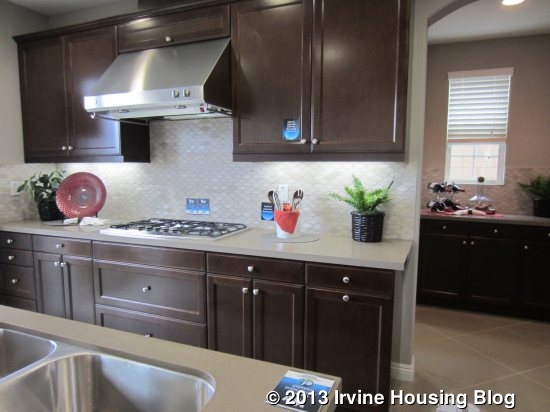
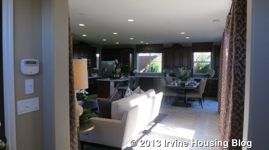
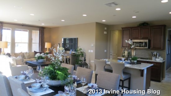
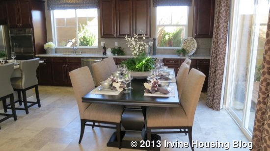
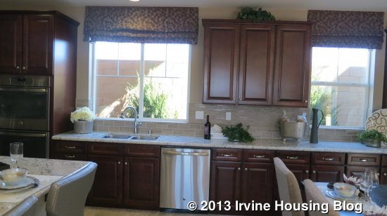
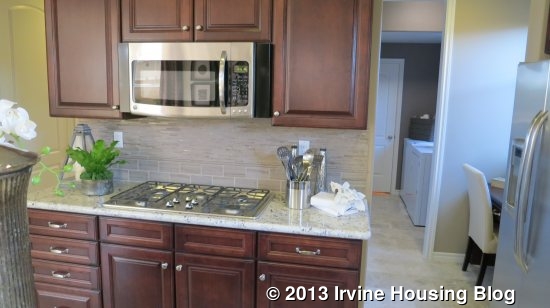
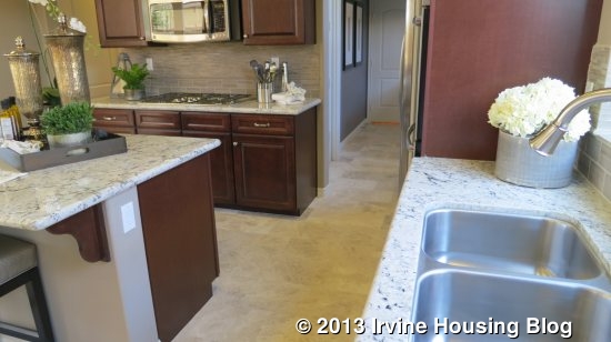
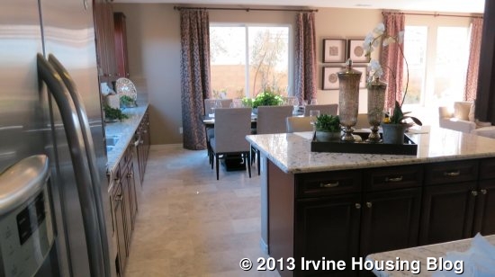
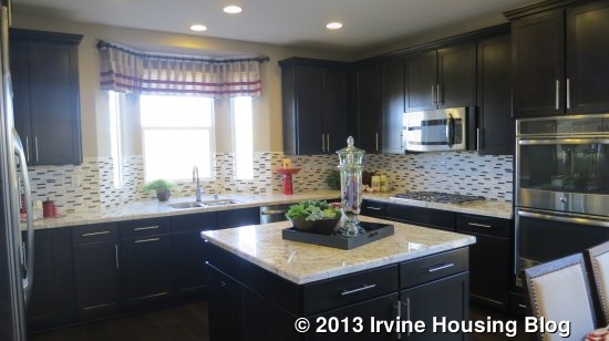
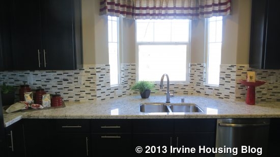
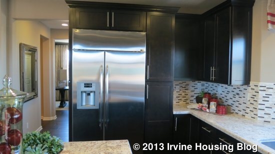
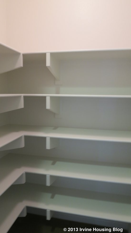
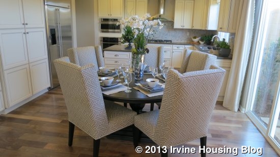
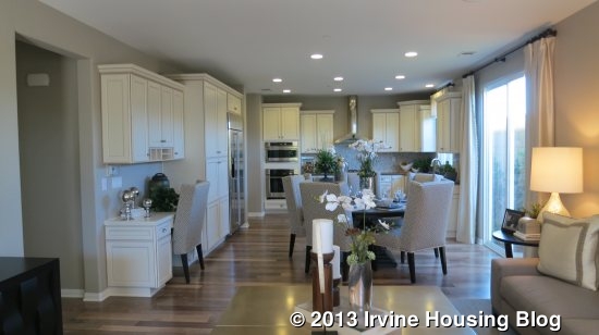
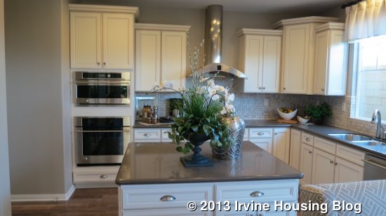
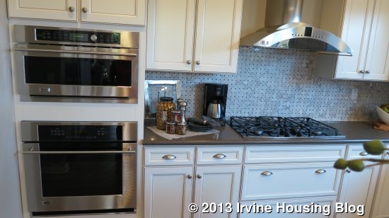
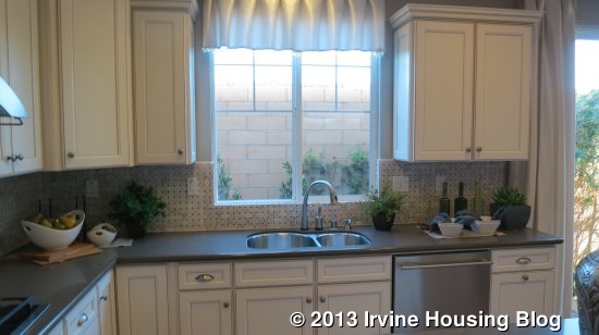
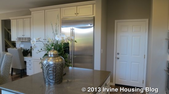
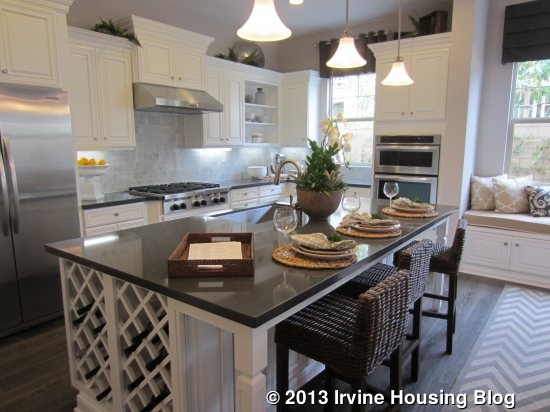
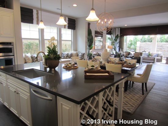
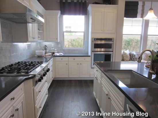
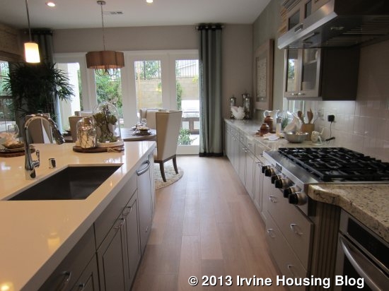
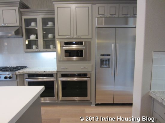
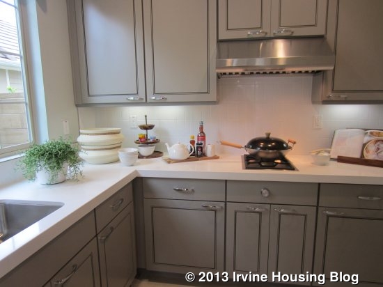
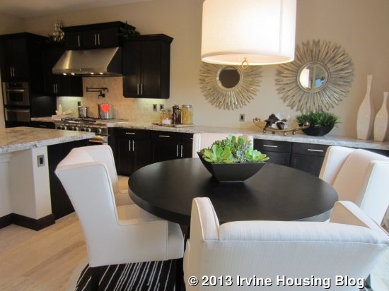
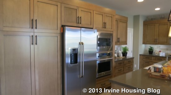
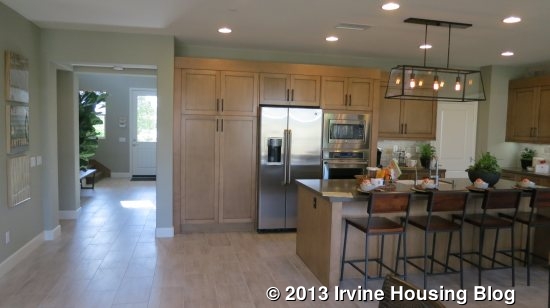
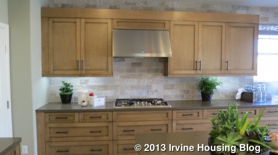
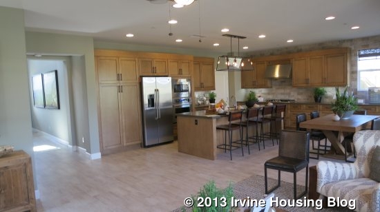
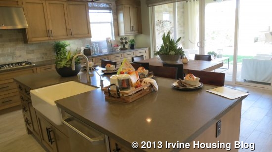
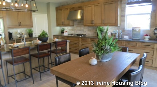
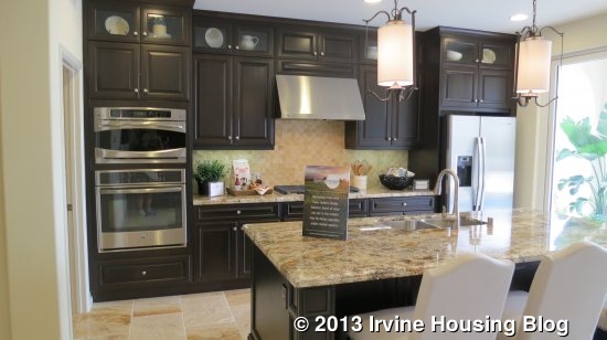
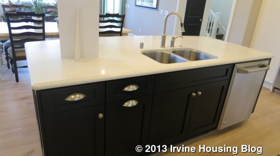
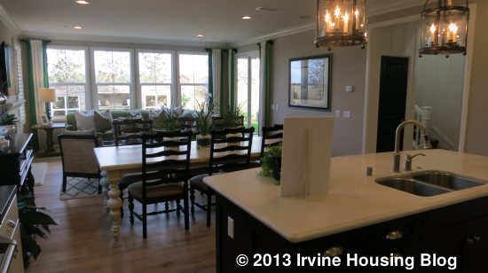
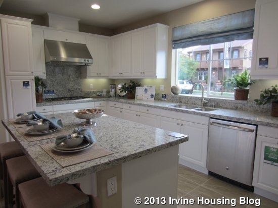
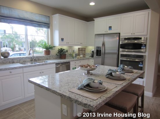
The kitchen shows mostly included, standard features without upgrades, so it gives buyers a true sense of the base model. It has a rectangular island with seating for three and without any appliances on it. The fridge, oven and microwave are on one wall, the sink and dishwasher are in the middle, and the stove is on a third wall, forming a U around the island. Cabinets line the top and bottom, but only one narrow cabinet is pantry-height. It has a window looking out to the street. The kitchen looks nice and is functional, but I would prefer more pantry space and less distance between the stove and the fridge.
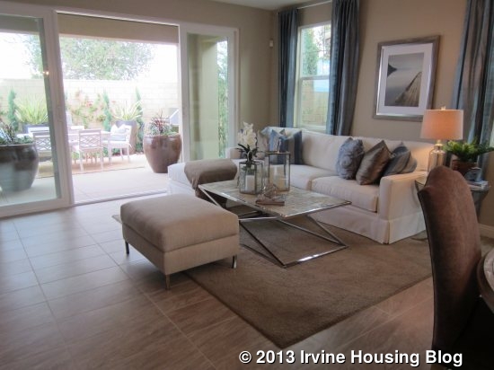
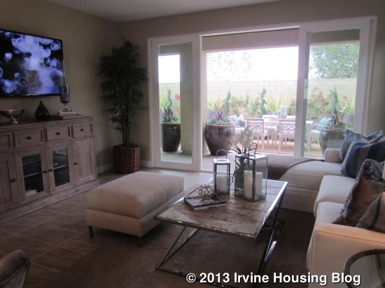
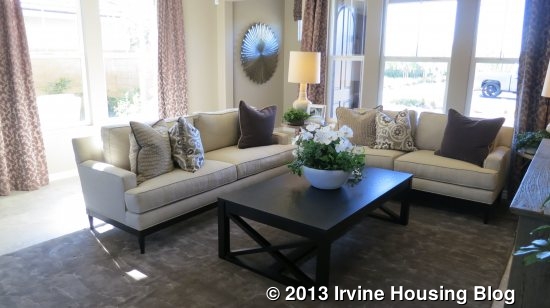
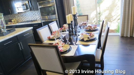
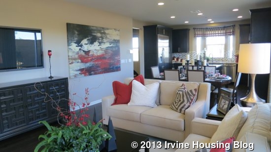
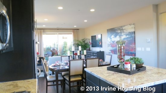
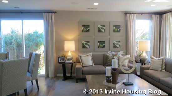
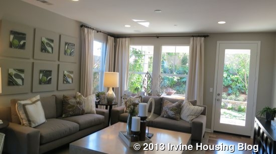
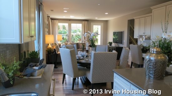
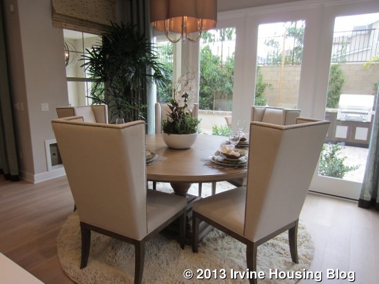
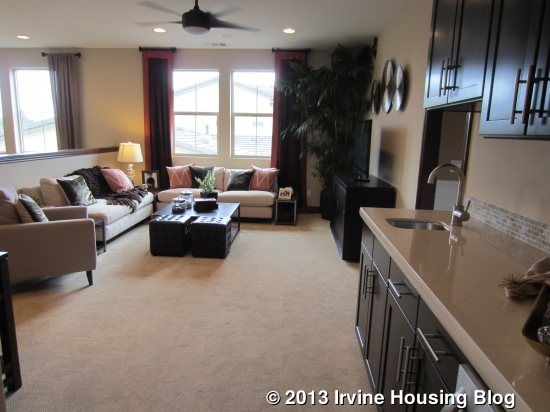
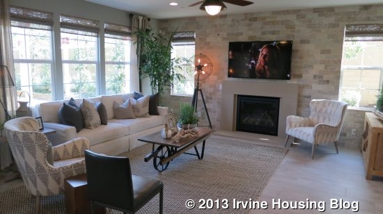
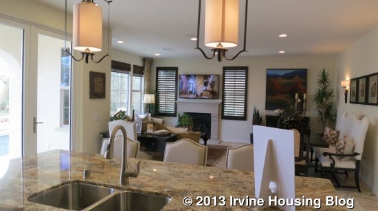
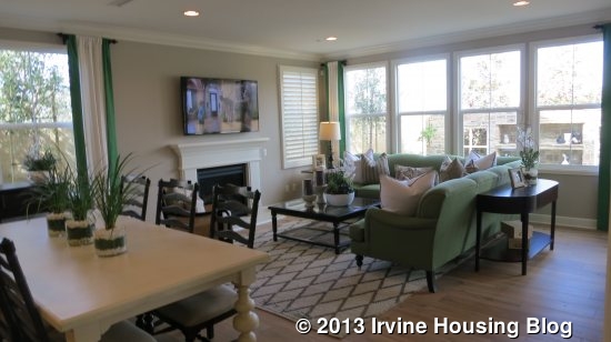
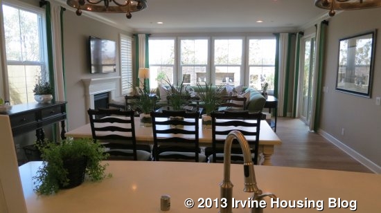
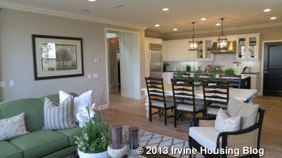
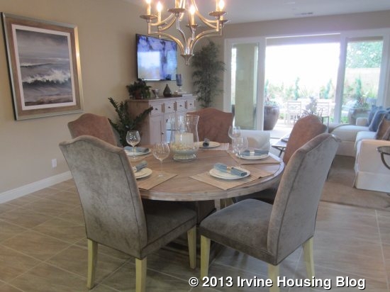
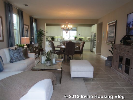
The kitchen is wide open to the adjacent great room, with space for a dining table in the middle. The openness offers the option for a table of any size and is probably best suited for a more casual atmosphere. Two tall windows face the side yard and have space between them for a china hutch. The living area is a good size, with windows facing the side and sliding doors to the backyard. It doesn’t have a fireplace. The setup allows for furniture to be arranged in a variety of ways.
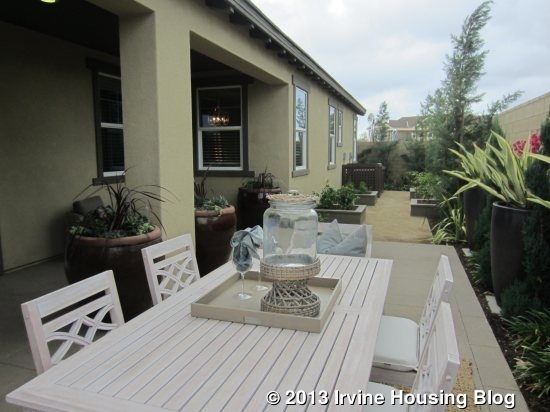
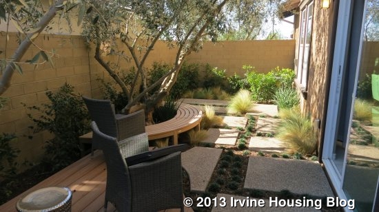
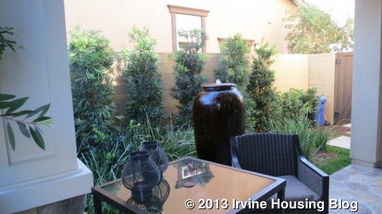
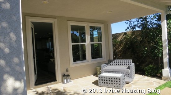
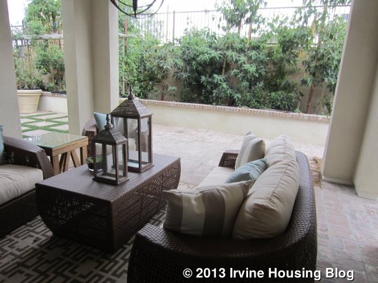
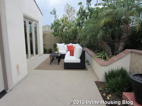
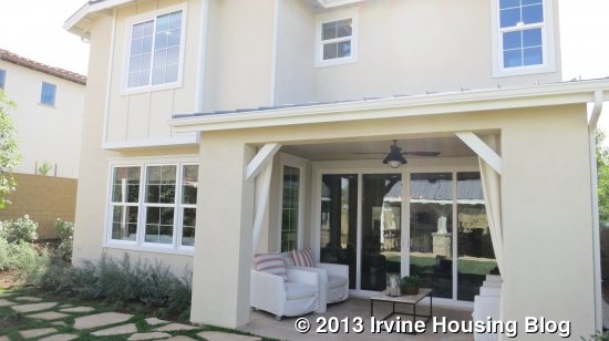
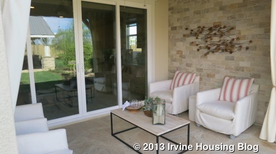
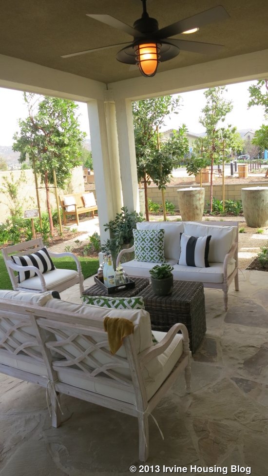
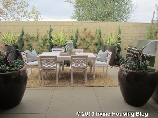
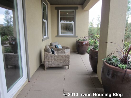
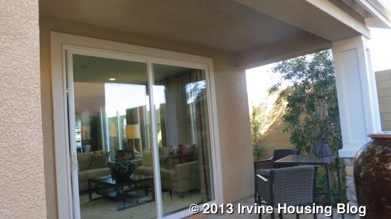
The backyard is extremely small. There is a narrow, covered porch area built into the house (similar to what other collections call a California Room). It’s wide enough for a couch or comfy chairs, but not for a table. The rest of the yard is just a long, narrow space that is wide enough for a table and chairs but nothing else. The backyard really isn’t much bigger than a typical side yard.
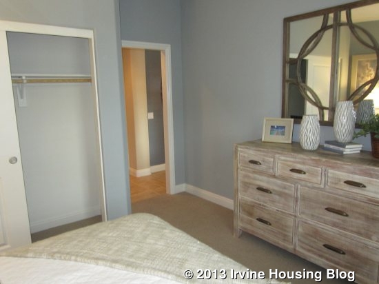
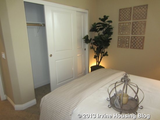
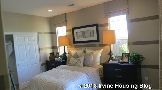
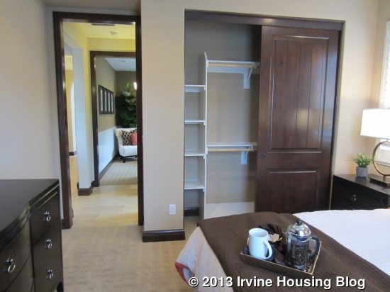
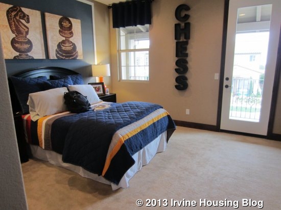
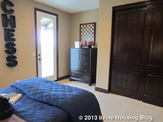
On the other side of the home, there are three bedrooms, two full baths and a laundry room. A hallway off the entry leads to one bedroom and the garage. The bedroom overlooks the street and is on the smaller side, but still has room for a large bed, nightstands and a dresser. It has a standard, two-door sliding closet.

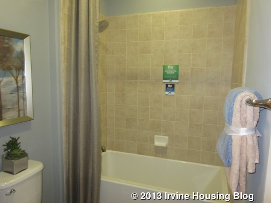
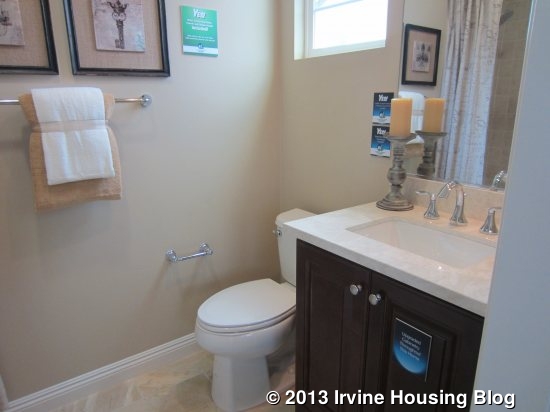
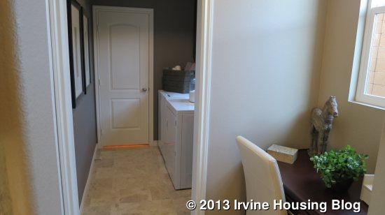
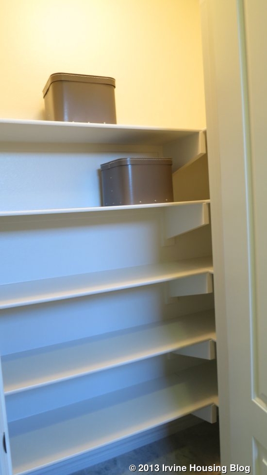
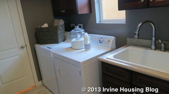
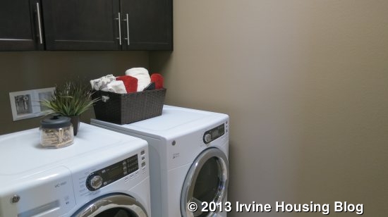
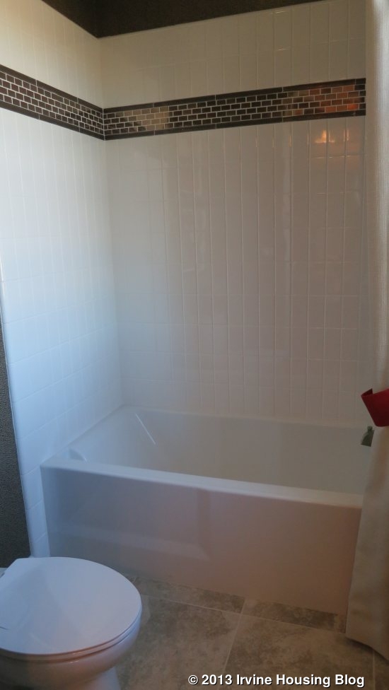
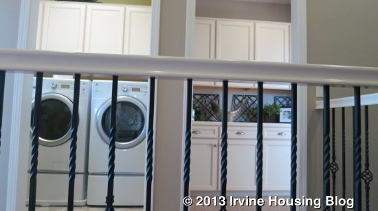
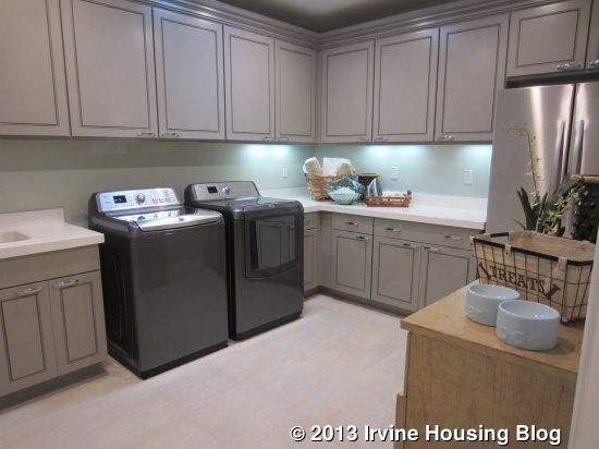
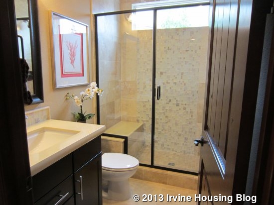
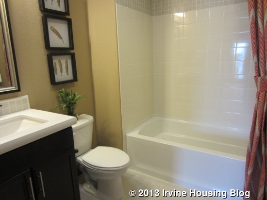
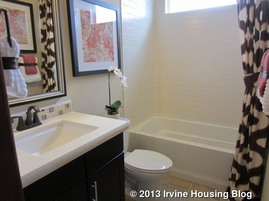
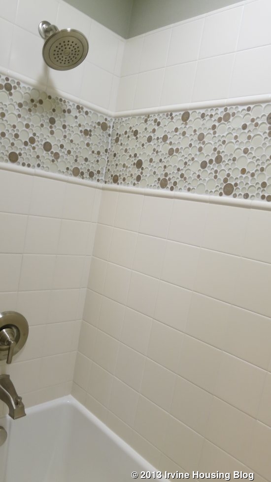
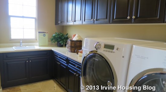
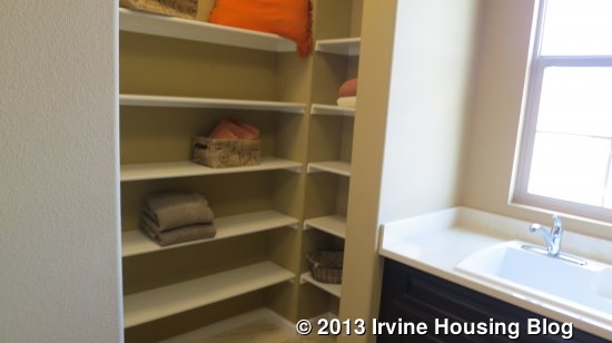
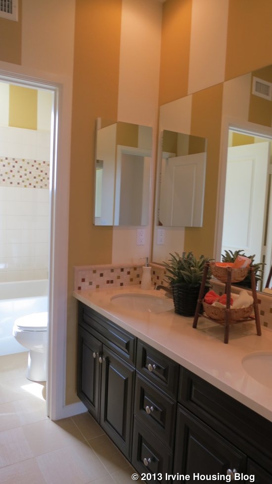
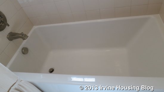
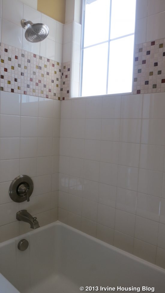
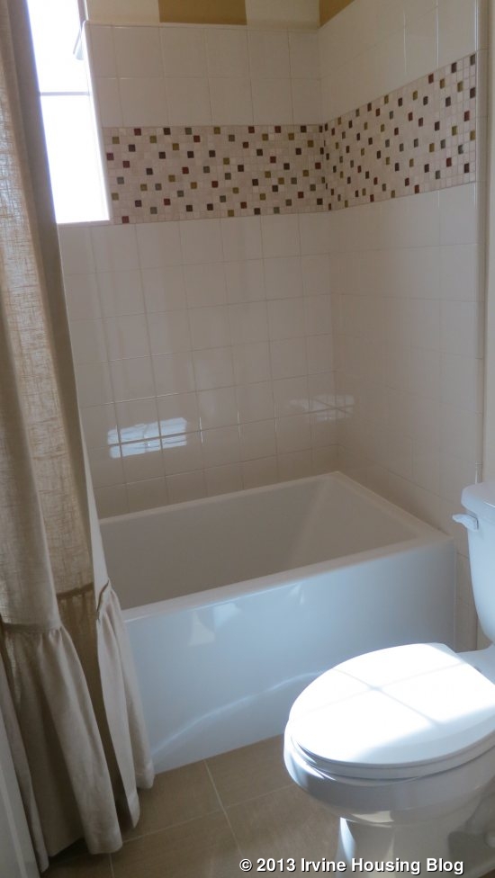
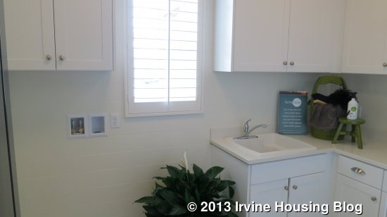
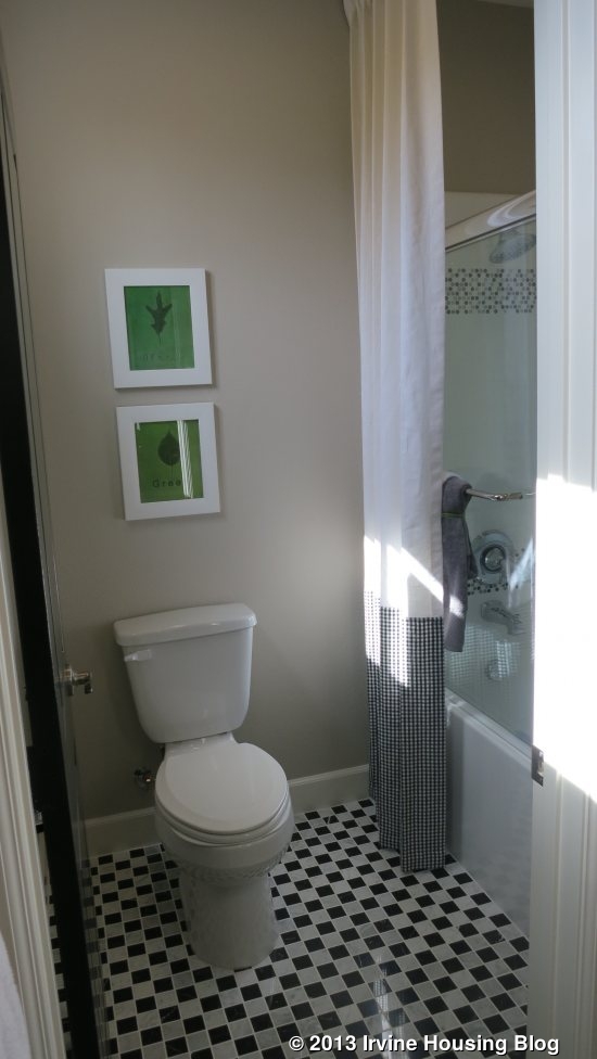
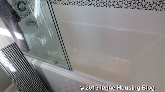
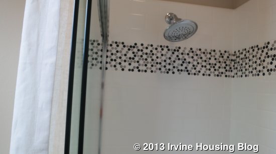
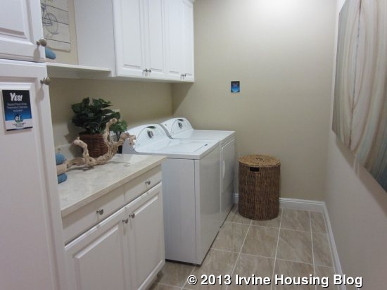
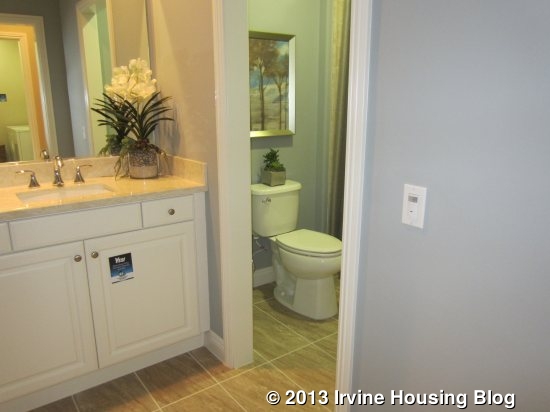
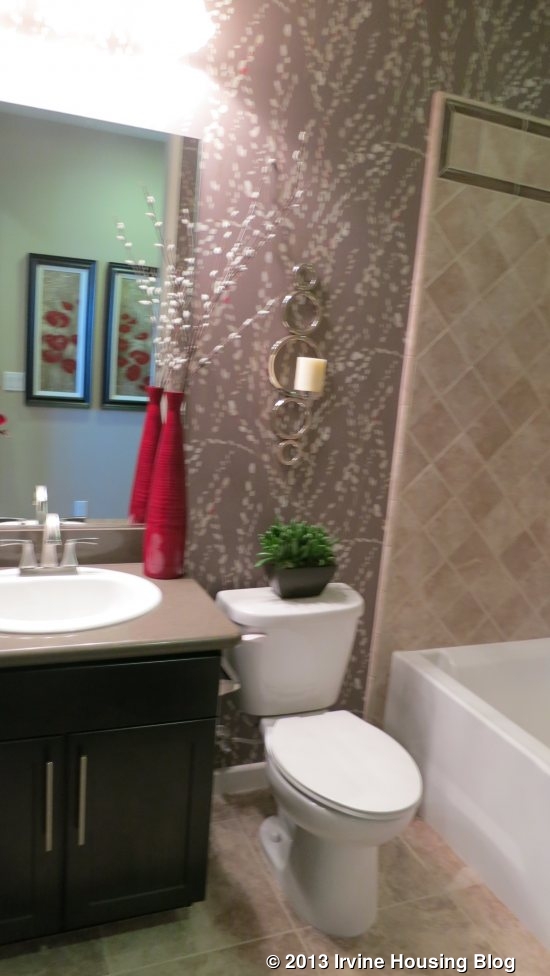
Another hallway leads to the other rooms. The laundry room is on the right and the first bathroom is across from it on the left. The laundry room has counter space but no sink with upper and lower cabinets. The bathroom has a single sink and, through a separate door, the toilet and a shower/tub combo. This is the bathroom that would serve both secondary bedrooms as well as any guests in the house, as there is not a separate powder room. Fortunately, the showers are much better designed than in Lennar’s Roundtree collection, with tile going higher up on the walls. Like the kitchen, this bathroom appears to show the standard features without upgrades. Just beyond the bathroom, there is a very small coat closet and a set of upper and lower linen cupboards.
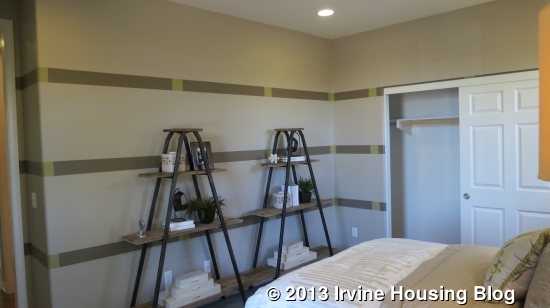
The next bedroom is just behing the laundry room. It has one window looking out to the backyard and a two-door, sliding closet. This room is a little smaller than the one at the front of the house and feels more cramped with a bigger bed. It shares walls with both the great room and the master bedroom, so it probably isn’t as quiet or as private as the bedroom at the front.

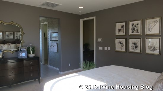
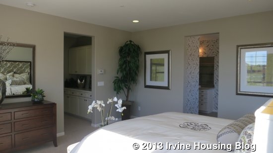
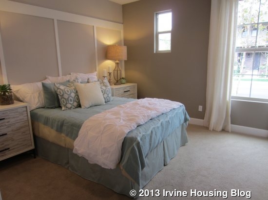
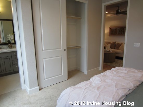
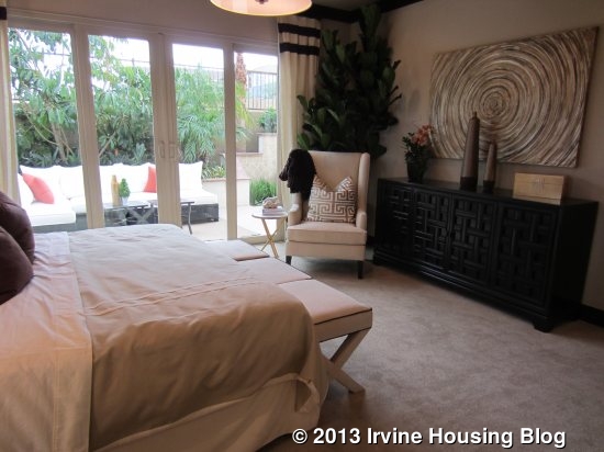
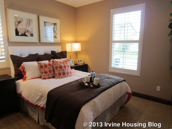
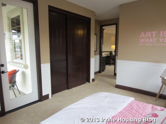
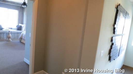
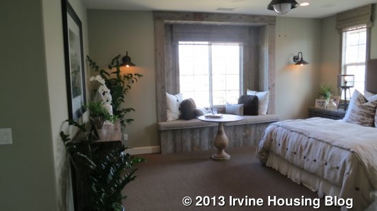
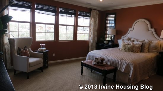
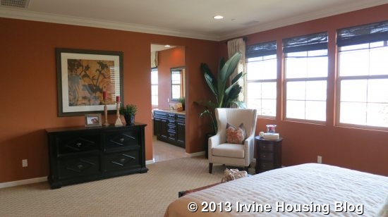
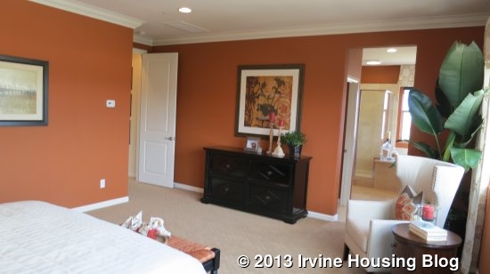
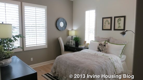
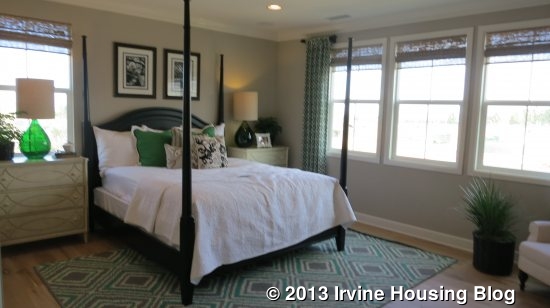
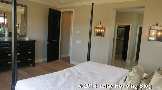
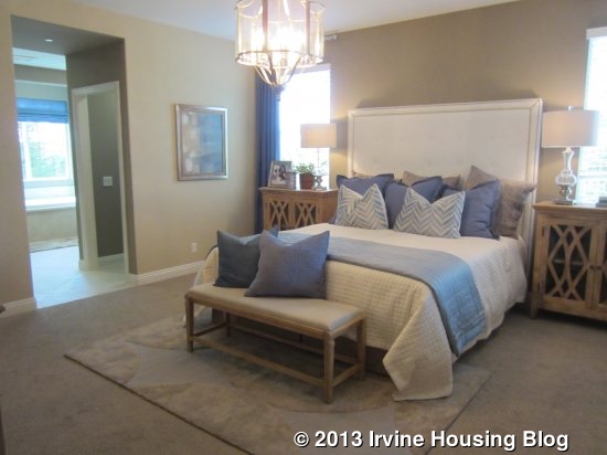
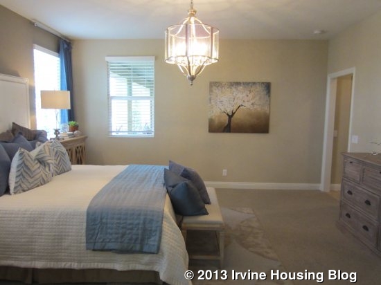
The master bedroom is at the end of the hall. It is much bigger than the other bedrooms and it gets more light. Two windows face the backyard and another, smaller window faces the back porch.
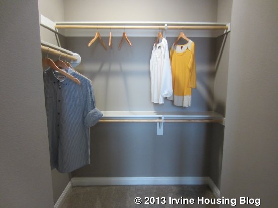
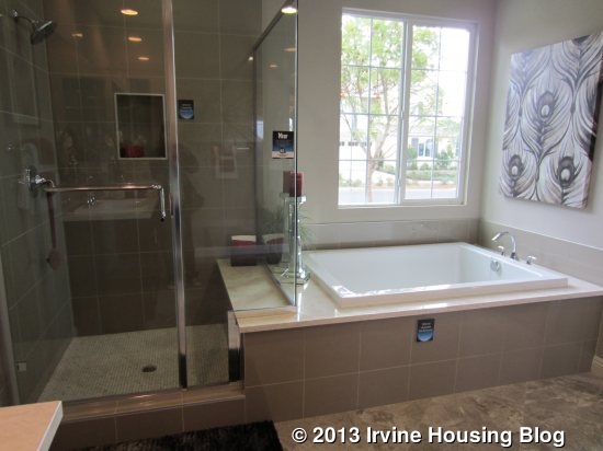
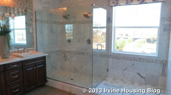
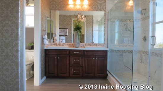
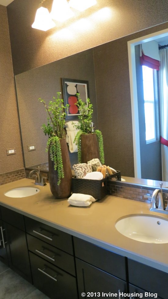
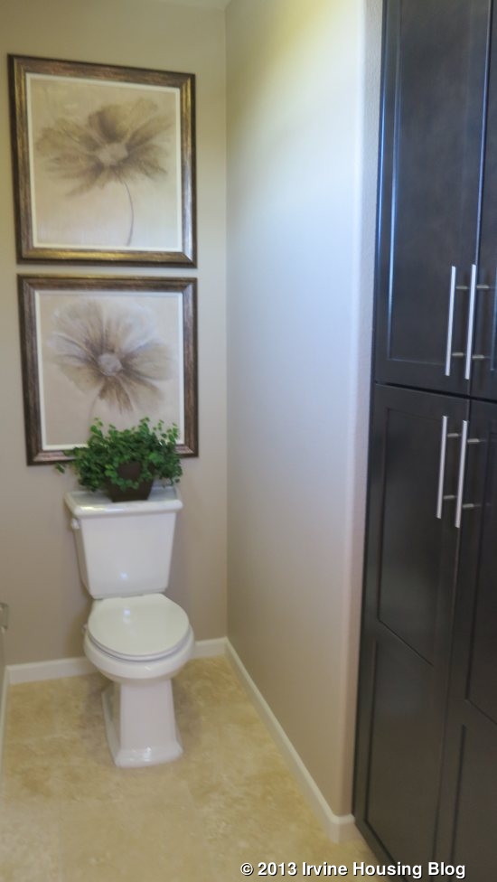
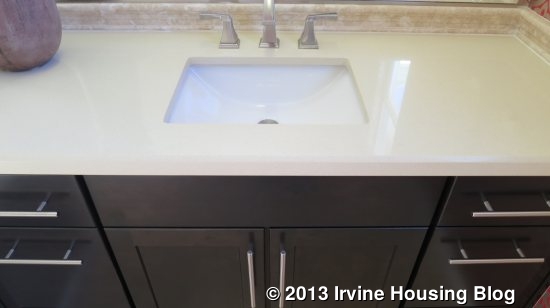
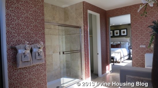
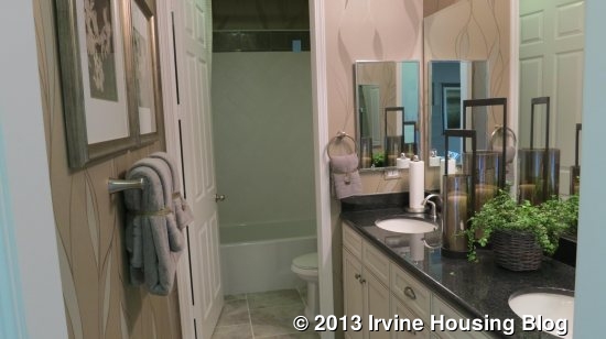
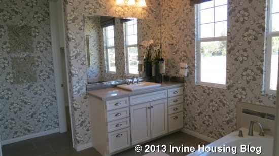
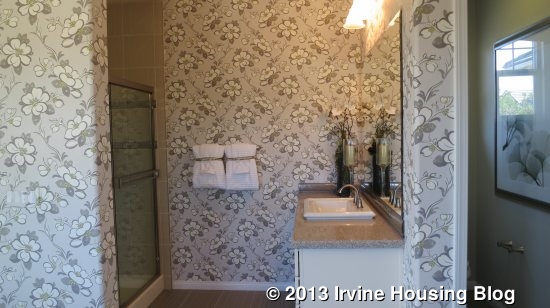
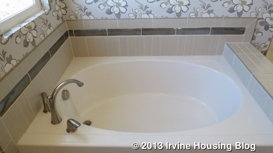
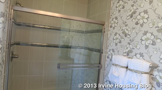
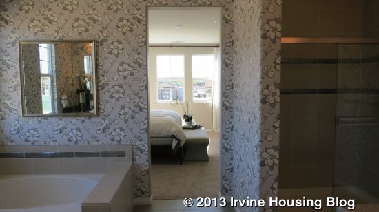
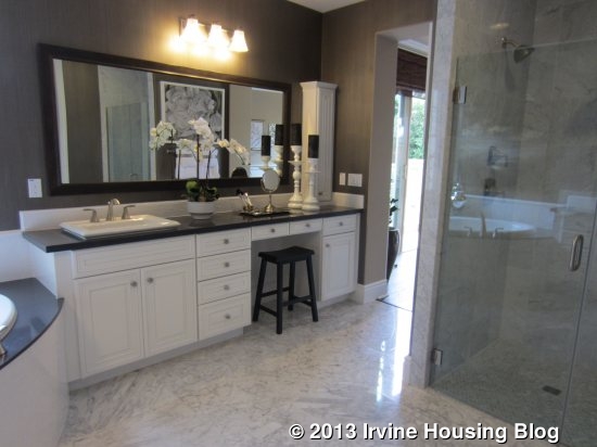
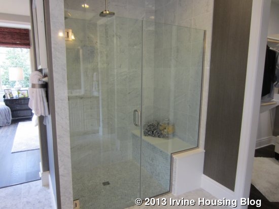
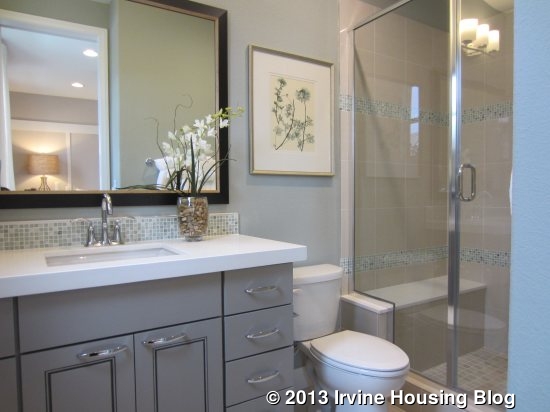
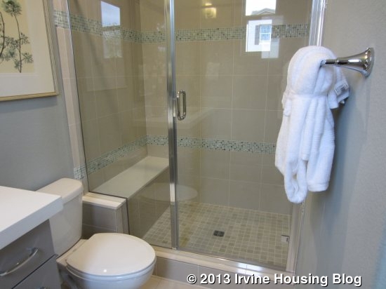
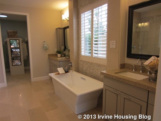
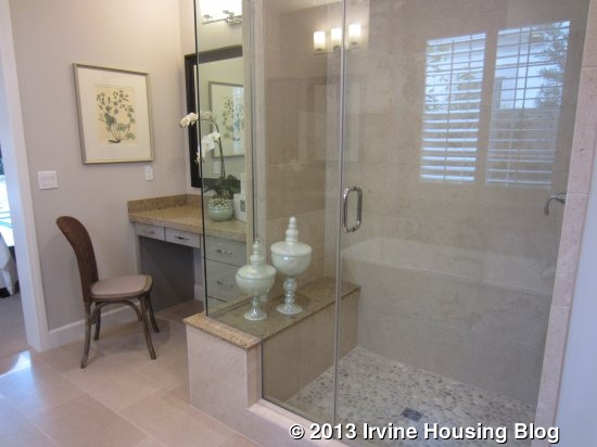
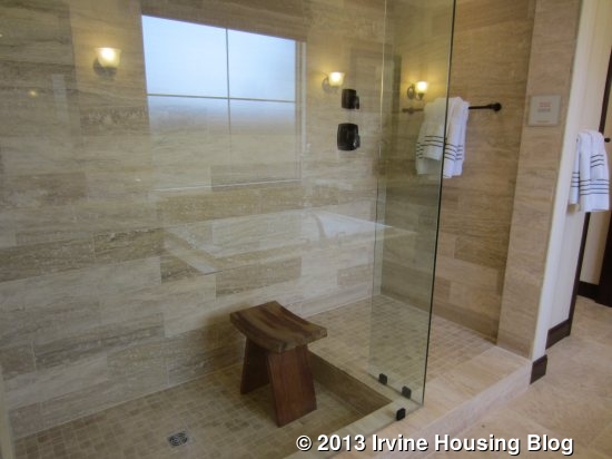
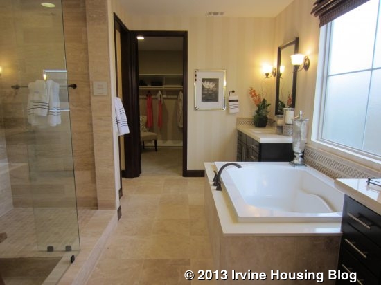
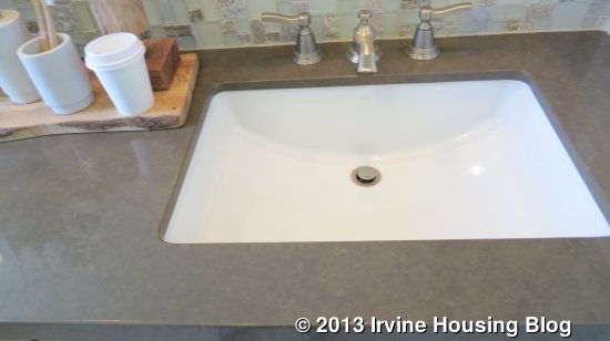
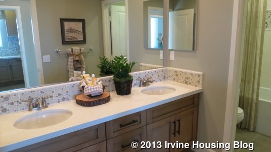
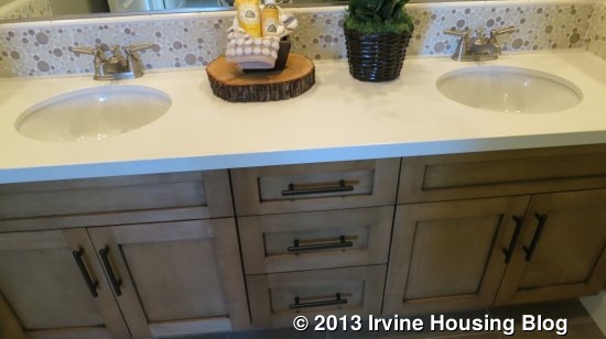
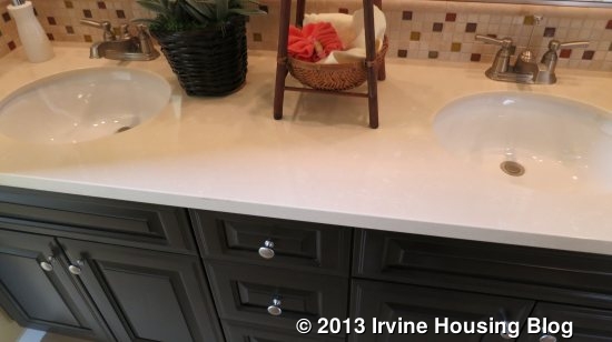
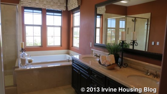
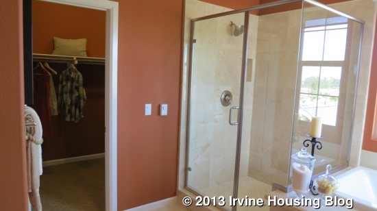
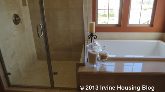
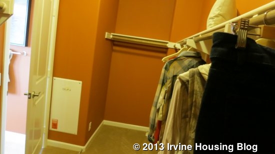
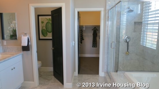
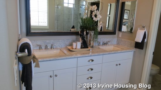
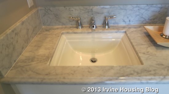
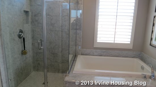
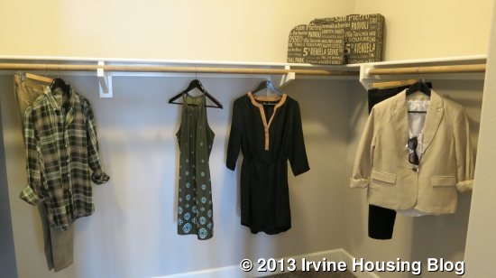
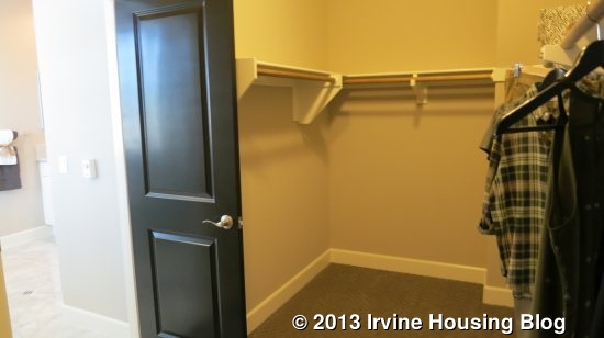
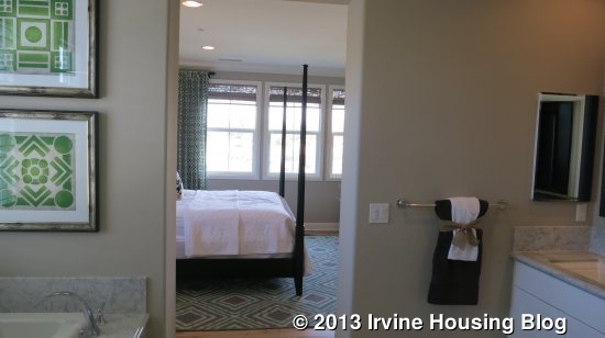
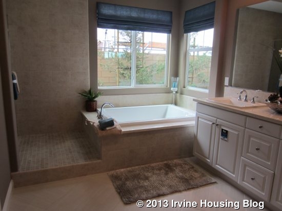
The master bath has dual sinks, a soaking tub, and a separate shower. The area between the tub and shower is tiled and raised from the rest of the floor, creating a similar feel to a walk-in shower. The shower has a seat and a small cutout in one wall for shampoo, soap, etc. As with the rest of the house, this bathroom appears to be mostly standard features.
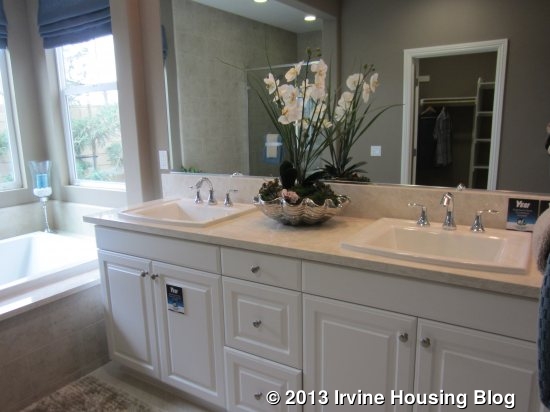
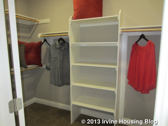
Overall, this is a pretty basic house without any remarkable features. I think it will appeal to some buyers because single story homes are not common in Irvine. However, the tiny yard will be a turnoff for others.

Residence Two

2,479 Sq Ft

4 Bedrooms, 4 Bathrooms, “Home within a Home,” Loft

Base Price from $904,990 ($365/sq ft)
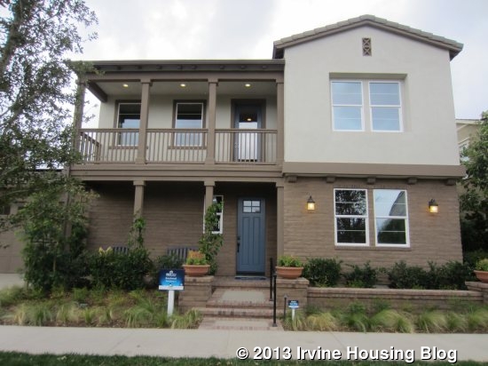
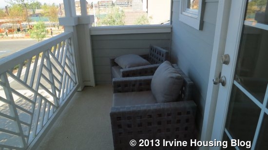
Residence Two is modeled with the Monterey Elevation and is the only elevation that has the large balcony in the front. The Spanish Elevation has a very tiny one off one bedroom and the Farmhouse doesn’t have any.

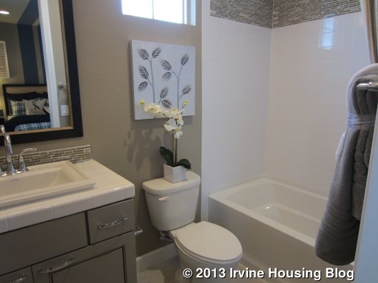
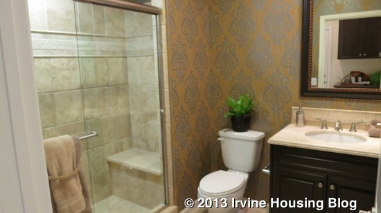
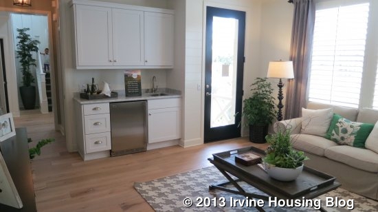
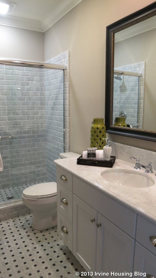
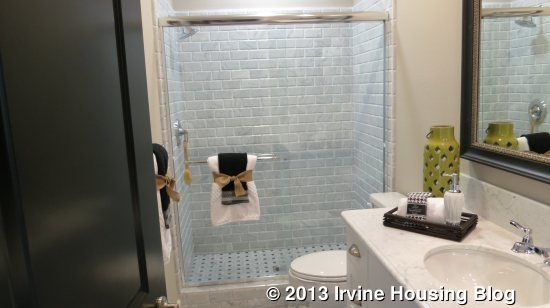
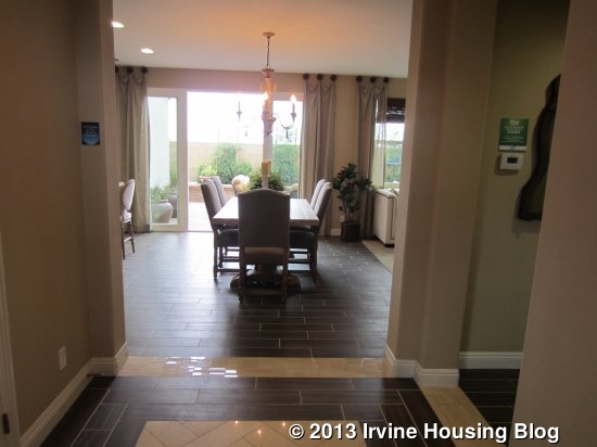
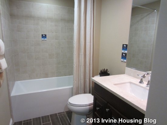
When you enter the home, the dining area is visible directly in front of you. The stairs are immediately to your left with a small coat closet next to them. A bathroom and bedroom are to the right. The full bathroom has a single sink and a shower/tub combo. It shows an upgraded vanity and upgraded tile. You do not have the option for just a shower. The bathroom is not connected to the bedroom, but is just outside of it.
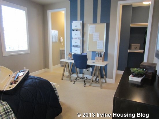
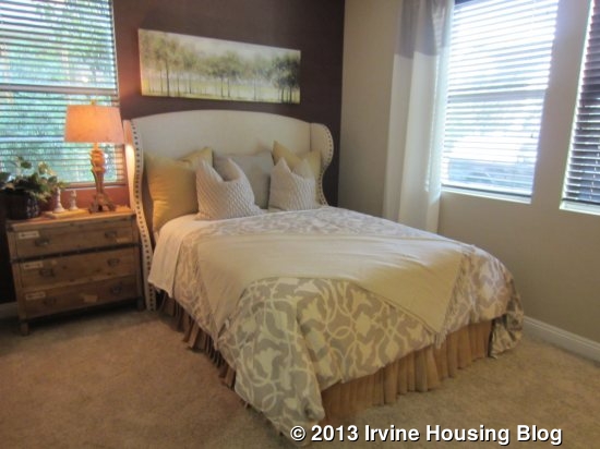
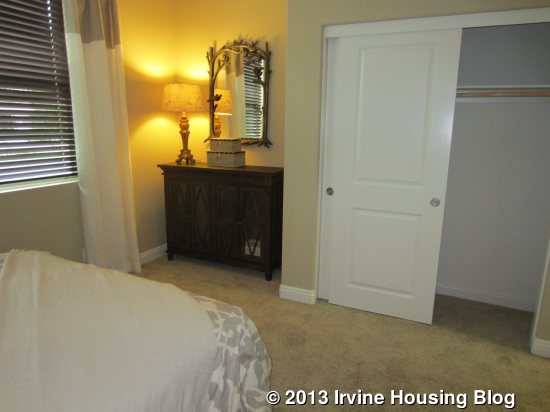
The downstairs bedroom is a bit smaller than average, but it does have a nice nook to fit a dresser, desk or bookshelf. The closet is a standard, two-door slider and the room has windows facing both the front and side of the house. Depending on the elevation, you can have one, two or three front-facing windows.
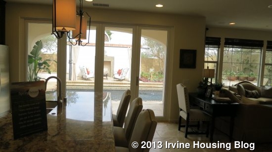
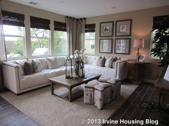
The great room and kitchen are at the back of the house. Windows line the back wall of the living area and sliders in the dining area lead to the backyard. Along with windows on the side, it brings a lot of light into the great room. The great room is a pretty typical space – a big square room without any notable features. This one does not have a fireplace or show any built-ins.
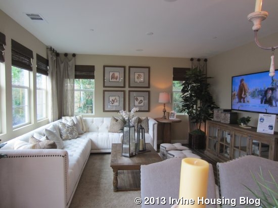
The dining area is also average in size, with room for a big table and the opportunity to be as casual or formal as you wish.
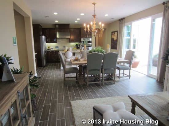
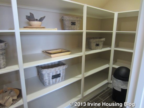
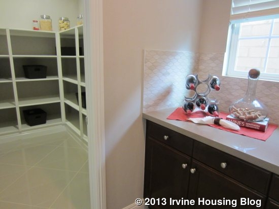
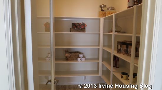
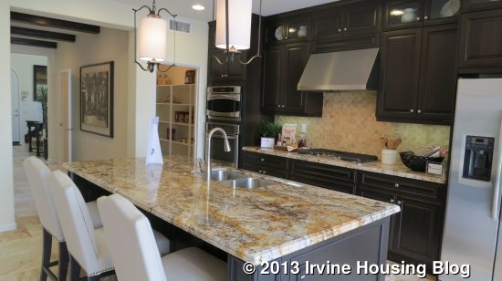
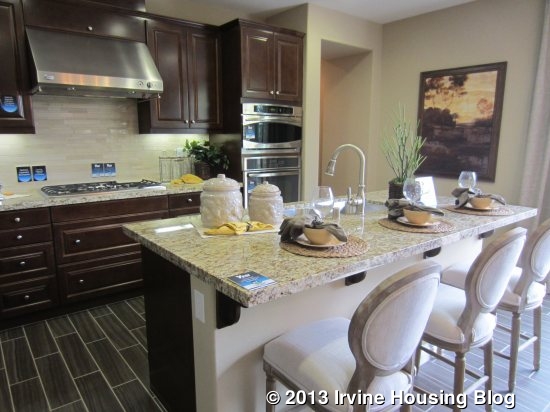
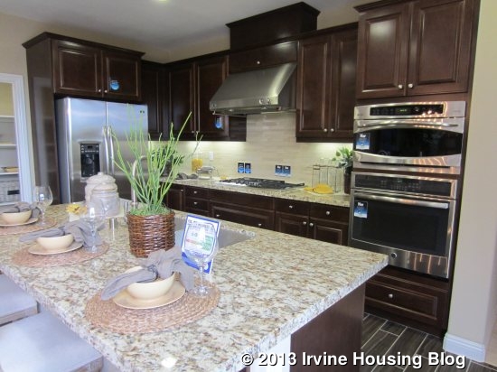
The kitchen is shown with upgraded cabinetry. The island is longer than the one in Residence One and, though pictured with three chairs, could probably seat four. The sink and dishwasher are in the island. The wall behind the island has the microwave, oven, cooktop and a fair amount of counter space (though I prefer a little bit more). The fridge is just to the left with a large, walk-in pantry next to it.
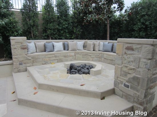
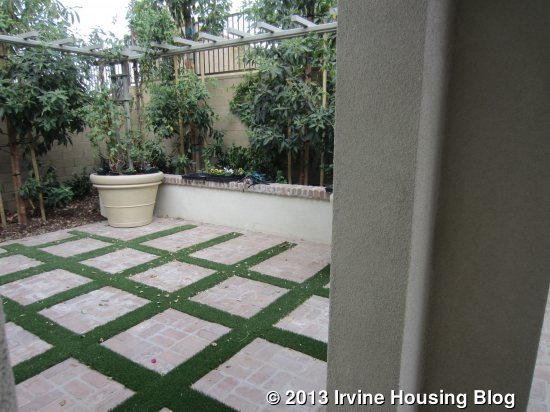
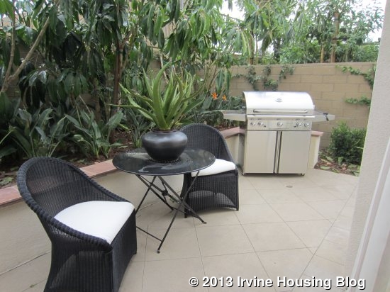
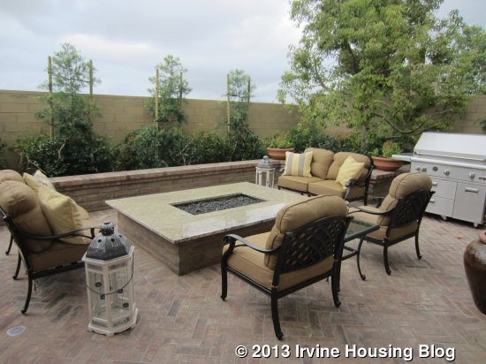
As in Residence One, the backyard is really small. This one doesn’t have a covered area and is just one open space. The model shows a fire pit with seating all around and space for a big grill. There is also a very long, narrow portion of the yard that can’t really be used for much of anything.
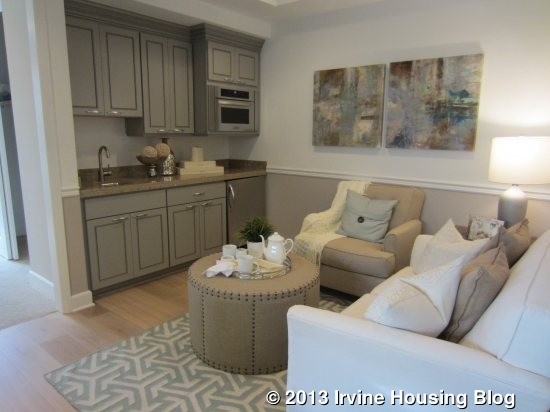
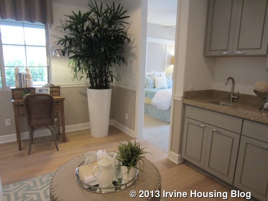
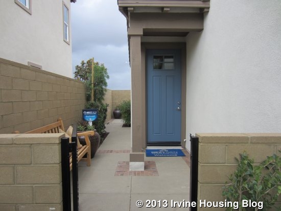
A short hall in the back corner of the kitchen leads to the garage and to the private residence, or what Lennar calls “NextGen – The Home Within a Home.” The private suite has a bedroom, living room, kitchenette, full bath and a washer dryer. In addition to access from the kitchen, this home has a private entrance next to the garage, set far back from the street, and behind a gate, so it won’t be confused with the home’s main entrance. I actually entered from the outside entrance, as the door from the kitchen was locked.
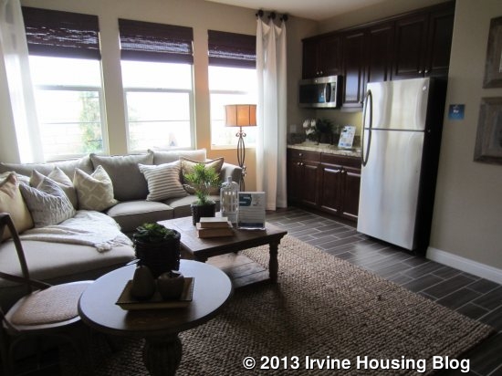
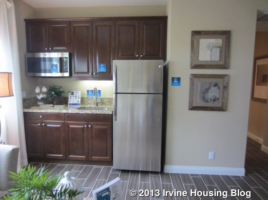
The living room is a good size, but doesn’t get a lot of light. It has three windows on the back wall, but since the backyard’s wall is so close, it blocks the light. The kitchenette has a sink, a full size (but slightly smaller than normal) refrigerator, and microwave/convection oven.
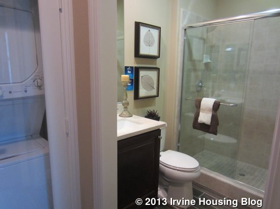
There is a spot for a stacked washer and dryer just outside the bathroom. The bath has a single sink and a shower, no tub. The bedroom is pretty small, but does have two windows and a standard, two-door closet. This is the only closet in the private residence. The private suite is a nice feature, but I think the one in Roundtree and the options for a private suite in Hawthorn are much nicer.
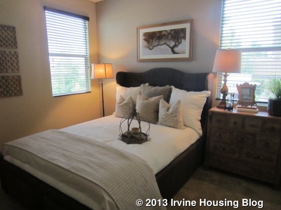
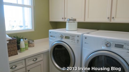
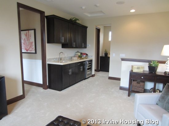
Back in the main house, the upstairs offers a small loft. Unlike most lofts, this one is too small to use as a family room. It has a long, narrow area with built-in cabinets and a small, square open spot that could maybe house a bookcase or a single cozy chair. The loft has the only access to the deck, which is long and narrow. The laundry room is at the top of the stairs with side by side machines and a counter, but no sink.
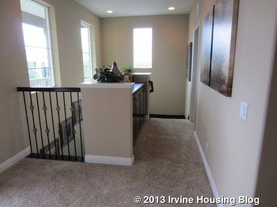
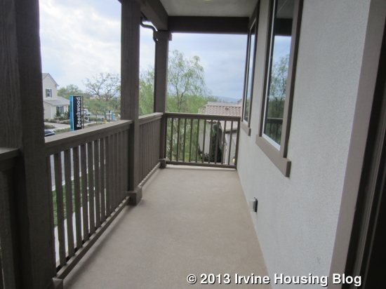
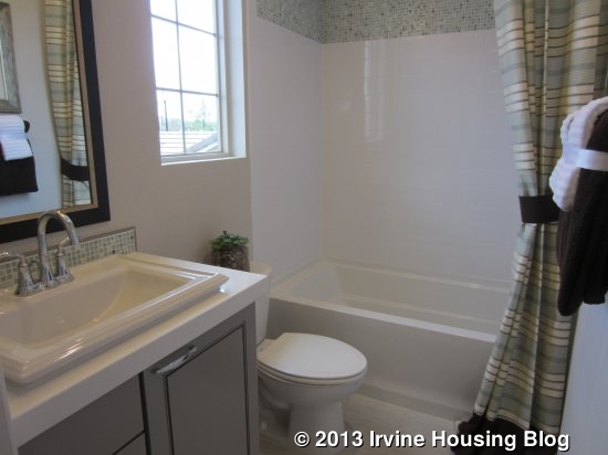
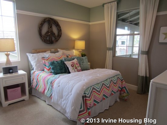
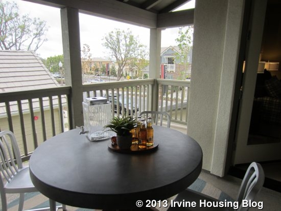
There are only two bedrooms upstairs. The secondary bedroom is a pretty good size and has windows facing the front of the house. This is the room that has a tiny balcony in the Spanish elevation. Unfortunately, the closet is really small. This room also has an en suite bathroom. It has a single sink (again, with upgraded cabinetry) and a shower/tub combo.
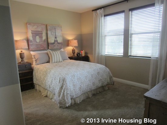
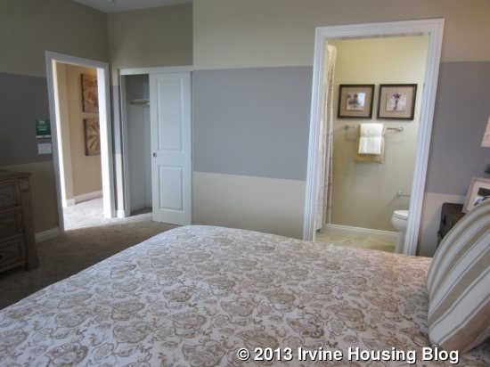
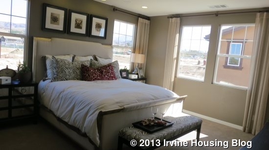
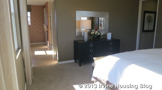
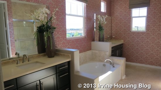
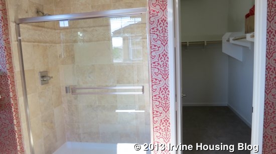
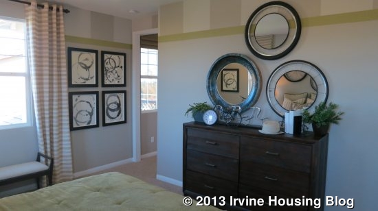
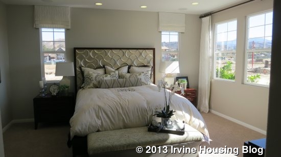
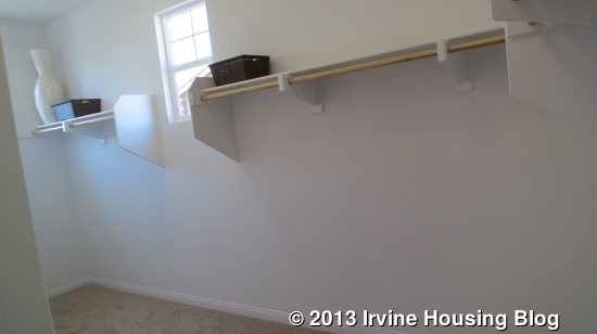
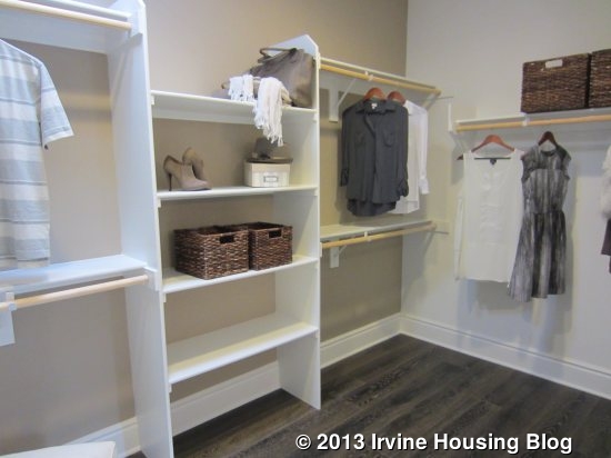
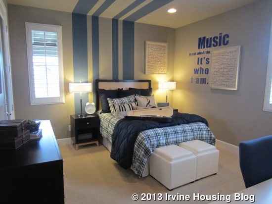
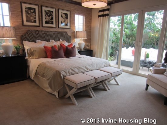
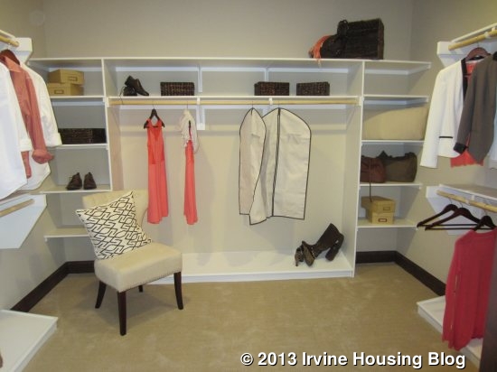
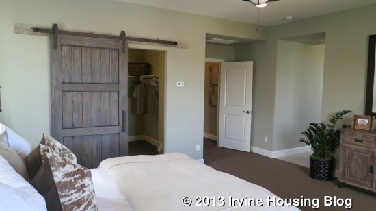
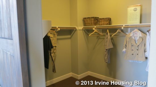
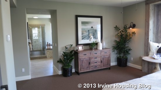
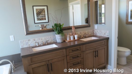
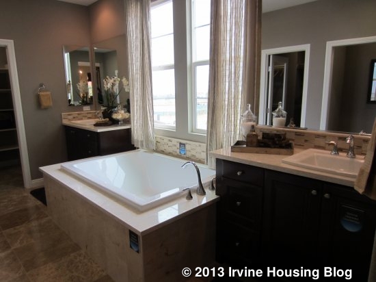
The master bedroom is at the back of the house, with windows facing both the back and side. It is smaller than the ones in the other Beachwood homes and is very basic. The master bath is nice, with split sinks and a bathtub between them. There are two walk-in closets, each about the same size. I think the shower is too small for a master. It has a built-in seat and shows upgraded tile.
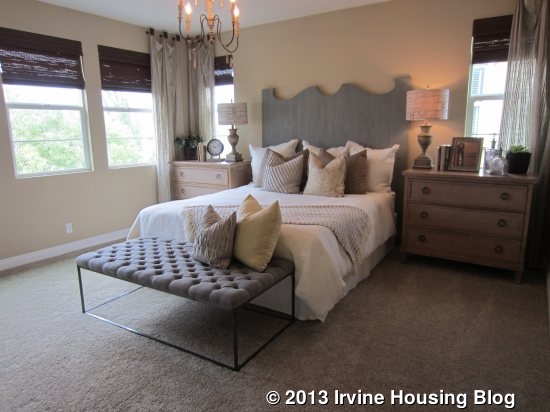
Aside from the private residence, this home doesn’t really have any interesting features. It feels smaller than I expected, based on the square footage, and I was disappointed to see that the loft really isn’t usable. I also wish there was more closet space throughout the home. Per square foot, this home is priced much lower than Residence One

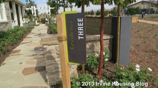
Residence Three

2,691 Sq Ft

4 Bedrooms, 3 Bathrooms, Downstairs Master, Bonus Room, California Room

Base Price from $918,390 ($341/sq ft)
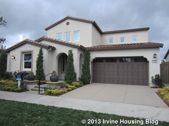
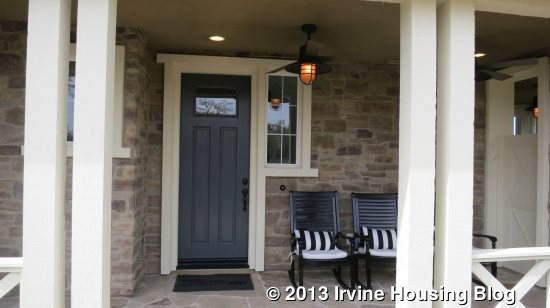
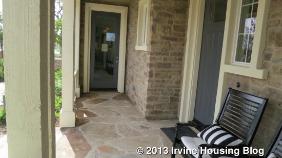
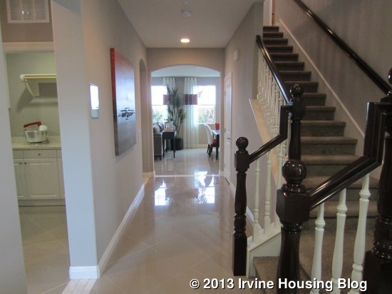
Residence Three is modeled in the Spanish Elevation, with the others being Farmhouse and Craftsman. It is also shown reversed from the typical layout. The entryway opens to a long hallway in front, with the great room visible at the end. The stairs are in front of you to the right and a short hall leading to a bedroom, bathroom and laundry room are to the left.
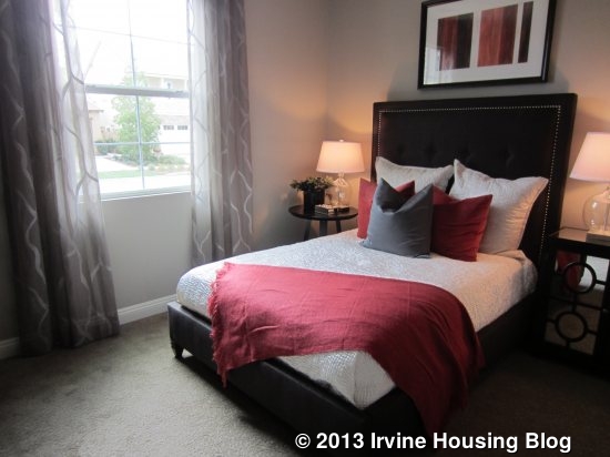
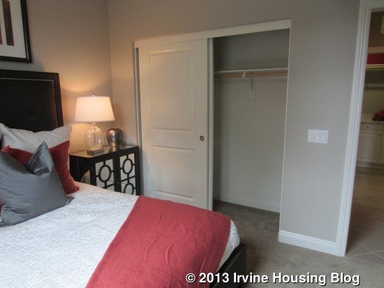
The downstairs bedroom faces the street and, as in the other models, is a pretty typical size. It has a standard, two-door closet and, in the Farmhouse elevation, two windows instead of one.
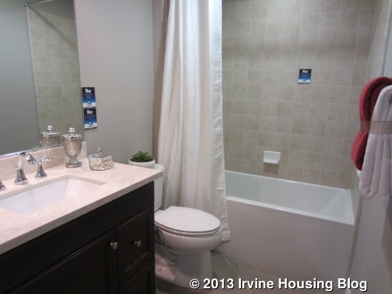
The downstairs bath is adjacent to the bedroom. It has a single sink and a shower/tub combo. This one shows upgraded cabinetry but the tile is standard. The laundry room has a very long counter, but still no sink. This room shows the standard cabinetry.
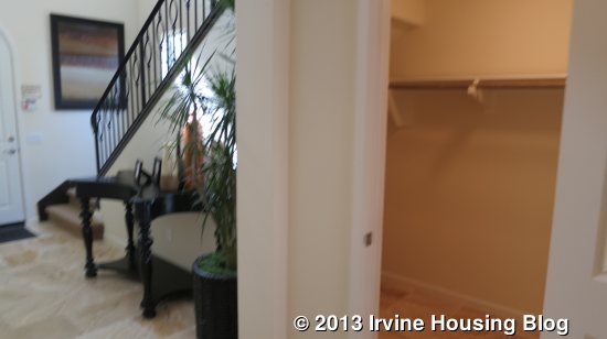
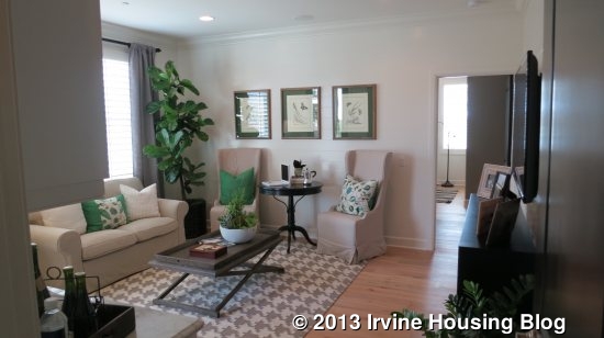
As you walk back to the great room, there is a coat closet with expanded storage under the stairs, though not as large as the closets in some homes. The great room is similar to those in the other two residences. This one has windows lining the back wall and a sliding door on the side that leads to the outdoor California room. Just like Residence Two, this one doesn’t have a fireplace or built-ins.
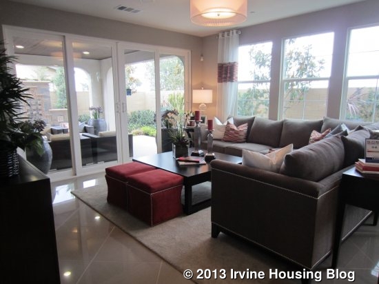
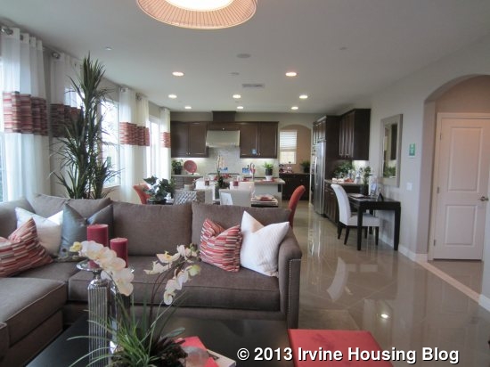
The dining area isn’t directly in front of the main hall, as it was in Residence Two, so it feels a little more open when you walk into the room. Again, there is space for a big table and it would work well with a casual or more formal set up. More windows face the backyard here. There is space along one wall for a nice china hutch or, as seen in the model, a small desk.
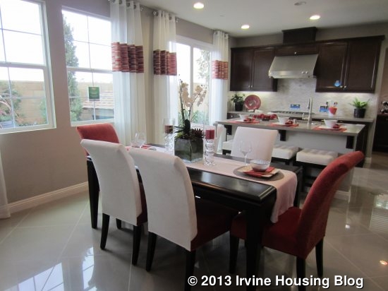
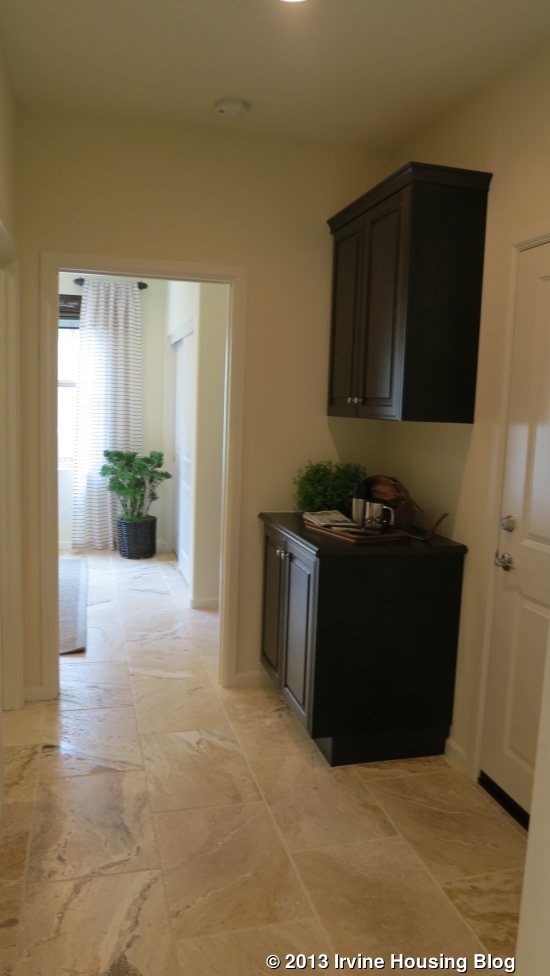
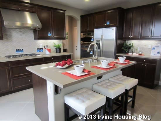
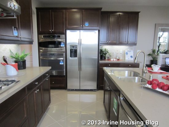
The kitchen is similar in size to Residence Two, but with a slightly different set up. The island is shorter and still houses the sink and dishwasher. The cooktop is still directly across from the sink, with counter space on either side. In this layout, the microwave, oven and fridge are on a different wall, with additional counter space next to the fridge. Both upgraded cabinetry and countertops were used in this home. Beyond the kitchen, there is a small entry area with built-in cabinets that leads to the garage. On the other side of the cabinets is the large, walk-in pantry. The kitchen also has sliders to the backyard.
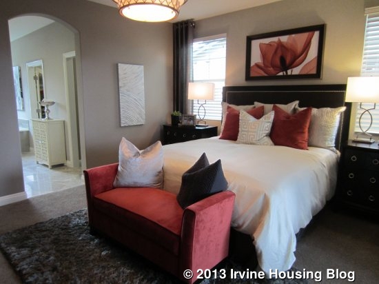
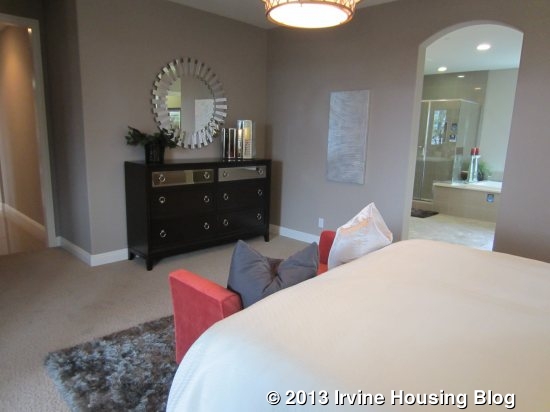
In this home, the master bedroom is downstairs. A hallway between the laundry room and the great room leads back to the suite. The bedroom is a little bigger than in the other homes and it has access to the California room.
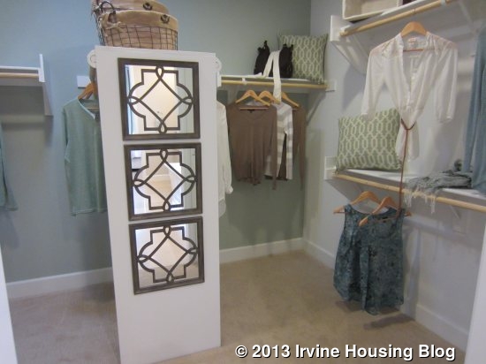
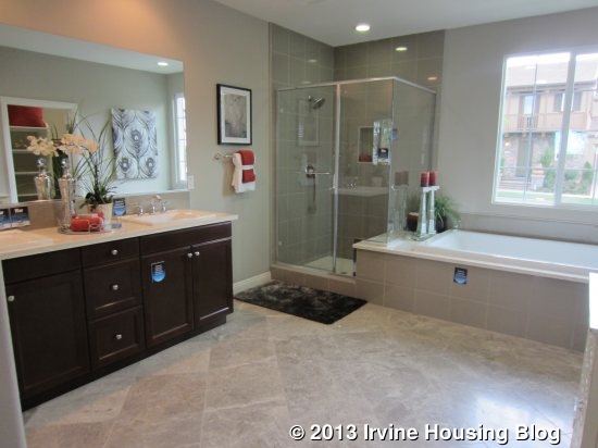
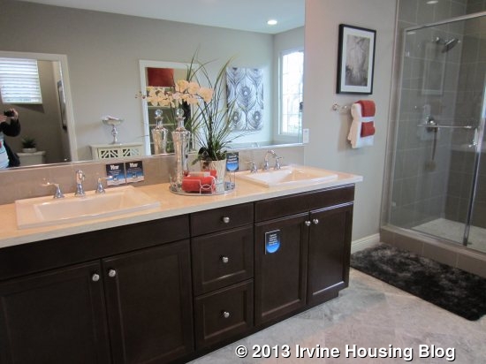
The master bath has a lot more open floor space. The two sinks are side by side on one wall, with the shower and bathtub next to each other on another. The shower has a built-in seat that is actually part of the tub surround. The large window above the bathtub looks directly out to the street, which I find incredibly awkward, as it creates a total lack of privacy. A window like that may work when the master is on the second floor, but not when it’s on the lower level. The walk-in closet is about the same size as the one in Residence One.
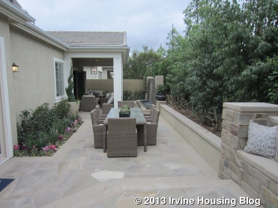
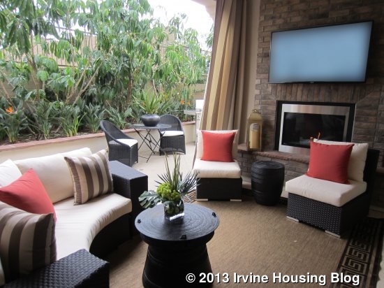
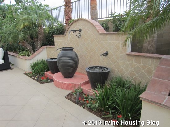
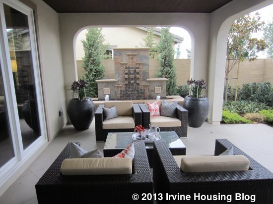
The backyard is pretty much consumed by the California Room. It’s a very nice space for sitting and, in the model, has a fountain just outside of it to create a peaceful atmosphere. The rest of the yard is extremely narrow and, though you could easily put a grill out by the kitchen doors, you couldn’t put a table and chairs over there.
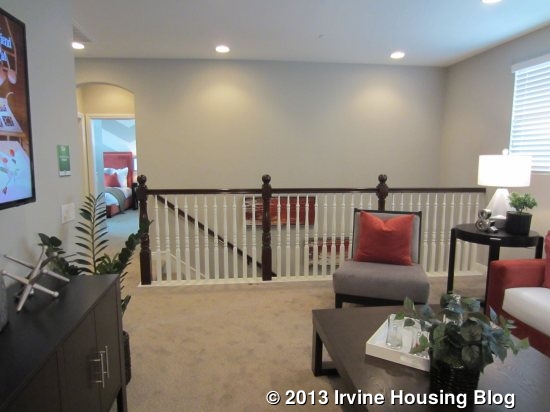
Upstairs, there are two bedrooms and a loft-style bonus room. The extra living space up here is nice, and about the same size as the living room downstairs. Three smaller windows face the front of the house. There is a walk-in linen closet just next to the bonus room.
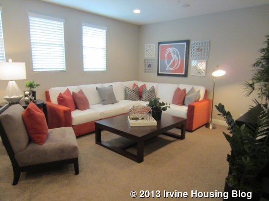
The bedroom at the back of the house is a lot bigger than the one downstairs, and bigger than the secondary rooms in Residences One and Two. It has windows overlooking the back and side of the house. It also has a walk-in closet.
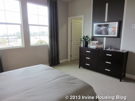
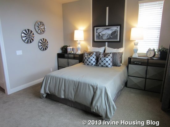
The other bedroom is even bigger, and is almost as large as the downstairs master. In this room, three of the walls have two windows each, so it gets a lot of light throughout the day. It has a walk-in closet that is about the same size as in the other upstairs room.
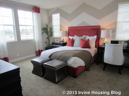
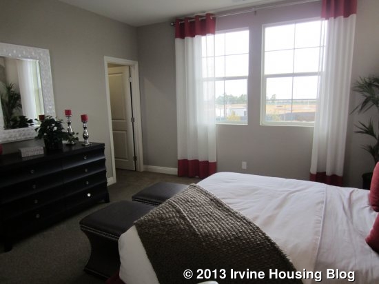
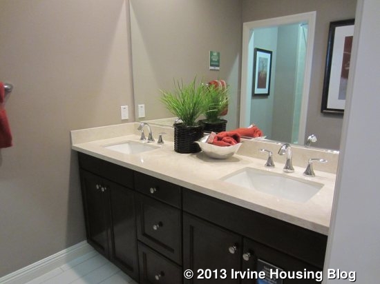
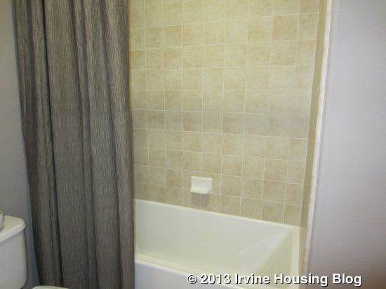
These two bedrooms share a bathroom. This one has two sinks and, through a separate doorway, the toilet and a shower/tub combo. I like the setup of this bathroom.
While I don’t love the downstairs of this home, I like the upstairs much more than any part of either of the other two residences. The rooms are much bigger and the bonus room is a great living space. A family with older children and teens could make great use of the upstairs area, especially since the master is downstairs.

Overall, I am not a big fan of Beachwood. The only part I really liked was the upstairs of Residence Three. Residences One and Two lack sufficient closet space and I don’t love the layout of either one. I also really disliked how small the backyards are in every home. The prices per square foot are pretty low in Residences Two and Three (relative to other Irvine homes) if you stick with the standard features. I am sure the NextGen Home in Residence Two and the single story living in Residence One will appeal to some buyers, but those were not big selling points for me.

Discuss on Talk Irvine: http://www.talkirvine.com/index.php/topic,11019.0.html
A Review of the Birch Trail Tract at Pavilion Park

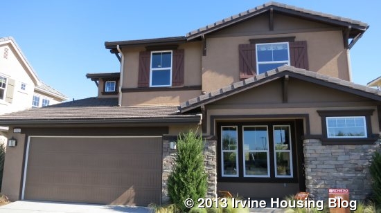
Today I am reviewing Birch Trail, the smallest of the ten Pavilion Park’s developments and the only neighborhood built by Richmond American Homes. Eighty-eight homes will feature an Americana-themed architecture and all come with a two-car garage, six solar panels, granite countertops, recessed lighting and front yard landscape package with irrigation. In Residence 1 (Neil) and 2 (Nelson), all bedrooms are located on the second floor, with the option for a bedroom on the first floor in Residence 2 (Nelson). Residence 3 has a bedroom on the ground floor with the option for an additional bedroom.

Residence 1 (Neil) Residence 2 (Nelson) Residence 3 (Newton)
Approx 1,878 Sq Ft Approx 2,011 Sq Ft Approx 2,388 Sq Ft
3 Bed 3 Bed + *Study 4 Bed + *Study
2.5 Baths 3 Baths 3 Baths
Base Price $719,990 Base Price $739,990 Base Price 789,990
*Optional 4th Bedroom *Optional 5th Bedroom

Approximate HOA Dues: $138 – $193 per month

Approximate Tax rate: 1.1%

Approximate Mello Roos: $4,400 – $5,400 (based upon the square footage of the home) and subject to an increase by 2% per year.

Residence 1 (Neil) Floor Plan

Residence 2 (Nelson) Floor Plan

Residence 3 (Newton) Floor Plan

Community Amenities include a playground, swimming pools, sport courts, spa, great lawn, pavilion and greenhouse & garden.

All Pavilion Park homes are currently slated to attend Irvine public schools:

– Canyon View Elementary School

– Jeffrey Trail Middle School

– Northwood High School

These schools are subject to change. A new K-8 school is slated to open in the Great Park Neighborhoods in 2016 and there are also plans for a new high school in the area.

Standard amenities list

Pricing as of 10/12/2013

The only way to be aware of any upgrades is to check against the handout listing the standard features, which made it challenging to walk through the models and recognize upgraded features. It was a nice surprise to see that the standard bathroom amenities included tiled shower areas (instead of the pre-fabricated fiberglass) and that bedrooms and the family room were prewired for fans. But my all-time favorite standard is the six solar panels.

This particular builder, Richmond American Homes, offers a Sellers Edge Program that can benefit the Buyer if particular requirements are met in the case he/she decides to sell their current home and simultaneously buy a Birch Trail home with a referred 1-2-3 HomeKeys agent. Some of the benefits include, but are not limited to a Commission Rebate of 2%, home staging, a check for $2,500.

Residence One (Neil)

Approx. 1,878 square feet

3 Bedrooms, 2.5 Bathrooms

Base Price from $719,990

Style Options: Elevation A – C

Neil consists of three bedrooms upstairs, a shared bathroom, and a master bathroom with an optional enlarged shower or walk-in shower. Among other standards, the home includes six solar panels. The model home incorporates many of the upgrades, including tiled living room floor, additional cabinetry in the kitchen and linen closet area, as well as dual sinks in the upstairs bathroom. In my opinion, the overall first floor layout has flaws that deem this to be my least favorite model.

The entrance is located under a small covered porch, which leaves room for one chair. I entered into a small square area which opens immediately into the great room. Looking towards the back of the house, I immediately noticed the dishwasher placed in the middle of the back wall. The room brings in plenty of natural light with 6 windows and a sliding glass door. The coat closet is in the hallway located between the living room and kitchen. The hallway consists of a linen closet, garage entrance and half bathroom before leading to the stair case.

The dining area is limited in space due to it being surrounded by the kitchen island, the extended countertop/cabinets running across the entire back wall and the sliding door leading to the small backyard. However, the extended countertop and cabinetry provides ample storage space.

The kitchen consists of a small island with room for a couple of bar stools. Along the back wall sits the refrigerator, oven, and a counter top that runs the rest of the length of the wall, with the sink and dishwasher in the center. The wall adjacent to the refrigerator consists of a hallway opening that leads into a hall with a handy built in desk, walk-in pantry, a laundry room with a sink and a small storage area beneath the stair case. The built-in desk is a great place to have a computer or place bills/mail on. Next to the hallway opening is the stovetop.

There are a few things that bother me with this layout. The distance between the sink and the stovetop is too far, especially with the island hindering smooth transition between the two areas. I cannot imagine prepping food and having to walk so far to the stovetop, and worse, having to carry a heavy pot of boiled pasta/veggies and walking so far to strain it in the sink. In addition, with the sink and dishwasher centered against the back wall, anyone entering the house can plainly see if there is a pile of dirty dishes left on the countertop. Another big downfall is the inconvenience of the laundry room’s location. Someone would have to walk down the stairs, through the kitchen, through the pantry area and back to the laundry area.

The backyard is small in size and located off the dining room’s sliding glass door.

The downstairs bathroom has a pedestal sink and toilet.

Upstairs, the secondary bedrooms are placed each side of the hallway. They are both on the smaller side and similar in size. Each bedroom has a two-door sliding closet. On the left, between the secondary bedroom and master bedroom is a shared bathroom. The model includes the optional double sink, but does not have the optional door separating the sinks from the toilet and tub/shower combo.

The master bedroom has two smaller windows to the left and a larger window on the adjacent wall. The bedroom is a decent size. The master bathroom has dual sinks with no counter space on the outside of both sinks and limited space between the sinks. There is a large walk-in closet and separate toilet. The model includes a walk-in shower with dual shower heads. A different option includes a tub and enlarged shower. There is an optional bathroom door that can be added, and would block out any of the light in the mornings if one person was utilizing the bathroom while another was sleeping.

Residence 1 (Neil) is the smallest of the Birch Trail residences. As mentioned above, my biggest complaint is the kitchen layout, which I find inconvenient. Another downfall is the small backyard. I wish the laundry room was better located as well. This was my least favorite layout.

Residence Two (Nelson)

Approximately 2,011 Sq Ft

3 Bedrooms, Study (with optional 4th Bedroom)

3 Bathrooms

Base Price from $739,990

Style Options: Elevation A – C

Residence Two model is Elevation A. The home is designed to be a corner lot, with the garage on one side of the house and the entrance on the adjacent side. There are 3 bedrooms upstairs, with an option to convert the first level study into a 4th bedroom.

A covered porch, with space for a couple of chairs and small table, leads up to the entrance. Upon entering, the staircase and study are located to the right. A short hallway is straight ahead consisting of a bathroom, coat closet and garage entrance. The left hand opening leads into the great room.

The study in the model home includes the optional built-in bookcase. It is a smaller room which includes a closet and an option to install double doors. Another option is to convert the room into a fourth bedroom. The single bedroom door entrance would also be located in the short hallway, across from the bathroom.

The bathroom has a single sink and tub/shower combo.

The great room has 2 sliding glass doors and 3 windows spread throughout the kitchen, dining room and living room which bring in an abundance of light. The dining area sits between the kitchen and living room. A covered patio is accessed from the living room. It is small patio with space for a couple of chairs and table. The backyard is small.

The kitchen has plenty of cupboards and storage space. Unlike the first residence, the layout is functional but the island does not have space for seating. It does however provide additional storage in the kitchen/dining area.

Upstairs you will find the laundry room, three bedrooms and two bathrooms. The staircase leads you up to the first secondary bedroom. It’s a decent sized room with a small walk-in closet.

Adjacent to the bedroom is a small laundry room which includes the optional cabinets. There is no sink or counter space so it seems that the cabinets would be a necessity for a homeowner, depending on the type of washer/dryer they owned.

Across from the laundry room is the shared bathroom and next to it, in the back corner, is another secondary bedroom. The bathroom model includes the optional dual sinks which still leaves a good amount of counter space. There is a separate toilet and tub/shower combo.

The back secondary bedroom is slightly smaller than the other. It also has a small walk-in closet.

The master bedroom entrance is located in a separate short hallway between the laundry room and back bedroom, which creates a sense of privacy. A very large linen closet is located in the hallway in front of the master bedroom door. Natural light fills the room with two windows along each of the two adjacent walls. There are also 4 windows in the master bathroom which bring in extra light. The master bedroom is a decent size. Entering the master bathroom, a large walk in closet is immediately to the right, next to a large shower and a separate small room with another linen closet and the toilet. I was surprised to see the shower floor was not tile, but a type of fiberglass. Along the left side are dual sinks separated by a large tub. Each sink has plenty of counter space. There is an optional bathroom door that can be added, and would block out any of the light in the mornings if one person was utilizing the bathroom while another was sleeping.

The layout of Residence 2 is much better than Residence 1. The option to have a downstairs bedroom may appeal to many buyers. Whether the room is used as a study or bedroom, it could serve as multiple purposes. However, the rooms in this model felt small, along with the backyard. Although the master bathroom was large with additional linen storage, it would not be my preference to have the tub between the two split sinks. It also felt like some of the features I would expect to be standard, are options: optional double sinks, cabinets in the laundry room.

Residence Three (Newton)

Approximately 2,350 Sq Ft

Main Home: 4 Bedrooms, 3 Bathrooms + Study (with optional 5th Bedroom)

Base Price from $789,900

Style Options: Elevations A – C

Residence Three is the largest and the only model that comes with a standard bedroom on the first floor and a balcony on the second floor. There is also a first floor study which is the optional fifth bedroom and comes with the option of having a door directly accessing the backyard covered patio. Upstairs consists of 3 bedrooms, 2 bathrooms and the laundry room.

The entrance is located under a small covered porch that is not as open as Residence 2’s. With it being darker and set back it would not be used as a sitting porch. Entering the home you come into a foyer with space to have a table or chairs against the wall. The staircase and entrance into the great room are found straight ahead. To the right is the entrance to a small hallway that consists of a coat closet, study, bathroom and bedroom.

The study is a nice size room with a large window facing the backyard on the back wall and one on the adjacent wall that faces the covered patio. The room has the option of substituting the window into a door for direct accesses to the covered patio. The option for the door is available even if the space was selected as a fifth bedroom. As a fifth bedroom, a two-door sliding closet would be placed immediately to the left and would be smaller than the other secondary bedroom on the first floor.

A bathroom with optional dual sinks and an option to have a separate toilet and tub/shower combo sits between the study and other bedroom. The model includes both options. Even with dual sinks, there is plenty of counter space.

The bedroom faces the front of the house and has 3 windows that bring in a lot of light. As previously mentioned, it is bigger than the study and with it being separate from the living space, it would appeal to buyers that have guests, older family members or just want a bedroom on the first floor.

The great room has a kitchen with a window over the sink, the door to access the garage and this particular model depicts the option of a working desk and cabinets installed between the great room entrance and the pantry. The small dining area has a sliding glass door to the small narrow side of the backyard. I am not quite sure what the purpose of the dining room sliding door is since there is no space to play or entertain on the side of the house. The living room has 3 windows and a glass door out to covered patio. There is plenty of natural light that floods the room.

The optional desk and cabinets make a great place to have mail or files you want to easily access. It is also a great place to have oversight of children on the computer or doing homework. However, if you are comfortable using the study for your everyday files/mail/computer, the room may look larger without the option. However, even without it, the dining area remains small and restricted since it primarily is located between the kitchen island, pantry and great room entrance.

When entering the great room, immediately to the left is the optional desk and the kitchen’s large double door pantry, refrigerator and garage door. On the adjacent wall is the oven and stovetop with plenty of counter space. To the right is the sink and dishwasher. The kitchen island is small and in my opinion it hinders the flow from the sink/prep area to the refrigerator. The kitchen has plenty of cupboards and storage.

Like the other models, the backyard is small. The covered patio is a nice feature that can sit a couple of chairs and small table.

Upstairs, there are three bedrooms, two bathrooms, as well as a laundry room. This is the only model with a balcony which faces the front of the house.

Immediately to left is a secondary bedroom. Although the floor plan depicts two windows, the model has 3 windows. The secondary bedrooms and bathroom appear to be the exact same sizes as the first floor. Again, the bathroom has optional dual sinks but it depicts a bathroom without the optional separated toilet and tub/shower comb. Adjacent to it is the other secondary bedroom that is the same size as the bedroom downstairs. It is bedroom which is slightly larger.

Walking out of the secondary bedroom, a small window on the left overlooks the balcony. Around the corner from the window sits the single door to the balcony. The balcony can fit a couple of chairs and small table.

Adjacent to the balcony is the laundry room. The model home has the optional cabinets above the washer/dryer as well as the optional cabinets installed under the countertop on the side of the machines. A sink is not available in the list of options.

The master bedroom is located off of a short hallway with optional linen cabinets installed. It is nice that the bedroom is on the opposite corner of the secondary bedrooms, providing more privacy. The room brings in a lot of light with two smaller windows on the back wall and three larger windows on the wall to the right, which overlook the backyard. The room is a nice size. An optional bathroom door is offered to block out any of the light in the mornings if one person was utilizing the bathroom while another was sleeping.

The bathroom has a big tub immediately to the right and a shower with two sliding glass doors immediately to the left. Across from the tub and shower are split sinks with plenty of counter space. Beyond the sinks are a separate toilet and an L-shaped large walk-in closet.

This model, with a downstairs bedroom and the option of having either a study or a fifth bedroom will appeal to many buyers. The dining areas in all three residences feel restricted and I wish there was a larger area for a bigger dining table. The biggest complaint I have is the location of the refrigerator with regards to the sink and kitchen island. However, I like the privacy and location of the master bedroom. The master bathroom layout is also my favorite. Which model is your favorite?

Discuss on Talk Irvine: http://www.talkirvine.com/index.php/topic,11010.0.html
A Review of the Hawthorn Tract at Pavilion Park

This week, I am going to bring you one of the Great Park Neighborhoods bigger home collections. Hawthorn is the 7th largest and the first one whose base prices start at over $1,000,000. Built by Pulte homes, this is one of only two collections (Beachwood is the other) to offer a single story model. In addition, the master bedroom is downstairs in all three residences, allowing for single-story living even in a two-story home. All homes have a two-car garage with additional storage space and a covered patio in the backyard. The homes range from 3 – 5 bedrooms, 2.5 – 4.5 baths and feature covered patios, game rooms (two models only) and options in some for private suites. Hawthorn has a total of 46 home sites, including the models. They are close to the current main entrance to Pavilion Park off of Irvine Blvd, with the closest homes directly across from the park and the rest stretching back toward the 133 toll road.

Some of the standard amenities in all homes include granite kitchen countertops with 6” backsplash and full cooktop backsplash; stainless steel undermount sinks; Kitchenaid appliances, including 36” gas cooktop, 30”oven, wall microwave and Energy Star dishwasher; under cabinet lighting ; and maple wood recessed cabinetry in a dark sasparilla finish. In the bathrooms, there are marble countertops with square undermount sinks and tile shower surround in the owner’s baths; and 6 x 6” tile countertops with undermount sinks and fiberglass tubs in the secondary baths. Ceramic tile (12”) comes standard in the entries, kitchen, nook, laundry room, and powder bath while other areas have plush designer carpet. In keeping with the Neighborhood’s commitment to sustainability, the homes have sustainable wall and ceiling insulation; vinyl windows with dual-paned, low-E glass; 80% energy efficient gas furnaces; 13 SEER air conditioning system; and tankless water heaters.

All Pavilion Park homes are currently slated to attend Canyon View Elementary, Jeffrey Trail Middle and Northwood High Schools, all part of IUSD. However, a new K-8 school is slated to open in the Great Park Neighborhoods in 2016 and there are also plans for a new high school in the area.

Basic Neighborhood Financial Information

Approximate HOA Dues: $138 – 193 per month

Approximate Tax rate: 1.1%

Approximate Mello Roos (aka Community Facilities District tax): ranges from $5,902 – $8,352 (based on the square footage of the home) and subject to a 2% increase each year

Base Prices were not listed in any of the documents I received, but per the website, the collections prices start from the low $1,000,000s.

Residence 1 Floor Plan

Residence 2 Floor Plan

Residence 3 Floor Plan

Residence One

2,488 Sq Ft

3 Bedrooms, 2.5 – 3 Bathrooms, Den

Optional: Dual Owner’s Suite, Living Suite, Guest Suite with Den or Bedroom, Walk-in Shower at Owner’s Bath, Extended Covered Patio

Residence 1 is the collection’s single story home. Hawthorn refers to the master bed and bath as the “Owner’s Suite” though I may still refer to it as the master in my review. The basic floor plan includes the master, two secondary bedrooms, and a den. However, I will discuss the options for changing the configuration of the den and secondary bedrooms. The model actually depicts the layout that they call “optional guest suite with den.” The model shows the American Traditional elevation, with the other options being Spanish and Monterey. Currently, 15 of the collection’s 46 homes are slated for Residence One.

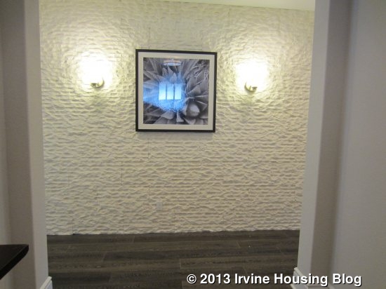
The home has a nice front porch area with a small fountain and space for seating. Apparently the rain gutters on the home are an optional feature that isn’t included in the base model. When you walk in the home, you are immediately faced with a wall (upgraded with the decorator’s stone wall detailing). I didn’t like this aspect of the house, as it didn’t create a sense of openness when I first entered. There is upgraded flooring throughout the home. All of the common areas are to the left of the entry while the bedrooms and den are to the right.

The kitchen has a long, rectangular island with bar seating. The sink and dishwasher are also located on the island, along with cabinets and an optional (upgraded) built-in wine rack. There is also an option for a second dishwasher in the island. The sink is one large, rectangular basin without a divider. Across from the island, a long wall includes the refrigerator, stove and numerous cabinets and storage drawers. The L-shaped counter continues along the side wall with more cabinets, drawers, and the double oven/microwave. There is ample space throughout for both storage and food preparation. Several windows and upgraded pendant lighting brighten the room. There is also a walk-in pantry with plenty of shelving. Upgrades shown in the model include Diamond Premier Cabinetry in white, furniture island with wine rack, cabinet hardware, open shelving upper cabinets, a Kitchenaid SS refrigerator, quartz countertops and an upgraded backsplash.

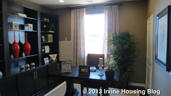
Adjacent to the kitchen is what Pulte refers to as the “café,” better known as a dining area or breakfast nook. It is a big space with plenty of room for a large dining table. One wall has an optional wet bar with upper and lower cabinetry, a tiny sink and a wine rack. The wine rack and the glass-front upper cabinets are upgrades. The opposite wall shows an upgraded, built-in window seat that I absolutely loved. It sits beneath three windows that look to the side of the house and it has built-in cabinets underneath. These cabinets could be a great place to store kitchen linens and rarely used items.

Just beyond the café is what Pulte calls the “gathering room,” aka a great room or family room. It is a very big room, and the included 10’ ceilings make it seem even more open. This room normally comes carpeted, but like the other rooms, has the upgraded wood floors. It also shows the upgraded built-in media center and can light package. The media center is white, to match the kitchen, and has numerous cabinets and shelves surrounding the large TV niche. A fireplace sits between the media center and the wet bar, bringing the family and dining rooms together. While the gathering room comes standard with a big window and sliding door to the backyard, the model shows the upgraded full-wall folding door. This allows the outdoor, covered patio to truly feel like an extension of the indoor living space.

Just off the kitchen, a small area called the “Everyday Entry” leads out to the garage. It comes standard with a bench that has built-in cubbies and coat hooks above. It makes a great space for stashing coats, backpacks and shoes without cluttering up the rest of the house.

The opposite side of the house has all of the bedrooms and a den. When you come from the home’s main entry, the den is in front of you, the owner’s suite is to the back and the secondary bedrooms are toward the front of the home. The laundry room and a small powder room are here as well. The laundry room is quite long and includes a sink. The counter and cabinets are upgrades.

The master bedroom is a good-sized room at the back of the house with access to the backyard. A big, sliding door plus windows on another wall provide natural light. The room doesn’t offer many options in how to set it up, but does have ample room for furnishings.

The master bath has split sinks in an L-shape, separated by a tub in the corner. The sink closer to the bedroom also has a vanity seating area. Since that is the main walkway into the bathroom, I actually think it would have been better to put the vanity with the other sink so the stool wouldn’t block the entry. The counters and cabinets are upgraded to match those in the kitchen, but the top mount sinks are standard. The sink areas also include optional “apothecary” cabinets, which are tall, skinny cabinets that sit atop the counter. The standard shower includes a seat as modeled, though this one does have an upgraded low threshold. As an alternative, you could select a walk-in shower that has a small entry way into the shower itself. Doing this would shrink the size of the master closet. The closet is at the back of the bathroom and is quite big without feeling unnecessarily huge.

The den is a nice-sized room that makes a great office or sitting room. The model shows upgraded French doors at the entry and out to the side yard, upgraded can lights, and an upgraded, built-in wall of cabinets and shelves. The base plan includes a walk-in closet/storage area in the den, but isn’t shown in the model. The traditional powder room is next to the den, but is shown expanded in the model in lieu of the den closet.

Both secondary bedrooms are a good size and come standard with standard, sliding closet doors. One (called bedroom 2) has a single window facing the side of the house and the other (bedroom 3) has a small window to the side and large window looking out to the front. Each has ample space for furniture. In the standard model, the two bedrooms share a Jack and Jill bathroom. It would have two sinks and, through a separate door, a toilet and shower/tub combo (optional shower only). As I mentioned earlier, the model actually depicts the alternate layout known as “Optional Guest Suite with Den.” In this model, the front bedroom has a private bath with a single sink and a shower with a built-in seat. The other bedroom (bedroom 2) uses a detached, extended bathroom (in lieu of the powder room) that also has a single sink and a shower/tub combo or optional shower only. This bathroom is the only bathroom accessible from the house without being attached to a bedroom, so it is the one that any visitors to the home would use. The bathrooms shown in the model include upgraded counters, shower surround, and framed mirrors.

There are three other optional layouts affecting the setup of the den, secondary bedrooms, and bathrooms. All but one still include a standard coat closet and linen closet, plus an additional, optional linen storage. In addition, they all have the full bathroom shown in the model in lieu of the powder room and den storage that come standard in the house. The first option is called “Dual Owner’s Suite.” It eliminates the den and puts bedroom 2 there instead. In place of both standard secondary bedrooms, there is a complete master suite. This has a larger bedroom, a bath with two sinks, a large, combined tub and shower with seat, and a big walk-in closet. The second option is called “Living Suite.” Again, it puts bedroom 2 where the den was and has the adjacent full bath. The rest of these rooms are created as a separate suite, with private access from the front porch and from inside the house. It includes a living room where the standard bedroom 2 is, a bedroom at the front, and a bathroom between the two rooms with a single sink and shower with built-in seat. The living area in this version can include a wet bar with cabinets, a sink and a small fridge. The final option is called “Guest Suite with Bedroom 3,” and is the only option that creates an additional bedroom. In this version, the den becomes a bedroom with a sliding closet and is labeled Bedroom 3. Bedroom 2 stays as modeled and shares a hallway bath that, again, looks as modeled. The front bedroom is now known as “guest suite” and is the same as modeled, with a private bath.

Buyers will like the flexibility of these rooms, as it allows them to create extra bedrooms or living space as needed. The private living suite and dual master suite options will appeal to multi-generational families.

The backyard of the home is long and narrow. As I mentioned, the covered patio portion sits just outside the gathering room. An extended cover is available as an option, but if included would eliminate all open space. The third segment of the yard is raised with a built-in stone bench surrounding a fire pit. A raised garden box spans the entire back wall. Around the side, a narrow yard is accessible from the den and is shown with a very small patio and garden shelves. This is a yard for sitting or dining, but doesn’t really have any space for children to play.

Overall, I think this house provides a lot of flexibility and is a great option for someone who wants a single-story home, especially since most houses in Pavilion Park (and really, all of Irvine) are two levels. None of the bedrooms felt too small and the main living area is quite spacious. My biggest complaint is with the bathrooms. I wish that there was a powder room closer to the living area so that visitors to the home didn’t have to go over to the bedroom side. Similarly, I wish that all of the optional setups still included a powder room, in addition to a third full bath, so visitors could still have a space to use that wasn’t primarily for the bedrooms. The only other downfall to the house is the size of the backyard. While a few of Hawthorn’s lots are bigger (and I’m sure priced much higher), the majority of them appear comparable in size to the models. I’ve already heard several people who say that the single-story home is very appealing and imagine that they will sell well.

Residence Two

3,105 Sq Ft

4 Bedrooms, 4.5 Bathrooms, Suite, Game Room

Optional: High Heat Kitchen, Super Laundry, Exercise Room, Wet Bar, His/Hers Walk-in Closets

This home is much larger than Residence 1, with over 600 more square feet. As in the first house, there are numerous options available, many of which eliminate the storage space in the garage. Others affect the kitchen pantry and hall storage closet. There are no variations available on the second floor. The home is modeled in the Monterey Elevation, with a combination of brick and stucco on the outside. As with Residence 1, there is a nice front porch for sitting, but it is less visible from the street, so it doesn’t offer as much social opportunity as the neighborhood tries to promote.

This house has a more open foyer, with rooms coming off all four sides. To the right, there is a short hallway with linen cupboards at the back and a powder room off to the side. The pedestal sink is included, though you can upgrade to base cabinets with an undermount sink.

To the left of the foyer are the laundry room and the Everyday Entry with access to the garage. The everyday entry has optional cabinets and the standard laundry room has a sink and optional uppers on two walls. However, the house is modeled with the “Super Laundry 2 in lieu of Laundry/Garage Storage.” Basically, the original laundry room is converted to a big closet and the entire garage storage area is now an enormous laundry room. It includes a sink, a big counter, optional uppers and an optional refrigerator, plus several lower cabinets and plenty of floor space. Personally, I would rather have the flexibility of garage storage, but the super laundry is nice if all you really want is more closet space.

Off the foyer going toward the front of the house is a private living suite, which has an option for a separate entry off the front porch. The suite includes a sitting room with and optional kitchenette and a bedroom with an en suite bathroom. The sitting room is a nice size, but if you do include the kitchenette, there isn’t a great way to set it up if you want a TV. There is room for a couch and a comfy chair though. The wet bar can have a very small sink, microwave, small refrigerator, and/or upper cabinets. A door between the foyer and sitting room is optional, giving you the choice of having a complete private living quarters or creating an open den plus a downstairs bedroom.

The bedroom is pretty big with two windows overlooking the street. The two-door sliding closet is a little smaller than average. The en suite bathroom has a single sink with a good amount of counter space and comes standard with a shower/tub combo, though the model shows the optional shower with seat. Most of what you see in this bathroom is upgraded.

Finally, if you walk through the foyer toward the back of the house, you find the main living areas of the home. The hallway has a coat closet with a big storage space under the stairs and comes standard with a second storage closet with optional shelves that isn’t shown in the model. There are three different options for the space that I will describe below with the kitchen. The stairs are located at the end of the hall, which then opens up to the gathering room, kitchen and café (dining area).

The gathering room doesn’t feel quite as big as the one in Residence 1, but I like the layout more. A nook in one corner offers an optional built-in media center, which sits next to the fireplace. The model shows an upgraded finish around the fireplace and upgraded can package. Again, 10’ ceilings really help open up the room. As in Residence 1, most rooms downstairs have upgraded flooring, though the standard family room would include carpet. Sliding doors (shown in an upgraded version) lead to the covered patio.

The kitchen has an island similar to Residence 1 with bar seating, a single basin sink, and the dishwasher, with an option for a second dishwasher. All of the cabinets and counters are upgraded, as are the backsplash and appliances. In this model, the island has a different countertop than the rest of the kitchen. The appliances, counter and cabinets all line up along one wall, with the refrigerator, double ovens, microwave and stove all grouped together at one end. There isn’t any counter space that can be reached from the refrigerator, so you would have to walk back and forth to the island if you were taking out multiple items at once or loading up the fridge after a trip to the market. The second oven in this kitchen is an upgraded feature. Another wall of the kitchen has a small counter with upper and lower cabinets.

The standard kitchen has a big walk-in pantry next to the refrigerator and, as previously mentioned, a storage closet accessible from the hall. However, three different options change the setup of this space. The model shows the “High Heat Kitchen” option, which uses the pantry space and some of the storage space to create a kitchen designed for cooking stir fry or other foods at high heat that may create a lot of grease splatter. It includes a single stove burner, a sink, and plenty of cabinetry and counter space. There is a pantry accessible through the high heat kitchen, though it is smaller than the standard one. Another option for this space is a “Prep Kitchen,” which has the same footprint as the high heat kitchen. The main difference is an oven/range and dishwasher instead of only a single stove burner. The final option (“Wet Bar” keeps the walk-in pantry as originally designed, but eliminates the storage closet. Instead, that area becomes a wet bar with a sink, counter overlooking the great room and an optional wine fridge.

At the back of the kitchen is the “café” or breakfast nook. Because it is set back, it feels more like a nook than the big, open space did in Residence 1. The model includes the optional cabinetry that extends the kitchen counters all the way to the back of the house. It also includes the optional French doors leading to the backyard and both optional French and doggy doors leading to the covered patio.

The standard covered patio is in the center of the backyard, but could extend all the way across the entire yard. Again, the yard is long and narrow without much room to play. The model shows brick hardscaped with a built-in bbq and bar seating at one end. There is plenty of space for a table in addition to the furnishings in the covered patio. On the opposite side, the model just shows open space with a combination of brick and grass.

The master bedroom is also downstairs. A doorway off the family room leads to a small foyer and into the master (aka owner’s) suite. Its proximity to the family room eliminates the feeling of privacy that many master bedrooms have. It is a square-shaped room with small windows looking to the side and sliding doors to the backyard.

The master bath has dual sinks split by the bathtub, which is shown with the freestanding tub option in the model, rather than the standard built-in tub. I thought the vanities were a little too small and that a master should offer more counter space. A separate vanity area (no sink) is across from the first sink. The shower is across from the tub and has a built-in seat. One option for the bathroom eliminates the extra vanity and instead includes a walk-in shower. The walk-in closet is at the back of the bathroom and has a partial divider right in the center that utilizes some of the open space. The bathroom has upgraded quartz countertops, shower surround, apothecaries, framed mirrors and can lights.

In addition to the super laundry room that eliminates the garage storage, two different layouts in the master bath can also replace that space. The first replaces it with his/hers walk-in closets. The original closet (“his”) is shrunk to make room for the water closet and doorway to the new (“hers”) closet, which is quite large as it takes the entire garage storage space. The second alternative also cuts into the walk-in closet to make room for the water closet and puts an exercise room in lieu of the garage storage. In addition to the access from the master bath, you can put a door to the exercise room in the foyer between the gathering room and master bedroom.

Upstairs, there are a game room and two bedrooms. No alternative layouts exist, though the American Traditional elevation of the home eliminates the outdoor deck. The second floor may be particularly appealing to teenagers, as they have a private space to hang out that is separate from the space used by their parents. The game room is a big, open space at the top of the stairs that includes the plush carpet that comes standard in the home. It has a closet and an option for a built-in desk (shown in the model). It also includes the upgraded can lights and pre-wiring for a ceiling fan. Three small windows sit high on one wall and a sliding door to the deck is on another. The built-in media niche is an upgraded “decorator item.”

The first bedroom is just across from the stairway and has a linen cupboard and bathroom outside of it. The bathroom includes a single sink and shower/tub combo with an option for just a shower. The bedroom is a good size, with a two-door, standard closet and optional door to the deck (not shown). The second bedroom is bigger and includes a walk-in closet and en-suite bathroom. This bath is basically the same as the other one upstairs. The bedroom does include the optional door to the deck. In the Spanish elevation, there is a small balcony overlooking the street off of this bedroom.

I really like the upstairs area in this house. I think it’s a good set up and a great way for kids to have some privacy without being closed in their room all day. The downstairs suite is also a nice touch, whether you choose to make it a private suite or a general sitting area and bedroom. I don’t love the setup of the kitchen or the location of the master bedroom, though I do see the appeal of a downstairs master. I wish the yard was bigger and I don’t love the look from the outside of any of the elevations.

Residence Three

3,486 Sq Ft

5 Bedrooms, 4.5 Bathrooms, Den, Suite, Game Room

Optional: Living Suite 1 or 2, Bedroom 6, Super Laundry 1 or 2, Expanded Game Room, Expanded Covered Patio

This house is 1000 square feet bigger than Residence 1 and nearly 400 bigger than Residence 2. The model depicts the Spanish elevation and currently includes the rental office in place of the garage. I like the look of this house much more on the outside than either of the other two residences. It has a big front porch that is visible from the street but still covered. There are a lot of different options in this home, but I will do my best to explain each layout.

The foyer is open in this plan as well, with rooms coming off three sides. The standard home, as modeled, has a den just to the left that is open to the foyer, though doors are available if desired. It is basically a traditional living room and makes a great sitting area. There is an option to make it a bedroom instead, which would have a standard closet and a full bathroom accessible from the hall that would replace the standard powder room.

To the right of the foyer are two more rooms off of a short hallway with a full bathroom between them. The basic arrangement is for two bedrooms, each with a standard closet and a shared, full bathroom accessible only from the hallway (single sink, shower/tub combo, option for just a shower). The model depicts this set up, with Bedroom 3 being at the front of the house and Bedroom 2 farther back. Though it is designed as a bedroom, they put den furniture in Bedroom 2 to help show the flexibility of the space. Two of the alternate plans use Bedroom 2 as an actual den, eliminating the closet and adding a door to the main hallway. In these setups, there is not access from the shorter hallway currently between the two rooms. The only difference in the two den options is what type of door you have; French doors or a barn door are available.

Two other options for this area create combine the two rooms to create a complete living suite. In each one, there is a living room/den and a bedroom with a walk-in closet. The bathroom is still accessible only from the suite’s hall area, with the hall having an optional door separating it from the foyer. The bathroom is laid out differently but still has only one sink. It cannot have a bathtub and instead has a shower with seat. In Living Suite 1, the living room space is at the front of the house (Bedroom 3) and can have an optional kitchenette with cabinets, a sink, and a wine fridge. The room farther back (Bedroom 2) is a standard bedroom with a walk-in closet. In this set up, there is an option for a door leading from the front porch directly into the private living room. If you go with Living Suite 2, the rooms are reversed, with Bedroom 3 becoming the only bedroom at the front and the back room (formerly Bedroom 2) set up as a living room without a closet or kitchenette. In this option, you cannot have access to the front porch but have optional access to the main hallway and/or the side yard. Again, the versatility of this space will be a big selling point to buyers who need something different than a traditional house set up.

From the main foyer, a hallway leads back to the rest of the house. Along the way, you pass a powder room, linen closet, and coat closet (with under the stairs storage) on the left. It opens to a formal dining room with soaring ceilings and options for French doors to the side yard, built-in shelves, and/or a dual fireplace that is open to both the dining and family rooms. The model shows a built-in wine rack and counter along one wall that is not listed as an upgrade, so I’m not sure if that is a standard feature or just an accidental omission from the upgrade list. The room comes standard with carpet, though most people I know prefer some sort of wood or tile in their dining rooms. Overall, it is a very pretty room and a great space for those who prefer a house with a formal dining room.

Beyond the dining room, a doorway leads to the gathering room and kitchen; there is also a hallway to one side with another door leading directly to the kitchen. The gathering room is a big, square room with windows on one side and doors to the covered patio on another (various door options available). A third wall has the fireplace, which comes standard in the family room with the option for the dining room side. Two openings flank the fireplace to see through into the dining room; the model shows them with upgraded shelves inside.

The kitchen is right next to the family room and has a very wide island with one rounded side with bar seating that divides the space. One wall has the refrigerator with a small counter and cabinets next to it. The other wall has everything else, with the oven and microwave on the end and the range in the middle. There are only a few upper cabinets and many of the lower cabinets are optional, so you’d pretty much have to include the extra cabinets to have enough storage and counter space. The island has the sink and shows both dishwashers (one is an upgrade). There is a walk-in pantry built into the corner shown with upgraded shelving. This kitchen shows upgraded granite and a gourmet appliance package, but seems to have the standard cabinetry and backsplash. There is a breakfast nook at the back of the kitchen with optional French doors to the backyard.

Again, the backyard is small, long and narrow. The covered patio is directly behind the gathering room and is shown with a fireplace and wall-mounted TV. A space to the right of it has room for a grill and small table. The center area has a fountain and is the widest space, but still quite narrow. The far end has room for another sitting area but, again, doesn’t have room to play.

The everyday entry and laundry room are off the hallway across from the kitchen. In the basic model, the everyday entry is small with optional cabinets. The laundry room is long and narrow with an optional sink. Two alternative plans for this area eliminate the garage storage space. The first one enlarges both the everyday entry and the laundry, with a lot more cabinet storage options in both spaces. The second one turns the entire area into a gigantic laundry room without a separate everyday entry. As in residence 2, this laundry room could have a refrigerator and it would also add a small storage closet with optional shelves. The model is using the space as their office, so none of these options are actually shown.

As in Residence 2, the master bedroom is downstairs, farther down the hall from the laundry room and kitchen. The bedroom is pretty much identical to the one in the other home, with two small windows on one wall and doors leading out to the yard. The room is a good size with plenty of space to furnish it.

The master bath is set up with one of the alternate designs rather than the standard model, showing a walk-in shower rather than the basic shower with seat. If you choose this option, you lose a vanity area. Either way, the opposite wall still has two sinks separated by a tub. The model shows the standard, built-in tub but a freestanding tub option is available. The walk in closet is one big, open square.

Another way that this home is similar to Residence 2 is the upstairs. Residence 3 also has a game room with two bedrooms and a deck in some elevations. The game room is at the top of the stairs and is pretty big, though there is an option to create an expanded game room. If you opt for this, the extra space would be over the dining room, so that room would no longer have the soaring ceilings. The game room has a storage closet in one corner that could be a wet bar instead. The bar in the model has a small sink and wine cooler, plus several cabinets.

Both upstairs bedrooms are at the front of the house, accessible from the game room. One (bedroom 4) has a hallway bath with a single sink and shower/tub combo with an option for just a shower. This room is really big, with a lot of floor space, a niche for a desk or dresser, and a two-door closet. There is an optional door to the large deck overlooking the street and one other window on the same wall. The other bedroom (bedroom 5/suite) is even bigger. It has a door to the main deck and, in the Spanish elevation, a separate small balcony also facing the street. The en-suite bathroom is set up exactly like the other one.

This is a really big house. If you’re looking for a lot of space, a lot of flexibility, and the availability of a downstairs master’s suite, it’s definitely worth taking a look.

Overall, I really like the Hawthorn collection. The homes are spacious and well laid out. The numerous options make them suitable for almost any type of family. I like the location of the tract, as it is close to the common area. I’m disappointed by the lot sizes, but that seems to be the trend in most new homes.

Discuss on Talk Irvine: http://www.talkirvine.com/index.php/topic,10976.0.html
Pavilion Park Overview

The first of the Great Park Neighborhoods, Pavilion Park is now selling. This week, rather than reviewing an open house or a set of models, I’m going to discuss the general neighborhood and its amenities. Pavilion Park is adjacent to the 133 toll road and stretches from Irvine Blvd. to Portola Parkway. There will be approximately 725 total homes once all construction is complete.

Pavilion Park is comprised of 10 different home collections with a total of 31 floor plans. Every property is a detached, single family home ranging from approximately 1,700 to 4,200 square feet. Every model has three different elevations (primarily affecting how it looks on the outside) and they are designed in an American Heritage style. A quick run-down of the collections, from smallest to biggest:

Collection

Sq Ft

Beds

Baths

Garages

Base Price

Builder

Birch Trail

1,850 – 2,350

3 – 4

Up to 3

2

Upper $700,000s

Richmond American Homes

Roundtree

2,053 – 2,462

4

Up to 4.5

2

$700,000s

Lennar

Springhouse

2,161 – 2,481

3 – 4

Up to 3.5

2

Upper $700,000s

Taylor Morrison

Beachwood

1,767 – 2,691

3 – 4

Up to 4

2

$800,000s

Lennar

Whistler

2,336 – 2,896

4 – 5

Up to 3.5

2

$900,000s

William Lyon Homes

Sagewood

2,515 – 2,960

4 – 5

Up to 4.5

3

$900,000s

Shea Homes

Hawthorn

2,488 – 3,486

3 – 5

Up to 4.5

2 + storage

$1,000,000s

Pulte Homes

Rosemist

2,924 – 3,404

4 – 5

Up to 5.5

3

Low $1,000,000s

Lennar

Harmony

3,362 – 2,722

4 – 5

Up to 6

3

Low $1,200,000s

K. Hovnanian Homes

Melrose

3,900 – 4,223

5

5.5

3

Mid $1,000.000s

Ryland Homes

Each collection has three different residences, with the exception of Roundtree, which has four. Of the 31 different models, two are single story homes – one in Beachwood and one in Hawthorn. Six of the collections (Roundtree, Beachwood, Sagewood, Hawthorn, Rosemist and Melrose) have the option for a private residence/suite on the ground floor in at least one residence. These are designed to appeal to multi-generational families, but also make excellent suites if you have frequent visitors or are looking to rent out a room. All but two of the homes (the smallest models in the Birch Trail and Springhouse collections) have at least one bedroom on the ground floor. Many of the homes offer a complete master suite downstairs.

Pavilion Park boasts its efforts to create a true community feel among all the collections. Many homes have front porches to encourage families to sit outside and talk to neighbors. Some houses have trees and shrubs to mark the property line between homes, rather than walls or fences. Paths throughout the neighborhood encourage walking and biking. Rather than having individual HOAs with separate pools and playgrounds, one large community park serves the entire Pavilion Park Neighborhood. Spanning over five acres, the park (aptly named Pavilion Park) highlights the neighborhood’s commitment to sustainability and community. Over 100 Heritage trees were brought in and replanted throughout the neighborhood, including 36 in the park itself that give it shade and eliminate the sparse feeling found in many other new communities. There are also numerous sidewalks, paths and trails to create a flowing environment throughout the park and the entire neighborhood.

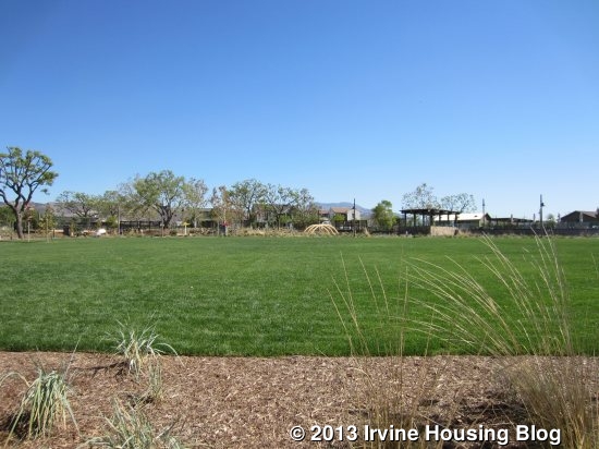
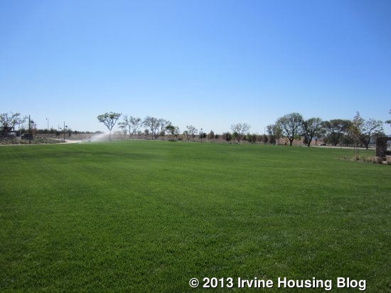
At the heart of the park is a huge, open grassy space perfect for various activities, such as impromptu soccer games, picnics, or community events. The Terrace and its surrounding buildings are on one side of the lawn; the Tot Lot, Swimming Pools and Sports Courts are on the other.

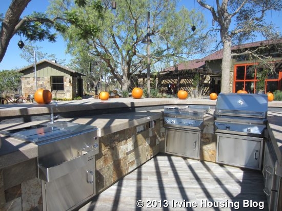
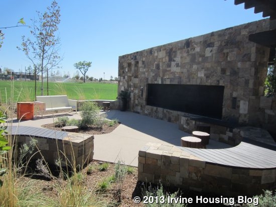
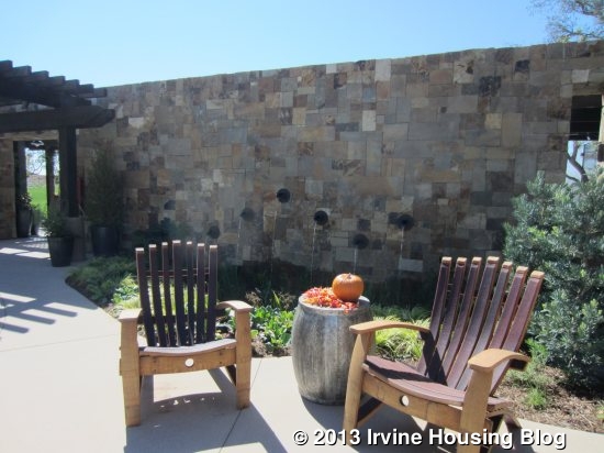
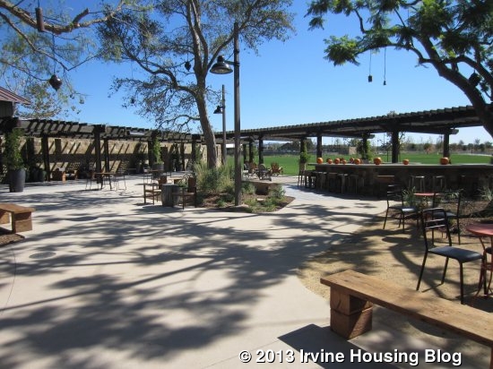
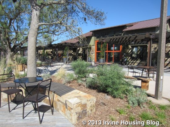
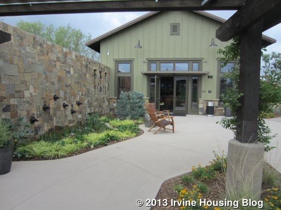
The Terrace is a sprawling patio divided into several sections with the park’s main buildings around the edges. One side of the Terrace has a large rock wall with a recessed fireplace built into it. Benches and stools surround the fireplace to create a gathering spot. A matching wall next to it has a built-in fountain. The bigger part of the Terrace has numerous benches and café-style tables. It’s a great place for an outdoor meal, morning coffee, or just to sit and chat. Relaxing Adirondack chairs have beautiful views of the lawn. There is even a barbecue area with built-in grills.

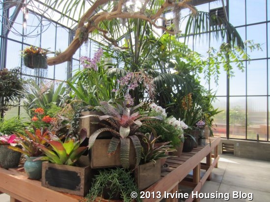
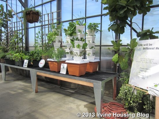
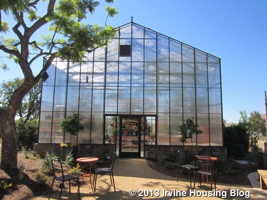
An unusual feature of the park is the Greenhouse, which will offer classes on gardening and provide a space for vertical gardens. The Greenhouse is currently full of different plants and flowers and is open for visitors to see.

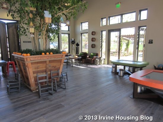
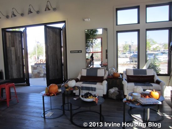
A large community building, called The Pavilion, sits across the Terrace from the Greenhouse. Currently, this building is the visitor information center but will eventually become available for residents to hold events and use as they choose. It is a big, open room with entrances on three sides – one leading to the fireplace and fountain, one to the main Terrace and one to a small patio. The Pavilion has a rustic feeling that goes along with the park’s natural feel. Wooden trellises outside the building extend the space and create shaded areas on the Terrace.

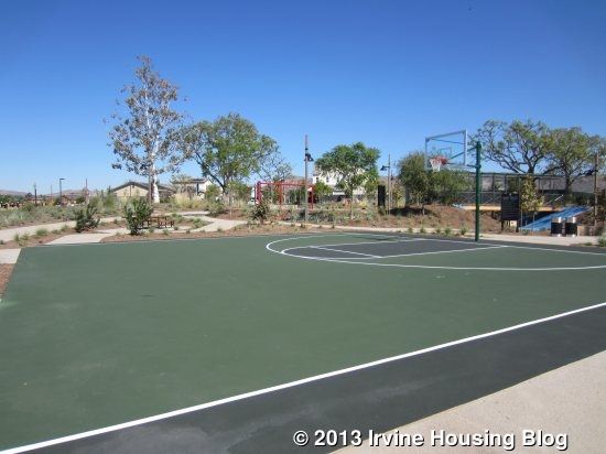
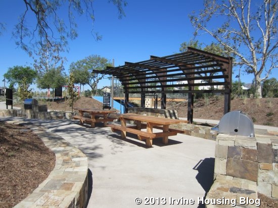
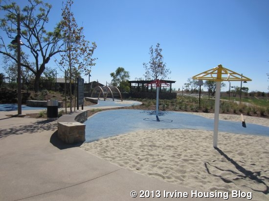
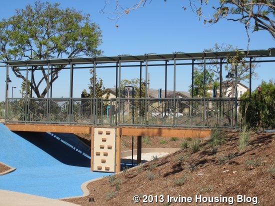
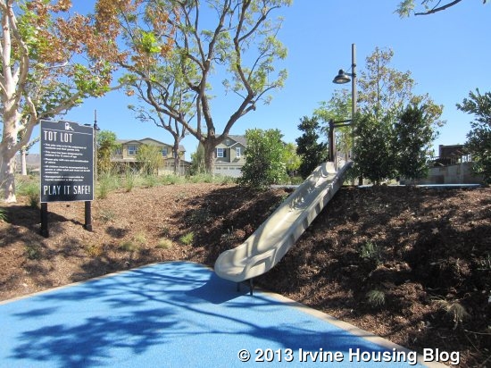
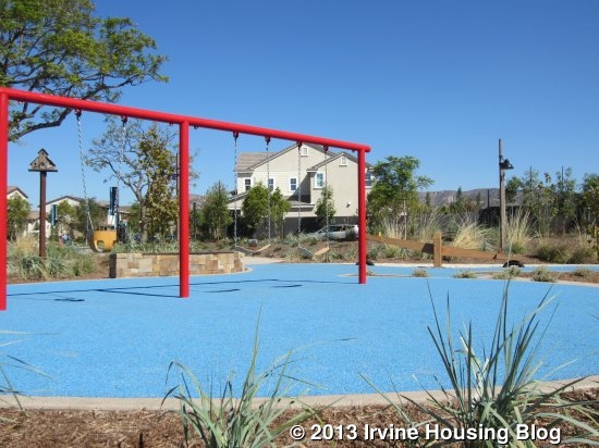
Across the lawn, there is a Tot Lot with playground equipment and a slightly elevated area where parents can sit and have a 360-degree view of the entire playground while enjoying the shade of a coral tree. The Tot Lot is designed to inspire creativity and to blend in with the natural surroundings. One area has swings and a seesaw, another has a bridge and rock wall, a third has a slide designed to feel like part of the natural environment and a few other play structures and sandboxes are spread around. It doesn’t have as much climbing equipment as most other parks in the area and doesn’t have a lot to do for toddlers. There is a half basketball court next to the Tot Lot. Situated in the middle of the Tot Lot is a picnic area with two built-in barbecues and several picnic tables.

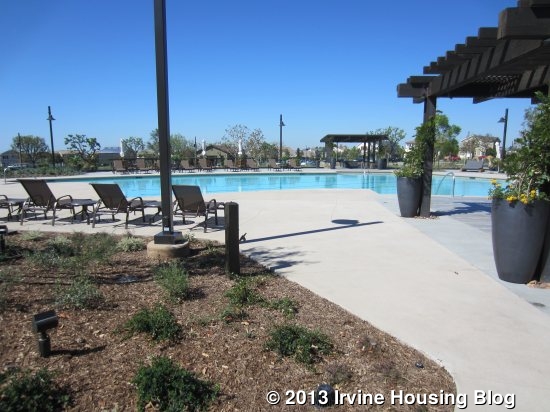
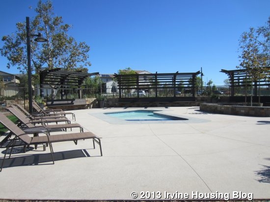
The neighborhood swimming pool and spa are just beyond the playground. The main pool can be used for lounging or lap swimming. A small wading pool has a beach-entry at one end so even the smallest children have a safe place to play in the water. There is a spa on the other side of the main pool. The area also has an outdoor fireplace and, just outside of it, another basketball court.

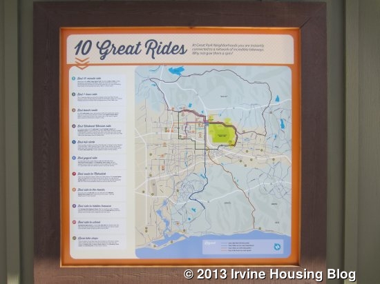
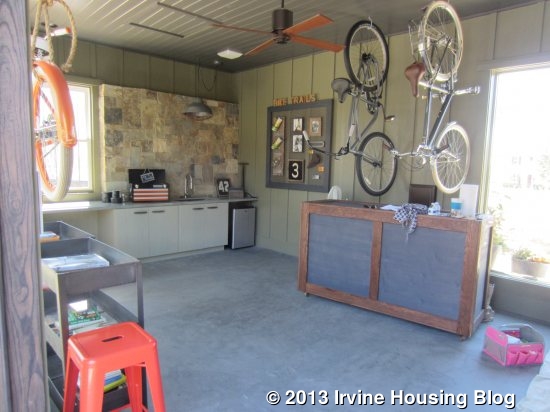
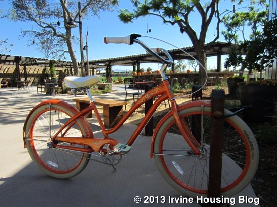
One of the most unique features of Pavilion Park is its bike program. In tribute to the Great Park’s logo, a bright orange beach cruiser will be given to every single new household. Felt Bicycles, an Irvine-based company, will build the bikes, which will be branded to identify them as part of the Great Park community. The goal is to encourage residents to get out more and socialize with each other, as well as to promote fitness and sustainability. There is a neighborhood bike shop next to the Greenhouse that provides a place to work on your bike and has a large sign detailing ten of Irvine’s best bike paths.

Each household gets another special item: a laptop to donate in their name to the Orange County school of their choice. These laptops are part of the Orange County Register subscription service, so each household will also receive the newspaper for one year. In addition to the Register, this is also a partnership with FivePoint Communities (the company managing the entire Great Park project), the Orange County Department of Education, The California Endowment, Acer Inc., and Google. The laptops are Google-powered Acer Chromebooks and will be pre-loaded with school curricula.

Sustainability is an important part of the neighborhood. Solar panels and tankless water heaters are available in most homes. Narrow streets and roundabouts create reduced speeds and encourage residents to bike or walk instead. Both Heritage and newly-planted trees create shade along the streets and, together with trellises, in the park as well. Parkways and common areas are irrigated with recycled water. All of the homes feature numerous other types of green technology.

Currently, all Pavilion Park homes are zoned for Canyon View Elementary School, located in Northwood Pointe (near Yale and Portola). They will attend the brand new Jeffrey Trail Middle School, located in Cypress Village (Jeffrey and Trabuco). All homes are currently zoned for Northwood High School, also in Northwood Pointe, near Yale and Portola. All school assignments are subject to change and the neighborhood has a proposed K-8 school, which I believe is slated to open in 2016.

With its wide variety in home sizes, the neighborhood will appeal to many different families and buyers. I hope that Pavilion Park will succeed in creating the strong community ties that it seeks to build.

Discuss on Talk Irvine: http://www.talkirvine.com/index.php/topic,10954.0.html
A Review of the Springhouse Tract at The Great Park

Last week Karen started reviewing one of the ten new sets of developments debuted in the Pavilion Park area of the Great Park Neighborhoods, which opened at the end of September. She reviewed Roundtree, the second smallest and today I will review Springhouse, the third smallest of the ten developments. All residences have a 2 car garage and an Outdoor Room. Residence 3 is the only plan with its own separate living quarters (consisting of a Den, Bathroom and Bedroom) with its own entrance, which would be perfect for extended families or guests.
Residence 1 Residence 2 Residence 3
2,161 Sq Ft 2,348 Sq Ft 2,481 Sq Ft
3 Bed 4 Bed 4 Bed + Den
2.5 Baths 3 Baths 3.5 Baths
Base Price $760,990 Base Price $790,990 Base Price 823,000
Approx Mello Roos:$4,981 Approx Mello Roos:$5,441

Approx Mello Roos:$5,902

Approximate HOA Dues: $138 – $193 per month

Approximate Tax rate: 1.1%

The Property Management was not as organized as I had expected. It took multiple attempts just to obtain any of the Base Prices as well as the Approximate Mello Roos of Residence 2. They said they would e-mail me information, and I never received it. When I inquired about identifying upgraded features in the models, they stated they were the first development with model homes to be on display, therefore they were not sure how to present the upgrades in each model. The only way to be aware of any upgrades is to check against the “Included Features” handout, which made it inconvenient and challenging to walk through the models and recognize upgraded features. I would have hoped they could label or find a better method after time had elapsed.

Here is a link to the standard amenities. link

None of the models represent the optional Conservatory. The Conservatory would simply use the Outdoor Room and include that space as part of the Great Room if someone chooses to have a bigger Great Room instead. The only way to preview the installed option is by going into the office and viewing it on their computer.

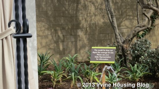
Note that the backyards all have a sign stating that it does not represent the true average size of the backyards, which I found rather annoying. The actual lot size of the homes is approximately 4,400 square feet. The Management office said that the true size would be about half the size in Residence 1 and 2, and it is closer to being represented correctly in Residence 3.

Residence One

2,161 square feet

3 Bedrooms, 2.5 Bathrooms

Base Price from $760,990

Style Options: Spanish (A) , Farmhouse (B), American Cottage (C)

When I entered the home I noticed it was Farmhouse style due to the décor and wood farmhouse closet door upstairs. The stairs were immediately to my right. A bathroom and a coat closet with extra storage under the stairs were down further to my right and a hallway straight ahead led to the kitchen, small dining area and great room. The bathroom had a toilet and upgraded pedestal sink.

The end of the hallway leads you directly into the great room. It is an open square room with the flexibility to arrange it comfortably in a couple of different ways. There are plenty of large windows that provide an abundance of light and a view to the backyard.

The kitchen shows upgraded cabinetry, backsplash, sink and flooring. It has a rectangular island with bar seating. The island contains the sink and the dishwasher. The location of the dishwasher is awkward since it is on the farthest side of the island from the rest of the kitchen’s cabinets/drawers. The oven, refrigerator, large pantry, and garage entry are located on the wall behind the sink. Along the perpendicular wall is the stovetop. The countertop and drawers run across the entire wall. It provides plenty of storage, but with the counter running along the entire wall, it leaves a smaller area for a dining table.

The backyard in all models features an outdoor room. Residence One’s outdoor room is a small covered outdoor entertaining space, and it was placed a bit awkwardly directly between the kitchen slider and yard, which makes it difficult to maneuver around a desired table centered between chairs in the outdoor area. Note, that the yard has a sign that clearly states that it does not represent the true size of their backyards, which was a huge disappointment. The Management office said that the true size would be about half the size.

Upstairs, there are three bedrooms and a laundry room. The master bedroom is off a small hallway to the side as soon as you get upstairs, which creates a sense of privacy. It is a good sized square room with two windows on one wall and a larger window above a built in bench/sitting area. The bench/window may differ in the Spanish style model. The walk-in closet is located in the room, along the third wall, which is not my first choice due to light/noise of accessing the closet in the morning. I would prefer the closet in the bathroom, as the other two models. An open doorway leads to the master bath. The shower and large bathtub are immediately in front of you, along the back wall. There are two sinks, with a good amount of counter space between them. There is an optional bathroom door that can be added, and would block out any of the light in the mornings if one person was utilizing the bathroom while another was sleeping.

The two secondary bedrooms share a bathroom. The bathroom has double sinks, plenty of counter space and a separate toilet and shower/tub combo. All of the bathrooms have solid surface E-Stone countertops. The laundry room which contains a sink, counter space and cabinets separate the two bedrooms.

Residence 1 is the smallest of the Springhouse residences. The secondary bedrooms felt smaller, along with the dining room area and outdoor room, and I wish one of the models had the optional conservatory room to preview. If the Conservatory was opted for, a larger dining table could be furnished. The bathrooms were nicely set up, especially with the option for a privacy door at the master bathroom. Overall I liked the layout of the house and especially the bedrooms upstairs.

Residence Two

2,481 Sq Ft

4 Bedrooms, 3 Bathrooms

Base Price from $790,990

Style Options: Spanish (A), American Ranch (D), East Coast Traditional (E)

Residence Two model was Spanish style. The entry has upgraded flooring and upgraded stair railing. Flipped opposite from the brochure layout, immediately to my left is the staircase with a very large coat closet with storage under the stairs. The downstairs bathroom and bedroom are off of a hallway to the right. This one has a linen cupboard outside the bathroom itself. The entry to the garage is located next to the linen closet. The bathroom is larger for a downstairs bathroom, with a single sink and a large shower which has a sitting bench.

The downstairs bedroom is a decent size with a nook for a dresser next to the sliding two-door closet.

The kitchen and great room are at the back of the house. The kitchen has upgraded cabinets and countertops and has a rectangular island with space for bar seating. Like all models, the sink and dishwasher are located in the island. There is a large walk-in pantry next to the back wall oven. Also on the back wall are the cooktop and refrigerator. Unlike Residence 1, the cabinetry reaches up to the ceiling, but there are only 2 sets cabinets above the countertop.

The kitchen opens directly up to the Outdoor room. It is smaller but a nice little area for sitting in the backyard. Like Residence One, there is a sign posted that the backyard does not depict the average lot size. The Management office said that the true size would be about half the size.

The Great Room seems small to comfortably share with a proper dining area. It has plenty of windows that open to the backyard and side yard. However, if the option for the Conservatory was chosen, it would give ample space for a dining area.

The laundry room is at the top of the staircase to the left. This one has an L-shaped counter area, a sink, plenty of cupboards and it is the only model with the big linen closet.

The shared bathroom upstairs is located across form the laundry room, on the wall adjacent to the stairs. It has a double sink with good counter space and a private toilet with shower/tub combo. The tub is large and deep.

The three bedrooms are next to one another. Some people prefer the Master Bedroom to be on a separate side of the house or a bathroom separating it from the secondary bedrooms. This model has all of the bedrooms sharing its walls. The bedroom adjacent to the shared bathroom is larger than the middle bedroom. They both have two sliding door closets.

The master bedroom is at the corner of the house, adjacent to the laundry room and secondary bedroom. It has a full wall of windows looking out to the backyard and two more facing the side.

Like the other Residences, the bathroom has a shower, large tub and double sinks with plenty of counter space. One advantage compared to Residence One is that the larger walk-in closet is located in the bathroom.

Compared to Residence 1 and 3, this is my least favorite layout due to the configuration and size of the great room, although I do like the fact it has a downstairs bedroom with large bathroom. The bedrooms are also not separated on the second floor.

Residence Three

2,481 Sq Ft

Main Home: 4 Bedrooms, 3.5 Bathrooms + Den

Base Price from $823,000

Style Options: Spanish(A), American Cottage (C), East Cost Traditional (E)

Residence Three is the most different of the tract, featuring a private suite which includes a large den, bathroom and bedroom. It is set up to be a corner house, with the garage on one side (along one street) and the entrance on a different side of the house (on the perpendicular street). No option exists to replace the outdoor room with a conservatory. This is my favorite layout.

Entry to the house and private suite are located under the covered patio. Entry to the private suite is to the left, facing 90 degrees from the main entrance wall, while entry to the main house is in the center as you walk up to the residence. On the opposite side of the suite entrance is the gate to the backyard, which leads directly into the outdoor room.

The suite entrance enters into the private den area. The living area is a nice size for a private suite and can comfortably fit a sofa and coffee table, but there is only space for a tiny dining table that can fit two seats. An optional wetbar and cabinets can be added into the den, which I feel would be a must-have if you plan on having people occupy the suite as a separate living quarter. The bathroom is a nice size with a large walk-in shower and single sink with good counter space. The bathroom sits between the den and bedroom, instead of being en suite, which can be an advantage so that guests are not required to enter the bedroom if they want to utilize the restroom. However, directly outside the den door leading directly into the main house is the main house’s half bathroom immediately on the right, so it may have been worth having an en suite bathroom. The bedroom is similar in size to those in the other models. If you have frequent long-term visitors, have extended family living with you, or want to rent out a portion of your home, this is a perfect way to offer privacy and comfort.

Entering the home through the front door you will find the stairs and large coat closet with storage to your right. As mentioned earlier, the half bathroom and door to the private suite are to the left. The bathroom has a window that faces the front porch. The dining area is visible from the front door.

As the kitchen doesn’t have a separate breakfast nook (only a breakfast bar), this is the only space for a dining table, unless you move the family room closer to the kitchen, and move the dining table towards the back wall. However, if you are going to utilize the table often, that may not be the best solution. The room has space for a long table if desired. Access to the garage is in the kitchen, next to the pantry. The kitchen is to the left and has a rectangular island, but with a nicely rounded countertop with room for seating. As all of the other models, the sink and dishwasher are located in the island, but the location of the dishwasher in this model makes sense since it is close to most of the cabinets. This kitchen has the most set of cabinets and drawers along two sides of the walls, ad well as a nice sized pantry.

The great room has an abundance of natural light, with two windows on one side, windows along the entire wall facing the backyard, and the sliding glass door out to the outdoor room. I like the location of the outdoor room best in this model since it is the largest and doesn’t cause any foot traffic in the middle of the outdoor room in order to access the backyard. Like all models, it has a sign posted in the backyard to remind you that the size of the backyard is not the true average size of the house.

Upstairs, there are three bedrooms, two bathrooms, as well as a laundry room. Like residence one, the laundry room does not include a separate linen closet. But it still has a sink, cabinets and room for side by side washer and dryer.

The master bedroom is the first door to the right. The laundry room is located in the hallway which also leads to the secondary bedrooms and shared bathroom. The master bedroom is similar in size as the other models, and the bathroom is also similar in size with a shower, big tub and double sinks with plenty of counter space. Like all models, there is a nice option for a bathroom door to reduce noise and light in the mornings if someone is utilizing the bathroom while the other is still in bed. The walk-in closet is located in the bathroom and seems to be the biggest of the models.

The two secondary bedrooms are on opposite corners of the house, with the shared bathroom between them. One bedroom is to the right, and faces the backyard. It seems slightly larger than the other bedroom. Although the documentation shows a closet with doors swinging out into the room, the model had a two-door sliding closet. The other bedroom is at the front of the house with two-door sliding closet. Next to the closet is a nook that is big enough for a dresser.

The shared bathroom is similar to the other Residence’s bathrooms with double sinks and plenty of counter space. Like the others, it also has a separate toilet and large shower/tub combo.

I think the private suite will be very appealing to certain buyers. It can also prove to be a great playroom and/or office space if desired. By far, this is my favorite layout in the tract due to the private suite, location of the outdoor room and layout of the bedrooms on the second floor.

Discuss on Talk Irvine: http://www.talkirvine.com/index.php/topic,10953.0.html