Category Archives: New Homes

A Review of the Melrose Tract at Pavilion Park – Residence 3

The Melrose collection in Pavilion Park (the first of the Great Park Neighborhoods), has the community’s largest – and most expensive – homes. The three models feature rooms often not seen in new construction these days. They have formal dining rooms and two downstairs living spaces, rather than just a great room. Built by Ryland Homes, each house has the option for a downstairs living suite plus a three car garage. The models didn’t offer lists outlining the upgrades, but I will list some of the standard features and try to note upgrades when I can. Once you express serious interest in purchasing, the information about upgrades is available.

See the rest of The Melrose Collection Overview and Review of Residence 1 here.

See a Review of Residence 2 here.

Residence Three

4,223 Sq Ft

5 Bedrooms, 5.5 Bathrooms, 3 car garage, downstairs master suite

Base Price from $1,588,205 ($376/sq ft)

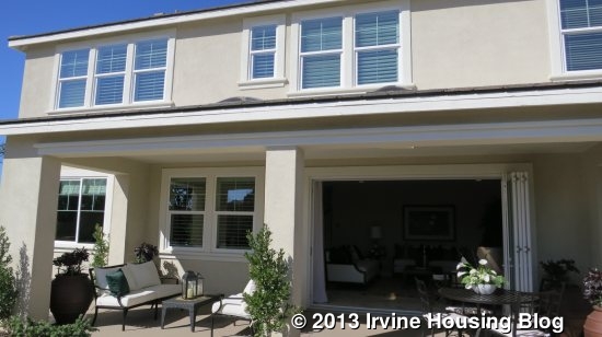
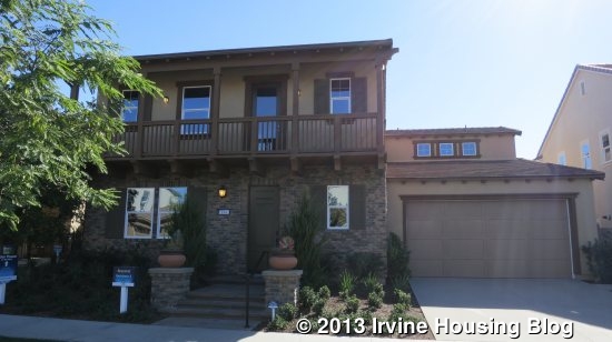
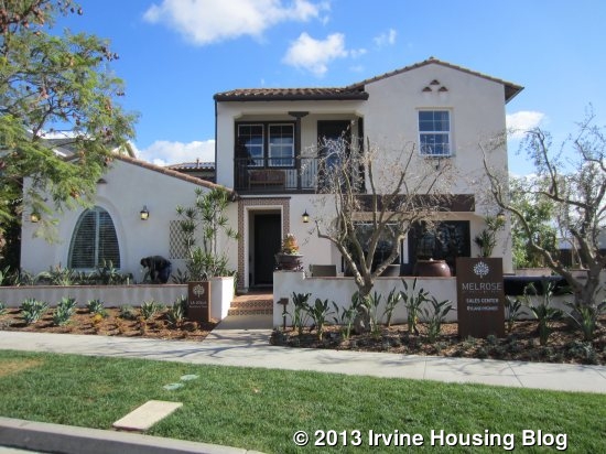
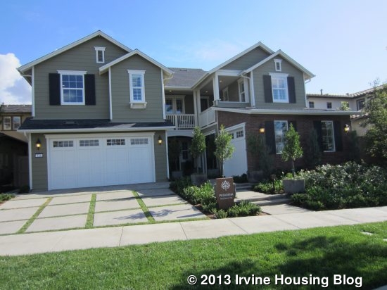
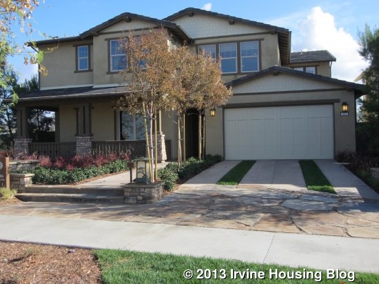
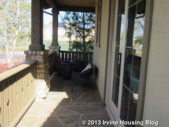
Residence Three is the La Jolla home, modeled in the Spanish style and also available in Monterey and Farmhouse elevations. The model is shown with a reversed floor plan. Like Residence One, there are a variety of alternative room arrangements. This model houses the main sales office, so I couldn’t see the real garage. In the printed floor plan, it appears to be a much larger garage then in Residence One, as it is the full width almost the entire way back.

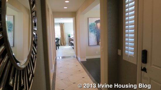
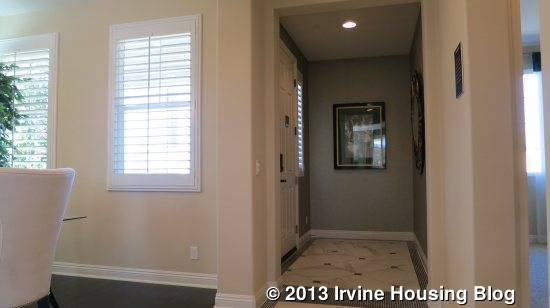
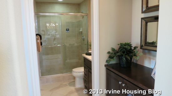
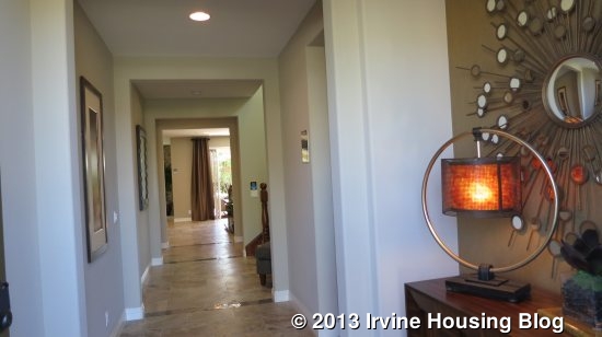
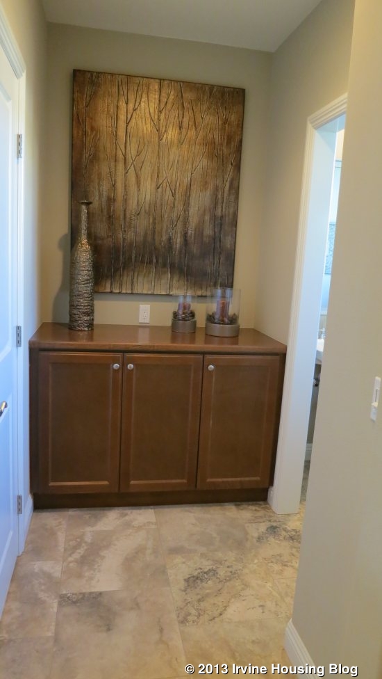
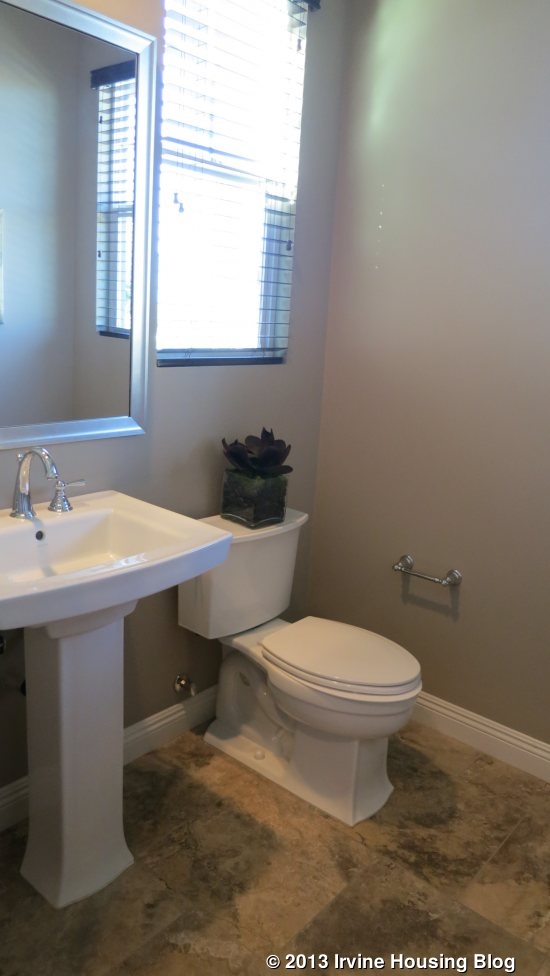
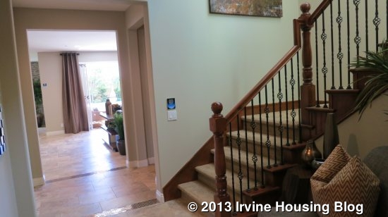
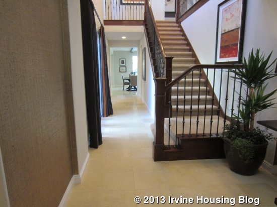
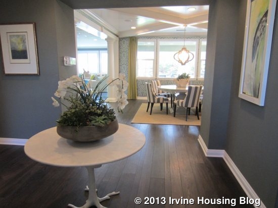
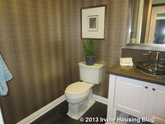
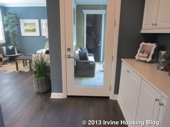
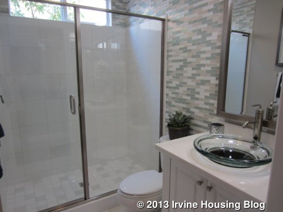
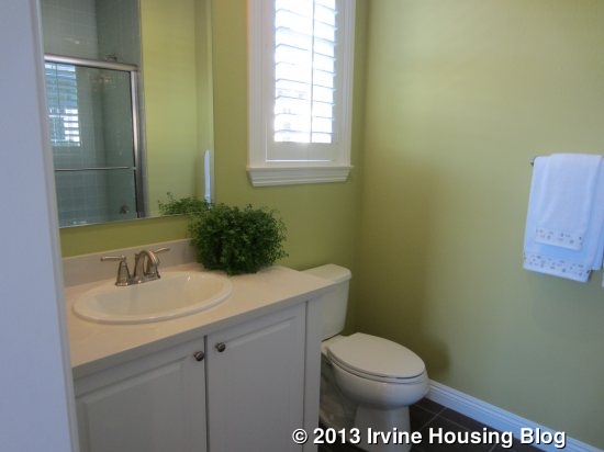
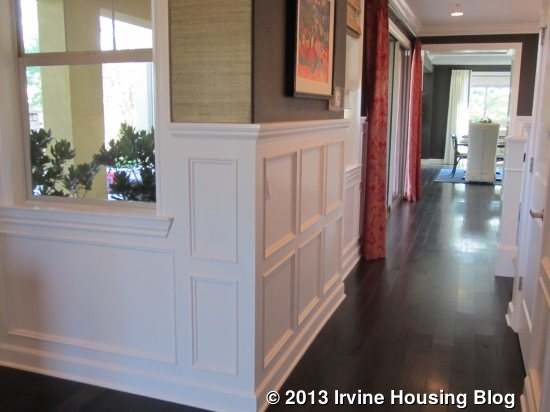
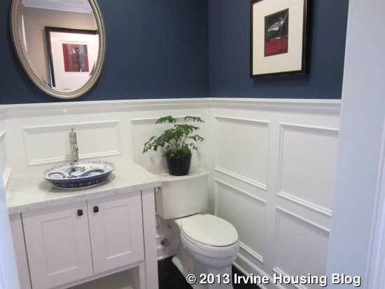
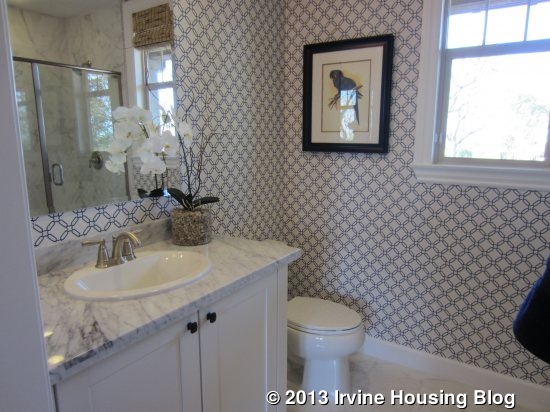
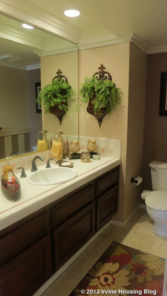
In this home, the view from the entry is a long hallway toward the back of the house, with the staircase just a few feet back from the door. To the left of the entry, there is a small powder room (shown highly upgraded), linen storage, and the downstairs master suite.

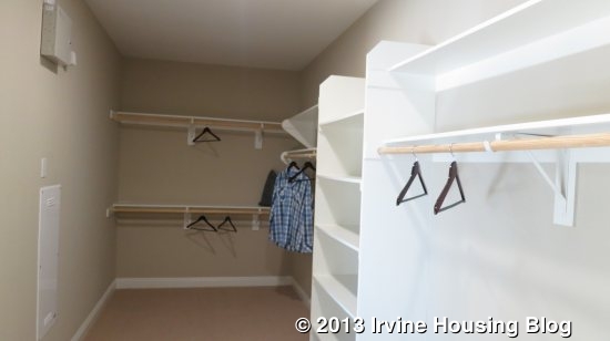
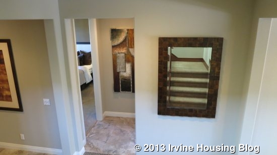
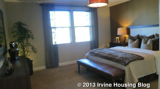
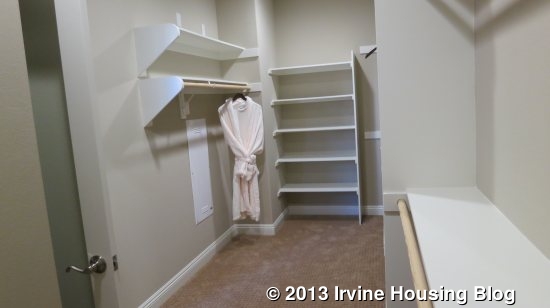
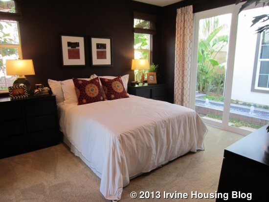
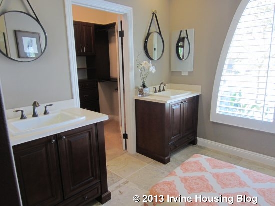
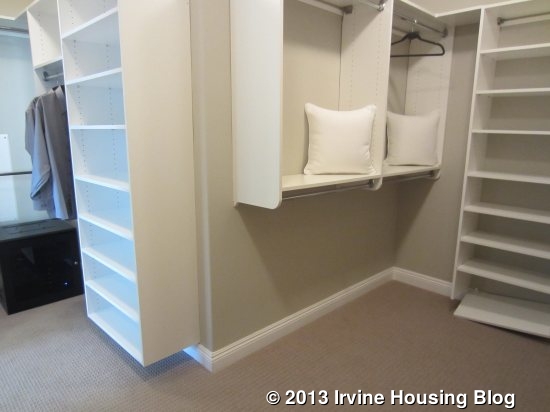
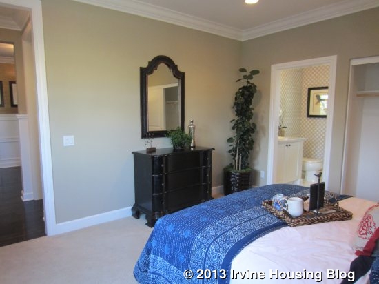
The downstairs master is a nice room, but over 100 square feet smaller than the upstairs master. It is closer in size to the secondary bedrooms upstairs (one of which is actually much bigger). It has sliding doors that lead to an inner courtyard, plus two more windows on another wall. The carpet appears to be the standard, plush carpet that comes with the home. The master bath has split sinks, with the door to the walk-in closet between them. The built-in organizers are shown in an upgraded finish that matches the vanities. This room has a somewhat small shower and no bathtub. It also has a big window facing the street, which doesn’t give the bathroom a lot of privacy.

For those who prefer something other than a master suite, there are two alternatives. The first is a den and bedroom. In this scenario, the original master bedroom is converted to a den and made a little bit smaller. The extra square footage taken from the den, plus the former master bath, are converted to a bedroom with a sliding closet and an en suite bath with a shower/tub combo and single sink. Both the den and bedroom are accessible from the hallway just outside the powder room (which is unchanged). The linen cabinets are eliminated.

The other option is for a private living suite. Again, the powder room remains untouched and access to the suite is just outside of it. You enter the living room, which is smaller than the original bedroom, but bigger than the den in the other alternative plan. It does not appear to have an optional kitchenette. A doorway leads into the bedroom, which is also slightly bigger than the bedroom in the last plan but smaller than the original master. It has a mini hallway that leads to a sliding closet and a bathroom identical to the one in the den/bedroom plan. The suite seems to have a regular door (as opposed to sliders) that leads to the inner courtyard, but doesn’t seem to have private access directly from the street. This is definitely not as nice as the suites in the other residences.

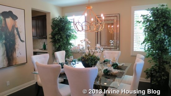
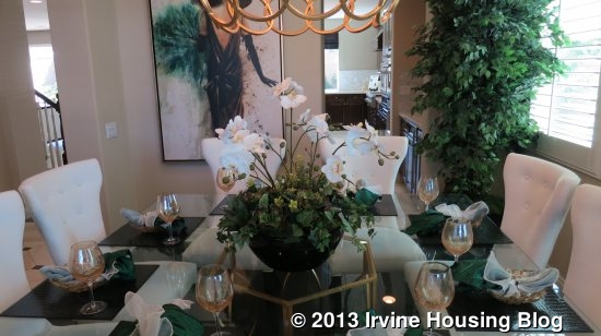
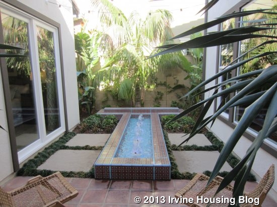
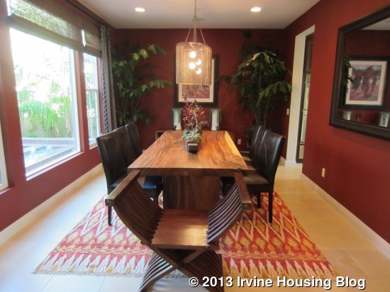
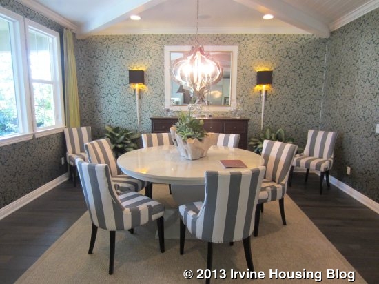
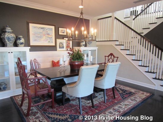
Moving back down the main hallway of the home, I passed more sliding doors leading to the courtyard, which has a nice fountain and small patio area for seating. Just beyond it is the formal dining room. This room is very rectangular (those in Residences One and Two were more square-shaped). It has big windows facing the inner courtyard and a door to the kitchen.

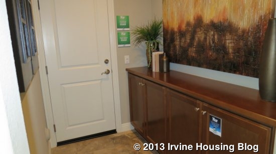
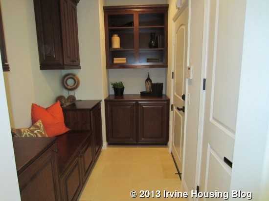
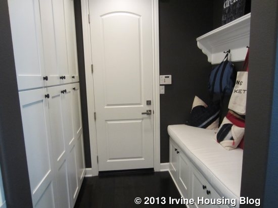
Across the hall from the dining room, there is a coat closet under the stairs plus a built in bench, and linen storage with an option for additional upper cabinets. The garage access is here as well, making a nice spot for a drop zone. Though I mentioned earlier that the garage is almost like a four-car garage, there does seem to be an option to turn part of it into a den. If you do that, it looks like the drop zone area will be more of a regular hall and the garage will then be a true three-car garage with one half having tandem spaces. It is a little hard to tell on the brochure, but it looks like the den can

have a built-in unit that would be back-to-back with the family room’s built-in.

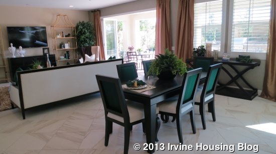
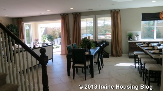
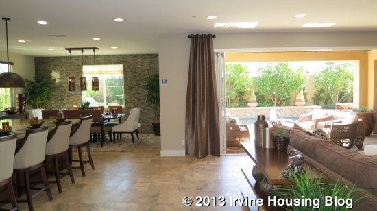
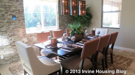
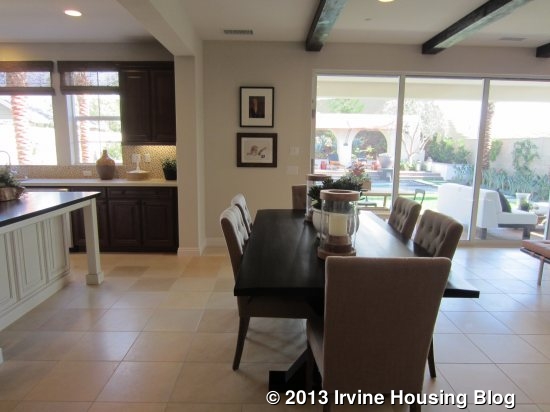
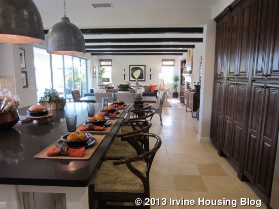
The hallway opens at the end to the “morning room,” which is a large dining area between the kitchen and family room.

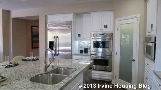
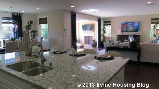
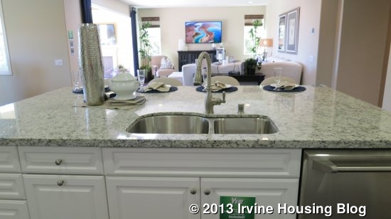
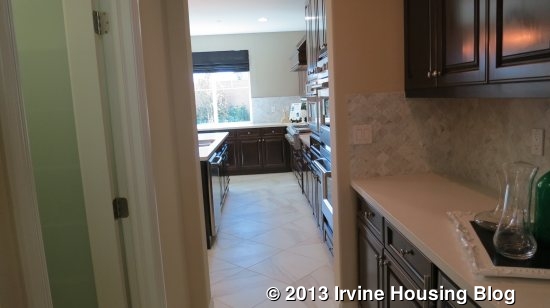
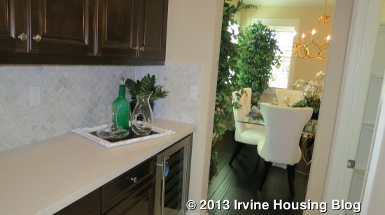
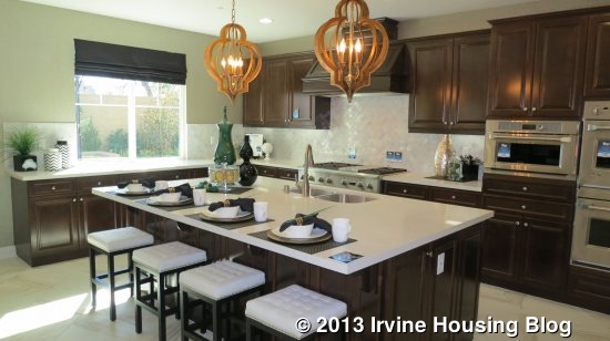
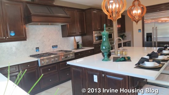
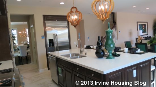
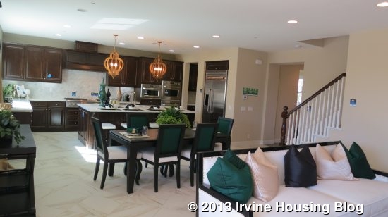
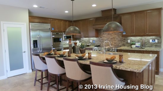
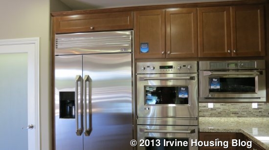
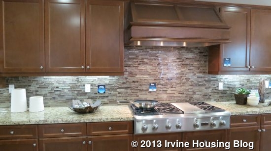
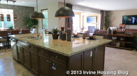
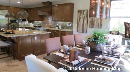
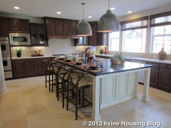
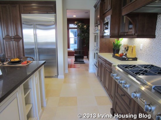
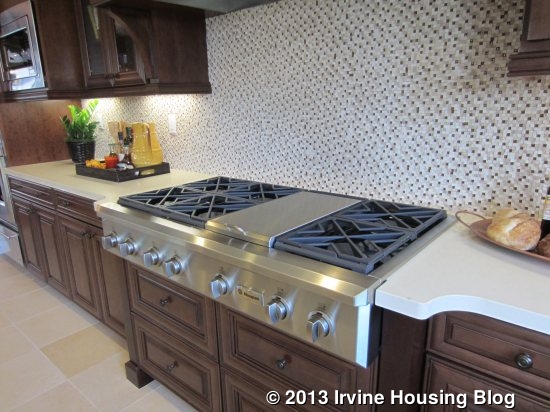
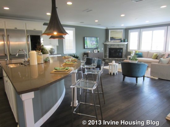
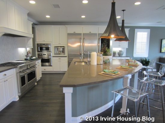
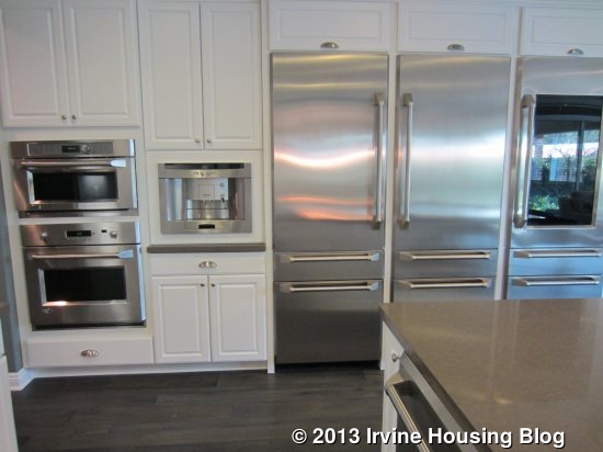
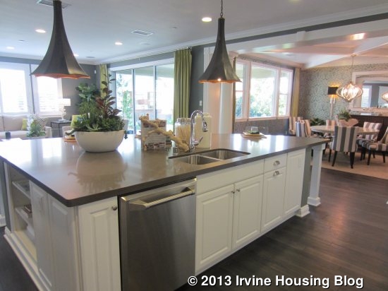
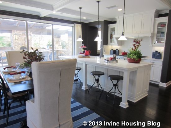
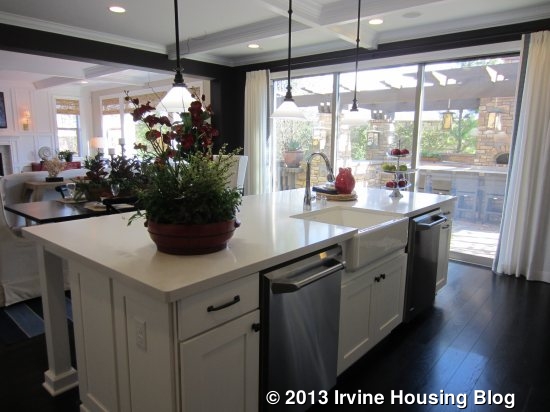
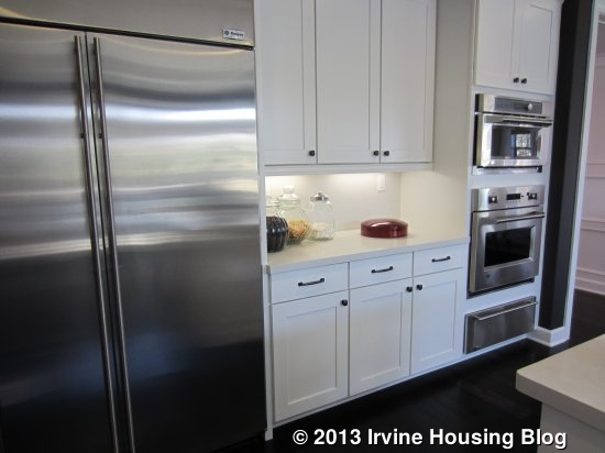
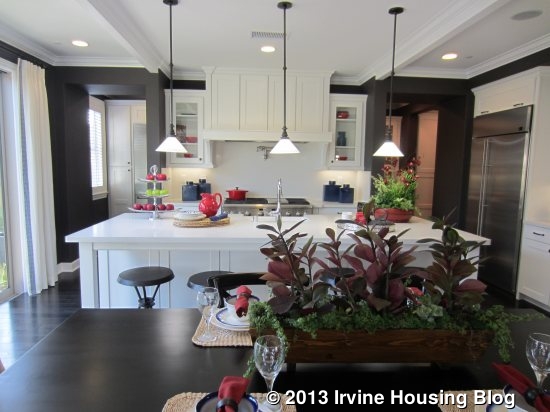
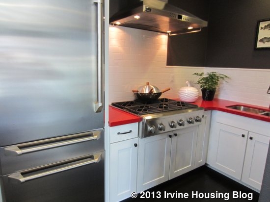
The kitchen is on the left and includes a very wide island. Seating on two sides allows for six to sit comfortably. One side has several cabinets and an optional wine cooler. Unlike the other two models, the sink and dishwasher are actually located on the counter behind the island, rather than in it. The wall on the far side of the island has numerous cabinets, plenty of counter space, and the cooktop. This is the only residence that shows the actual 6-burner cooktop that comes standard with the Melrose homes. At the end of that wall, next to the dining room, are the two built-in ovens and the built-in microwave. The third wall has the fridge and several pantry-height cabinets. While the model does have upgraded cabinets, it is nice to see the standard appliances and tile flooring.

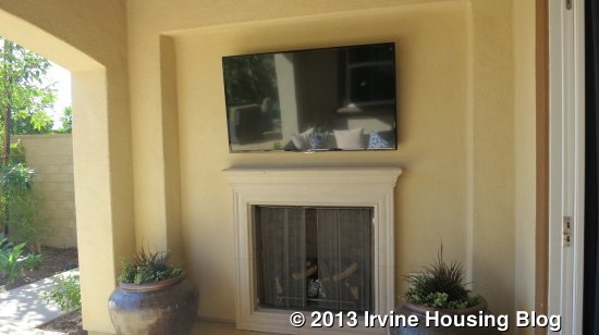
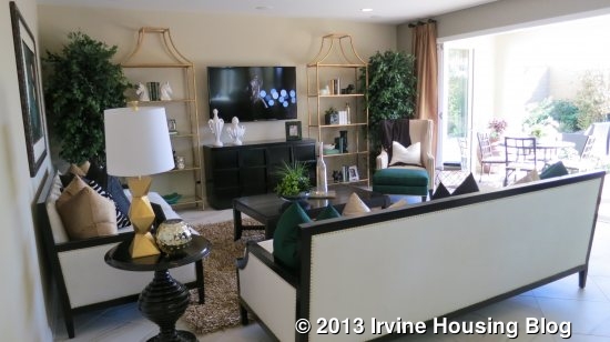
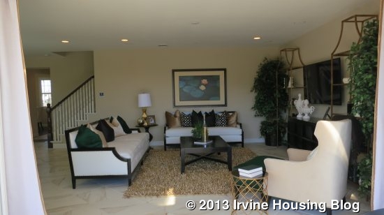
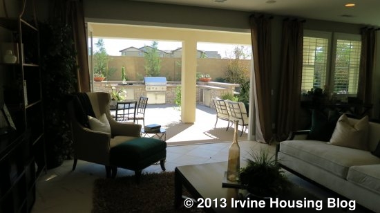
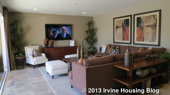
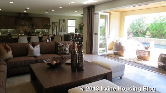
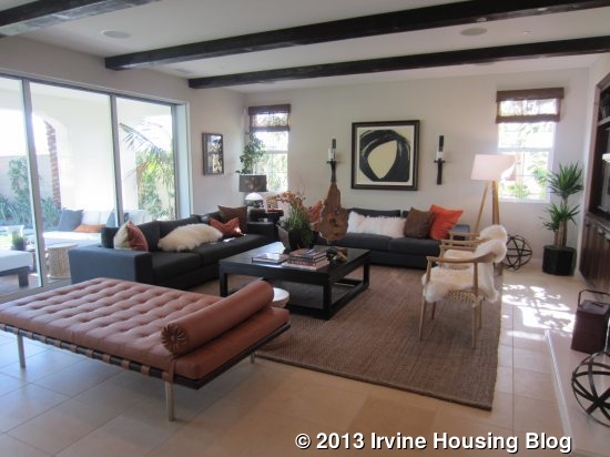
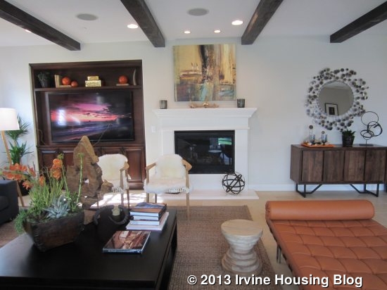
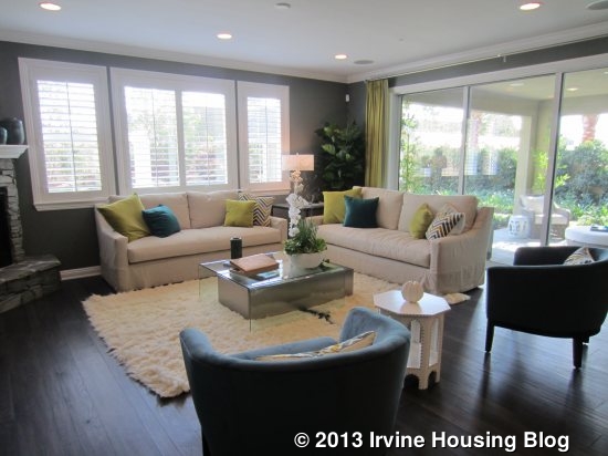
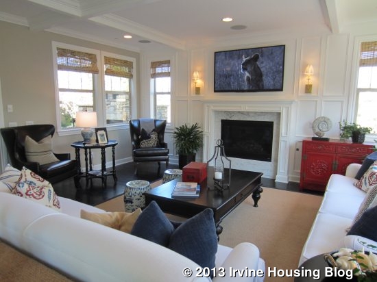
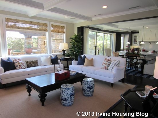
The family room is on the other side of the morning room. It has a small fireplace in the center of one wall and a built-in unit next to it. The side wall has two windows and the entire back wall (stretching into the morning room) has sliding doors to the yard. Three different California Rooms are available – two are the same size but appear to have slight differences in the thickness and decorative style of the walls. The third is about half as wide. The morning room can also have optional stackable doors.

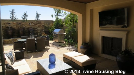
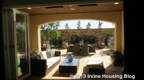
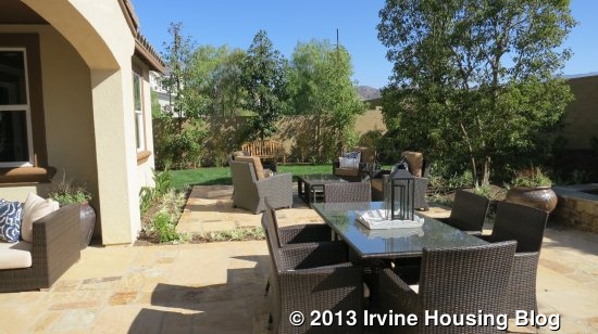
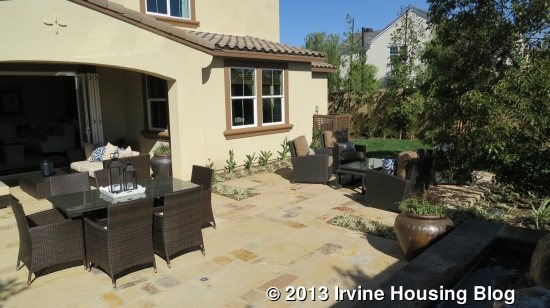
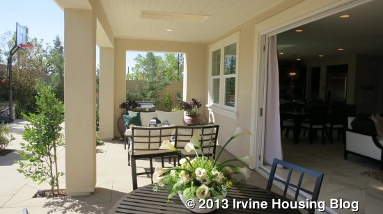
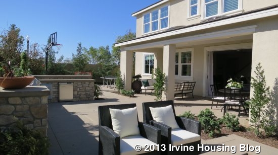
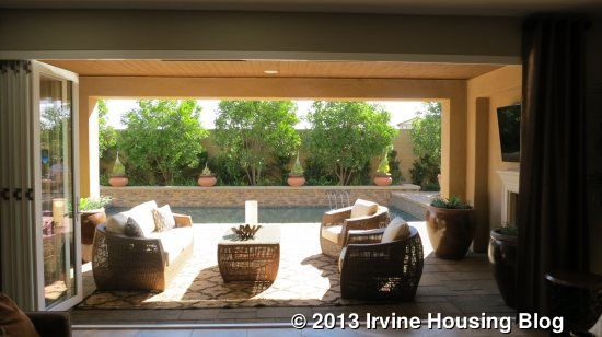
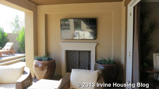
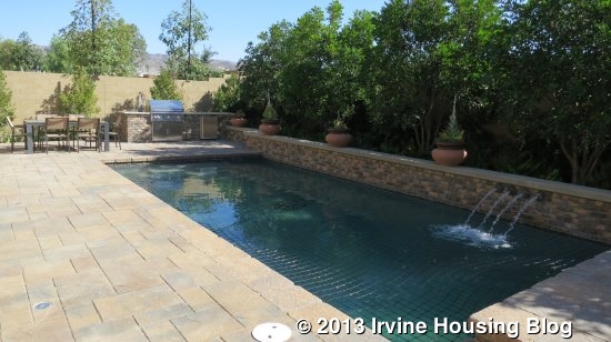
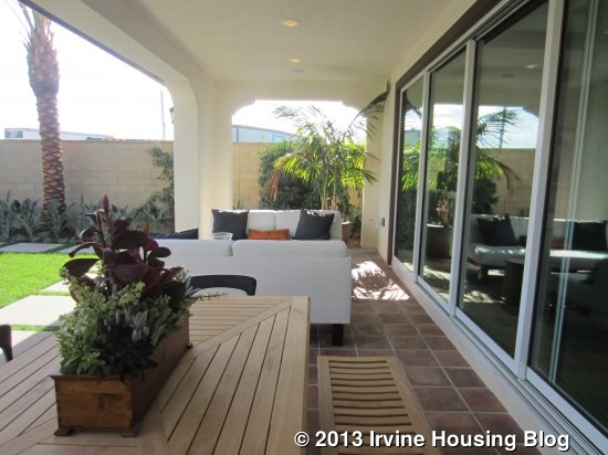
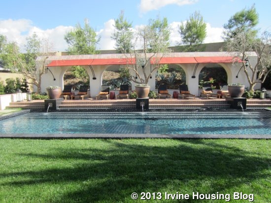
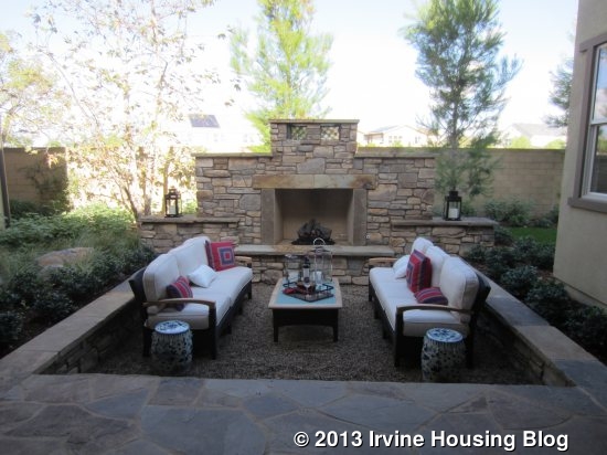
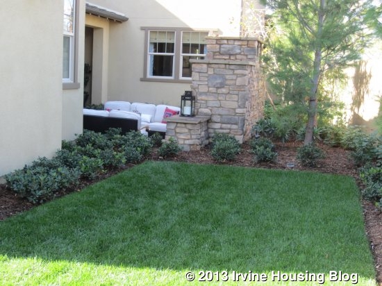
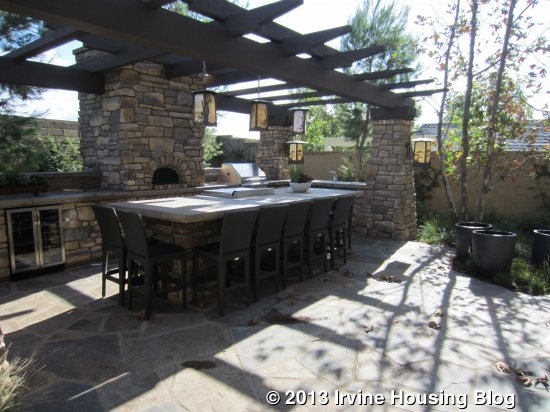
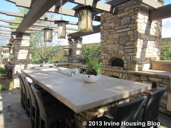
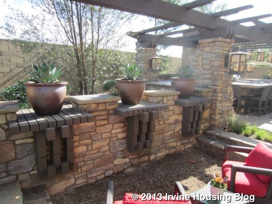
When you walk into the backyard, you might think you have stepped into a tropical resort. A lawn area with palm trees at both ends stretches across the width of the yard and the elegant pool behind it is just as wide. At the back of the yard is a covered patio area lined with lounge chairs that face the pool. Sadly, this yard is nothing like the real yards in most Melrose homes.

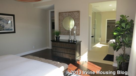
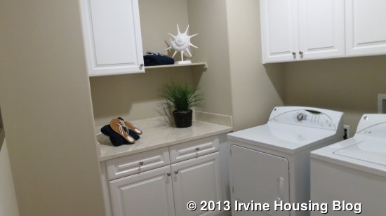
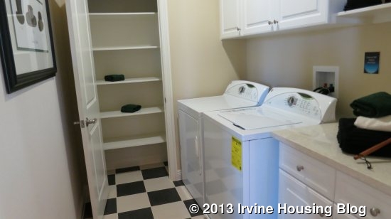
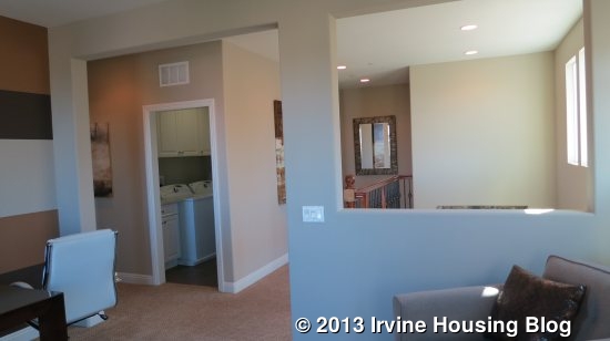
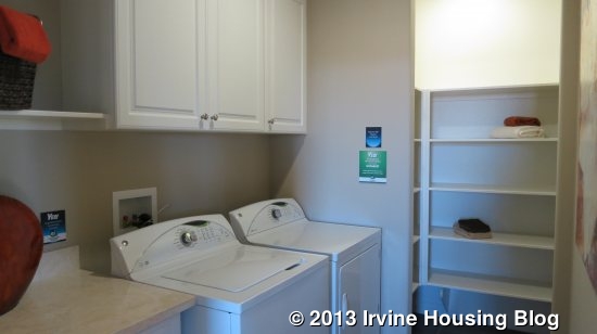
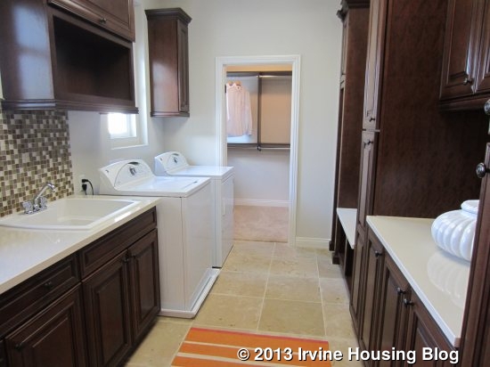
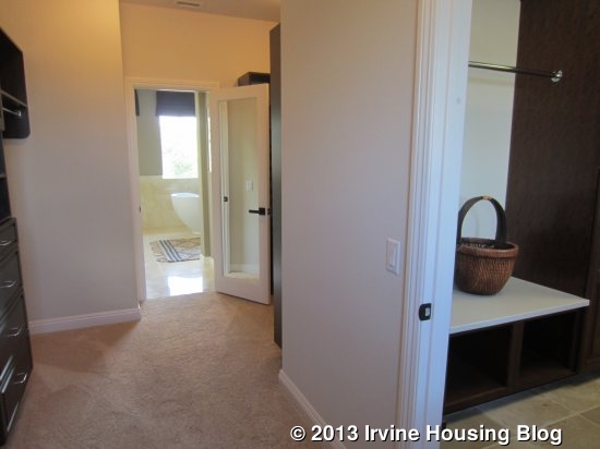
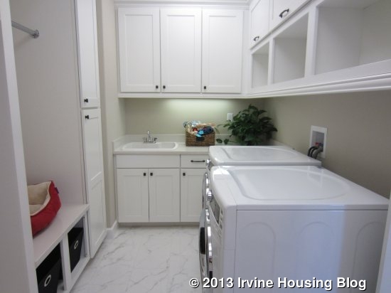
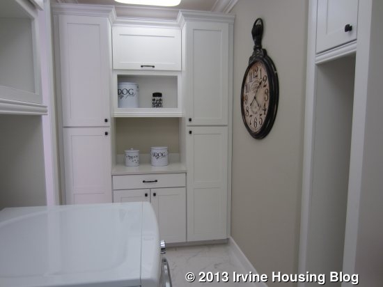
Upstairs, numerous optional doors create a bit of a maze. I found myself confused until I stopped to look at the printed floor plan. The laundry room is just to the left of the stairs. It has a sink, side by side machines, numerous cabinets, and plenty of counter space. A door at the far side led to what seemed to be a very large, L-shaped extra closet. However, as I stepped through the closet and into an elegant bathroom, I realized I had actually entered the master suite through the laundry room (this door/access is optional).

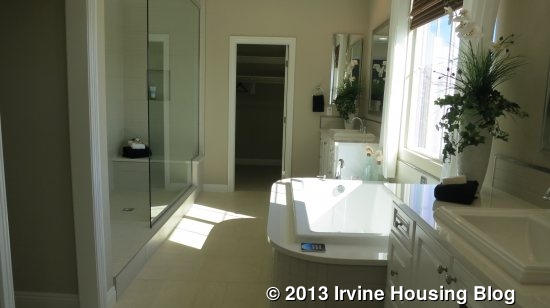
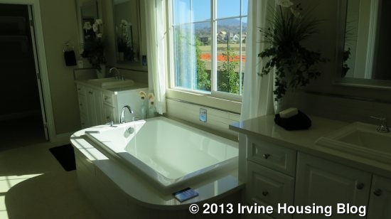
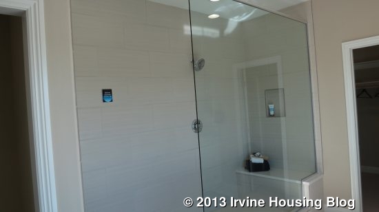
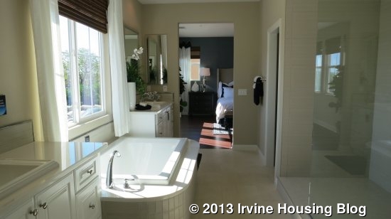
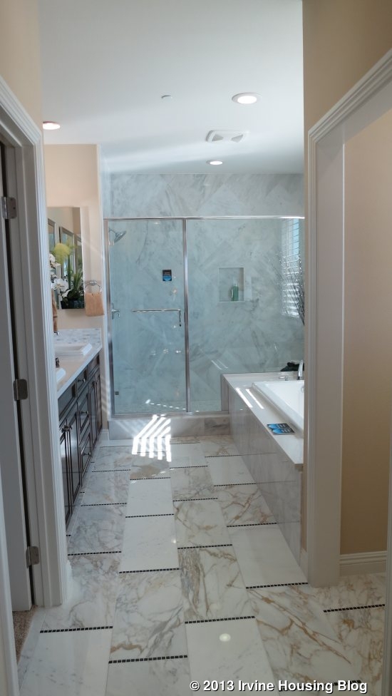
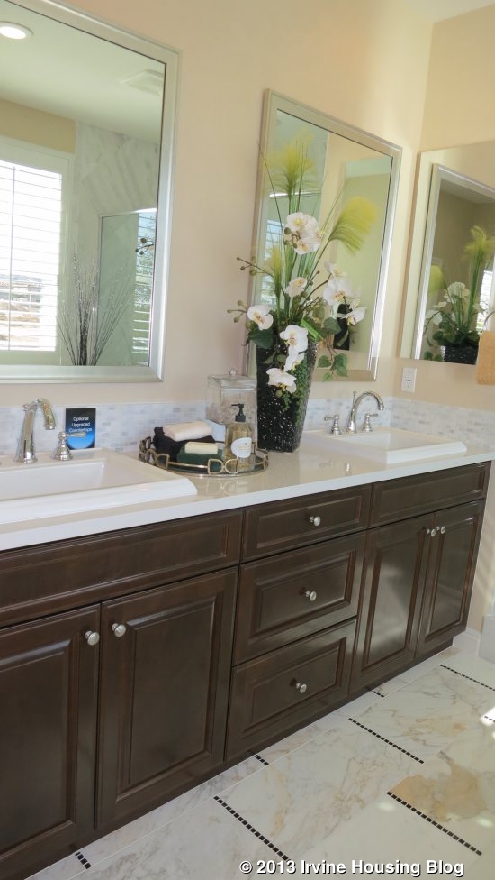
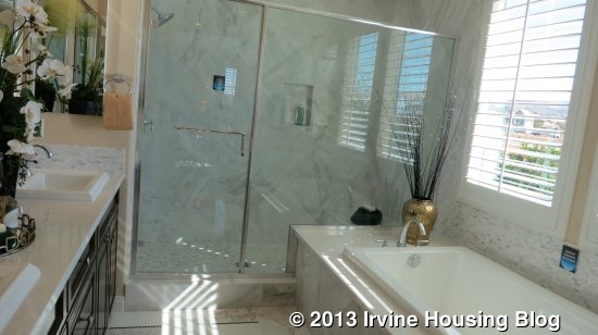
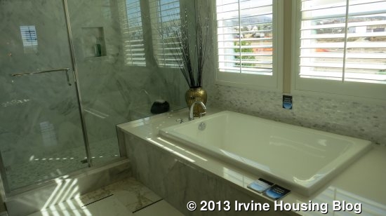
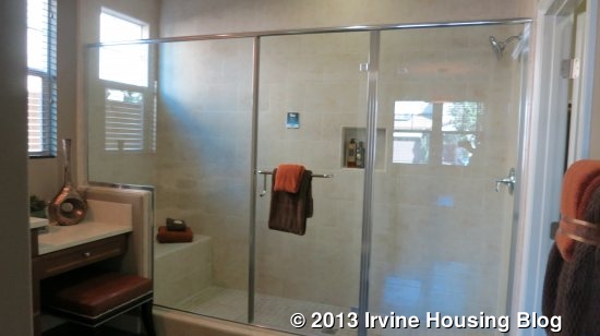
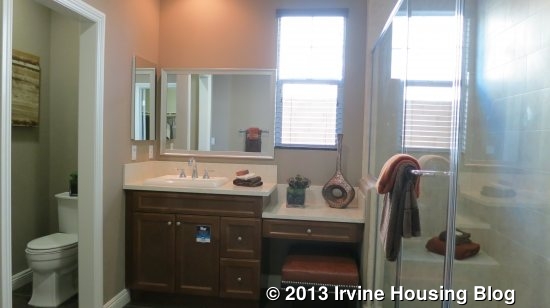
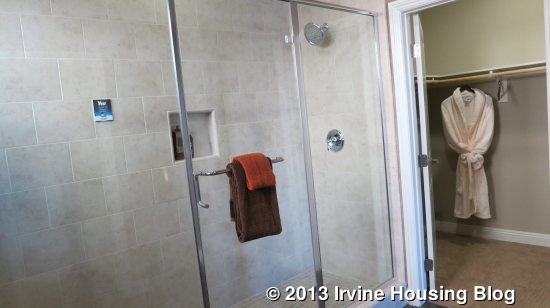
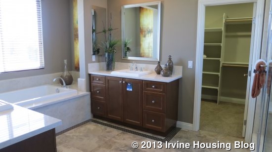
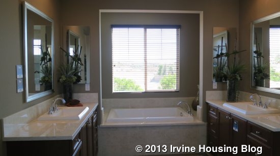
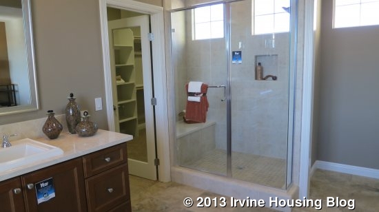
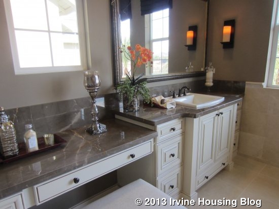
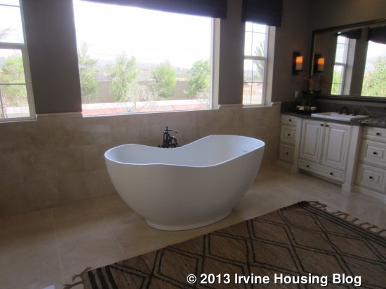
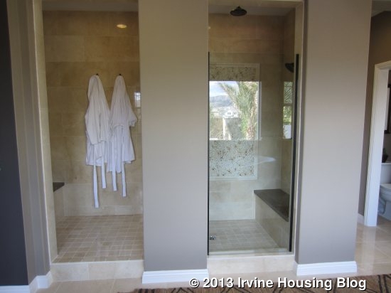
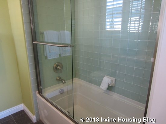
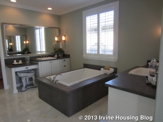
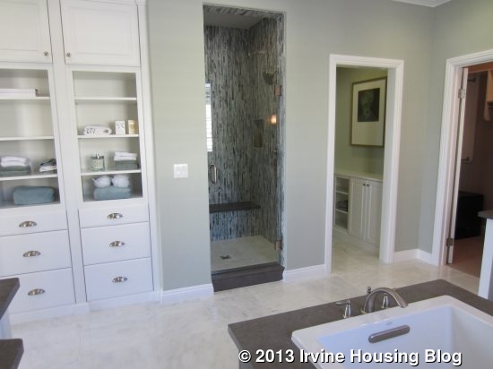
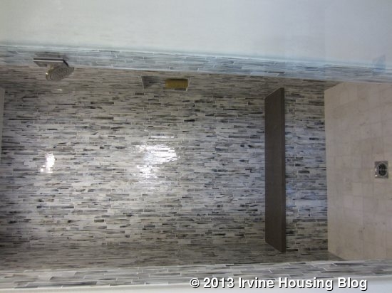
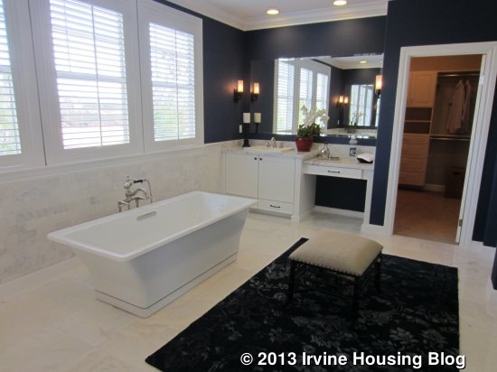
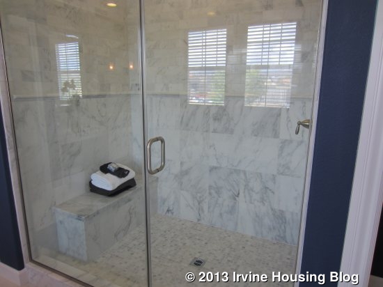
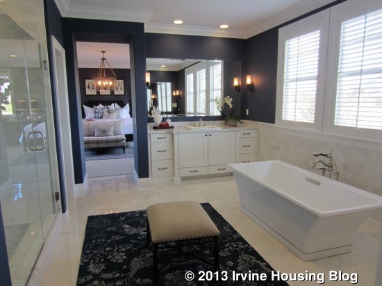
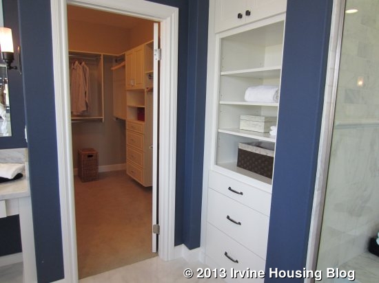
The closet led me to the spacious master bath. Sinks on either side are shown with upgrades; one side has the standard, attached vanity area as well. The standard, built-in tub is replaced by a kidney-shaped, free-standing tub. Windows above the tub overlook the backyard. Across from the tub is a big, walk-in style shower with benches at both ends.

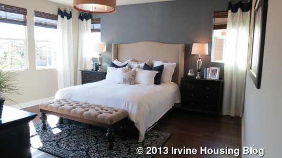
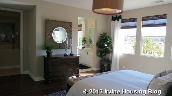
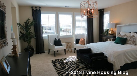
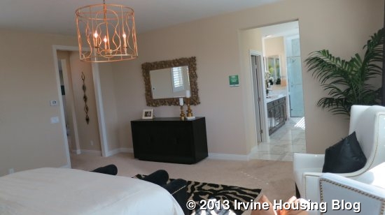
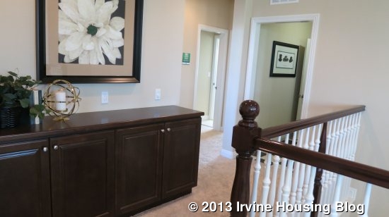
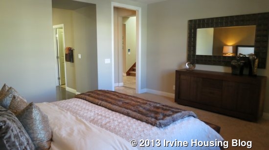
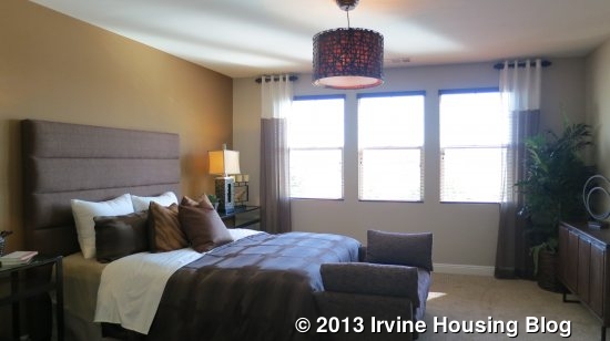
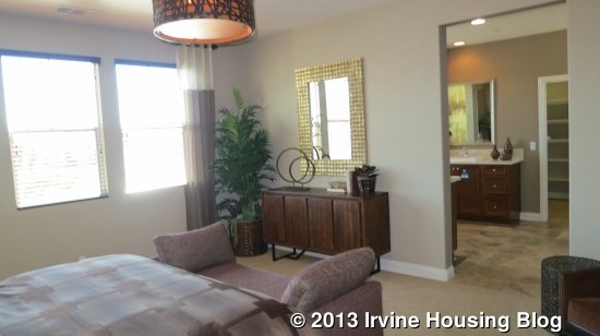
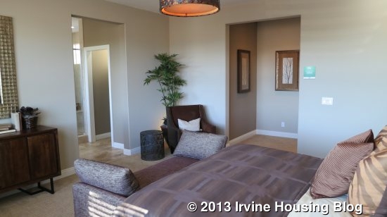
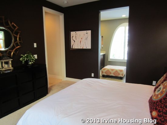
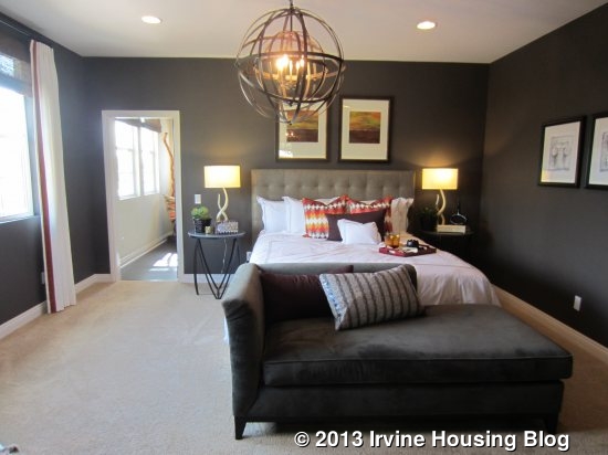
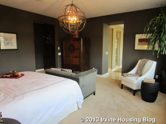
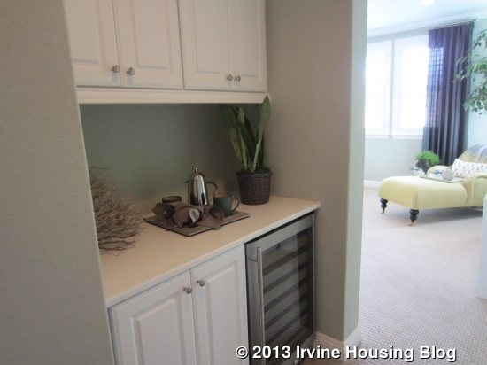
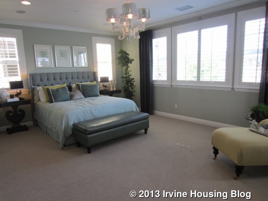
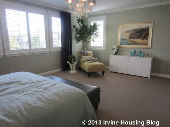
The master bedroom is big, but a little smaller than those in Residences One and Two. It still has plenty of room for standard bedroom furniture and a seating area. The entryway from the main hall (which happens to be at the top of the stairs) has a niche, multiple linen cabinets and an optional, small fridge. On the far side of the master though, is another door, continuing the maze of rooms upstairs.

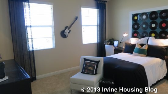
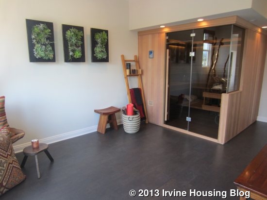
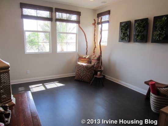
Through the door, I entered what appears to be the optional Flex Room. This door could be sealed off instead. The flex room in this home contains a sauna and has a Zen-like atmosphere. I’m sure the flex room could be used for anything. The standard arrangement for this space is actually a bedroom (bedroom 4) with a sliding closet and en-suite bathroom (shower/tub combo). Bedroom 4 is the smallest in the house. Even with the bedroom, you can still have an optional door to the master, so this could be a great nursery space.

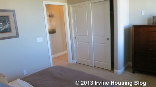
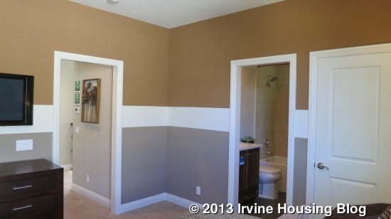
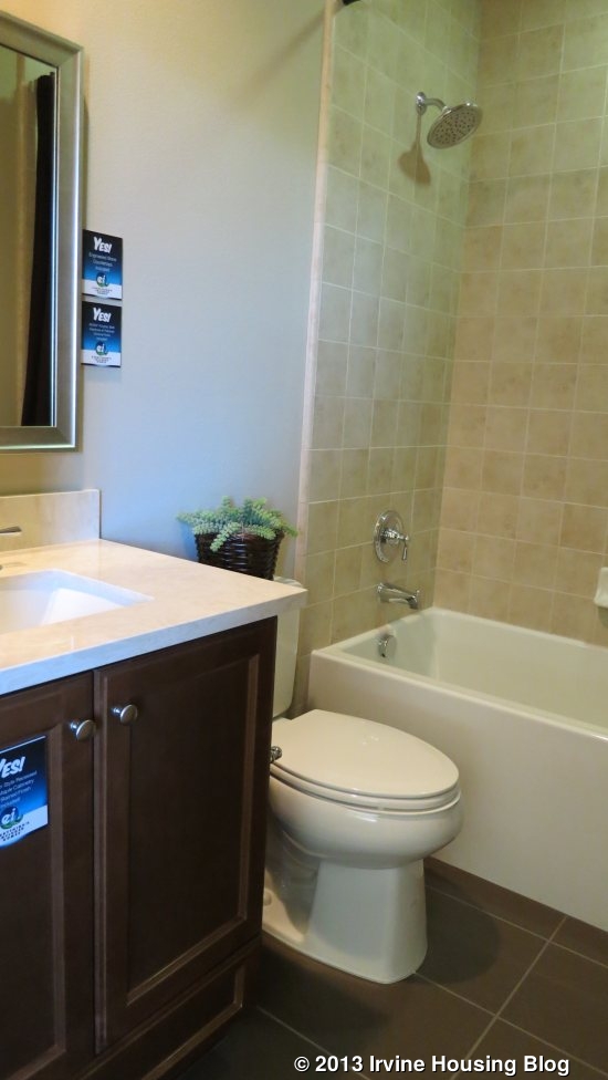
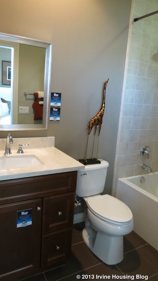
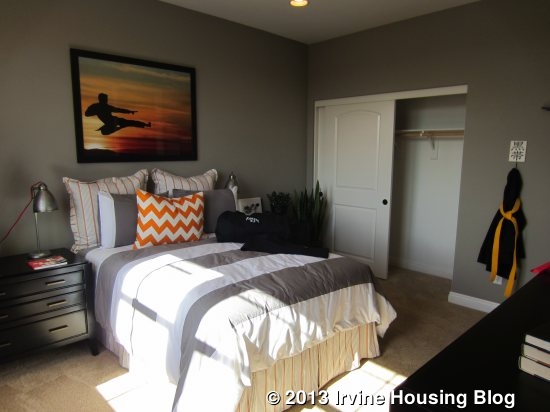
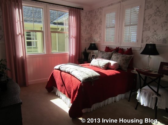
I left the flex room and finally found myself back in the main hall. Directly across from me was Bedroom 3. This one is medium sized and sandwiched in the middle of two other rooms, so it has windows only facing the side of the house. Like bedroom 4, it has a sliding closet and a bathroom with a single sink and shower/tub combo. The bathroom shows a variety of upgrades.

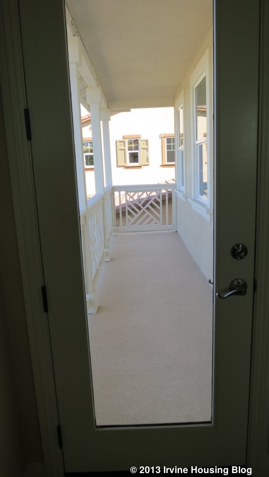
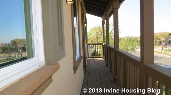
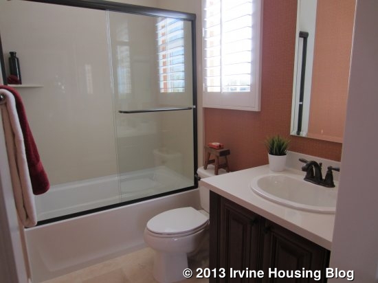
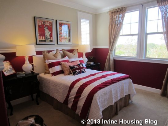
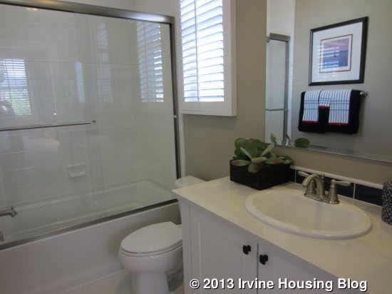
The hall wraps around the stairs to the front of the house, where there is another bedroom and a loft. Bedroom 2 is the biggest secondary room and is incredibly spacious (over 60 square feet bigger than the downstairs master). It has a walk in closet and a private bath similar to those in the other upstairs bedrooms. The bedroom has a private door to the outdoor, covered deck. In the Spanish and Farmhouse elevations, the room sticks out as far as the deck. In the Monterey elevation, the bedroom is recessed and the deck actually runs all the way across the loft and the bedroom.

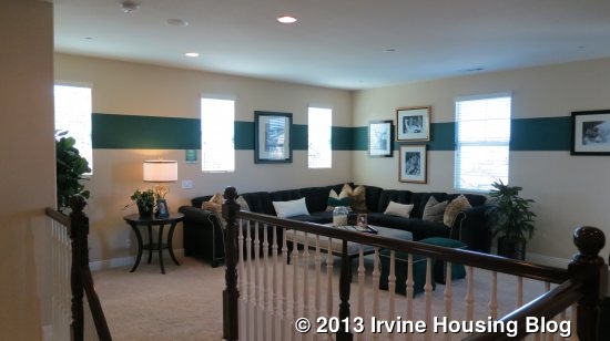
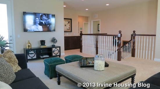
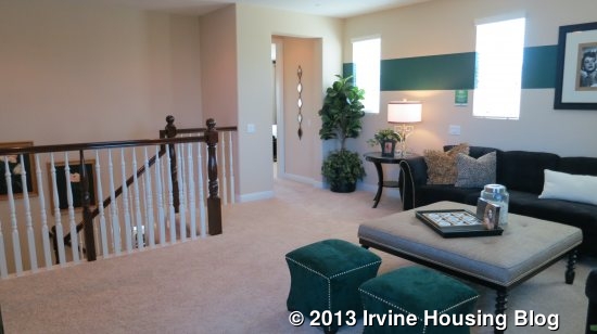
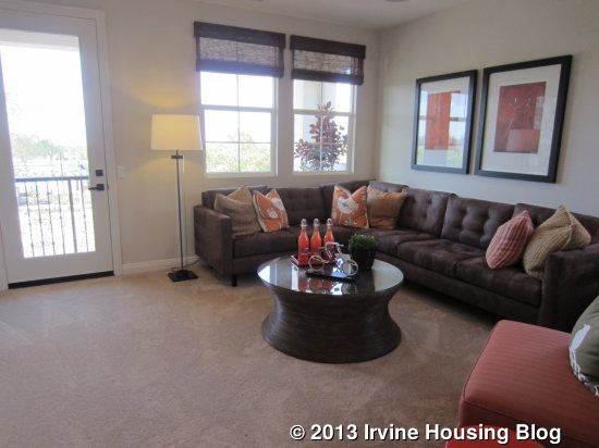
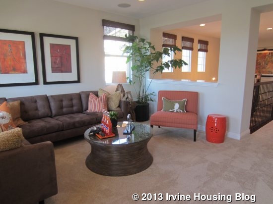
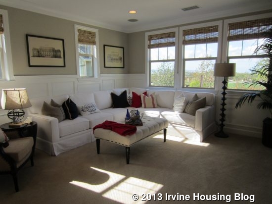
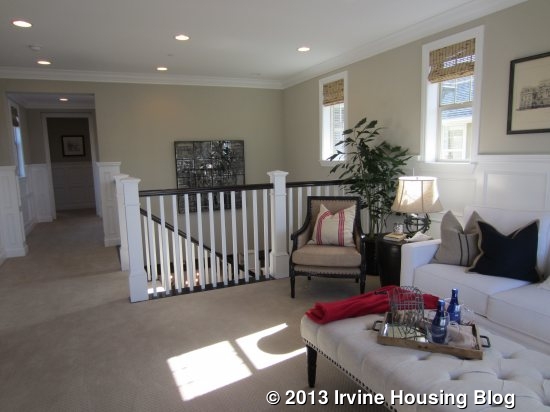
The loft is the final room upstairs. It is big and bright, with access to the deck and is partially open to the hall. The room is big and offers plenty of flexibility.

I think Residence 2 (Pasadena) is my favorite of the bunch. I like the layout the best and think it has the nicest downstairs living suite. I don’t really like how bedrooms 2, 3, and 4 are all in a row in Residence 3 (though I do love the size of bedroom 2). The Melrose homes are all a little too big for me, but they are great for someone who needs or wants a lot of space. They also boast one of the best locations in Pavilion Park. Their base price is actually on the lower side per square foot than many areas of Irvine. With many options for indoor/outdoor entertaining and multi-generational living, those in search of a large home will appreciate the value of the Melrose Collection.

A Review of the Melrose Tract at Pavilion Park – Residence 2

The Melrose collection in Pavilion Park (the first of the Great Park Neighborhoods), has the community’s largest – and most expensive – homes. The three models feature rooms often not seen in new construction these days. They have formal dining rooms and two downstairs living spaces, rather than just a great room. Built by Ryland Homes, each house has the option for a downstairs living suite plus a three car garage. The models didn’t offer lists outlining the upgrades, but I will list some of the standard features and try to note upgrades when I can. Once you express serious interest in purchasing, the information about upgrades is available.

See the rest of The Melrose Collection Overview and Review of Residence 1 here.

Residence Two

4,080 Sq Ft

5 Bedrooms, 5.5 Bathrooms, 3 car garage, downstairs living suite, bonus room

Base Price from $1,529,808 ($375/sq ft)

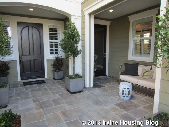
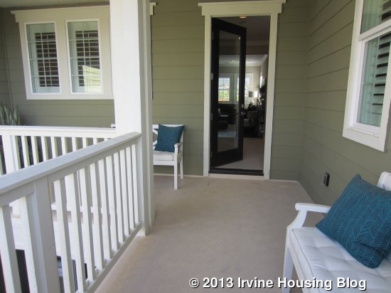
Residence Two, known as Pasadena, is modeled in the East Coast Traditional elevation; Santa Barbara and Craftsman elevations are also available. Like Residence One, I think this is a very attractive house from the outside. It has a nice front porch area, with access to both the main home and the private suite, and an L-shaped balcony on the second floor. This home has a two-car garage facing the street and a single car garage on a separate wall. The separation is really nice if you plan to use the garage as a workshop or extra room. The two-car garage has direct access to the home; the single car side must cross the porch to get in the house. The only variations to the floor plan that can be made to this home are a California Room and/or stackable doors leading outside from the Great Room.

This home has a large, square entry with the staircase immediately to the left. A hallway leads to the powder room and private living suite on the right and the formal dining room is visible directly in front of you. There is a large storage closet under the stairs. The powder room shows an upgraded vanity with a single sink.

The entry to the private living suite is just off the powder room. There are linen cabinets immediately inside the entry, shown in the standard white Thermofoil and with the optional upper cabinets included. You can see the private door from the outside porch and the entry to the single car garage directly across from it. In comparing this suite to the optional living suite from Residence One, the living room in the Pasadena home is the same width, but is 10’ longer than the other. The bedroom in Pasadena is bigger as well, but only by about a foot each in length and width. The living area has ample space for a sitting area and a separate dining space. The kitchenette, located on the back wall of the room, has a microwave, sink, small fridge, and several cabinets. A hallway leads back to the bathroom and bedroom.

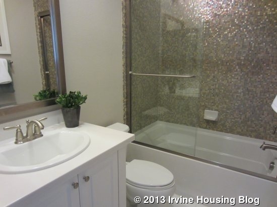
The bathroom in the suite is highly upgraded, with nicer tiles and upgraded fixtures in the single sink vanity. It has a good size shower and no option for a tub. The bedroom is at the back of the suite. There is an option to put a door from the bedroom to the dining room in the main home. The bedroom has a two door sliding closet and a door leading outside to the suite’s small, private California Room and the rest of the backyard. All of its windows face the back of the house. This is a very nice living suite and is bigger than many of the others I have seen throughout Pavilion Park. However, this one does not have laundry hookups.

Back in the main house, I walked through the entry to the dining room. It is a large, square room with three windows looking out to the backyard and the optional California Room. One wall is completely open to the kitchen.

The kitchen is very big with an island shaped like a slice of pie. The sink and dishwasher are located in the island, which also has several cupboards and a bookshelf. There is seating for four or five around the curved side. The stove (again, shown upgraded) is directly across from the sink. The ovens, microwave and fridge are on the far side of the island. This home doesn’t seem to have quite as many cabinets as many of the other new kitchens I’ve seen lately and has only three that are pantry height. At the back of the kitchen, a short hallway (or “drop zone”) leads to the two-car garage.

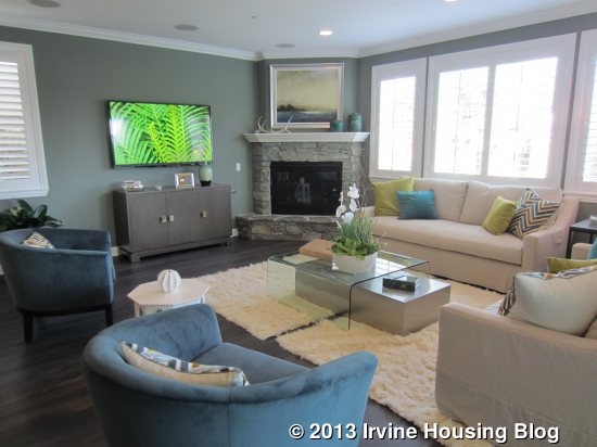
The great room sits just beside the kitchen. One full wall is sliding doors and another has windows facing the backyard. A stone fireplace sits at an angle in the corner of the room. The room is big and bright and has one more window facing the side of the house.

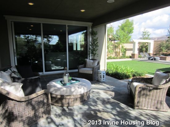
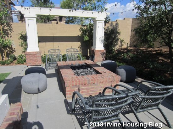
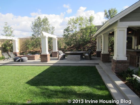
The backyard is beautiful, but much bigger than the standard lots. This one has a large grassy area, a covered outdoor kitchen and a fire pit with plenty of seating around it. The outdoor kitchen even has a flat screen TV. It’s hard to know what a backyard would be like on most lots.

The bonus room is at the top of the stairs but is definitely more of a room than a loft. It has a half wall dividing it from the hallway and is bigger than most lofts. It is shown with the same upgraded flooring that they used downstairs. There are windows facing the back and side of the home. The hallway wraps around the upper floor, leading to all of the bedrooms, the laundry room, and the deck. Each bedroom sits at one corner of the house, offering a lot of privacy.

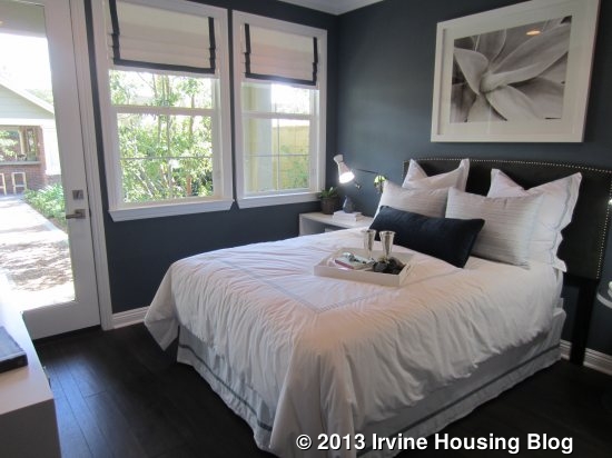
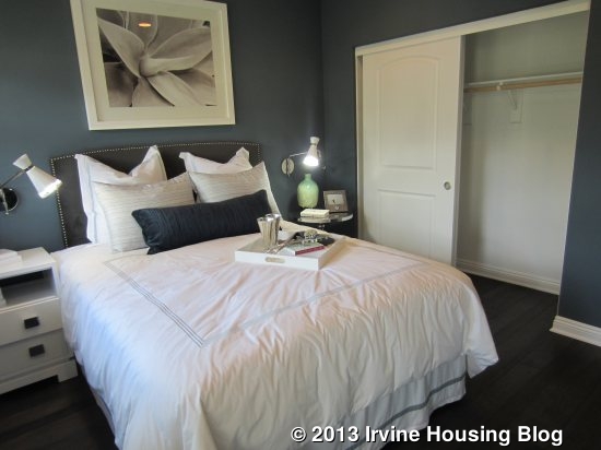
On the right side of the house, there are two bedrooms, each with a private bath. The one at the back of the house (bedroom 2) is a little bit smaller, but it has a walk-in closet in a small foyer area of the room. Its private bath shows what appears to be the standard vanity, but has upgraded tile in the shower/tub combo. With just one window facing both the back and side of the home, it doesn’t get as much light as the other rooms.

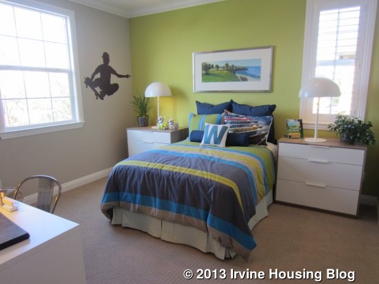
The one at the front of the house (bedroom 3) has the bathroom just off the hall and the bedroom beyond it. This bathroom is identical to the one the other bedroom. The room itself is a little bigger and a lot brighter. It has windows on three different walls, including a big one facing the street. You can have an optional door leading to the L-shaped, covered deck. There is also access to the deck from the hallway.

On the opposite side of the home, the laundry room and bedroom 4 are at the front of the house. The laundry room has a sink, side by side machines and lots of cabinets but no counter.

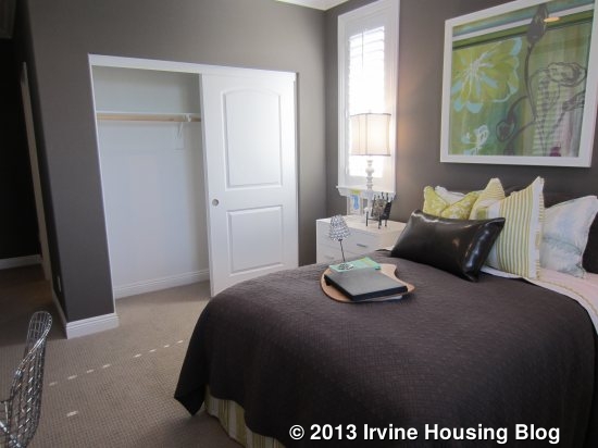
Bedroom 4 is a tiny bit bigger than bedroom 3. It has windows facing the street and side, plus a walk-in closet comparable to the one in bedroom 2. Its private bath is configured differently, but still has the same single sink and shower/tub combo. This one has different tile, but I don’t know if it is standard or upgraded.

The master suite sits alone at the back of the house and is completely private. A long hallway leads back to the room and includes linen cabinets, plus the options for upper cabinets and/or a small fridge. The model shows both. The bedroom is rectangular (20’ x 15’) and the shape makes it feel bigger than a square room. With windows on three sides and no houses blocking two of them (because of the huge backyard), the room can be quite bright. There is plenty of wall space for furniture plus an open area for seating.

The master bath has a nice set of linen cabinets just inside the door. The two vanities are located on opposite walls with the tub between them (similar to Residence One). Again, one vanity has both the sink and seating area. While most master bathtubs have the long side against the wall, this one has a short side against the wall, so it sticks out farther into the room. Fortunately, the bathroom is so large that it doesn’t feel imposing. The shower is directly across from the tub and has a seat, but isn’t particularly big. There is a nice set of built in cabinets in the water closet. Finally, the walk-in closet is at the back of the bathroom. It is L-shaped and comes standard with organizers.

I like the upstairs of this house more than the second floor in Residence One. I think it has a better layout and the deck is a nice touch. In comparing the first floors, I also like Residence Two more, but wish the kitchen had a pantry and tech center like the ones in Residence One.

A Review of the Melrose Tract at Pavilion Park – Residence 1

The Melrose collection in Pavilion Park (the first of the Great Park Neighborhoods), has the community’s largest – and most expensive – homes. The three models feature rooms often not seen in new construction these days. They have formal dining rooms and two downstairs living spaces, rather than just a great room. Built by Ryland Homes, each house has the option for a downstairs living suite plus a three car garage. The models didn’t offer lists outlining the upgrades, but I will list some of the standard features and try to note upgrades when I can. Once you express serious interest in purchasing, the information about upgrades is available.

In the living areas, the homes feature gas burning 42” fireplaces; plush carpeting in hallways, living areas and bedrooms; decorative 17” x 17” ceramic tile in entryway, bathrooms, kitchen and laundry; flat panel pre-wire in great room, bonus room and bedrooms; Kohler acrylic tubs with tiled shower and tub surrounds in secondary bathrooms; E-stone countertops, Kohler undermount china sinks and MOEN brushed nickel fixtures in secondary bathrooms; upgraded 5” baseboards and 9’ ceilings on both the first and second floors. The master suites come standard with walk in closets complete with organizers; Kohler rectangular soaking tubs with oversize tiled tub decks; oversized showers with handset ceramic tiled shower walls and frameless enclosures; white Thermofoil cabinetry and the same counters, sinks and fixtures as the secondary bathrooms.

The kitchens also have full overlay, raised panel custom cabinetry in white Thermofoil; granite countertops, Kohler under-mount stainless steel sinks; MOEN pull-out faucets; under-cabinet lighting; and stainless steel built-in GE Monogram Professional Series appliances including an Energy Star built-in dishwasher, overhead vent hood. Numerous other features designed to save energy and water come standard with the homes.

Each house also has a variety of options within the floor plan. I will do my best to outline each option as I describe the rooms. The Melrose models are directly across the street from the park’s tot lot and swimming pools. They are located in the center of the neighborhood, thus eliminating most noise from any of the major streets bordering Pavilion Park.

One thing to note: the models show gorgeous, huge backyards and are situated on lots that are approximately 9,000 square feet. Only a few lots this size are actually available and at a high premium. Most lots are actually around 6,000 square feet. So don’t get too excited when you walk into the yard of model 3 and feel like you’re in a resort – sadly, your yard will probably end before their pool even begins.

Basic Neighborhood Financial Information

Approximate HOA Dues: $193 per month

Approximate Tax rate: information not provided; other neighborhood homes are at1.1%

Approximate Mello Roos: information not provided; Hawthorn (the biggest models I have seen so far and range 500-800 square feet smaller) are between from $5,902 – $8,352 (based on the square footage of the home), so Melrose is likely higher

Base Price from $1,486,605 (Plan 1), $1,529,808 (Plan 2) $1,588,205 (Plan 3)

Schools: Canyon View Elementary, Jeffrey Trail Middle, Northwood High (all subject to change; Great Park has a K-8 school scheduled to open in 2016, as well as plans for a high school)

Residence One

3,910 Sq Ft

5 Bedrooms, 5.5 Bathrooms, 3 car garage, downstairs bedroom, loft

Base Price from $1,486,605 ($380/sq ft)

Residence One, known as Carmel, is shown in a reversed plan of the Craftsman elevation; Santa Barbara and Farmhouse elevations are also options. I like the look of this house a lot, especially in the modeled elevation. The front has a long, narrow porch that fits with the neighborhood’s efforts to create outdoor living and a social environment. The garage door is only for a 2-car garage, as one side has tandem spaces. Inside, the entry has a long hallway in front of it with the dining room visible at the end and a short hallway to the left that leads to a powder room, den and bedroom. Upgraded wood flooring replaces the standard tile.

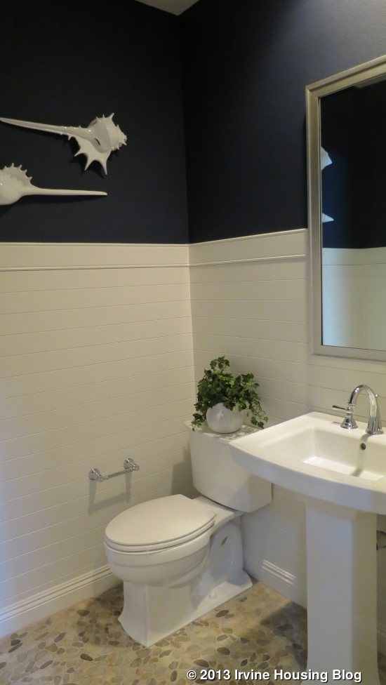
The den faces the front of the house and has an option for doors leading to the front porch. It is a cozy room shown with numerous built-ins and designer touches. This room can serve well as an office or sitting room. The downstairs powder room is also upgraded, with fancy wainscoting, and a decorative, single-sink vanity.

The bedroom is just past the powder room. It is a good-sized room (over 12’ by 13’) with a two-door sliding closet and a private bath. The room has doors that lead to another porch area in the middle of the home that isn’t visible from the street. Recessed lighting and crown molding add a touch of elegance. The en-suite bathroom has as single sink and shows just a shower, though a shower/tub combo is standard.

Those looking for a more private space can opt for a complete living suite instead of the standard den and bedroom. In this layout, the den becomes the bedroom and is a little bit smaller. It includes a sliding closet that takes up one entire wall. The bedroom is converted to an entry area plus living room and kitchenette. The entry offers private access from outside and leads to the bathroom, which is a bit smaller than in the standard model. The living area is a little bigger than the bedroom and can still access the interior porch and the main hallway of the home. Its kitchenette space has a sink and fridge. In this scenario, the main home’s powder room remains exactly the same.

The main hall takes you past a coat closet with a large storage space under the stairs. The stairway itself is attractive, showing wood trim edges and banisters that complement the floors.

The large dining room sits just beyond the stairs. It has a big, open feel to it, as there are sliding doors leading out to the interior porch. It offers ample space for a table and china hutch with enough wall space to offer various furniture arrangements. The model actually shows two built-in hutches.

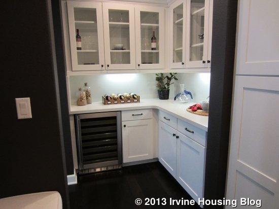
The kitchen sits just on the other side of the dining room, though the rooms don’t open up to each other. The first thing you see is the breakfast area and, behind it, a full wall of sliding doors leading to the backyard. The island has seating for four and includes the sink, dishwasher and an optional second dishwasher. A variation to the floor plan shows the dishwasher in the center of the island and the sinks on one side. The refrigerator, microwave and convection ovens are on the wall that borders the dining room. They have a counter with several cabinets between them. Behind the island is the cooktop, shown in the model with a major upgrade that includes a professional-style oven. Cabinets and counter space sit on both sides of the stove. There is a doorway on each side of this counter as well. The one toward the front leads to a pantry with numerous cabinets and an L-shaped counter. The model shows a wine fridge but I don’t know if this is standard. Beyond the pantry, there is a drop zone with a built-in bench and access to the garage. The doorway at the back of the kitchen leads to a tech center. However, the model shows the optional prep kitchen in this space instead. It has a 6-burner stove, refrigerator and sink.

The great room also has designer touches to create elegance and brightness. The back wall is lined with windows and the wall toward the front of the room also has windows that look at the interior porch. The side wall has the fireplace with a flat screen TV mount above it and windows on either side. With so many windows, the room should be bright at almost anytime of day.

The interior porch is a nice extra space, especially since the backyard will actually be much smaller than modeled. It has a long, covered area that runs the length of the dining room and hallway. Beyond it, a large, step-down area has room for seating in front of a grand fireplace. A grassy sideyard leads around the house to the backyard. The yard in the model shows a huge, outdoor kitchen space plus an additional seating area. This yard isn’t as big as those in the other models and may be closer to a true representation, though it is definitely still bigger than an actual lot. An optional California Room is available off the kitchen.

The second floor includes a bonus room, three secondary rooms and the master suite. The bonus is a loft area at the top of the stairs. Windows on two sides, plus more by the stairway bring in a lot of light. The model has a beautiful view of the park. At slightly over 15’ by 15’, this room provides a great living space and would be a great place for kids to hang out.

Two of the bedrooms are also at the front of the house. Each one has a walk-in closet and a private bathroom. In one room (bedroom 3), the bathroom is toward the hall and the room faces the front of the house. This room is a little bigger and, in the Santa Barbara elevation, it has a tiny balcony. The other (bedroom 4) faces the side and interior porch area, with the en-suite bathroom actually being at the front of the house. Both bathrooms have a single sink and a shower/tub combo; one of them shows upgrades in the model.

On the other side of the stairway, a hallway leads to another bedroom, the laundry area, and the master suite. Optional upper cabinets are available in the hall, which also has an included linen closet. The laundry room has side by side machines, a sink, and is lined with cabinets and storage cubbies. It even has a designated space for an ironing board.

The bedroom (bedroom 2) is even a bit bigger than bedroom 3. It has a larger walk-in closet and its private bath is just like the others. It doesn’t get as much light, as the windows face the house next door and a smaller window looks to the front, but is set back so far from the street that the house blocks a lot of the light.

The master suite spans the back of the house. An entryway creates a little separation from the main hall. The room is very large and having windows on three walls makes it feel even bigger. There is plenty of room for a seating area in addition to the standard bedroom furniture.

A doorway leads to the extra large master bath. It has two vanities – one on each side of the room. The one toward the back includes a seating area in addition to the sink, whereas the one at the front offers more drawers. The bathtub sits between the two sinks and the master shows the optional free standing tub. The shower is across from the tub and has a built-in seat that seems a little small to me given the size of the shower and the bathroom overall. Linen storage sits just outside the shower and access to the large walk-in closet is just beyond it. Optional access to the laundry room can replace the linen cupboard.

I like how many windows there are in this home, as I felt almost every room was really bright. The bedrooms are all a good size and the extra living areas create a lot of flexibility. It has ample closet space as well. The decorator’s touches were a bit too formal for me, but did make everything feel clean and bright.

A Review of the Rosemist Tract at Pavilion Park

Today I am reviewing Rosemist, the eighth largest of the ten new sets of developments debuted in the Pavilion Park area of the Great Park Neighborhoods, which opened at the end of September. Built by Lennar, all residences have a 3 car tandem garage, at least 4 bedrooms (with at least one bedroom downstairs), at least 4 bathrooms and a California Room. Residence 1 is the only plan with its own separate living quarters (consisting of a kitchenette, Bathroom and Bedroom) with its own entrance, which would be perfect for extended families or long term guests. But each Plan has its own special features to appeal to different buyers.

Residence 1

2,924 Sq Ft

4 Bed

4 Baths

Base Price $1,081,990

Residence 2

3101-3230 Sq Ft

4 Bed + Teen Room

4.5 Baths

Base Price $1,077,290

Residence 3

3,404 Sq Ft

5 Bed

5.5 Baths

Base Price $1,132,990

Approximate HOA Dues: $193/month

Approximate Mello Roos $6474 – $7479 per year

Approximate Tax rate: 1.165%

Phase 2 move-in is January 2014. As of November 5, 2013 only two Plan 1 lots are available: Lot 38 and Lot 3. Note: Lennar sales managers notified me that Phase 3 prices will increase.

Links to Floor Plans:

Residence 1

Residence 2

Residence 3

Here is a link to the standard amenities:

PDF

Lennar markets the home as “Everything Included” and signs throughout the houses claim “YES!” to let you know which features are standard. Smaller signs indicate upgrades. Some of the standard amenities include a ceramic tile flooring at entry, kitchen, baths and laundry; Mohawk wall-to-wall carpeting in all living areas and bedrooms; polished chrome hardware and engineered stone countertops in all bathrooms; and fiberglass secondary tubs and acrylic master tubs. In the kitchen, all homes come with European style recessed panel maple cabinetry with stained finish; granite counters with a full backsplash; built-in self cleaning double wall oven; gas cooktop with 6 sealed burners; built-in Advantium oven/microwave; stainless steel

two-compartment undermount sink, and Energy Star dishwasher; bi-fold doors to California room

These homes also pride themselves on their green technology. Some of the standard features include CertainTeed AirRenew drywall that actively cleans the air; central air; cool roof tiles on concrete roofs; tankless water heater; programmable thermostat; water conserving toilets, faucets and shower heads; low VOC interior paint; and pre-wiring for ceiling fans; electric/hybrid vehicle charging systems and Innovative SunStreet Energy solar program (requires either participation in SunStreet’s Solar 20/20 Plan or the separate purchase of the system).

Residence One

2,924 square feet

Main Home: 3 Bedrooms, 3.5 Bathrooms

Private Suite: 1 Bedroom, 1 Bathroom

Base Price from $1,081,990

Style Options: Spanish (A) , Monterey (B), American Tradition (C)
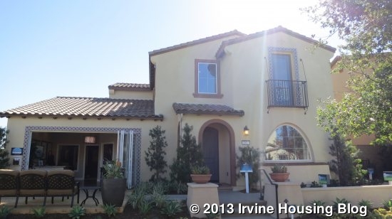
Residence One is the most different, featuring a private suite. The main entrance to the home is located in the front, while the private entrance to the suite is on the side of the house, next to the backyard fence.
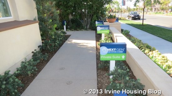
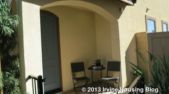
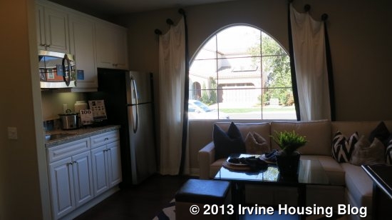
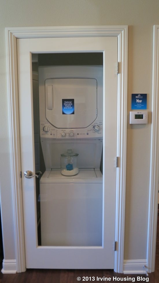
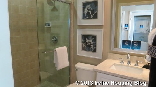
The private suite has a small living area with a kitchenette to the right, a closet for a stackable washer/dryer, a bathroom with a single sink and good sized shower.
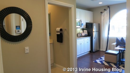
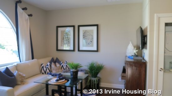
The kitchenette is automatically equipped with a granite countertop, 6” backsplash, GE Stainless Steel refrigerator and microwave/hood and single sink with disposal. The bathroom comes with an engineered stone countertop and a ceramic tiled large shower.
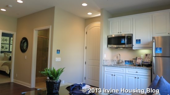
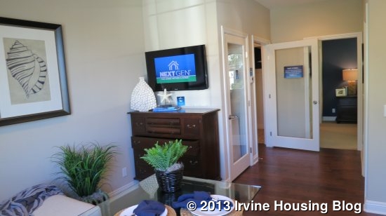
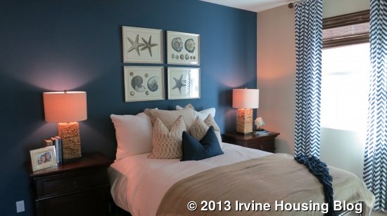
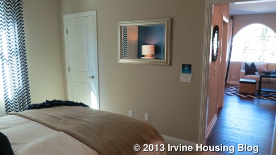
To the left is a bedroom with two walk-in closets. This area would be desirable for long term guests or extended family. Even without extended family, the space could be utilized as office space, a second television room, a game room or many other possibilities.
Entering the main doorway, on the left is the staircase and a short hallway with a coat closet and the entrance to the garage. On the right is a short hallway with a bathroom and the home entrance to the private suite. Straight ahead at the back of the house is the kitchen, great room and dining area.
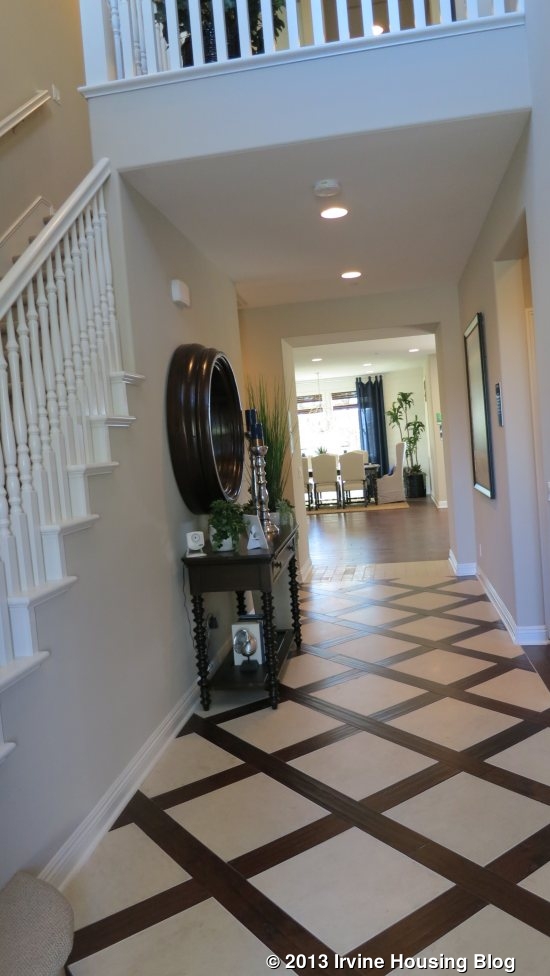
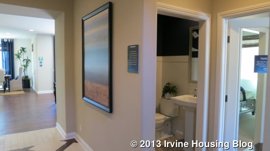
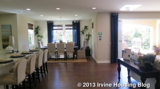
The end of the entrance hallway leads directly into the great room. An abundance of light shines in from the 6 windows located throughout the dining and living rooms in addition to the huge bi-fold doors opening up from the living room into the California room.
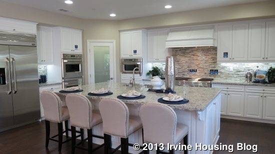
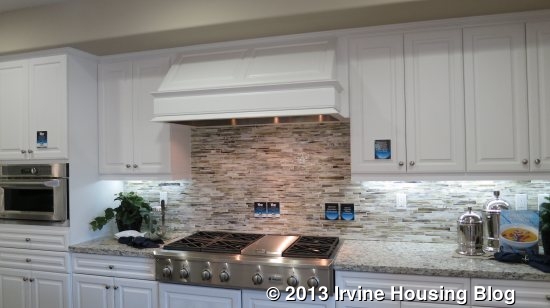
The kitchen shows an upgraded granite countertop, backsplash and flooring. It has a large rectangular island with bar seating. The island contains the sink and the

dishwasher. The corner pantry, microwave and 6-burner stovetop are located on the wall behind the sink. Along the perpendicular wall is the double oven and refrigerator. The amount of cabinets and drawers provide ample storage.
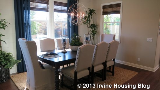
The dining area is well situated to the side of the kitchen. I like how it is not right in the middle of the great room. By having it off to the side, it gives it more of a proper dining room feel and is not in the middle of the foot traffic between the living room and kitchen. The windows face out towards the back yard and the California room.
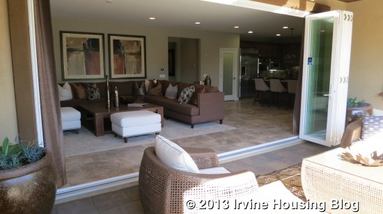
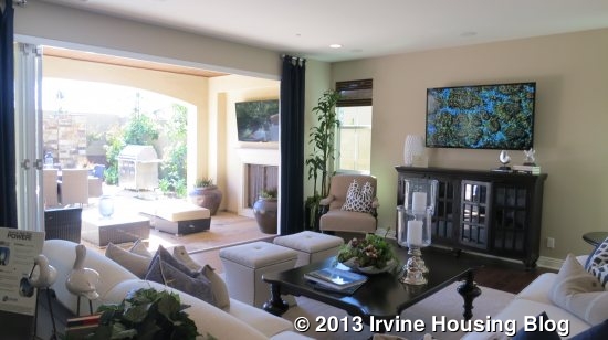
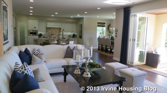
The living room is large with the flexibility to arrange it comfortably in a couple of different ways. The bi-fold doors open up across the majority of the living room wall and create a wonderful feeling of expanding your living space into the backyard. There is no fireplace inside the house, but an option to install a fireplace in the California room is shown in Residence One. Because the doors open so widely, foot traffic is not hindered when accessing the backyard even with the California room furnished. Lennar management office informed me the backyards will range between 5,400-6,000 square feet. The model homes reflect the 6,000 square feet backyards.
Upstairs, there are three bedrooms, three bathrooms and a laundry room. Wrapping back around the staircase, a short hallway consists of two secondary bedrooms, both with en suite bathrooms. The first bedroom that faces the front of the house has a door that opens to a railing, although it is not a balcony. Both secondary bedrooms have two-door sliding closets, but the middle room is slightly smaller in size. The bathrooms each have a single sink and a tub/shower combo.
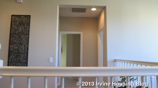
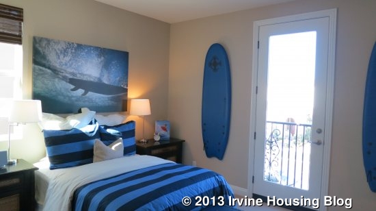
Adjacent to the middle bedroom is the Master bedroom. The master bedroom is at the back of the house and actually shares a wall with the other bedroom (the master has more separation in Residence 2). It is a nice sized, square room with two windows on one wall, and three on the perpendicular wall, overlooking the backyard. An open doorway leads to the master bath. On the right are dual sinks separated by a large tub. There is plenty of counter space around each sink. A large window is located above the tub. To the left are the separated toilet and a large shower with a seat. The shower has upgraded tile. At the back of the bathroom is a very large walk-in closet.

Across the hall sits the laundry room. It has a small counter with cabinets above and below it, as well as above the laundry machines.

Residence 1 may be the smallest of the Rosemist residences in square footage; however this is one of my favorite layouts. This model is the only one with its own private suite and the house is still spacious. I was disappointed that there is no option for a door at the master bathroom and that there is no separation of the master from the other secondary bedrooms, but the first floor was nicely laid out and the bi-fold doors to the large California room made a lasting impression. One question that comes to mind

when I think of the bi-fold doors is, as beautiful as the open doors make the transition of the indoors and outdoors, if a screen door is possible.

Residence Two

3,103 – 3,230 Sq Ft

4 Bedrooms, 4 Bathrooms + Teen Room

Base Price from $1,132,990

Style Options: Spanish (Two AX), Monterey (Two B), East Coast Traditional (E)

Residence Two has a balcony above the garage. The front door is located under a small covered porch which has space to furnish a couple of chairs. You immediately enter into a hallway which forces you to go towards the back of the house. To the left are two parallel short hallways. The first short hallway consists of a linen closet, bathroom with a single sink and nice sized shower and entry to the downstairs bedroom. The bedroom is adjacent to the bathroom and is a decent size with a two-door sliding closet. A single window facing the front of the house is located on the wall opposite the doorway.

The parallel small hallway comprises of the garage entrance and coat closet.

On the other side of the main entrance hallway is the formal dining room. It can accommodate a good sized table. Two windows are located towards the sides of the back wall and two windows are on the perpendicular wall facing out to the covered porch area. Off of the dining room is a small walkway leading into the kitchen. The walkway consists of a walk-in pantry to the left. On the right is a countertop with drawers and cabinets below, as well as 2 sets of double-door cabinets above. An optional wine chiller is shown in Residence 2. This area makes a nice place to have a variety of supplies, such as cocktail, entertaining or even some office supplies.

Continuing down the main entrance hallway leads to the great room and kitchen. To the left is the staircase and living room, the middle of the great room is used as a casual dining area and to the right is the kitchen.

The kitchen has upgraded cabinets and backsplash and has a rectangular island with space for seating. Like all models, the sink and dishwasher are located in the large rectangular island, which has enough space for seating. On the back wall are the cooktop, microwave and double oven. To one side, backing to the pantry is the refrigerator. On the other wall is counter space with cabinets below. A large window sits above the middle of the countertop. Unlike Residence 1, the cabinetry does not reach up to the ceiling, but there are plenty of cabinets/drawers for storage.

There is enough space in the great room for a casual eating area if desired. Some people may prefer this model, having a formal dining area out of sight from the kitchen. The great room’s causal eating area still provides a social setting for the family, while the formal dining room would provide separation from the kitchen and living room. There are two windows looking out to the California room from the dining area.

Like Residence 1, the living room is large with the flexibility to arrange it comfortably in a couple of different ways. The bi-fold doors open up and create a wonderful feeling of expanding your living space into the backyard. There is no fireplace inside the house, but an option to install a fireplace in the California room is available. I like the layout and larger size of the California room in Residence 2. Because the bi-fold doors open in front of the left side of the California room, there is still extra space on the right half of the California room to furnish the area and not worry about foot traffic disturbing the area between the living room and backyard.

Once upstairs, you walk into an open loft area, which Lennar calls a teen room. The space is large enough to have a couple of couches, coffee table and television. A glass door leads out to the balcony, which sits on top of the garage and looks out to the front of the house. Four additional windows bring in an abundance of light into the area.

To the left, off of the teen room, is the master bedroom. It is a square room with 7 windows spread over 3 walls, bringing in an plenty of natural light. An open doorway leads to the master bath. On the left is a large walk-in closet and dual sinks with plenty of counter space. On the right are the separated toilet and a large tub with two large windows over the tub. At the back wall is a large walk-in shower with a bench. The layout is nice and functional

On the other side of the teen room are the laundry room, two secondary bedrooms and 2 bathrooms. Across from the laundry room is a row of lower cabinets. The laundry room has a small counter next to a space for side-by-side washer and dryer. It has a linen closet in the back of the room, making it more functional than the one in plan one; however it does not look like a door exists in front of the linen closet so I wonder if the usual laundry room lint/dust would affect what is placed in the linen closet.

The secondary bedrooms are located on each corner of the house. One faces the balcony/front of the house, while the other faces the backyard. The front bedroom is a decent size and has two windows facing the front of the house and one small window facing the side. The bedroom has a small walk-in closet and en suite bathroom which has a single sink and tub/shower combo. A small window brings in natural light.

Separating the two secondary bedrooms is a bathroom that has an entrance from the hallway and an entrance from the back bedroom. It is the same size as the other bedroom’s bathroom, with a single sink and tub/shower combo. Since it backs to the other bathroom, no window exists in the shared bathroom. The bedroom appears slightly smaller than the other bedroom. It has three windows and has a two-door sliding closet.

Overall the layout of Residence Two is nice. The separate formal dining area will appeal to particular buyers who still want an open concept, but have an opportunity to host a formal dinner away from the kitchen. Residence Two is the only plan that separates the master bedroom from the other bedrooms, although it is located off of the teen room. It appears that the secondary bedrooms are slightly larger in Residence 2 than the other two Rosemist plans. As with all Rosemist Residences, I am disappointed that there is no option for a door at the master bathroom.

Residence Three

3,404 Sq Ft

5 Bedrooms, 5.5 Bathrooms + Teen Room

Base Price from $1,132,990

Style Options: Spanish(A), Monterey (BR), American Traditional (C)

Residence Three has two master bedrooms, one on each floor. This is a nice layout for those who do not want a full separate suite, but still want a private area for guests or separate living quarters from the secondary bedrooms upstairs. It is the only plan with 5 bedrooms.

Entry to the house leads into a hallway. On the right side of the hallway there is a powder room, coat closet, staircase and garage entry. On the left is the downstairs master bedroom. At the end of the hallway is the back of the house which leads into the great room, dining area and kitchen.

The coat closet, a row of three lower cabinet doors and the powder room is off a short hallway on the right. The spacious powder room has a small window that faces the front of the house and consists of a pedestal sink and toilet.

Further down, there is enough space for a table or furniture in front of the staircase. In the short hallway with the garage entrance sits a row of lower cabinets with 4 cabinet doors. I think this is great feature to have the counter and some cabinets upon entry from the garage in case you need an area to set groceries or things down. It works as a place to also store things on your way out to the car, such as purses/computer bags etc. This is the only Plan that has a ‘drop-off’ station by the garage entry.

The master bedroom sits across from the staircase. It is a good size room with two large windows facing the front of the house. The master bath has a large shower with a bench, big walk-in closet, a single sink with a lower vanity, and a separate toilet. A small window brings in natural light into the bathroom. I do not know if there is an option for a second sink, but there is enough space to have dual sinks, although a mirror could not be hung above the second sink without hindering the existing window.

The back of the house has the same layout as Residence 1 with the kitchen and dining area to the left. To the right is a large living room with bi-fold doors opening to a large California room. Immediately to the left is a wall with a pantry, refrigerator, double oven and microwave. Along the perpendicular wall, which sits behind the island, has the stovetop. Each side has plenty of counter space and cupboards. Like all models, a large rectangular island has a sink and dishwasher and space for seating. Like Residence 2, the cupboards do not run all the way up to the ceiling.

The dining area is well situated to the side of the kitchen. I like how it is not right in the middle of the great room. By having it off to the side, it gives it more of a proper dining room feel and is not in the middle of the foot traffic between the living room and kitchen. There are three windows, one on each wall surrounding the dining area.

The living room is large with the flexibility to arrange it comfortably in a couple of different ways. The bi-fold doors open up across the majority of the living room wall and create a wonderful feeling of expanding your living space into the backyard. It appears by the layout, the bi-fold doors in this plan may be the largest. There is no fireplace inside the house, but an option to install a fireplace in the California room is shown in Residence Three. Because the doors open so widely, foot traffic is not hindered when accessing the backyard even with the California room furnished.

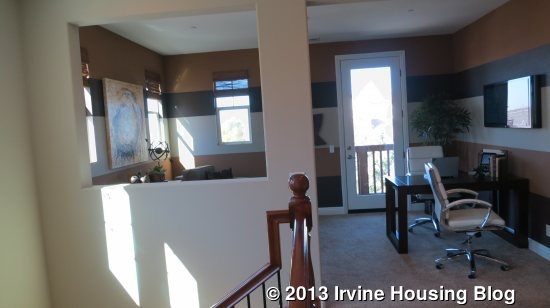
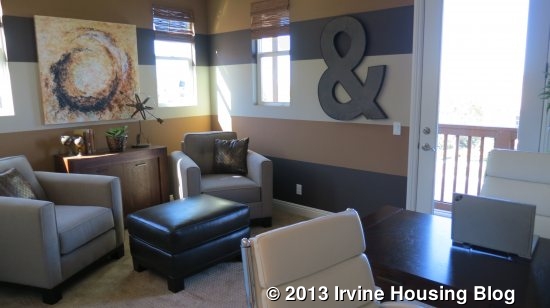
The second floor consists of 4 bedrooms, 4 bathrooms, laundry room and teen room. Along the left side of the house are the secondary bedrooms and the laundry room. Along the right side are the teen room, staircase and master bedroom. Once upstairs, immediately to the left is the open loft area that Lennar calls the teen room. It is a small area that can be furnished with a couch, coffee table and television. The model home uses the area as office space. A door leads out to a narrow deck that faces out to the front of the house. Although it is narrow, it looks like it can still have some small chairs on it.

To the left of the teen room is a short hallway with the first door on the right leading into the laundry room. The laundry room comes with a small square counter with two cupboard doors under it. Next to it is space for a side-by-side washer and dryer. Above are a shelf and 3 cupboard doors. Like Residence 2, a linen closet is found at the back of the laundry room; however it does not look like a door exists in front of the linen closet so I wonder if the usual laundry room lint/dust would affect what is placed in the linen area.

At the end of the short hallway is a shared bathroom with a single sink and a tub/shower combo. A small window sits above the toilet, bringing in some natural light.
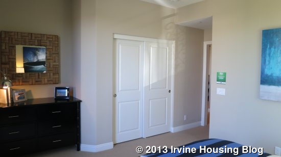
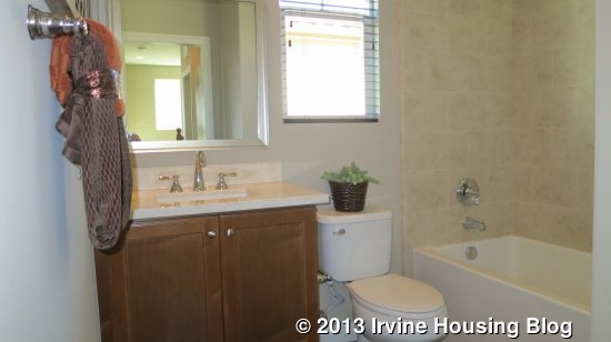
The last doorway in the short hall leads to the front left corner of the house, which is the first of three secondary bedrooms. It is a decent sized room with a two-door sliding

closet and a nook for dresser or small desk. Two windows face out over the deck.
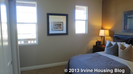
Another short hallway is located behind the laundry room. It consists of the last two secondary bedrooms, which both have en suite bathrooms. The middle secondary bedroom has one window looking out to the side of the house. A walk-in closet and bathroom are along the same wall. The bathroom is similar to the shared bathroom, with a single sink and tub/shower combo; however this bathroom does not have a window. The bedroom appears slightly smaller than the front bedroom.
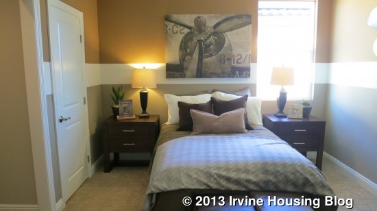
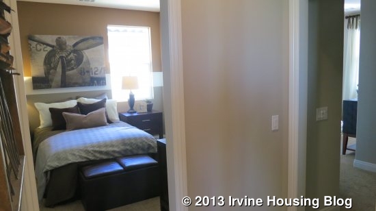
Adjacent to the middle bedroom is the last secondary bedroom, which sits in the back left corner of the house. It has one window facing the backyard. There is a two-door sliding closet that is bigger than the closet in the front bedroom. It also has an en suite bathroom, which is similar in size as the other bathrooms. It has a single sink and tub/shower combo.
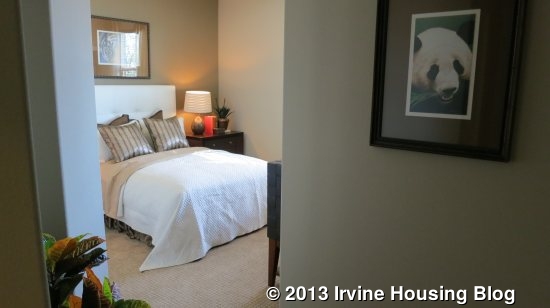
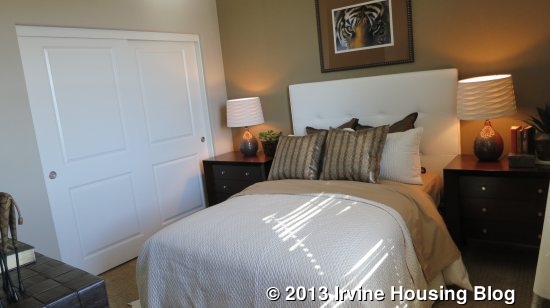
On the other adjacent wall is the master bedroom. It is a square size with 3 windows facing the backyard. Upon entering the master bath, the separate toilet and a shower with a bench are on the right. Three small windows lay high across right hand wall, sitting over the garage roof. Straight ahead is a large walk-in closet. To the left are two split sinks facing opposite walls. The large bathtub is on the left wall with a large window overlooking the backyard.

This model is good for buyers who do not need a private suite, but desire a master bedroom on the first floor. This is also one of my two favorite models. This model is the only one with 5 bedrooms, although they felt smaller than the secondary bedrooms in Residence 2. As with all Rosemist Residences, I was disappointed that there is no option for a door at the master bathroom and that in this model there is no separation of the master from the other secondary bedrooms. However, the first floor was nicely laid out and the bi-fold doors to the large California room made a lasting impression. One question that still comes to mind when I think of the bi-fold doors is, as beautiful as the open doors make the transition of the indoors and outdoors, if a screen door is possible to have. Would that matter to you, as a buyer if there was no screen door to prevent insects from coming in? Each model appeals to different buyers due to options such as a private suite, master on the first floor or a private dining room. Which model would suit your needs best?

Open House Review: 4 Urbino

Today I saw a house at 4 Urbino. It is nicely situated on a quiet cul-de-sac street in the gated community of Windstream. Windstream is divided into three gated sections so it limits the amount of car traffic although pedestrian traffic is not limited between the sections. 4 Urbino is found in one of the smaller portions that consist of 2 short cul-de-sac streets and just steps from the community pool and Hicks Canyon Trail.

Asking Price: $998,000

Bedrooms: 4

Bathrooms: 3.5

Square Footage: 2,618

Lot Size: 5,663 sq ft

Price per Square Foot: $381

Property Type: Residential, Single Family

Style: Two Level

Year Built 1979

Community: Northwood, Windstream

Days on Market: 40

HOA Fees: $174/mo

There are no Mello Roos.

The home was originally a 3 bedroom house with a large bonus room over the garage, but the bonus room is converted into two split bedrooms with a partial wall that divides the room. The single car portion of the 3-car-garage is also converted into an office area, although I was informed that the wall is temporary and can easily be removed if someone desires to convert it back to garage space.

Although the house has a number of upgrades such as scraped ceilings, wood flooring downstairs, upgraded stair rails, plantation shutters, 6-panel doors and a remodeled kitchen, there were enough original features that left me with the impression that a lot of changes would still be needed to update the home. The windows are original, the carpet and paint look worn in areas, some bathrooms, including the master bathroom have original/outdated countertops and an old tiled tub and the garage doors are not roll-up.

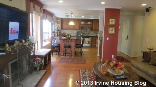
Upon entering the wood double doors the staircase, with beautiful railing, is to the right. A small closet with a short door is located on the landing of the stairs. The flooring on the first floor is wood, while the staircase and second floor are carpeted. The room feels spacious with the vaulted ceilings and there is plenty of light flooding the area through multiple windows. The windows, although original, are furnished with plantation shutters. Straight ahead is a step-down living room next to an open dining room. A good sized dining table can be accommodated in the dining area.

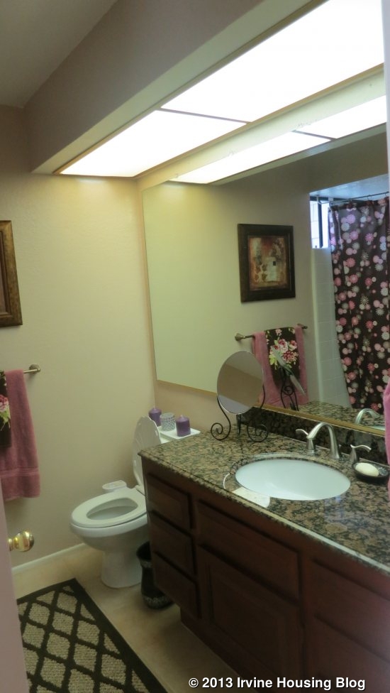
To the right is a hallway with a coat closet and bathroom which leads to the kitchen, laundry room and family room. The bathroom is located directly across from the dining area. It has a single sink with a large 4×4 tile countertop. The fluorescent lighting has been replaced with recessed lights.

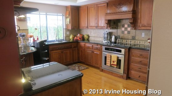
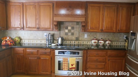
The kitchen has been updated with recessed lights, black granite countertop and tile backsplash. Immediately to the right is the entrance to the laundry room, which leads to the garage.

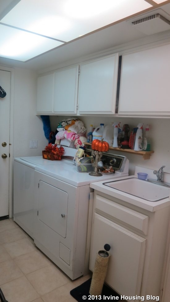
The laundry room has cupboards and a sink and still has the original fluorescent lights. The refrigerator is next to the laundry room entrance. On the adjacent wall is the oven with an electric stovetop above it. On the far wall are the sink, dishwasher and window overlooking the side backyard wall. The granite counter top extends out to create a rounded eating area in front of a bay window. The kitchen has plenty of counter space, cupboards and storage. In the center of the room, between the kitchen and family room, is a small wall that appears to be a load-bearing wall and part of the original structure of the kitchen prior to a remodel. It has another set of cupboards and storage and currently has recipe books and is where the home telephone is placed. The kitchen flooring is slightly different from the family room flooring.

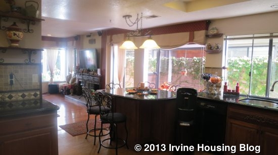
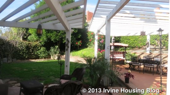
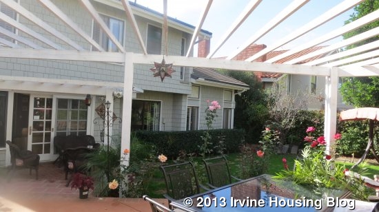
The family room has recessed lighting, a remodeled fireplace and a new sliding glass door leading to the backyard. There are multiple windows that bring in plenty of natural light. The sliding door leads out to a covered patio. The backyard is beautifully landscaped with a mature tree, a flat grassy area and vine covered walls. The yard sits lower than the neighbor in the back so a small, low retaining wall sits against the back wall.

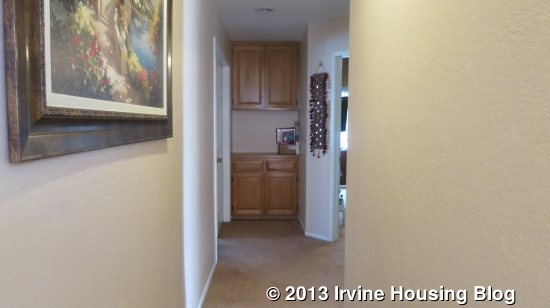
Carpeted stairs lead up to the second floor. Once upstairs, one of the two small linen closets is located at the end of the hallway. The linen closet sits between the master bedroom which is to the left, and one of the secondary bedrooms which is to the right. The hallway is L-shaped. To the right is the shared bathroom, another linen closet, another secondary bedroom and the bonus room which was converted to a split bedroom.

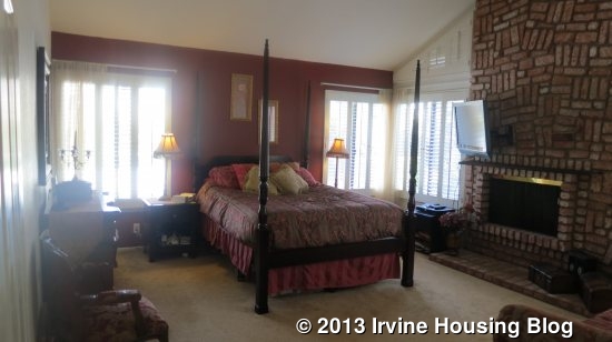
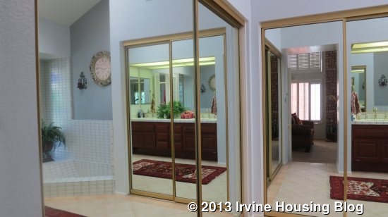
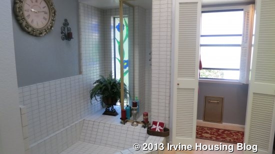
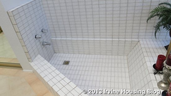
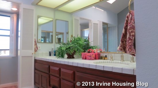
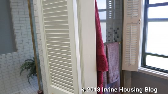
The master bedroom is a nice size and has large windows overlooking the backyard. A brick fireplace is found in the bedroom. The master bathroom is a step up. Two sets of mirrored two-sliding-door closets are found at the entrance of the bathroom. There is no bathroom door which can bring some light into the bedroom if someone is utilizing the bathroom in the morning/night. The bathtub is sunken and entirely tiled. It is a unique asymmetric shape. At the end of the bathtub is the glass wall to the shower. The entrance to the shower and the toilet are separated from the rest of the bathroom by a set of wood slated swinging doors. There are dual sinks with plenty of counter space, but the countertop is outdated with tile that matches the bathtub and shower. The original fluorescent lighting sits over the sink area. The floors have been updated with clean 12 inch tiles.

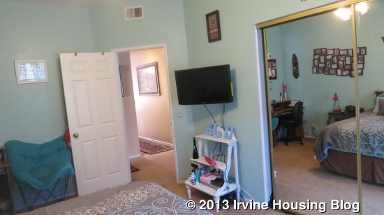
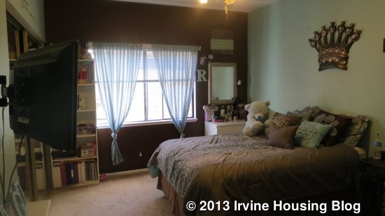
The first secondary bedroom is large and has a mirrored two-door sliding closet. There is enough space for a double bed, bookcase, small desk and nightstands.

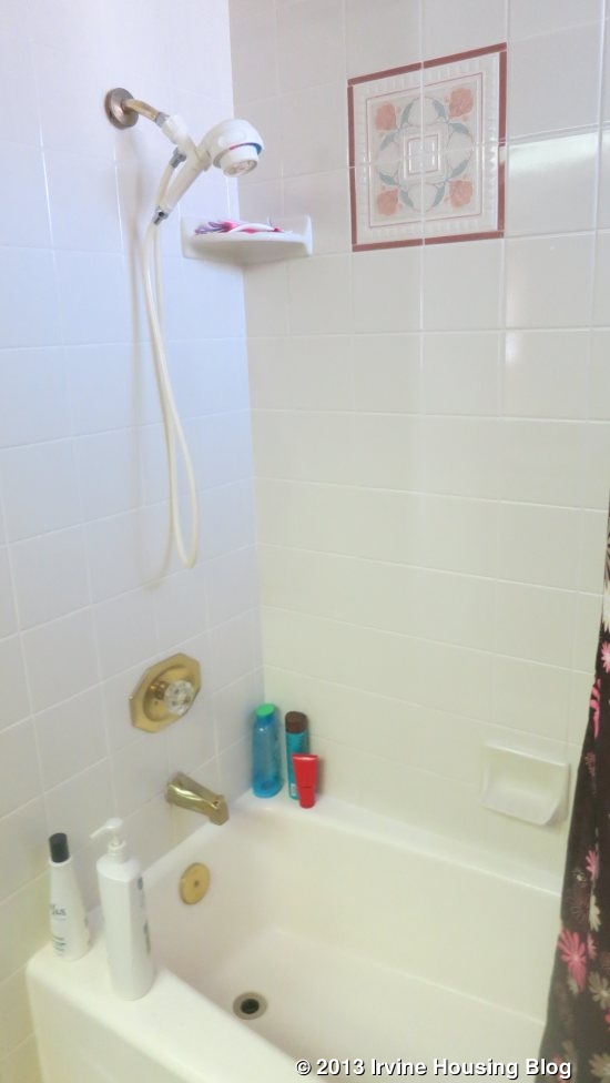
The shared bathroom has a single sink and tub/shower combo. It has a granite countertop and updated cabinets but still has the original fluorescent lighting.
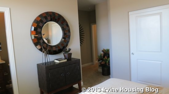
The second secondary bedroom appeared slightly smaller, but still a nice size. Both rooms have a large window that brings in plenty of light. The closet has two pull-out doors.

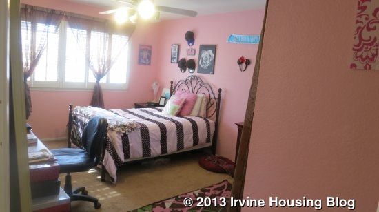
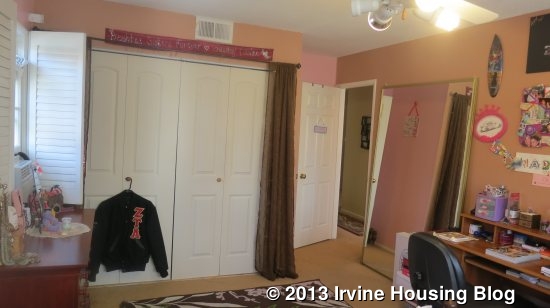
The last bedroom is the converted bonus room. It currently consists of two separated sleeping areas with a partial wall that does not meet the ceiling. In order to get to the bedroom with a closet, one must walk through the front bedroom/room area into the back section. It is a small bedroom which fits a twin bed. The windows face the front of the house. This would not be my first choice of conversion for this room.

The layout of the house is nice, but if you are looking for a true 4 bedroom house, then the bonus room conversion may not be what you had in mind. There is plenty of storage space, but another downfall is the location of the bathroom, which sits directly across from the dining room. The price seems high for the amount of original features still left in the house, but would you be willing to overlook it and pay a higher price for a quiet, great location? The house is walking distance to Santiago Hills Elementary and Sierra Vista Middle schools.