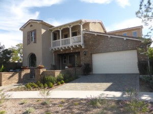
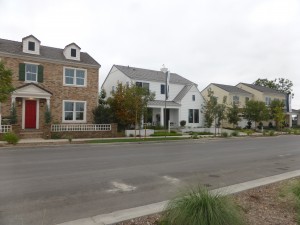
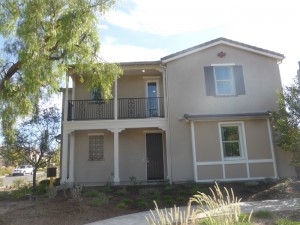
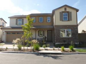
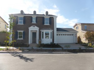
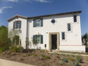
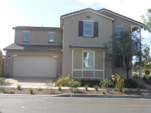
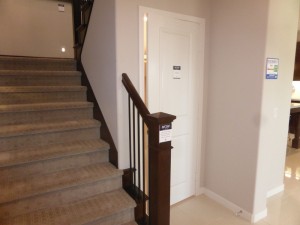
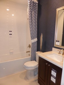
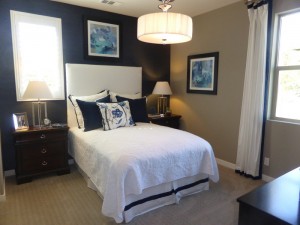
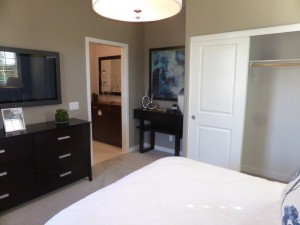
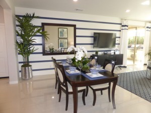
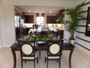
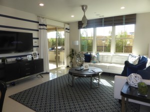
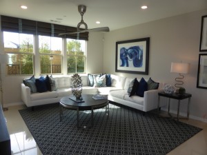
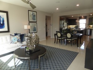
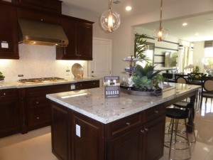
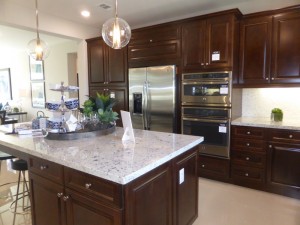
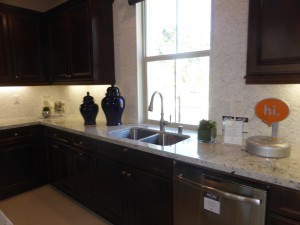
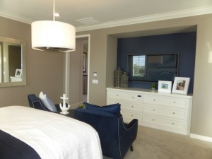
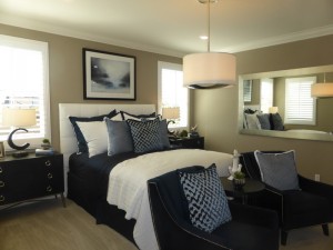
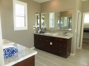
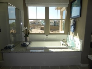
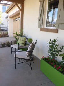
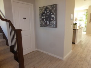
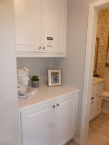
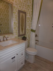
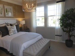
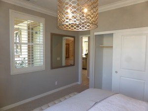
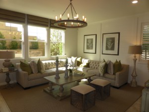
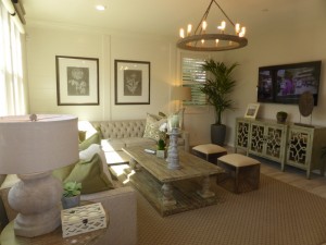
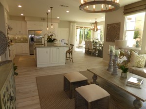
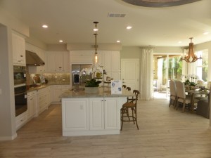
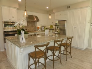
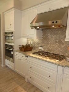
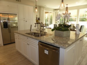
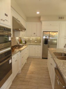
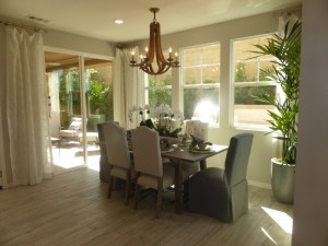
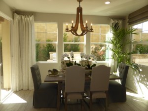
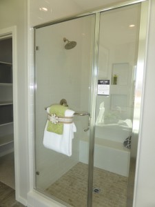
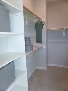
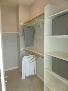
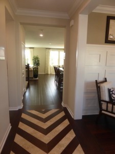
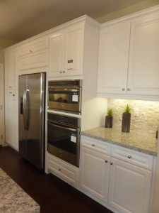
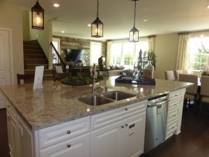
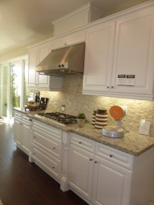
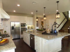
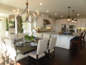
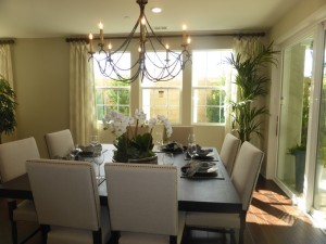
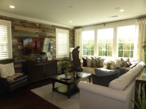
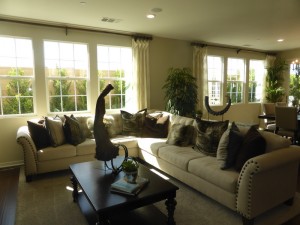
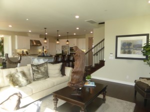
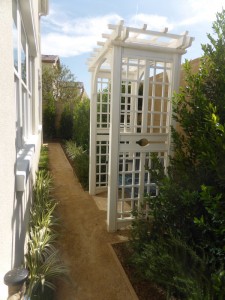
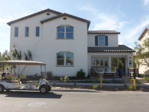
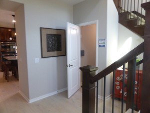
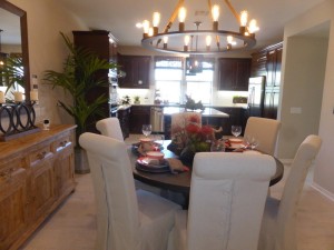
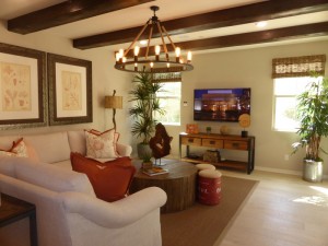
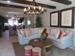
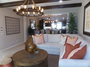
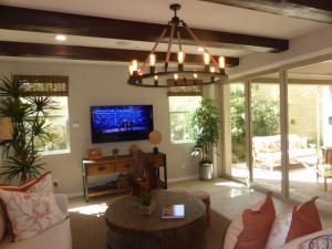
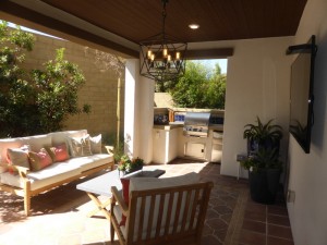
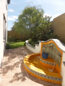
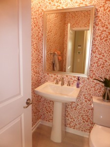
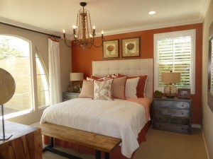
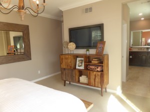
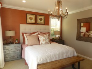
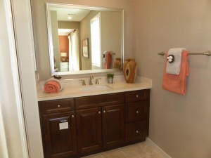
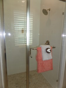
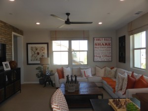
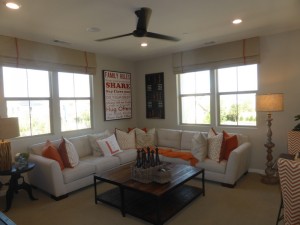
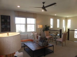
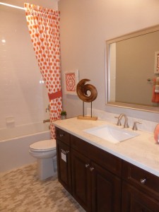
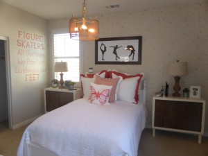
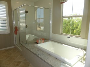
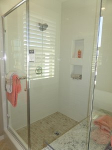
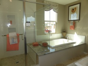
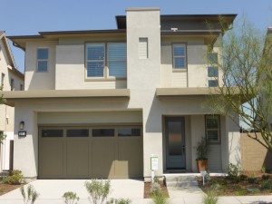
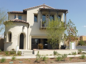
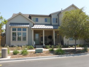
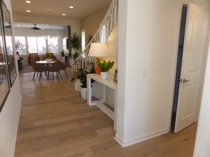
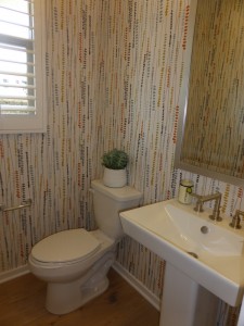
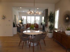
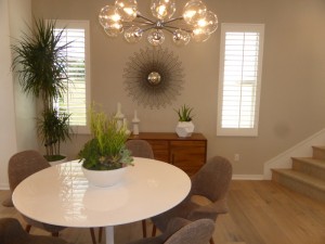
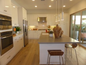
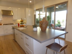
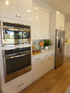
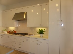
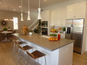
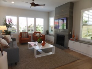
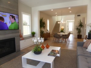
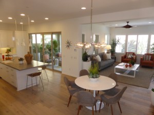
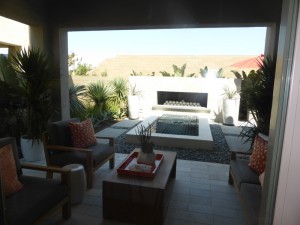
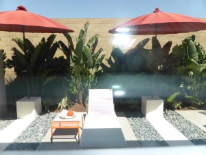
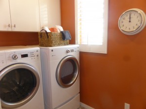
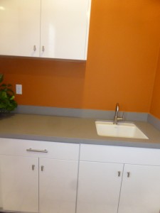
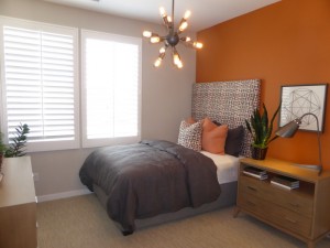
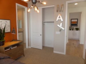
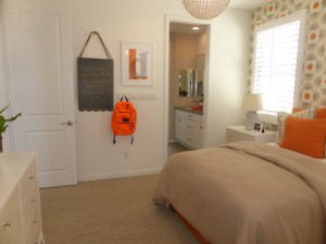
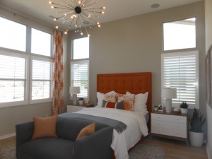
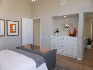
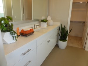
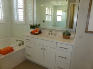
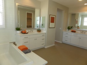
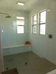
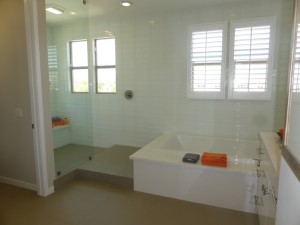
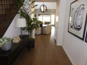
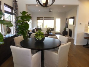
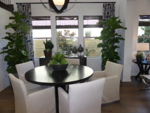
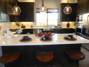
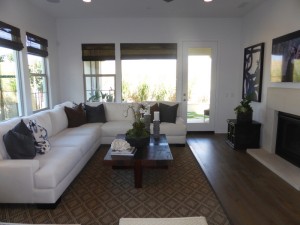
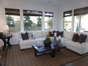
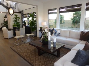
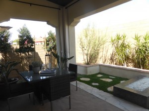
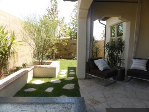
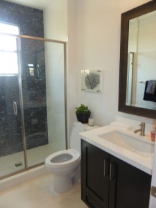
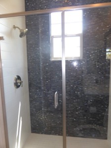
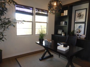
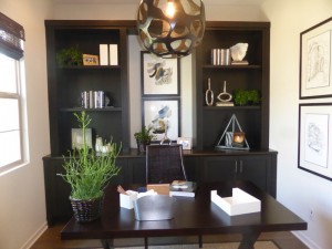
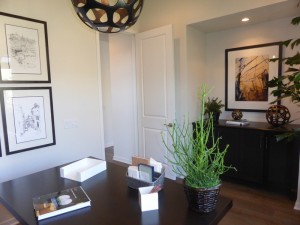
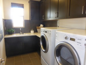
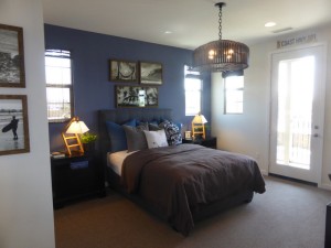
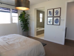
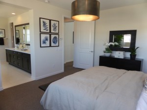
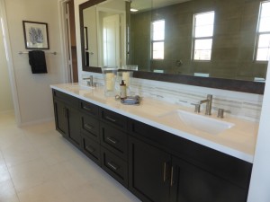
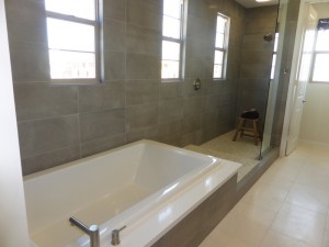
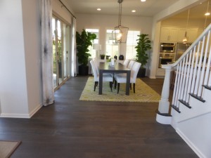
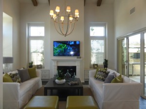
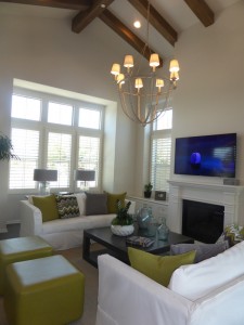
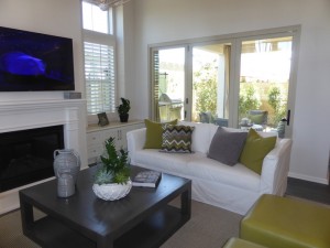
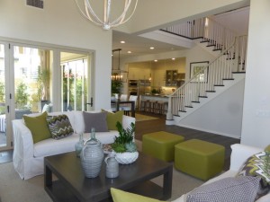
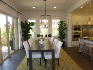
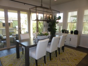
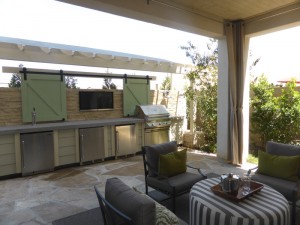
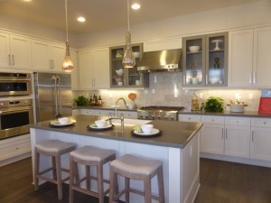
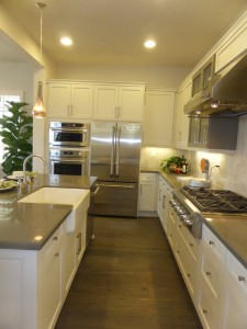
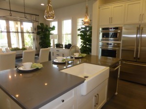
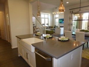
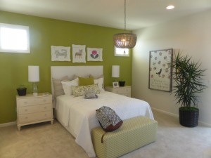
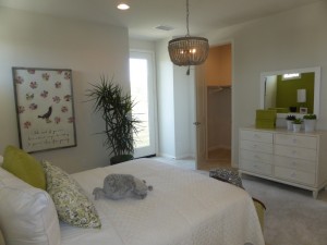
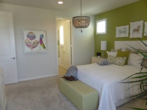
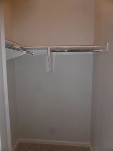
This week, I visited the Juniper Collection at Beacon Park. Build by Pulte Homes, the collection will have 54 single-family homes. The Juniper models sit on lots that range from 6,800 – 7,500 square feet, though many of the homes available in phases one and two only have about 5,100 – 6,000 square feet. Across the collection, lots range from around 5,000 – 9,000 square feet. The three different models all have four bedrooms and 3.5 – 4.5 bathrooms, with each home also have at least one additional “flex” room. The models are located in the center of the neighborhood, but the actual Juniper community is in the southeast corner of Beacon Park. The elevations include Monterey, Abstract Traditional, American Farmhouse, and Spanish. All homes have a two-car garage and some plans offer additional storage areas. Juniper is the first collection to have a wide range of options within each floor plan, so I will do my best to walk you through each option.
Category Archives: New Homes
Beacon Park – Larkspur Collection Review
This week, I explored the Larkspur Collection at Beacon Park. Built by Lennar, the collection will have 69 homes with an average lot size of just under 6,000 square feet. The model lots are on among the smallest in the collection. The three different models have 4-5 bedrooms and 4-5 bathrooms and range from 2,165 – 3,160 square feet. The collection is more spread out than many of the others in the neighborhood, stretching across from the center of the neighborhood all the way to the eastern edge. One neighborhood sits between Larkspur and Irvine Boulevard. The elevations include Spanish, Craftsman, Ranch, St. Augustine, and Monterey. All homes have a two-car garage and residence two includes an extra 10’ x 17’ storage space in the garage.
Beacon Park – Oakmont Collection Review
This week, I visited the first single family residence collection in the Beacon Park neighborhood. Oakmont is built by Ryland Homes, the collection will have 49 homes and three different models. The houses range from 3-4 bedrooms, 3.5-4 bathrooms, and 2,524 – 3,064 square feet. The Oakmont collection is on the east side of the neighborhood, with two collections to the north and three to the south. The elevations for the homes include Cape Cod (aka Nantucket), Classic Colonial (Savannah), and East Coast Traditional (Williamsburg). The models are set on approximately 4,550 square foot lots, which is among the smallest in the neighborhood, though most still average just under 5,000 square feet. A few sites will have lots that are nearly 8,000 square feet. All homes have a two-car garage.
Beacon Park – Melody Collection Review
The Melody Collection at Beacon Park is the fourth and final collection of single family, detached condominiums. Built by Lennar, the collection will have 62 homes, comprised of four different models. The homes are arranged in groups of four. All four homes share a motor court, leading to a two-car garage and two-car driveway for each. The front two homes have their front doors facing the street, while the back two homes have front doors off the motor court. Models 1 and 4 will always be in the front, while 2 and 3 are always at the back. The Melody homes are located in the southwest corner of the neighborhood, with easy access to Ridge Valley and Trabuco Roads. They are also right next to the planned neighborhood park and will be near a future entry into the Great Park. All homes have four bedrooms and 4-4.5 bathrooms, ranging from approximately 2,321 – 2,774 square feet. The elevations include Monterey, St. Augustine, American Farmhouse, Classic Colonial, Spanish, and Santa Barbara.
Included Features
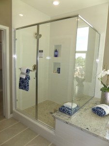
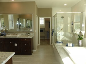
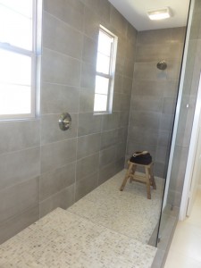
Lennar homes boast an “Everything’s Included” policy, meaning that most of the features seen in the models are included, rather than displaying a lot of upgrades. These features include ceramic tile flooring in entry, kitchen, powder room, baths, and laundry room; Mohawk(R) wall-to-wall carpeting in all living areas and bedrooms; custom-crafted Maple handrail with wrought-iron post-to-post stairway system and lights; California room with LED lights, prewire for ceiling fans/lights, and a multimedia outlet; dimmer light switches at great room, dining room, and all bedrooms, and laundry rooms with Piedrafina(R) engineered stone countertop, cabinetry, and sink. The kitchens include raised panel white Thermafoil or maple cabinetry with soft close hinges; granite countertops with 6″ backsplash; stainless steel GE Profile(TM) appliances including, built-in oven, single wall built-in microwave/oven with Advantium technology, ENERGY STAR(R) dishwasher, and side-by-side refrigerator with ice and water dispensers, as well as a GE Monogram five-burner gas cooktop and professional hood. The master suites have 6 1/2″ Colonial crown moulding; Moen(R) widespread faucets with brushed nickel finish and matching accessories; framed mirrors in metallic finish and adjustable medicine cabinet; granite countertops with top mount sinks; soaking tub with granite deck and tile surround; clear glass shower enclosure with full height tile surround and decorative mosaic tile shower floor; two-sided mirrored French door at walk-in closet; and pre-wire for ceiling fan/light fixture. The secondary baths have Piedrafina(R) countertops; bathtubs with full height tile surround; and the same hardware, accessories, cabinetry and mirrors as in the master bath. The homes also feature a variety of green technology, including options for solar plans and home intelligence; tankless water heater; water conserving faucets and showers; LED lighting; recycled floor covering options; and prewire at garage for electric/hybrid vehicle charging systems. Some features seen throughout the models are not part of the Everything’s Included program, including paint, wall treatments, ceiling treatments, window coverings, built-ins, specialty door casings, flooring, lighting fixtures, landscaping and surround sound. However, some of the front landscaping is maintained by the HOA.
Schools
Beacon Park is going to have its own K-8 school, called Beacon Park School, which is slated to open in August 2016 as part of the Irvine Unified School District. There will be a new high school, Portola High, opening nearby (also scheduled for August 2016, though possibly not with all grades opening the first year). Until then, students will attend Canyon View Elementary, Jeffrey Trail Middle School, and Northwood High School.
Basic Neighborhood Financial Information
Approximate HOA dues: $141-216 per month, estimated at $184 upon buildout
Base tax rate: 1.0875% plus an annual special assessment of $172
Community Facilities District tax – ranges from $6,592 – $8,190 per year, depending on square footage of the home
Prices start at $944,990 for Residence 1, $989,990 for Residence 2, $1,064,990 for Residence 3 and $1,059,990 for Residence 4
Residence One
2,321 square feet
4 bedrooms, 4 bathrooms
Residence One is shown in the Monterey elevation, with St. Augustine and American Farmhouse options also available. The home has the garage entry on one side and the front door around the corner; these homes are located on the street, rather than at the back end of the motor court.
The home has a small foyer, with the staircase and coat closet on the left and a hallway to the downstairs bedroom and bathroom on the right. The coat closet has extra storage under the stairs. There is space for built-in linen cabinets across from the bathroom. The bathroom has a single sink set into a small vanity. It also has a shower/tub combo.
The main floor bedroom is 12′ x 11′ and has windows facing the street and side. There is a small alcove behind the door with room for a table or bookshelf. It has a two-door, standard closet.
The foyer opens up to the great room, which is 24′ x 15′ and includes the dining area. The space for the dining room isn’t specifically defined, leaving plenty of room for a large table and china hutch.
The living area feels spacious as well. A full wall of windows face the side of the home and sliding doors lead out to the California room. It has the option for a wall-mounted TV and pre-wire for a light fixture or ceiling fan.
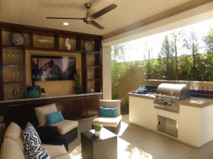
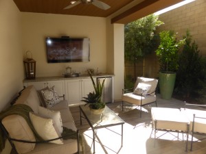
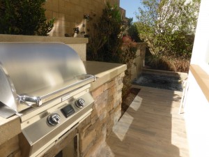
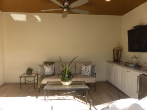
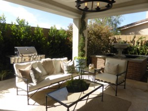
The California room has the potential to be a true outside living room. The model shows a built-in barbecue and large built-in wall unit with a mounted TV. The home doesn’t have a yard and there isn’t really a lot of space beyond the walls of the room.
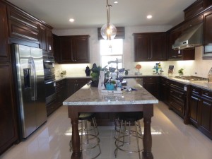
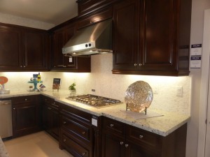
The open kitchen is just on the other side of the dining room. It measures 15′ x 15′ and has a u-shaped set up. The center island is long and narrow, with bar seating on three sides. I noticed numerous cabinets and plenty of counter space along all three sides of the kitchen. The refrigerator, oven and microwave are along the left wall, the sink and dishwasher are at the far end, and the cooktop is on the right. The garage access is also in the kitchen.
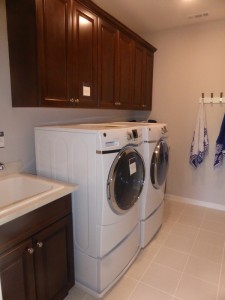
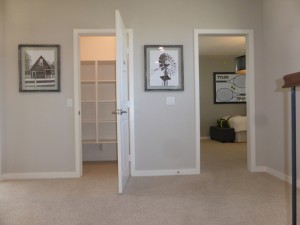
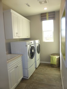
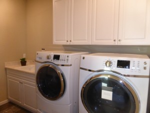
On the second floor, there is a big landing at the top of the stairs, with all of the rooms coming off of different corners. The laundry room has side by side machines, a sink, and upper cabinets, with built-in linen cabinets just outside of it.
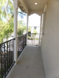
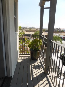
The landing also has a door opening to a deck that runs above the front porch. The deck is only available in the Monterey elevation.
Bedroom 2 is 11′ x 12′ and has windows on two walls. It includes a two-door standard closet and en-suite bathroom. Like the first floor bath, this one has a small vanity and a shower/tub combo.
Bedroom 3 is at the front of the house, with windows facing both the street and side. Like the other secondary rooms, it is 12′ x 11′ and has a two-door, standard closet. It sits directly above the first floor bedroom and has the same basic layout. The key difference is this room has an en-suite bathroom, which includes a slightly larger vanity and a shower/tub combo.
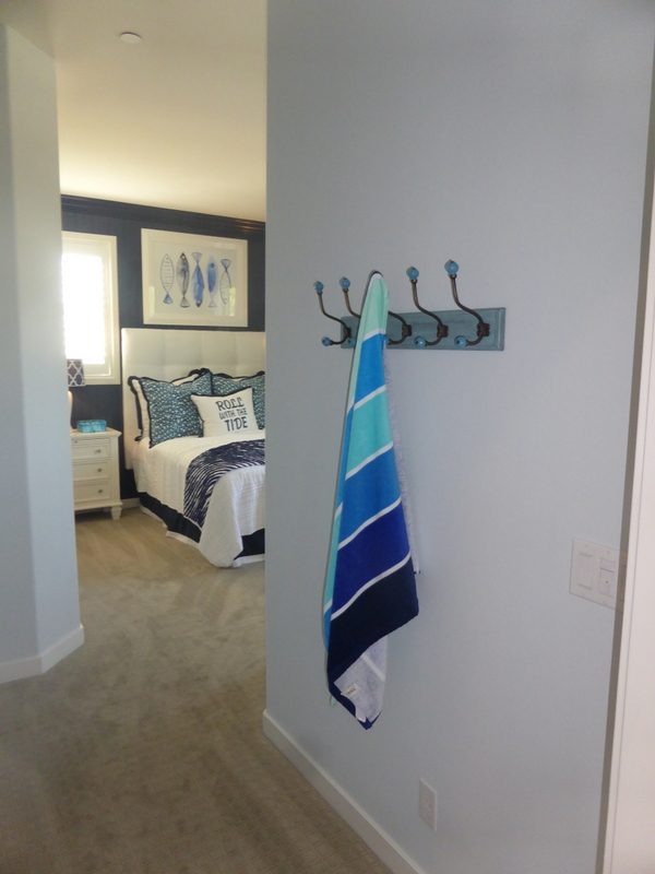
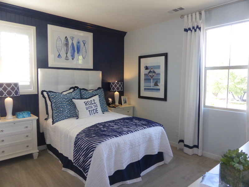
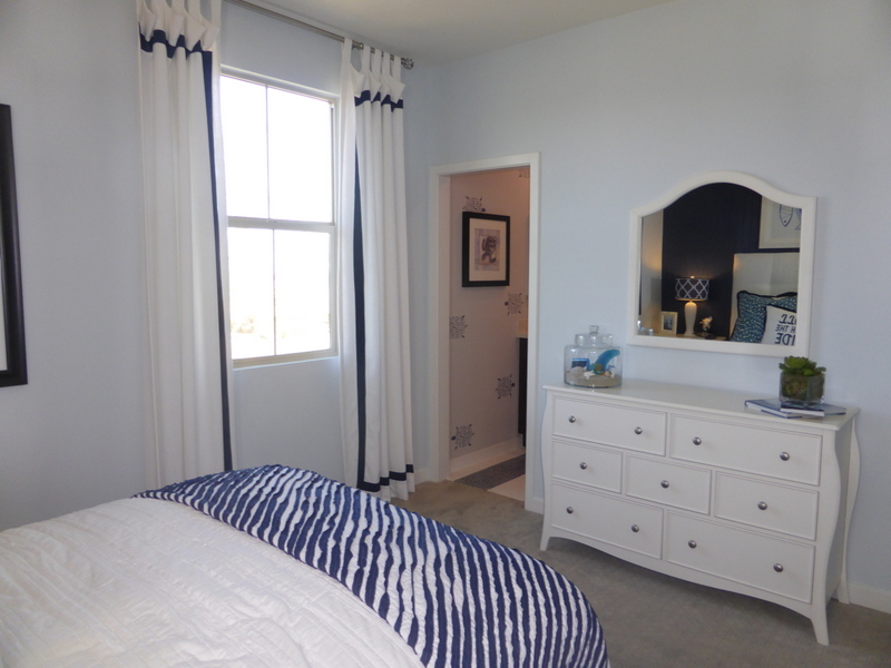
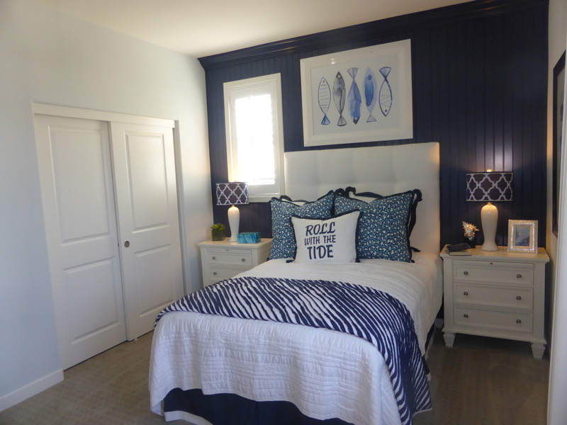
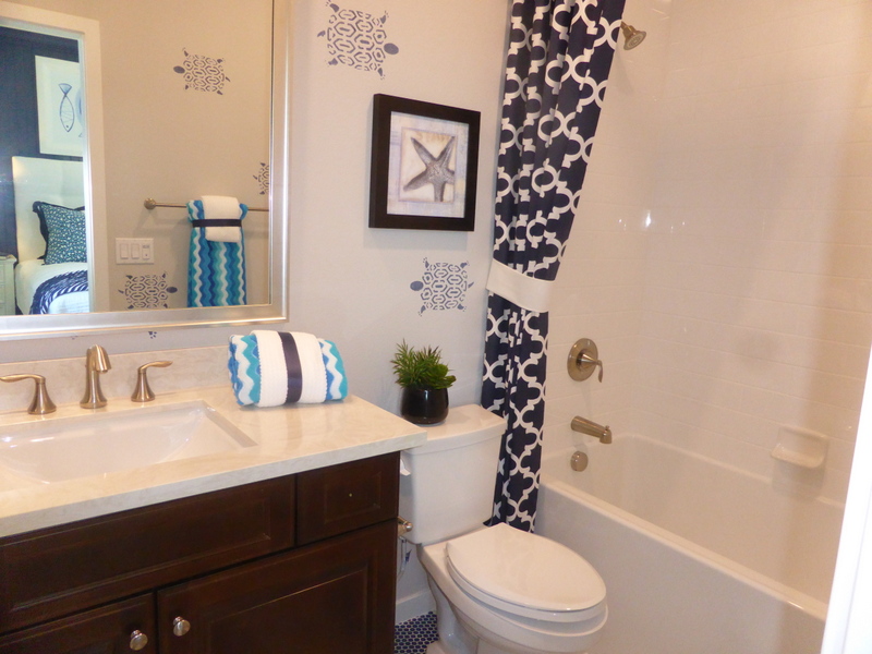
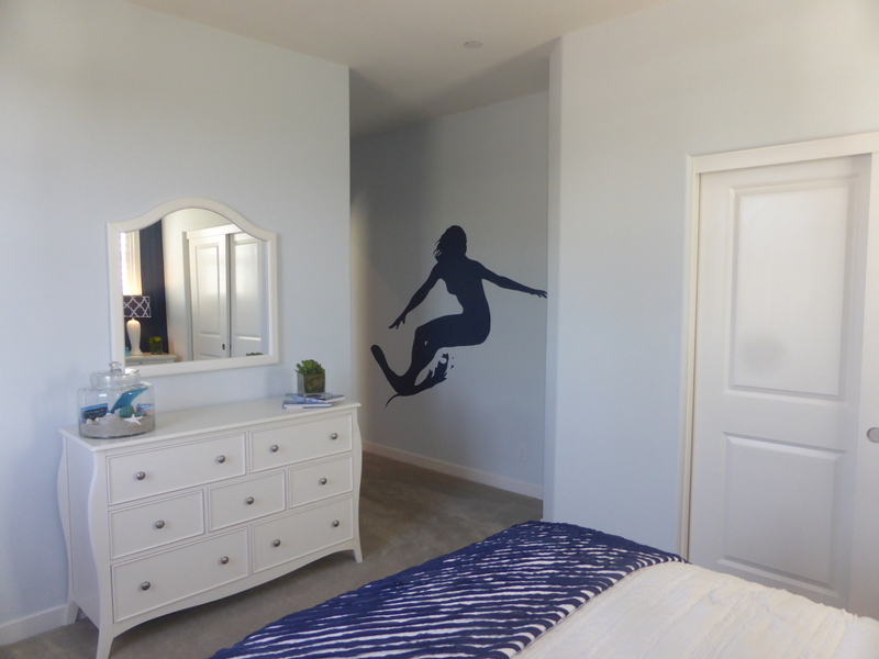
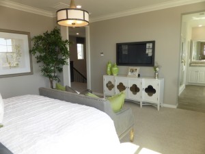
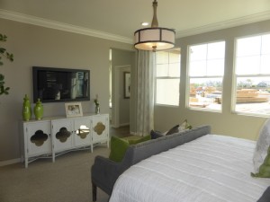
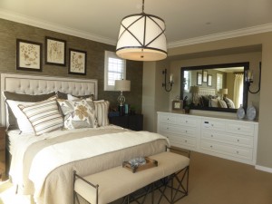
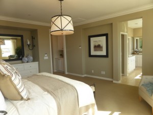
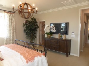
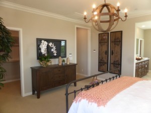
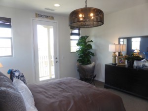
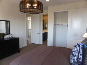
The master bedroom sits above the great room, with windows on two walls. At only 15′ x 15′, the room is not particularly spacious. However, an alcove offers a great space for a dresser or built-in unit and frees up space in the room.
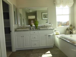
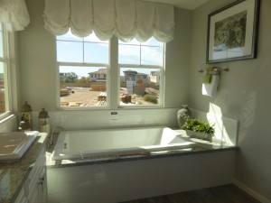
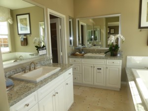
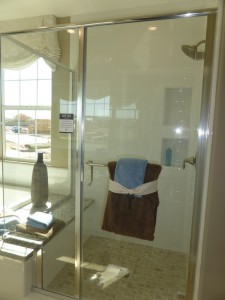
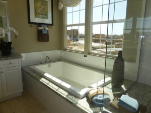
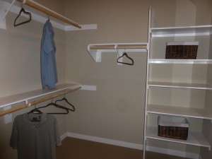
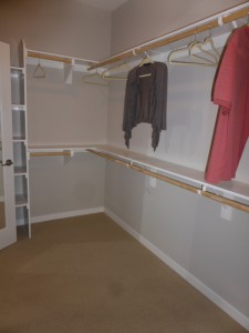
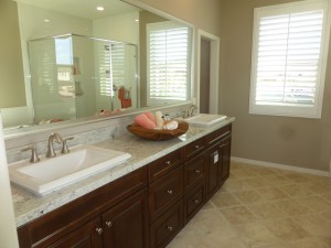
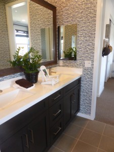
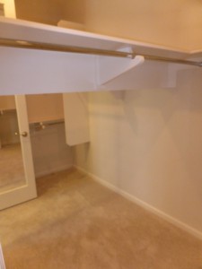
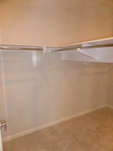
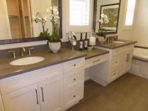
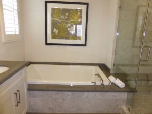
The master bath has two vanities set across from each other. Each has a single sink, three cabinets, four drawers and a medicine cabinet. The bathtub is across from them, set beneath two big windows. The tub deck is shared with the shower to create a seat in the shower. The shower is a really good size and has with two built-in shelves. The walk-in closet is at the end of the suite. It is long and narrow, with Lennar’s custom built-in shoe rack, which is really just a set of shelves and could hold something other than shoes.
This house felt very similar to the other detached condos I have seen, especially Lennar’s Harper Collection. I like that each bedroom has a private bathroom and felt that the living areas were spacious.
Residence Two
2,407 square feet
4 bedrooms, 4 bathrooms
Residence Two is modeled in the American Farmhouse style. The other elevations for this home are Monterey and St. Augustine. Like many of the Beacon Park homes, this one has a front porch. The front door and garage both face the motor court, as this will be a back unit. The other two elevations have a big deck on the second floor, but the Farmhouse style does not.
When I entered the home, it looked almost exactly like residence one. The stairs and coat closet are on the left and a hallway with linen storage leads to the main floor bedroom and bathroom. This model shows the white Thermafoil cabinetry option throughout.
The main floor bathroom has a single sink and a shower/tub combo.
The bedroom is 12′ x 11′ with windows facing the front and the porch. There is a two-door, standard closet. It is a basic room that is quite similar to most of the first floor bedrooms I have seen in new homes lately.
The family room, kitchen and dining room are just across the foyer from the front door. Unlike residence one, this model has a designated dining room toward the back. The family room is on the right when you come through the doorway. It is 17′ x 16′ and has windows facing the back and side of the home. It is shown with decorative wall touches and flooring.
The kitchen has a wide center island with seating on one side and the sink and dishwasher on the other. The L-shaped room includes the oven, microwave and cooktop on the longer wall, and the fridge and pantry on the shorter wall. Overall, it seems to have a lot less storage than the kitchen in residence one, though there are still a good number of cabinets and drawers. At 14′ x 12′, it is a lot smaller in area, too. The pantry has two cabinets facing the kitchen and another set facing the dining room. I found that set up to be a bit strange and inconvenient, unless you wanted to use the third set for china storage. The garage access is just between the kitchen and dining room.
The dining room is behind the kitchen, but open to it. The room is bright, with a full wall of windows at the back, a single window on another wall, and sliders to the California room on the third. As it doesn’t have any full walls, only a low hutch would fit beneath the windows.
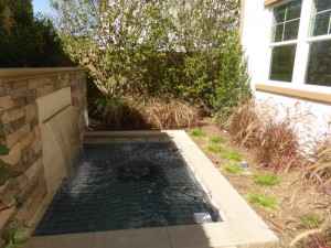
The California room is quite nice, shown with an optional built-in cabinet unit that includes a mini fridge. A narrow space behind the house offers room for a built-in barbecue and even a small pond.
Upstairs, the layout is also similar to residence one, with rooms in three of the corners. The laundry room comes off the main landing, with side by side machines, a sink, and upper cabinets. Off the landing, there are also two full linen closets with shelving included. It appears that access to the deck in the other elevations is also off the landing.
Bedroom 2 is located at the front of the house, and is slightly larger than the other secondary rooms at 12′ x 13′. It has windows on three walls, so it probably gets light throughout the day. Again, this room has a standard closet and an en-suite bathroom. The vanity offers a little more counter space, still with one sink, and there is a shower/tub combo.
Bedroom 3 is at the far end of the hall. Like the room downstairs, it is 11′ x 12′. However, this one has a walk-in closet instead. There are windows on two walls and an en-suite bathroom. The vanity here is a little smaller and, like the other secondary baths, it has a shower/tub combo.
The master bedroom is at the back of the house. It is 16′ x 14′ and has a full wall of windows facing the backyard. There are two additional windows on the side. This room doesn’t have space for a built-in dresser, but it’s slight rectangular shape gives enough space for a bench or couch at the foot of the bed.
The master bath has a single vanity with two sinks. It’s on the smaller side, with just a little space between the sinks and only one set of drawers. The bathtub sits next to the vanity and has a wide deck at each end. The shower sits alone on the other side. It has a built-in seat on one side with shampoo shelves above it. The closet wraps around behind the shower, with doors on each side of it. There is a built-in shoe rack just inside each door.
This house felt very similar to Residence One. The key difference is the separate dining area. I also really like the dual linen closets in the upstairs hall.
Residence Three
2,678 square feet
4 bedrooms, 4 bathrooms
Den
Residence Three is shown in the Classic Colonial elevation, with a Monterey elevation also available. A second elevation is also listed as Classic Colonial. The model is the only one that does not have a large second floor deck.
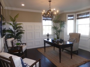
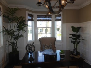
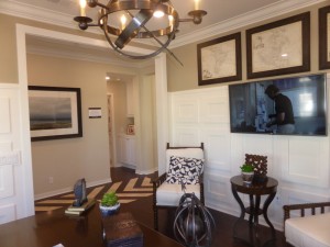
When I entered this home, it felt quite different than the other two. This one has a long hallway just inside the door and doesn’t have a staircase or coat closet near the front entry. It has a den on the ride side with windows facing the street and another on the side. The decorator’s paneling adds a nice touch.
Across the hall from the den, there is a linen cabinet, bathroom and bedroom. The bathroom has a single sink and a shower/tub combo.
The main floor bedroom is 10′ x 11′, making it the smallest room I have seen so far in the Melody collection. Its windows face the front and side of the home and it has a two-door, standard closet.
As I walked down the main hallway, I came to the stairs on my left and the kitchen on my right. There is a large closet under the stairs.
The kitchen feels very open. It has a very large center island with seating on two sides and the sink and dishwasher on another. There are numerous drawers in the island as well. The room is L-shaped, with the oven, microwave and fridge on the near wall. The cooktop is along the long wall, surrounded by plenty of counter space, cabinets and drawers. There is a set of pantry-height cupboards next to the fridge, and also adjacent to the garage door. Overall, this kitchen is sized in between those of Residences One and Two, at 13′ x 16′.
The dining room sits behind the kitchen. It has three windows facing the backyard along one wall and sliders opening to the California room on the other. The table in the model is pretty big, so it gives a good idea of how to fit a larger table in the space. A low hutch could sit beneath the windows.
The great room is 17′ x 17′, making it slightly larger than the one from Residence Two. It has windows facing the back and side of the home. Even though the kitchen, dining room and great room all have their own defined spaces, the whole area still has a great, open feel.
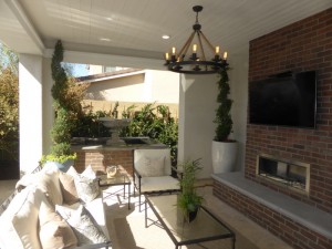
The California room shows a full brick wall with a fireplace and mounted TV, as well as a fountain with a brick base. A freestanding grill sits just outside the room. There is a very narrow stretch of yard running behind the house that could make a good garden, but isn’t really big enough for anything else.
Upstairs, the two secondary bedrooms sit at the front of the house, while the master suite stretches across the back. Two sets of linen cabinets sit on the main landing, across from the laundry room. As in the others, there are side by side machines, upper cabinets, and a sink.
Bedroom 2 is the smaller of the two rooms at 12′ x 11′. It has windows on two walls and a two-door, standard closet. This room has an en-suite bathroom. The vanity is bigger than in the other secondary rooms I’ve seen and, as usual, it has a shower/tub combo.
The other bedroom is a lot bigger. It is 13′ x 12′ and feels more spacious throughout. It also has windows on two walls. However, this one has a walk-in closet, freeing up even more wall space in the bedroom. The vanity in the en-suite bathroom is much smaller and there is a shower/tub combo.
The master bedroom is 16′ x 17′, so it is a lot bigger than in the previous two models. It also has an alcove for a dresser or built-in unit. There is space for a seating area as well.
The master bath has sinks in separate vanities, perpendicular to each other. The shower and tub sit side-by-side, with the tub deck serving as a seat in the shower. The closet isn’t quite as large as in the others, but still has some built-in shelves.
The den is a great addition to this home. It offers a really nice, flexible space downstairs. I also thought it was great to have a bigger secondary bedroom upstairs, but wished the other was equal in size.
Residence Four
2,774 square feet
4 bedrooms, 4.5 bathrooms
Dual Master Suites
Bonus Room
Residence Four is another front, corner unit. It is shown in the Spanish elevation, with Classic Colonial and Santa Barbara options also available. The Santa Barbara home has a small balcony on the second floor. None of the homes have a front porch. The Melody sales office replaces the garage in the model.
This home has a small foyer with a u-shaped staircase that offers a space for a small table. There is also a coat closet, though it is smaller than in the other three homes.
As you pass through the foyer, you walk directly into the kitchen. The island is smaller than in the other models, with just two seats on one side and drawers along two others. Everything is set up in a u-shape. The fridge and pantry are on one wall, sink and dishwasher on another, and cooktop, oven and microwave on the third. The darker cabinetry makes the room feel dark overall, but it’s actually a good size with a lot of storage. Access to the garage is right next to the oven.
The dining room is next to the kitchen. This one has a full wall, allowing for a taller china cabinet. A second wall provides space for a smaller hutch, too.
The great room is 19′ x 15′, so it is quite large. The ceiling has exposed beams. Windows face the side of the home and a sliding door leads to the California room at the back.
The California room has a built-in barbecue and mini fridge. It also has a wider yard than the other three models offered. The model shows a small grassy patch and a fountain.
A short hallway between the great room and dining room leads to a powder room and a downstairs master suite. The powder room has a pedestal sink.
The downstairs master is only 13′ x 13′, so it isn’t as large as a regular master. It has a big window facing the street and a smaller one on the side. There is a walk-in closet, though it’s closer in size to that of a secondary room than a master.
The master bath only has one sink, but the vanity is a bit bigger than in the secondary bedrooms. It has a good-sized shower, but no tub.
Upstairs, there are three more bedrooms and a bonus room. The bonus room is right at the top of the stairs. At 16′ x 16′, it provides a great game room or play room, though it doesn’t really have the privacy to make a good office. Windows face the side and back of the house.
There is a hallway in the back corner of the bonus room that leads to bedroom and bathroom 3. This is the only upstairs bedroom in the entire collection without an en-suite bathroom. Rather, it is in the hall and shared with the bonus room. It has a single sink, larger vanity, and a shower/tub combo. A set of linen cabinets sits outside it.
Bedroom 3 is the bigger secondary bedroom at 13′ x 11′. It has a three-door closet, though it isn’t really much bigger than most two-door closets, as the doors themselves are smaller.
A longer hallway off the front of the bonus room leads to the rest of the rooms. The laundry room comes first, again with side-by-side machines and a sink.
Bedroom 4 sits across from the laundry room and is the smallest bedroom in the home at 10′ x 12′. It has a single window facing the front of the home. This is the room that has a balcony in the Santa Barbara model. Its two-door closet is about the same size as the one from Bedroom 3. The en-suite bathroom has a single sink and a shower/tub combo.
The master suite is at the end of the hall. It is 15′ x 16′ and windows on two walls make it very bright. The walk-in closet is in the main room, rather than the bathroom, and is pretty big. The built-in shoe rack is taller than in the other models.
The master bath has both sinks set into one long vanity, with two sets of cabinets and drawers. The shower and tub are next to each other, with the shared deck creating a seat in the shower.
This home felt a lot bigger than the other three models. I think having both a downstairs master suite and an upstairs bonus room will make it a very popular home.
Overall, the Melody Collection homes are laid out well and have great storage throughout. They don’t feel at all like condos, aside from the shared motor court. Unlike many new collections, none of these models have any optional changes to the floor plans, so the setup of the rooms is exactly as they are in the models. They don’t even offer the increasing popular bi-fold doors found in so many new homes. With the Everything’s Included policy, the majority of what you see in the model is what you get when you buy a Lennar home.
Beacon Park – Welton Collection Review
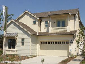
The Welton Collection at Beacon Park is another neighborhood of single family, detached condominiums. Built by Taylor Morrison, the collection will have approximately 50 homes. They will be located on the western edge of the neighborhood, adjacent to the new school. The homes have between 3-4 bedrooms, 2.5-4.5 bathrooms, and range from 2,188 – 2,739 square feet. The four elevations include Spanish, Mid Century Modern, Abstract Traditional and American Farmhouse.
Included Features
The Welton homes have designer tile and color-coordinated carpet in a choice of color palettes; integrated multi-media prep system; rounded bull-nose corner drywall detailing with square corner detailing at windows; interior laundry rooms with upper cabinets; white thermafoil cabinetry; 3 1/2″ baseboards; 2 1/2″ door casings; digital thermostats; and tankless water heaters. The secondary bathrooms have solid surface E-stone countertops with undermount sinks; white 6″ x 6″ tile in showers and bathtub surround; and Moen(R) chrome plumbing fixtures. The master baths also have E-stone counters and Moen(R) chrome fixtures, along with fiberglass rectangular tubs with 6″ tile deck and skirt; and a separate shower with 6″ white ceramic tile, clear glass enclosure and shampoo niche. In the kitchens, the Welton homes have white thermafoil cabinets with concealed hinges and recycling bin; choice of slab granite countertops with 6″ backsplash and full height splash at cooktop; stainless steel GE profile appliances including dishwasher, 5-burner cooktop, built in micro/convection microwave, and 36″ canopy hood; Kohler(R) Sterling undermount stainless steel sink with Moen(R) pullout faucet in chrome finish; fluorescent under cabinet lighting; and space for a 36″ refrigerator and plumbed for icemaker.
Schools
Beacon Park is going to have its own K-8 school, called Beacon Park School, which is slated to open in August 2016 as part of the Irvine Unified School District. There will be a new high school, Portola High, opening nearby (also scheduled for August 2016, though possibly not with all grades opening the first year). Until then, students will attend Canyon View Elementary, Jeffrey Trail Middle School, and Northwood High School.
Basic Neighborhood Financial Information
Approximate HOA Dues: $141 – $216 per month for the Great Park Neighborhood Association
Base tax rate: Approximately 1.0785%
Community Facilities District Tax: see sales associate for details
Prices start at $900,610 for plan 1, $1,011,180 for plan 2, $1,080,015 for plan 3
Residence One
2,188 square feet
3 bedrooms, 2.5 bathrooms
California Room
Optional formal dining room at California Room
Residence One is the only Welton home with a starting price of under $1,000,000. The model shows the Mid-Century Modern elevation, with the home also available in Abstract Traditional and Spanish Elevations. It has a very small, covered front porch.
The entryway offers a great space for a table or bench, with a glimpse of the dining and family rooms farther back in the house. A short hallway to one side leads to the coat closet and powder room. The closet goes partly under the stairs, though not as far back as some closets and overall the ceilings are pretty low throughout. The powder room has a pedestal sink and a small window overlooking the front porch. The stairway is just past the foyer.
The dining room is the first room at the end of the hall. Unlike many great rooms, this one has more of a designated area and isn’t just an extension of the living room. It’s a pretty big space, with a full wall allowing for a taller china hutch if desired. Windows face the side of the home.
The kitchen is next to the dining room and it is quite large. The longer center island has seating for four along one side plus room for a fifth chair along the short end. The sink, dishwasher, and a few drawers and cabinets run along the other side. Each wall in the L-shaped room offers numerous cabinets and drawers, along with plenty of counterspace. One wall has the built-in oven, microwave and refrigerator. The other wall has the cooktop and a set of pantry-height cupboards. One full wall has sliding doors out to the California Room, with options for 4-panel bifold doors instead. Garage access is in the space between the two counters.
The family room is at the back of the house, behind the dining room. With windows on three sides, this room gets a lot of natural light. A fireplace sits between two windows and has space to mount a TV above it. The model shows optional built-in cabinets surrounding the fireplace. There is an option to replace two of the windows with either 4-panel bifold or 4-panel sliding doors to the California room.
The California room offers a nice outdoor living room. In addition to the covered area, there is still a yard behind it. The model includes a small pond and fireplace. This yard is definitely bigger than the outdoor spaces in any of the other detached condos I have seen. There is an option to convert the California room to a formal dining room, bringing it inside the house instead of being an outdoor space. There would still be an option to include bifold doors between the kitchen and/or living room and the dining room. The dining room would have sliding doors leading to the backyard.
A curved staircase leads to the second floor, where all of the rooms come off of one small landing. The laundry room is at the top of the stairs. It has side by side machines, a sink with a small counter, and several upper and lower cabinets.
Bedroom 3 is at the front of the house. The room is average sized, though it felt somewhat small. It has two windows facing the street, though in the Spanish elevation, they are replaced by a single door and a tiny Juliet balcony. This room has a standard, two-door closet.
A Jack and Jill bathroom sits between the two secondary bedrooms. It has two sinks, each with cabinets beneath and one set of drawers in between. The vanity shows numerous upgrades. A separate door leads to the shower/tub combo, shown with upgraded tile and hardware.
Bedroom 2 is on the other side of the bathroom. It is a little larger than the other bedroom and has two windows facing the side of the house. This room also has a walk-in closet, shown with a single shelf and pole.
There is a set of linen cabinets in the short entryway that leads to the master bedroom. The room itself has high ceilings and tall windows on two walls, making it feel spacious, though it isn’t particularly large. A recessed nook in one wall offers extra space for a dresser, built-in, or mounted TV.
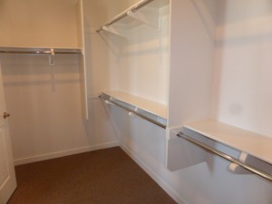
The master bath is bigger than the bedroom itself. The sinks are set into separate vanities, perpendicular to each other. One is nearly twice as long as the other. The rectangular bathtub has a wide deck with upgraded hardware and surround. The shower has a tiled dressing area just outside it, then an open entry into the very wide shower. Buyers may want to consider frosted glass on the three windows, as they will face other homes. The walk-in closet shows the included shelves and poles.
I really liked the layout of the first floor. I thought the rooms flowed nicely together and, though they had an open feel, each still had a designated space. The condo has a good amount of outdoor space as well. The bedrooms are fairly small. I would have preferred to see the garage access in the foyer, rather than in the kitchen, since it would have been pretty easy to relocate the door.
Residence Two
2,412 square feet
4 bedrooms, 3 bathrooms
Optional Office at Bedroom 4
Residence Two is modeled in the Spanish elevation, which features a round “entry tower.” The other elevations available are American Farmhouse and Mid-Century Modern. The welcome center replaces the garage in the model.
Like Residence One, this home has an entry hall with room for a table. The stairs are just off the front door and have a coat closet beneath them. Garage access is also in the entry, which I think works much better than having it in the kitchen.
The front hall opens up to the dining room. Its setup is similar to that of the first home. It has a defined space, with three windows on one wall. A low hutch could go beneath the windows, or a taller one could go on the narrow wall near the stairs.
The kitchen is next to the dining room. Unlike most modern kitchens, this one has a peninsula with bar seating, rather than an island. Nearly everything in the model has been upgraded, including the appliances, counters, cabinetry, and hardware. One wall holds the stove, another has the sink and dishwasher, and the third has the fridge, oven and microwave. This kitchen has numerous upper and lower cabinets, as well as storage drawers, and one set of pantry-height cupboards. Having a peninsula instead of an island makes it feel less open to the other rooms.
The family room again is at the back of the house. It has windows on two walls and a fireplace on the third. A single French door leads to the California room, with an option for either bifold or 4-panel sliding glass doors instead.
The California room occupies most of the outdoor space. There is a small yard behind it, shown here with grass instead of fancy features like fountains and fire pits.
A short hallway off the family room leads to the main floor bathroom and bedroom. The bathroom has a single sink set into a small vanity and a shower without a tub. Upgrades include the tile, hardware and cabinetry.
The model shows the optional office instead of the standard bedroom. While the bedroom has a standard, two-door closet, the office has a recessed area instead, shown in the model with built-in cabinets. The model also shows a large built-in unit behind the desk. Whether you choose the office or the bedroom, there is an option for French doors to the backyard in lieu of the windows.
On the second floor, the rooms come off a long hallway overlooking the first floor. The laundry room is at the top of the stairs, with linen cabinets outside of it. It has side by side machines, a sink, counters and cabinets.
Bedroom 3 is at the front of the house. It has windows overlooking the street and two more on the side. The Spanish elevation has a French door opening to a large balcony; the Mid-Century Modern elevation has a smaller balcony and the American Farmhouse elevation does not have a balcony at all. This room is much bigger than the other secondary rooms. It has a two-door, standard closet.
As we have seen in many of the detached condos, the secondary bedrooms share a Jack and Jill bathroom. It has two sinks in a shared vanity. A separate door leads to the shower/tub combo. The tile walls throughout the bathroom are all upgraded.
Bedroom 2 faces the side of the home. Though smaller than the other room, it doesn’t feel too tiny. This one also has a two-door, standard closet.
As in Residence One, a small foyer with linen cabinets leads to the master bedroom. The room is just an average size, and doesn’t have the high windows or inlet on one wall that made the master in the first home feel bigger. This one does have windows on two walls, but even these are smaller than in Residence One.
The master bath has two sinks set into a shared vanity, with plenty of space between them. The bathtub sits across from them. Next to the bathtub, there is a tiled dressing area leading into the open shower. The shower is long, but narrower than in Residence One. The walk-in closet is a good size, with a few shelves and poles.
Buyers will likely welcome the opportunity for a first floor bedroom. Other than that, I think that Residence One has a nicer overall layout and style. This model has a smaller yard and the kitchen feels more separate from the other rooms. Though this is a detached home, the base price tag of $1,011,180 seems high for a condo, and that’s without the numerous upgrades shown in the model.
Residence Three
2,739 square feet
4 bedrooms, 4.5 bathrooms
California Room
Private Living Suite
Residence Three is shown in the Abstract Traditional elevation, with the other options including American Farmhouse and Spanish. The garage is on one side of the house, while the front door is around the side. There is a covered porch, with entrances to both the main house and the private living suite.
The entryway of the main home has vaulted ceilings, as it is open to the second floor. It is a wide foyer, with the family room on the left and the dining room straight back.
The family room is set off by itself, so you don’t get the great room feel of most homes where it is open to the kitchen. One wall has a fireplace, with windows on each side. Built-ins below the windows show an optional upgrade. The room also has windows facing the street and sliding doors to the California room on the third wall. Optional bi-fold doors are available. The family room has higher ceilings; this elevation has wooden beams at the top.
The dining room is behind the foyer. It is a pretty big area, with windows on one wall and sliders or bi-fold doors to the California room on the other. It doesn’t have any full, empty walls, but a low hutch could sit beneath the windows.
The California room is shown with a built-in, outdoor kitchen, including a grill and mini fridge. This home doesn’t have much space for a yard beyond the California room.
The kitchen is next to the dining room. Its center island has seating for 3-4 people, as well as the sink and dishwasher. The shorter wall includes the fridge, oven and microwave, with a few small cabinets above them. The long wall has the (upgraded) cooktop, numerous cabinets and drawers, and two long counters. Glass-fronted upper cabinets show another designer option. Unlike the other two Welton homes, this one boasts a walk-in pantry, which is off the hallway behind the kitchen. However, it doubles as a coat closet, with storage under the stairs.
The hallway behind the kitchen also leads to the garage access, powder room, and private suite. The powder room has a pedestal sink.
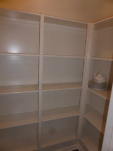
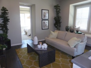
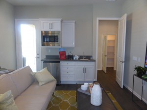
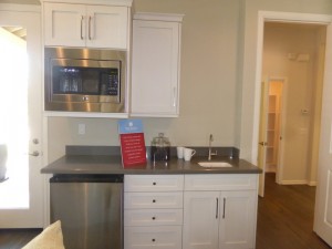
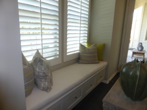
The private living suite will definitely be a strong selling point for this home and, so far, is the only one I have seen in any of the Beacon Park homes (though I imagine I will see more as I move into the bigger models). I entered the sitting room first. It is a good-sized room, with windows facing the street and a door to the front porch. The model shows the upgraded window seat with storage drawers. The sitting room also includes the kitchenette. It has a sink, mini fridge and convection microwave, along with a few cabinets and drawers.
The suite’s bedroom is behind it, with windows facing the front and side of the house. It’s a pretty standard size for a first floor bedroom and has a two-door closet. The bathroom is off the bedroom. It includes a single sink set into a nice vanity and a shower with a seat.
On the second floor, the laundry room is at the top of the stairs. Linen cabinets outside it offer extra storage. The room has side by side machines, a sink, and several cabinets.
Bedroom 3 is one of the biggest secondary rooms I have seen. It had two windows high up on one wall and a single French door leading to a small deck on another. The size and locations of the decks in both secondary bedrooms vary with each elevation. This room also has a walk-in closet. Bedroom 3 also has a private, en-suite bathroom. There is a single sink and a shower/tub combo.
Bedroom 2, unfortunately, is much smaller, though not as tiny as some rooms I’ve seen. It has a standard closet and double French doors opening to another deck. In some elevations, Bedroom 3 may also have a door to this deck. Bedroom 2 also has an en-suite bathroom that is identical to the other (though the model shows different upgrade options).
The master bedroom is quite private, as it is down a long hallway, sitting by itself at the back of the house. Windows line the wall overlooking the backyard while two more look over the California room. The space is big enough for a sitting area if desired.
In the master bath, his and her walk-in closets sit side by side, and are actually connected on the inside. The two sinks are set into one very long vanity, with a lower makeup table between them. The bathtub is at the back of the bathroom. The large shower has a built-in seat and, unlike the other Welton models, this one has a normal door and no dressing area.
I think the private suite is the highlight of this model. I also really liked the size of Bedroom 3 and wish we could see more secondary rooms like this. I didn’t like that the family room was separate from the other rooms downstairs.
Overall, the Welton collection condos really feel like single family homes and they have the price tag to match. They have the benefits of some outdoor areas being maintained by the HOA without having to pay a separate dues. The homes don’t have too many options within the floor plans, so they have pretty basic layouts. Two of the models start at over $1,000,000 and, with upgrades, I’m sure Residence One could easily get that high as well.
