The Melrose collection in Pavilion Park (the first of the Great Park Neighborhoods), has the community’s largest – and most expensive – homes. The three models feature rooms often not seen in new construction these days. They have formal dining rooms and two downstairs living spaces, rather than just a great room. Built by Ryland Homes, each house has the option for a downstairs living suite plus a three car garage. The models didn’t offer lists outlining the upgrades, but I will list some of the standard features and try to note upgrades when I can. Once you express serious interest in purchasing, the information about upgrades is available.
See the rest of The Melrose Collection Overview and Review of Residence 1 here.
Residence Two
4,080 Sq Ft
5 Bedrooms, 5.5 Bathrooms, 3 car garage, downstairs living suite, bonus room
Base Price from $1,529,808 ($375/sq ft)
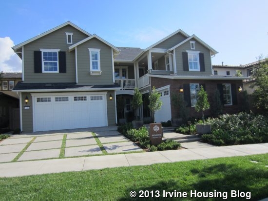
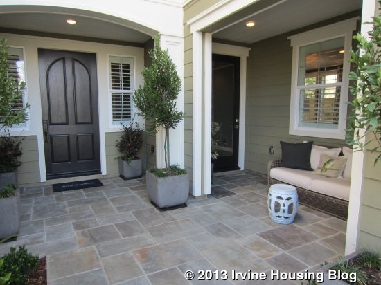
Residence Two, known as Pasadena, is modeled in the East Coast Traditional elevation; Santa Barbara and Craftsman elevations are also available. Like Residence One, I think this is a very attractive house from the outside. It has a nice front porch area, with access to both the main home and the private suite, and an L-shaped balcony on the second floor. This home has a two-car garage facing the street and a single car garage on a separate wall. The separation is really nice if you plan to use the garage as a workshop or extra room. The two-car garage has direct access to the home; the single car side must cross the porch to get in the house. The only variations to the floor plan that can be made to this home are a California Room and/or stackable doors leading outside from the Great Room.
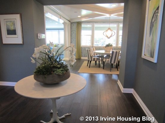
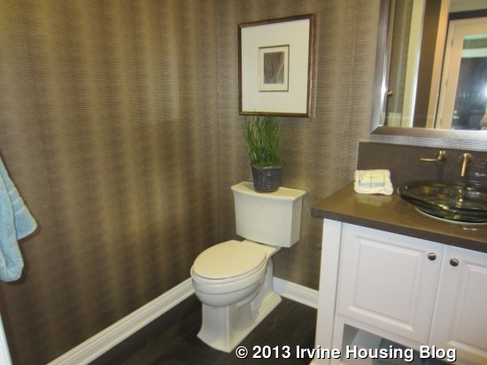
This home has a large, square entry with the staircase immediately to the left. A hallway leads to the powder room and private living suite on the right and the formal dining room is visible directly in front of you. There is a large storage closet under the stairs. The powder room shows an upgraded vanity with a single sink.
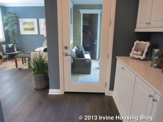
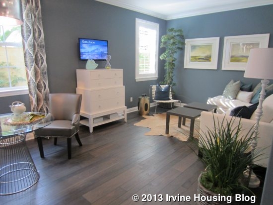
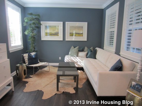
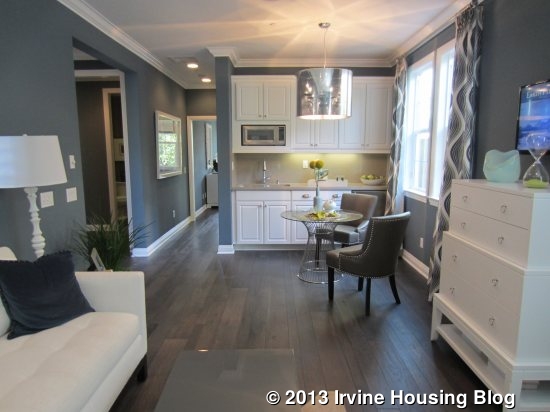
The entry to the private living suite is just off the powder room. There are linen cabinets immediately inside the entry, shown in the standard white Thermofoil and with the optional upper cabinets included. You can see the private door from the outside porch and the entry to the single car garage directly across from it. In comparing this suite to the optional living suite from Residence One, the living room in the Pasadena home is the same width, but is 10’ longer than the other. The bedroom in Pasadena is bigger as well, but only by about a foot each in length and width. The living area has ample space for a sitting area and a separate dining space. The kitchenette, located on the back wall of the room, has a microwave, sink, small fridge, and several cabinets. A hallway leads back to the bathroom and bedroom.
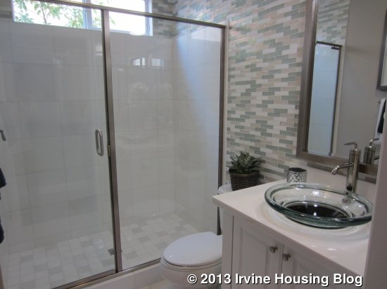
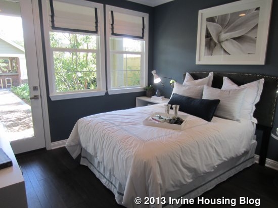
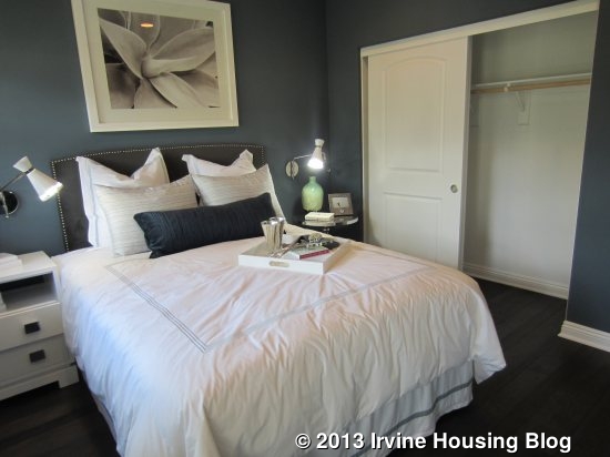
The bathroom in the suite is highly upgraded, with nicer tiles and upgraded fixtures in the single sink vanity. It has a good size shower and no option for a tub. The bedroom is at the back of the suite. There is an option to put a door from the bedroom to the dining room in the main home. The bedroom has a two door sliding closet and a door leading outside to the suite’s small, private California Room and the rest of the backyard. All of its windows face the back of the house. This is a very nice living suite and is bigger than many of the others I have seen throughout Pavilion Park. However, this one does not have laundry hookups.


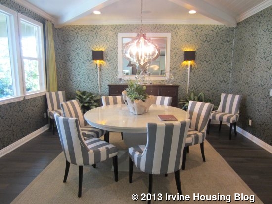
Back in the main house, I walked through the entry to the dining room. It is a large, square room with three windows looking out to the backyard and the optional California Room. One wall is completely open to the kitchen.
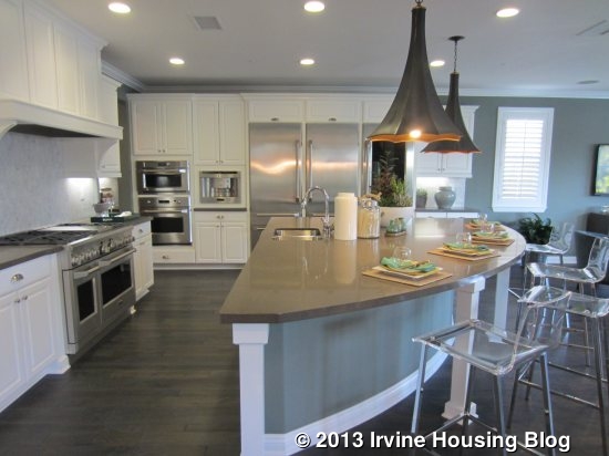
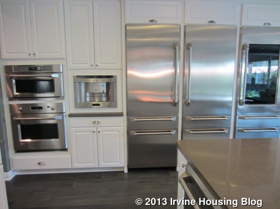
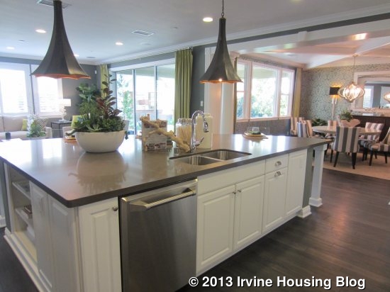
The kitchen is very big with an island shaped like a slice of pie. The sink and dishwasher are located in the island, which also has several cupboards and a bookshelf. There is seating for four or five around the curved side. The stove (again, shown upgraded) is directly across from the sink. The ovens, microwave and fridge are on the far side of the island. This home doesn’t seem to have quite as many cabinets as many of the other new kitchens I’ve seen lately and has only three that are pantry height. At the back of the kitchen, a short hallway (or “drop zone”) leads to the two-car garage.
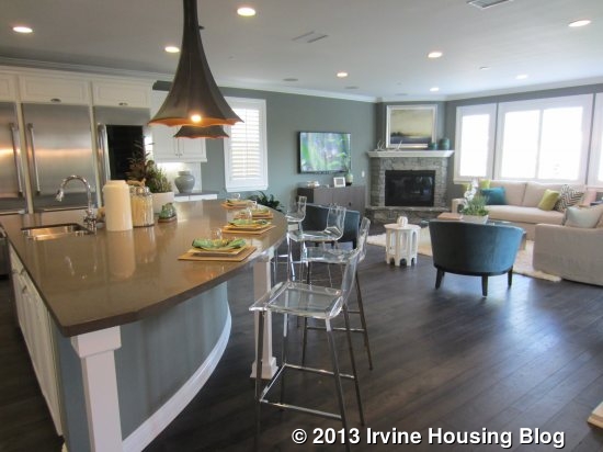
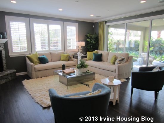
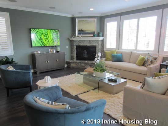
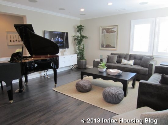
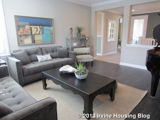
The great room sits just beside the kitchen. One full wall is sliding doors and another has windows facing the backyard. A stone fireplace sits at an angle in the corner of the room. The room is big and bright and has one more window facing the side of the house.
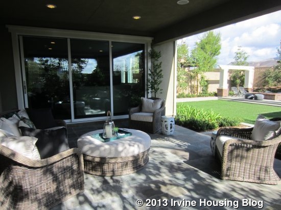
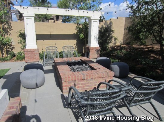
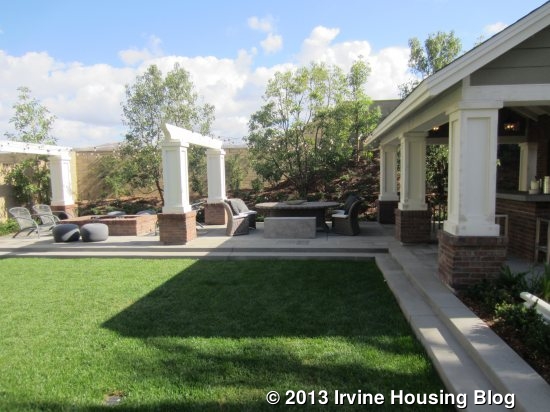
The backyard is beautiful, but much bigger than the standard lots. This one has a large grassy area, a covered outdoor kitchen and a fire pit with plenty of seating around it. The outdoor kitchen even has a flat screen TV. It’s hard to know what a backyard would be like on most lots.
The bonus room is at the top of the stairs but is definitely more of a room than a loft. It has a half wall dividing it from the hallway and is bigger than most lofts. It is shown with the same upgraded flooring that they used downstairs. There are windows facing the back and side of the home. The hallway wraps around the upper floor, leading to all of the bedrooms, the laundry room, and the deck. Each bedroom sits at one corner of the house, offering a lot of privacy.
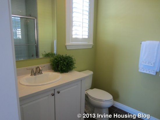
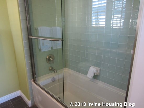
On the right side of the house, there are two bedrooms, each with a private bath. The one at the back of the house (bedroom 2) is a little bit smaller, but it has a walk-in closet in a small foyer area of the room. Its private bath shows what appears to be the standard vanity, but has upgraded tile in the shower/tub combo. With just one window facing both the back and side of the home, it doesn’t get as much light as the other rooms.
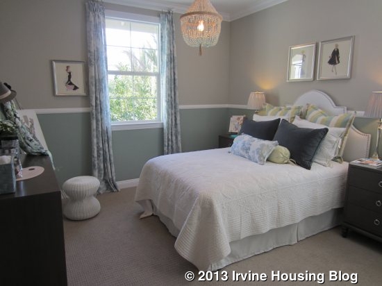
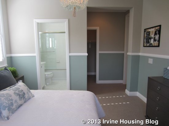
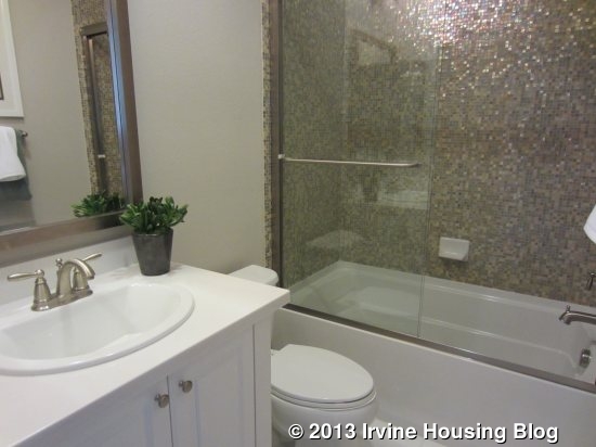
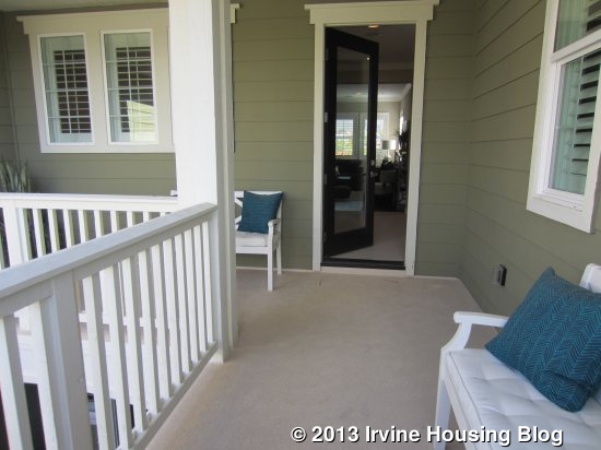
The one at the front of the house (bedroom 3) has the bathroom just off the hall and the bedroom beyond it. This bathroom is identical to the one the other bedroom. The room itself is a little bigger and a lot brighter. It has windows on three different walls, including a big one facing the street. You can have an optional door leading to the L-shaped, covered deck. There is also access to the deck from the hallway.
On the opposite side of the home, the laundry room and bedroom 4 are at the front of the house. The laundry room has a sink, side by side machines and lots of cabinets but no counter.
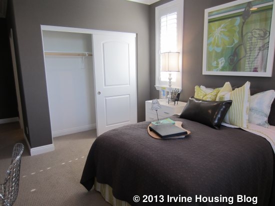
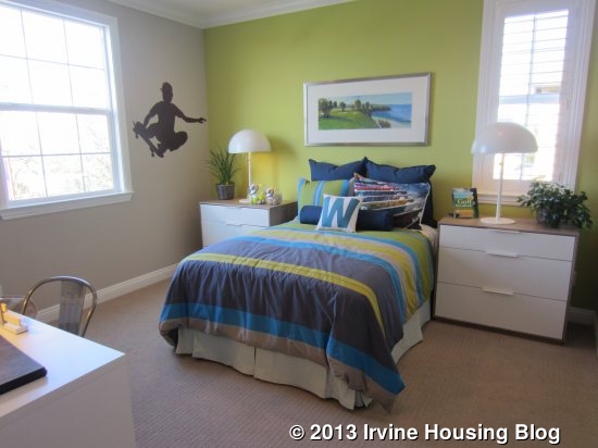
Bedroom 4 is a tiny bit bigger than bedroom 3. It has windows facing the street and side, plus a walk-in closet comparable to the one in bedroom 2. Its private bath is configured differently, but still has the same single sink and shower/tub combo. This one has different tile, but I don’t know if it is standard or upgraded.
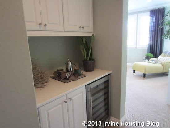
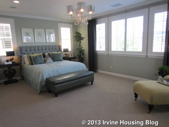
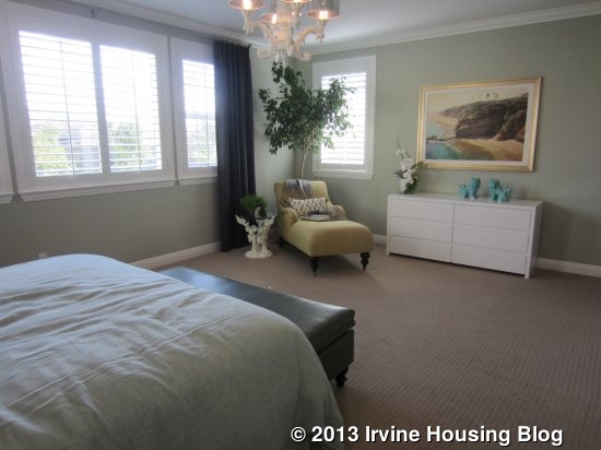
The master suite sits alone at the back of the house and is completely private. A long hallway leads back to the room and includes linen cabinets, plus the options for upper cabinets and/or a small fridge. The model shows both. The bedroom is rectangular (20’ x 15’) and the shape makes it feel bigger than a square room. With windows on three sides and no houses blocking two of them (because of the huge backyard), the room can be quite bright. There is plenty of wall space for furniture plus an open area for seating.
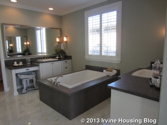
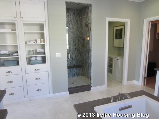
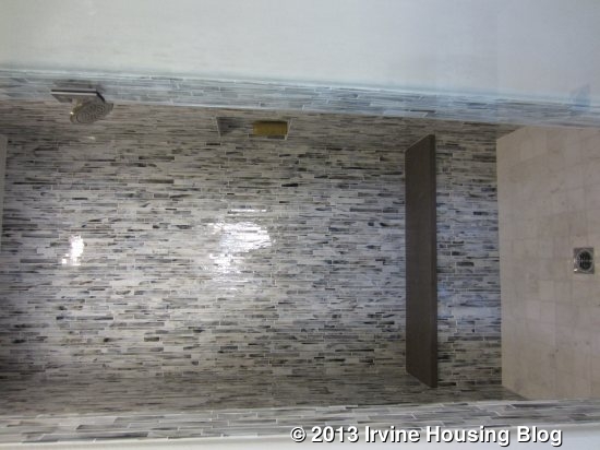
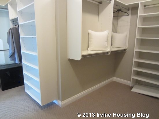
The master bath has a nice set of linen cabinets just inside the door. The two vanities are located on opposite walls with the tub between them (similar to Residence One). Again, one vanity has both the sink and seating area. While most master bathtubs have the long side against the wall, this one has a short side against the wall, so it sticks out farther into the room. Fortunately, the bathroom is so large that it doesn’t feel imposing. The shower is directly across from the tub and has a seat, but isn’t particularly big. There is a nice set of built in cabinets in the water closet. Finally, the walk-in closet is at the back of the bathroom. It is L-shaped and comes standard with organizers.

I like the upstairs of this house more than the second floor in Residence One. I think it has a better layout and the deck is a nice touch. In comparing the first floors, I also like Residence Two more, but wish the kitchen had a pantry and tech center like the ones in Residence One.