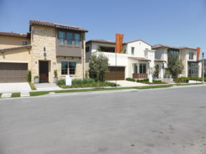
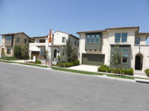
Three more home collections recently opened in Eastwood Village. This week, I will review the Beverly Collection by Brookfield Residential. There will be approximately 80 single-family homes on an average lot size of 4,600 square feet (model lots range from 4,250 – 4,600 square feet). The neighborhood is on the north end of the village, near the Hicks Canyon Trail. The three models range from 3.239 – 3,500 square feet, with 4 – 6 bedrooms and 3.5 – 4.5 bathrooms. All homes have an attached, two-car garage, downstairs bedroom, and upstairs bonus room. Elevations include Santa Barbara, Early California, Monterey, and Spanish Colonial.
Included Features
The Beverly homes have modern technology and energy-friendly features, including pre-plumb conduit for electrical vehicle charging station; QuietCool® whole house fan system; Low-E dual glazed vinyl windows; WaterSense® faucets; Cat-5 prewiring in kitchen, bedrooms, great room, and library; USB outlets in kitchen and master bedroom; tankless water heater; and hot water delivery recirculation system at kitchen and bathrooms. The living spaces feature 13” x 13” ceramic tile flooring in entry, kitchen, launch, pantry, bathrooms, and laundry room; decorative door casings and baseboards; two-panel, 8’ interior doors with Schlage® Latitude hardware in matte black finish; European and white shaker-style cabinetry in kitchen, all bathrooms, and laundry room. The bathrooms have cultured marble white matte countertops with 4” backsplash; oversized walk-in showers with ceramic tile surrounds and shampoo niches (in master); 6’ acrylic soaking tubs; Gerber® rectangular under mount sinks with Delta® Dryden polished chrome faucets; and Gerber® elongated toilet. The laundry rooms feature lower cabinetry, Florestone® sink with Delta® faucet, and gas dryer hook-ups.
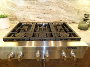
The Beverly kitchens include a Jenn-Air® stainless-steel professional appliance package with a 36” pro-style gas rangetop with six burners, high powered 600 cfm ventilation hood, built-in 30” electric oven with microwave above, and multi-cycle dishwasher with hidden controls. The kitchens also have European-style white Thermofoil shaker-style cabinetry in satin finish with under-cabinet lighting, concealed hinges, adjustable shelves, and brushed nickel knobs; recycling/trash roll-out cabinet with two bins; granite countertops with 6” backsplash and full splash at range; Kohler® Vault stainless-steel, single-basin sink with Delta® Essa single-handle, pull-down faucet; food waste disposal switch with stainless-steel button; spacious, walk-in pantry with shelving; island with seating for four or more; and optional high-heat or prep kitchen at residences one and three.
Basic Neighborhood Financial Information
Approximate HOA Dues: $125 per month
Basic Property Tax: 1.0035%
Approximate Tax Rate including Mello Roos: 1.26%
Current prices start at $1,572,800 for Residence 1; $1,578,800 for Residence 2; and $1,634,800 for Residence 3
Schools
Students living in Delano will attend schools in the Irvine Unified School District. Students in grades K – 6 will attend Eastwood Elementary School, which opened in August 2017. Students in grades 7 – 8 will attend Sierra Vista Middle School and grades 9 – 12 will attend Northwood High School.
Residence 1
3,239 – 3,255 square feet
4 – 5 bedrooms, 3.5 – 4.5 bathrooms
Music Room/Library
Bonus Room
Optional bedroom 5 at bonus room
Optional outdoor kitchen
Optional conservatory at California room
Optional high heat or prep kitchen at launch
Pricing on currently available homes ranges from $1,572,800 – $1,635,800
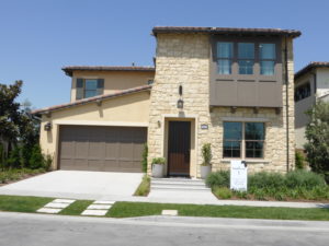
Residence 1 is modeled in the Early California style, with Santa Barbara and Monterey elevations also available. The model lists well over one hundred upgrades, so I will try to point them all out as I go along. Upgrades found throughout the home include baseboards, door casing, paint, flooring, window and wall treatments, ceiling fans, and all decorator items. This house has a single, standard-width front door, rather than a double or wide entry door that would make moving furniture easier.
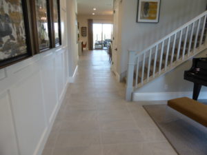
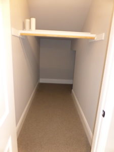
Inside, there is a long hallway that leads to the back of the house with tile flooring. The music room/library is on the right, with the staircase just behind it. There is a coat closet that wraps beneath the stairs to create a lot of storage.
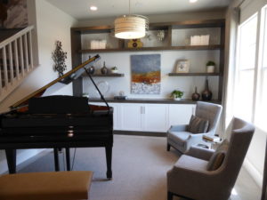
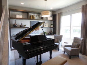
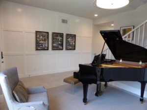
The library has two windows facing the street; these windows open vertically, rather than horizontally. The room shows upgraded recessed lights, built-in speakers with volume control, and built-in shelving with Level 2 cabinets (maple sage stain and white painted split finish) with polished chrome hardware. The room measures 13’ x 12’6” and this is the only Beverly home to have an extra living space on the first floor.
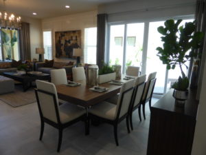
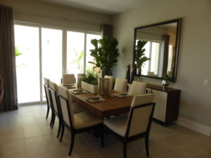
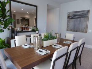
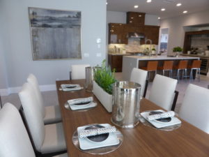
The dining room is on the other side of the staircase. The room is 11’8” x 11’10” and has sliding doors leading to a side patio. The recessed lights are included and there is a full wall offering space for a china hutch. I don’t like this style of sliding doors, where both open from the center, as both had to be lined up perfectly to keep the lock from getting stuck.
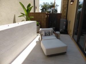
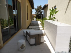
The side patio is narrow and shown with an upgraded fountain. It was well-shaded when I was there and it connects to the backyard.
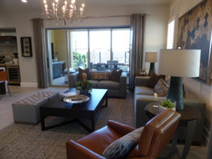
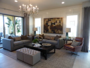
The great room is behind the dining room. It is 17’10” x 14’11” and has sliding doors leading to the California room, plus two windows on the side. It is shown with upgraded multi-panel pocket doors, a J-box on dimmer switch, recessed lights, built-in speakers, and TV-pre-wire.
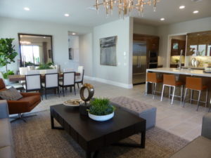
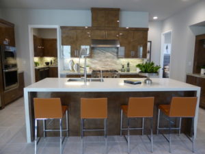
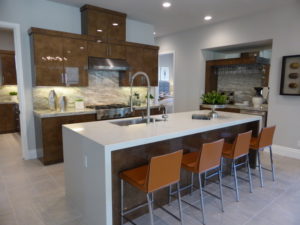
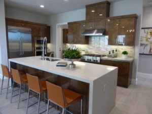
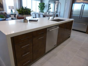
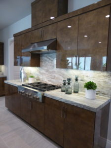
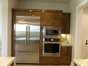
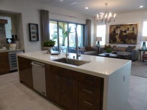
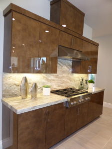
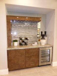
The kitchen is open to the dining room and great room. It has a large center island with seating for four, the sink, and the dishwasher. One wall has the fridge, oven, and microwave. The second wall has the range, and the third wall has a bar with a wine fridge and rack for wine glasses. The cabinets are upgraded Level 3 in Lux Cruz Oro with level 2 hardware in polished chrome; they also have dovetail drawers and doors with full-extension glide and soft close. There are upgraded Level 5 countertops and full height backsplash in Fantasy Brown and a Level 1 quartz waterfall island in Arizona Tile New Carrara. At the wine bar, the mirror, stemware rack, and beverage center are upgrades. At the sink, the K-7 super steel faucet and instant hot water dispenser in satin nickel are upgrades. The JennAir 42” built-in side-by-side fridge is another upgrade.
A doorway in the corner of the kitchen leads to the launch area, pantry, and access to the 2-car garage. The standard launch area would have shelving and base cabinets on three walls. However, the model shows the high heat kitchen instead. Standard features in the room include the JennAir stainless steel dishwasher, 15” wok burner with hood, under counter fridge, and sink with garbage disposal. The recessed lights, pocket door, and under cabinet lighting are also included. Upgrades include the cabinetry, hardware, countertops, and backsplash.
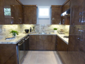
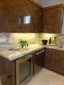
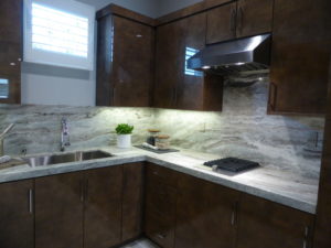
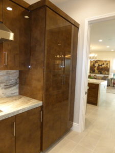
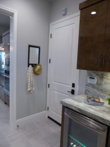
A third option for this space is a prep kitchen. This would be similar to the high-heat kitchen, but would not include the wok burner or fridge.
A doorway in the back corner of the kitchen leads to the powder room and first-floor bedroom suite. There is a set of base linen cabinets with optional uppers outside the bathroom. Rather than a pedestal sink, the Beverly powder rooms come standard with a vanity. This one shows upgraded cabinets and countertops, frameless mirror, Kohler Archer under mount sink, and designer tile backsplash.
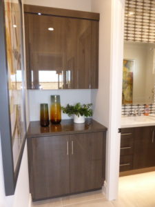
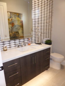
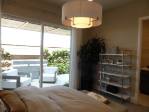
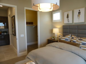
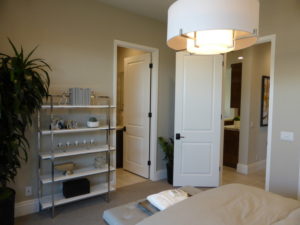
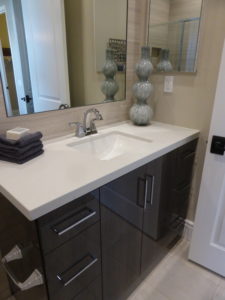
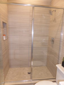
Bedroom 4 is 13’4 x 12’1” and has a small window on the side and two windows facing the back, but is shown with the optional sliding doors instead. The walk-in closet has a shelf and pole on two walls. The recessed lighting is an upgrade. The en-suite bathroom has a vanity with a single sink, one set of cabinets, and three drawers. The entire vanity is upgraded, as is the shower tile. The shower is a good size and includes a shampoo niche but no seat.
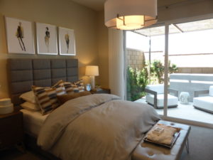
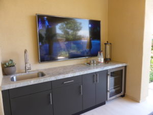
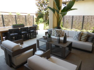
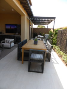
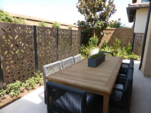
The California room is off the great room. It includes four recessed lights and one weatherproof outlet. It is shown with the optional entertainment bar, which has outlets for a TV and under-cabinet refrigerator. It has a slab countertop with a sink but no splash. The ceiling fan and speakers are upgrades. The rest of the backyard is narrow, with enough room for a table or small garden, but not a lot of space for kids to play.
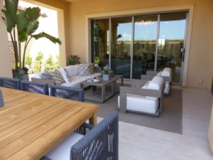
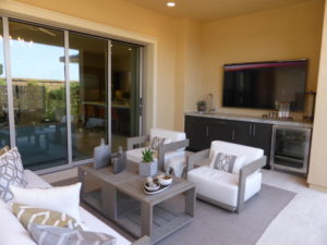
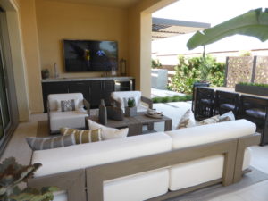
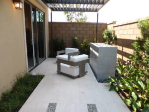
There is an option to convert the outdoor room to a conservatory. This room would be open to the great room, with windows on one wall and sliding doors opening to the backyard. The room would be 19’6” x 10’ and would add a great space inside, but would drastically shrink the already small outdoor space.
The bonus room is at the top of the stairs. It is 10’11” x 13’10” and has two windows facing the side of the house. The model shows the optional cabinets with an upgraded finish and hardware. The LED lights and speakers are also upgrades. There is an option to convert the bonus room to a bedroom. It would be smaller, at 10’10” x 11’4” and would have a closet occupying about two-thirds of the space that the base cabinets occupy in the model.
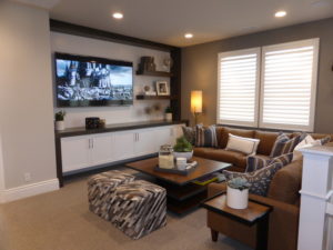
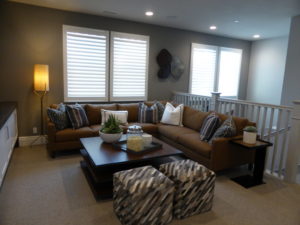
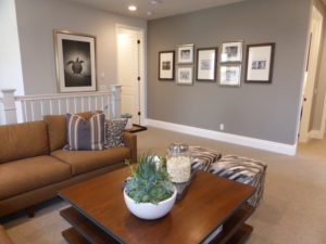
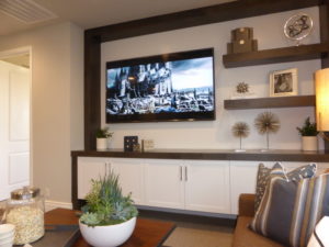
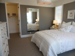
Bedroom 2 is at the front of the house and has a small foyer and entry hall. The room is 12’10” x 13’9”, with three windows facing the street and two more on the side. The lighting and dimmer switch are upgrades. The walk-in closet has a shelf and pole on two walls. The model shows the optional en-suite bathroom, with a small vanity and shower/tub combo. Everything in the bathroom is upgraded. Without the bathroom, the standard bedroom would be 18’9” x 13’9”, making it slightly larger than the master bedroom.
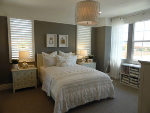
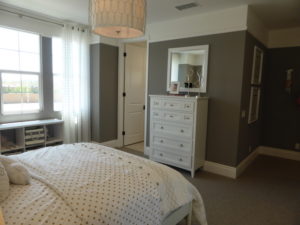
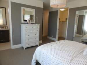
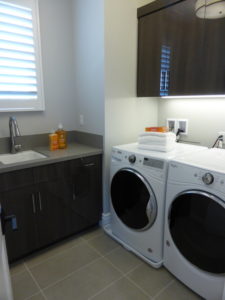
The laundry room is on the other side of the bonus room. It has space for side-by-side machines, a short counter with a sink, and optional upper cabinets. The undercabinet lighting, cabinet finish and hardware, countertop, and dovetail doors and drawers are all upgrades.
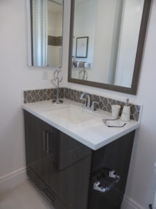
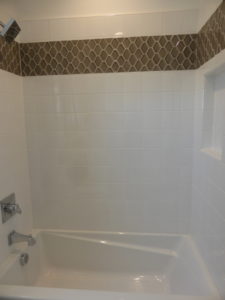
The secondary bathroom is across from the laundry room. It has a vanity with two sinks, shown completely upgraded. A separate door leads to the shower/tub combo, which is also shown fully upgraded.
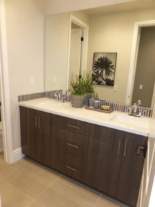
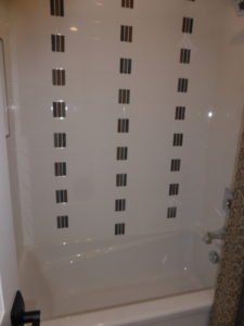
Bedroom 3 is on the side of the house. It has windows facing the front and side, but is set behind the garage. The room is only 12’ x 11’4” and has a walk-in closet. The ceiling fan, lighting, dimmer switch, and double-sided, mirrored door at closet are upgrades.
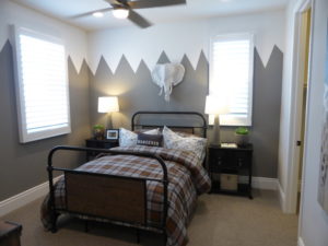
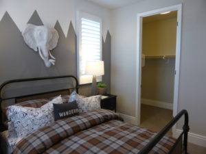
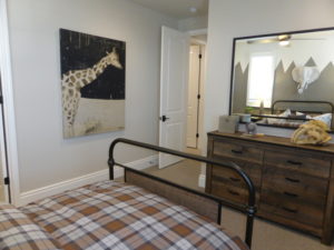
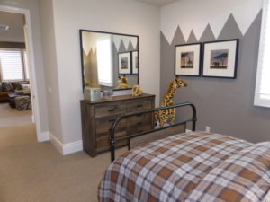
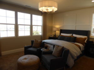
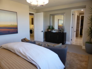
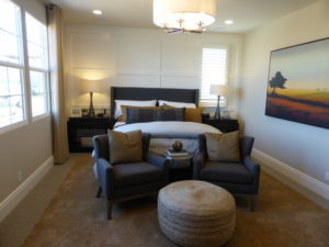
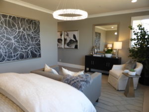
The master suite stretches across the back of the house. The bedroom is 18’11” x 13’5” and has three windows facing the backyard and one more on the side. The lighting and speakers are upgrades. Unlike bedrooms 2 and 3, which don’t border any other rooms, the master bedroom borders the bonus room, giving it less privacy than the secondary rooms. There is an option for a door separating the bedroom from the bathroom.
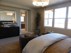
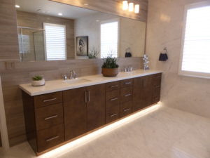
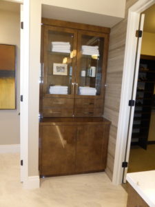
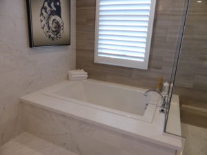
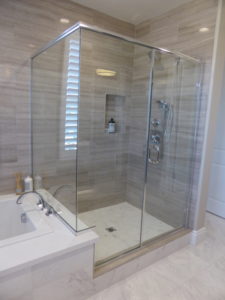
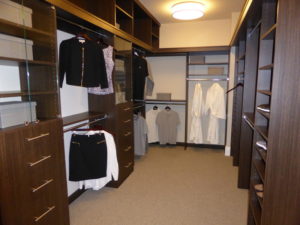
The master bathroom has two sinks set into a shared vanity, shown with the same upgraded cabinetry, hardware, and counter that we’ve seen throughout the home. Each sink has two cabinets and six drawers. There is an extra set of linen cabinets in a small nook, shown with optional uppers and upgraded glass doors. The shower and tub are across from the vanity. The tub has an upgraded deck that forms a narrow ledge in the shower. The shower is a good size and includes a shampoo niche. The tile and hardware are upgraded. The walk-in closet stretches the full length of the bathroom and is shown with a fully upgraded organizer system.
Residence 1 has a good layout and several options to customize the floorplan. I like having the extra living space on the first floor and the option for a conservatory to create more indoor space. There is good storage throughout the home and the rooms are spacious.
Residence 2
3,359 – 3.360 square feet
4 – 5 bedrooms, 3.5 – 4.5 bathrooms
Bonus room
First-floor master suite
Optional 2nd master suite
Optional elevator
Pricing on currently available homes ranges from $1,578,800 – $1,650,800
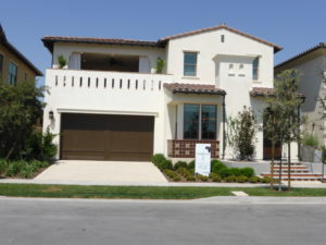
Residence 2 is shown in the Santa Barbara elevation, with Spanish Colonial and Early California options available. All three have a large balcony above the garage. As in the first home, the flooring, wall treatments, window treatments, cabinetry, countertops, lighting, ceiling fans, speakers, and decorator’s items are upgraded throughout.
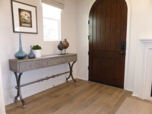
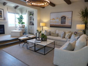
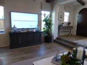
This home is listed as having a “dramatic foyer,” but my first impression when I entered the home was that I didn’t like the setup. The foyer stretches the full length of the great room, which sits directly below it, separated by two wide steps that also run the length of the room. It shows the optional built-in bookcase on one wall and the optional fireplace on another. The foyer also has windows facing the front and side of the home. I think the home would be more popular if everything was on the same level.
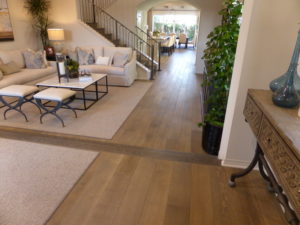
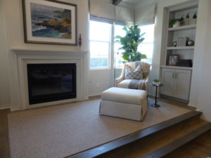
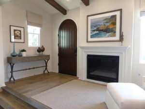
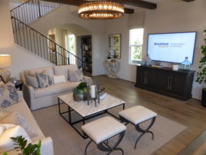
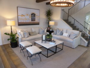
The great room is just below the foyer and has matching, upgraded, stain grade ceiling beams. There are two small windows on one side of the room, so most of the light comes from the foyer windows. The room is 18’7” x 13’11” and is bordered by the staircase on one side. The room is isolated from the kitchen and dining areas and, unlike in residence 1, is the only living room on the first floor.
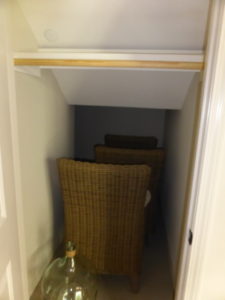
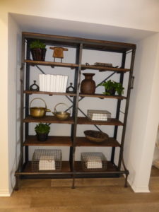
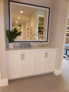
There is a coat closet under the stairs and a nook across from it with space for shelving or a built-in launch zone.
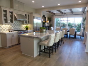
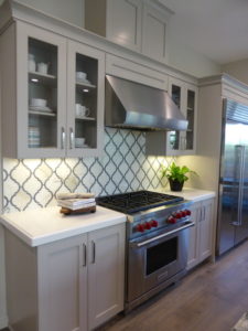
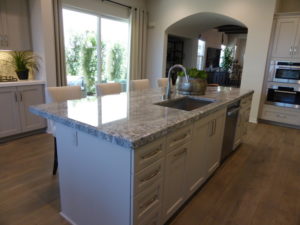
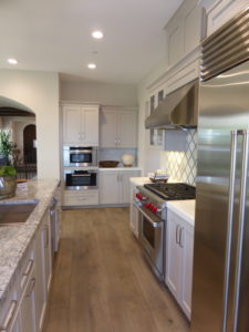
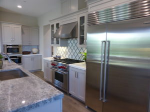
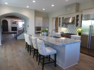
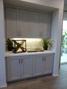
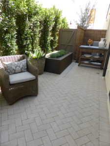
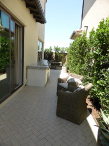
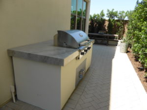
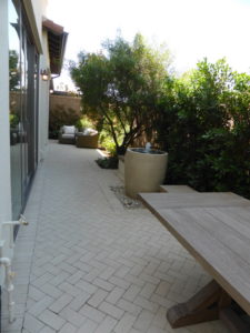
The hallway opens to the kitchen. The island holds the sink and dishwasher and can easily seat four people. One wall holds the built-in oven and microwave, while the cooktop and refrigerator are on another. The model shows an upgraded Wolf appliance package, including a dual fuel range, hood, convection steam oven, microwave with trim kit, and Asko dishwasher. The model shows a sub-zero 48” built-in, side-by-side refrigerator. The upgraded cabinets are Level 2 in 505 Anew Grey with Level 2 cabinet hardware in satin nickel. The island is upgraded Level 5 slab in Azul Aran and the other counters are upgraded Level 1 quartz in Arizona Tile Denali. There is a 2 ¼” ogee drop edge at all counters and upgraded glass doors at some uppers. At the border between the kitchen and dining room, the standard base cabinets are shown with optional uppers and upgraded lighting. The kitchen has sliding doors that lead to a side patio, shown with a built-in barbecue. The side yard connects to the narrow backyard, which is shown fully hardscaped.
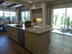
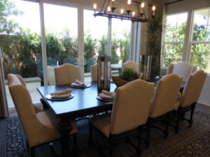
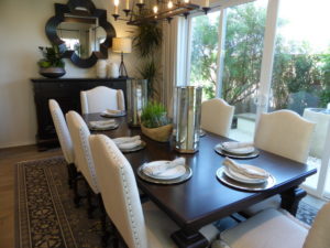
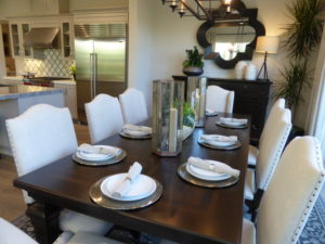
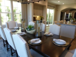
The dining room is at the back of the house. It is 17’7” x 10’6” and has sliding doors that lead to the backyard. The other wall has three windows but an option for sliders instead. The ceiling beams and lighting are upgrades.
A hallway behind the kitchen leads to the powder room, garage access, launch area, and master suite. The standard layout includes a walk-in pantry here as well; however, the model shows the optional elevator instead. I find it a little strange that the builders chose to put an accessible elevator into a home with a raised foyer, rather than one where the first floor is level.
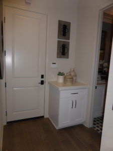
The launch area in this home is a very short counter with a base cabinet and single drawer, located just outside the powder room. The powder room has a fully upgraded vanity with a single sink. The framed mirror is another upgrade.
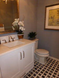
The master bedroom is at the back of the house. It is 14’ x 16’ and has sliding doors leading to the backyard. There aren’t any other windows, so it doesn’t get a lot of natural light. The TV flat screen conduit and crown molding are upgrades.
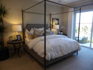
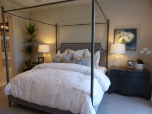
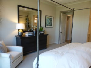
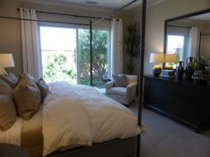
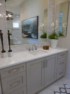
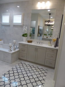
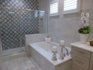
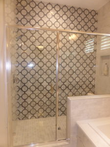
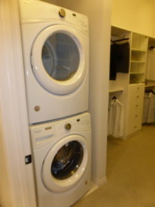
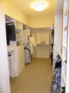
The master bathroom has split vanities. Each includes one sink with a set of cabinets and six drawers. As we have seen throughout the home, the counter, cabinets, and hardware are upgraded. The medicine cabinets, mirrors, and splash are upgrades, too. The bathtub has an upgraded deck and one raised side that forms a ledge in the adjacent shower. The shower has upgraded tile, a shampoo niche, and a seat. The walk-in closet has an upgraded organizer system and is shown with the optional, stacked washer and dryer.
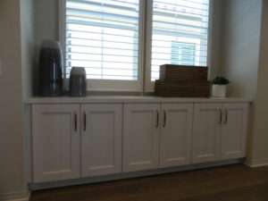
The second floor has a set of base cabinets at the top of the stairs. These are just outside the bonus room, making it great storage for toys, board games, and art supplies. The bonus room is 18’9” x 14’9” and is shown with optional built-in cabinets and a media niche. It has two windows facing the street and two more on the side. The third wall has sliding doors leading to the covered deck, with an option for bi-fold doors.
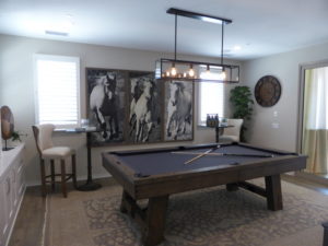
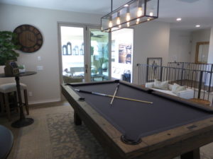
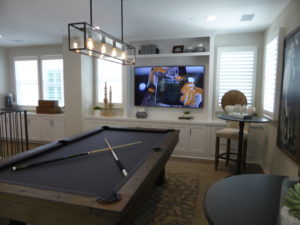
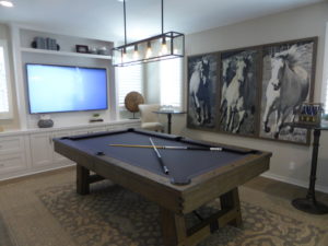
There is an option to convert the bonus room into a fifth bedroom. In this option, the room would be 13’4” x 14’8” with the same window configuration. It would not have the base cabinets or the sliding doors. Where the doors are now, the bedroom would have a walk-in closet and en-suite bathroom. There would be a small vanity and shower/tub combo.
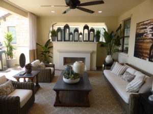
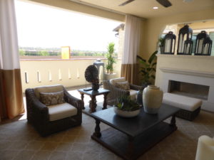
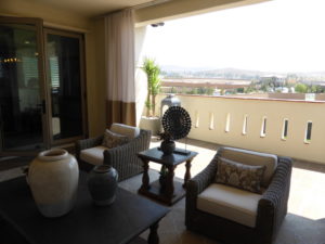
The model shows the optional covered terrace with an uncovered portion closest to the street. It also has the upgraded fireplace and ceiling fan. The standard terrace is not covered at all and occupies the same total space (19’10” x 20’8”). It still has an option for a fireplace and also has an option for a bar where the couch is located in the model.
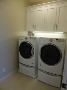
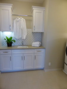
A hallway leads toward the back of the house, where I found the laundry room, secondary bathroom, and two bedrooms. The laundry room is a good size, with space for side-by-side machines and optional upper cabinets. The counter has a sink with four base cabinets and two optional uppers. In homes without the elevator, the counter extends all the way to the back of the washing machine.
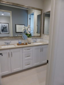
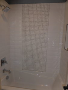
The bathroom has a vanity with two sinks, each with its own set of cabinets, and a shared set of three drawers. The cabinets, hardware, splash, and countertop are upgraded. The shower/tub combo is through another door and has upgraded tile.
Bedroom 3 is closer to the bathroom. It has two windows facing the back of the house and one on the side. This is the largest secondary room at 13’2” x 11’ and it has bi-pass closet with upgraded, frameless, mirrored doors.
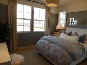
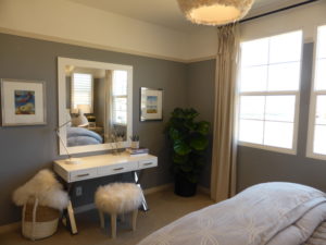
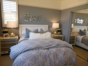
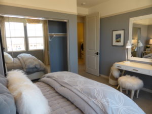
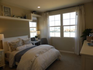
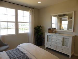
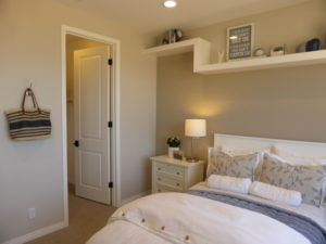
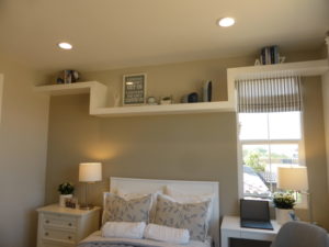
Bedroom 2 is right next door. It also has two windows facing the back and one on the side. This room is only 11’11” x 12’8” and it has a walk-in closet. The shelf above the bed is an upgrade.
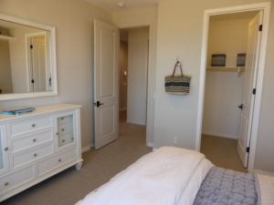
The hallway that runs along the stairs leads to the laundry room, elevator, bedroom 4, and another a single French door leading to the terrace.
Bedroom 4 is only 10’10” x 11’10” in models with the elevator. It has a window facing the covered terrace and another on the side. The room has a walk-in closet and en-suite bathroom. The bathroom has a vanity with a single sink, two cabinets, and six drawers, all fully upgraded. The shower/tub combo has upgraded tile, too. In models without the elevator, the bedroom is extended to 16’3” x 11’10” with no changes to the closet or bathroom.
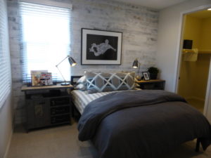
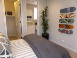
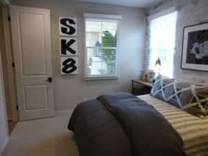
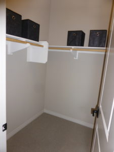
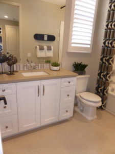
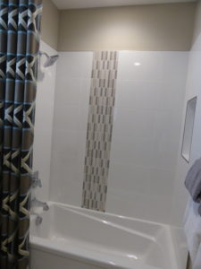
There is also an option to convert bedroom 4 into a second master suite if the home does not have an elevator. The room would be 16’3” x 14’4” and there would be extra square footage added to the back of the room for the closet and bathroom. The bathroom would start where the closet is now. It would have dual sinks set into a shared vanity. There would also be a shower but no tub. The walk-in closet would be much larger than in the standard bedroom 4.
While the second floor of this home offers a lot of flexibility, the first floor is rather limiting (though the first-floor master suite is appealing). I dislike the raised foyer and the placement of the great room. It lacks a California room and the yard is small, so there is very little outdoor space.
Residence 3
3,475 – 3,500 square feet
5 – 6 bedrooms
4.5 bathrooms
Optional elevator
Optional prep or high heat kitchen at launch
Optional bedroom 6 at bonus room
Pricing on currently available models ranges from $1,634,800 – $1,719,800
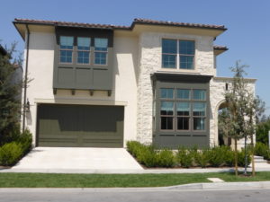
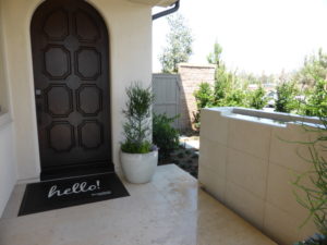
Residence 3 is modeled in the Spanish Colonial style, with Santa Barbara and Monterey elevations available. All elevations have a covered porch and the model shows a fountain on the side. Upgrades found throughout the home include flooring, paint, wall and window treatments, lighting, ceiling fans, speakers, cabinetry, counters, and decorator’s items.
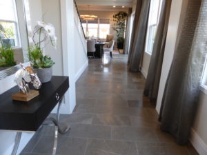
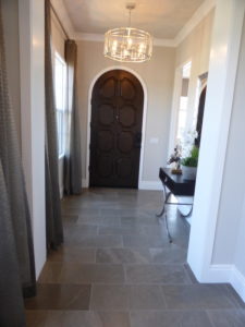
This home has a foyer with space for a table or bench. Windows facing the side of the house line a long hallway that leads back toward the common areas. A door on the left leads to the downstairs bedroom.
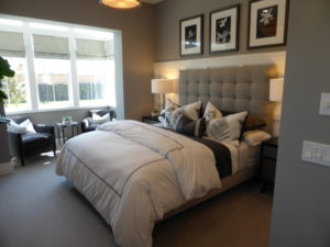
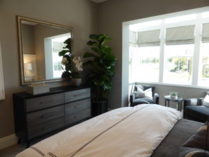
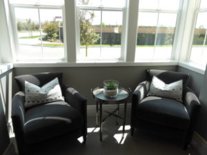
Bedroom 5 is 12’3” x 12’2” and it has several windows facing the street, with a niche in front of them that makes a great sitting area. It has space for a built-in window seat. There is a walk-in closet just inside the entryway and an en-suite bathroom. The bathroom has a vanity with a single sink, one set of cabinets, and a small drawer at the bottom. The cabinets are not listed as an upgrade, so I believe these are the standard white Thermofoil satin finish “shaker” doors. The counter is an upgraded Level 2 Quartz in Arizona Tile Grigio Nube with a 6” backsplash and 1 ½” upgraded edge detail in flat ogee. The shower is shown in lieu of the standard shower/tub combo with upgraded, full-height designer tile.
The main hall opens to the dining room. The spacious room is 18’4” x 10’10” and has sliding doors leading to the side yard. Some of the LED recessed lights are included, but there are two additional lights in the model. The stairs to the second floor come up from the dining room as well. While the room itself doesn’t offer anywhere for a hutch, there is a nook beside the stairs that could hold a hutch.
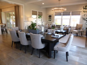
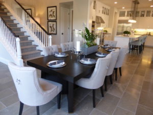
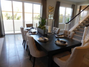
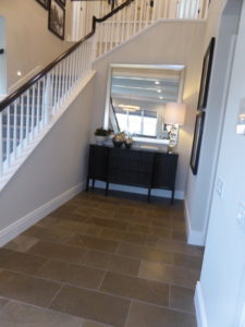
There is an option to put an elevator in the nook by the stairs. This would eliminate space for a hutch but would offer accessibility to the second floor.
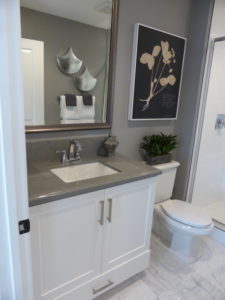
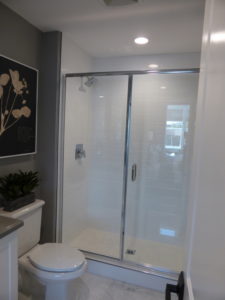
The powder room is also off the nook by the stairs. It has a small vanity like the one in the bedroom and upgraded crown molding. The placement of the powder room isn’t ideal; the person sitting at the head of the dining table can see right into it. There is a small coat closet just outside the bathroom. Unlike the first two homes, this one doesn’t go beneath the stairs.
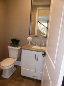
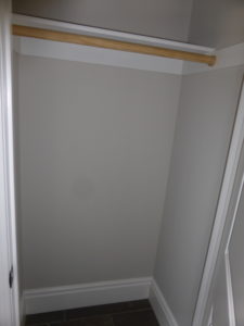
The great room is at the back of the house and is fully open to the dining room. It is 18’5” x 12’ with windows on the back and side walls. The model shows the optional 42” gas fireplace with an upgraded surround. The windows on one wall look into the California room.
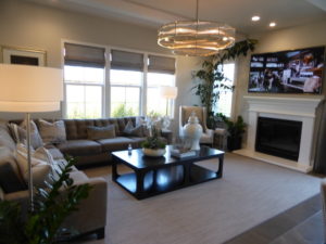
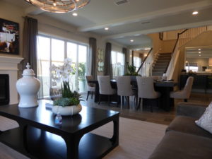
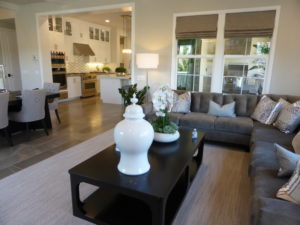
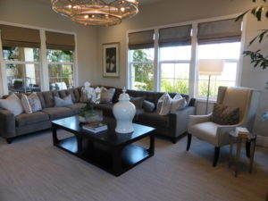
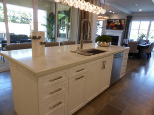
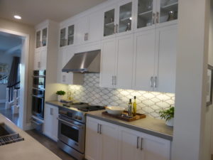
The kitchen is across from the dining room and, while it’s open to that room, it is not open to the great room. The island seats four and houses the sink and dishwasher. The oven, microwave, and cooktop all line one wall while the refrigerator is on another. Both walls have ample counter space and a lot of cabinets. The JennAir appliances are upgraded and show a full range instead of the standard cooktop. The warming drawer is not included either. The model has an upgraded cabinet accessory package with a spice drawer, cutlery organizer, roll out trays, and tray/cookie sheet dividers. The cabinets are Level 2 is 001 Shaker with satin nickel hardware and upgraded glass-faced cabinets to the ceiling. The counters are upgraded Level 1 Quartz in Arizona Tile New Carrara at island and Lagos at perimeter. The 2 ¼” ogee edge is another upgrade, as are the Kohler Tournant Faucet in vibrant stainless and Kohler 8-degree single basin sink in stainless steel.
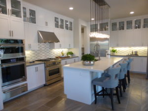
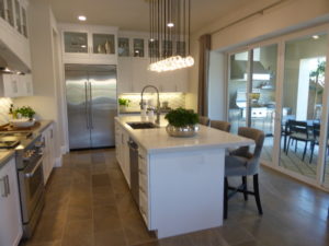
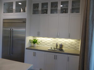
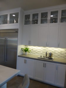
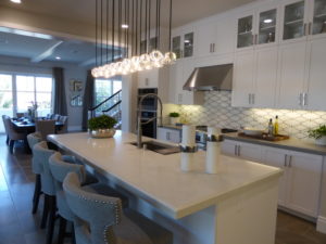
A door in the corner of the kitchen leads to the launch area, which would have a counter and base cabinets along one wall. There would also be a walk-in pantry off the launch, along with direct access to the two-car garage. The model shows the prep kitchen instead. This area has base and upper cabinets, a sink, and a long counter, as well as the walk-in pantry (modeled with upgraded organizers).
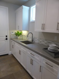
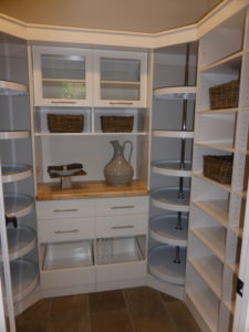
In lieu of the standard launch or prep kitchen, there is a third option for a high heat kitchen. This room would have a sink and optional dishwasher on the long counter, along with base and upper cabinets. Instead of the walk-in pantry, the space would have pantry-height cabinets, a wok burner, and an under-counter beverage cooler or wine fridge.
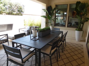
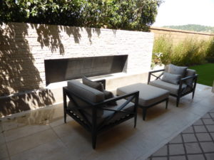
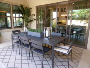
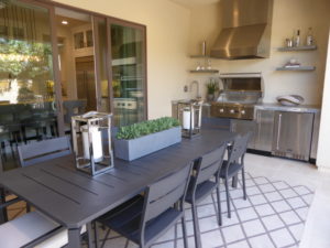
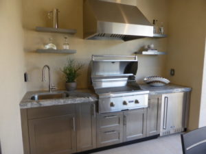
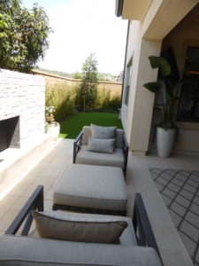
The California room is accessed from sliding doors in the kitchen. The room is shown with an upgraded outdoor kitchen, including a sink, grill, and under-counter fridge. There is a slab countertop and a little storage as well. There is plenty of space for a large table or outdoor seating. The rest of the yard – both across the back and along the side – is narrow and doesn’t leave much room to play. The model shows an upgraded fireplace.
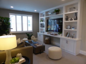
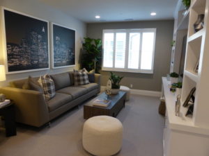
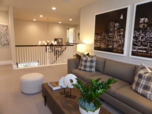
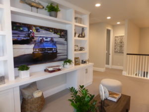
The stairs open to a long hallway with an open bonus room. The hallway shows upgraded lower linen cabinets with floating shelves. The bonus room shows an upgraded built-in unit and has two windows facing the side of the house. The room is 15’1” x 11’9” and could be converted into a sixth bedroom. The bedroom would measure 12’5” x 11’9” with a bi-pass closet just to the side of the door.
Bedroom 4 is at the back of the house, adjacent to the bonus room. It is 14’10” x 11’2” with windows facing the back and side. It has a large walk-in closet with shelving and poles on three sides and an upgraded, double-sided, mirrored door. The en-suite bathroom has a large vanity with one sink, two wide cabinets, and six drawers. The cabinets are standard but with upgraded hardware. The counter is also a standard option. The shower/tub combo has upgraded tile.
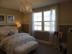
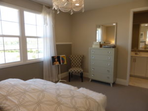
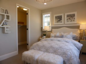
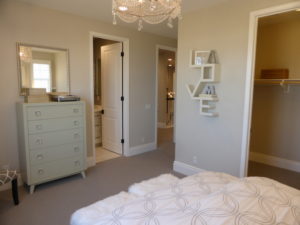
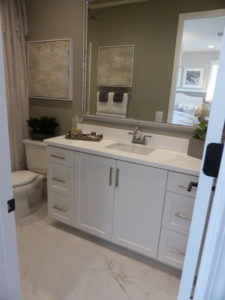
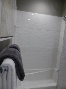
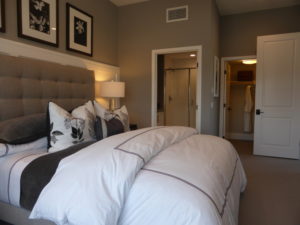
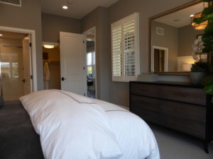
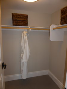
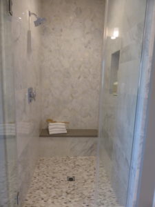
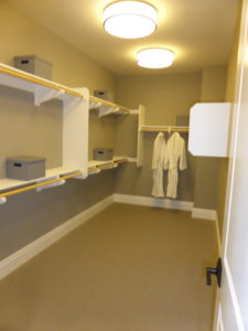
The master suite is also at the back of the house. When you enter the suite, the bathroom is on the right, with an option for a door. The vanity has two sinks and a long counter; each sink has two cabinets and three drawers. The bathtub is at the end of the counter. The counter, cabinets, and tub deck are all upgraded. The shower is across from the vanity and has upgraded tile, a shampoo niche, and a seat. The enclosure is another upgrade. The walk-in closet is in the corner of the bathroom; it is a good size and is shown with the standard shelves and poles.
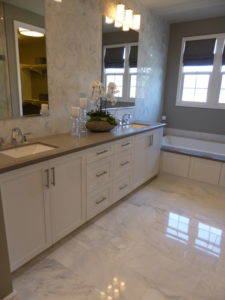
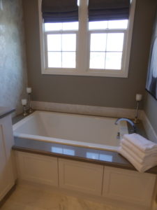
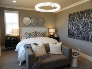
The master bedroom is 18’9” x 13’2” and has windows on three walls. In addition to the lighting and speakers, the crown molding is also an upgrade. The room feels spacious, bright, and private.
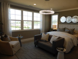
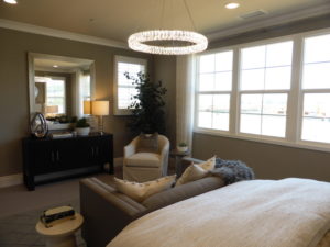
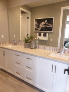
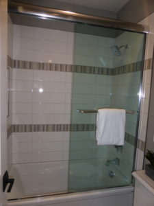
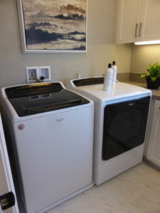
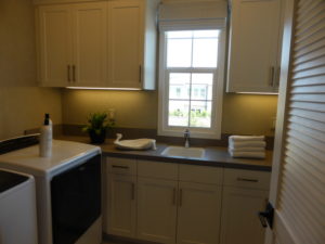
Bedrooms 2 and 3 are at the front of the house and are shown with the standard base linen cabinets between them. Uppers are an option but not modeled. There is a secondary bath in the hallway that the rooms share. It has two sinks set into a shared vanity, with two sets of cabinets and six drawers. The cabinetry is standard, but the hardware, countertop, and splash are upgrades. The shower/tub combo is through a separate door and has upgraded tile. The laundry room is also in the hallway. It has space for side-by-side machines, a long counter with a sink, and ample cabinets.
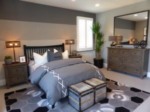
Bedroom 3 is the largest secondary room at 14’10” x 14’11”. It has one window on the side and three in a niche facing the street. Like the room downstairs, this one would like nice with a built-in window seat. The walk-in closet is also a good size with shelving on three walls.
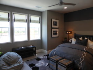
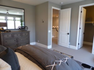
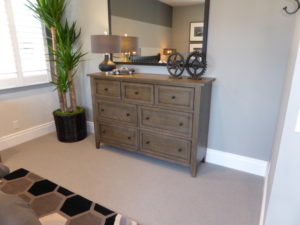
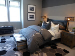
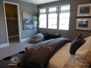
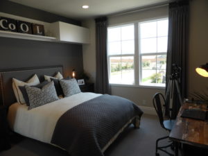
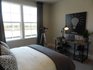
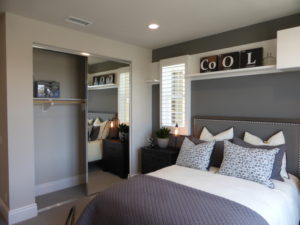
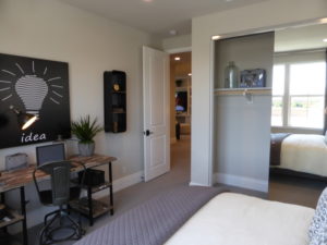
Bedroom 2 is 12’3” x 12’3” and has windows facing the front and side of the home. This one has a bi-pass closet shown with upgraded, mirrored doors. The shelf above the bed is another upgrade.
I like the layout in residence 3 more than in residence 2 because the great room is closer to the other living areas and the house flows better overall. Each bedroom has a lot of privacy, as none directly share walls with any others, thanks to the placement of closets and bathrooms. The options for a prep/high heat kitchen or launch and for converting the bonus room to a bedroom give the house more flexibility.
Overall, I think residence 1 is my favorite home in the Beverly Collection. The layout works well and it offers the extra living room on the first floor. It has plenty of flexibility and great storage throughout. The Beverly Collection as a whole offers luxurious living in Eastwood Village with nice, large homes but small lots.