I knew from the moment I walked into the sales office and saw the floorplans, I wouldn’t like the Casero properties. The floorplans are rectangular, which created awkward angles and wasted space. The houses are geared towards children—young children, but even still I wouldn’t raise my family in any of the houses. As I was touring the properties I kept thinking about the prices. $600K+ for this? Tragic! Consider the hefty Mello Roos! You’re looking at well over $4K in taxes per year, which is tough for me to swallow. It wasn’t what I expected and I think if I had to choose between a house at Laguna Altura and Casero, I’d choose Laguna Altura. I think the builder (Standard Pacific Homes) got it wrong.

Estimated Property Taxes and Special Assessments:
Base Property Tax: 1.05% of sales price
CFD Tax: $4,103 per year
Other Taxes: $156 per year
Overall Effective Tax Rate: 1.74%
Homeowners Association: $153/month
Residence 1
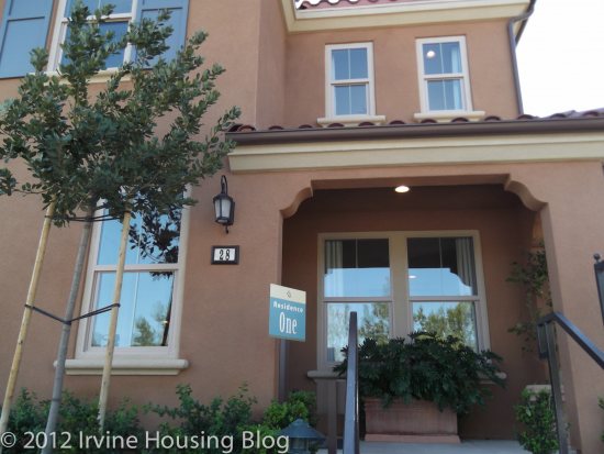
Price: From $590,888
Bedrooms: 3 + loft option
Bathrooms: 2.5
Garage: 2 cars
Square Footage: 1,909 sq/ft
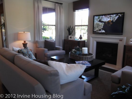
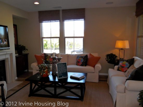
Upon entering the house, you’re immediately standing in the living room (AKA the great room). Your eyes are drawn towards the dining/kitchen area as a focal point, so it’s best to keep these areas clean if you have guests. The model features a built in media/wine center on the back wall of the living room. Because this is a high traffic area and you’re limited to what can be done with the space, I’d invest in the upgrade. The living room is a lot smaller than I thought it would be. I liked the fireplace, but noticed that there wasn’t space left over once you fit your furniture in the room. You are forced to mount your television over the fireplace because there is nowhere else to put it—or a t.v. console of any sort. Wall space is limited, so hanging pictures or artwork might be a challenge.
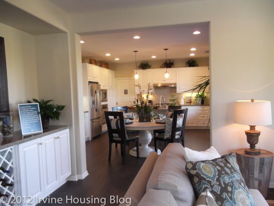
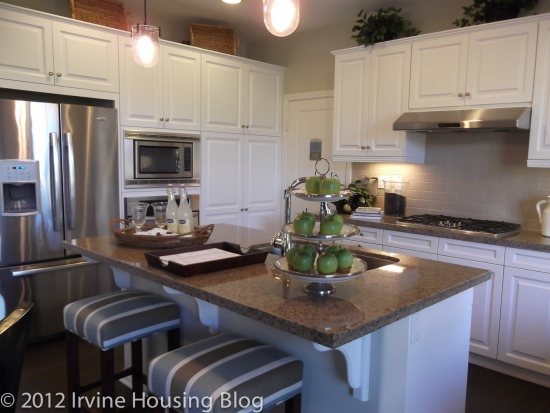
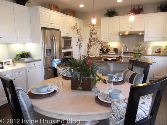
The kitchen and dining room blended together, but were distinctly separate from the living room by a wall. This space would’ve been a mess without the wall. At least wall gave it an appearance of space organization. I don’t have many complaints about the kitchen. The cabinets are white Thermofoil or a maple chestnut color. When you take a close look at the cabinets, they’re very nice and look pretty but I wonder about durability after 3 years. There’s tons of storage, all the amenities are there (upgraded of course!) and it’s functional. My recommendation for this space is that you invest in the recessed lighting. It creates consistency throughout the space.
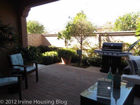
Residence 1 has a very nice outdoor area referred to as the California Room. It’s spacious enough for seating, grilling and general lounging about. If you’re creative you might be able to have your child’s birthday party in the California Room, provided that the guest list is short and doesn’t include many adults.
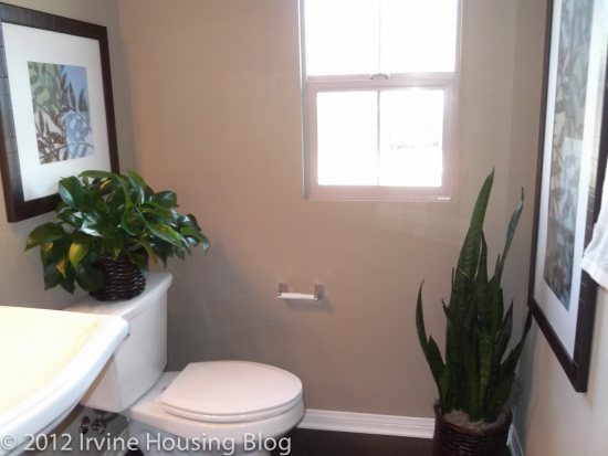
Just before walking up the stairs is a powder room. It’s petite, but thankfully away from the kitchen.
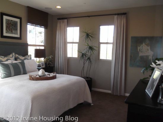
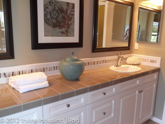
The master bedroom is located just off the top of the stairs. The entry to the master bedroom felt like too much wall with weird angles. I didn’t like walking into the master bedroom. There was nothing special about the master. It was bland. There were a lot of windows, which brings in the much needed extra light. It had a good size walk in closet, but the bathroom was awkward. It’s set up like a long hallway with a small room housing the tub and shower. The vanity has ample counter space because of the hallway feel, but on the whole I’d pass over this bathroom. The tub had paneling and upgraded “surrounds” that reminded me of the kitchen cabinets. It wasn’t well done at all.
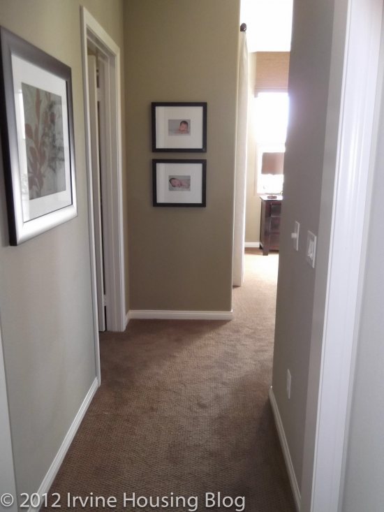
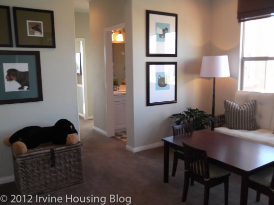
There is a common area between the master and remaining bedrooms. They refer to this space as the loft, but I think common area is a better description. This would be perfect for a play area for the kids (except watch out for the stairs!) or a game room. The living room isn’t large enough to provide an X-Box Kinect friendly play area, so this is where you’d have to hook it up. I like that there’s a space separating the master suite from the other bedrooms, but I still wasn’t partial to the layout.
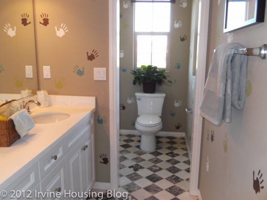
The second bathroom is located just off the loft. It’s a nice dual sink vanity that the kids can share, but the layout is extremely narrow. I felt cramped. The tub is also very narrow. Your children can fit in the tub up until age 12—after that, it’s showers or really uncomfortable baths.
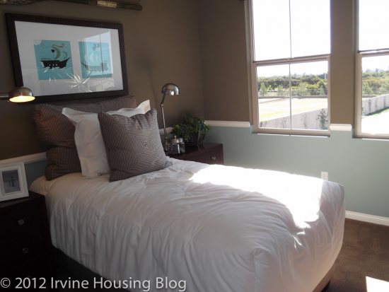
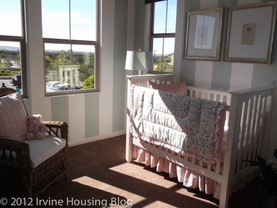
Bedrooms 2 and 3 share a wall. Both rooms are square. Both rooms are small. You can fit a twin bed and a couple pieces of furniture in these rooms. The closets are small and might be a bit rough during the teenage years.
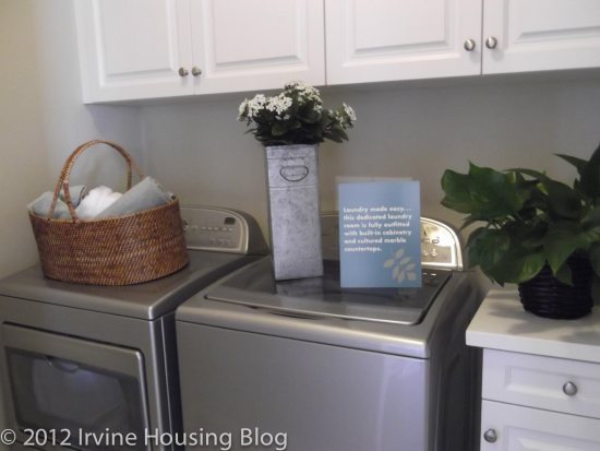
There is a laundry room with a full size washer and dryer. It’s small, but if you opt for the cabinet and counter upgrades you’ll be happy with it.
First impressions are important when purchasing a house. My first impression was that Residence 1 completely missed the mark.
Residence 2
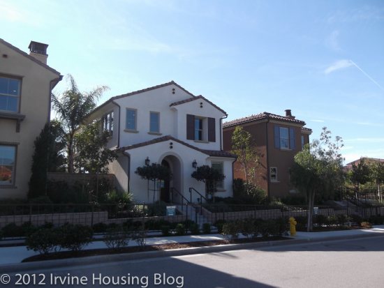
Price: From $617,888
Bedrooms: 4 + loft option
Bathrooms: 3
Garage: 2 cars
Square Footage: 2,023 sq/ft
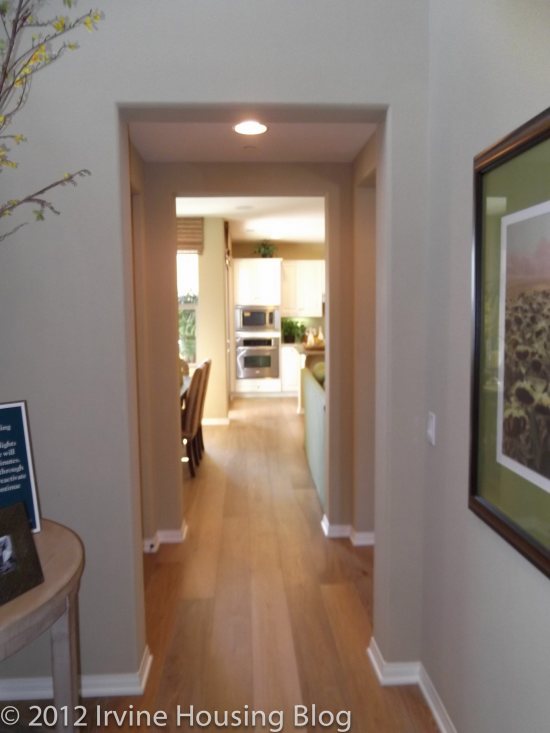
Residence 2 had a terrible entry. You enter into a narrow hallway with nothing gorgeous to look at. It was like an arcade of hallway doors, with nothing promising at the end. This was almost enough to make me turn around. I wasn’t off to a very good start.
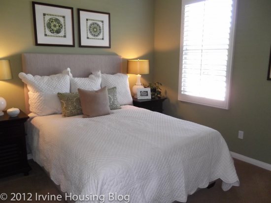
The downstairs bedroom (bedroom 4) isn’t too bad. The size is ok, but the bed faces the closet and the cable was wired in the wall on the side of the bed. I’m not quite sure how that’s going to work—other than having to strategically place your television. I really expected better. The guest bath is a full bath and is typical to apartment living. The tub felt a little narrow, but this is a common theme to the Casero property. This is a good space for guests to stay. If I had a tween or teenage child I don’t think I’d feel comfortable putting them in this room since it’s so close to the front door.
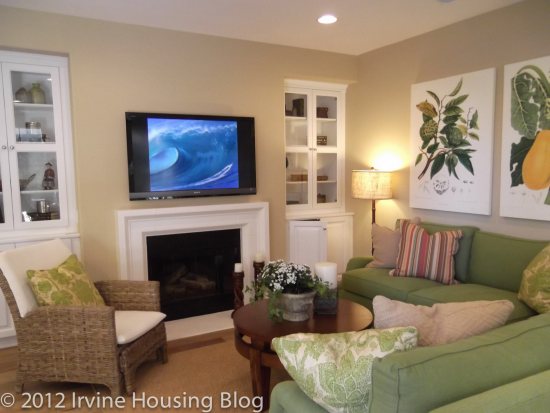
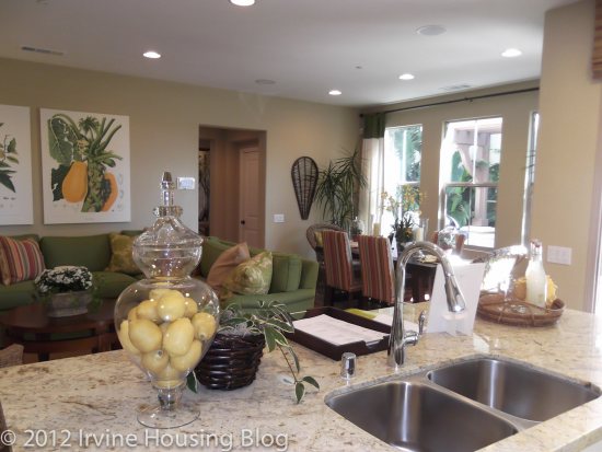
The kitchen, dining and living rooms felt too small for me. The living room mirrored Residence 1 with the exception of the optional built in media cabinets. There is definitely more wall space in the living room at Residence 2, but I still think you’re forced to mount your flat screen over the fireplace. Mounting the television over the fireplace creates a crisp look, so it’s not a deal breaker. My furniture wouldn’t fit in this place, and I live in an 860 square foot apartment. If I’m paying $600K+ I want my furniture to fit.
The dining area is surrounded by windows, but it’s narrow. You’ll need to invest in a long rectangular table, because the space isn’t built for anything else. It’s also a high traffic area and there’s not much space in between the dining and living room.
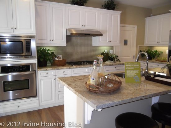
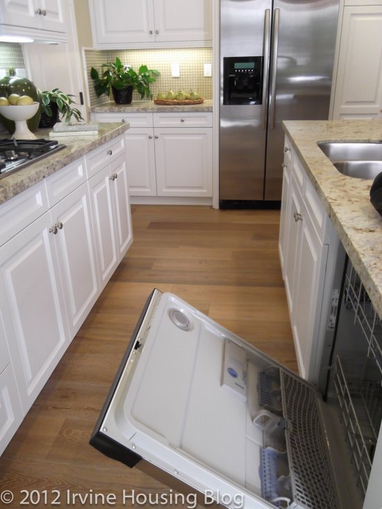
The kitchen is just “alright.” There’s not a lot to say about it because nothing really stood out to me. There’s not a whole lot of space to move. In fact, if you open the dishwasher you almost block traffic! I liked that the cabinets didn’t extend to the ceiling so you can decorate on top. The kitchen gives you everything you need. It’s functional and I wouldn’t dismiss the house out of disappointment in the kitchen.
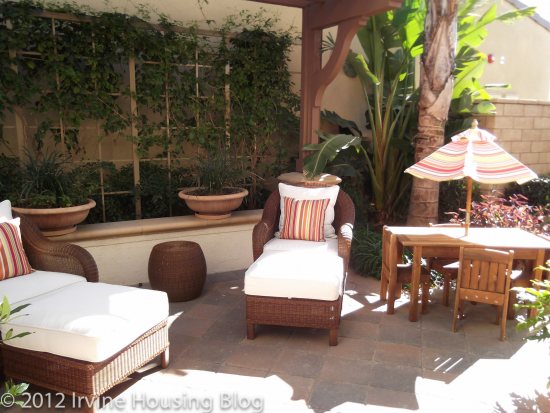
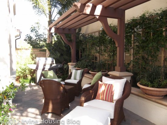
The backyard was lovely. It was big enough for someone like me, but I don’t have small children running around so it’s tough to gage exactly what is a comfortably sized space. The backyard extends along the side of the house, and the model features a really nice seating area. Let’s be practical. Usually trashcans are kept along the side of the house. I just don’t see this space used for entertaining.
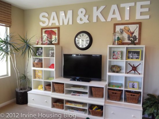
At the top of the stairs is the “Sam & Kate” room. I call it the Sam & Kate room because of the big letters the designer choose to decorate the room with. Technically, it’s the loft. You can have an optional built in media center/desk built in. I’d turn this space into an entertainment room or an office. The designer chose to showcase it as a children’s play area. I’d be concerned as a parent if I had little kids because this space is just off the top of the stairs. I’d have to baby gate it.
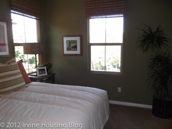
The second bedroom is big enough to fit a full bed. Once again, the bed is facing the closet. This is the same problem I had with the downstairs bathroom. It’s not set up to fit my lifestyle. I don’t want to face my closet. The closets are adequate, but not ideal.
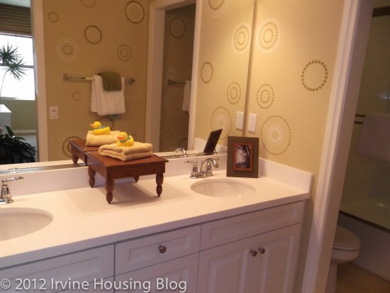
The second bathroom is unacceptable. There was little room to stand. The toilet is nearly flush against the tub. The tub was narrow and it sloped, which prevents you from stretching your legs. The sinks were small. I can’t understand why they can’t get these bathrooms right! Very disappointing.
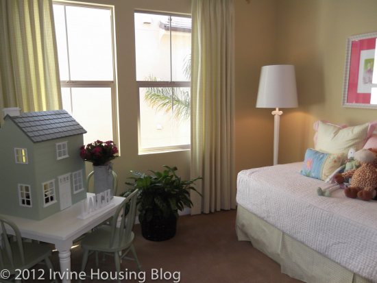
Bedroom 3 can accommodate a full size bed. It had great closet space, but once again you’ll have to run the cable line to a more suitable position. I would’ve liked to have seen the builder extend bedroom 3 out a little further by shortening the Sam and Kate room. I’d rather have a larger bedroom and a smaller loft. The big thing that turned me off of bedroom 3 was that it shared a wall with the master. This nixed the floorplan for me.
The master bedroom is actually a decent size. I liked the lighting, and there was a great walk in closet. However, the master bathroom was too small. I was really surprised to find the master bathroom so petite. It was large enough to have a dual sink vanity and the tub separate from the shower, but I wasn’t satisfied with the space. It felt cramped like an apartment.
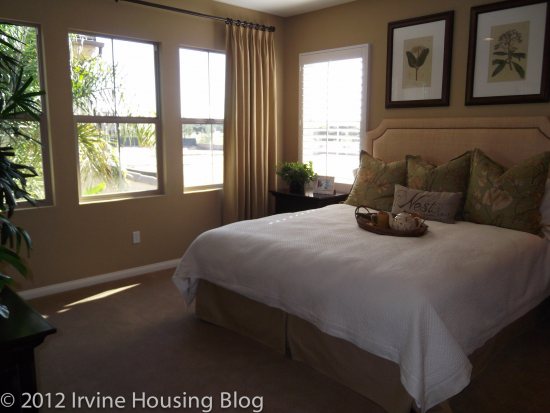
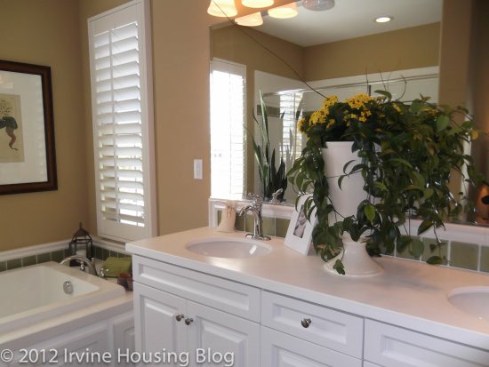
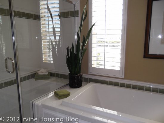
In general, I felt the upstairs of Residence 2 was too crowded. I can’t pinpoint why I’m so adverse to it, but it may have to do with the rectangular floorplan. It felt long and limiting. I’ll take Residence 2 off my list.
Residence 3
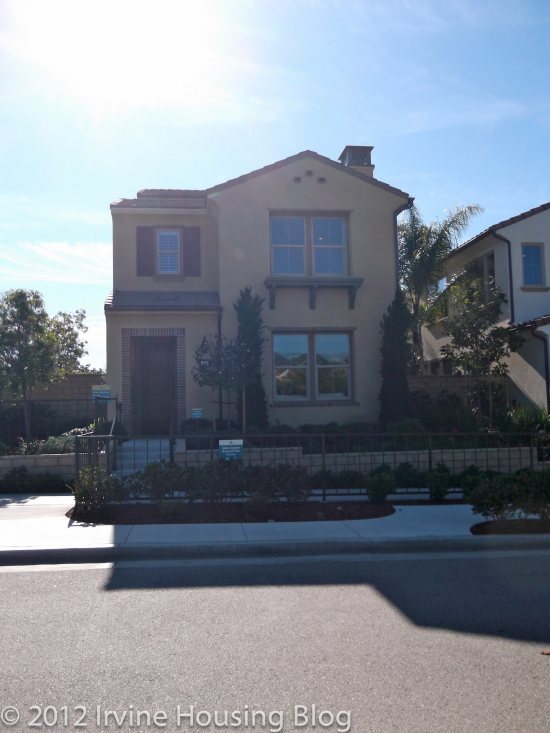
Price: From $661,888
Bedrooms: 4 + bonus room
Bathrooms: 3
Garage: 2 cars
Square Footage: 2,330 sq/ft
My feelings about Residence 3 are very similar to the previous properties. Long narrow hallways, crowded living/dining/kitchen areas and small bathrooms didn’t make this floorplan worth it. For the price I’d pay for Residence 3, I’d expect to have a house that utilizes the square footage better. I almost felt like the height of the interior increased the uncomfortable layout. “Third time is a charm” certainly didn’t apply here.
When you enter the house, I immediately felt the narrowness in the layout. The living room is a near replica of its sister properties. I don’t want to disparage the living room too much, or give the wrong impression. It’s an adequate space, but once the furniture fills up the room, you’re left with walking room only. For a housing tract that appeals to families, I would’ve thought that the builders would’ve considered little ones playing with big Tonka trucks in the living room. It’s not suitable for that. I honestly wouldn’t know where to put a Christmas tree in this house. If you rearrange furniture you could probably put it in the living room, but it defeats the purpose when you have to shove things around.
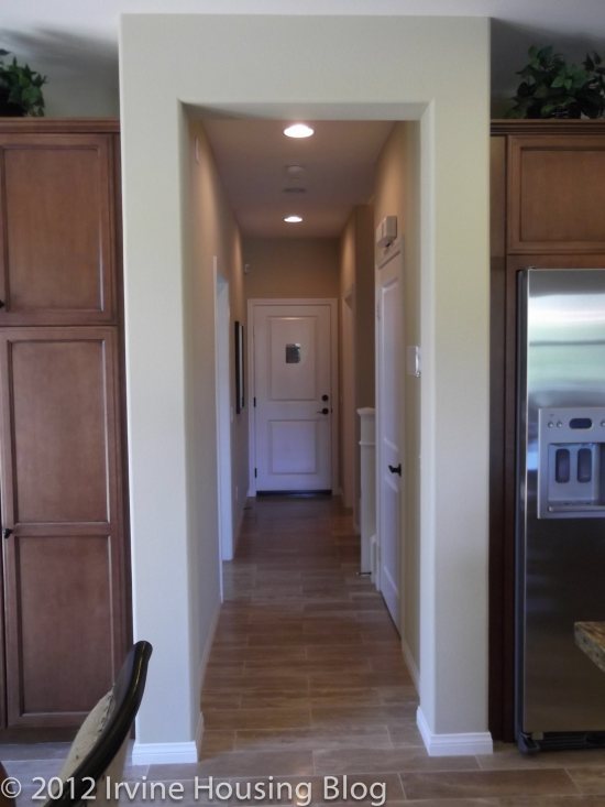
The dining room feeds into the kitchen. It’s situated in front of the sliding glass doors to the backyard. You can look at this two ways:
1. How nice to have sunlight while eating!
2. The dining room table blocks the entrance to the backyard.
Option 2 describes this space best.
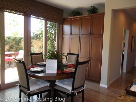
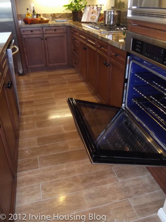
The pantry is located in the dining room. I never understood why you’d build the pantry in the dining room and not the kitchen. Obviously I can walk to the pantry from the kitchen. It’s not that big of a deal, but it feels awkward. Pantries should be in the kitchen. End of story. Just so you get an idea of how much space you have to walk between the island and appliances, I snapped a photo with the oven door open. You can judge whether this is a wide enough space for you to work in.
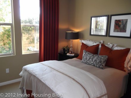
The downstairs bedroom (bedroom 4) felt smaller than it actually is. A full bed would fit here, but I’m wondering where I’d put a dresser. I could barely squeeze in there to get a picture. You have the same situation with the bed facing the closets. This room was a buzz kill for me. The downstairs bathroom (bathroom 3) only has a shower and almost no counter space on the vanity. I can live without a tub in bathroom 3. It’s a nice to have, but not a must have.
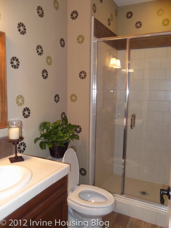
The second floor has two bedrooms connected by a common bathroom. I liked this concept, particularly if you have children. This won’t prevent children from fighting over the bathroom, but at least it is easily accessible. It’s a shower/tub combo with a dual sink vanity. I think the bathroom serves its purpose and it would be acceptable to me.
The sizes of bedrooms 2 and 3 weren’t too bad. They do not share a wall, but they suffer from the same tragic disease of forcing the bed to face the closets.

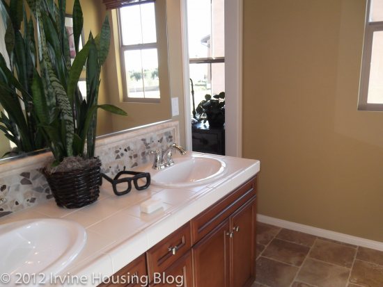
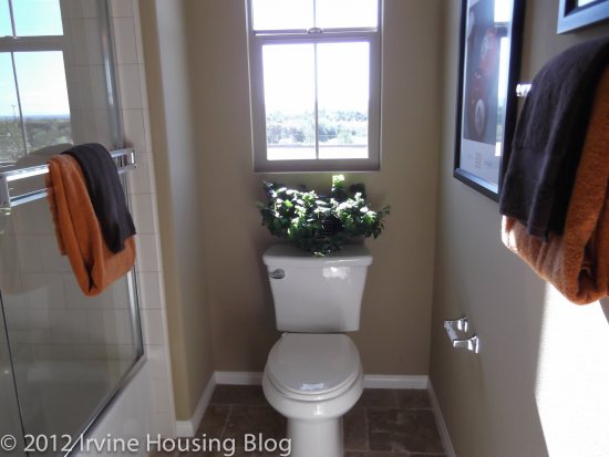
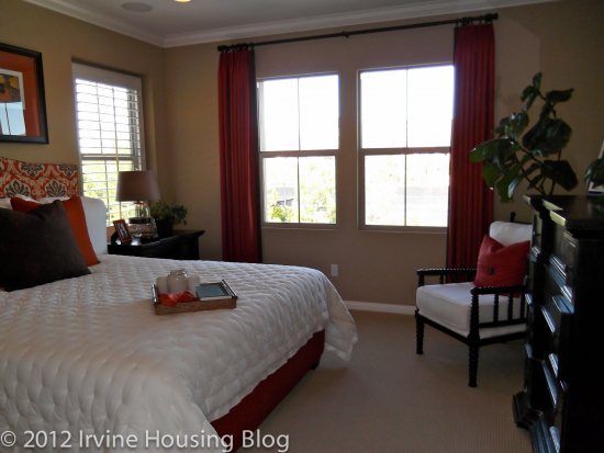
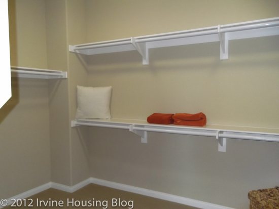
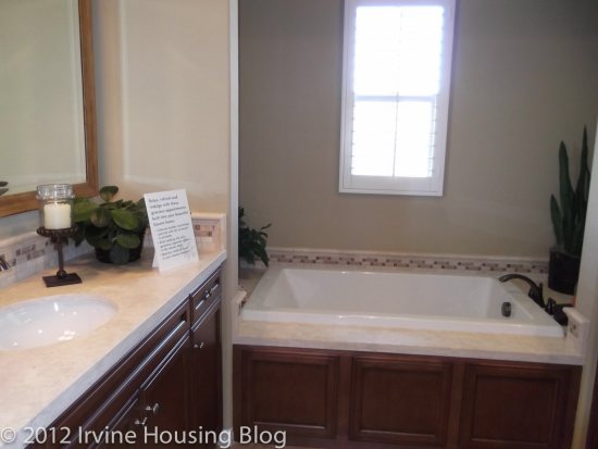
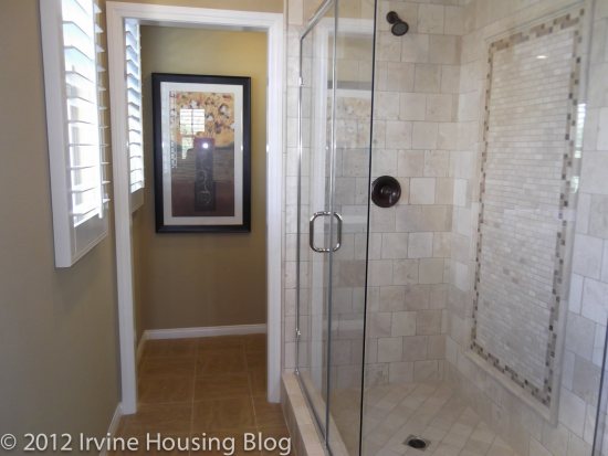
The master bedroom has a huge walk in closet. It’s probably the biggest walk in closet that I’ve seen in all the properties I’ve toured. I somehow envision this becoming your children’s overflow closet. The master bedroom is a decent size. I was impressed compared to the other properties. The master bathroom, however, did not strike my fancy. It felt oddly shaped. The vanity formed a nearly 90 degree angle with the tub (or that’s how it appeared) and it looked smooshed together. The tub surrounds (AKA counter space) are an upgrade. I think you need them. That same hideous paneling is featured on the tub. I’d figure out how to get rid of that. I liked that the vanities faced each other. This allowed for a lot of counter space.
If you’re inclined to travel up one more flight of stairs, you’ll end up in the bonus room. This is a unique feature to Residence 3. The builder suggests that the homeowners use the space as a game room for watching movies or a retreat to spend time with family and friends. It’s featured as a lounge noir type of feel in the model with a full service wet bar. I personally would probably not use this space. It’s a nice feature, but I can watch television at an awkward angle from my bedroom. I like this space because you can make it your own and turn it into anything you want—except a bathroom. It might work well as an office if you don’t mind climbing two flights of stairs to get to it.
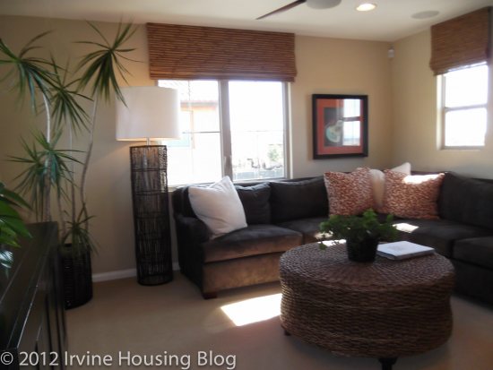
Casero was disappointing. I felt like the builders didn’t consider “practical living” in some circumstances. The bedrooms needed to have a different layout, the bathrooms needed larger tubs and more breathing room, and furniture has to fit in the rooms. In my opinion, the builder got it wrong.
Discuss below or at Talk Irvine.
interesting review!, we checked all the new properties and we liked Casero plan 1, here is why –
1. all new properties in Woodbury and Stonegate and portola springs have open floor plans i.e. kitchen + great room together so you can’t make an exception of Casero in fact Casero offers little separation from the kitchen
2. Woodbury is overrated, the homes/condos are little too close + pricey for the same sq. footage.
3. showers in most homes are very small, but Casero is different it has a better shower area.
4. every new property charges you high mello roos and hoa – that’s not just Casero, laguna altura has 5K/yr in mello roos for 50 years and hoa is $400/month Vs Casero is 4200/year and ~300/month respectively.
My wife and I love the Plan 2. It checked all the boxes for us:
1. Open floor plan, but the living/great room is not right there at the entry.
2. Upstairs loft can serve as kids’ playing area or office/tech space.
3. One of the bedrooms is right next to the master so it will be a perfect place for our infant baby.
4. Master closet is not in the bathroom, so clothes won’t get damp and moldy.
5. The beds in two of the smaller rooms are facing the closet, but we are not planning to have TVs in kids’ rooms and the guest room downstairs anyways. A little less TV is probably a good thing in this day and age.
6. Upstairs laundry which is pretty common in new constructions.