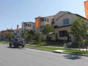
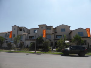
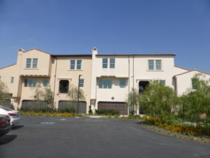
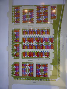
A couple of weeks ago, I introduced you to a new enclave in Cypress Village, located between the 133 toll road and Ridge Valley on the south side of Trabuco/Great Park Road. The Lantana collection is a neighborhood of 136 attached townhomes ranging from 1,231 – 1,526 square feet. There are five primary residences, though the 1 and 1X are quite similar. Most buildings will have either six or eight units. Residences 1, 1X and 2 are always 3-story, middle units; residences 3 and 4 are 2-story units, located on the end in a 6-unit building, but may be end or middle units in an 8-unit building. All homes have an attached 2-car garage. The homes range from 2 – 4 bedrooms and 2.5 – 3.5 bathrooms. Aside from an optional loft in residence four, the homes do not have customizable options to the layout.
Included Features
The Lantana homes have four different elevations, including Italian Rustic, Italian Formal, Spanish Rustic, and Spanish Formal. All homes have fire resistant concrete tile roofs and energy efficient, dual glazed, low-E glass vinyl windows. The homes have central air conditioning with programmable thermostat; split system heating and air in residences 1, 1X, and 2; tankless water heater; and energy efficient radiant barrier roofs. Throughout the home, the standard features include white thermofoil cabinets with contemporary style doors and stylish pulls; ceramic tile flooring at entry, kitchen, baths, and laundry; designer-selected plush carpet throughout living areas; two-panel smooth interior doors with Schlage Plymouth satin nickel hardware; bullnose corners; LED recessed lighting; structured wiring with enhanced CAT-5E wire, multi-media outlet at great room, and TV and data outlet at all bedrooms; powder room with pedestal sink, Moen Glyde polished chrome faucet, and wood framed mirror; and interior laundry. The kitchens come standard with Bosch appliance package in stainless steel including a 5-burner freestanding gas range with microwave/hood and dishwasher; countertops in Pental Quartz, Clay Pebble with 6” splash and full splash at range; sterling stainless steel single basin sink with Moen Arbor spot resistant stainless steel faucet; and cabinet depth refrigerator space pre-plumbed for ice maker. Secondary baths come standard with a matte white cultured marble countertop with 4” splash; fiberglass tub and shower; and matte white 3” x 6” subway tile shower with 2” x 2” ceramic tile shower pan and clear glass shower enclosure in polished chrome. The master suites include a stall shower with 3” x 6” matte white tile surround and clear glass enclosure; and a vanity with dual under mount sinks, cultured marble countertops, and Moen Glyde polished chrome faucets.
Schools
Students living in Lantana will attend schools in the Irvine Unified School District. They are zoned for Cypress Village Elementary, Jeffrey Trail Middle School, and Irvine High School.
Basic Neighborhood Financial Information
Approximate HOA Dues: $345 ($210 for Lantana Neighborhood Association and $135 for Cypress Village Community Association)
Basic Property Tax Rate: Approximately 1.05%
CFD Tax: $1,700 per year (Lantana is within Irvine Unified School District CFD No. 86-1 and No. 09-1)
Prices start at $528,202 for Residence 1, $583,973 for Residence 1X, $623,609 for Residence 2, $638,189 for Residence 3, and $673,043 for Residence 4.
Residence 1
1,231 square feet
2 bedrooms, 2.5 bathrooms
Prices start from $528,202
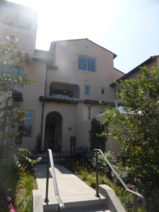
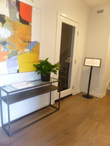
Residence 1 is the smallest of the Lantana townhomes and, due to its similarity to residence 1X, doesn’t have a full model. The first floor is where the two models vary. In Residence 1, the first floor consists solely of the garage and a foyer. This entryway has space for a table or bench before heading up the stairs to the rest of the home. The flooring and garage flooring are upgraded. The second and third floors are identical to residence 1X and will be reviewed below.
Residence 1X
1,496 square feet
3 bedrooms, 3.5 bathrooms
Prices start at $583,872
While residence 1 didn’t have any living space on the ground floor, residence 1X incudes a full bedroom and bathroom on the first floor. Throughout the home, the flooring, window treatments, decorator’s items (ceiling fans, lights, etc), bath accessories, and bath fixtures in brushed nickel are upgrades.
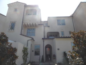
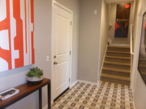
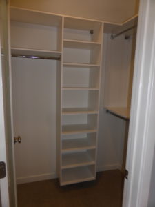
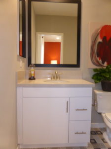
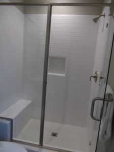
The main floor bedroom is a good size, with enough space for a small couch or sitting area. Two windows face the front of the home. It has a walk-in closet, shown in the model with an upgraded frosted glass door and built-in organizers. The recessed lighting in the bedroom is also an upgrade. This room also has an en-suite bathroom. The vanity is on the smaller side, but does have one cabinet and two drawers. It has an upgraded Pental Quartz countertop and vanity splash in Dolce Vita and an upgraded framed mirror. The shower has a narrow bench at one end and a small ledge for holding bottles. It shows the standard tile but an upgraded enclosure in brushed nickel.
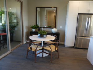
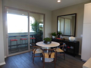
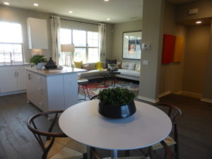
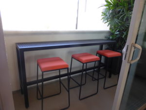
The second and third floors of Residences 1 and 1X are identical. As you reach the top of the stairs, the dining room is straight ahead. The area could comfortably seat about eight people and has room for a buffet or full china cabinet against the back wall. Sliding glass doors lead to the private deck, which is the home’s only outdoor living space. The deck is pretty narrow, but the model does show it with a table and bar stools.
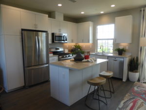
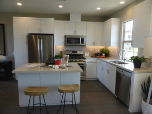
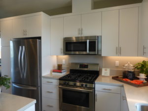
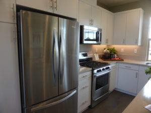
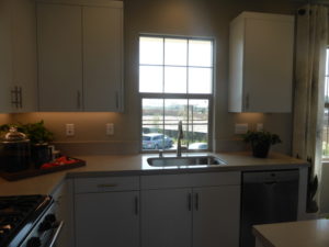
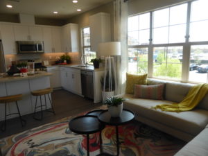
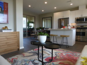
The kitchen is adjacent to the dining room. It actually shows the standard cabinets and satin nickel pulls. It also shows the included appliance package, with the addition of the Whirlpool refrigerator. The color of the countertop and splash (Dolce Vita) is an upgrade but they are still made out of Pental Quartz. The LED task lighting is the only other upgrade. The kitchen has a small island with bar seating for two people on one side, and a set of cabinets and drawers on the other. The rest of the kitchen is set up in an L-shape around the island. One wall has the fridge, range, microwave, and a pantry-height cupboard. The other wall has the sink and dishwasher, with a window over the sink facing the back of the home. For a small kitchen, this one actually has a lot of cabinet space and drawers and a decent amount of counter space.
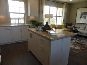
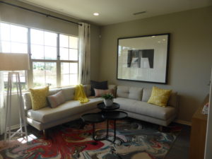
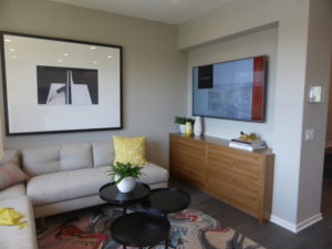
The living room is on the other side of the kitchen. Three windows line one wall, facing the back of the house. The room itself is pretty small, but a recessed area provides space for a wall-mounted TV, bookshelves or possibly a built-in unit. The recessed lights are upgraded.
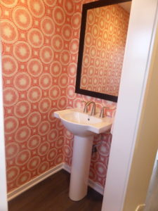
A hallway near the top of the stairs takes you up two more steps to the powder room. It shows the standard sink and hardware with an upgraded framed mirror. Past the powder room, another staircase takes you up to the third floor bedrooms.
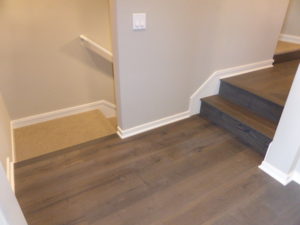
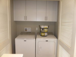
The laundry area is at the top of the stairs on the third floor. The side-by-side machines sit behind a pair of plantation-style doors and have a set of cabinets above them. A lower linen cabinet is just across the landing.
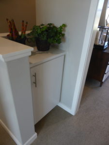
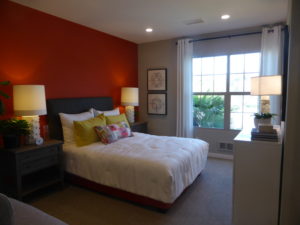
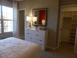
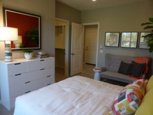
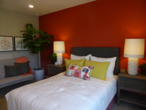
Bedroom 2 is on the right side of the landing. It has two windows facing the back of the home and is fairly spacious. The recessed lights are upgraded. The room has a generous walk-in closet and an extra storage nook shown with shelves. There is also an en-suite bathroom has a big vanity with a set of cabinets and two sets of drawers. The countertop and splash are shown in an upgraded color of Pental Quartz. As in the first floor bathroom, the shower/tub combo shows the standard tile but has an upgraded enclosure.
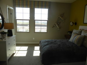
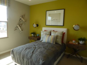
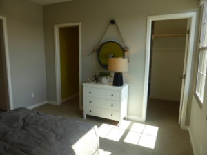
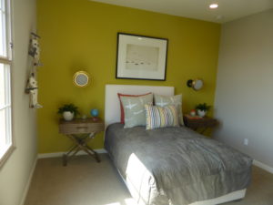
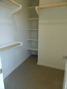
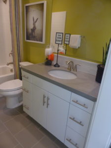
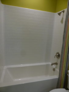
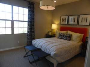
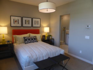
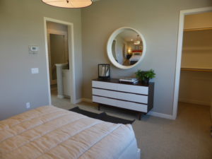
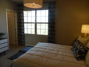
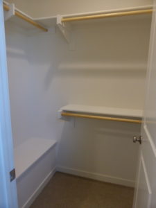
The master suite is across the landing from bedroom 2. The bedroom is only a little bigger than the secondary rooms. It has two windows facing the front of the house and is shown with upgraded recessed lights. The walk-in closet is actually a little smaller than in bedroom 2.
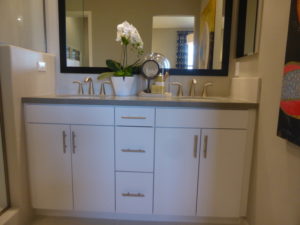
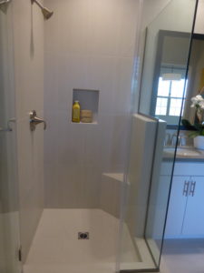
The master bath has a vanity with two sinks, two sets of cabinets, and one set of drawers between them. Again, the countertop and splash are shown in an upgraded color of the standard material. The shower shows upgraded 12” x 24” tile and a frameless glass enclosure in brushed nickel. The shower is actually smaller than in bedroom 3 and only has a small corner seat instead of a full bench. This is a very small shower for a master suite.
Overall, I thought residences 1 and 1X had a nice entry area and kitchens that made great use of the space. The bedrooms are all a good size, though I wish the master had a bigger closet and shower. The homes lack a coat closet and has just a small amount of outdoor living space. The three-story townhome may not appeal to some buyers but the layout works well given the space to work with.
Residence 2
1,590 square feet
3 bedrooms, 3.5 bathrooms
Prices start from $623,609
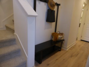
Residence 2 has a lot of similarities to residence 1, with a first floor bedroom, second floor living area, and two more bedrooms on the third floor. It has the most square footage of all the Lantana homes. Throughout the home, flooring, window treatments, decorator’s items, 5 ½” baseboards, and the satin white thermofoil cabinets with contemporary style doors and Berenson black matte knobs are all upgrades. The foyer on the first floor has a recessed area that offers a great space for an organized drop zone.
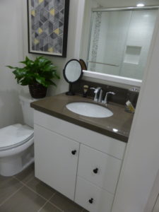
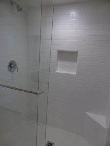
In this home, the first floor bathroom is across the hall from the bedroom, rather than attached to it. It has the same size vanity, shown with a Pental Quartz countertop in Clay Pebble. The shower has the standard white subway tile and a small corner seat.
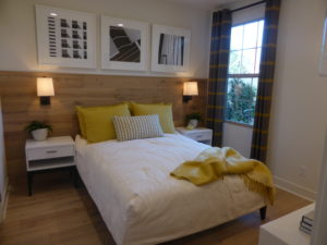
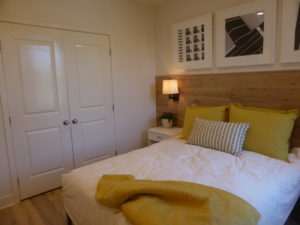
The bedroom has just a single window facing the front walkway. The room itself is an average size. It has a double French door-style closet that takes up most of one wall. The recessed LED lighting is an upgrade.
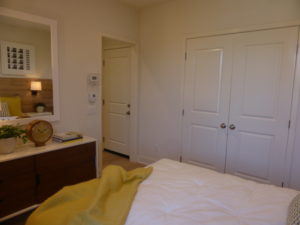
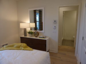
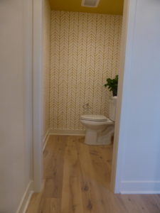
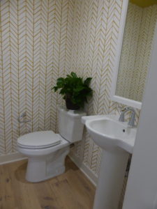
On the second floor, the powder room is right at the top of the stairs, so the toilet is the first thing you see when you reach the second floor. This powder room is shown with the standard pedestal sink and an upgraded framed mirror.
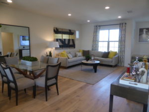
As you turn the corner, you face the living room. There is a small wall with space for a narrow table that could create a second floor drop zone. This living room is bigger than in residence 1. It has windows facing the front of the house and a tiny window on the side. This one is also open to the dining room, but not really as open to the kitchen. The recessed lights are upgraded.
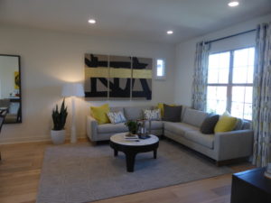
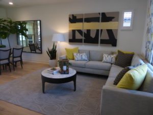
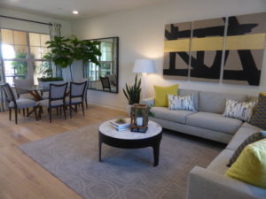
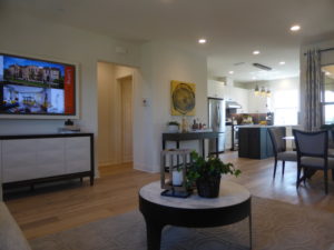
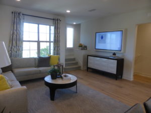
The dining room is basically an extension of the living room. As in the last home, it could probably seat eight comfortably. One full wall could hold a China cabinet. There are windows facing the covered deck.
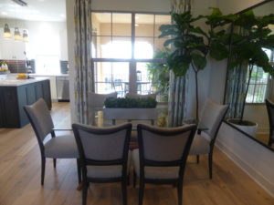
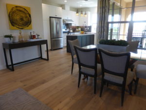
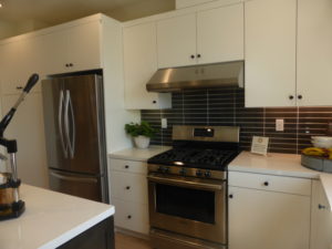
The kitchen is tucked back into the corner. The center island is bigger than in residence 1 and has an upgraded microwave on one side, along with a few drawers. The other side doesn’t have cabinets or seating. The rest of the kitchen forms an L around the island. One wall has the fridge, range, pantry, and most of the cabinets and drawers. The other wall has the sink, dishwasher, and a rear-facing window. This kitchen has a lot more counter space than in residence 1. Besides the microwave, upgrades in the kitchen include a Broan 600CFM hood, whirlpool refrigerator, Pental Quartz countertop in Cotton White with full glass tile splash, stain grade shaker style doors in smoke on maple at the island, outlets for pendant lights, LED task lighting, and a reverse osmosis system.
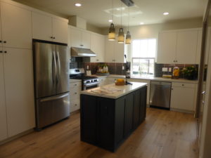
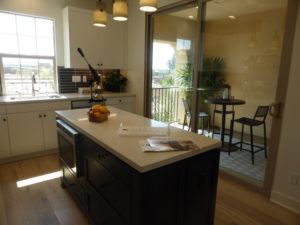
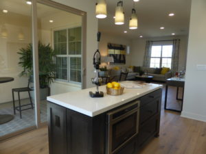
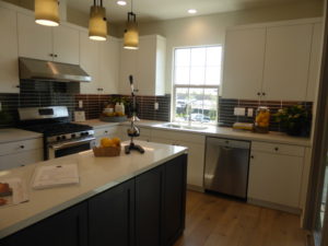
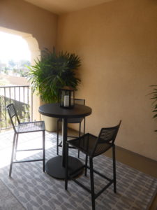
The kitchen also has sliding doors that open to the deck, which is wider than in residence 1. The deck also faces the back of the house, rather than the front walk.
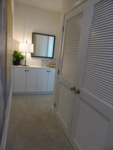
The stairs to the third floor are in the corner of the living room. There is a hallway at the top of the stairs, rather than a landing. The washer and dryer are behind plantation-style doors in this hallway. There are several linen cabinets at the end of the hall, just before the entrance to bedroom 2.
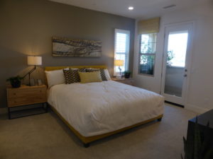
The master suite is at the top of the stairs. The bedroom has a window on one side, and a window and single French door on another. The door leads out to a small deck that faces the front of the house. The walk-in closet is in a corner of the room and is a little bigger than in the last home. This closet, like those throughout the rest of the Lantana homes, has an automatic, self-closing door. This was pretty frustrating, as I felt trapped in a very small space when I went to take a picture from the inside.
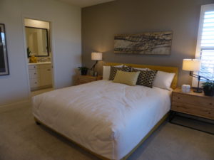
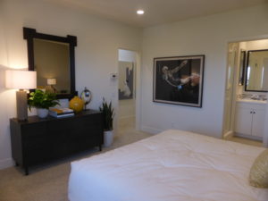
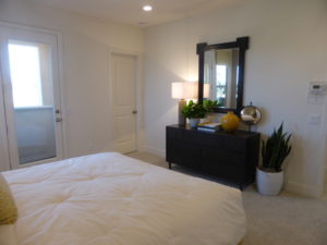
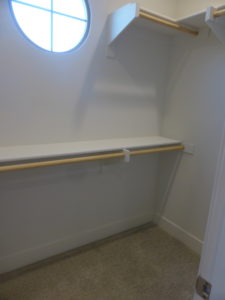
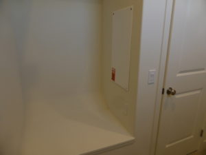
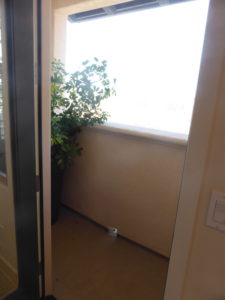
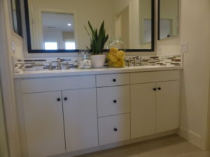
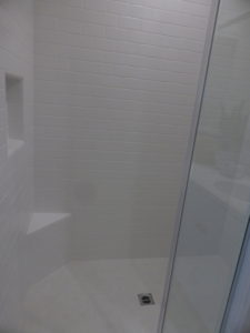
The master bathroom has a vanity similar to in residence 1. In this home, the vanity splash has upgraded tile detail. The shower is a little bigger and has the included tile but a frameless glass enclosure. There is an option for a pocket door separating the bedroom and bathroom.
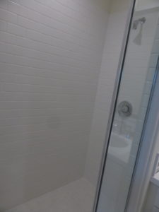
Bedroom 2 is all the way at the back of the house. It is a very large room. Two windows let in a lot of light. There is a 3-door bypass closet and upgraded recessed lighting. The en-suite bathroom has a small vanity and a shower/tub combo. This bathroom is shown without any upgrades.
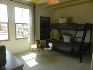
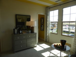
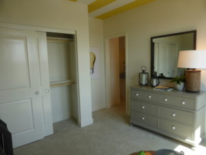
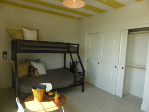
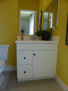
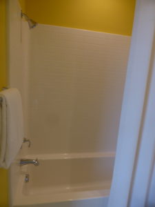
This home is only 100 square feet bigger than residence 1 but it felt much more spacious. I think the layout of the second floor is better, with the open living room and dining room having most of the extra space. The upstairs secondary bedroom is bigger in this model, but the first floor bedroom is bigger in the other home.
Residence 3
1,445 square feet
3 bedrooms, 2.5 bathrooms
Prices start from $638,189
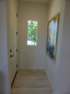
Residence 3 is the first home on the model tour. When I walked in the front door, I came face-to-face with a wall. The foyer is so small there is barely enough space to open the door. It wasn’t a great first impression for the Lantana neighborhood. Upgrades found throughout the home include flooring, window treatments, decorator’s items (lights, fans, etc), white shaker style cabinets, oil rubbed bronze egg knobs on cabinets and interior door hardware, and wrought iron handrail.
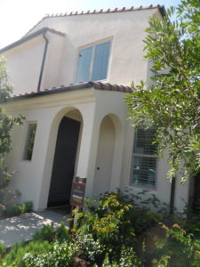
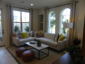
The living room is on the right as soon as you move past the foyer. It’s a little smaller than in Residence 2 but much brighter because it is an end unit. Two big windows face the front, one faces the front walk, and two more face an interior courtyard. A single French door leads to the yard. The recessed LED lighting is an upgrade.
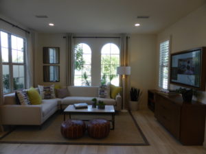
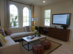
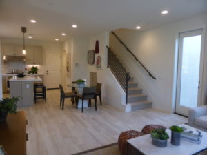
The dining room is next to the living room. The foyer and courtyard door help to define the space and separate the two rooms. The space is a little smaller than in the other homes but still comfortable. The model shows the optional storage under the stairs, shown here as drawers but with cabinets also an option.
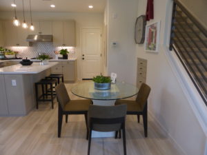
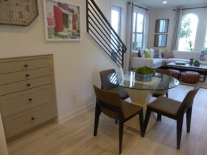
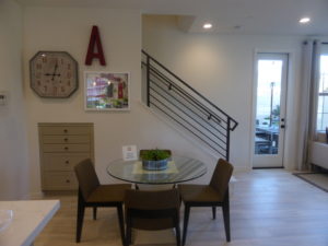
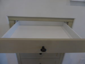
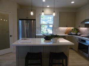
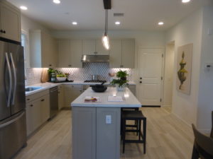
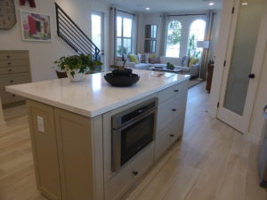
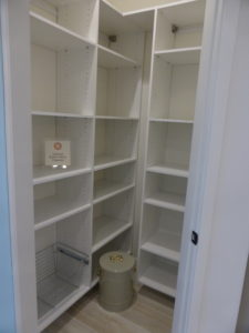
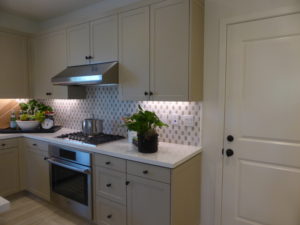
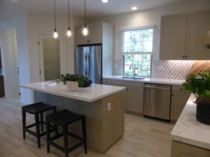
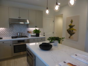
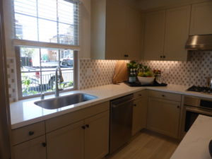
The kitchen is behind the dining room and slightly offset. The center island has seating for two people on one side and drawers on the other. An upgraded built-in microwave also sits in the island instead of in its normal spot above the range. There are also four drawers in the island. There is a walk-in pantry in the corner of the kitchen closest to the dining room that is modeled with an upgraded frosted glass door and built-ins. The rest of the kitchen forms an L around the island. The fridge is next to the pantry, followed by the sink and dishwasher. That wall also has good counter space and a few cabinets. The back wall has the range, along with a few more cabinets and drawers. The Bosch appliance package is upgraded to show an 800 Series 5-burner cooktop and convection oven, Broan 600CFM hood, Bosch microwave drawer and dishwasher, and Whirlpool refrigerator. The countertop is upgraded to a Pental Quartz in Statuario with custom full marble splash. The outlet for the pendant lights and LED task lighting are also upgrades. The door leading to the garage is on the back wall at the end of the counter.
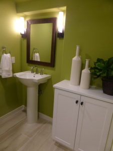
The powder room is right off the kitchen. It’s larger than usual, with space for an optional linen cabinet. The model shows the standard pedestal sink and upgraded framed mirror. I never really like having the bathroom off the kitchen.
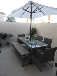
The interior courtyard offers a bit of outdoor living. It has space for a grill, along with a table and chairs.
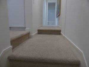
All three bedrooms are on the second floor. The staircase ends in a hallway, with the master bedroom to the left and the secondary rooms to the right. Rather than having the staircase include one more step, there is a short part of the hall at one level, then both the left and right wings go up one more step. I imagine this causing problems in the dark and don’t really see any reason for it.
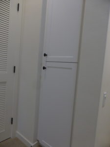
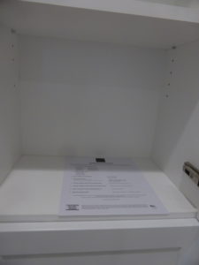
The laundry area sits to the left, just after going up the extra step. There is an option for one upper and lower linen cabinet, but they are incredibly shallow (not quite as deep as the 8 ½ x 11” sheet of paper shown in the picture). The stacked washer and dryer are behind a door right next to the cabinets.
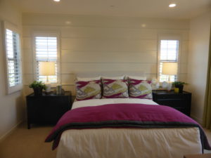
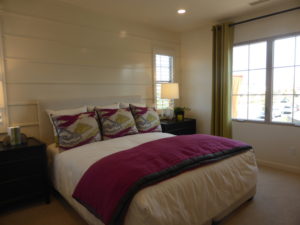
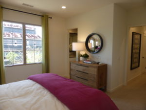
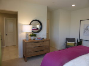
The master bedroom is pretty small, with just enough space for a queen size bed and two nightstands. Windows on three walls let in a lot of light, with the biggest window facing the side of the house rather than the front. The recessed LED lights are an upgrade.
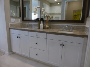
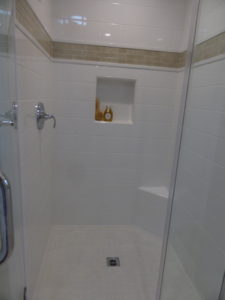
The master bathroom has two sinks set into a shared vanity. As in the other homes, each sink has a set of cabinets beneath it and there is a shared set of drawers in the middle. The shower is a bit smaller than average with a corner seat and a cutout on one wall. The Pental Quartz countertop in Oasis, tile detail at splash and shower, framed mirror, and frameless shower enclosure in chrome are all upgrades. There is a walk-in closet is at the far end of the bathroom.
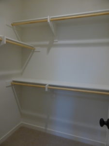
The secondary bedrooms are down another hallway toward the back of the house. Bedroom 2 is an average size with a single window facing the side of the house. There is a narrow bypass closet with upgraded mirrored doors. The recessed lighting is an upgrade.
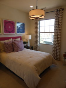
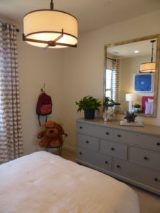
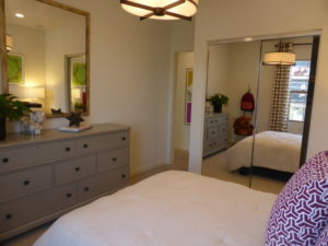
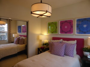
Bedroom 3 is right next to bedroom 2 and is about the same size. It has one window facing the back and a small one on the side. The bypass closet is wider and has standard doors. The recessed lighting is an upgrade.
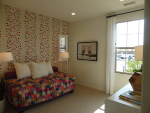
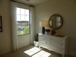
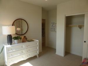
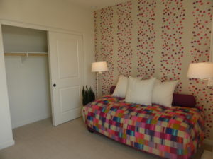
Bathroom 2 is at the very end of the hall. The vanity only has one sink, but it is wide enough for a set of cabinet and drawers. The countertop and tile detail in the backsplash are upgrades. The shower/tub combo is shown with the standard tile.
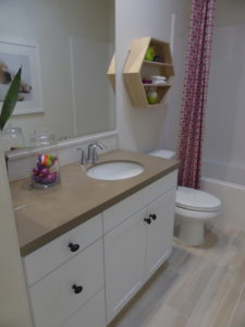
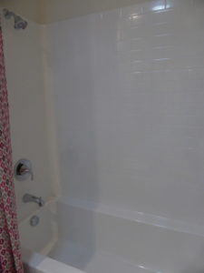
Residence 3 is smaller than both residences 1X and 2 but the end unit carries a premium because this one costs more than the others. While residences 1X and 2 have ground floor bedrooms, all of the bedrooms in residence 3 are on the top floor. While I understand the appeal of an end unit, the layout of this home and size of the rooms doesn’t seem worth the price.
Residence 4
1,526 square feet
4 bedrooms, 3 bathrooms
Optional loft at bedroom 4
Prices start from $673,043
Residence 4 is also an end unit. Upgrades found throughout the home include flooring, window treatments, recessed LED lights, decorator’s items (lights, ceiling fans, etc), satin white shaker style cabinet s with satin nickel cone knobs, bath accessories and bath fixtures in brushed nickel, interior door hardware, and 5 ¼” baseboards.
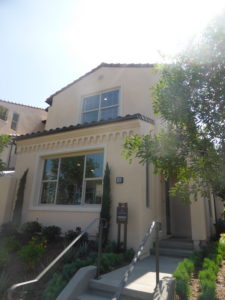
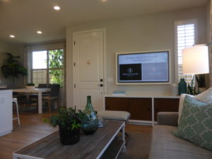
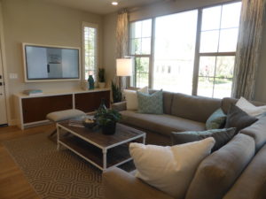
The front door leads directly into the living room. Three windows face the street, a small one faces the front walk, and two more face an interior courtyard. The room is right next to the kitchen, giving it more of a great room feel.
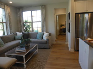
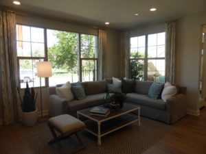
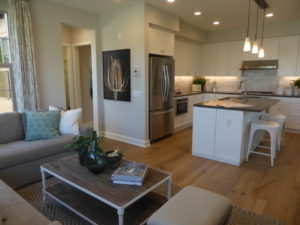
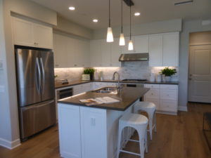
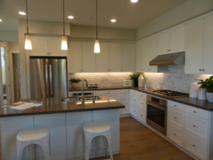
The kitchen has a similar set up to the others, with the biggest difference being the sink and dishwasher are in the island, which also has seating for two on the other side. The fridge and range are in the same locations as in residence 3, while this home has an upgraded microwave door near the fridge. This kitchen has more cabinets and drawers than in any of the other Lantana kitchens. Upgrades in the kitchen include the Bosch appliance package, Broan 600CFM hood, linear marble kitchen splash, all drawer package, sterling double basin stainless steel sink, task lighting, pendant outlets, and task lighting are upgrades.
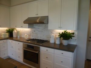
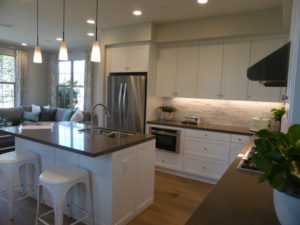
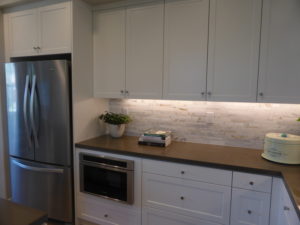
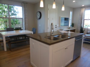
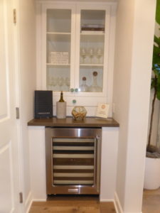
Unlike residence 3, where the garage access is directly off the kitchen, this home has a small vestibule behind the kitchen. In addition to the garage access, the stairs are on the left, and there is a small drop zone on the right. The model actually shows the optional butler’s pantry, with upgraded Pental Quartz countertop, wine refrigerator, and designer knobs are upgrades.
The dining area is adjacent to the kitchen. It looks like it would comfortably seat about six people, with a possibility of squeezing in eight. There are two windows facing the side of the house.
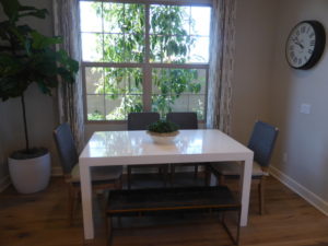
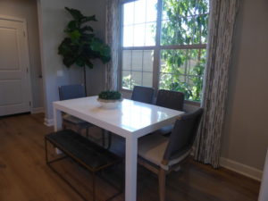
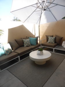
A hallway off the living room leads to the courtyard and the downstairs bedroom and bathroom. The courtyard is on the left, through a single French door. It has space for a grill, table, and chairs.
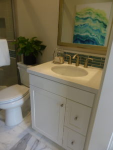
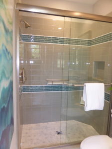
The bathroom is on the right. The vanity is pretty small, with a single cabinet and two narrow drawers. The shower is a good size, with a corner seat and cutout on one wall. The countertop, backsplash, tile detail at shower, frameless shower enclosure, and ADA fixtures and accessories are upgrades.
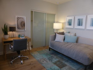
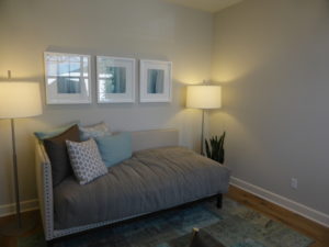
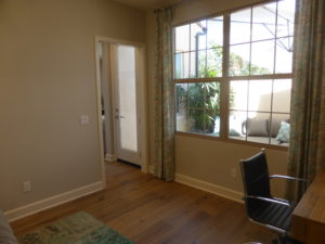
The main floor bedroom is at the end of the hall. The room is a good size and has a bypass closet shown with upgraded glass doors. The only windows face the courtyard.
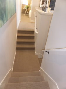
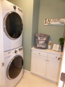
On the second floor, the stairs come to a small landing, then have four more steps going up to the right and four more on the left. The steps on the left lead to the laundry area. It has stacked machines and a set of lower linen cabinets. An additional set of upper and lower cabinets is in the hall.
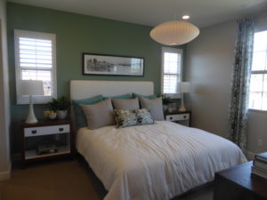
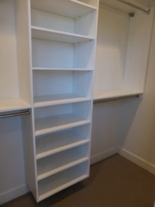
The master bedroom is at the end of the hall, facing the front of the house. It is similar in size to the one in residence 3 and has additional windows on the side. The walk-in closet is off the bedroom, rather than the bathroom, and is shown with upgraded built-ins.
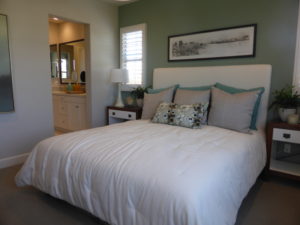
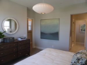
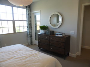
There is an option for a door separating the bedroom and bathroom. The vanity is the same as in all the other master bathrooms. Another set of upper and lower linen cabinets sits across from the vanity and are shown with upgraded glass doors on top. The shower sits next to the linen cabinets and is quite small. There is a corner seat and cutout on one wall. The vanity countertop, backsplash, shower detail, frameless glass enclosure, and framed mirror are upgrades.
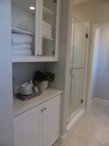
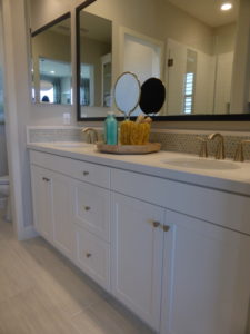
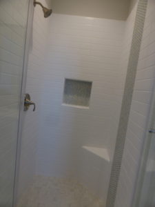
On the right side of the stairs, the model shows an optional loft in lieu of the standard bedroom 4. It has a single window on the side of the house. With the standard bedroom, the bypass closet would be against the hallway. It would also have a door leading to a Jack and Jill bathroom. With the loft setup, the bathroom is accessible only from inside bedroom 3.
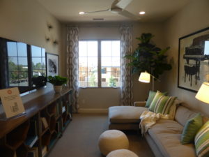
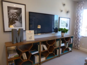
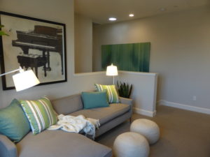
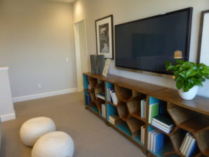
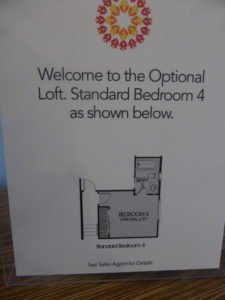
Bedroom 3 faces the back of the house. It has a walk-in closet in one corner of the room, shown with the standard shelving. This room has an en-suite bathroom. With the loft setup, it has a normal door leading into it, but with the standard bedroom 4, it would have a pocket door. The vanity is pretty small and there is a shower/tub combo. The backsplash and tub enclosure are upgrades.
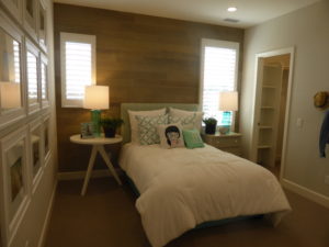
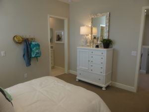
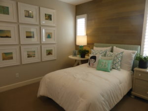
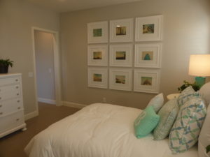
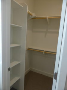
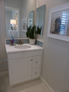
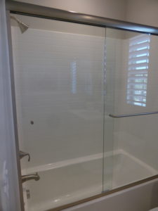
Residence 4 has a good layout with the private first floor bedroom and the flexibility of the loft or extra bedroom upstairs.
The Lantana collection has pretty standard townhomes. The kitchens are laid out well and most have a ground floor bedroom. I didn’t like the extra steps in residences 3 and 4 that separate the master bedroom from the other bedrooms. I think residence 3 is overpriced but the others seem in line with the current market.