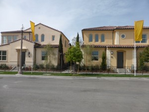
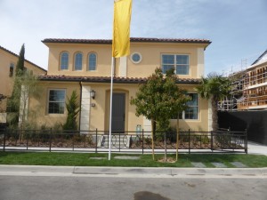
The Silverleaf Collection in Portola Springs is built by California Pacific Homes. These are courtyard homes, or detached condominiums, so they are detached from each other but sharing a motor court rather than a private driveway. There will be a total of 147 units with six homes per motor court. There are three different floor plans, plus a 1X variation that will only have two total units, with plans to release both in phase 8. Some of the homes are set far back from the street, behind the other units. The shared walkway goes between the condos, rather than around the outer edge. The neighborhood is in the middle of the new area of Portola Springs, with half the homes on the western edge and half on the eastern edge. The condos all have three bedrooms and 2.5 – 3.5 bathrooms, with a total of 1,636 – 1,839 square feet. All homes have an attached, 2-car, side-by-side garage. Elevation styles include Spanish Revival, Formal Spanish, and Santa Barbara.
Included Features
The interior of the Silverleaf homes comes standard with satin finish white Thermofoil cabinetry with contemporary style doors and satin nickel designer pulls; tile at entry, kitchen, baths and laundry; plush carpet throughout living areas; bullnose corners; structured wiring with enhanced CAT-5E wire to support phone and high speed internet, multimedia and TV/data outlets; powder room with Kohler® pedestal sink, Moen Eva polished chrome faucet, and floating beveled mirror; and interior laundry room with cabinetry. The kitchens include Bosch stainless steel appliance package including freestanding range, microwave/hood, and dishwasher; Pental Quartz counters in oyster with 6-inch splash and full splash at range; stainless steel single basin sink with Moen Arbor pull-out faucet in spot resistant stainless steel; and cabinet depth refrigerator space plumbed for ice maker. The master suites include a stall shower with 3” x 6” matte ceramic tile surround and clear glass enclosure; and dual undermount sinks with cultured marble countertop and Moen Eva polished chrome faucets. Additional standard features include fire resistant, concrete tile roofs; energy efficient vinyl windows, dual-glazed with low-E glass; central air with dual programmable thermostat; high efficiency gas furnace; LED recessed lighting; tankless water heater; and energy efficient radiant barrier roof.
Schools
Portola Springs students get to take advantage of the newest schools in the Irvine Unified School District. Portola Springs Elementary School opened in the fall of 2015, with advanced technology and modern amenities throughout. The village is zoned for Jeffrey Trail Middle School, another high-tech, modern facility that opened in 2013. Finally, while Portola Springs currently feeds into Northwood High School, they will be rezoned to the brand new Portola High School, scheduled to open in the August of 2016.
Basic Neighborhood Financial Information
Approximate HOA Dues: $134 per month for the Portola Springs Community Association and an additional $98 per month for the Silverleaf Neighborhood Association.
Base Property Tax: 1.05%
AD Tax: $2,200 per year
CFD Tax: $1,700 per year
Prices start at $684,410 for Residence One; $704,709 for Residence Two; and $752,622 for Residence Three
Residence 1
1,636 square feet
3 bedrooms, 2.5 bathrooms
Bonus room
Starting from $684,410
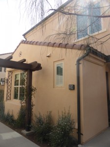
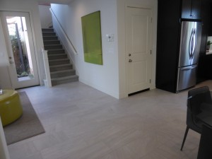
Residence 1 is set back from the street, down a landscaped walkway between the other units. The door is on the side, rather than facing the walkway directly. I entered the home into a small foyer, with direct views of the dining room on my right and the living room ahead of me. Throughout the model, the flooring, speakers, maple shaker style cabinets in Espresso with brushed nickel knobs, window treatments, and 5 ½” baseboards are upgrades.
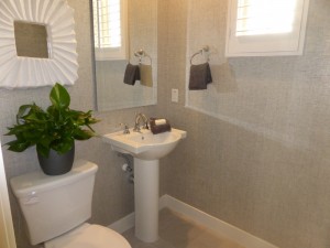
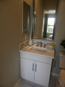
The powder room is just to the left of the foyer. It shows the standard pedestal sink and hardware without any upgrades. It has a small, high window facing the walkway. I really dislike the location of the powder room, both because it is so close to the front door and because the dining room has a direct view into it. I would probably keep the door closed at all times.
The dining room is just to the right of the foyer. It would probably best hold a table for six, though there is room to expand for company. You have to walk around the table to get to the kitchen, so anything too big would seem in the way. There are sliding doors leading to a small courtyard.
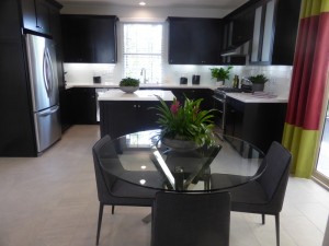
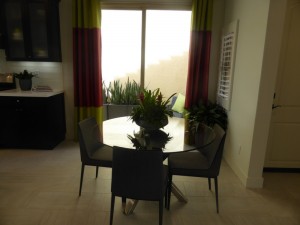
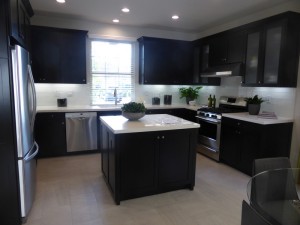
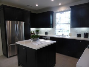
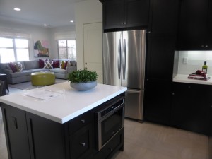
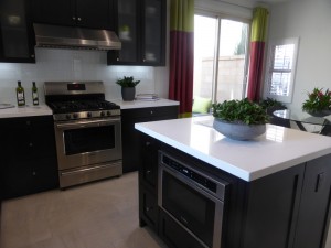
The kitchen is behind the dining room. The small, center island has cabinets on one side and drawers plus the microwave on the other. While the built-in microwave is an upgrade, I think it is too low and difficult to use in that location. The standard microwave would be a combination hood and sit above the range. The rest of the kitchen makes a u-shape around the island. The fridge is on the left, the sink and dishwasher are in the middle, and the range is on the right. There is ample counter space and plenty of cabinets, but only one pantry-height cupboard. Additional upgrades include Pental Quartz slab countertops in Seashell with full glass tile splash, frosted glass upper cabinets, and Kohler double basin white cast iron sink. Direct access to the garage is right next to the fridge, where there isn’t any counter space. You could put a narrow table or bench just around the corner at the foot of the stairs.
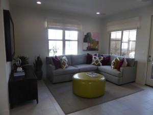
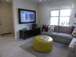
The living room is toward the back of the first floor. It has two windows facing the walkway and two more facing a private courtyard. A single French door also opens to the courtyard. The recessed LED lighting is an upgrade.
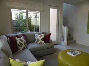
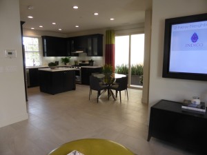
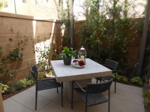
The courtyard is pretty small, with just enough space for a table for four. There is an option for a door leading directly to the garage as well.
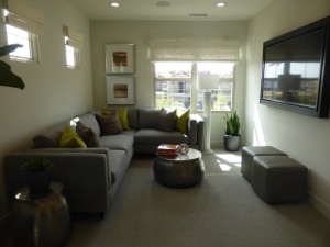
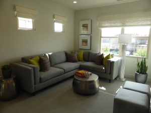
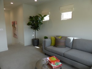
On the second floor, the stairway opens directly into the bonus room/loft. The room is long and narrow, with two windows on one wall and three small, high windows on another.
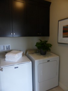
The laundry room is across from the bonus room. It has side by side machines and upper cabinets.
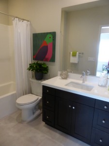
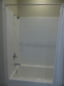
The secondary bathroom is just past the laundry room. It has a single sink set into a vanity with one set of cabinets and two sets of drawers. The countertop and splash are upgraded Pental Quartz. This bathroom also has a shower/tub combo, shown with the standard white tile.
Bedroom 3 is across from the bathroom. It has one large window facing the back. Overall, this is a good sized room. Its closet is large too, with three bypass doors instead of the standard two. The recessed LED lights are upgrades.
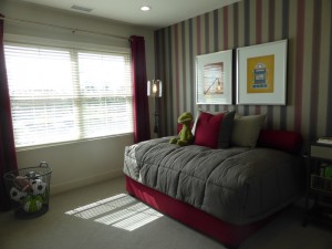
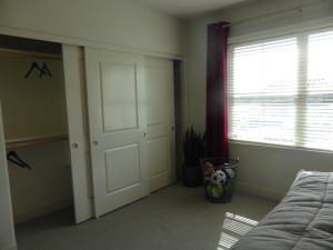
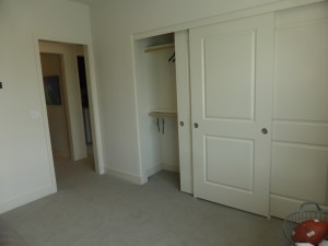
Bedroom 2 is just down the hall, also facing the back of the house. There is an additional window facing the side. It is a smaller room and has just the standard two-door closet. The pendant light and outlet are upgrades.
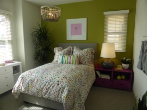
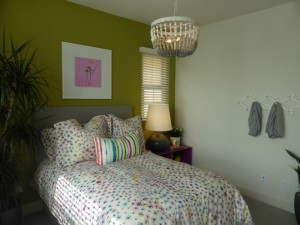
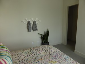
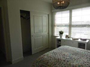
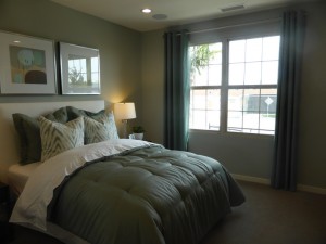
The master suite is next to bedroom 2. The bedroom is only a little larger than bedroom 3, so it doesn’t have a lot of extra space. The corner room has windows on two walls, though both are fairly small. Within the bedroom, there is a small, two-door closet, shown with upgraded frosted glass doors. The LED lighting is also an upgrade.
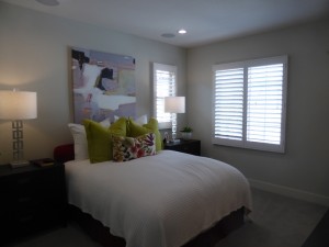
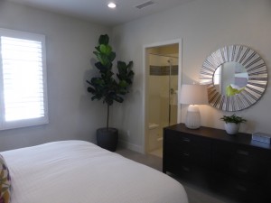
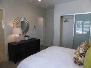
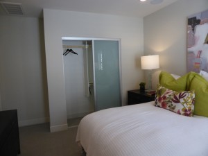
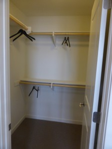
There is an option for a door separating the bedroom from the master bath. Just inside, the walk-in closet is on the right. It is small and angular, shown with the standard shelves and poles. The shower is across from the closet. It is an average size and has a full seat at the back. The surface of the seat and decorative tiles are upgrades. The vanity is at the back of the bathroom. It has two sinks, each with a set of cabinets and a shared set of drawers between them. The countertop and splash are upgrades.
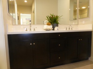
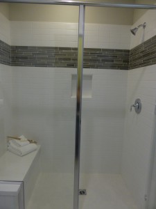
Residence 1 has some serious drawbacks. As I mentioned earlier, the dining room facing the powder room is a big turnoff. In addition, this house does not have a single coat closet, so there is a significant lack of storage space. Upstairs, there are linen cabinets above the washer and dryer, but no other linen storage or general closets.
Residence 2
1,640 square feet
3 bedrooms, 2.5 bathrooms
Bonus room
Starting from $704,709
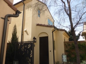
Residence 2 was also set back from the street, just next to Residence 1. The entry is on the side, with the front door opening directly into the living room. Throughout the model, the flooring, speakers, Shaker style cabinet doors with oil rubbed bronze egg-shaped knobs, and window treatments are upgrades. Though the door style is upgraded, the satin white Thermofoil finish is standard.
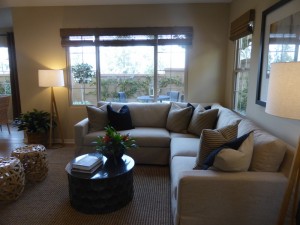
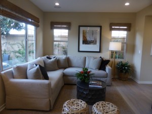
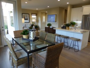
The living room is bigger and brighter than in Residence 1. It is more open to the other rooms downstairs, making it feel bigger than it really is. Windows face two sides of the house, including three facing the private courtyard. The LED lights are upgrades.
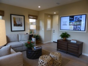
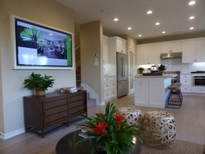
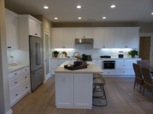
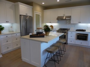
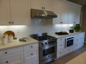
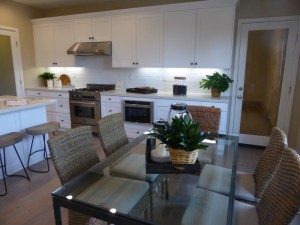
The kitchen is behind the living room. I like the L-shape layout, since it makes the room feel bigger than a U-shaped kitchen. The center island has seating for 3-4 people on one side and the sink and dishwasher on the other. The shorter wall has the fridge, a short counter, and several deep drawers. The walk-in pantry is next to the fridge and is modeled with the optional cabinet near the entrance. The pantry also includes a storage area under the stairs and is shown with an upgraded frosted door. The longer wall holds the range and built-in microwave, which is again upgraded from the standard microwave/hood combo. This wall has an upgraded drawer package, which includes numerous drawers below the counters and several cabinets above; there are no cabinets below the counters. Other upgrades in the kitchen include the Bertazzoni range with Broan hood, Thermador dishwasher, KitchenAid refrigerator, full tile splash, and Kohler single basin white cast iron sink. Direct access to the garage is in one corner of the kitchen.
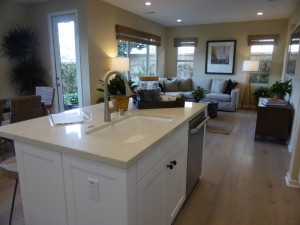
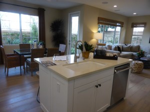
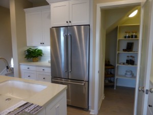
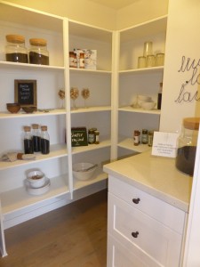
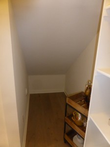
The dining room is next to the kitchen. Two windows on one wall and a single French door on another open to the courtyard. Because this dining room is off to the side, it has space for a bigger table than in Residence 1, without feeling like it’s in the way.
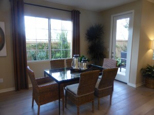
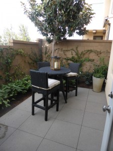
The courtyard is pretty small, but can hold a table and grill.
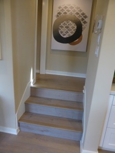
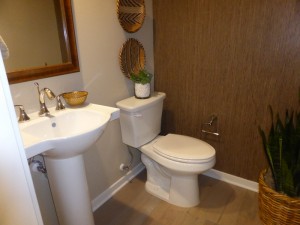
After going up the first three stairs to the second floor, there is a small landing with a powder room. It has the standard pedestal sink and an upgraded framed mirror.
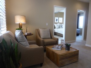
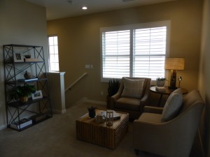
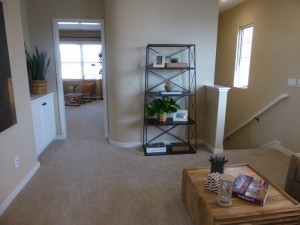
As in Residence 1, the top of the stairs open up to a bonus room. This one is smaller than in Residence 1 and with hallways/doorways coming off it in three different places. One corner has a base linen cabinet.
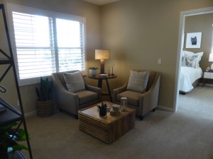
Bedroom 2 is directly off the bonus room. It has windows on two walls and upgraded recessed lighting. The two-door closet is modeled with upgraded mirrored doors. The room is an average size.
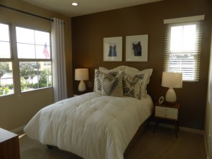
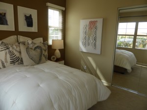
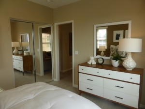
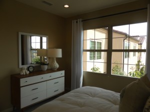
Bedroom 3 is almost a mirror image of bedroom 2. The windows are in the same places and the closet is the same size. The lighting and closet are not upgraded in this room; however, it does have an upgraded ceiling fan and outlet.
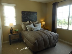
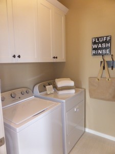
The laundry room is across from bedroom 3. It has side-by-side machines and upper cabinets.
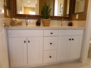
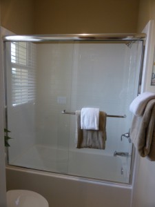
The secondary bath is next to the laundry room. Its vanity has two sinks, with two sets of cabinets and one set of drawers. The countertop, splash, and framed mirror are upgrades. The shower/tub combo is through a separate door. It has the standard tile and an upgraded enclosure.
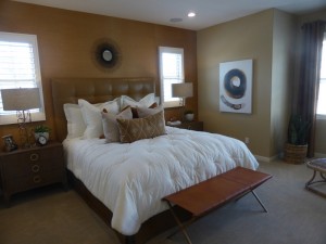
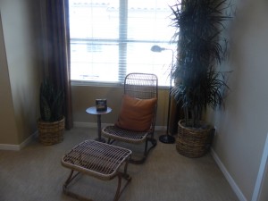
The master suite is at the opposite side of the bonus room. It is much bigger than the bedroom in Residence 1. It even has a recessed area beneath the window that would make a nice seating area. However, it doesn’t have any full walls aside from where the bed is, so placing a longer dresser would be difficult. There are two walk-in closets. The first one is in the bedroom and has bypass doors. The second is just inside the entry to the bathroom. The second one is bigger and has a single, standard door. The recessed LED lights in the bedroom are upgrades.
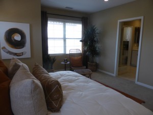
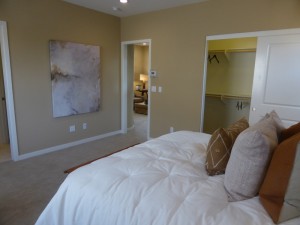
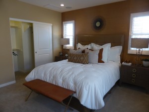
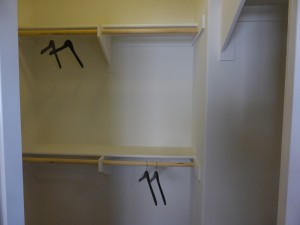
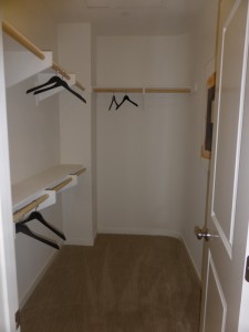
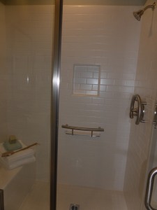
There is an option for a door separating the bedroom and bathroom. The vanity is straight ahead, with two sinks and a somewhat short counter. The countertop, splash and framed mirror are upgraded. The shower is somewhat small, but it does have a small corner seat and a recessed shelf for bottles. The tile detail is upgraded. There are optional cabinets above the commode.
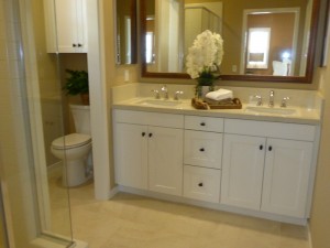
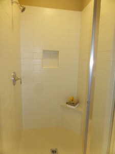
As in Residence 1, this condo lacks storage. It does have the walk-in pantry, which offers some additional space, but it still lacks a coat closet. I like the layout better on the first floor and think it all feels more open. I do wish the powder room was on the main level though, rather than up three steps.
Residence 3
1,664 – 1,839 square feet
3 bedrooms, 3.5 bathrooms
Tech space
Optional loft in lieu of tech space
Starting from $752,622
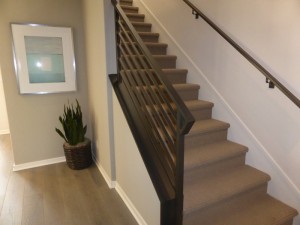
Residence 3 faces the street, making it easier for guests to find but a little less private. Throughout the model, the upgrades include flooring, speakers, stair rail, brushed nickel bath fixtures and accessories, and brushed nickel lever door hardware. This home has a true entryway, rather than entering directly into a room. The staircase is just across from the door and the walkway has space for a table or bench.
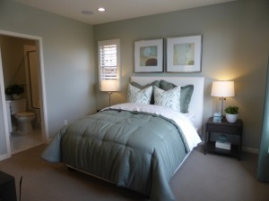
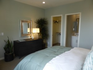
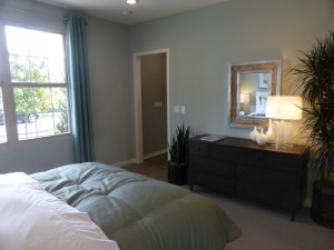
Bedroom 2 is actually on the first floor, right off the foyer. The room is quite spacious and bright, with windows facing both the street and side of the home. It has a walk-in closet and en-suite bathroom. The recessed lighting is an upgrade. The vanity is tiny, with barely enough space on the counter for basic toiletries. The shower is a good size and includes both a seat and shelf. Upgrades include linear mosaic tile at vanity, framed mirror, shower tile, and ADA bath fixture.
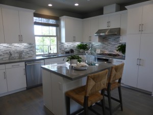
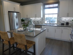
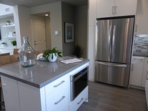
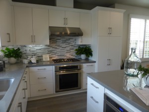
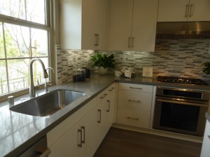
The entryway opens up to the kitchen, which has a window facing the street. The center island is small and can only seat two people. The microwave again is shown in an upgraded built-in position on the other side of the island, though I still think this location is awkward. The fridge sits on one wall with very narrow cabinets on each side. The longest wall holds the sink and dishwasher, while another shorter wall has the range and pantry-height cupboards. The Thermador appliance package, soft close drawer package, quartz countertops, full splash, and reverse osmosis system are all upgrades. Overall, this kitchen offers a lot of storage. I would have liked to see lazy susans built into the corner cabinets, making the spaces at the back more accessible.
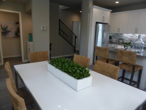
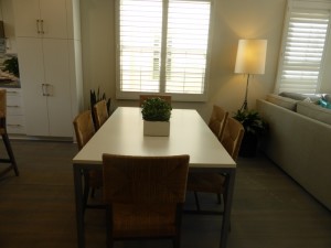
The dining room is just past the kitchen. It can comfortably seat six with space to expand if needed. Windows face the side of the home. There aren’t any walls suitable for a hutch, but a low unit could sit against the window. The recessed lights are upgrades.
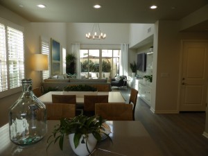
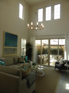
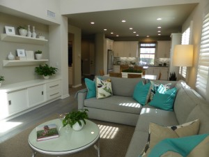
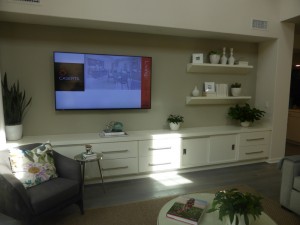
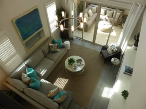
The living room is behind the dining room. It has vaulted ceilings, with windows up high letting in extra light. Additional windows face the side of the home and sliding doors open to the private courtyard at the back. The room is a good size and it appears that the built-in unit is actually included in the home. Only the pendant light and outlet are listed as upgrades.
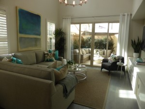
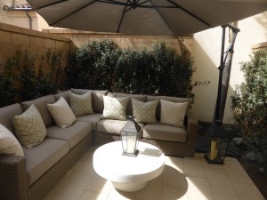
The courtyard is pretty small, as in the first two Silverleaf residences.
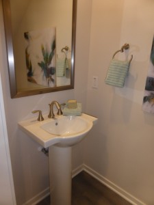
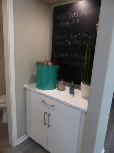
An alcove across from the dining room leads to the powder room and garage access. The powder room shows the standard pedestal sink. There is also a launch area across from the garage door, with included base cabinets.
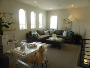
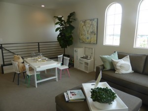
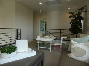
At the top of the stairs, the standard home has a small tech space on the left, with the remainder of the front of the house open to the first floor living areas. However, the model shows the optional loft instead, which sits above the kitchen and dining room, but is still open to the living room below. The loft is a good size, with several windows on two walls. The recessed lights are upgrades.
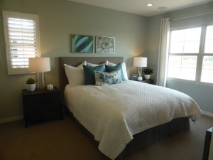
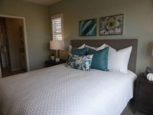
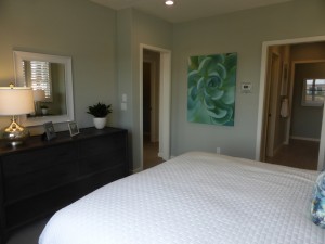
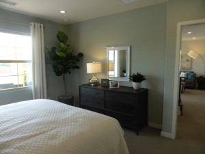
The master suite is at the top of the stairs on the right. It is smaller than in Residence 2, but with a layout that offers more space for a dresser. Windows face both the side and back of the house. The LED lighting is an upgrade.
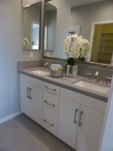
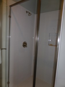
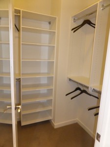
The master bath has the option for a door. Just inside it, the vanity is on the right and the walk-in closet is on the left. The vanity has two sinks but is on the smaller side. The countertop, splash and framed mirror are upgrades. The closet features an upgraded mirrored door and organizer system. The stall shower is next to the vanity and it is tiny. The tile detail is an upgrade.
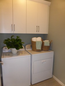
The laundry room is across from the stairs. It has side-by-side machines and upper cabinets.
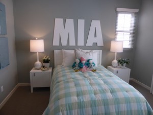
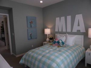
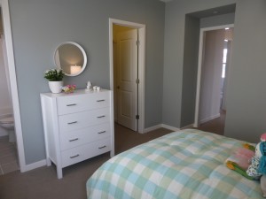
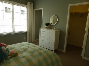
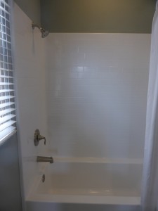
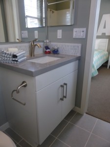
Bedroom 3 is at the end of that hall. It is an average size, with windows facing the front and side of the house. There is a walk-in closet and upgraded recessed lights. The room also has an en-suite bathroom. The vanity is quite small here too, and shown with an upgraded countertop and splash. The shower/tub combo shows the standard features.
I think Residence 3 has some great features. I like having a true foyer at the entry and a launch area by the garage, as well as not having the garage access in the kitchen. I really like the vaulted ceilings in the living room, which aren’t seen too often in a detached condo. This is also the only Silverleaf residence with a first floor bedroom. It also has the versatility upstairs of either a tech space or loft. On the downside, the outside space is quite small and it still doesn’t have a coat closet or extra linen storage.
Overall, I didn’t love the Silverleaf collection. There are some key design flaws, such as the lack of closet space and proximity of the powder rooms to the dining rooms. Residence 3 is a step up from the other two homes, but still not ideal. These homes have very little outdoor space, but aren’t too far from the two new neighborhood parks.