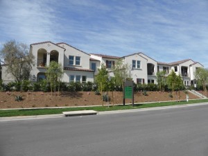
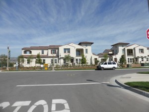
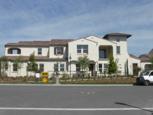
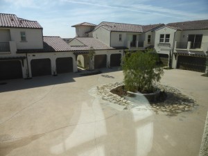
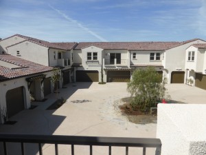
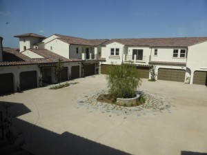
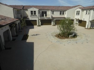
The Vine Collection in Portola Springs is built by William Lyon Homes. These are higher density flats with nine units in most buildings and two buildings forming a u-shape around a shared motor court. There are two sets of buildings that only have four units each (plans 2, 3, 6, and 7), forming a u-shape around their shared motor court. There are seven different floorplans, combining for 106 total homes. Nine unit buildings have one every model, plus a second, slightly different flat of plans 2 and 7. The neighborhood is located in the center of the new area in Portola Springs, with easy access to both neighborhood parks. All homes have an attached, two-car garage; most are side-by-side but some residences 2 and 7 have tandem parking. Residences 1 – 3 are on the ground level. Residences 4 – 7 have a ground level entry but all rooms are on the second floor. The flats range from 1 – 2 bedrooms, and 1.5 – 2.5 bathrooms, with 1,234 – 1,700 square feet of living space.
Included Features
The exteriors of the buildings have fluorescent light fixtures; fire-resistant concrete tile roofs; energy-efficient weather stripping and insulation; and 8’ fiberglass entry doors with Kwikset hardware in oil rubbed bronze. The standard interior features include tankless water heater; ceramic tile entries; energy-saving, low-E vinyl windows; plush carpeting in living areas; programmable digital Wi-Fi thermostat; pre-wired outlets for phone, TV/data, multimedia, satellite and flat-panel; recessed LED can lighting; and water conserving low-flow aerator on all bathroom faucets. The kitchens include stainless steel Whirlpool® appliances with a four-burner, 30” slide in gas range, microwave/hood combo, and ENERGYSTAR® dishwasher; white Thermofoil cabinetry with recessed panel-style doors, concealed hinges, and satin nickel pulls; granite countertop with 6” backsplash and full splash at range; stainless steel double sink with Delta® single-handle pull-down faucet; and pre-plumbed water line for icemaker. Finally, the master bedrooms and bathrooms have white Thermofoil cabinetry with matte cultured marble countertops with a square edge; chrome frameless shower enclosure with clear glass; China sinks; Delta® chrome faucets; and chrome finish hardware throughout. Some of the numerous optional upgrades offer ceramic tile options at showers; flooring; open stair systems; cabinet finishes and built-ins; mirrored closet doors; additional recessed lighting and pre-wire, including ceiling fan wiring; countertop and backsplash in upgraded tile, granite, or quartz; security systems; garage lighting and floor coating; appliance packages, including washer, dryer, and/or fridge; crown molding and upgraded baseboards; closet and pantry organizers; and decorative items like window treatments, ceiling fans and lighting fixtures.
Schools
Portola Springs students get to take advantage of the newest schools in the Irvine Unified School District. Portola Springs Elementary School opened in the fall of 2015, with advanced technology and modern amenities throughout. The village is zoned for Jeffrey Trail Middle School, another high-tech, modern facility that opened in 2013. Finally, while Portola Springs currently feeds into Northwood High School, they will be rezoned to the brand new Portola High School, scheduled to open in the August of 2016.
Basic Neighborhood Financial Information
Approximate HOA Dues: $134 per month for the Portola Springs Community Association and an additional $220 per month for the Vine Neighborhood Association.
Base Property Tax: 1.0035%
AD Tax: $1,966 per year
CFD Tax: $1,700 per year
Prices start at $502,990 for Residence One; $522,990 for Residence Two; 584,990 for Residence Three; $604,990 for Residence Four; $615,990 for Residence Five; $630,990 for Residence Six; and $634,990 for Residence Seven.
Residence 1
1,234 square feet
1 bedrooms, 1.5 bathrooms
Den
2-car garage, with perpendicular spots and two garage doors
Starting from $502,990
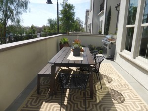
Residence 1 homes are all on the ground floor. They are at the front corner of the building, with one garage door facing the street and the other in the motor court. This model is not included in the four-unit buildings. There is a front patio facing the shared walkway, with plenty of space for seating and a grill. Throughout the home, upgrades include the security system, stereo speakers, flooring, window treatments and wall coverings, paint, and decorator items.
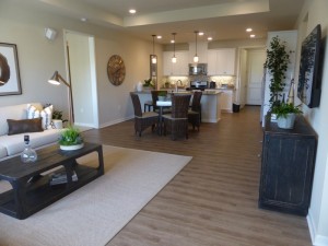
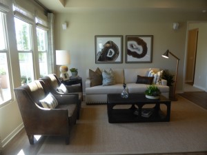
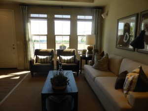
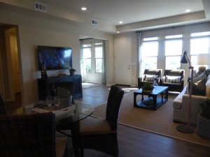
The front door leads directly into the great room. It has three windows facing the patio. The wall for a mounted TV is next to the front door. While the room is a good size, the setup is a bit strange. Upgrades include six optional flush lights and a speaker music package.
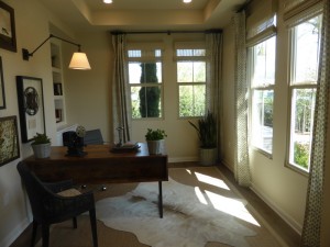
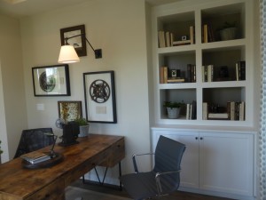
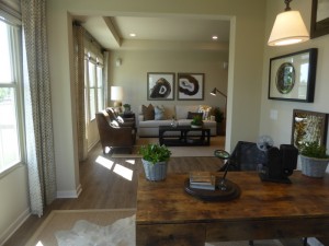
A wide, open doorway to the right of the entry leads to the den. Because it sits on the corner, it has two windows on each of two walls, letting in a lot more light than other rooms in the house. It’s not a large room, but works well as an office or second sitting room. It does not have an option for doors, so it couldn’t really be used as a bedroom. The base cabinet is included, but cabinet knobs and the bookshelf above it are upgrades. Additional upgrades include four flush lights, light outlet at wall, and light fixture.
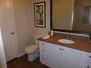
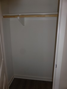
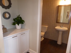
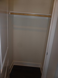
Back in the great room, a doorway on the far side of the TV wall leads to a coat closet and powder room. The closet is small, with just a single shelf and pole. The bathroom comes standard with a pedestal sink, but the model shows the optional vanity with upgraded countertop and splash instead, along with an upgraded framed mirror. The door seen in the bathroom just opens to the heating and air unit.
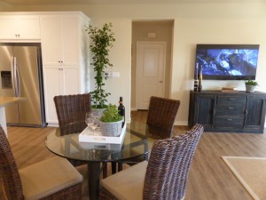
The dining room is just behind the great room. While the space itself isn’t that big, it is fully open to the great room so it could hold an extended table when needed. There is room for four additional seats at the kitchen peninsula. One wall next to the island offers space for a small hutch.
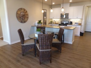
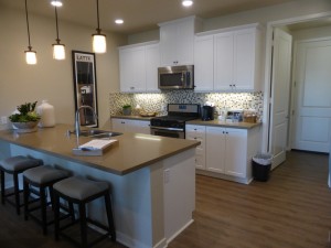
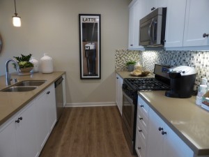
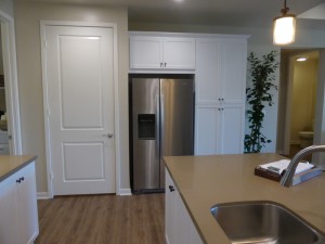
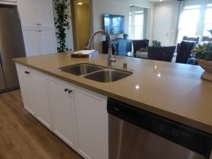
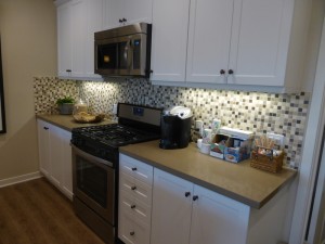
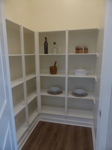
The kitchen is small but functional. The main peninsula faces the dining area and holds the sink and dishwasher. The opposite wall has the range and microwave. Both sides have ample counter space and cabinets, along with one set of drawers near the range. The third wall holds the fridge, pantry-height cupboards, and a large walk-in pantry. The cabinets show the included finish and door style, but have upgraded knobs. The countertop and backsplash are upgraded, along with the under cabinet lighting, J-box, and pendant lights. This kitchen shows the standard appliance package, along with an optional refrigerator.
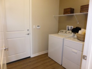
The laundry room sits behind the kitchen. It has space for side by side machines and an option for upper cabinets that are not shown in the model. Access to the garage is at the back of the laundry room.
The master bedroom is to the left of the great room. It has two windows facing the front patio. One wall borders the entry and stairs for the attached Residence 7. The room is an average size and is shown with optional flush lights, ceiling fan prewire, speaker package, and light fixture. There is also an option for a door separating the bedroom from the bathroom.
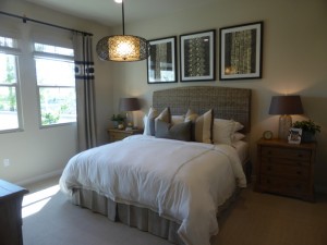
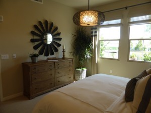
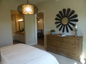
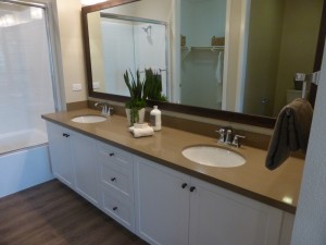
The master bath has a large vanity with two sinks, two sets of cabinets and one set of drawers. The countertop, backsplash and framed mirror are all upgraded, but the cabinets and their hardware are standard, as are the faucets. The shower/tub combo is typical of what you would normally find in a secondary bathroom and is modeled without any upgrades. The walk-in closet is a decent size and is shown with the standard shelf and pole.
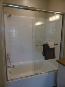
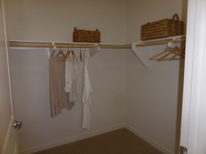
Residence 1 is the only one bedroom option in the Vine collection. The den makes the flat a little more versatile. This unit will appeal to those who prefer single story living. I like that many of the standard features were included in the model so that potential buyers can see what they are really getting as their base package.
Residence 2
1,240 square feet
2 bedrooms, 2 bathrooms
2-car side-by-side garage
Starting from $522,990
Residence 2X
1,248 square feet
2 bedrooms, 2 bathrooms
2-car tandem garage
Residences 2 and 2X are almost identical, so I will describe both below. The key difference is with the garage, In Residence 2, there is a side-by-side garage with access off the laundry room (as shown in the model). Residence 2X has a tandem garage with access directly off the kitchen. The pantry and coat closet are slightly larger in the standard Residence 2, while the shape of the master closet is more square in 2 and rectangular in 2X. From looking at the floor plans, it seems the extra eight square feet in the 2X may be in the master closet, due to the changed location of the garage (the standard 2 has a small nook for the trash cans that juts into the closet space).
All 9-unit buildings have both a 2 and a 2X, which are always entirely on the ground floor. Each of the two four-unit buildings have one 2X flat. All 2 and 2X homes are located in the middle of the building, with attached walls on both sides bordering the entryways for the neighboring flats. As in Residence 1, these homes have a large front patio facing the shared walkway. Upgrades throughout the model include security system, speakers, flooring, window treatments and wall coverings, paint, and decorator items.
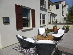
The setup of the common area is quite similar to Residence 1 as well. The front door leads directly into the great room, with the TV-mount wall right by the door. Three windows face the front patio and the room is wider than in the previous model. The six flush lights and speaker music package are upgraded.
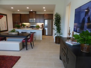
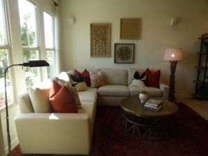
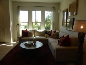
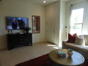
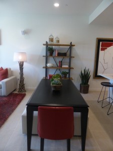
The dining area is right behind the great room. It is a little bigger than in Residence 1 and has a full wall for a hutch. There are not any upgrades shown in the dining room.
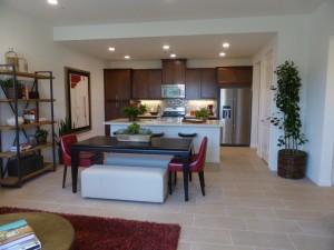
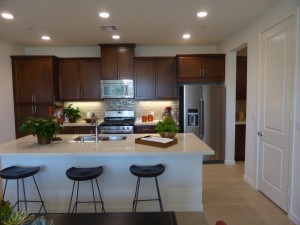
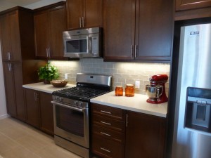
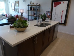
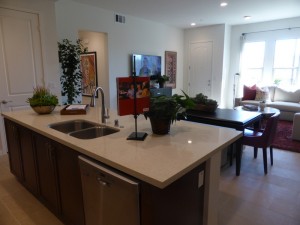
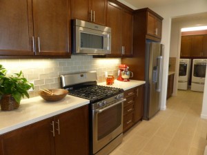
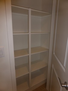
The kitchen is just behind the dining room. Rather than a peninsula, this one has an island, again with seating for four. The sink and dishwasher are in the island as well. The back wall holds the range, microwave and fridge. There is an option to move the microwave to the far left where the pantry-height cupboards sit. In the Residence 2X, the door to the garage is right next to those pantry cupboards. The main pantry is not a walk-in, but does have included shelving. There aren’t as many cabinets in this kitchen as in Residence 1, so organizing the space will be a challenge for buyers with a lot of cookware and baking/serving dishes. Upgrades in the model include the countertop and backsplash, cabinet stain and door style, Maytag appliance package, and under cabinet lighting.
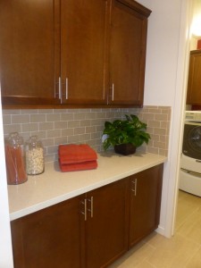
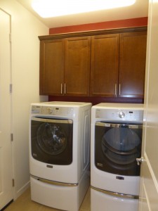
A butler’s pantry off the kitchen does offer an additional set of base cabinets with optional uppers, as shown in the model. This provides extra storage for lesser-used items. The laundry room is on the far side of the butler’s pantry. It is shown with optional upper cabinets. As this is a standard Residence 2, the door to the garage is located in the laundry room.
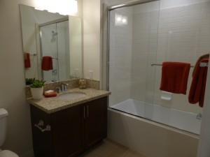
The bedrooms and bathrooms are located down a hallway off the great room. The small coat closet is at the beginning of this hallway on the left. The secondary bath is just past the closet. It has a small vanity and a shower/tub combo. The vanity has upgraded counters, cabinets, and backsplash. The tile tub surround is also upgraded from the basic square tiles. The bathroom door swings from left to right in the Residence 2 but from right to left in the 2X.
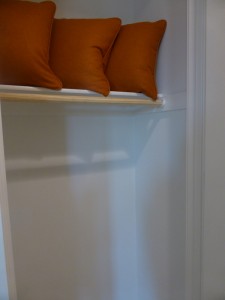
The secondary bedroom is across from the bathroom. It only has one small window facing the front patio so it won’t get much light throughout the day. It is an average sized room with a two-door closet, shown here with upgraded mirrored doors. The flush lights are also upgrades.
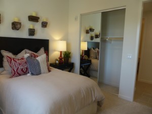
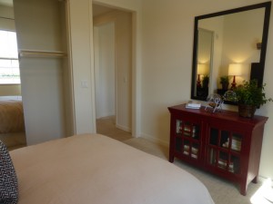
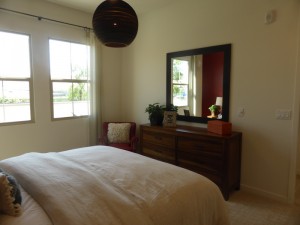
The master suite is at the end of the hall. The bedroom is a little bigger than in Residence 1 and has two windows facing the patio. It is shown with optional flush lights, ceiling fan pre-wire, speaker package and light fixture. There is also an option for a doorway separating it from the bathroom.
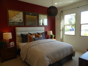
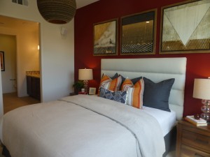
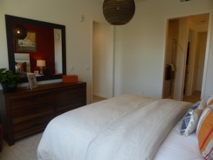
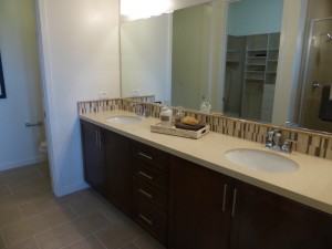
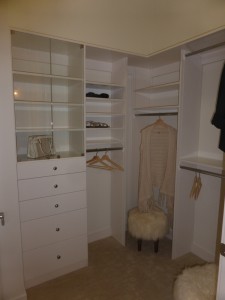
In the master bath, the vanity is on the right. It matches that of Residence 1, with two sinks, two sets of cabinets and one set of drawers. The cabinet stain, countertop, and backsplash are upgraded. The shower is just to the left of the door and is really small. It does not have a seat or even a shelf/alcove for shampoo. The tile surround and tile height to ceiling are upgrades. The closet is shown with an upgraded organizer.
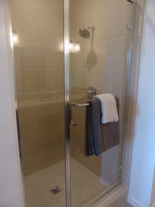
This is a pretty basic two bedroom flat. The great room is spacious but again has a slightly awkward setup. I would have liked to see more storage in the kitchen, but at least it has the butler’s pantry for additional space. I think the master shower is too small and poorly designed.
Residence 3
1,400 – 1,402 square feet
2 bedrooms, 2 bathrooms
Covered porch + patio
2-car, side-by-side garage with workshop
Starting from $584,990
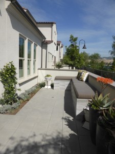
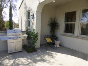
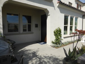
Residence 3 is the final floorplan where everything is on the ground floor. It is always a corner unit, with one model in every building. It has a large patio with a small, covered porch area facing the front walk. The front door is at the side of the porch and, as in the other units, leads directly into the great room. Throughout the home, the security system, stereo speakers, flooring, window treatments, wall coverings, paint, 5 ¼” baseboards, and decorator’s items are upgrades.
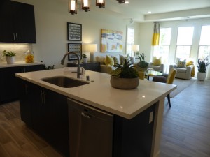
The setup in this great room is less awkward than in the first two homes. Because it is a corner unit, the great room actually has three windows facing the porch and one more facing the side. The media cabinet and open shelving are upgrades, as are the flush lights and speakers.
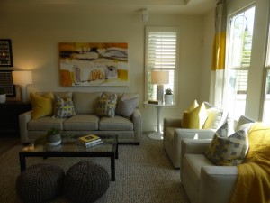
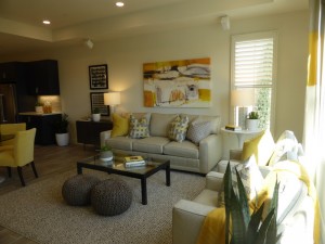
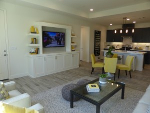
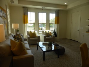
Once again, the dining room sits right behind the great room. The space is open, leaving room for a table of any size. With the media cabinet and a hallway leading back to the bedrooms, it doesn’t have a big wall to place a hutch, but one could sit next to the sofa as a combination hutch/side table. There are not any upgrades listed for the dining room.
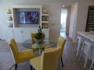
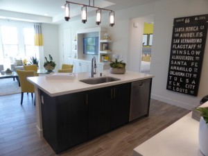
The kitchen is behind the dining room. The setup here is different than in the first two homes. This one has a center island with a sink, dishwasher, and seating for three or possibly four. It’s a smaller island with fewer cabinets and less counter space. The back wall has the range and hood, along with some counter space, cabinets and drawers. There aren’t too many cabinets in this area; however, the side wall has a few more cabinets and a short counter. The refrigerator and a built-in microwave are also on the side wall. Almost everything shown in this kitchen is upgraded, including the countertop, backsplash, flat panel cabinets, Maytag appliance package with built-in microwave and separate hood, under cabinet lighting, j-box at island, single basin sink, and pendant lights.
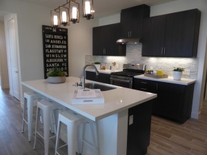
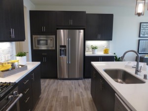
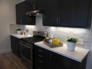
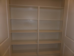
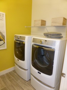
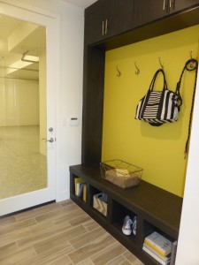
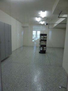
A hallway at the back of the kitchen leads to a walk-in pantry with built-in shelves. The laundry room is across from the pantry, with side-by-side machines and base linen cabinets. There is an option for upper cabinets above the machines and/or above the base cabinets. The model shows upgraded cabinet doors. Just past the pantry, there is space for a drop zone. While you can easily put in a freestanding bench or table, there is an option for cabinets and hooks as seen in the model (the cabinet doors and bench finish are upgrades again). Garage access is just past the drop zone, with the work space closest to the house. The organizer, floor coating, and light package are upgrades.

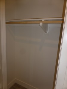
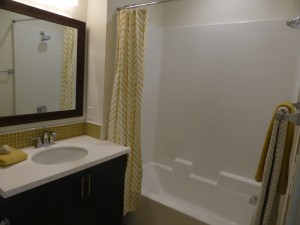
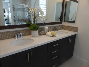
The hallway between the dining room and kitchen leads to the bedrooms and bathrooms. There is a small coat closet on the right with a single shelf and pole. The secondary bath is next to the closet. It has a small vanity with one sink and a shower/tub combo. The backsplash, cabinets, framed mirror and shower enclosure (curtain rod) are upgrades, but the shower tile is standard.
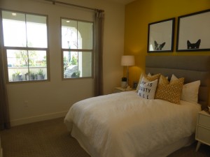
The secondary bedroom is across the hall from the closet. It is an average sized room with two windows facing the covered porch. It has an extra alcove in one corner for a narrow dresser or bookshelf. There is a standard, two-door closet. Upgrades in the bedroom include the flush lights, j-box and ceiling fan.
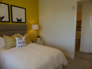
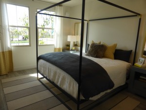
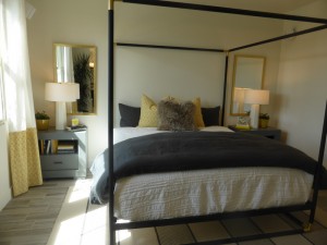
The master suite is at the end of the hall. The bedroom seems a little smaller than in the first two residences. It has two windows facing the side of the house. If you put a dresser opposite the bed, it would leave only a narrow walkway between them. Again, there is an option to separate the bedroom from the bathroom with a door. The flush lights and speakers are upgrades.
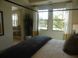
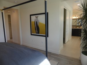
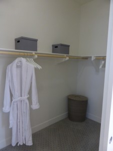
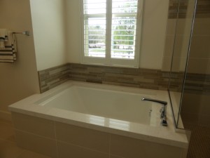
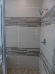
The master bath has a walk-in closet, but with bypass doors rather than a standard single door. Across from the closet are a separate shower and tub. This shower is a little bigger than in Residence 2. While it doesn’t have a seat or shelf, it does have a narrow ledge from the tub deck. All of the tile work in the shower is upgraded. The adjacent bathtub is a bigger tub typical of a master bedroom (unlike in Residence 1) and has an upgraded surround. The vanity is at the far end of the bathroom. It is a little smaller than in the other homes, but still has two sinks, two sets of cabinets, and one set of drawers. The countertop and backsplash are upgrades.
Residence 3 is a little more spacious than the first two homes, but still has a very similar feel. I like the setup of the great room a lot more in this one. I also think the drop zone and extra workshop space in the garage are great additions to this floorplan.
Residence 4
1,499 square feet
2 bedrooms, 2 bathrooms
Covered deck
2-car, side-by-side garage
Starting from $604,990
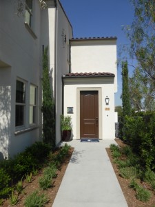
Residence 4 is the first of The Vine’s two-story units, where the garage and entryway are on the first floor, but all other rooms are on the second floor. All nine-unit buildings have a Residence 4 home, but it is not included in the four-unit buildings. This home is a corner unit, with windows on three different walls throughout the flat. Throughout the model, the framed windows, security system, stereo speakers, flooring, window treatments, paint, wall coverings, and decorator’s items are upgrades.
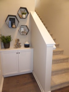
When you enter the home, the foyer has an option for a built-in cabinet next to the front door, as seen in the model. There is also room under the window to put in a bench or shoe rack. Typically, access to the garage is directly across from the front door; however, the model is connected to the sales office so there isn’t a door at all.
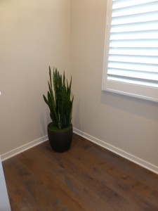
As you reach the second floor, the dining room is straight ahead and the living room is to the left. These flats are all corner units, so there are windows on three walls, with one wall facing the covered deck. The room is set back from the dining room and kitchen, so it lacks the open feel of a great room. In the model, the recessed lights and media cabinet are upgrades.
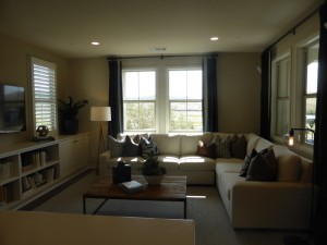
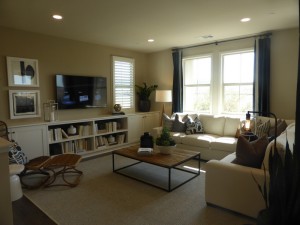
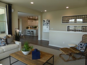
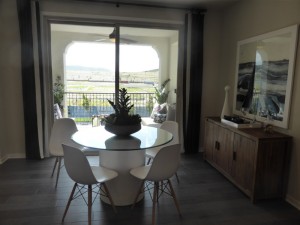
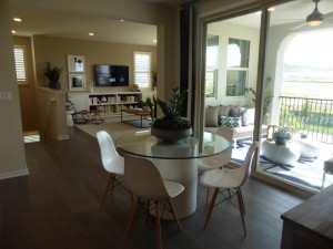
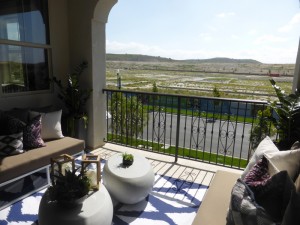
The dining room is set up in a way that it could easily be a casual or a formal space. One wall makes a perfect place for a hutch. Another wall is filled with sliding doors leading to the covered patio. The room is fully open to the kitchen. The covered patio is a good size. The j-box and ceiling fan are upgrades.
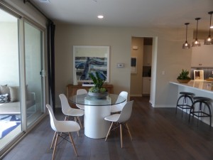
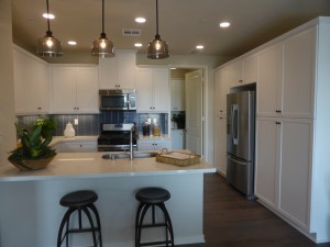
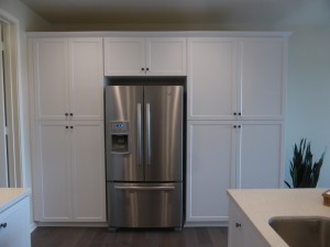
The kitchen is to the right of the dining room. It shows the standard cabinets offered at the Vine, but with upgraded bronze knobs. There is a peninsula with bar seating on one side and the sink and dishwasher on the other. Because of the u-shape, and not having the open wall facing the dining room, the kitchen felt a little small. While it’s fine for one person, it would probably feel cramped with two. The range and microwave are across from the sink and are the standard appliances. A fourth wall holds the fridge, which has pantry-height cupboards on both sides of it. Other upgrades in the model are the countertop, backsplash, under cabinet lighting, j-boxes and pendant lights, and the single basin sink.
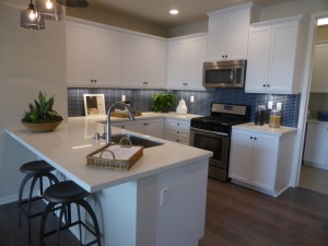
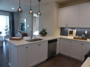
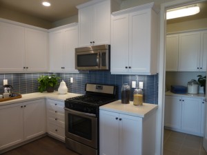
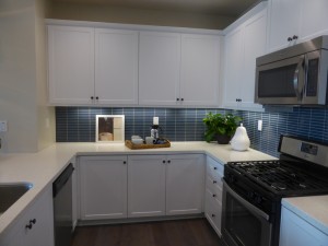
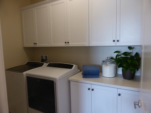
A door at the back of the kitchen leads to the laundry room. It has a short counter with included base cabinets and optional uppers. The countertop is upgraded.
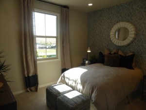
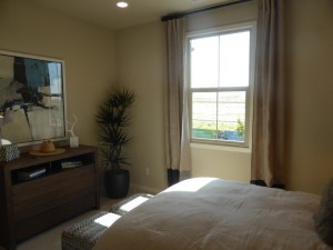
The bedrooms are at the back of the flat. A doorway between the dining room and kitchen leads to the back hall, with the secondary bedroom immediately on the left. The room is an average size (perhaps a bit small), with a single window. The flush lights are upgrades. The room includes a walk-in closet with plenty of space.
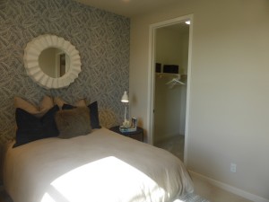
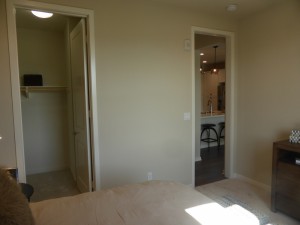
The hallway outside the room includes a set of base linen cabinets, shown with upgraded counters and knobs, along with optional uppers. There is a very small coat closet across from it.
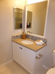
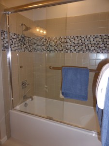
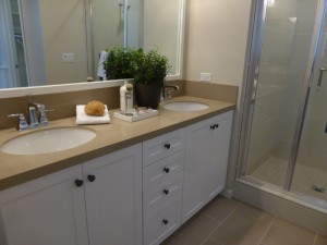
The secondary bath is next to the linen cabinets. The vanity is pretty small, with a single sink, and shown with upgraded knobs, countertop and backsplash. The shower/tub combo has upgraded tile and tub surround. The tub enclosure and framed mirror are also upgrades.
The master suite is at the end of the hall, with a small entry area offering a bit of space between it and the other rooms. Its two windows face the central motor court. The room is comparable in size to the others throughout the Vine homes. There is a set of linen cabinets between the bedroom and the master bath. The walk-in closet is right next to the cabinets. In the model, upgrades include flush lights, ceiling fan prewire, crown molding, bronze knobs, upper linen cabinets, closet organizer, the light fixture, flat panel TV conduit package at raised height, and the horizontal wood plank wall.
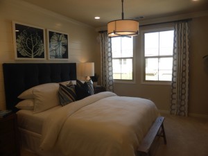
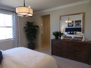
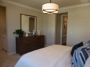
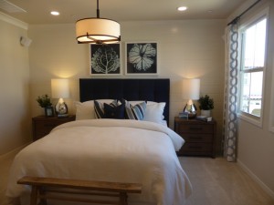
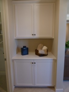
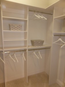
There is an option to put a door between the closet area and the bathroom. Inside the master bath, there is a vanity with two sinks. It’s a bit smaller than in some other models, but not tiny. The stall shower that sits next to the vanity is quite small. Again, it doesn’t offer a bench, shelf, or anywhere else to put your shampoo bottles.
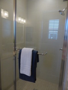
This model had some good and some bad points. I like the first floor entry more than in the other two-story town homes, as it offers the most space. The living room and dining rooms are nice, but the kitchen is too small. I really dislike the shower in the master bath and how small the vanity is in the secondary bath.
Residence 5
1,566 square feet
2 bedrooms, 2 bathrooms
Covered deck
2-car, side-by-side garage
Starting from $615,990
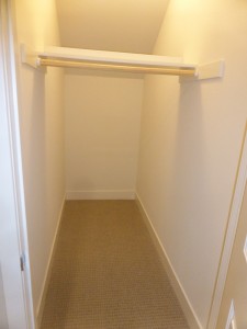
Residence 5 is another top floor, end unit occurring in all nine-unit building configurations. It has a covered porch outside the front door on the ground level, though it faces the street rather than a common walkway. The entryway has space for a very small table. It also has a closet with a large storage space under the stairs. Direct access to the garage is also off the small foyer. Throughout the home, the security system, stereo speakers, flooring, window treatments, wall coverings, paint, 5 ½” baseboards, and decorator’s items are upgrades.
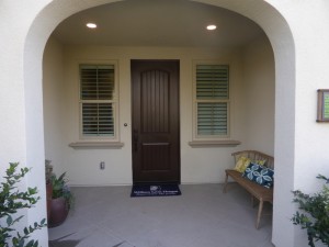
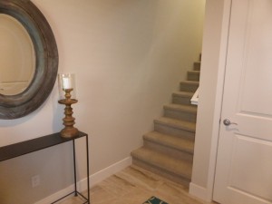
Unlike most of The Vine’s floorplans, Residence 5 actually has an entry area at the top of the stairs, rather than immediately entering the great room or dining room. This entryway has a built-in base cabinet unit, plus space for a table and/or bench. The cabinets are standard but the model included upgraded hardware. The living areas are all on the right side of the entry while the bedrooms and bathrooms are down a hallway on the left.
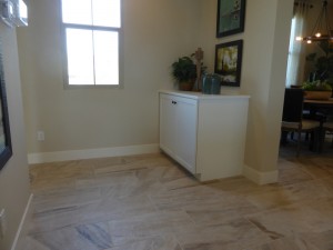
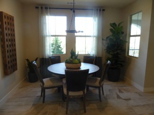
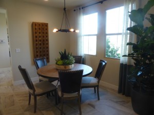
The dining room is the first room in the common area. It faces the front of the building, with two windows overlooking the street. It is a separate space from the great room, giving it a slightly more formal feel. The j-box and light fixture are upgrades.
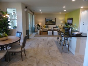
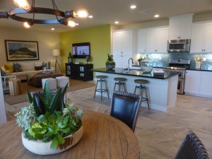
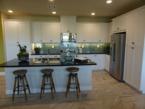
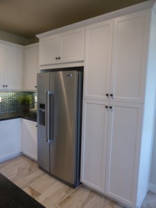
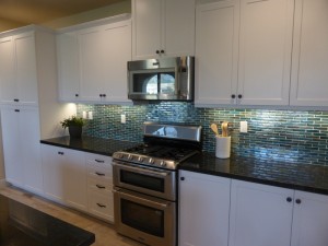
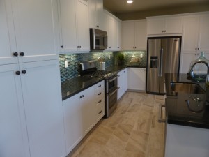
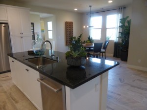
The kitchen is next to the dining room. It is open and bright, with an easy flow into both the dining room and the living room. The center island is pretty big, with comfortable seating for four, the sink, and the dishwasher. The rest of the room is L-shaped. The shorter wall on the side includes the fridge, pantry height cupboards and a short counter. The longer wall at the back has the range and microwave, along with longer counters and numerous cabinets. A second set of pantry height cupboards sits at the far end. While the model shows the microwave in its standard position above the range, there is an option to move it next to the fridge instead. Upgrades include the backsplash, bronze hardware, Maytag appliance package with double oven, under cabinet lighting, and single basin sink. This kitchen has a lot of counter and storage space, as well as a good layout.
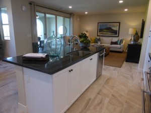
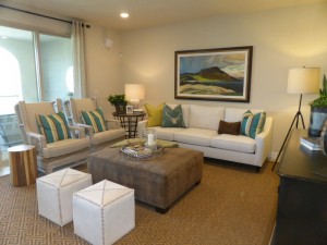
The living room is next to the kitchen. The room is a good size and feels bigger since it doesn’t share space with the dining room. The flush lights and speakers are upgrades. The access to the covered deck is also off the living room, which has upgraded 12’ multi-panel doors.
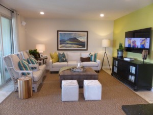
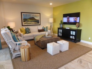
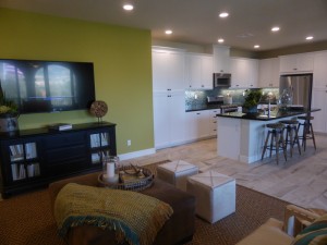
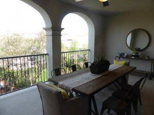
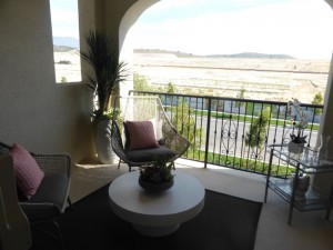
The deck shows the optional j-box and ceiling fan. It is a big space overlooking the street, with attractive arched openings and an iron railing.
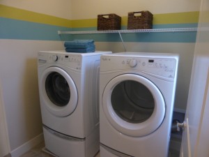
The bedrooms and bathrooms are on the opposite side of the house. The hallway leading to them includes the laundry room, which has space for side-by-side machines and optional upper cabinets.
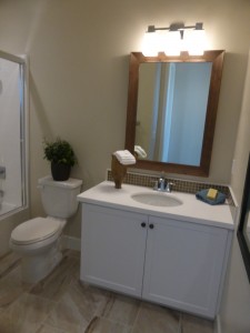
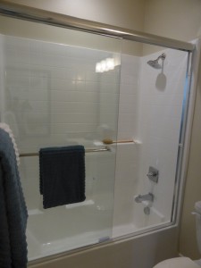
The secondary bedroom and bathroom are on the left. The bathroom has a single sink set into a small vanity and a shower/tub combo. The backsplash, bronze hardware, tub enclosure and framed mirror are all upgrades.
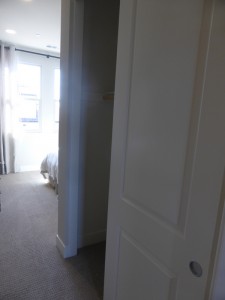
The bedroom is right next to the bathroom. It has an entry hallway where the two-door closet is located. The room itself is really small, but because it doesn’t have the closet taking up one wall, it does have space for a little extra furniture, or at least some versatility in the layout. Only the flush lights are upgraded.
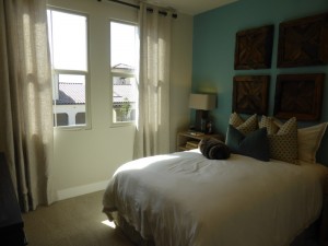
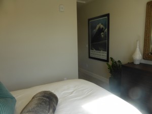
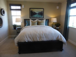
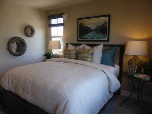
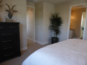
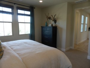
Finally, the master suite is at the end of the hall. It has two windows facing the street and one more on the side of the house. The room is just wide enough for a bed and two nightstands. The opposite wall has space for a dresser or two (one in each corner). The flush lights and speakers are upgrades.
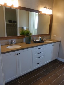
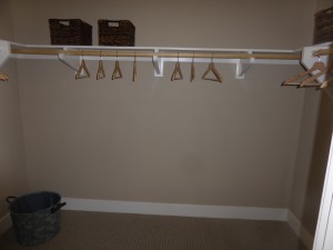
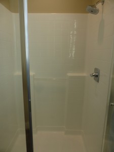
The master bath has an optional door separating it from the bedroom. The vanity is on the left, with two sinks, each with cabinets beneath, and a set of drawers in the middle. The cabinetry hardware is upgraded, but the cabinets themselves are standard. The countertop, backsplash and framed mirror are upgrades. The walk-in closet is across from the vanity and is slightly bigger than in the first few residences. Another doorway leads back to the stall shower, which is pretty small. Two very narrow ledges offer space for bottles, but it doesn’t have a bench or even a corner seat. The shower is shown with only the included features and no upgrades.
This home had a very different layout than the other residences in The Vine neighborhood. I liked the separation between the bedrooms and the living areas. I thought it was great to have a big closet on the ground floor and a spacious entry area at the top of the stairs.
Residence 6
1,632 square feet
2 bedrooms, 2.5 bathrooms
Covered deck
2-car, side-by-side garage
Starting from $630,990
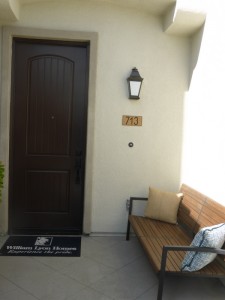
Residence 6 is another upstairs unit occurring in all building configurations. There is a small front porch outside the front door and a 2-car garage with direct access into the flat. While the entry area in Residence 5 had a large closet and space for a table or bench, this one has no closet at all and no space for a bench. There might be room for a very narrow shoe rack, but nothing else. Those who don’t wear shoes in the house would probably need to keep everything in the garage. Throughout this home, the security system, speakers, flooring, window treatments, paint, wall coverings, decorator’s items, picture framed windows and 5 ½” baseboards are upgrades.
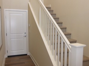
On the second floor, the stairs open up to the great room, nearest to the dining area. This model doesn’t have a designated dining room, but rather an extension of the living area as in Residences 1 – 3. The room is bigger overall, so the dining area has plenty of space for a big table. It also has a full wall for a hutch of any size and height.
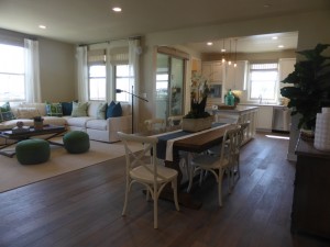
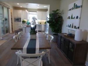
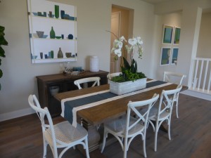
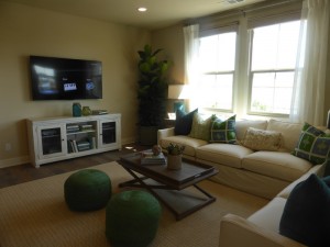
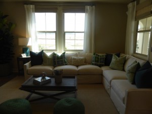
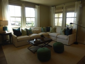
The living area is the back part of the great room. It has two windows facing the front of the flat and two more looking onto the covered deck. The room has a good layout, though it isn’t really open to the kitchen for those who like that type of setup. The flush lights, speakers, and stair pickets are upgrades.
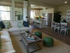
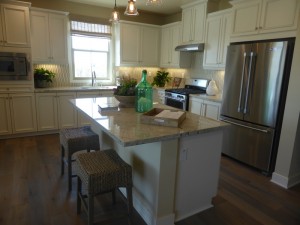
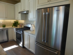
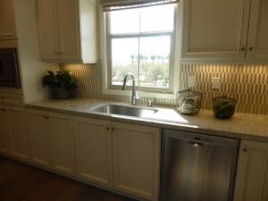
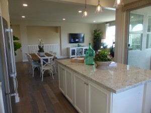
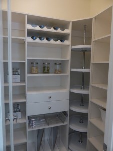
The kitchen is on the far side of the dining area. The center island has seating on one side and cabinets on the other, but does not have the sink or dishwasher. The entire island is actually an upgraded option; the standard kitchen includes only the L-shaped walls with the appliances and cabinetry. Those are located in the middle of one wall, beneath a side-facing window. There is counter space on each side of the sink and numerous cabinets along that wall. The model also put a built-in microwave on that wall as an upgraded option. The other wall holds the range (the standard configuration puts the microwave above it) and the fridge, along with more cabinets and two short counters. One corner of the kitchen holds a walk-in pantry, shown with upgraded organizers and an upgraded clear glass door. Additional kitchen upgrades include countertop, backsplash, cabinet finish and door style, cabinet knobs, Maytag appliance package, under cabinet lighting, j-box over island, single basin sink, and light fixtures.
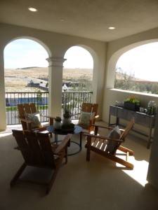
The sliding doors leading to the covered deck are in the kitchen. While the other units have a rectangular deck, this one is square. It’s on the corner, so it actually looks out in two directions, making it more open than the others.
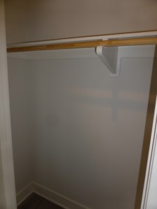
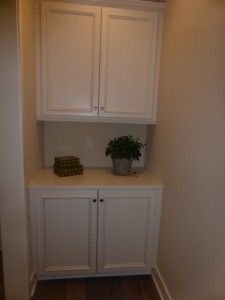
The bedrooms are off a hallway just to the right of the stairway. There is a coat closet on the right as soon as you enter the hall. It just contains a single shelf and pole. Just down the hall on the left, there is an alcove with linen cabinets. The base cabinet is included but the uppers are upgrades. In the model, the cabinet doors (glaze and style) and knobs are upgrades as well.
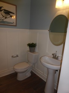
The powder room is next to the linen cabinets. It has a pedestal sink and is shown with an upgraded mirror and crown molding. This is the first flat in The Vine to have a powder room.
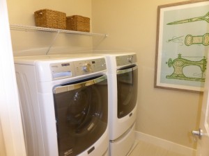
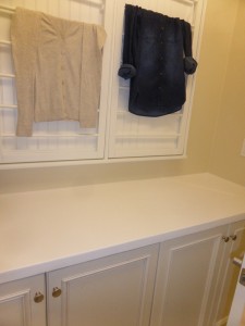
Moving down another hall, the laundry room is on the right. It has side by side machines and an option for upper cabinets on both sides of the room. The base cabinets behind the door are included. I don’t like the setup of this room; it’s too small and you would have to keep the door closed when you’re inside if you want to access the base cabinets or use the folding counter.
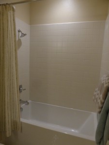
The secondary bedroom is across from the laundry room. As in the other homes, this one is an average size and has a single window facing the side of the home. There is a standard, two-door closet. The flush lights are upgrades. This bedroom also has an en-suite bathroom. The vanity has a single sink, but is pretty large for a private, secondary bath. It has a lot more counter space than I usually see. The countertop, backsplash, cabinetry, and knobs are upgrades. The bathroom also has a shower/tub combo, shown with an upgraded tile surround.
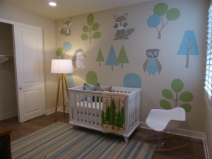
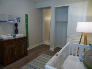
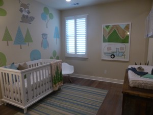
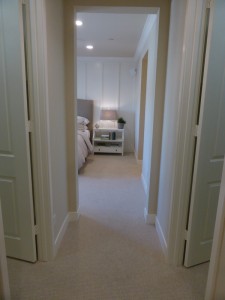
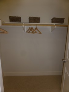
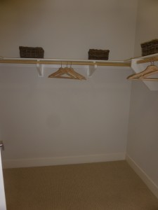
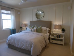
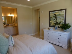
The master suite is at the end of the hall. The entrance takes you into a hallway with a walk-in closet on each side. Both closets are the same size and are shown with just the standard shelf and pole. The bedroom is a little bigger than in the other residences. It has two windows facing the back, overlooking the motor court for the two buildings. Upgrades include the flush lights, ceiling fan and prewire, speakers, crown molding, and wood wall treatment.
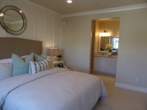
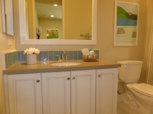
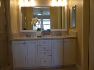
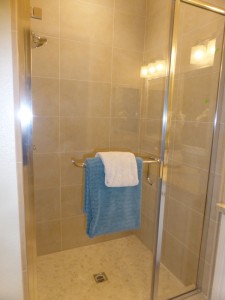
The master bath is somewhat small and there is an option for a door separating it from the bedroom. It has a vanity with two sinks, but the counter isn’t as long as in most master suites. The shower is small, but not tiny, and lacks a bench and shelves. Most features are upgraded, including the cabinets, knobs, countertop, backsplash, tile shower surround, and framed mirror.
Residence 6 is the only upstairs flat to have a dining area combined with the living area in a combined great room. It makes the living area feel a little bit smaller. However, I like the extra powder room and the dual walk-in closets in the master suite. I would have liked to see a better space on the entry level, but it does seem at least that the garage has some extra space on the side to allow for a first floor drop zone if desired.
Residence 7
1,660 square feet
2 bedrooms, 2.5 bathrooms
Covered deck
2-car, side-by-side garage
Starting from $634,990
Residence 7X
1,663 – 1,700 square feet
2 bedrooms, 2.5 bathrooms
Covered deck
2-car, tandem garage
Similarly to Residence 2, there are two versions of this home – a standard Residence 7 and a Residence 7X. In a nine-unit building, there is one of each type, while a four-unit building has only a 7X. The key difference between them is that the 7X has tandem parking, while the 7 has side-by-side spaces. The 7X has some additional square footage, though it’s difficult to tell from the floor plan exactly where the differences are. Both models have the same layout, except for the layout of the main floor entry and the stairs leading up to the living area on the second floor. The model is of the standard Residence 7. In both the 7 and 7X, the ground level has access to the garage and a staircase leading up, but no closet. The 7X has a narrow walkway that may fit a small bench or table (similar in size to the one in the picture, but without the garage door access at the end). Throughout the home, upgrades include 5 ½” baseboards, security system, stereo speakers, flooring, window treatments, paint, wall coverings, and decorator’s items.
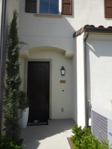
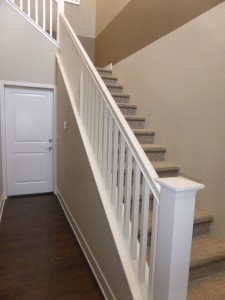
The top of the stairs leads directly into the dining room. As in Residences 4 and 5, there is a true dining room separate from the living area. In the standard 7, one wall has an open railing to the staircase. In the 7X, the stairs actually meet the second floor on the right side of that wall, instead of the left as they do here, so that wall is actually solid, but with three windows instead. Both models have sliding doors on another wall leading to the covered deck. The doorway leading to the master suite is just off the top of the stairs, leaving only a very small space for a hutch in the dining room.
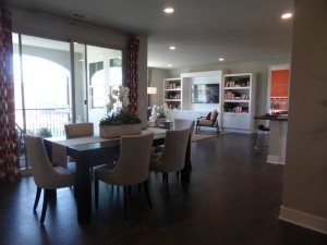
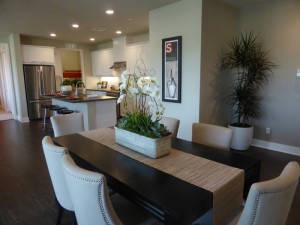
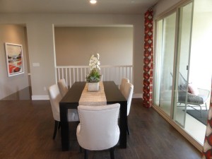
The covered deck is square, with a wide arch overlooking the walkways and street. It’s not quite as big as in Residence 6, but is still a good size.
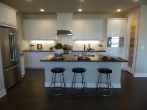
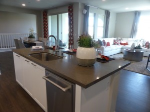
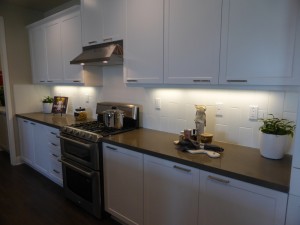
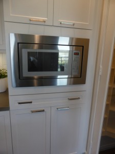
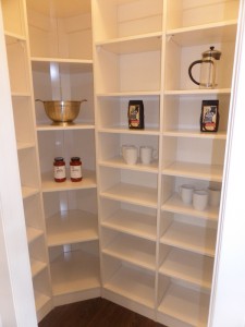
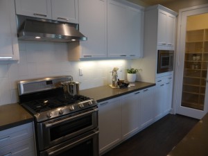
The kitchen is just past the dining room. This one has a center island with the sink, dishwasher, and seating for 3-4 people. A long wall across the back holds the range and microwave, with plenty of counter space and most of the cabinets and drawers. There is a walk-in pantry at one end and direct access to the laundry room at the other. The refrigerator sits alone on a shorter wall, with a narrow cabinet and counter next to it. Numerous upgrades in the kitchen include countertop, backsplash, cabinet pulls, Maytag appliance package with double oven and built-in microwave, under cabinet lighting, single basin sink, pantry organizer, and clear glass door at pantry. The cabinet doors are actually shown in the standard style and finish. This kitchen overall has a lot more storage than most of the others in The Vine.
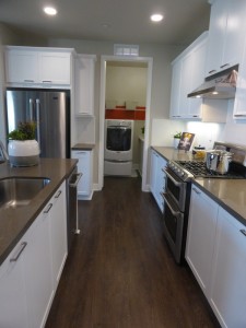
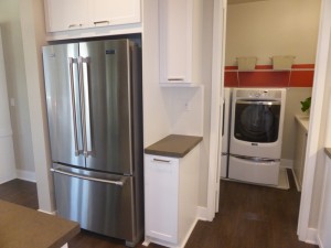
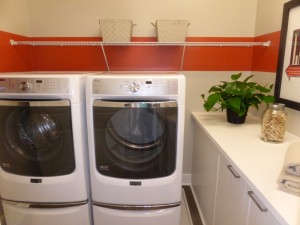
The laundry room has side-by-side machines and a folding counter with base cabinets. There is an option for upper cabinets over the machines and the counter. The model has upgraded countertop, backsplash, and cabinet pulls.
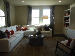
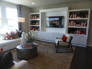
The living room is across from the kitchen. It has two windows facing the street and two more facing the covered deck. The model shows an upgraded, built-in media center filling one wall. The flush lights and speakers are also upgrades. The room is fully open to the kitchen, but slightly distanced from the dining room.
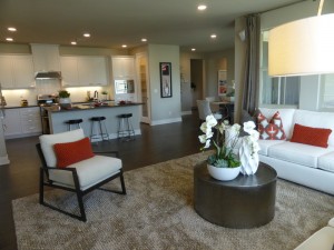
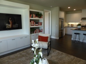
Residence 7 is the only flat in The Vine where the bedrooms are on completely opposite sides of the house. The secondary room is right off the living room. It is about the same size as in all the other units and has the typical two-door closet. A single window faces the street and the flush lights are upgrades. This one has an en-suite bathroom. As in Residence 6, the vanity has just one sink but is bigger than average. The countertop and cabinets are standard, but the pulls, backsplash, and framed mirror are upgrades. The shower/tub combo is shown without any upgrades.
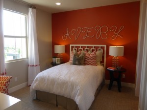
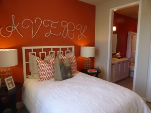
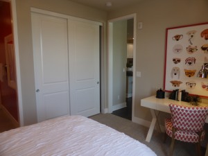
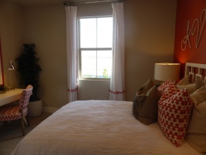
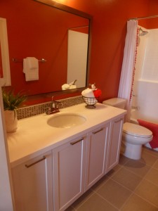
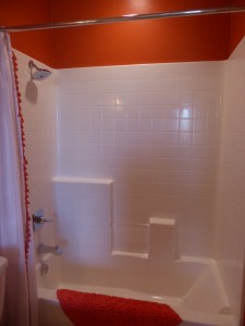
The doorway at the top of the stairs leads to the rest of the house. There is a powder room just inside the door. It is shown with the standard pedestal sink, but does have the option for a vanity. There are standard base linen cabinets just outside the bathroom, with an option for uppers as well. The coat closet is next to the linen cabinets, but it is quite small.
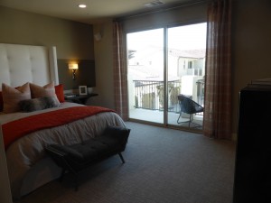
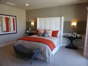
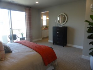
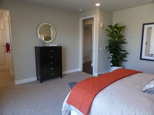
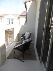
The master suite is at the end of the hall on the left. The room seems a lot bigger than most of the other master bedrooms in this neighborhood. It has a private deck facing the motor court. Upgrades include the flush lights, wall sconce prewire and fixtures, and speakers. As usual, there is an option for a door separating the bedroom from the bathroom.
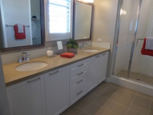
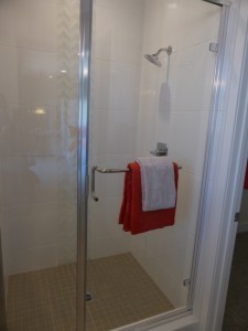
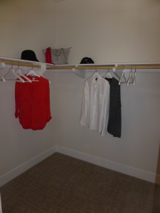
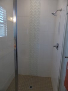
The master bath is more spacious than many of the other flats. It has a long vanity with two sinks and a small window facing the motor court. The shower, unfortunately, is still small and lacking any sort or seat or shelf. The cabinet pulls, countertop, backsplash, tile shower surround, and framed mirror are all upgrades. The walk-in closet is comparable to in the other homes and has the standard shelf and pole.
Residence 7 definitely feels more spacious than the others. I think having the separate living room and dining room makes it feel bigger. It is also the only flat with two outdoor spaces. This one offers more privacy as well, with the master bedroom being separated from the rest of the house.
The Vine offers basic flats. With the exception of the single bedroom Residence 1, all units have 2 bedrooms and either 2 or 2.5 bathrooms. None of the homes offer any options to vary the layout. Per square foot, these are coming in a little less expensive than many other neighborhoods, but with a price of around $400/square foot, I think it’s still fairly high for what you’re getting. These are high-density homes with a lot of shared walls and a busy motor court servicing as many as 18 units.