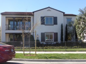
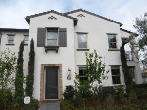
The Avalon Collection in Eastwood Village is the neighborhood’s only set of flats or apartments. Like all of the homes in the Village, these are built by Irvine Pacific. Most of the flats are arranged into buildings of six, with two of each model. The Residence One homes will be on the ground level; the Residence Two homes will have their entrances set farther back and between the Residence One entrances, with the ground level being only an entryway and all of the living space on the second floor, occupying the back half of the building. The Residence Three apartments will sit on opposite sides of the building with a side entry and, like Residence Two, all of the living space will be on the second floor, occupying the front half of the building. Three-unit buildings will have one of each model, again with Residence One on the bottom and the other two above it. The current phases of Avalon sit at the southeast corner of the village, bordering Irvine Boulevard and Jeffrey Road. There are four buildings mapped out at this time comprising a total of 21 flats. These are all closest to Irvine Boulevard and the Parkwood entry. Avalon homes have 2 bedrooms and 2 bathrooms, ranging from 1,161 – 1,544 square feet of living space. Building elevations include Early California (modeled) and Formal Spanish. All three-unit buildings will have the Formal Spanish elevation.
Some of the standard features included with each home are ceramic tile flooring at entry, kitchen, baths and laundry; plush carpets throughout living areas; and two-panel interior doors with satin nickel hardware. The kitchens have whirlpool stainless steel appliances including range, microwave, dishwasher and hood; cabinetry in white satin Thermofoil with concealed and soft close hinges; granite slab counters with 6-inch backsplash and full splash at range; stainless steel double basin sink with Kohler faucet; and refrigerator space pre-plumbed for ice maker. The master suites include a walk-in shower with 6” x 6” ceramic tile surround with clear glass enclosure; dual under mount sinks with cultured marble countertops and backsplash and Kohler polished chrome faucets. Additional features of the homes include fire-resistant concrete tile roofs; intelligent, Wi-Fi enabled thermostats; Lutron Home Automation System to control light levels at the touch of a button; and numerous Energy Efficient features such as LED lighting, vinyl windows with low-e glass, tankless water heater, and high efficiency air conditioners and has furnaces.
Eastwood Village is going to have its own K-6 school, called Eastwood Elementary School, which is slated to open in August 2017 as part of the Irvine Unified School District. Until then, students will probably attend Santiago Hills Elementary School. Eastwood students will attend Sierra Vista Middle School and Northwood High School.
Basic Neighborhood Financial Information
Approximate HOA Dues: $125 per month at buildout for the Eastwood Village Neighborhood Association plus $152 per month at buildout for the Avalon Neighborhood Association. Prior to complete buildout, the dues will be higher but exact amounts haven’t been determined yet.
Base Property Tax: 1.05%
AD Tax: $950 per year
CFD Tax: $1,700 per year
Other Taxes: $164 per year
Overall Effective Tax Rate: Approximately 1.5%
Prices start at $482,647 for Residence One, $555,808 for Residence Two, and 613,835 for Residence Three
Residence One
1,161 square feet
2 bedrooms, 2 bathrooms
Two-car tandem garage
Optional Den at Bedroom 2
Current price range (completed homes including designer upgrades & options): $482,647 – $503,926
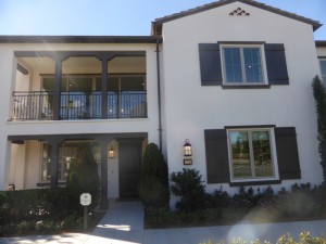
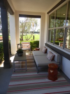
In a standard six-unit building, there will be two Residence One flats that will be mirror images of each other. Each will have its entrance off the front walkway with the tandem garage entry on the back side. They will sit directly below the Residence Three homes. There is a nice front porch, which is the home’s only outdoor living space. Throughout the model, the flooring and window treatments are upgraded.
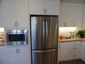
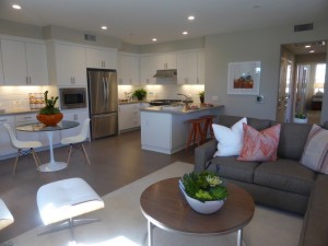
When I entered the flat, the kitchen was right in front of me and the living room was to the left. The kitchen is u-shaped, with the peninsula closest to the door. It includes bar seating for 2-3 people and also holds the sink and dishwasher. The short side of the room has the range and oven, while the back wall includes the fridge and microwave. The model shows the standard appliance package along with an added Whirlpool stainless steel refrigerator. The kitchen is small, but makes efficient use of the space with its cabinetry and counters. Upgrades shown in the model include White Thermofoil #615 flat panel cabinets, 6” tubular pulls in brushed nickel, and Pental Quartz “Sahara” countertops with upgraded full-height.
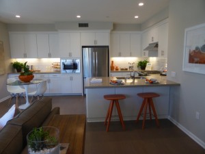
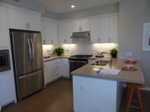
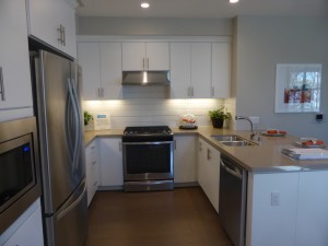
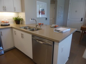
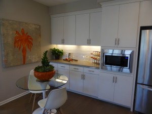
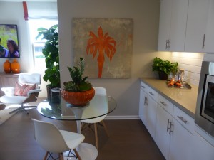
The dining area is on the left side of the kitchen. The model upgraded the space to include extended upper and lower cabinets and counters. With this addition, there is really only space for a four-person table; without, you might be able to squeeze in six.
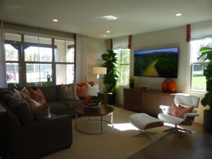
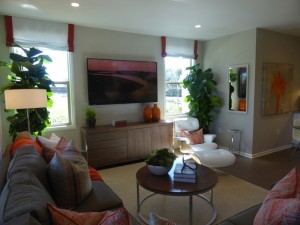
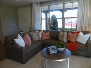
The great room felt fairly spacious. Big windows facing the porch plus two more on the side make it feel brighter and bigger. The can lighting, flat-screen pre-wire and TV/Data outlet are all standard features in the home.
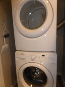
A hallway to the right of the entryway leads to the rest of the house. On the left side of the hall is a laundry area, which is just stacked machines inside a set of double doors. Next to that is the door leading to the tandem garage. On the right side, there is a small coat closet and a set of linen cabinets.
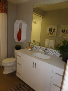
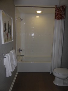
The secondary bedroom and bathroom are also on the right side of the hallway. The bathroom has a single sink and a shower/tub combo. Like the kitchen, it shows upgraded cabinetry and drawer pulls, and also includes an upgraded tile backsplash. The vanity is a good size with plenty of counter space on each side of the sink. The shower/tub combo shows the standard tile package.
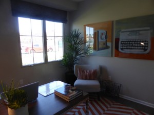
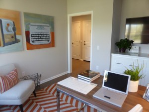
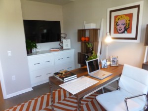
The bedroom is shown as the optional den rather than the standard bedroom. The room is an average size with a single window facing the street. In the den, the standard closet is replaced with an open niche; the model goes one step further to show the upgraded built-in drawer option. In the bedroom, the space occupied by these file drawers would be a two-door, sliding closet.
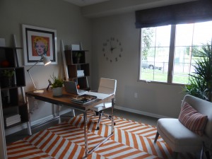
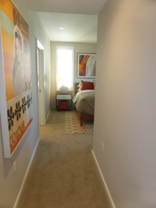
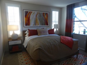
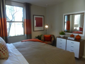
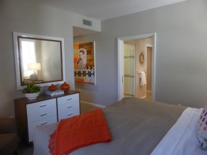
The master bedroom has a hallway of its own once you enter the suite, which opens up to the rest of the room. It is definitely a lot smaller than a typical master bedroom, but seems appropriate for an apartment of this size. Windows face both the front and side; those on the side would look out to the walkway that leads to the two flats at the back of the building. Upgrades in the room include tile wall with cased windows and shutters and a solid core pocket door to the master bath with Baldwin hardware.
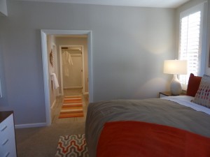
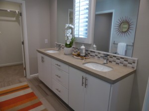
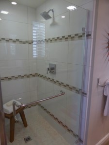
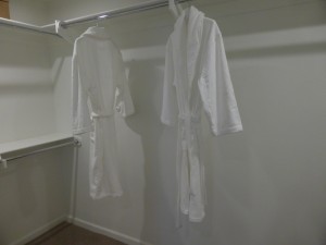
The master bathroom includes a vanity with two sinks, two cabinets and a set of drawers. The framed mirror, cabinets, tubular pulls, and countertop with 6” splash are all upgrades. The shower also seemed pretty small to me and it lacks a bench or ledge of any kind. The shower walls and floor have upgraded tile. The walk-in closet is at the far side of the bathroom and includes the shelves and poles as shown.
Residence One is small but has a good layout. The only thing I really disliked was having the kitchen directly facing the front door. Because these flats are always on the first floor, it could be a great option for empty nesters that are looking to downsize. It’s not easy to find housing under $500,000 in Irvine these days, but Residence One homes will from $482,000.
Residence Two
1,343 square feet
2 bedrooms, 2 bathrooms
Two-car garage
Current price range (earliest phases, including designer upgrades & options): $555,808 – $580,241
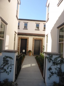
The front doors for all Residence Two homes are set back from the front walkway, typically located behind or between the Residence One apartments. When you enter the unit, the ground floor contains a coat closet and access to the garage, which has room for two cars side-by-side. A staircase leads upstairs to the rest of the flat. Throughout the model, there is upgraded flooring and window treatments. The garage has upgraded epoxy floors.
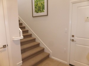
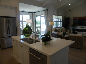
The great room sits at the top of the stairs, offering a more pleasant first view of the home than Residence One, where the entry faces the kitchen. The room was fairly dark, since its only windows face look onto a covered balcony at the back side of the building. It is a good size and completely open to the kitchen. The built-in media cabinet and ceiling beams are upgrades.
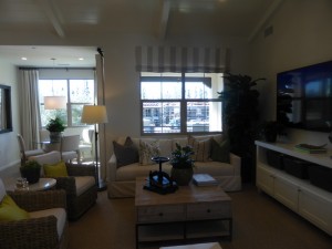
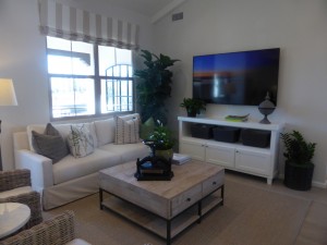
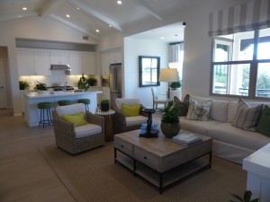
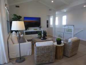
There is a small dining nook set at the back of the house between the kitchen and the great room. It isn’t very wide, but could have a longer, narrow table that stuck out farther into the room if needed. The small table shown for four fits very well. This nook also has the sliding door access to the balcony. While the dining area comes standard with two recessed LED can lights, the pre-wiring for a light fixture is actually an upgrade.
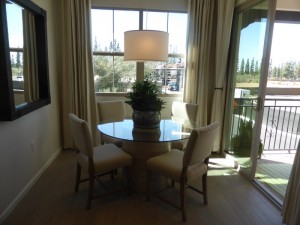
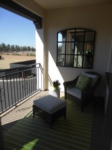
The balcony is the only outdoor living space for this apartment. It isn’t big enough for kids to play on, but works well as a small seating area. It would have space for a grill as well.
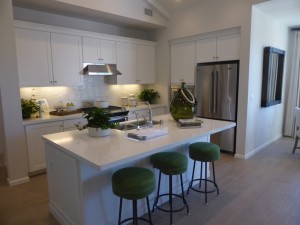
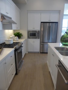
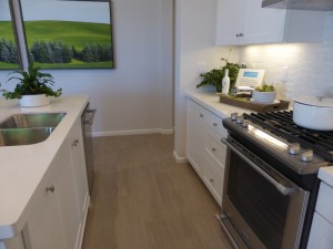
The kitchen has a center island with seating for four; it also holds the sink and dishwasher. The stove and oven sit opposite the island, while the fridge and microwave are on the shorter wall to the side. There aren’t as many cabinets and drawers as in residence one, nor are there any pantry-height cupboards. This kitchen has an upgraded Maytag appliance package, as well as upgraded Quartz countertops and full-height backsplash. It also shows an upgraded reverse osmosis system.
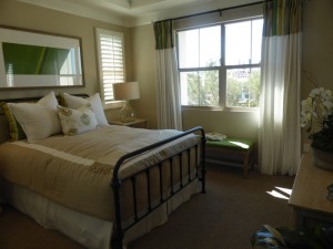
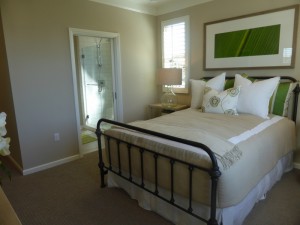
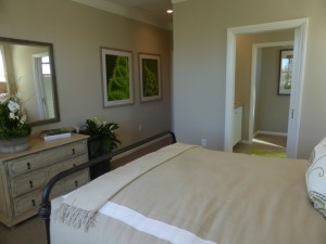
The bedrooms in this home are on opposite sides of the flat. The master suite is behind the kitchen. Linen cabinets sit outside the room. When you enter, a short hallway leads into the bedroom. The room is on the smaller side, with a big window facing the back and two smaller ones facing the side. The walk-in closet is at the far side of the room and comes standard with a double shelf and chrome pole. Upgrades in the bedroom include four recessed LED can lights, ceiling paneling at coffer with reverse casing, and a solid core pocket door separating the bedroom from the bathroom.
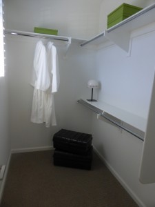
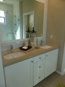
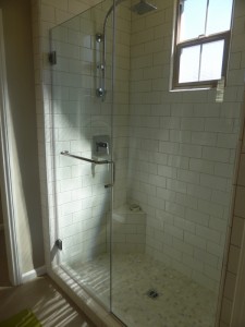
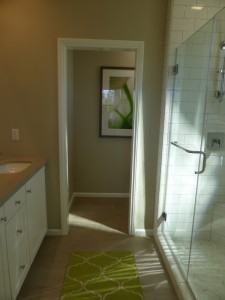
The master bath has two sinks set into a small vanity. Each sink has just one cabinet door and a single set of drawers sits between them. There isn’t a lot of extra counter space at all. The shower sits across from the vanity. Its footprint is about the size of a typical secondary bathroom’s bathtub, though this is just a shower. There is a small corner shelf but not a full seat. The bathroom does not have separate tub. Upgrades include the framed mirror, Caesarstone countertops, full-height tile at countertop wall and shower wall, shower floor, frameless clear glass shower enclosure with tubular towel bar and Kohler Hydrorail shower column in polished chrome.
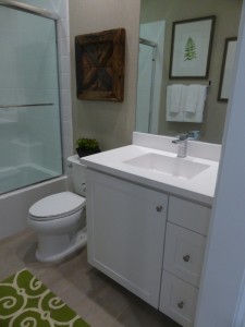
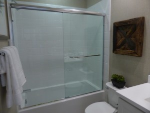
The secondary bed and bath are across the flat on the far side of the great room. The bathroom has a single sink and a shower/tub combo. The only upgrades here are the frameless glass shower enclosure, so this is a good way to see the standard tile, counters, and cabinetry.
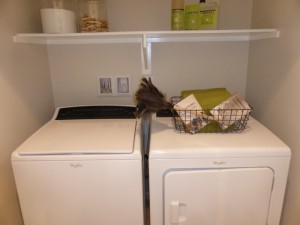
The laundry area is between the bathroom and bedroom. A set of double doors opens to side by side machines with a shelf above them.
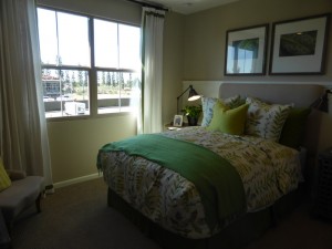
The bedroom is an average size with a single window facing the back of the building. It has a walk-in closet with a double shelf and chrome pole. Upgrades in the bedroom include recessed lights and partial-height horizontal v-groove wall paneling with ledge (shown only on the wall behind the bed).
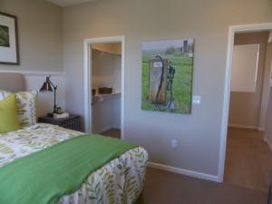
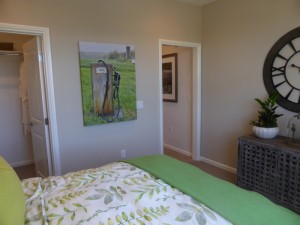
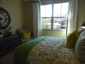
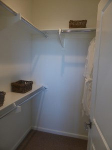
This flat offers a lot of privacy, as the bedrooms are set on opposite sides of the house. The bedrooms also don’t border too much living space, with the master sharing just a bit of the kitchen’s wall and the secondary room sitting primarily off the back deck. I like the layout overall, but would have liked to see a slightly bigger master bath and a little more storage in the kitchen.
Residence Three
1,544 square feet
2 bedrooms, 2 bathrooms
Two-car garage
Tech space
Current price range (completed homes including designer upgrades & options): $613,835 – $635,005
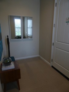
Residence Three homes sit on the ends of a six-unit building, with their doors facing on the side. They are positioned in the front half of the building, with the majority of the space directly above the Residence One units. The ground floor of this home consists only of the garage, which has a utility closet, and the foyer. It does not have a coat closet. A long, straight staircase leads up to the unit. Throughout the home, the flooring and window treatments are upgraded.
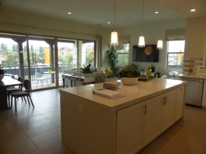
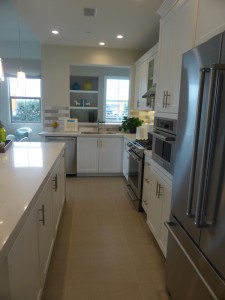
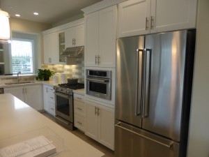
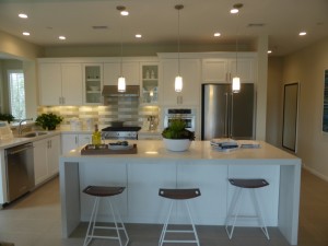
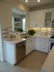
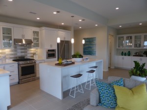
The kitchen is at the top of the stairs, but around a corner so it didn’t feel as strange to me as the Residence One model. The center island has seating for four on one side and four cabinets on the other. It is shown as an upgraded waterfall island, rather than a standard island. The long wall of the room has the refrigerator, microwave, oven and stove, with just a little bit of counter space on each side of the stove. The short wall has the sink and dishwasher, again with just a short counter space. The majority of open space is on the island. It has a lot of cabinets, but not a full pantry. Other upgrades in the model include the KitchenAid appliance package, the clear glass doors on the upper cabinets, the tubular pulls, the single-basin sink, the quartz countertop, and the prewiring for pendant lights above the island.
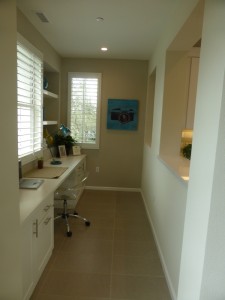
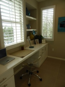
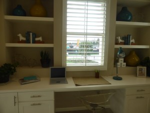
Behind the kitchen there is a tech space, which can be seen from an open wall above the sink. The long, narrow room is a really nice addition to the apartment. It comes standard with just two empty niches; the desk and shelves are upgrades. Windows facing the back and side of the house will bring a lot of light into the space.
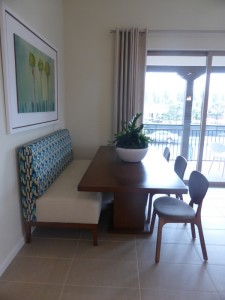
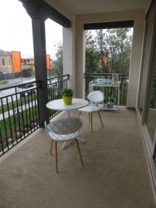
The dining area is across from the kitchen. It is much bigger than in the other two Avalon homes and could easily fit a table for eight or more. The sliding door to the balcony is off the dining room. The balcony is a good size and faces the street, directly above the Residence One front porch.
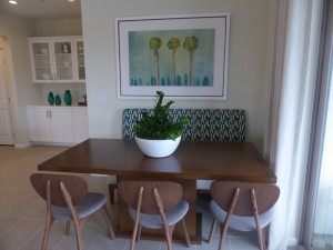
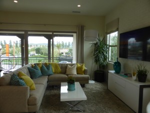
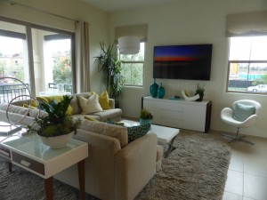
The great room is in the corner, but fully open to the dining room and kitchen. The full length doors/windows from the balcony extend all the way through the room, while additional windows face the side of the house. The only upgrade listed for this room is the painted brick wall with cased windows.
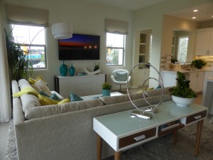
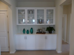
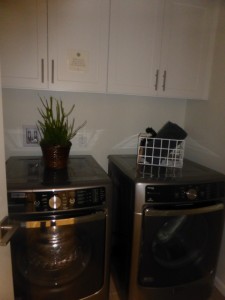
As you head over to the bedrooms, there is a linen area with four upper and four lower cabinets. The lower cabinets come standard but the uppers are an upgrade. A short hallway toward the back of the house leads to a coat closet and the laundry room. This flat has a true laundry room, rather than just a closet-like area that holds the machines. The upper cabinets shown in the model are upgrades.
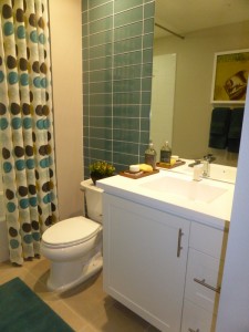
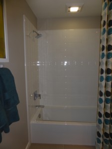
The secondary bath is on the other side of the linen area. It has a single sink with one cabinet and two drawers. This bathroom also has a shower/tub combo. Only the floating mirror and tile wall are upgraded, so the vanity and shower tiles are shown with the included features.
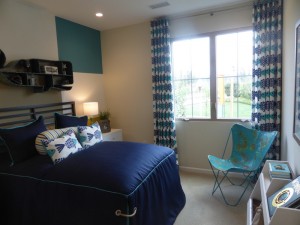
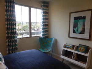
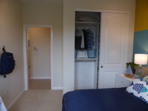
The secondary bedroom is right next to the bathroom. It has one window facing the street and a narrow, two-door closet. The room is pretty small overall. The recessed lights are upgrades, as is the closet organizer.
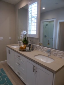
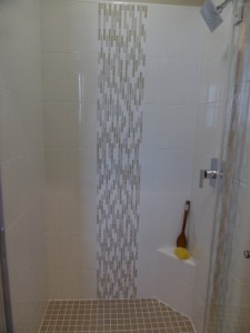
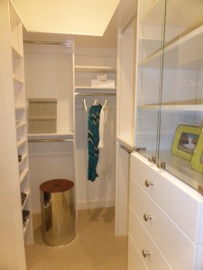
The master suite has an entry hallway. The master bath sits off this hall. It has two sinks set into a long vanity, with plenty of counter space, cabinets and drawers. The stall shower still has just a small corner ledge and the bathroom does not have a tub. The walk-in closet is at the far end of the bathroom. There is an option for a door separating the bathroom from the hallway. Upgrades include floating mirrors, Caesarstone countertops, tile backsplash, shower tile (walls and floor), the cabinet above the toilet and the closet organizer.
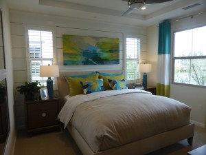
The hallway opens up to the master bedroom. The room felt very small to me. Windows face both the street and the side of the house. The can lights, coffer ceiling, ceiling fan and prewire, the horizontal wide paneling with reverse casing are all upgrades. The master bedroom shares most of one wall with the secondary bedroom.
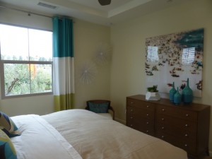
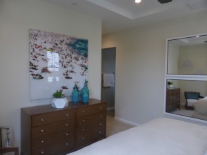
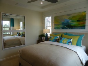
I like the layout of the living areas in this home. The space felt big and open and I think the tech area is a useful addition. I don’t love having the bedrooms side by side and felt that both rooms were very small.
Overall, the Avalon neighborhood doesn’t have anything particularly exciting about it, nor does it have many features I truly dislike. The flats seem pretty standard and unremarkable. I like the layout of Residence Two the most and those homeowners don’t have to worry about disturbing neighbors above or below them. The shared walls between Residences Two and Three don’t really border living space (the master bath in Residence Two and the staircase in Residence Three), so noise between those neighbors shouldn’t be too bad either. I am curious to see whether this neighborhood has a lot of turnover, as the small size won’t work well for growing families and the second story units won’t work well for people looking into downsize and move into single story living.