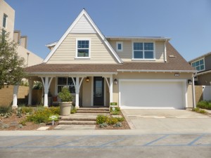
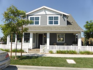
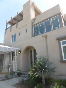
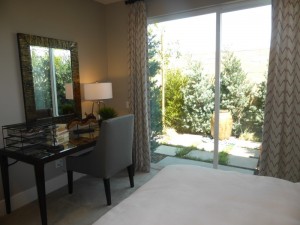
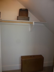
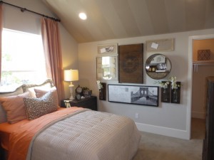
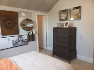
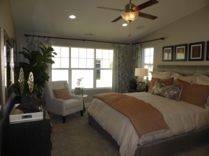
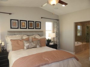
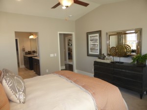
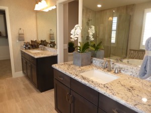
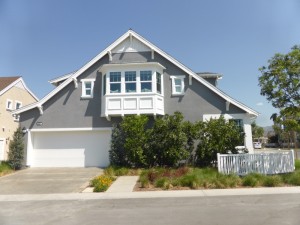
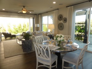
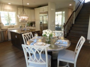
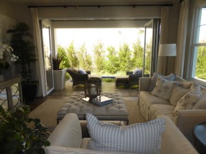
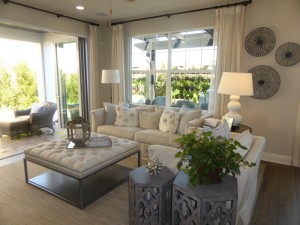
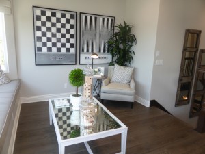
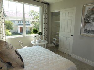
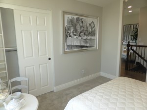
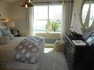
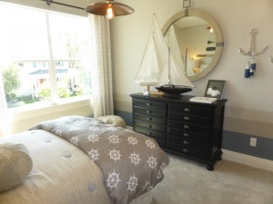
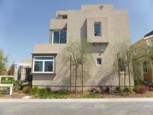
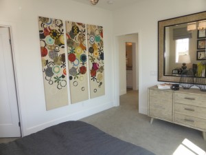
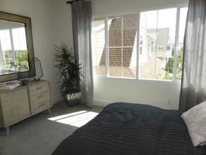
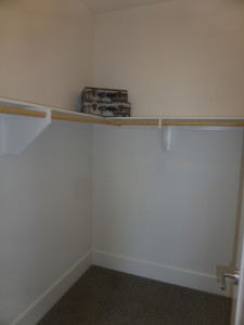
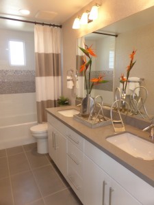
The Ellwood Collection in Beacon Park is another group of single family, detached condominiums. There will be 71 condos built by Richmond American Homes. The collection is located at the south end of the neighborhood, but still a short walk from the planned K-8 school. There is a proposed neighborhood park adjacent to the Ellwood homes. The homes come standard with four bedrooms and at least three bathrooms; they range from 2,050 – 2,300 square feet. Each model has three elevations, including Craftsman, Mid-Century Modern, and Spanish Colonial.
Included Features
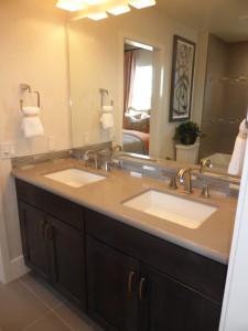
Included in all Ellwood homes are granite/E-stone countertops; recessed lighting; wall-to-wall carpet in living room, family room, hallways and bedrooms; tile flooring in entry, kitchen, bathrooms, and laundry; forced-air gas heating; prewired ceiling fans in master bedroom and family room; 14 SEER air-conditioning unit; dual-glazed, low-e windows with vinyl frames; tankless water heaters; and programmable Honeywell(R) thermostats-dual zoned. The kitchens come standard with a GE appliance package including 30″ stainless steel four-burner cooktop, 30″ BS microwave with hood, stainless steel dishwasher, choice of white for five cabinet stains; recessed panel birch cabinets; granite slab counters (three selections); 6″ backsplash and full splash at hood; 12″ x 12″ tile flooring; Elkay stainless steel double bowl sink; Delta stainless faucet; garbage disposal; and 2-port USB charger. The bathrooms have cabinets matching the whole house; e-stone vanity tops and 6″ backsplash; Delta chrome faucets; 12″ x 12″ tile flooring; Progress Lighting(R) chrome bath bar fixture; and tile surrounds.
Schools
Beacon Park is going to have its own K-8 school, called Beacon Park School, which is slated to open in August 2016 as part of the Irvine Unified School District. There will be a new high school, Portola High, opening nearby (also scheduled for August 2016, though possibly not with all grades opening the first year). Until then, students will attend Canyon View Elementary, Jeffrey Trail Middle School, and Northwood High School.
Basic Neighborhood Financial Information
Approximate HOA Dues: $141 – $216 per month for the Great Park Neighborhood Association
Base tax rate: Approximately 1.1%
Community Facilities District Tax: based on square footage of the home, ranging from $6,041 – $7,532 per year and subject to annual 2% increase
Prices start at $818,990 for plan 1, $855,990 for plan 2, $876,990 for plan 3
Nash (Residence One)
2,050 square feet
4 bedrooms, 3 bathrooms
Optional Master Suite 2 in lieu of bedrooms 2 & 3 and bath 2
Optional loft in lieu of bedroom 3
Optional rooftop terrace in Mid-Century Modern elevation
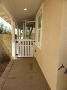
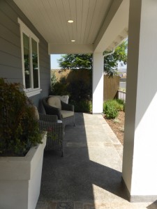
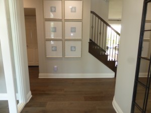
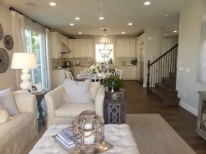
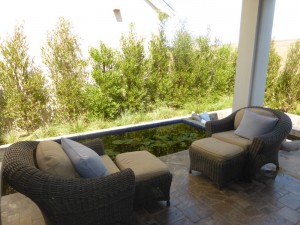
Nash is modeled in the craftsman style and is shown with the standard floor plan. It has a two-car garage and a covered porch, which wraps around and has access to the side patio. When you enter the home, you are immediately in the living room, rather than in a foyer. The home shows upgraded wood flooring instead of the standard tile.
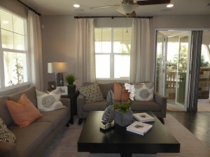
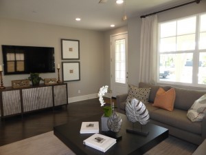
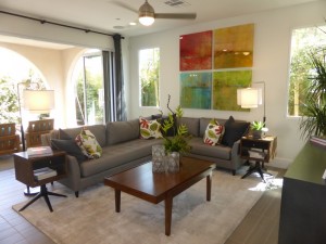
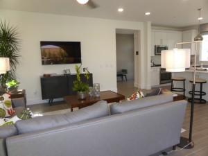
The living room is an average size, with windows facing the front and side of the home. Because it looks onto the covered porch, it doesn’t get as much natural light as if it faced the street directly. The setup is a bit awkward, as the only wall with enough space to mount a TV is by the front entry.
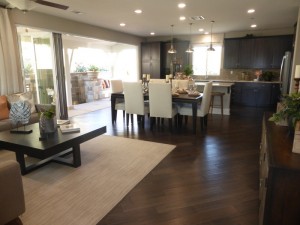
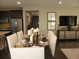
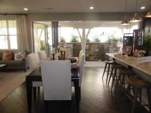
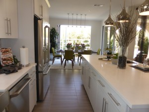
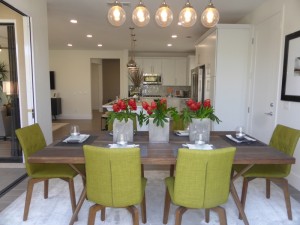
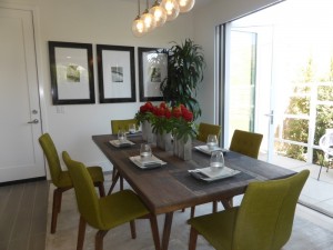
The dining area is directly behind the living room, like an open great room. It is shown with the optional bi-fold doors leading to the yard, rather than a standard sliding door. In this setup, there is not room for a hutch or china cabinet, though I think there would be with a regular slider. The dining area allows for any size or style of table. The stairs to the second floor are down a short hallway across from the dining room.
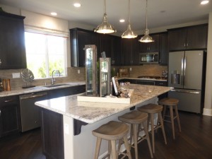
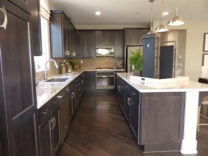
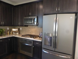
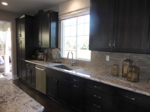
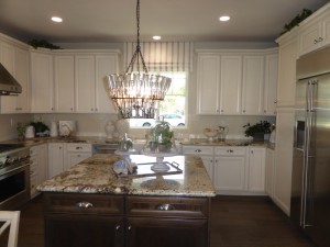
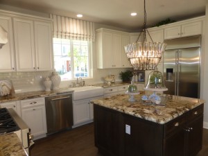
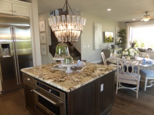
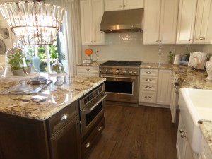
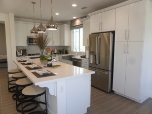
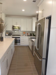
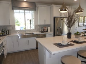
The open kitchen is right behind the dining room. The long center island offers bar seating for at least four people; the other side is lined with cabinets and drawers. A very long counter along the back wall includes the sink, dishwasher, ample counterspace, and numerous cabinets. It also has one set of pantry-height cupboards. The shorter side wall has the cooktop, oven, microwave, fridge and a few additional cabinets. There wasn’t an available list of upgrades, so I don’t know whether the cabinet and granite colors are among the included choices or not (though I would guess both are standard options).
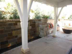
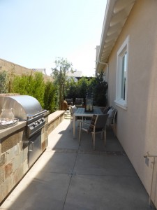
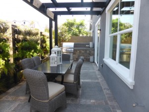
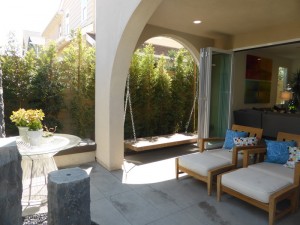
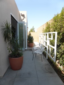
The yard is quite narrow, but does wrap around the side and back of the home. The model shows built-in benches and a built-in barbecue.
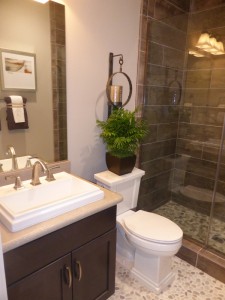
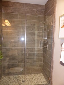
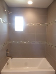
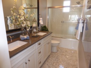
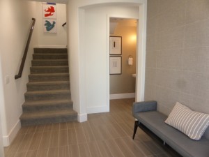
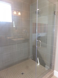
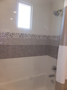
The hallway leading to the stairs also leads to the garage access and the downstairs bedroom and bathroom. The bathroom is adjacent to, but not connected to, the bedroom. It has a single sink set into a small vanity. Though it comes standard with a shower/tub combo, the model shows the upgraded shower-only option. Both the flooring and shower tile are upgraded. The sink hardware is upgraded from the standard chrome.
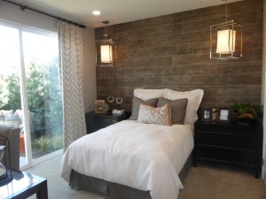
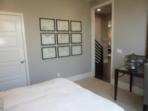
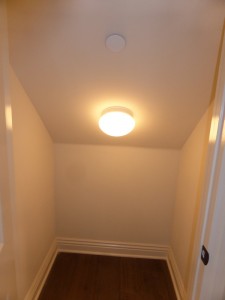
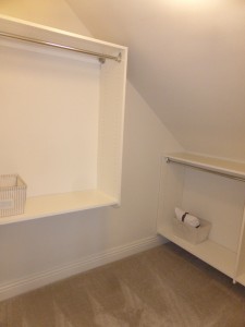
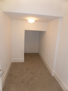
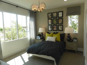
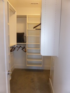
The main floor bedroom is an average size. It has a large walk-in closet with extra storage under the stairs. The room is modeled with the optional sliding doors to the backyard instead of the standard windows. The decorative wall is upgraded as well.
On the second floor, all of the rooms come off of one long hallway. Though this model does not include the optional rooftop terrace, if it did, the stairs to the roof would go directly over the existing staircase. Only the Mid-Century Modern elevation offers the option for the terrace.
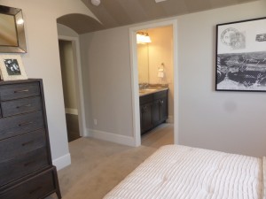
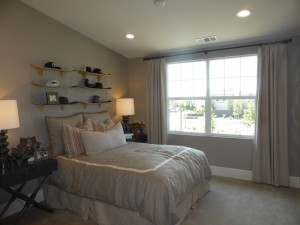
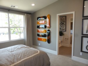
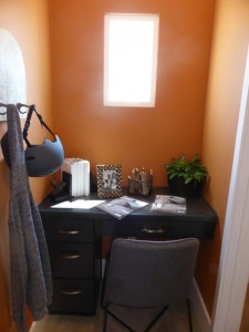
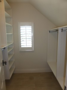
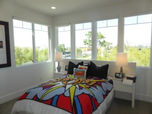
Bedrooms 2 and 3 both face the front of the house, with a Jack & Jill bathroom between them. The rooms comparable in size and vaulted ceilings make them feel more spacious. Both have walk-in closets, though the one in Bedroom 2 is a little bigger. In Bedroom 3, a small nook outside the closet offers space for built-in cabinets (standard) or the upgraded built-in desk shown in the model.
The Jack & Jill bathroom has two sinks set into a shared vanity, which looks at least partially upgraded from the standard package, which normally has chrome hardware. It is shown with the standard shower/tub combo (though an upgraded version of it), but a shower-only option is available. There is also an option to put a door between the sinks and the shower area.
Two alternate floor plans are available in this area. In the first option, a loft replaces Bedroom 3. The only major change is that the whole wall to the hallway is open. The loft still has the built-in unit, walk-in closet, and direct access to the bathroom. The other option is far more involved, in which both bedrooms and the bathroom are replaced with a second master suite. In that setup, the built-in cabinets and walk-in closet from Bedroom 3 remain untouched. Bedroom 3 and most of the Jack & Jill bathroom become the new master bedroom. An optional door separates the bedroom from the master bath, which is the same size as the original Bedroom 2. It would have two sinks set into completely separate vanities, a bathtub, and a separate shower. The walk-in closet from Bedroom 2 would remain the same size, though the door is moved slightly.
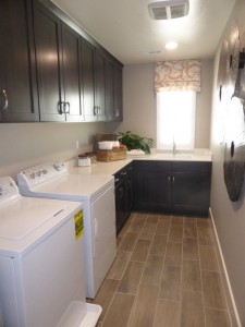
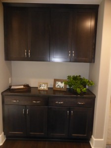
Regardless of which layout you choose, the laundry room sit at the far end of the hall. It has side by side machines, an optional sink, a long counter, lower cabinets, and optional upper cabinets. A linen storage area in the hallway offers lower cabinets and optional uppers, too.
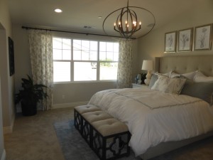
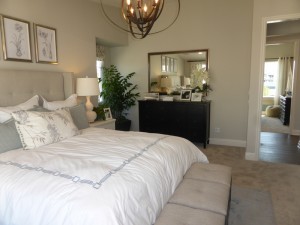
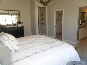
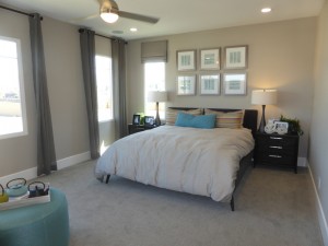
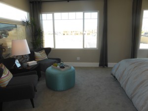
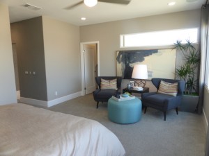
The standard master suite spans the back half of the house. The room is big and bright, with slightly elevated ceilings. Several windows face the side of the house while two smaller ones overlook the back. The room is shown with recessed lighting and a ceiling fan. There is an option for a door separating the bedroom from the bathroom.
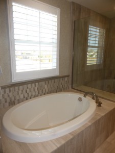
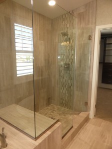
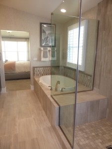
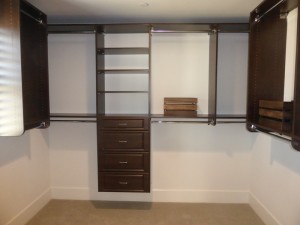
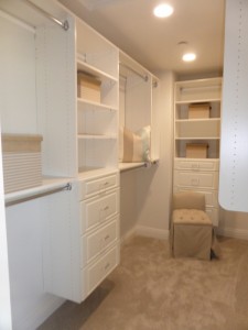
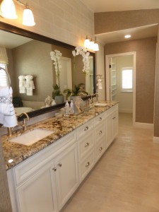
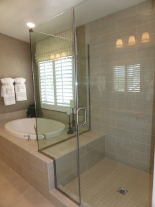
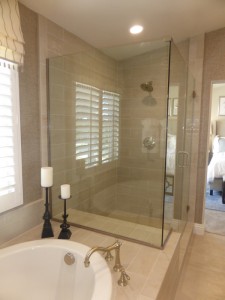
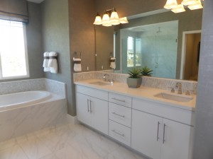
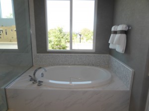
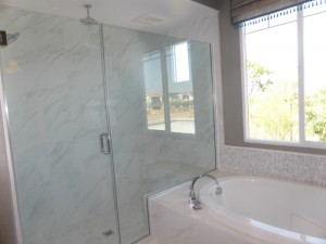
The master bath has two sinks set into separate, spacious vanities. A separate tub and shower sit across from them, with the tub deck providing a large seat inside the shower. The bathroom shows numerous upgrades. The walk-in closet sits at the end of the bathroom.
For buyers who choose the optional rooftop terrace (photos available in the Nolan review below), the layout of the master suite is altered a bit to accommodate the additional staircase. The doorway into the bedroom moves just a little. In the bathroom, the two sinks are now set into a single, smaller vanity. The shower (which now seems a little bit larger) moves next to the sinks and still has a built-in seat. The water closet moves from between the original sinks to the location of the original bathtub, while the bathtub moves over to the spot of the original shower.
Though designated a condo, this house really has the feel of a single family home. It has a good layout, spacious rooms, a downstairs bedroom, and a lot of options for the second floor. One flaw in this model is that it lacks a downstairs coat closet, with the only storage coming from the closet in the bedroom. I also would have liked to see more of an entryway, rather than coming in directly to the living room.
Nathaniel (Residence Two)
Approx. 2,200 square feet
4 bedrooms, 3 bathrooms
Optional craft room at Bedroom 4
Optional study at Bedroom 4
Optional rooftop terrace in Mid-Century Modern elevation
Like the Nash home, the Nathaniel model is also shown in the Craftsman style. In this home the garage is on one side of the house, off a short motor court, while the front door is on another side facing the street. This house also has a covered front porch.
This home has an actual entryway, with space for a table or bench. The stairs and garage access are visible ahead of you, with the downstairs bedroom just off the entry. There is a coat closet with some storage underneath the stairs.
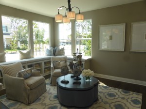
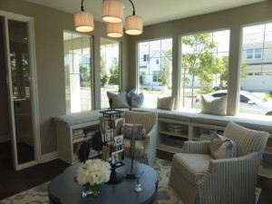
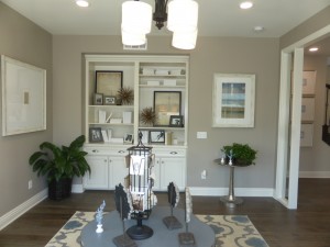
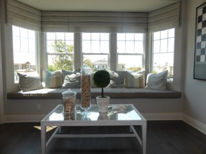
In the model, the downstairs bedroom shows a combination of the optional craft room and optional study instead. I loved this room as soon as I walked into it. Windows on three walls look out to the street and front porch. A long, u-shaped window seat sits beneath them all, with a cushioned top and shelving underneath. Instead of a closet, there is a built-in shelving and cabinet unit. The room is really spacious and bright and has a very homey feel to it. According to the floor plan, the craft room has the window seat and shelving, but a normal closet, while the study doesn’t have the window seat, but does have the built-in unit instead of a closet. In the standard bedroom model, it has a regular closet but no window seat. The study has its entry off the foyer, while the bedroom and craft room have a doorway just around the corner from the front entry. The windows are the same in each option.
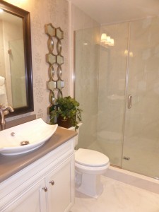
There is a full bathroom in the hallway just outside the room. It comes standard with a single sink and a shower/tub combo, though there is an option for just a shower. The model shows an upgraded sink and the shower-only option with upgraded tile.
The main living area is on the other side of the foyer. The kitchen is at the front of the house, overlooking the covered porch. The square island sits right in the middle, but does not offer any seating. It has cabinets and drawers on two sides. The model also includes an upgraded convection oven/microwave in the island, rather than over the cooktop. The rest of the kitchen is arranged in a u-shape. The closest wall has the refrigerator and one pantry-height cupboard. The long wall facing the street holds the sink and dishwasher, along with numerous cabinets and drawers, plus ample counter space. The cooktop and oven (shown in the model instead as an upgraded range) are on the far wall. The sink and hardware are also upgraded.
The dining room is adjacent to the kitchen. With sliding doors to the yard on one side and the stairway on the other, it doesn’t have a wall for a hutch.
The living room is just beyond the dining area. It has windows facing one side and a sliding door (shown instead with the optional bifold doors) opening to a covered porch. The room is a nice size and has a much better layout than its Nash counterpart.
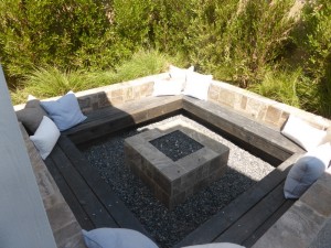
The porch and sideyard are nicer in this model. It is shown with a seating area, a fountain, and a sunken fire pit with benches around all four sides. It all connects to the side yard off the dining room, where there is a built-in barbecue and space for a table and chairs.
On the second floor, the stairs open up to a loft area. The room has a big bay window facing the street and is shown with the optional window seat. Though the loft isn’t that large, it is bright and offers a really nice extra space on the second floor.
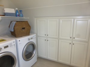
The laundry room is off the loft. It has side by side machines but have space for a sink. Linen cabinets are built into one wall, which has slightly lower ceilings.
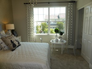
The bedrooms all come off of one hallway. Both secondary rooms face the street, each with two windows. Bedroom 2 is larger and has a standard, two-door closet. Though bedroom 3 is a little smaller, it has a nice walk-in closet. Both rooms have slightly elevated ceilings.
These rooms share a bathroom at the end of the hallway. It has two sinks set into a single vanity with a good amount of space between them. The traditional shower/tub combo is shown, though it has an option for just a shower. The room shows numerous upgrades, including hardware and tile.
The master suite is across the hall, facing the back of the house. The bedroom is a good size, but as it only has windows on one wall, it doesn’t have as much natural light. A small nook in the corner offers a tiny window. There is an option for a shelf there, though it isn’t shown in the model. One of the suite’s walk-in closets is off the main bedroom and is shown with upgraded built-ins. Long and narrow, this one is the larger of the two closets and is designated “hers” on the floor plan.
An optional door separates the bedroom from the bathroom. The two sinks are set into one very long vanity, with two sets of cabinets and drawers. One set of tall linen cabinets sits at the end of the vanity. The separate shower and tub sit across from the sinks and a shared deck provides a seat in the shower. “His” walk-in closet is at the back of the bathroom. It is a lot smaller and a slanted ceiling reduces the space on one side while offering extra tall shelves on the other.
For those with the Mid-Century Modern elevation who choose a rooftop terrace, the stairs would be directly above the existing staircase and wouldn’t cause any other changes to the layout of the house. Nathaniel is the only home in the Ellwood collection to offer an upstairs loft in addition to all three bedrooms. It is also the only one that has a specific option to convert the downstairs bedroom into a living area (study or craft room) instead. With these options, the home has a lot more common areas than its counterparts.
Nolan (Residence Three)
Approx. 2,300 square feet
4 Bedrooms, 3.5 bathrooms
Optional rooftop terrace in Mid-Century Modern elevation
Nolan is shown in the Mid-Century Modern elevation, so the model includes the optional rooftop terrace. This home has a long driveway, with the front door and the garage perpendicular to each other. In the model, the welcome center replaces the garage. Unlike the Nash and Nathaniel plans, Nolan doesn’t offer many changes to the layout.
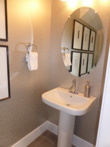
This home has a smaller covered porch than the other two. It leads into a wide foyer, with the stairs at the end of it. A curved doorway leads to the powder room and downstairs suite. The powder room has a pedestal sink.
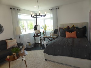
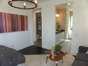
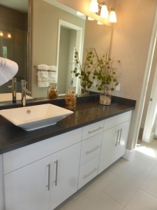
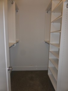
The main floor bedroom is really big and is designed like a second master suite. Windows face the front and side of the house, with a full wall of windows facing front in the other two elevations. The en-suite bathroom shows the standard single sink, though a double sink is available. The shower is a really good size and is shown with the optional seat, though the standard model actually has linen cabinets in the adjacent water closet instead. Another set of lower linen cabinets are at the back of the bathroom, next to the long, narrow walk-in closet. Because the closet sits under the stairs, it has a much lower ceiling at the back.
The living room, kitchen and dining room are on the other side of the foyer. The living room is at the back of the house. Windows face the back, while sliding doors (shown instead with the optional bifold doors) open to a covered porch. The room has a good set up.
The kitchen is next to the living room. It has a long island with seating for four on one side and cabinets and drawers lining the other. The L-shaped room has the cooktop, oven and microwave on the shorter wall. The fridge, sink, dishwasher, and one set of pantry cupboards are along the other wall. This kitchen doesn’t have a lot of upper cabinets, though there are plenty of lower cabinets and drawers. Access to the two-car garage is right next to the pantry.
A separate, but open, dining room is on the other side of the kitchen. The room is a nice size, with sliding doors or optional bifolds opening to the same covered porch as those in the living room. Another set of sliding/bifold doors opens to the side yard. I like how the dining room is its own space but is still open to the kitchen and living room. However, I dislike how the garage opens right into the room.
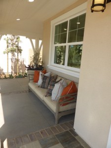
The covered porch is a good size, with plenty of room for seating. An uncovered portion and the connected side yard offer extra space as well.
Like the other Ellwood homes, all of the upstairs rooms come off of one long hallway. Bedroom 2 is directly across from the stairs and faces the front of the house. It has a full wall of windows facing the street and two more on the side. It has a standard, two-door closet.
Bedroom 3 is a lot bigger and has a full wall of windows facing the back of the house, plus a small one on the side. It has a walk-in closet.
Both secondary bedrooms share a bathroom in the hallway. It shows the optional double sinks, rather than the standard single. The vanity is pretty long so there is definitely space to easily fit both sinks. An optional door separates the sinks from the rest of the bathroom. The model shows the standard shower/tub combo (albeit with upgraded tile), but a shower-only option is available, as in the other models.
The laundry room is across the hall from the bathroom. It has side by side machines and a sink, but doesn’t come standard with cabinets.
The master suite is at the end of the hall. When you enter, there is a short hallway with the bathroom on one side and “her” walk-in closet on the other. The bathroom is a big, open square. The two sinks are set into a single vanity. On another wall, the bathtub sits beneath the windows. The shower and water closet are on the other wall, though the shower does still share a partial deck with the tub.
The master bedroom is really big, with plenty of room for a seating area. Windows on three walls let in a lot of light. “His” walk-in closet is off the bedroom and is only slightly smaller than the first closet. Both are shown with optional built-ins.
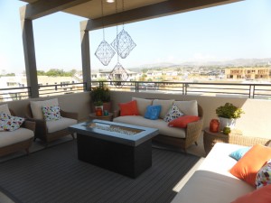
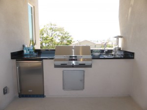
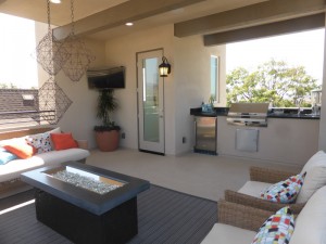
The highlight of the Nolan home is the optional rooftop terrace. It offers a really nice mountain view, which will hopefully still be visible once the neighborhood is full built out. It’s a really big space, with plenty of room for a variety of seating options. The model also shows the optional outdoor kitchen, which includes a grill, mini fridge, and sink.
The Nolan home offers a lot of living space, with big bedrooms, a nice living room, and a couple of different outdoor options. Most rooms have windows on at least two walls, so they get light throughout the day. Like the Nash plan, this one lacks a downstairs coat closet, though at least this one has a bigger entryway that offers some space for a “drop zone.”
Overall, the Ellwood collection feels a lot more like true single family homes than condos. Each house has a downstairs bedroom and full bath, plus three more bedrooms upstairs. The various options in each model allow for a lot of customization. While the covered porches don’t offer too much outdoor living space, they do all have enough for a grill, table and chairs.
