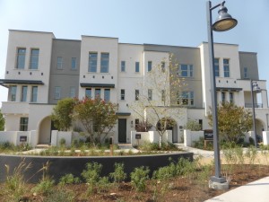
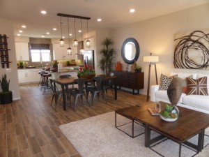
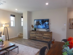
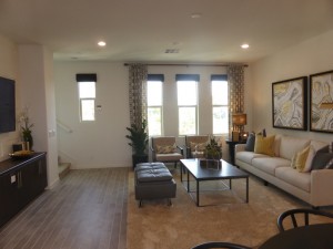
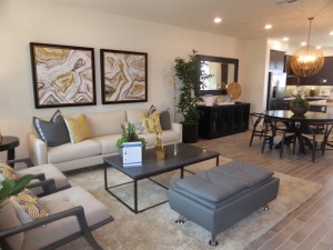
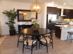
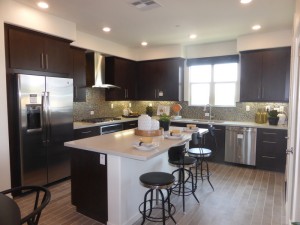
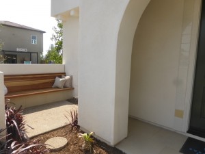
The Rowland Collection in Beacon Park has the neighborhood’s only set of townhomes. Built by Lennar, the collection includes four different, three-story models comprising 107 homes. The collection is split in half, with the earlier phases being built on the south side of the planned K-8 school and the later phases just north of the park, behind the current models. Each building will have three or four attached townhomes. Plans 1 and 2 will always be interior units and Plans 3 and 4 will always be end units. Homes range from 2-3 bedrooms and 2.5-3.5 bathrooms, with 1,661 – 2,076 square feet of living space. Building elevations include Mid-Century, Abstract Traditional, and Art Deco.
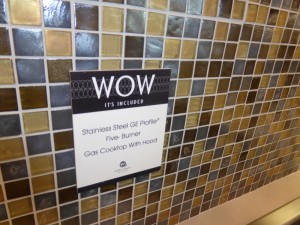
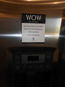
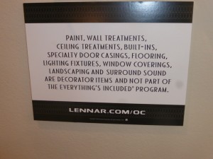
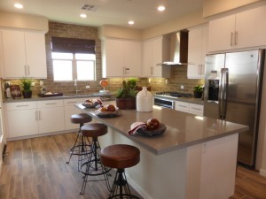
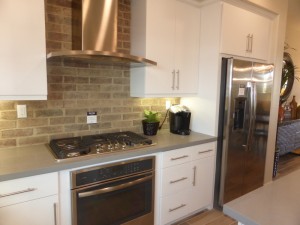
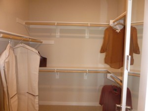
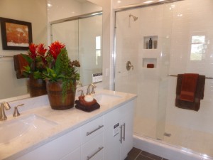
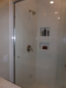
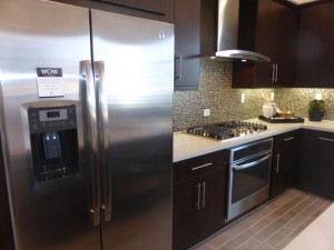
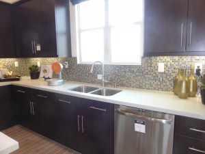
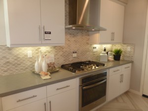
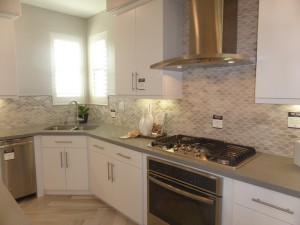
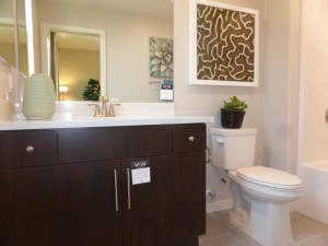
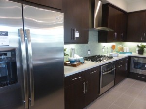
Lennar boasts an “everything’s included” policy, meaning what you see in the models comes standard in the homes. This generally applies to things like appliances, countertops, tile, basic hardware, etc. Exceptions to the policy include flooring, built-ins, window treatments, furniture and all decorative items. You’ll find signs saying “WOW it’s included” on items throughout the models. Standard features include ceramic tile flooring at entry, kitchen, baths, and laundry home, Mohawk(R) wall-to-wall carpeting in living areas and bedrooms, laundry room with cabinetry and sink (even the GE washer & dryer are included), USB ports in kitchen and bedrooms and high-speed wiring. The kitchens have GE Profile appliances including a five-burner gas cooktop with hood, convection microwave oven, built-in electric oven, dishwasher, and side-by-side refrigerator with ice and water dispensers. There are Caesarstone(R) countertops with a 6″ backsplash and flat panel white or coffee Thermafoil cabinetry with soft close hinges. Guest baths include Moen(R) faucets with brushed nickel finish, Piedrafina(R) engineered stone countertops and the same cabinetry as the kitchen. Master suites include the above, plus clear glass shower enclosures with full height tile surround and walk-in closets with a two-sided mirrored French door and built in shoe rack.
Some of the green technology included with the homes are tankless water heaters, low-E glass, full exterior door weather stripping, central air conditioning, water conserving faucets and showerheads, energy-efficient LED lighting, and prewiring in the garage for charging electric/hybrid vehicles. Another feature is home-automation-ready by Nexia (TM) Home Intelligence, including wireless camera, touch-screen deadbolt and programmable thermostat.
Beacon Park is going to have its own K-8 school, called Beacon Park School, which is slated to open in August 2016 as part of the Irvine Unified School District. There will be a new high school, Portola High, opening nearby (also scheduled for August 2016). Until then, students will attend Canyon View Elementary, Jeffrey Trail Middle School, and Northwood High School.
Basic Neighborhood Financial Information
Approximate HOA Dues: $141 – $216 per month for the Great Park Neighborhood Association plus $300 per month for the Rowland Homeowners Association, reduced to approximately $187 per month at buildout
Base Property Tax: 1.1%
Special Assessment Taxes: $4,762 – $5,450 per year
Prices start at $609,990 for Plan 1, TBD for Plan 2, $669,990 for Plan 3 and $689,990 for Plan 4
Residence One
1,661 square feet
2 bedrooms, 2.5 bathrooms
Den
Two-car garage
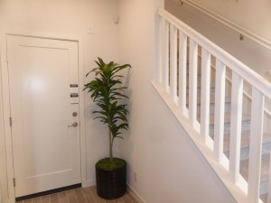
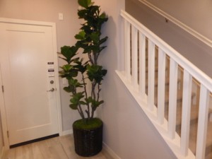
Residence One is currently used as the collection’s welcome office, so the first story isn’t a true representation. The actual homes will have a small foyer, direct access to the two-car garage, and a den with sliding glass doors on the first floor.
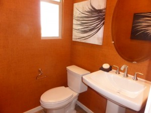
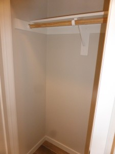
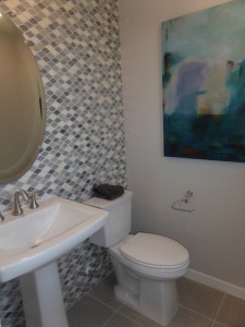
On the second floor, there is a powder room directly across from the top of the stairs, making it the first thing you see when you walk up to the main living area. It includes a pedestal sink. There is a small coat closet next to it with a single shelf and pole.
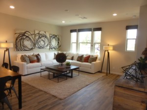
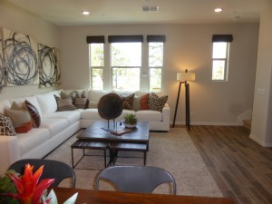
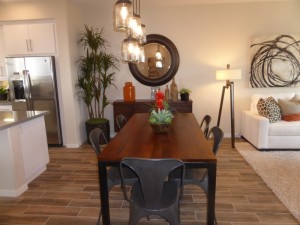
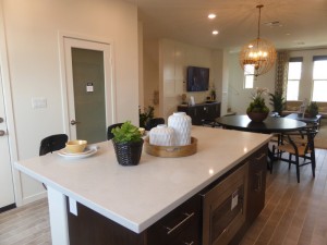
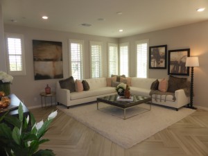
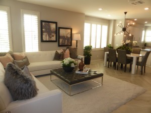
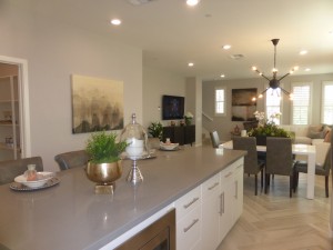
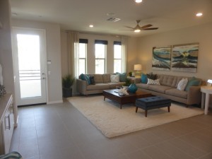
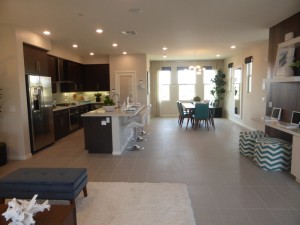
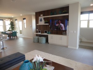
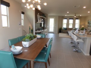
The house then opens up to the large, 17′ x 22′ great room. It has a living room on the front side, dining area in the middle, and kitchen at the back. The living room has several windows facing the street and recessed lighting. It is a big room, with the stairs to the third floor in the front corner.
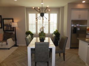
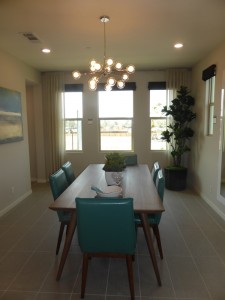
The dining room has space for a large table and a hutch, with wiring for a chandelier.
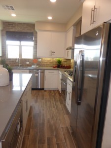
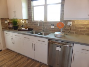
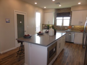
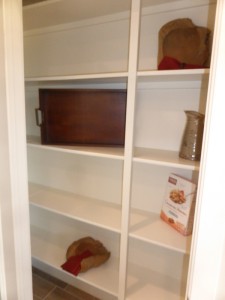
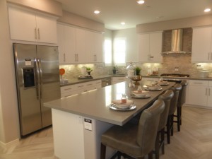
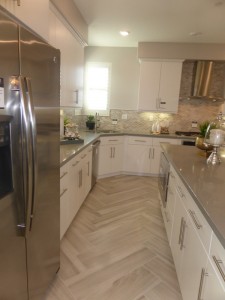
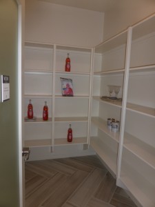
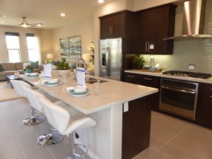
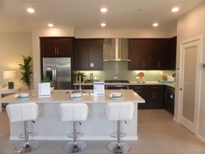
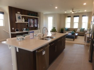
The 13′ x 13′ kitchen is well designed with a long center island and L-shaped counters around it. The convection microwave oven is built into the island, making it quite low and rather awkward. The other side of the island offers bar seating for four. The fridge sits closest to the dining room, next to a long counter that houses the cooktop and oven. The other counter has the sink and dishwasher; windows above it face the back of the home. The third wall has a walk-in pantry with built-in shelves. Aside from the placement of the microwave, I thought the kitchen was well laid out, with lots of counter space and plenty of storage.
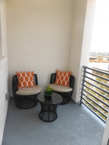
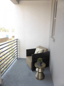
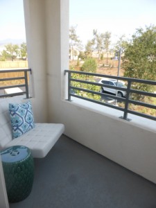
There is a small balcony off the kitchen, which would overlook the garages. Aside from a front porch, this is the only outdoor living area.
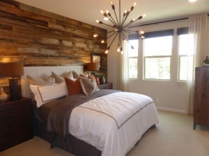
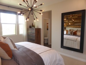
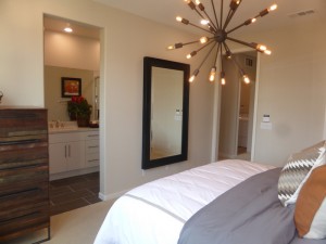
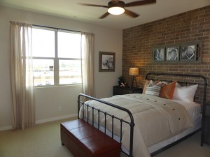
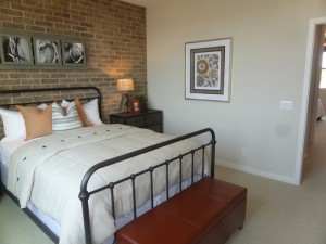
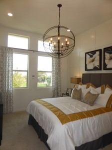
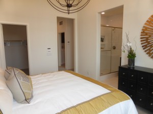
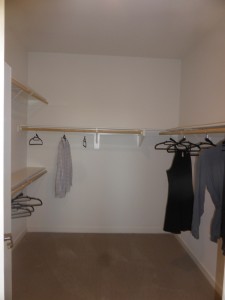
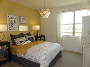
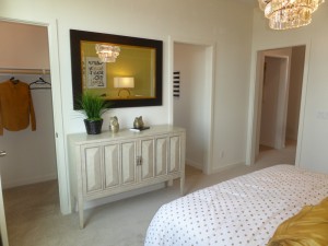
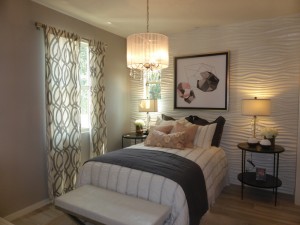
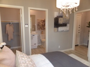
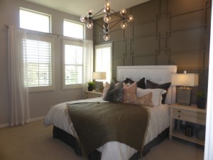
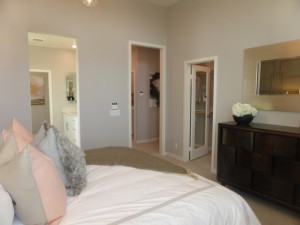
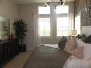
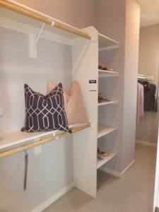
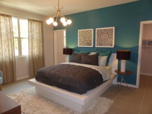
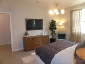
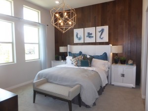
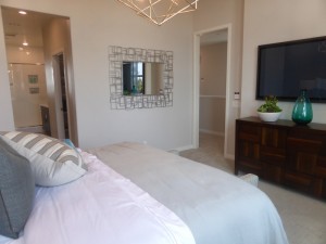
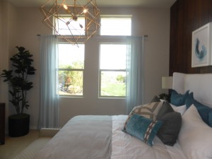
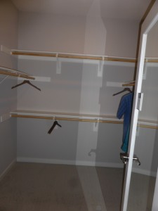
Both bedrooms are on the third floor. The master bedroom is at the front of the house, closer to the top of the stairs. It is 11′ x 15′ and has three windows facing the street. It is pre-wired for a ceiling fan or lighting unit. The walk-in closet is in one corner of the room, with several shelves and hanging poles. Its built-in shoe rack is behind the door.
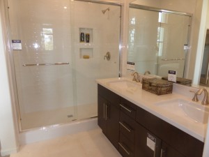
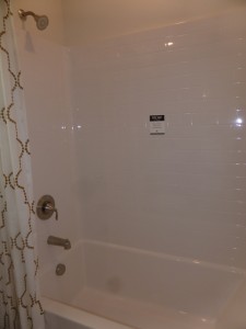
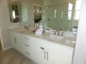
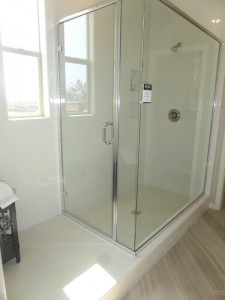
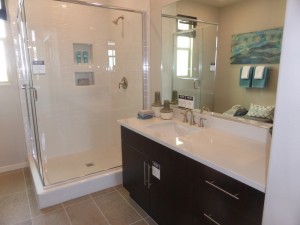
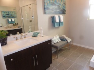
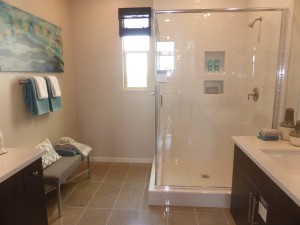
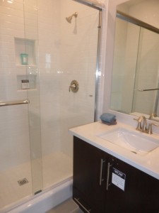
The master bath has a vanity with two sinks, two sets of cabinets, and three drawers. The shower has plain white tiles throughout and is a good size, with cutouts for shampoos and soaps. The suite does not include a bathtub.
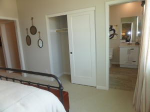
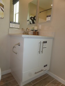
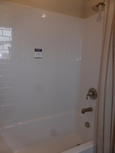
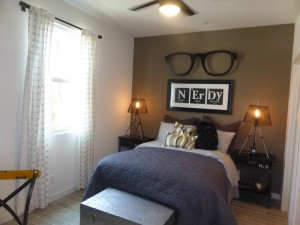
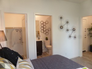
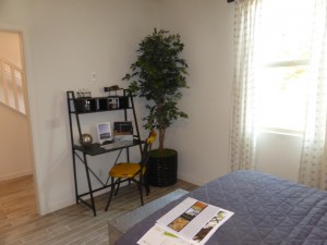
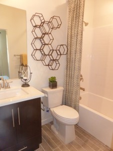
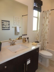
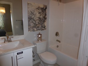
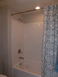
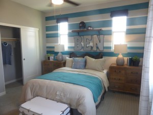
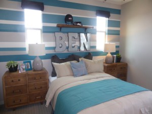
The other bedroom faces the back of the house and is 12′ x 12′ with two windows. This room is also wired for a ceiling fan. It has a two-door sliding closet and an en-suite bathroom. This bath has a small vanity with one sink and very little counter space. It has a shower/tub combo with white tile.
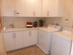
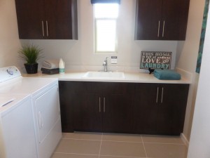
The laundry room is off the upstairs hall. It has a GE top loading washer and front loading dryer, a sink, a folding counter, and five sets of cabinets (three upper, two lower).
The biggest downfall to this house, which I observed throughout the Rowland collection, is a lack of general storage space. While the kitchen and bathrooms have enough storage, the rest of the house doesn’t. Aside from the small coat closet on the second floor, there aren’t any other closets for storing things like luggage, vacuum cleaners, and seasonal items.
Residence Two
1,748 square feet
3 bedrooms, 3.5 bathrooms
Two-car garage
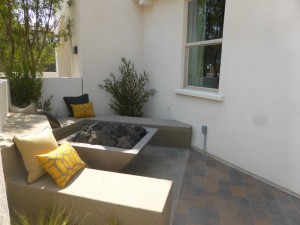
Residence Two is almost identical to Residence One. The front porch is a good size with room for a fire pit. The foyer is small, again with access to the garage and possibly space for a very narrow entry table or bench.
The biggest difference between Plans 1 and 2 is on the first floor, where Plan 2 has a full bedroom and bath instead of a den. The bedroom is 12′ x 9′ with a single window facing the street. It has a walk-in closet and en-suite bathroom. The bath has a small vanity with a single sink and one set of cabinets. There is a shower/tub combo as well.
The second floor is a mirror image of Plan 1. The powder room and coat closet are at the top of the stairs. The great room is slightly bigger at 17′ x 23′ but I couldn’t spot any other differences (and only noticed the size difference because it is stated in the floorplan). The decorators show a round dining table instead of a rectangular one, giving a different perspective on how to use the space.
The kitchen island is a little shorter in Plan 2. The microwave is in the middle of the island instead of at one end and the dishwasher is on the other side of the sink relative to the rest of the appliances. It’s essentially the same though, as these differences are so minor most people won’t notice them.
The kitchen still has a walk-in pantry and a deck off one corner.
The other two bedrooms are on the third floor and, again, very little is changed from Plan 1. The Plan 2 bedrooms are actually each one foot shorter, so you do have a little less space. The master closet is larger, which accounts for the loss of space in the rooms. The master bath is also set up in basically the same way.
The secondary bedroom still has a walk-in closet and en-suite bath, this time with a different layout allowing for a larger vanity.
I think having a full bedroom and bath downstairs is more appealing than a den, as it allows for more versatility. The bedroom measures 12′ x 9′, while the den is 7′ x 14′ so you also get a little more space with Plan 2.
Residence Three
1,837 square feet
3 bedrooms, 3.5 bathrooms
Two-car garage
Once again, there aren’t a lot of differences between Plan 3 and the other two models. As I mentioned earlier, Plan 3 will always be an end unit, so there are a lot more windows and a lot more natural light. This model is also bigger overall, so while the layout is basically the same, each room has a little more space. Even the front porch offers a little more room and the foyer seems a tiny bit bigger.
The first floor bedroom is 12′ x 10′ with windows facing both the front and side. Though it’s only a foot longer than the one in Plan 2, it feels bigger. This one again has a walk-in closet and en-suite bathroom. The vanity is small and there is a shower/tub combo.
Once again, the powder room is right at the top of the stairs. The setup is exactly the same, with a pedestal sink. Unlike the other models, Plan 3 does not have a coat closet next to the bathroom, nor did that add one anywhere else, so this home does not have a single closet for general storage.
The great room is the same size as in Plan 1. The key difference is extra windows on the side to brighten things up.
The dining room also has a large window, rather than a solid wall like the other plans. This takes away the space for a hutch, but a low buffet could sit under the window.
The kitchen is a little bit bigger, at 13′ x 15′ and the layout is a little different as well. The island is long and narrow and can easily seat four people. The microwave is still in the island. The kitchen sink is now in the corner, rather than the middle of one of the long counters. The fridge is still closest to the dining room and the cooktop and oven are in the middle of the other side. The walk in pantry is more than twice as large as in the other models and has built-in shelves on all three sides. The extra large pantry is what caused the elimination of the coat closet. The deck off the kitchen is a little bigger in this model as well.
The layout of the third floor is slightly different in this model, but the master bedroom still faces the front and the secondary bedroom is at the back of the house. The laundry room sits between them.
The master bedroom is bigger at 13′ x 14′ and has an extra window facing the side. The walk-in closet is long and narrow, as opposed to the squarer ones in the other two plans. The built-in shoe rack is in the center of the closet instead of behind the door, making it more accessible.
Although the master bath is a lot bigger in this model, it still does not have a bathtub. The vanity is longer and has wider cabinets. The shower now includes a “dry off” area, which is a tiled section outside the enclosure. I think a bench inside the shower would have been a better use of the space.
The secondary bedroom in this home is the smallest of the three models at 11′ x 11′. It only has windows facing the back, as it is on the wrong side of the house to have side-facing windows. A small alcove in one corner leads to the walk-in closet and en-suite bathroom. This bathroom has a good-size vanity and a shower/tub combo.
Though this model is only about 90 square feet bigger than Plan 2, it did feel a little more spacious. I really dislike the lack of a coat closet and would rather have a smaller pantry and add that closet back in.
Residence 4
2,076 square feet
3 bedrooms, 3.5 bathrooms
Two-car garage
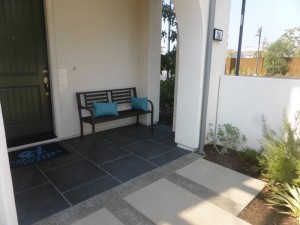
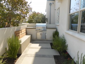
Plan 4 has a big front porch area, which the model shows with a built-in barbecue area. The entryway is the same as in Plan 3.
The first floor bedroom is a lot bigger, at 12′ x 15′ and has a different layout than in the other plans. This room truly felt spacious and bright, as it has two big windows facing the street instead of just one. The walk-in closet is bigger. The vanity in the en-suite bathroom is also bigger than in the other models. This bathroom also has a shower/tub combo.
On the second floor, the layout is significantly different. In a nice change of pace, the powder room is not the first thing you see when you come upstairs. The living room is still at the front of the house. Windows face the street and side. The deck is off the living room as well, sitting directly above the front porch, instead of the back as in the other three plans. At 19′ x 17′ it sounds smaller, but it doesn’t include the dining area as it does in the other plans.
The dining room, instead, is at the back of the house. A nice, bright room with several windows facing the back and side, it is designed to be a little more like a formal dining area than an extension of the great room.
Strangely, the powder room is off the dining room, though there is a small alcove between them. As in the others, it has a pedestal sink.
The kitchen is in the middle of the second story. The island now houses the sink and dishwasher instead of the microwave. It still has seating for four. Though the counters are still L-shaped, one side is now much shorter to allow room for the walk in pantry, which had been on its own wall in the other models. In this setup, the fridge is still closest to the living room, the cooktop and oven are in the center of the long counter, and the microwave is built in below the short counter. I still find the low microwave to be strange.
The layout on the third floor is a little different again. The laundry room is now at the front of the house, with a much bigger counter and a small window facing front.
The master bedroom is also at the front of the house. It only has windows facing front, as the laundry room occupies the outside wall. At 14′ x 13′, it is the same size as in Plan 3. The walk-in closet is now down the same hallway as the bathroom. It is square, with the shoe rack behind the door, as in plans 1 and 2.
The master bath has split vanities, with one each side, creating a lot more cabinet and counter space. Rather than a designated dry off area with the same tile floors as the shower, this bathroom has a dressing area that offers more flexibility.
The secondary bedroom is 12′ x 11′ and, as it is on the outside wall, it has windows on two walls. As in Plan 1, it has a two-door standard closet rather than a walk-in. The bathroom has a small vanity. Unlike the other three plans, this one only has a shower and no bathtub.
I like some of the changes made to this layout, but not all of them. I think it’s nice to have a designated dining room, but don’t like that it came at the expense of the kitchen counter space. Nor do I like having the powder room off the dining room. I also would have liked to see the master bedroom on the outside wall, rather than the shared wall.
Overall, the Rowland collection is a lot nicer than many townhomes I have seen. The kitchens and great rooms are large and well-designed. All of the showers are big, though none have benches. The lack of closets is definitely a downfall for this collection. While having a first floor bedroom is a definite plus, I think the overall idea of three story house will turn some people off. As these are the only townhomes in Beacon Park, I’m sure they will still attract many visitors.
