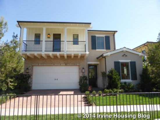
The final collection of homes in the Orchard Hills II neighborhood is Strada. These homes are the biggest, ranging from 2,195 – 2,693 square feet. Again, these homes were built by Irvine Pacific. All homes have 4 bedrooms, 3 – 4.5 bathrooms, and some models also have a loft or bonus room. All homes have a two-car garage. In addition to the three standard models, there is also a Residence 2X and a 3X. All models have a main floor bedroom. The Strada collection is the first one north of Narrow Path when you enter the community. It surrounds Orchard Vista Park and some homes will have views of the avocado groves.
Some of the standard amenities in all homes include Kitchenaid stainless steel appliance package, including cooktop, oven, microwave, dishwasher and hood; white satin Thermofoil cabinets with adjustable shelves; granite slab kitchen counters with 6-inch backsplash and full backsplash at cooktop; stainless steel double basin sink with Kohler pull-out faucet; master bath with a sterling tub with 6” x 6” tile surround and separate shower; dual Kohler undermount sinks with marble countertops and backsplash; Kohler polished chrome faucets; ceramic tile flooring at entry, kitchen, dining, baths and laundry; plush carpet throughout living areas; pre-wired multi-media plate; fire-resistant concrete tile roofs; decorative front doors; high efficiency air conditioning and gas furnace; tankless water heaters; and energy efficient bathroom fixtures. All homes are Build it Green™ Certified.
Strada homes have four different elevations: Monterey, Northern Italian, Formal Spanish and Tuscan. The Strada neighborhood is actually split between the Tustin and Irvine Unified School Districts. Of the 224 total homes, 60 will attend Tustin schools and will be in the first several phases released. The remaining 164 homes will be zoned for Irvine Unified, with those phases coming after the initial 60 have sold. Students going to Tustin schools will attend Hicks Canyon Elementary, Orchard Hills School, and Beckman High School. Currently, Hicks Canyon serves grades K – 4 and Orchard Hills serves 5 – 8. Eventually Orchard Hills will be a K-8 facility. Students attending Irvine Schools will go to Canyon View Elementary, Sierra Vista Middle School, and Northwood High School.
Basic Neighborhood Financial Information
Approximate HOA Dues: $196 per month
Approximate Tax rate: 1.06%
Approximate Mello Roos for schools in Irvine Unified: $4512 per year (AD Tax: $2,650; CFD Tax: $1,700; other tax $162)
Approximate Mello Roos for schools in Tustin Unified: $4,554 – $5,104 per year (AD Tax: $2,650, CFD Tax: $1,800 – $2,350; other tax: $104)
Overall Effective Tax Rate: 1.5%
Prices start at around $970,000 for Residence One, $1,020,000 for Residence Two, and $1,088,000 for Residence Three.
Residence One
2,195 square feet
4 Bedrooms, 3 Baths
Optional California Room, Optional Super California Room, Optional Conservatory
Base Price: $970,000 ($442 per square foot)
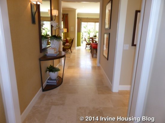
Residence One is modeled in the Monterey style and features a large balcony on the second floor. When you enter, there is a long hallway leading back to the great room and kitchen, with a doorway leading to the downstairs bed and bath on the right. Upgraded flooring and window treatments are found throughout the model.
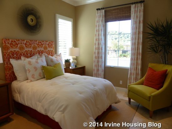
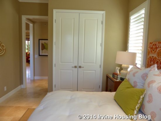
The downstairs bedroom is pretty typical. It is average in size, has windows facing the street and side of the house, and has a somewhat small, standard closet. The model shows the optional French-style doors instead of the regular sliding closet doors. There are upgraded recessed lights and crown molding.
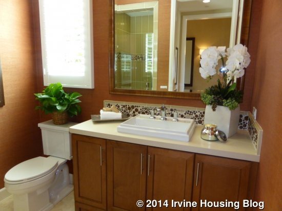
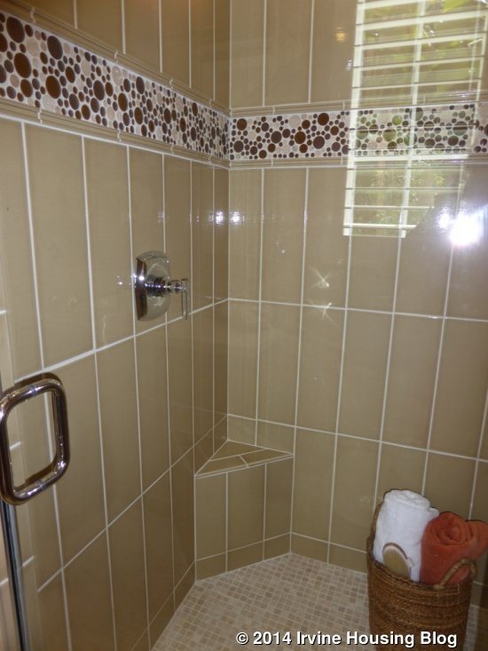
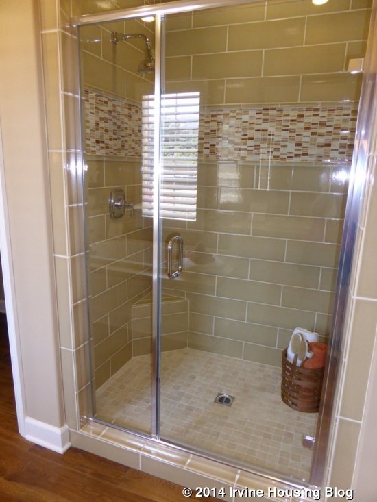
The adjacent bathroom features numerous upgrades. The single sink vanity is shown with upgraded cabinets, drawer pulls, Caesarstone countertop, backsplash and framed mirror. The vanity is a bit bigger than in many first floor bathrooms. The shower tiles, including the surround, decorative liner, and floor, are all upgraded. There is not an option for a bathtub.
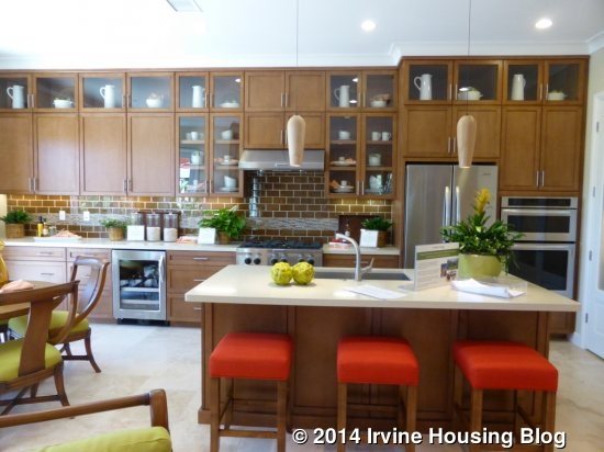
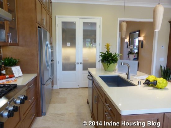
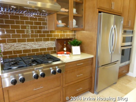
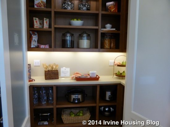
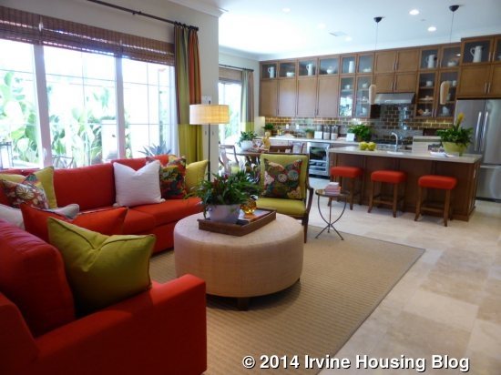
The great room, kitchen and dining room are at the back of the house. The kitchen is on the right and is also shown with many upgrades. There is a center island with bar seating, as well as the sink and dishwasher. All of the other appliances are spread across one long wall. The oven, microwave and fridge come first, followed by a short counter, and then the cooktop. There is a longer counter on the other side that stretches all the way to the back of the dining room. Upgrades include the cabinets, refrigerator, beverage center, furniture package detail at island, brushed chrome tubular pulls, glass doors, pot and pan drawers, Caesarstone countertop and backsplash. The other appliances, plus the sink and faucet, are part of the standard package. This home also has a walk-in pantry at one end that is shown with a built-in unit instead of the standard shelves. The pantry doors are also upgraded.

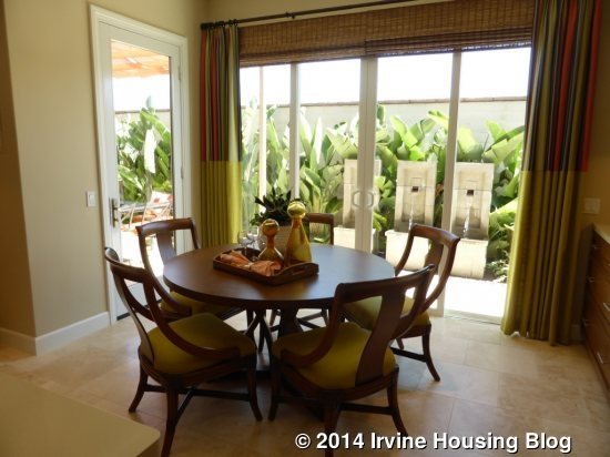
The dining area is just behind the kitchen. It includes double sliders and a single French door, all leading to the backyard. There are no upgrades shown in the dining room.
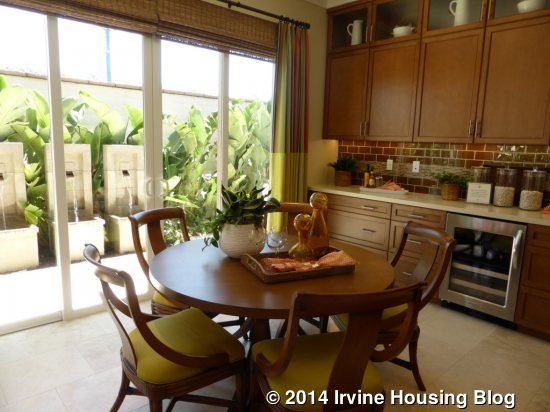
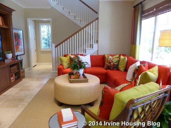
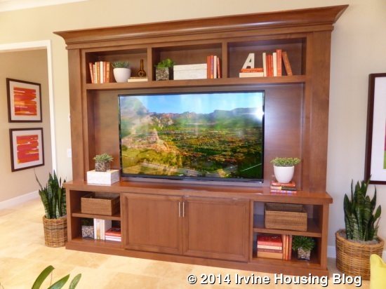
The great room is adjacent to the kitchen. It resembles most other great rooms I’ve seen throughout Orchard Hills. A full wall of windows faces the backyard and an upgraded built-in unit sits on the opposite wall. The biggest difference between this great room and all the others is that the staircase to the second floor actually sits at the far side of the room, rather than off the hallway. A small alcove at the foot of the stairs leads to the garage access and a big closet with storage beneath the stairs.
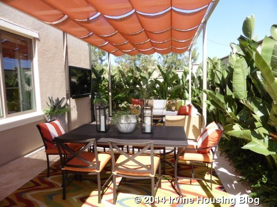
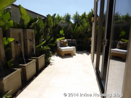
The backyard of this model has a few different options and is shown with the standard trellis option, though the trellis itself is upgraded from the basic wooden structure. The yard is long and narrow and is shown with three fountains along the back wall. Buyers who don’t want the traditional trellis can opt for one of two California rooms instead. The basic California room is about as wide as the great room, not including the stairway area. The Super California room stretches all the way to the end of the house. Both options still have a French door from the dining room. The final option for this space is a conservatory, which is actually an indoor room. In this case, the windows in the great room become the wide doorway into the room, and the French door in the dining room is also just an open doorway. The conservatory would have French doors leading to the backyard and windows on the other wall. It would be the same size as the standard California room. Buyers choosing the conservatory would gain an inside room, but lose most of their outdoor space.
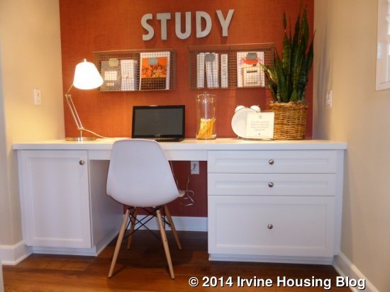
Upstairs, there are three bedrooms, including the master. There is an optional tech desk at the top of the stairs. The master bedroom sits at the end of the long hall and the other bedrooms are off to the right.
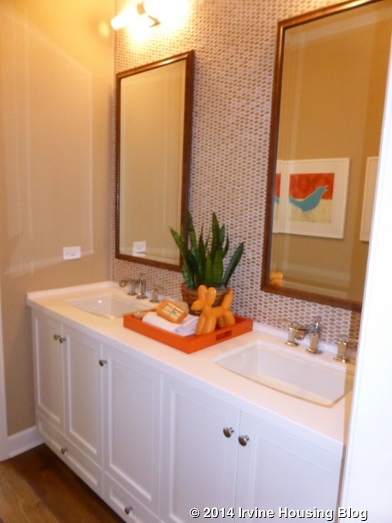
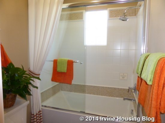
As you go down the hall on the right, the bathroom is the first door on your right. It includes two sinks in a shared vanity, shown with upgraded cabinets, backsplash and counters. A door separates the vanity from the shower/tub combo, which is also shown with upgraded tile liners. The sinks and hardware are all standard. There is a small linen closet just opposite the bathroom. There is an option for a shower without a tub.
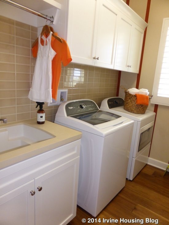
The laundry room is at the end of this hall. It has side by side machines, a sink, and upper cabinets. The countertop surrounding the sink, tile wainscot, and the cabinet style and finish are all upgrades.
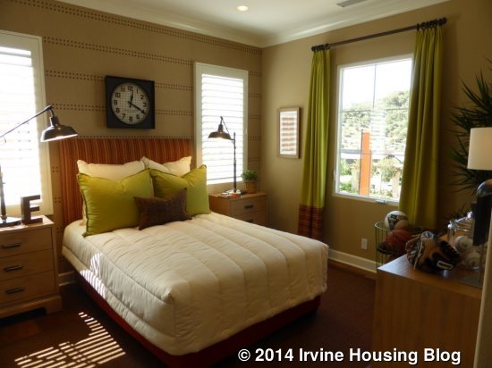
Bedroom 2 is on the left and is the smaller of the secondary rooms. It has one window facing the street and two more facing the side. There is a standard closet with storage above, shown with upgraded doors.
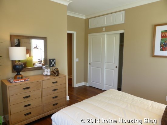
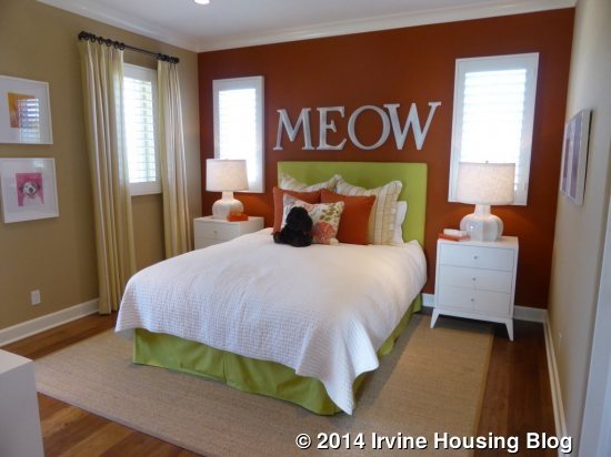
Bedroom 3, which is on the right, is noticeably bigger. Like the other room, it has a standard closet and storage above. The recessed lights and crown molding are upgrades. Two windows face the side of the home; an additional window and French door face the street. The door leads to the large balcony that spans the full length of the bedroom and laundry room. Some elevations may only have a small, Juliette balcony.
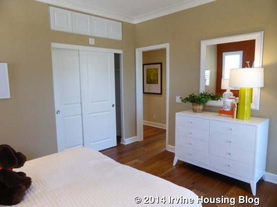
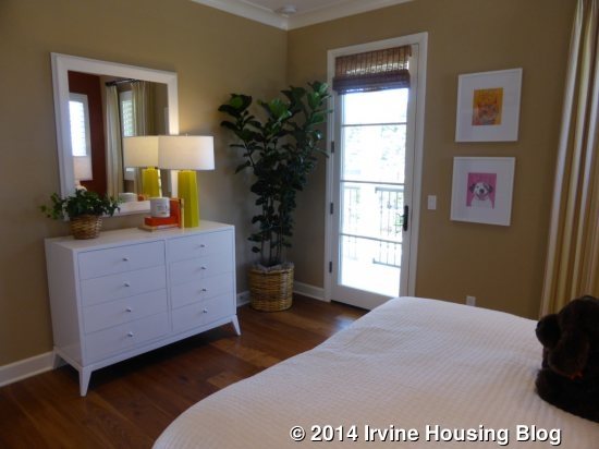
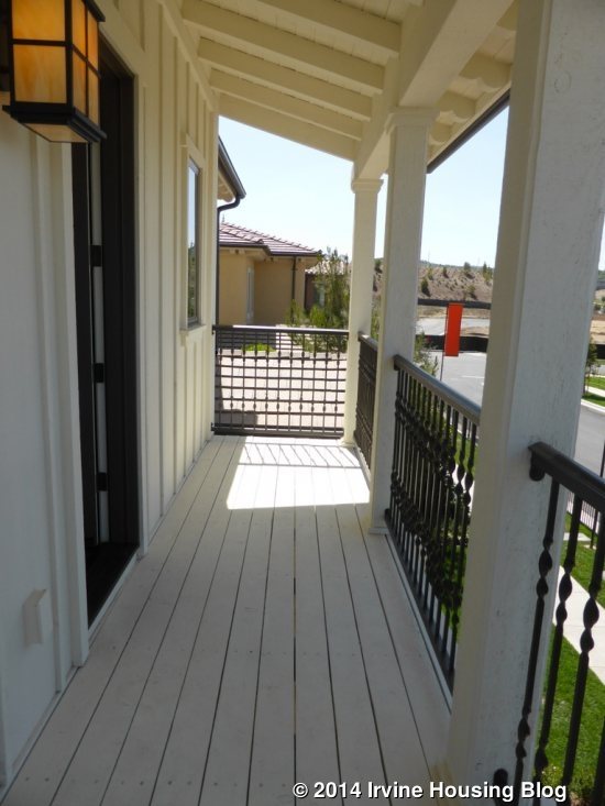
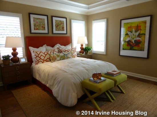
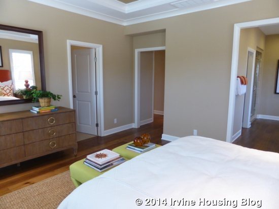
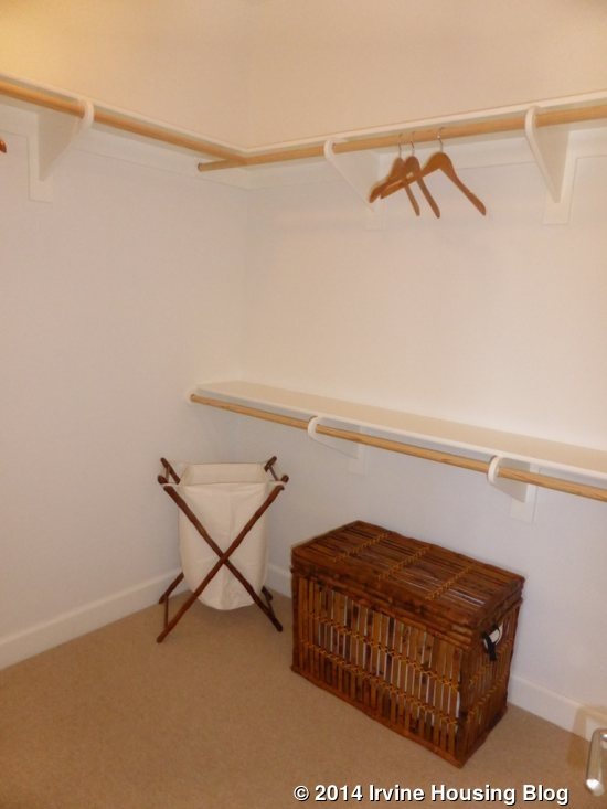
The master bedroom is at the end of the main hallway. It is similar to most other masters I’ve seen, though it feels a little more spacious than some. The recessed lights, ceiling fan and crown molding are upgrades. The closet is just inside the main doorway, rather than being part of the bathroom as in most homes. It is shown with the standard pole and shelves.
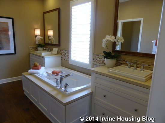
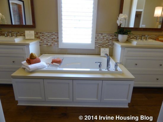
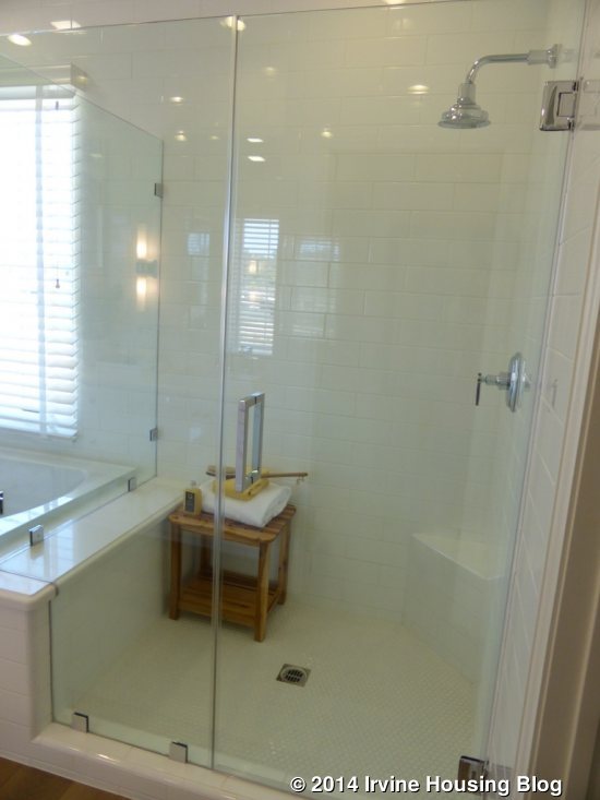
The master bath features split sinks with the bathtub in the middle. Each vanity has upgraded cabinets, drawers, detailing, countertop, backsplash and framed mirror. The tub deck shares the same upgrades, plus is a jetted tub instead of the standard. Buyers could also choose a free-standing tub in the same space. The shower is a good size, but only has a tiny seat in one corner. The shower tile is upgraded but the enclosure and hardware are standard.
Aside from the staircase being at the back of the house, this home is pretty similar to Irvine Pacific’s other Orchard Hills homes. It has a very similar layout with a bit more square footage than the others.
Residence Two
2,480 square feet
4 Bedrooms, 3 Baths
Loft, Optional California Room, Optional Conservatory
Base Price: $1,020,000 ($411 per square foot)
Residence Two X
2,512 square feet
4 Bedrooms, 3.5 Baths
Tech Space, Optional California Room, Optional Conservatory
Base Price: Not Listed
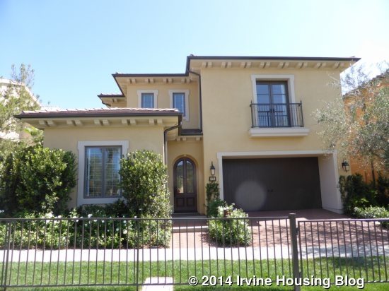
The model is the basic Residence Two, shown in the Northern Italian elevation. In the Two, the entry is at the front; in the Two X, the entry is at the side of the house. The Two has a full bath downstairs that is adjacent to the bedroom. In the Two X, there is a full, en-suite bathroom and a separate powder room downstairs. The Two X also has an additional, coat closet in the downstairs hall (both models have a big closet under the stairs). The Two has a big loft upstairs, while the Two X has L-shaped stairs and an L-shaped tech area, with the space between open to the first floor. Two X units will always be on corner lots.
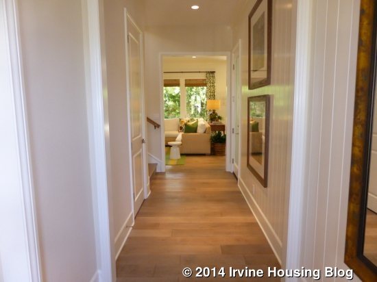
As in Residence One, the entry shows a hallway leading to the back of the house, with the downstairs bedroom off to one side (in this case, it’s on the left, because the home is shown in reverse).
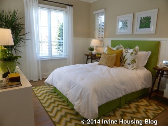
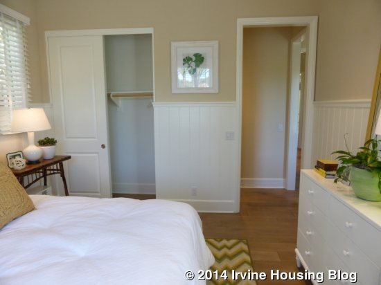
The bedroom is a little bigger than in Residence One. Windows on three sides will let light in throughout the day. It has a fairly small closet. The recessed lights, crown molding and wainscot are upgrades. In Residence Two X, the standard, small closet is replaced with a walk-in closet.
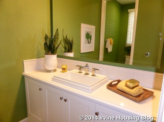
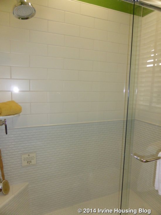
The adjacent bathroom has a larger vanity with a single sink (shown in an upgraded, top-mount style). Though the countertop and backsplash are upgraded, the cabinets are standard. The shower and toilet are through a separate door; the shower has upgraded tile throughout. There is an option for a shower/tub combo. In the Two X, the vanity is smaller and the toilet is right next to it. The shower is still through a separate door, but there is not an option for a tub. The powder room in the Two X would have a pedestal sink.
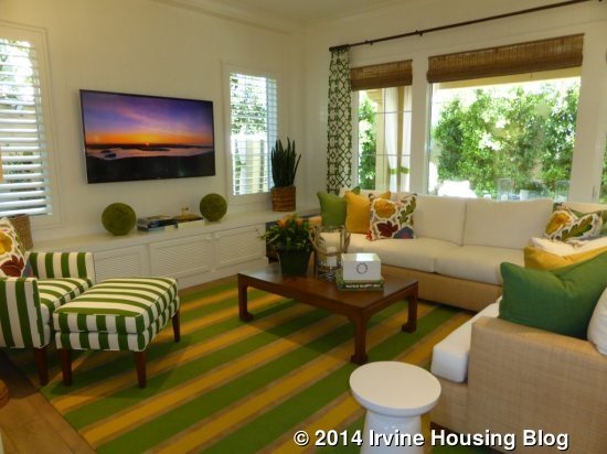
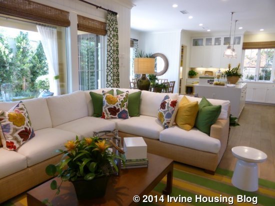
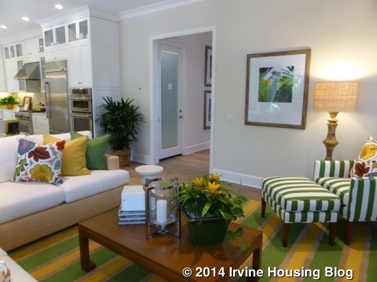
As you move down the main hallway, the stairs are on the left and garage access is on the right. At the end of the hall, the great room is on the left and kitchen on the right. The great room, again, resembles all the other great rooms I’ve seen lately. This one has two windows on the side and three more on the back wall. It has an upgraded built-in unit on one wall and is open to the adjacent kitchen.
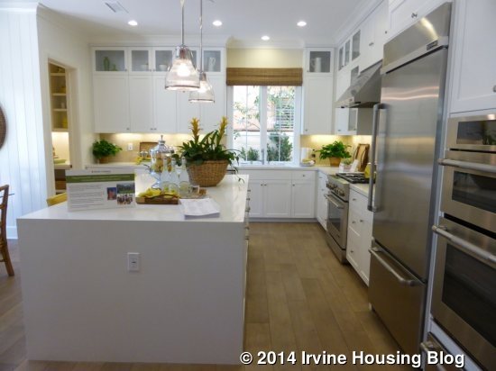
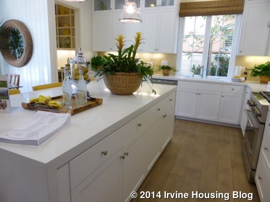
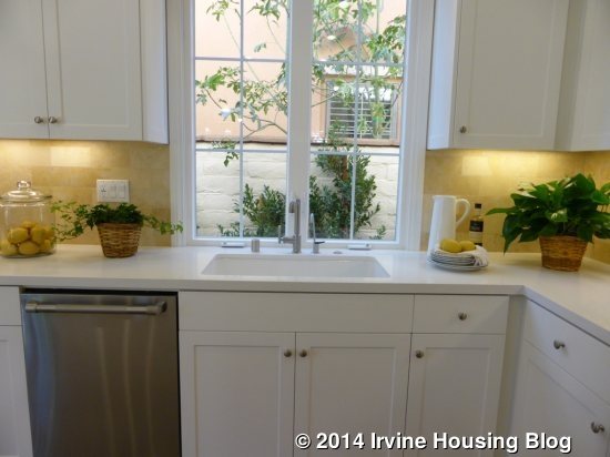
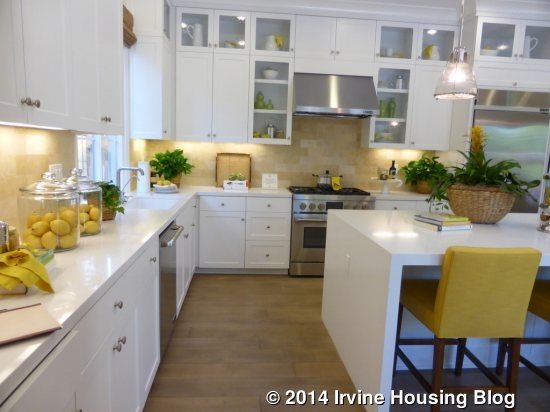
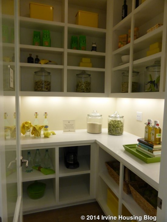
The kitchen is set up a little differently than some of the others, but is overall still similar. This one is a true L-shaped kitchen, with appliances, cabinets and counters taking up two full walls. The front wall has the oven, microwave, and fridge, plus the cooktop surrounded by counter space. The side wall has the sink and dishwasher, along with an optional mini fridge, plus plenty of counter space. The center island doesn’t have any appliances, but could have an optional sink (not shown). This kitchen has a fully upgraded Jenn-Air appliance package, plus warming drawers, glass cabinet doors, upgraded Caesarstone countertops, fully upgraded backsplash, and an upgraded sink and faucet. Aside from the glass doors, the cabinets are the standard white Thermofoil shaker cabinets with brushed chrome knobs. All of the extra counters make this kitchen feel much more spacious to me than some of the others. It also has a large, walk-in pantry in the back corner, shown with upgraded shelving units and a frosted glass door.
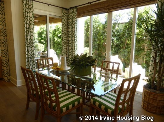
The dining room is behind the kitchen and is pretty similar to that of Residence One. The standard room has two sliding doors leading to the backyard and another slider leading to the (optional) California Room. As in Residence One, there is a standard trellis instead of the California Room or there is an option for a conservatory. Both the California Room and conservatory stretch all the way to the end of the house, so there isn’t a separate Super California Room option. If you choose the standard trellis, all of the sliding doors could be replaced with optional bi-fold doors.
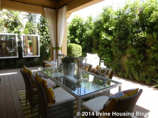
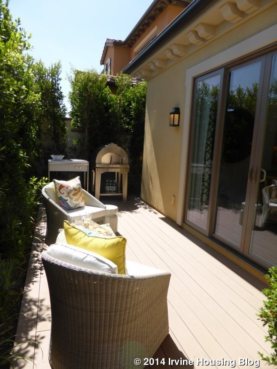
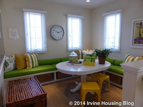
Upstairs, this home has a loft and three bedrooms, including the master suite. The Two X has a tech space instead of the loft. I really like the loft space in Residence Two. It is just to the right at the top of the stairs and feels very bright, with light coming in from two sides. It isn’t a huge space, but seemed comfortable and was shown with an upgraded built-in storage bench.
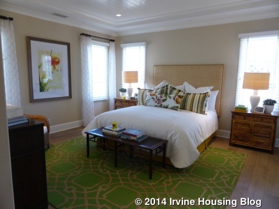
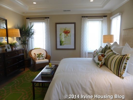
The master suite is on the left at the top of the stairs. Like the loft, it has light coming from two walls (the side and the back of the house) and it feels bright even though the windows aren’t particularly large. It is bigger than the master in Residence One and has plenty of wall space. The recessed lights, crown molding, and tongue & groove ceiling are all upgrades.
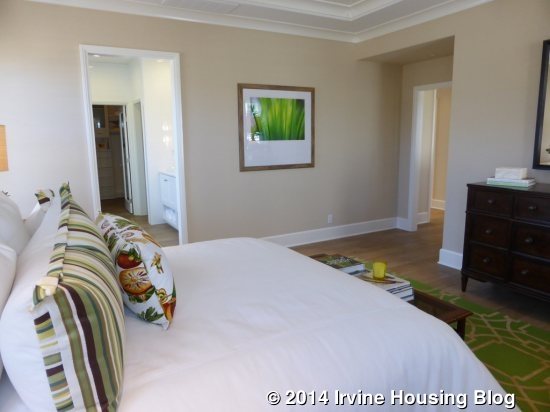
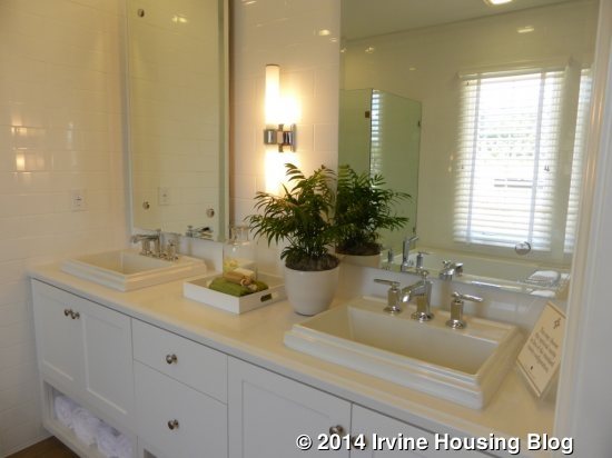
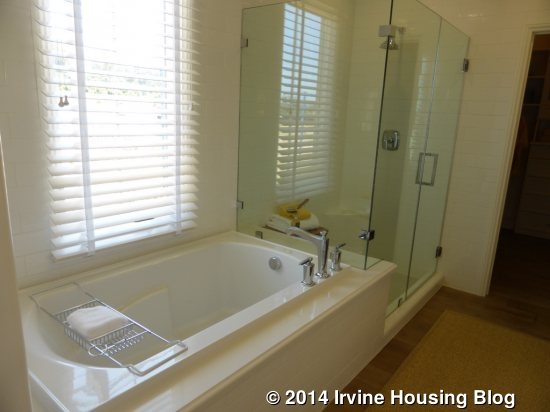
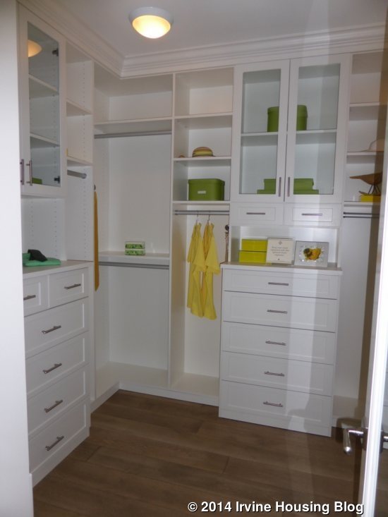
The master bath is highly upgraded. There is a vanity with two sinks but not too much extra counter space around or between them. The open shelving, backsplash, counters and mirrors are all upgraded. The bathtub and shower sit across from the vanity. The tub deck, shower tile and shower enclosure are upgraded, too. The shower is a pretty good size, with a wide ledge shared by the tub and a small seat in one corner. There is an option for a free standing tub. The walk-in closet is very big in this home and is shown with an upgraded door and full built-in organizer.
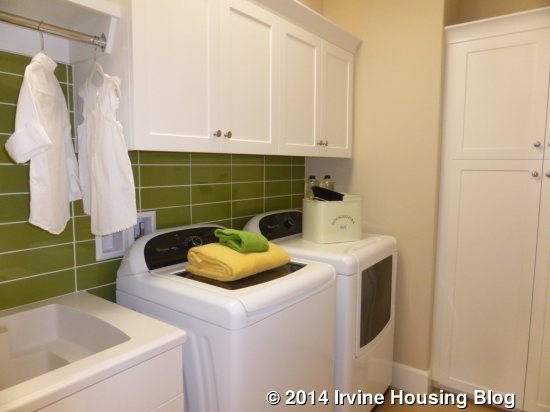
The remaining rooms are down a hallway that is straight ahead from the top of the stairs. The laundry room is on the left and has side by side machines plus a sink. There are upper cabinets plus a full-height linen cabinet. The tile is upgraded but the hanging bar over the sink is included.
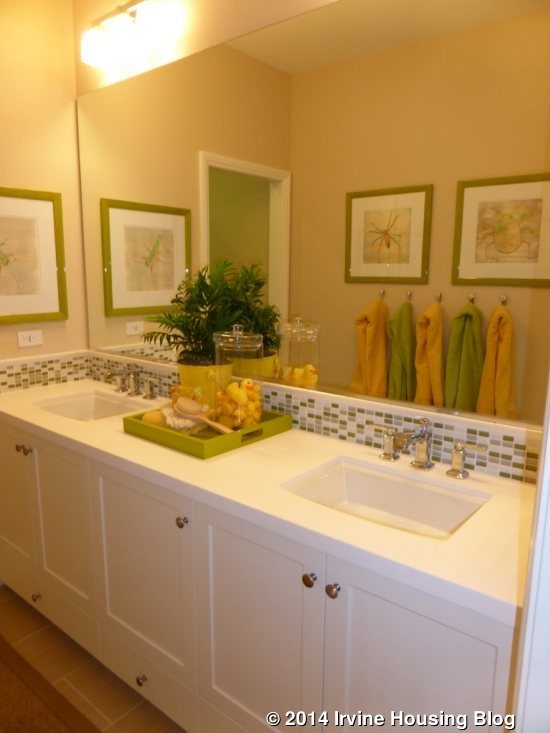
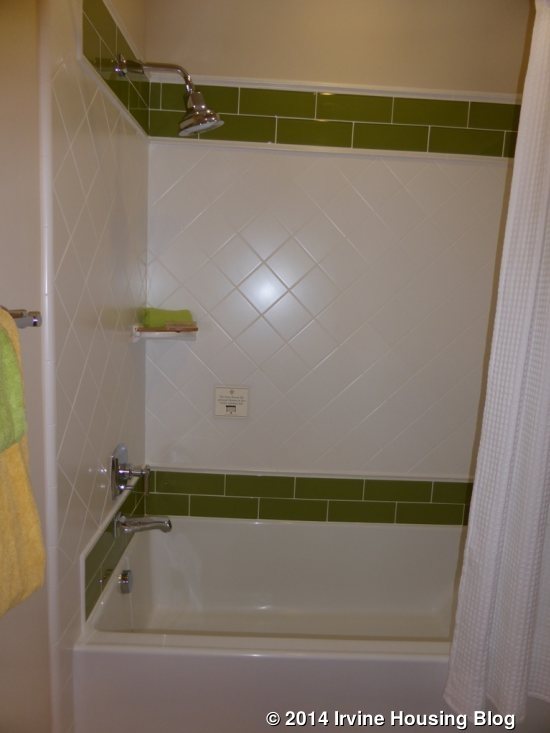
The secondary bathroom is on the right, across from the laundry room. The vanity has two sinks and is shown with only an upgraded backsplash. A door separates the sinks from the shower/tub combo, which is shown with upgraded tile. This bathroom has the option for a shower only.
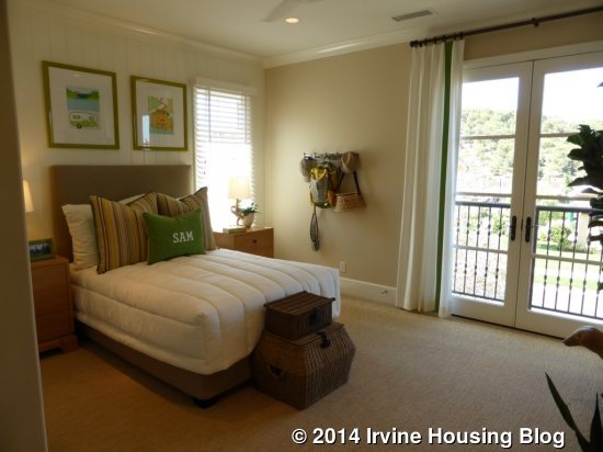
Bedroom 2 is very large. It faces the front of the house and has French doors leading to a Juliette balcony. The spacious room has a standard closet with storage above, shown with upgraded cabinet doors. The recessed lights, ceiling fan, crown molding and wall paneling are all upgrades.
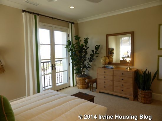
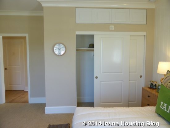
Bedroom 3 is much smaller. It has a large window facing the side of the house and a standard closet on the opposite wall. The storage above is shown without the upgraded doors. Besides being smaller, this room doesn’t have a ton of wall space. The recessed lights and chair rail are upgraded.
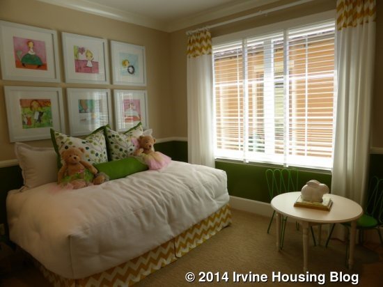
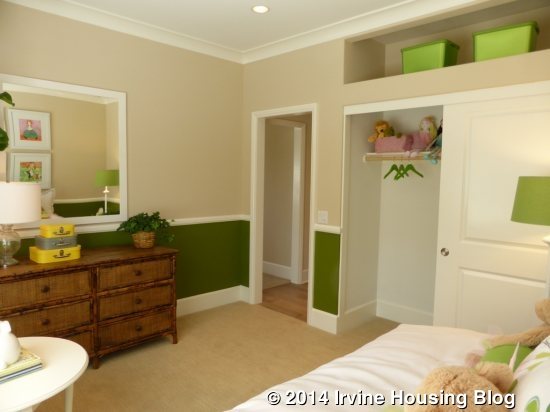
Overall, I liked this home more than Residence One. I think the layout of the kitchen and the extra loft space make it a much more desirable floor plan.
Residence Three
2,693 square feet
4 Bedrooms, 4.5 Baths
Bonus Room, Optional California Room, Optional Conservatory
Base Price: $1,088,000 ($404 per square foot)
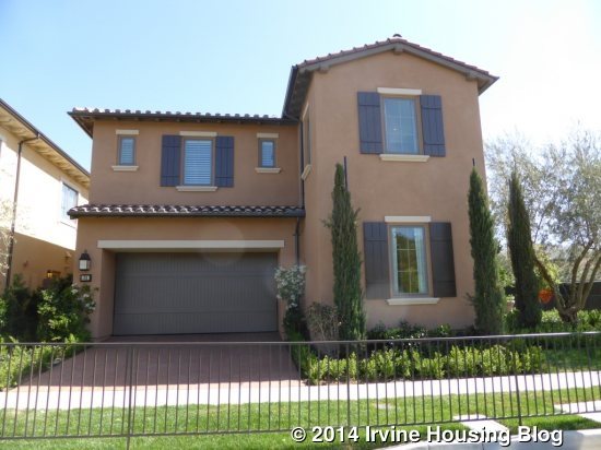
This home also has two different base models, with the Three being a standard location and the Three X being a corner location. The model shows is of the Three X with a Tuscan elevation. Both variations have a side entry, but the Three has a separate door from the street leading to a private walkway. The only real difference inside the homes is the addition of a storage area in the laundry room in the Three X. Some elevations have a large deck over the garage.
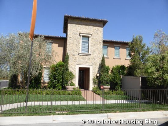
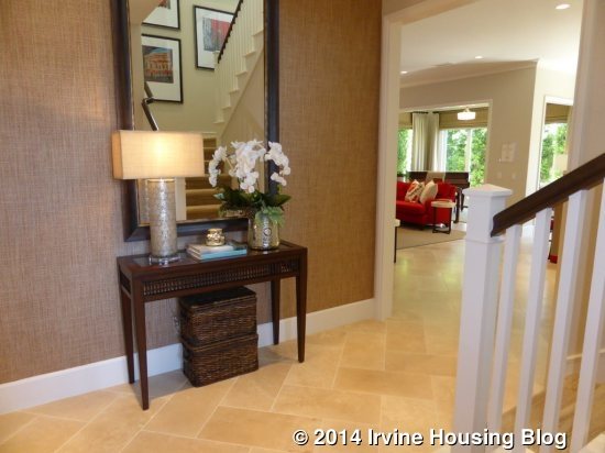
When you enter the home, a wall is in front of you and the stairs (with a large closet underneath) are to the right. The downstairs bed and bath, powder room and garage access are down a hall to the left. The great room, kitchen and dining room are off to the right. Throughout the home, the flooring, window treatments, baseboards and recessed-style painted cabinets are upgraded.
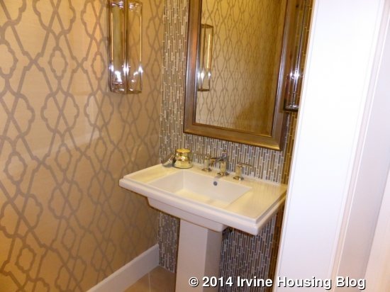
The powder room has a pedestal sink and is shown with an upgraded tile wall, crown molding and framed mirror.
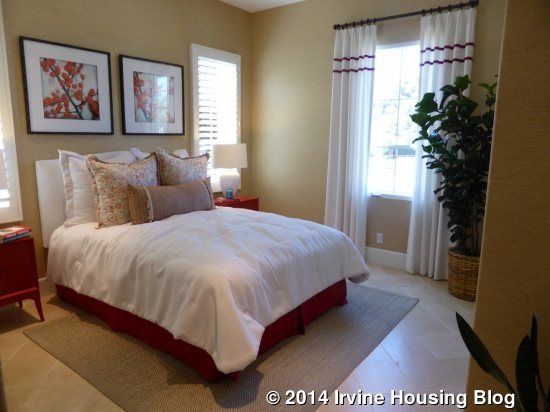
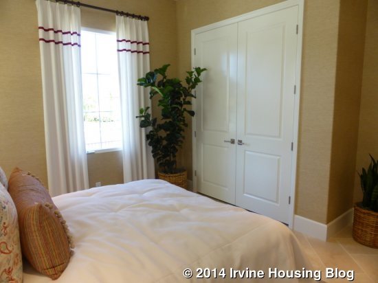
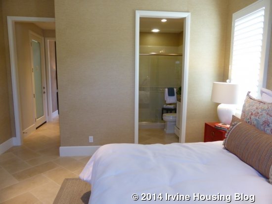
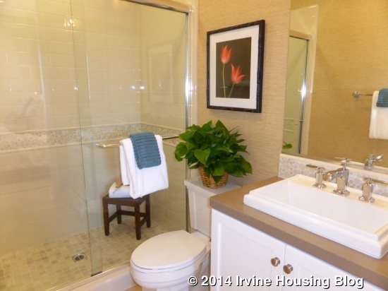
The bedroom is a little bigger than the downstairs bedrooms in Residences One and Two. It has windows facing both the front and side of the home. The closet is shown with upgraded French-style doors, though sliders are standard. The en-suite bathroom has a single sink and a shower, with an option for a tub. The countertop and sink, backsplash, and shower surround, liner and floor are all upgraded. The shower is a good size for a downstairs bathroom.
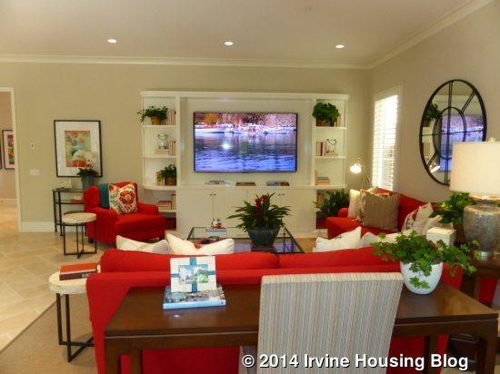
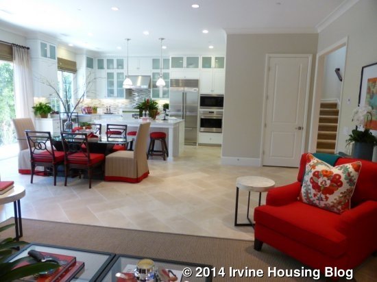
Once again, this home has a very standard great room. Two windows face the side of the house and an upgraded built-in fills one wall. The recessed lights and crown molding are included in this model. The regular setup would include more windows facing the backyard; however, this model shows the optional conservatory instead.
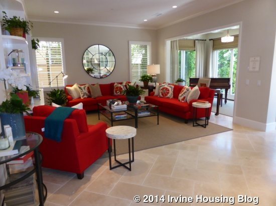
The conservatory adds extra depth to the great room. Shown here with a grand piano, this space could also make a nice office/tech area or mini playroom. There are windows on one wall and two sliders leading out to the backyard. As in Residences One and Two, the standard home comes with a trellis in this space; a California Room is also an option.

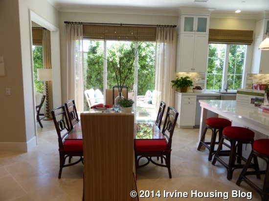
The dining room sits between the great room and kitchen. This open set up offers space for a much bigger table than when the dining room is at the back of the kitchen. Additional sliding doors lead out to the backyard and, when applicable, to the trellis or California room. Bifold doors are also an option with the standard trellis.
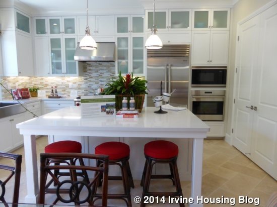
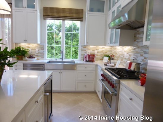
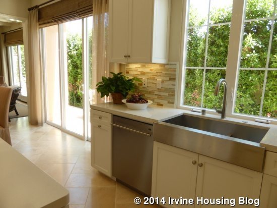
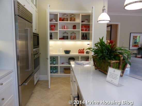
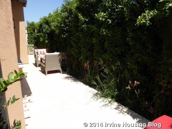
The kitchen isn’t as open as in the other models. Stacked upper cabinets also make it feel a little more closed in. This heavily upgraded kitchen includes a Wolf/Asko appliance package, sub-zero wine cooler, frosted glass doors on many cabinets, pot and pan drawers, Caesarstone “eggshell” countertop with full backsplash, a Kohler stainless steel apron front sink and a Kohler “sensate” stainless steel faucet. The center island is bigger than in the other models and is shown with the optional mini fridge but without the optional sink. Again, the walk-in pantry shows the fully upgraded organizer. The sink overlooks the backyard while the cooktop, fridge, microwave and oven are all along the other wall. While I usually like it when the sink looks out to the backyard, this yard is so small that it actually feels like you’re too close to the wall when you look outside.
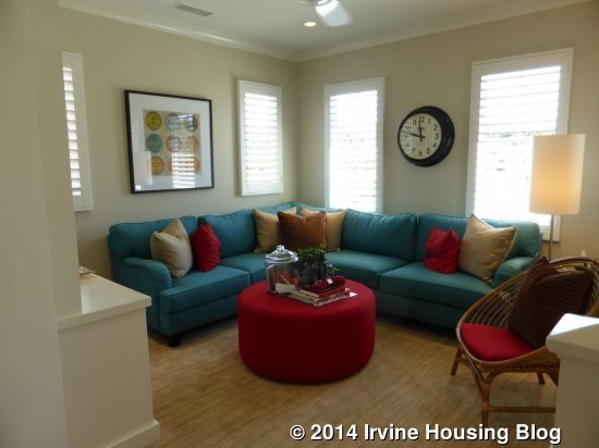
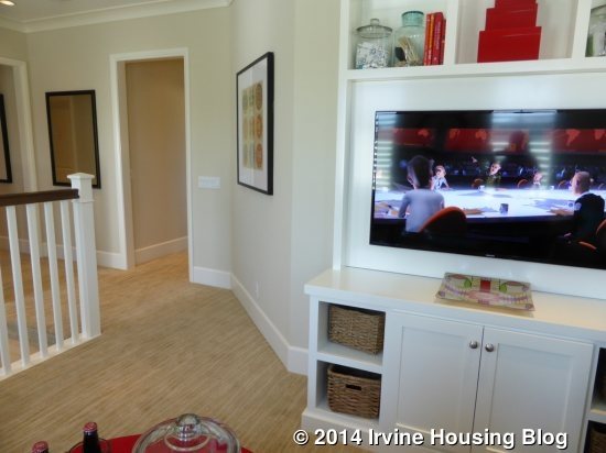
Upstairs, the bonus room is just to the right of the stairway. It is basically the same as the loft in Residence Two, but called a bonus room instead. The media cabinet, ceiling fan and crown molding are upgrades.
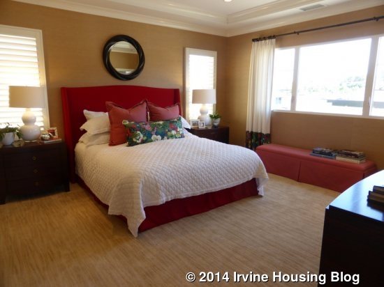
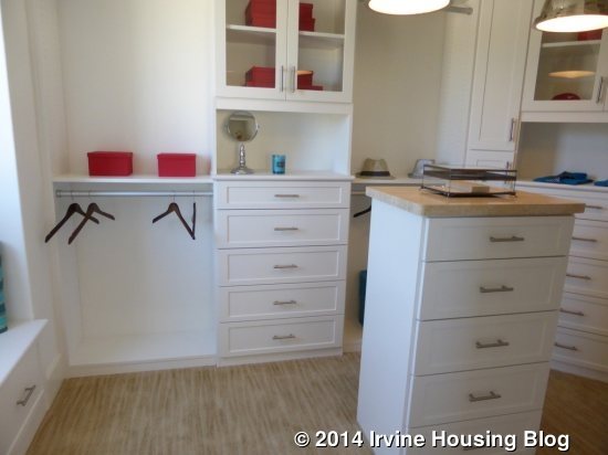
The master suite is straight ahead of the stairs and has a small foyer before you enter the room. Windows overlook the backyard and sides of the house. The recessed lights and crown molding are upgraded. The huge master closet is accessible for a corner of the bedroom. The model shows the upgraded organizer.
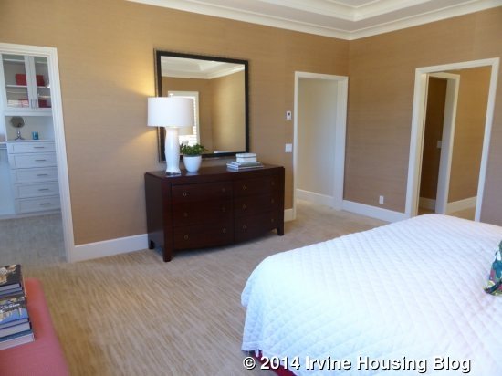
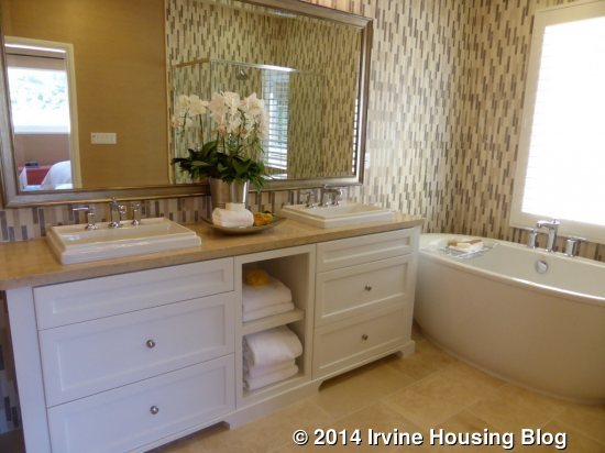
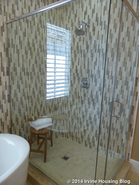
The master bath has an option for a door dividing it from the bedroom. The vanity has two sinks and is shown with an upgraded furniture package, drawers and open cubbies, countertop and backsplash. The model shows the optional free standing tub, though the standard version is for a tub with a surrounding deck that is attached to the adjacent shower. The shower is pretty big, but without the shared ledge of the tub deck, it is left with only a tiny corner seat. The tile surround and floor are upgraded.
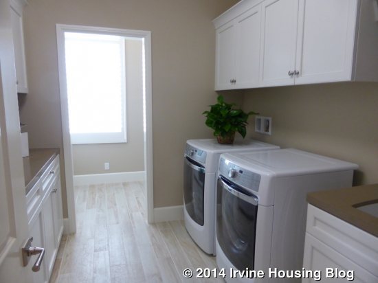
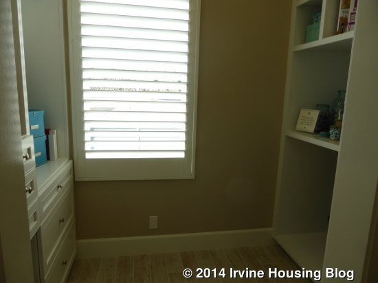
A hallway to the left of the stairs leads to the other rooms. The laundry room is first and it is very big. One wall has side by side machines and a sink, while the opposite wall has a counter and cabinets. The countertop and backsplash are upgraded. The extra storage, available only in the Three X, is at the back of the laundry room, shown here with upgraded built-in cabinets.
Bedroom 2 is down the hall on the right. The entryway to the room has a standard closet on the left and an en-suite bathroom on the right. The closet has additional storage above, shown here with added doors. The vanity in the bathroom shows the standard sink and countertop, though the cabinets and backsplash is upgraded. This room shows the optional shower in lieu of the standard tub. The shower surround, accent liner, floor and hardware are all upgraded. The bedroom itself feels spacious, especially because none of the walls are taken up by the closet. Windows face both the front and side of the house and, when applicable, this room would have access to the large deck over the garage. The recessed lights, crown molding and paneling are upgrades.
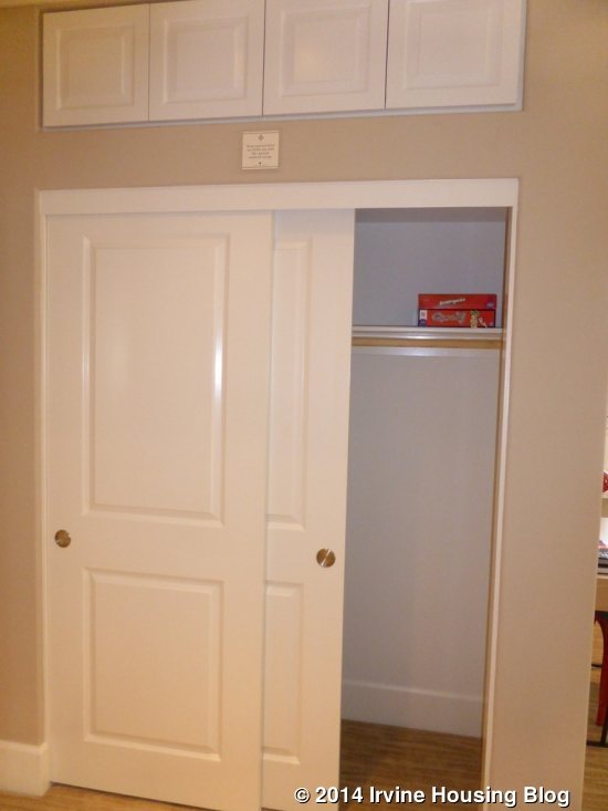
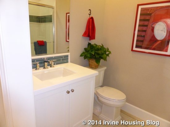
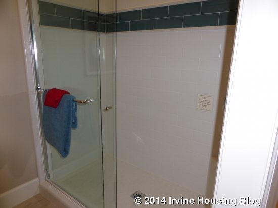
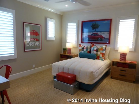
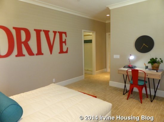
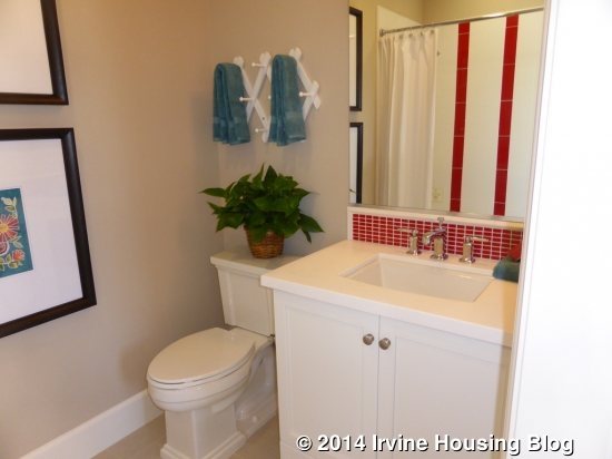
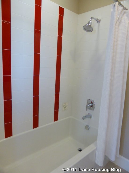
Bedroom 3 is at the end of the hall, also facing both the front and (opposite) side of the house. This room has a walk-in closet just inside the door, shown with the standard shelf and pole. The room has upgraded recessed lights and crown molding. This spacious room is even bigger than Bedroom 2. It also has an en-suite bathroom. Again, the vanity has upgraded cabinets and backsplash but the standard sink and counter. The standard tub is shown, though the decorative liners are upgraded. A shower-only option is available.
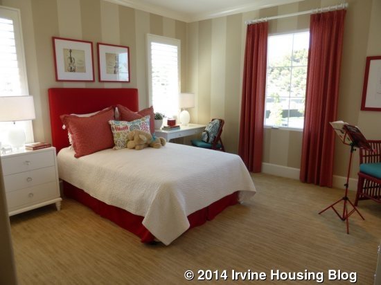

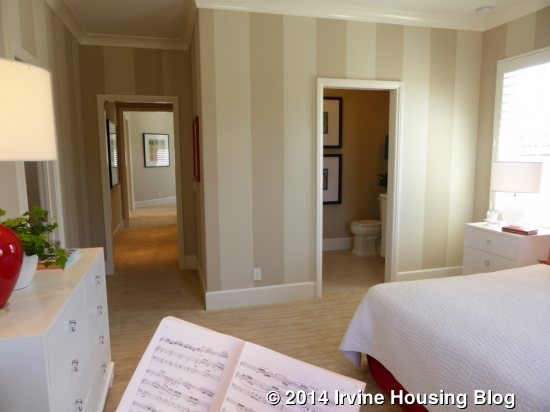
Overall, I didn’t like this model quite as much as Residence Two. Though I do like the spacious bedrooms and en-suite baths, the layout of the kitchen is the downfall for me. Strada is the final set of homes that Irvine Pacific built on the Orchard II side of the community. I am looking forward to visiting the seven sets of models located in the gated “Groves” neighborhood on the other side of Culver.
