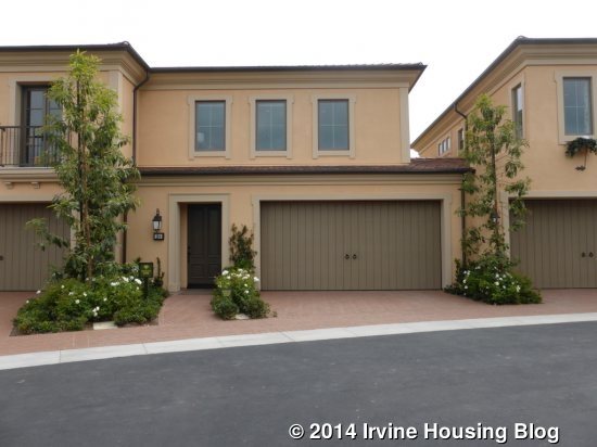
A couple of weeks ago, I gave an overview of the non-gated side of the new Orchard Hills community (known as Orchard Hills II). Today, I will review the Vista Scena homes, which are the second smallest of the twelve new neighborhoods. Like all of the homes in the non-gated portion, Vista Scena homes are built by Irvine Pacific. These are townhomes, with configurations of either two or three connected homes. They have three different Residences, ranging from 1,586 – 1,914 square feet. The homes all have three bedrooms and 2.5 bathrooms; Residences Two and Three also have a loft. All homes have a two-car garage. None of them have a main floor bedroom. Elevations include a two-unit Monterey, two-unit Formal Spanish, three-unit Monterey and, as modeled, a three-unit Northern Italian. In the two-unit buildings, the homes are only connected on the ground floor and there are no shared walls upstairs. In a three-unit home, Residence One is always in the middle, with Residence Two on one side and Residence Three on the other. Residences One and Three share a wall upstairs, but Residence Two does not have a shared wall. Most streets have three or four buildings on each side, with two-unit buildings in the middle and three-unit buildings on each end.
Some of the standard amenities in all homes include Kitchenaid stainless steel appliance package, including cooktop, oven, microwave, dishwasher and hood; white satin Thermofoil cabinets with adjustable shelves; granite slab kitchen counters with 6-inch backsplash and full backsplash at cooktop; stainless steel double basin sink with Kohler pull-out faucet; master bath with a sterling tub with 6” x 6” tile surround and separate shower (Residences Two and Three only); dual unilav sinks with marble countertops and backsplash; Kohler polished chrome faucets; ceramic tile flooring at entry, kitchen, dining, baths and laundry; plush carpet throughout living areas; pre-wired multi-media plate; fire-resistant concrete tile roofs; decorative front doors; high efficiency air conditioning and gas furnace; tankless water heaters; and energy efficient bathroom fixtures. All homes are Build it Green™ Certified.
Vista Scena is situated in the northern portion of the community. It has approximately 200 homes and sits on both sides of the smaller Entrata collection. They are very close to Orchard Terrace Park.
Orchard Hills homes are split between the Irvine and Tustin Unified School Districts. Always double check with your sales consultant to make sure you know which schools you attend. Vista Scena is currently slated to attend Irvine Unified schools, including Canyon View Elementary, Sierra Vista Middle, and Northwood High.
Basic Neighborhood Financial Information:
Approximate HOA Dues: $385 per month ($196 to Orchard Hills II Community Association and $189 to the Vista Scena Neighborhood Association)
Approximate Tax rate: 1.06%
Approximate Mello Roos: $3612 per year (AD Tax: $1,750; CFD Tax: $1,700; other tax $162)
Overall Effective Tax Rate: 1.5%
Prices start at around $702,000 for Residence One, $738,000 for Residence Two, and $775,000 for Residence Three.
Residence One
1,586 square feet
3 Bedrooms, 2.5 Baths
Base Price: $702,000 ($443 per square foot)
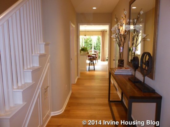
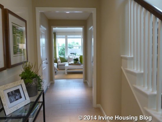
If you start touring the models from the office, Residence One is actually in the middle of the three units. It can be found in any of the elevations except the Two-Unit Formal Spanish. The models are shown in the reversed floor plan. It connects to Residence Three on both floors and to Residence Two on the main level only. Upon entering, I saw a long hallway leading to the great room and kitchen at the back of the home. Immediately to the left of the front door are the stairs to the second floor. There is an optional storage drawer under the stairs, a powder room and access to the garage off the main hall.
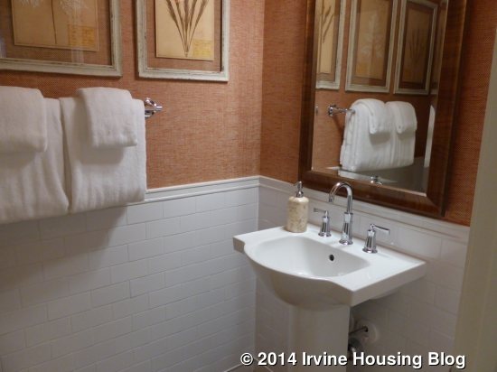
The powder room shows the standard pedestal sink, faucet, and chrome light fixture. The tile wainscoting and decorative mirror are upgrades. The garage includes an upgraded organizer and upgraded floor coating.
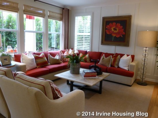
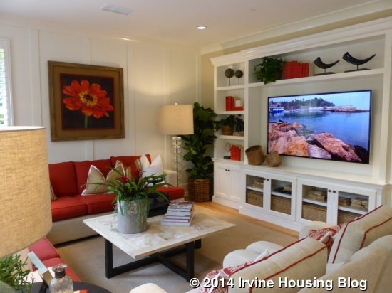
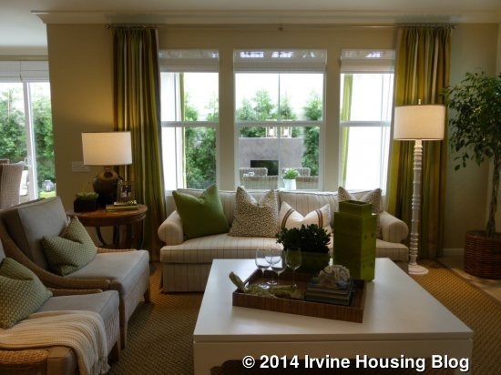
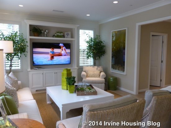
The end of the hall opens up to the great room on the right and the kitchen on the left. The great room is pretty similar to almost every other new home I’ve seen. It has a full wall of windows at the back and another window on the side. The model shows the upgraded built-in unit and also includes upgraded wall paneling.
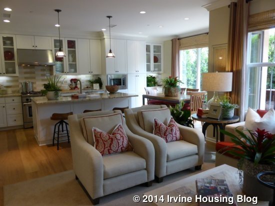
The kitchen has an island with bar seating and one long counter behind it. The sink and dishwasher are located in the island. Behind them are the cooktop, oven, microwave and optional wine fridge. The refrigerator is to the left of the island. The model includes an upgraded range, hood, dishwasher, wine cooler, a few glass cabinets, pull out pantry shelves, tile backsplash, hardware, single basin sink, faucet and pendant lights. There is plenty of storage and an average amount of counter space. The white cabinets are standard.
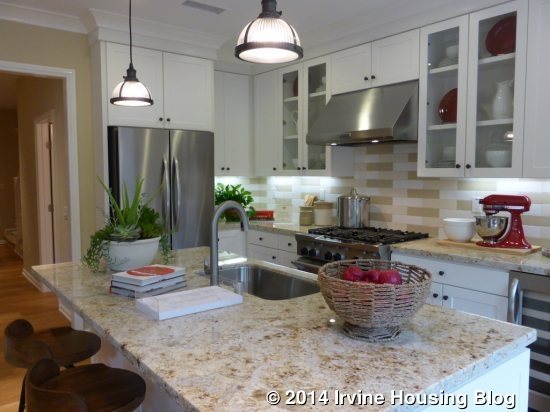
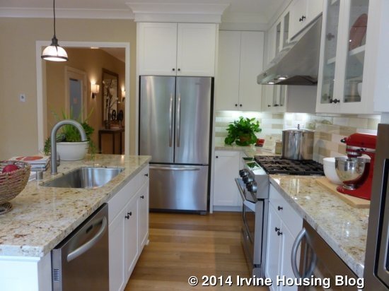
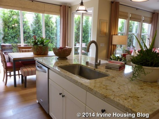
There is a dining area behind the kitchen with two sets of sliding glass doors that lead to the backyard. The kitchen cabinetry and counter extend all the way through the dining room. A very large dining table probably wouldn’t fit, but there is plenty of space for 8-10 people.

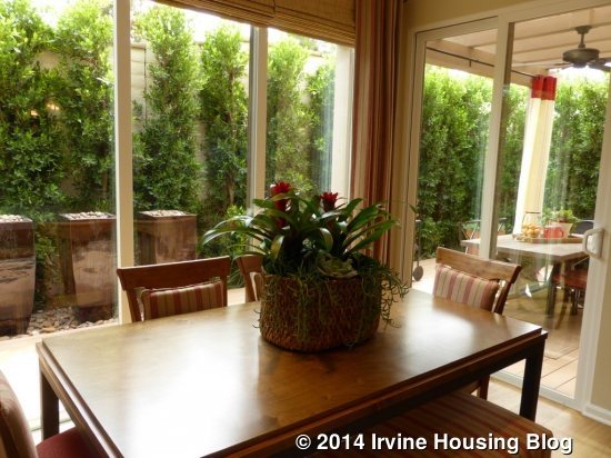
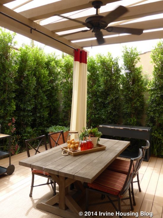
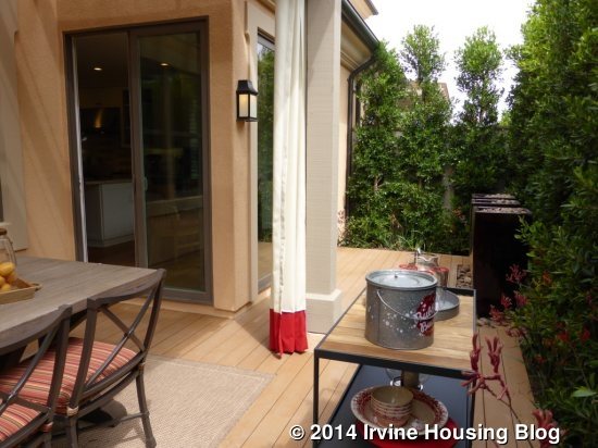
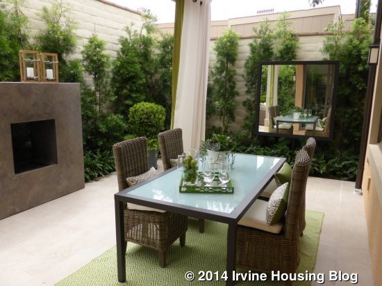
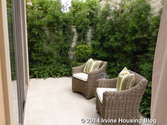
The backyard is tiny, as are all the lots in Vista Scena. The sliding doors lead to a trellis area with space for a table and barbecue. There is a narrower portion of the yard on one side.
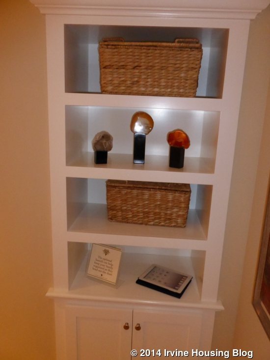
The home comes standard with a coat closet at the foot of the stairs. The model shows the optional launch area instead, which includes four built-in shelves with a cabinet underneath. All three bedrooms, both full bathrooms, and the laundry room are upstairs.
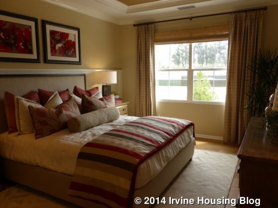
The master suite sits at the top of the stairs and spans the whole back of the house. The bedroom has a large window looking to the backyard, but no windows on the side because it is attached to the townhouse next door (I believe it shares a wall with the closet in the master suite). The coffered ceiling is a standard feature, but the crown molding is an upgrade, as are the recessed can lights. The room isn’t big enough for a sitting area, but it’s a good sized bedroom.
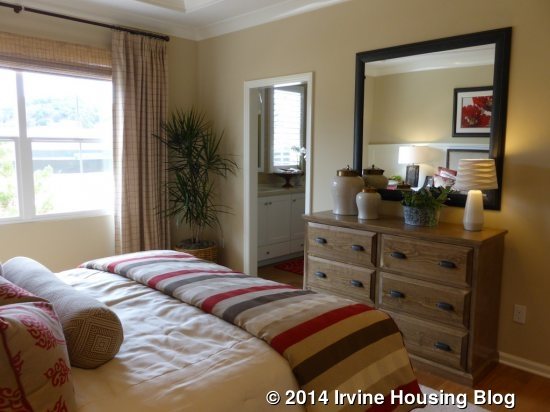
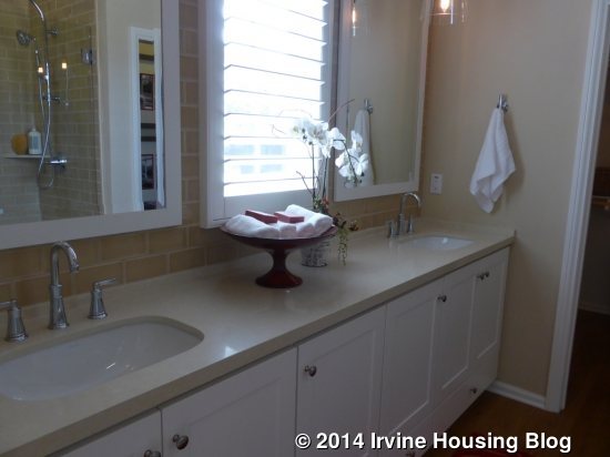
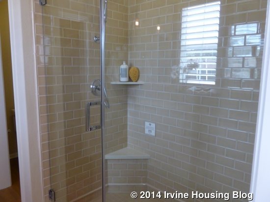
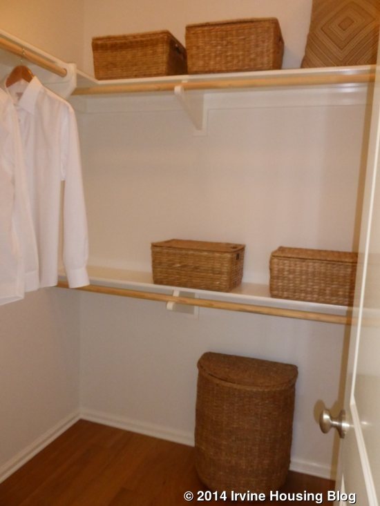
The master bath has numerous upgrades. There is a double vanity on the left with several storage cabinets. These cabinets are standard, but the Caesarstone slab and full tile backsplash are upgrades. The undermount sinks and decorative mirrors are also upgrades. The standard master bath comes with a shower/tub combo across from the sinks. It would have a cultured marble tile tub deck with 6” x 6” white tile backsplash and a polished chrome framed shower door. The model shows the optional shower in lieu of a bathtub. The tile is upgraded, as are the Caesarstone slab seat and shelf. The walk in closet is average sized.
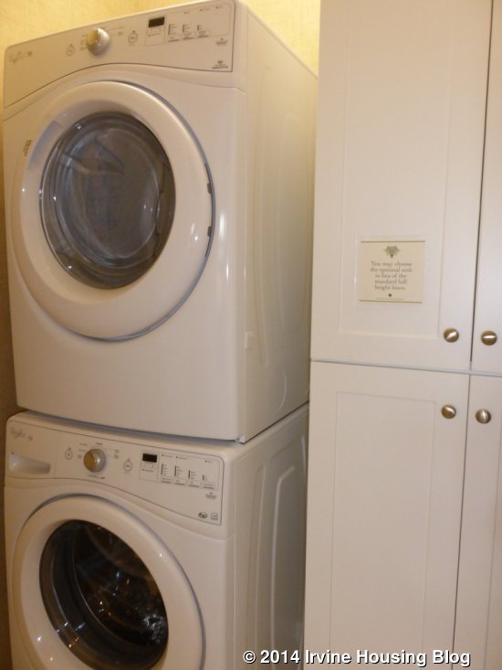
Back in the main hallway, the laundry room and bathroom are on the left and the two bedrooms are at the front of the house. The laundry room has a stacked washer and dryer and a set of linen cabinets. There is an option to replace the cabinets with a sink.
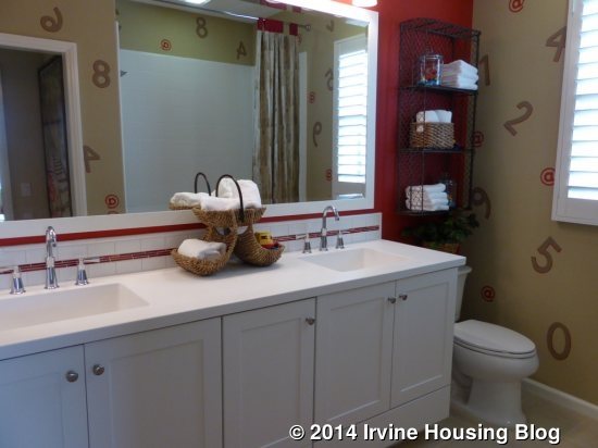
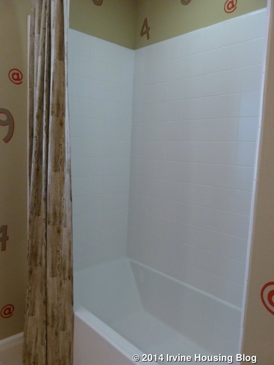
The bathroom has two sinks that are shown without any upgrades. The tile backsplash and framed mirror are the only upgrades in this bathroom. There is a standard shower/tub combo with white tile and polished chrome fixtures.
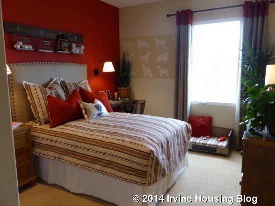
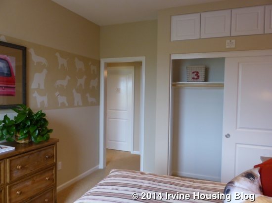
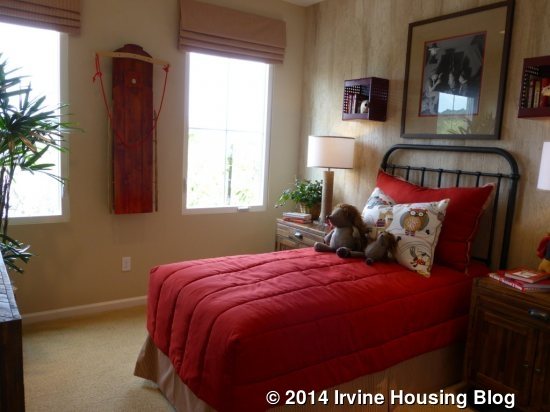
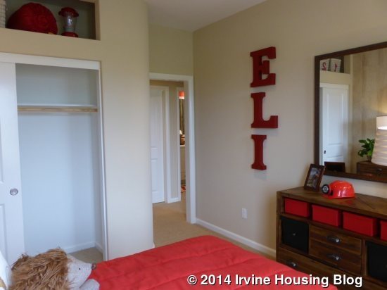
The two secondary bedrooms are pretty similar. One has two windows and the other has one, all overlooking the street. They are about the same size and both have two-door sliding closets. Each room has a storage area above the closet. Bedroom 3 shows the storage area with the upgraded cabinet doors; this room also has upgraded recessed can lights.
As the smallest townhome in the neighborhood, Residence One makes good use of the space. There are storage areas tucked in throughout the house and good counter space in the kitchen and upstairs bathrooms. The backyard is too small, but that is pretty typical for new construction in Irvine, especially in a smaller home.
Residence Two
1,731 square feet
3 Bedrooms, 2.5 Baths
Loft
Base Price: $738,000 ($426 per square foot)
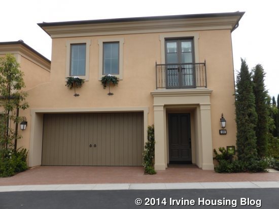
Residence Two is the closest model to the office and can be found in all four building types. Its layout is similar to Residence One, with the stairs just inside the doorway, a hallway with a powder room and garage access, and the kitchen and great room at the back. Upstairs, the two secondary bedrooms overlook the street and the master suite spans the back of the house. The key difference between the units is the addition of a loft in Residence Two. The flooring and window treatments throughout the home are all upgrades.
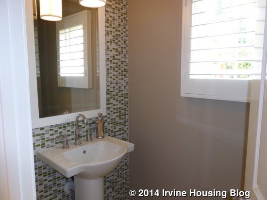
The powder room has the standard pedestal sink, light fixture, and faucet. The tile accent wall and decorative framed mirror are upgrades.
As in Residence One, the hallway opens up to the great room on the right and the kitchen on the left. The great room is very similar, though the upgraded built-in unit is on the side wall instead of the front. Windows line the back wall. The recessed lights and crown molding are standard. The room is slightly larger than the great room in Residence One.
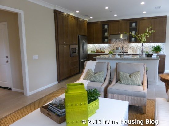
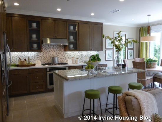
The kitchen in this home features upgraded perimeter cabinets in bamboo glaze, though the rest of the home uses the standard white Thermofoil. The center island houses the sink and dishwasher and has an upgraded granite counter (granite is standard, but this particular color – Giallo Cream – is not). The back counter used a Caesarstone slab with upgraded tile backsplash. In this home, we get to see the standard appliance package, with the exception of the refrigerator and the addition of the smaller, undercounter fridge. Large, optional storage drawers flank the oven. The setup is very similar to Residence One; however, in this home, the cabinets and countertops do not extend into the dining area.
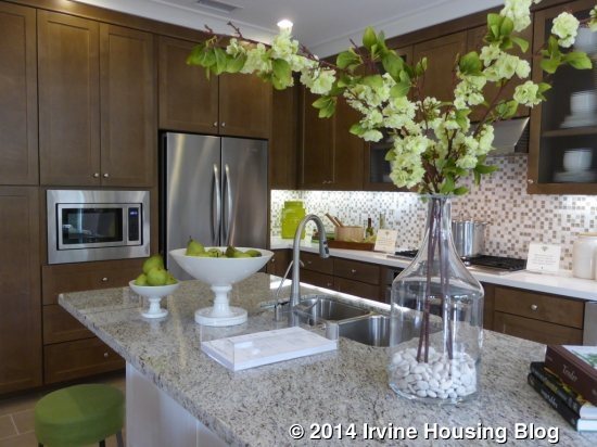
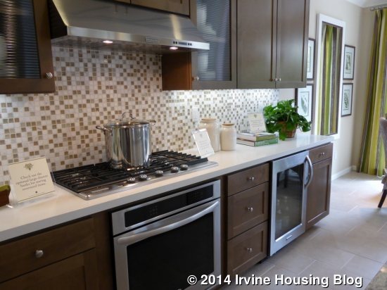
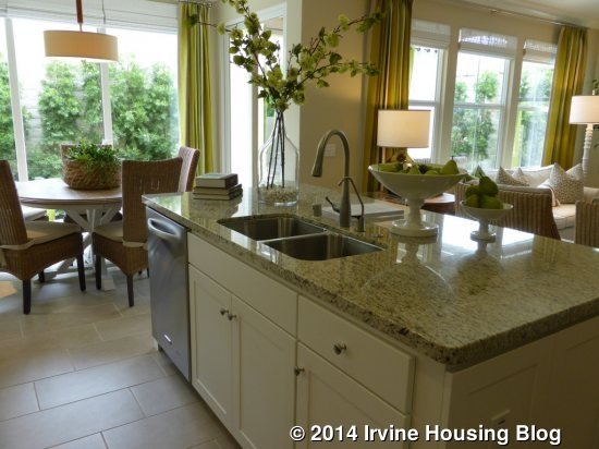
The dining area is about the same size as in the first home and, like that one, has sliding doors on both the back and side walls.
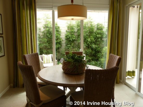
The backyard is equally tiny, with a trellised area and a smaller area behind the dining room.
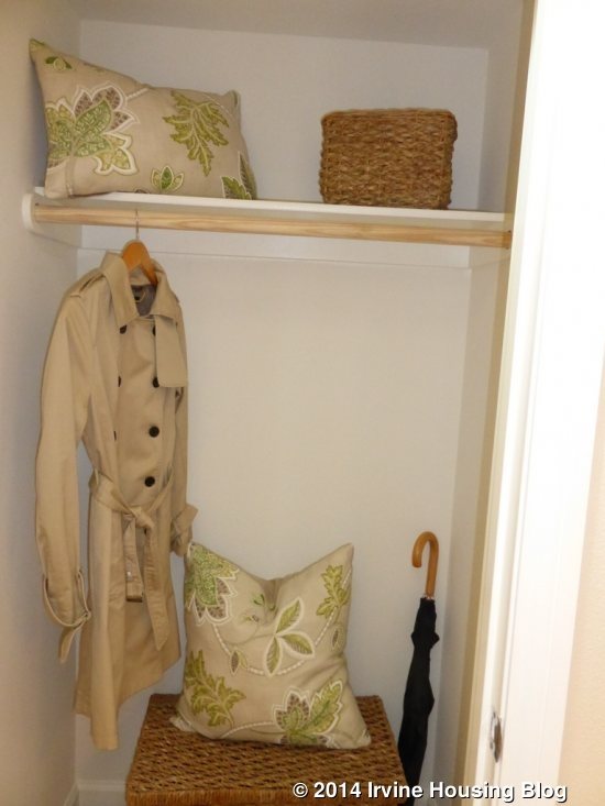
This home shows the standard coat closet at the base of the stairs. Like Residence One, there is an option for a built-in launch zone.
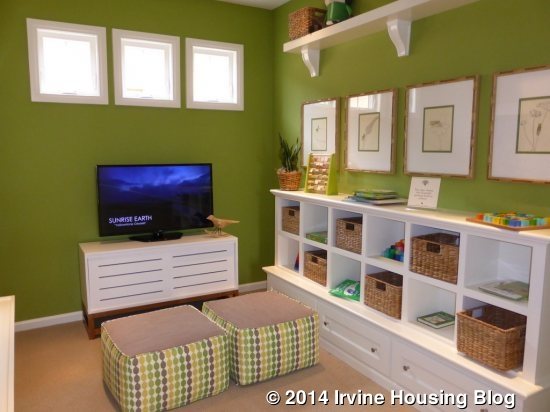
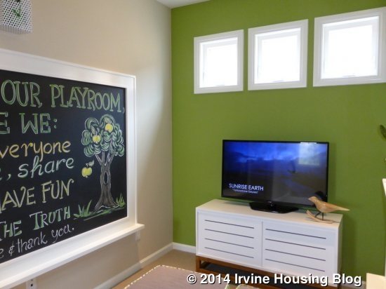
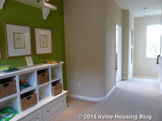
The loft is straight ahead when you come upstairs. It is a great size for a playroom or office, though there isn’t an option for a door. The built-in unit and upper shelf are upgrades. This room has three small, high windows looking out to the side of the house, on the side that faces Residence One.
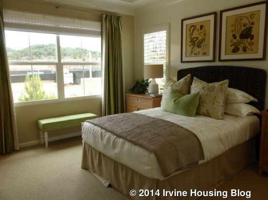
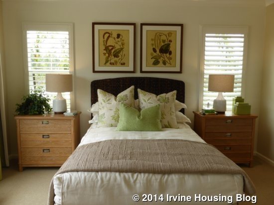
The door to the master bedroom is right at the top of the stairs. This room is brighter, as it has windows both on the back and side wall, since it isn’t attached to another home. It is slightly smaller than the master bedroom from Residence One.
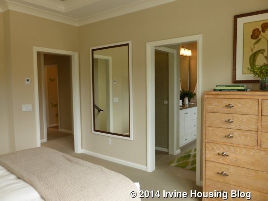
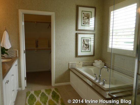
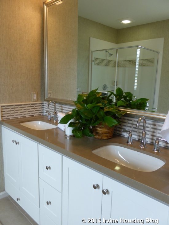
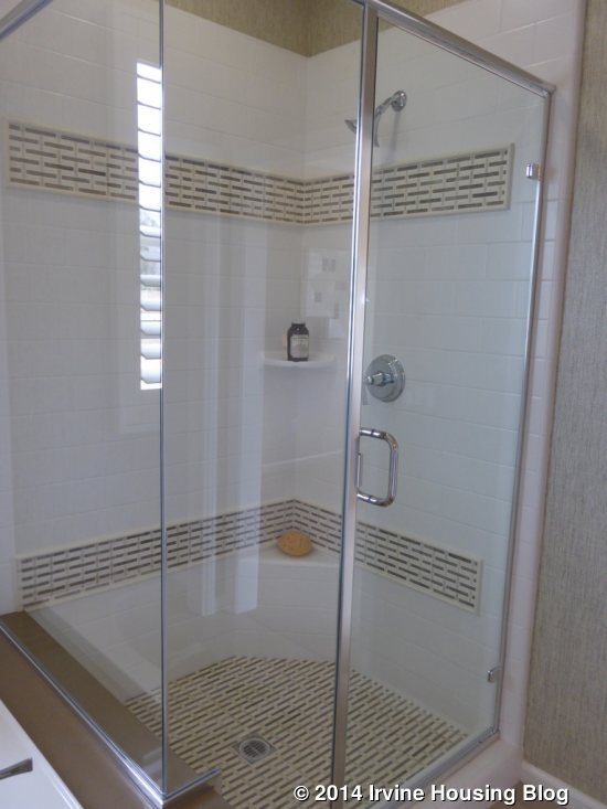
The master bath does not have any other optional layouts. Throughout the bathroom, the counters, tub deck and tiles are all upgraded. The two sinks are set into a vanity smaller than the one in Residence One. There is a stall shower attached to a separate bathtub. The jetted tub is also upgraded. The shower has a very narrow ledge and a tiny shelf. The walk-in closet is long and narrow.
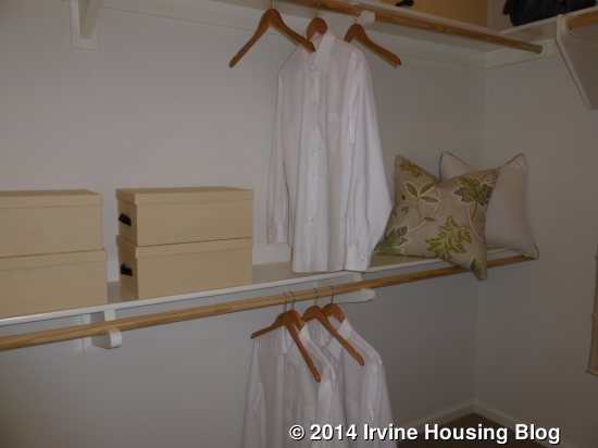
There is a hallway leading to the other bedrooms, with a laundry room on the left and a bathroom on the right. The laundry room again has stacked machines, standard linen cabinets, and an option for a sink in lieu of cabinets.
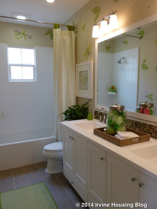
The bathroom has two sinks with a decent amount of storage and a shower/tub combo. The tile backsplash and framed mirror are upgrades, but the rest of the bathroom is standard. There is an option to have only a shower and no tub.
Bedroom 2 is slightly larger than Bedroom 3. It has two windows facing the front and another on the side. Like Residence One, this room has a standard, two-door sliding closet with storage above. The only upgrade to bedroom 2 is the addition of recessed lights.
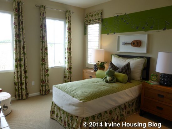
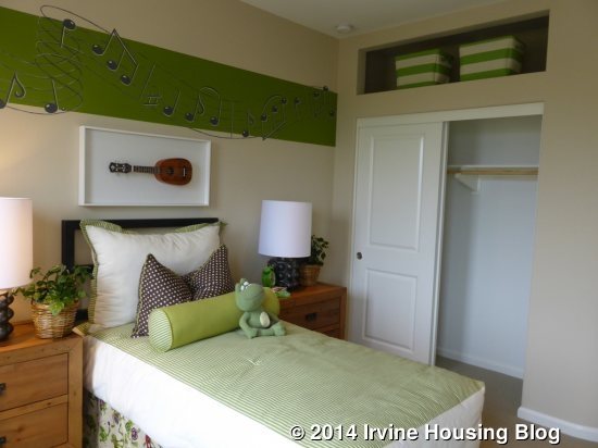
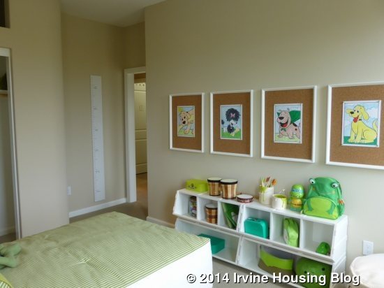
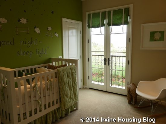
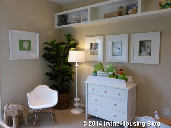
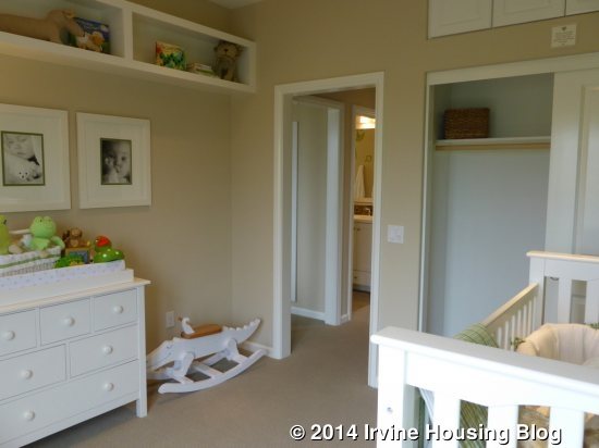
Bedroom 3 is a little smaller. It has French doors leading to a tiny, Juliette balcony. It has a standard closet and the storage above shows upgraded cabinets. This room also shows an upgraded wall to wall shelf unit. The highlight of this room is that there is a second closet. It is a small walk-in, shown with upgraded closet organizers.
As I said, Residences One and Two are very similar. Some of the rooms in Two are a little larger and the loft offers great additional space. The price difference isn’t significant, so I think having the extra room is worth the extra money.
Residence Three & Three Y
1,841 – 1,917 square feet
3 Bedrooms, 2.5 Baths
Loft
Base Price: Three: $775,000 ($421 per sq ft) / Three Y $785,000 ($409 per sq ft)
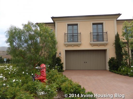
Residence Three actually has three different configurations depending on which building it is in. The Two-Unit Formal Spanish features the Three Y, the Three-Unit Monterey is a Three X, and the Three-Unit Northern Italian (modeled) is a standard Three. In the standard Three, the front door is actually on the side of the house. The powder room and coat closet are right off the entry, next to the stairs. In Three X and Y, the front door is on the front of the home, with the coat closet at the bottom of the stairs and the powder room farther down the hall. The only difference I can find between the Three X and Y is that Y has a door leading from the back of the garage to a narrow side yard. The garage may also be a bit wider in the Y plan. The extra square footage in the X and Y models appear to all be in the main entry and downstairs hallway areas.
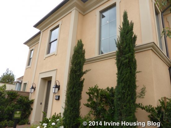
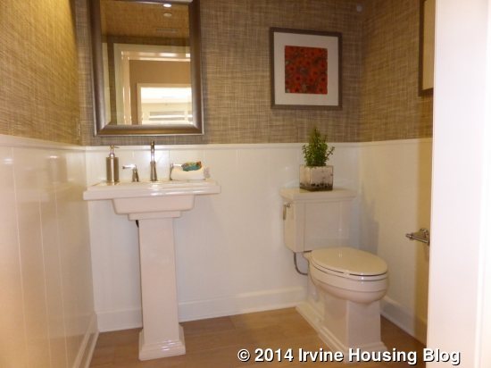
In the standard Three, the side entry brings you into a small foyer, with the stairs directly on the right, the powder room just past them, and the great room immediately to the left. Everything in the powder room is upgraded. The small coat closet next to it shows the standard single shelf and pole.
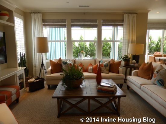
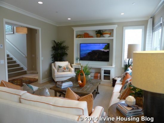
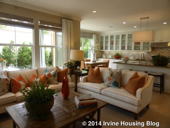
The great room is quite similar to the other two. Three windows line the back and one more looks out to the side. The media unit is an upgrade, but the recessed lights and crown molding are standard. As in Residence Two, the media unit is on the side wall.
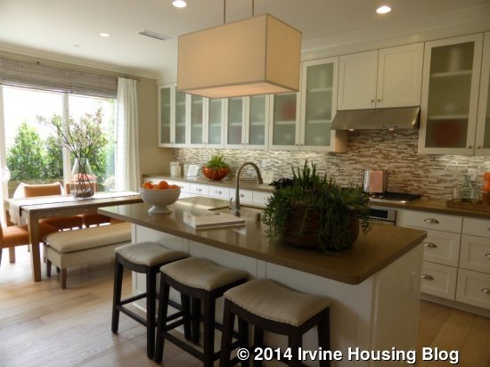
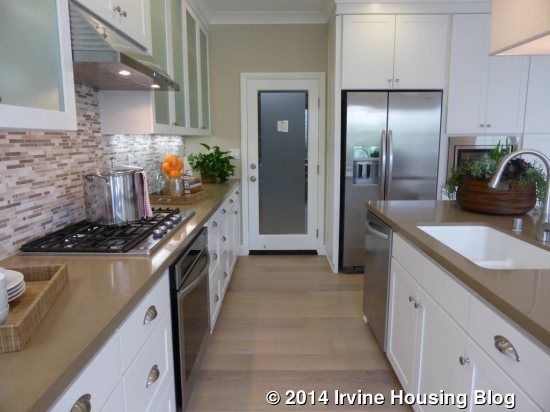
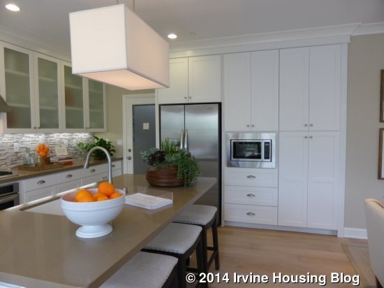
The kitchen is also pretty similar to the other two. This one models the standard appliance package except for the upgraded refrigerator. Numerous pot and pan drawers, frosted glass cabinets, the Caesarstone Mocha slab, and the tile backsplash are all upgrades. The hardware on the drawers is upgraded, but the cabinets have the standard hardware. The island has bar seating and includes the sink and dishwasher. The stove and oven are set into the long countertop, while the fridge and microwave sit on another wall, along with pantry cabinets. In this home, having the counter and cabinets extend to through the dining room is an upgrade. There is a choice of three natural stone countertop colors and it includes 6” splash, frosted glass uppers, and under cabinet lighting. The dining area again has sliding doors at the back and side. My only complaint about the kitchen is that the garage access is right next to the refrigerator. I never like having the garage enter the kitchen and prefer the access to be in the hall.
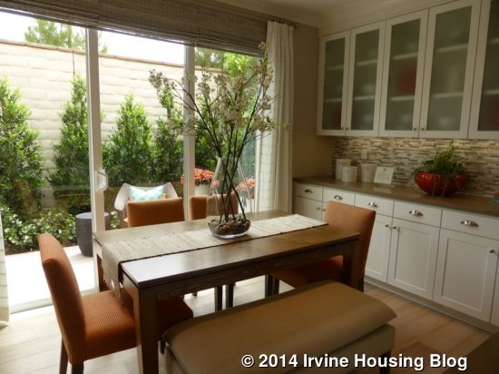
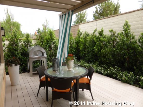
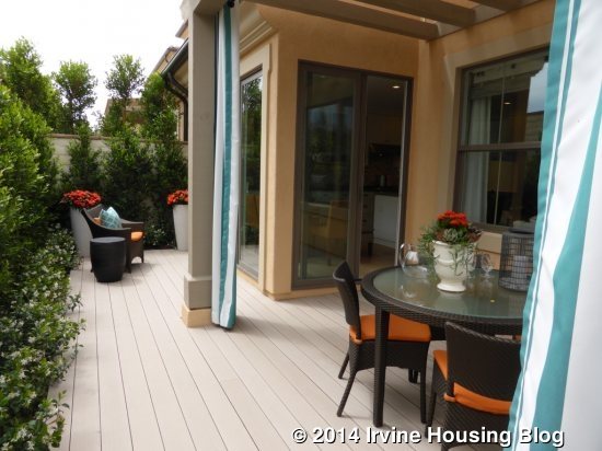
The backyard is just like the others – very small, with a trellis area and a smaller area behind the dining room.
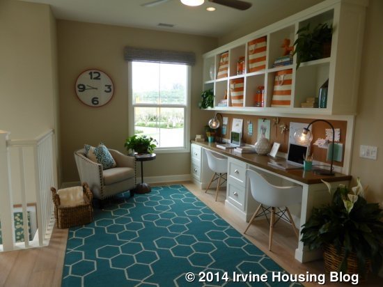
The stairs open directly to the loft at the top. The model shows upgraded built-in desks with storage above. The recessed lighting and ceiling fan are also upgrades. One window looks out to the side of the house.
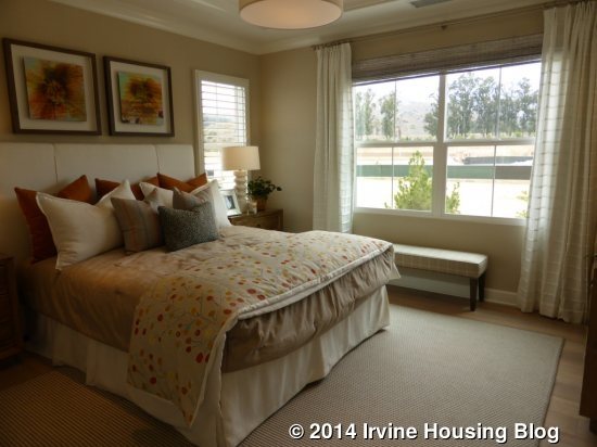
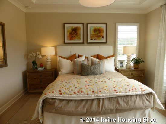
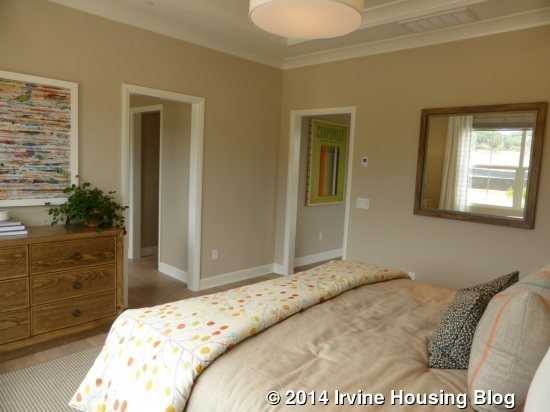
The master bedroom sits behind the loft. It is about the same size as the master in Residence One, but this one is squarer and the other is rectangular. As in the other homes, the coffered ceiling is standard, but the recessed lights and crown molding are not.
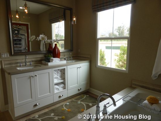
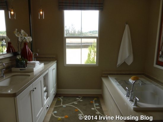
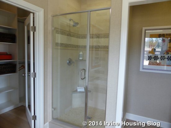
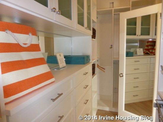
The master bath has two sinks and a bathtub on the left and a shower on the right. The sinks are set into a shared vanity, shown with upgraded shelves in the middle, and upgraded undermount sinks. The vanity also has upgraded Caesarstone counters and tile backsplash. The tub face has matching tile and Caesarstone upgrades. The shower also has upgrades on the seat and the tiles. The long, narrow closet sits at the back of the bathroom.
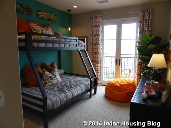
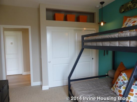
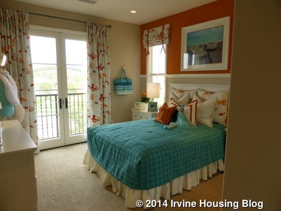
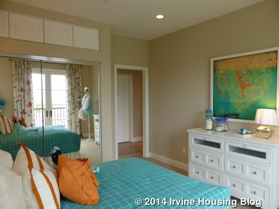
The other two bedrooms are off a hallway to the right of the loft. Like the other two Vista Scena plans, both bedrooms face the front of the house. There aren’t many differences between them. Both have the same two-door sliding closets with overhead storage and they are similar in size. Each room has French doors leading to a tiny Juliette balcony.
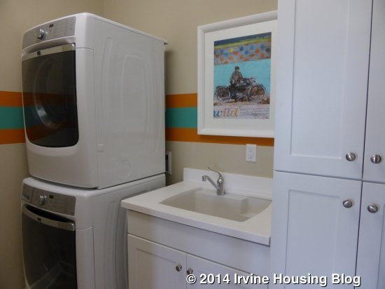
The laundry room sits across the hall. Unlike the other models, this one comes standard with a sink and linen cupboards, in addition to the stacked washer and dryer.
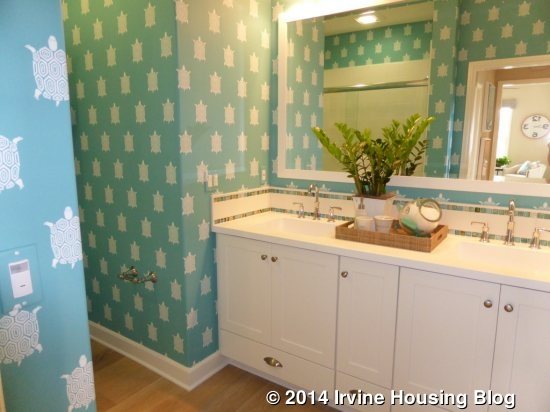
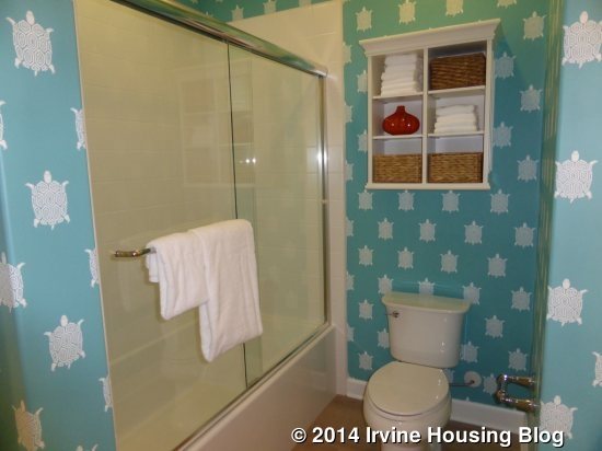
The bathroom is at the end of the hall. The vanity, which is shown without any upgrades, has two sinks and a few storage cabinets. The tile backsplash and framed mirror are upgrades, as is the frameless tub enclosure. This bathroom does have the option to include a shower without a tub.
There really aren’t that many differences between the homes in Vista Scena. The biggest difference is that Residences Two and Three have a loft. Residence Three is only about 100 square feet bigger than Two. Buyers looking for a townhome setup will probably like these homes. They are laid out well and make good use of the space. The biggest disappointment will be the lot size and the small backyards.
