This week, I toured the Sagewood collection in the Great Park’s Pavilion Park Neighborhood. This collection was built by Shea Homes and, like the Whistler collection that I reviewed recently, it is mid-range for the neighborhood (five collections are smaller; four are bigger). The three Sagewood homes range from 2,515 – 2,941 square feet, with starting prices ranging from $1,015,900 – $1,135,900. All homes have four bedrooms (one has an optional fifth) and 3.5 – 4.5 bathrooms. Each home has a 3-car tandem garage and an outdoor retreat with an exterior fireplace. They are currently selling phase five, with a total of 11 planned phases, none of which are located near the models. Phases 1 – 5 (45 total homes) are near the eastern edge of the neighborhood (off Ridge Valley) and closer to Portola than to Irvine Blvd. Phases 6 – 11 (54 total homes) are near the main entrance to the neighborhood, closer to the toll road and Irvine Blvd (directly behind the current Harmony models). Phases 1 – 5 have lots that are about 6,500 square feet, as seen in the models. The lots for Phases 6 – 11 will be approximately 5,500 square feet.
Sagewood’s kitchens come standard with granite countertops with a 6” backsplash and full splash behind cooktop; stainless steel Whirlpool® appliances including 36” gas cooktop with five burners, combination oven/microwave with convection oven, Electric Energy Star rated 6-cycle dishwasher with stainless steel tall tub; In-Sinkerator® Badger 5 waste disposal with air switch; designer Delta® faucet with large single basin undermount sink; adjustable shelves in upper cabinets; under-cabinet lighting; recessed lighting; and large under-cooktop storage drawers. In the master suite, homes come standard with 6 x 6” ceramic tile showers; E-Stone countertops with 4” backsplash and framed mirrors over cabinets; and Designer Delta® faucets with chrome finish. Throughout the home, there are decorative baseboards and door casings; smooth finish two-panel interior doors; raised-panel white Thermofoil® cabinets; prewired for flat panel TV at great room; ceramic tile tub/shower walls in secondary baths with E-Stone white countertops; interior laundry room with utility sink; and optional interior gas fireplaces. All homes also have central heating and air with programmable thermostats; tankless water heaters; dual-panel vinyl windows with low-E glass; exterior insulation and weather stripping for energy efficiency; fire-resistant concrete tile roofing; attached three-space tandem garages with abundant storage; decorative exterior coach lighting; and gas fireplace at Outdoor Retreat.
All Pavilion Park homes are currently slated to attend Canyon View Elementary, Jeffrey Trail Middle and Northwood High Schools, all part of IUSD. However, a new K-8 school is slated to open in the Great Park Neighborhoods in 2016 and there are also plans for a new high school in the area.
Docs
Basic Neighborhood Financial Information
Approximate HOA Dues: $193 per month
Approximate Tax rate: 1.16%
Approximate Mello Roos (aka Community Facilities District tax): range from $5,902 – $6,934, subject to an increase by 2% per year
Base Prices start at $1,015,900 for Plan 1, $1,060,900 for Plan 2, and $1,135,900 for Plan 3.
Residence One
2,515 square feet
4 Bedrooms, 3.5 Baths
Home Management Center, Optional Extended Outdoor Retreat (select homesites)
Base Price: $1,015,900 ($404/sq ft)
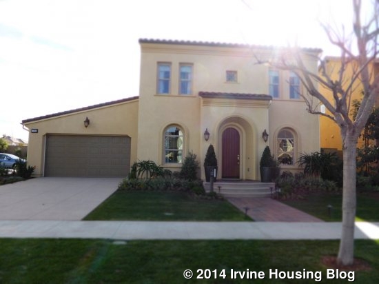
Residence One is modeled in the Spanish style, with Monterey and East Coast elevations also available. The Monterey style has a large balcony running the full length of the second floor with access from both secondary bedrooms. The other homes don’t have a balcony. When you enter the house, upgraded hardwood floors stretch down a long hallway, with the family room and kitchen visible at the back.
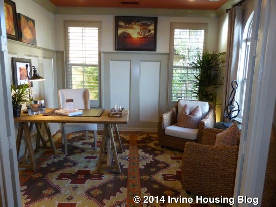
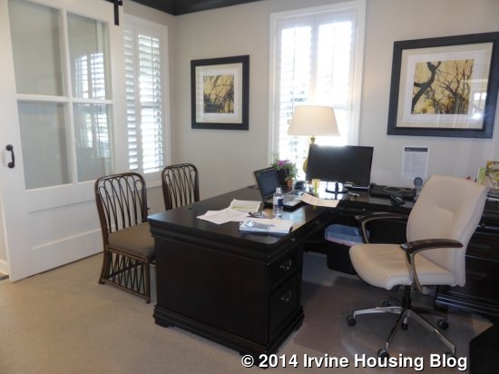
Immediately to the right of the entryway is the home management center. This is basically a den or office, as it is a full sized room. It has optional glass French doors separating it from the hallway and windows facing both the front and side of the house. The model shows upgraded wainscoting, ceiling detail, crown molding and recessed lights.
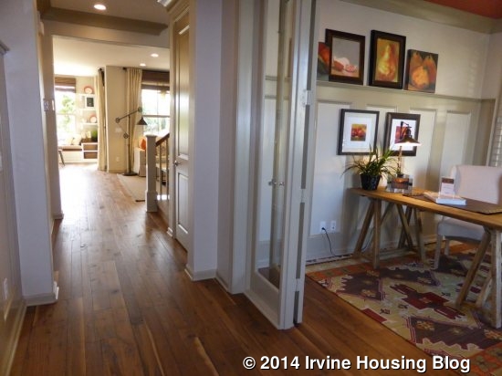
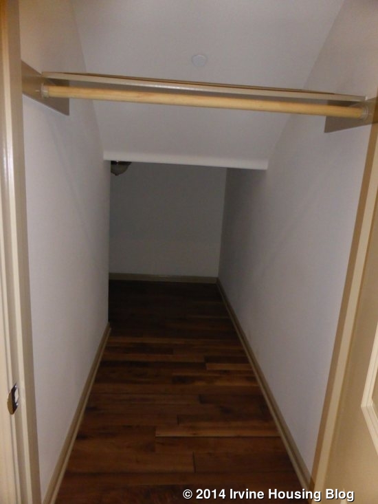
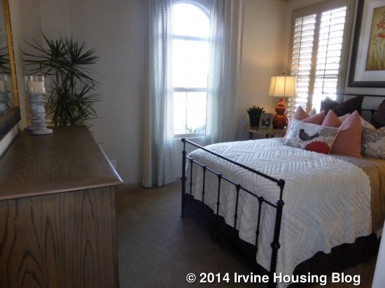
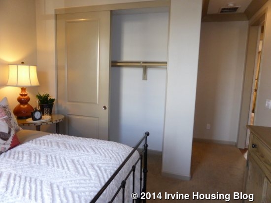
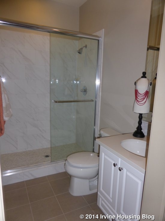
As you move down the hallway, the staircase is to the right and has a large closet underneath. On the left, across from the stairs, is the entry to the downstairs bedroom and bath. The bedroom is an average size, with windows facing the front and side of the house. It has a two-door standard closet. The only upgrade listed for the bedroom is crown molding. The en-suite bathroom has a single sink with white Thermofoil cabinets and a shower. Both the backsplash and the shower tile are upgrades. This bathroom is easily accessible from the hallway, so it may be used by guests or someone using the Home Management Center.
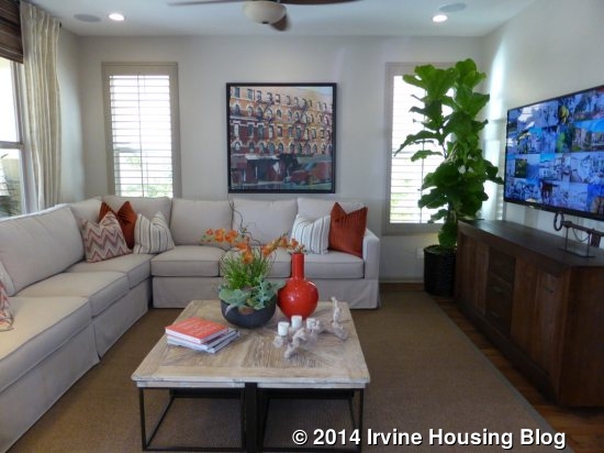
The end of the hall opens up to the great room and kitchen. The great room is to the right. There are four windows – two each on two walls – to let in light. It is a pretty simple room, but it’s a good size. Though the model doesn’t show it, there is an option for a fireplace on the side wall, between the two narrow windows. Upgrades in this room include recessed lights, surround sound with speakers and wainscoting.
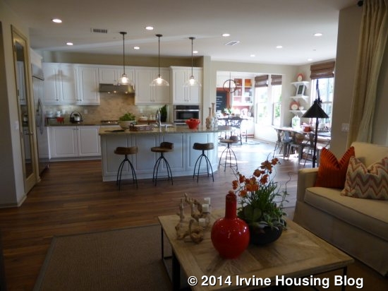
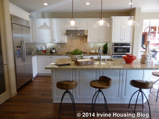
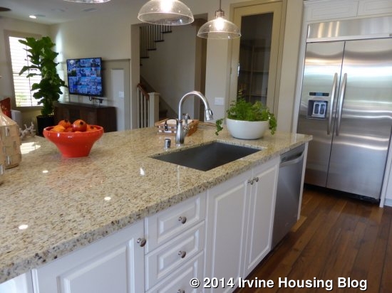
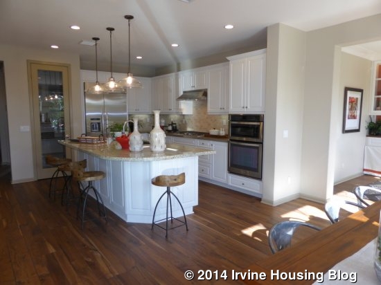
I liked the kitchen in this house a lot. For the most part, this model shows the standard, included features of a Sagewood kitchen. The island is a good size, with plenty of space but without being too big like in some of the other new homes I’ve seen lately. The sink and dishwasher are in the island, but there is still plenty of counter space. It has bar seating on the opposite side. The stove sits alone across from the sink, with plenty of counter, cabinet and drawer space around it. The microwave and oven are at the end of the counter. The refrigerator is at the opposite side (closer to the front of the house) and a big, walk-in pantry sits next to it. The only upgrades shown are the built-in fridge, the counter surrounding the stove (Caesarstone), custom backsplash, optional boxes for pendant lights and the Single Lite pantry door in lieu of a raised panel door.
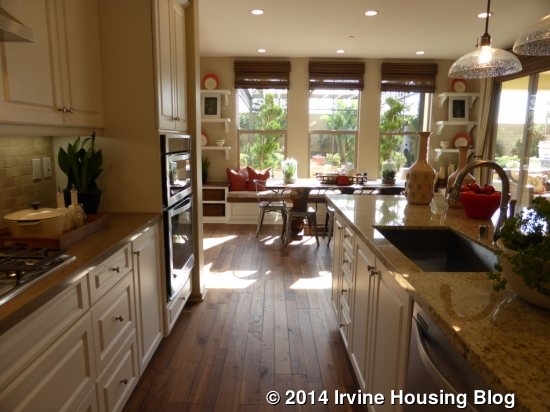
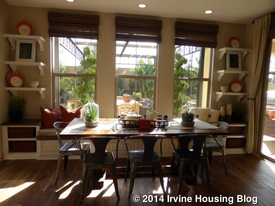
At the back of the kitchen is a dining area. This space has three big windows facing the backyard with a window seat running the length of the wall. There are also doors leading out to the backyard. Both the window seat and the shelves on either side of it are upgrades. There is plenty of space for a large dining table, but the proximity to the kitchen makes it easy to have a casual feel.
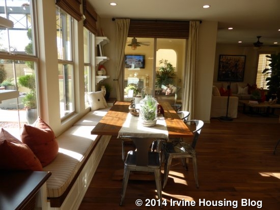
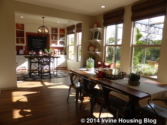
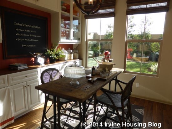
Just beyond the dining area is a small sitting room with two big windows facing the backyard. Though small, it’s a versatile space and a nice bonus to the living area. It would make a great homework spot, craft room, or anything else. The built-in hutch is an upgrade, as are the recessed lights and crown molding.
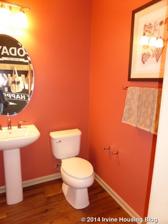
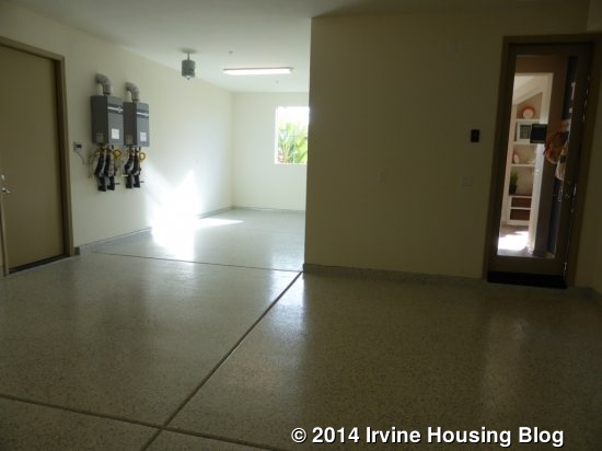
Just off the sitting room is a small powder room. It has a single pedestal sink and is shown without any upgrades. Access to the tandem, three-car garage is just beyond the powder room.
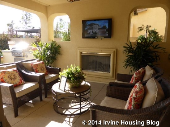
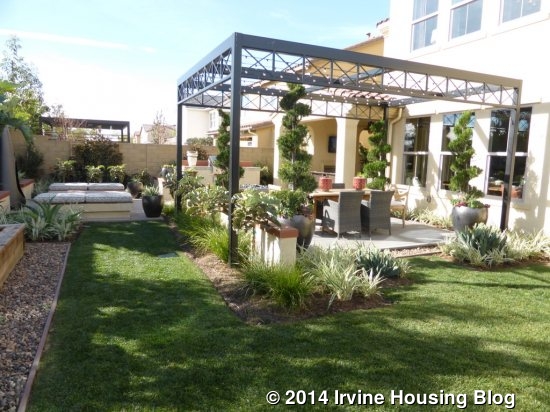
There is an outdoor retreat (called a California Room by some builders) just off the dining area. It comes standard with recessed lighting and a fireplace. The TV outlet above the fireplace is an upgrade. In addition, this model is shown with the extended outdoor retreat, which pushes it out just a few extra feet. The rest of the yard is true to size for homes in phases 1-5 of Sagewood, but the overall lot is about 1000 square feet bigger than those in phases 6-11. The model shows an outdoor fireplace, additional paved seating areas and a grassy area on one side.
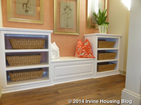
Upstairs, Residence One has a master bedroom and two secondary bedrooms. The stairway shows the upgraded built-in bench and shelves located halfway up, where the staircase changes direction.
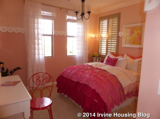
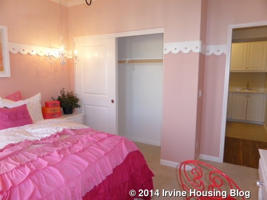
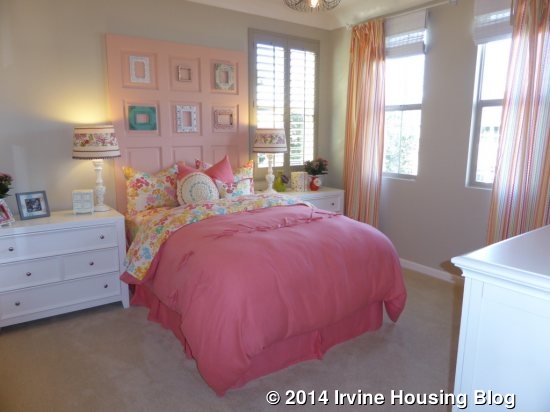
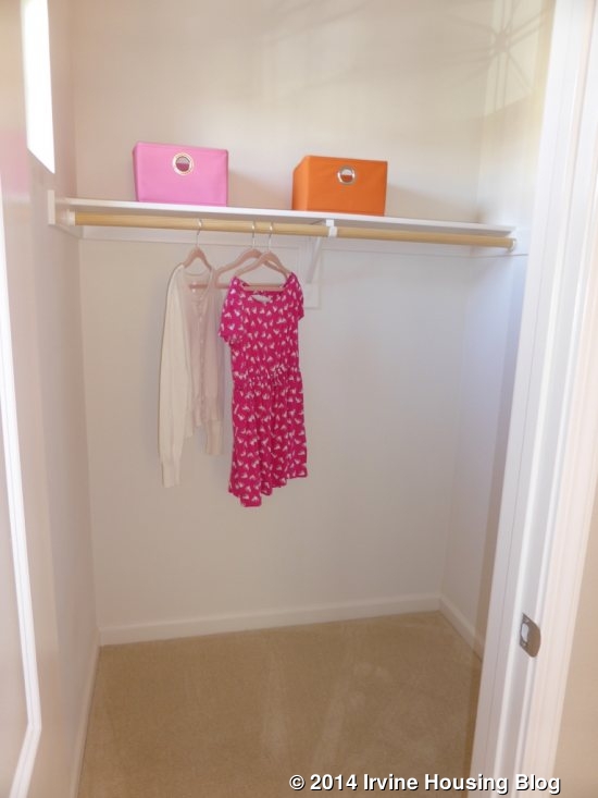
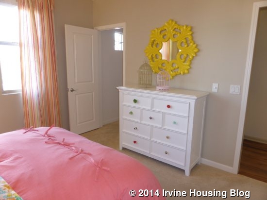
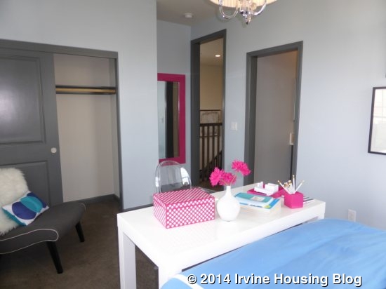
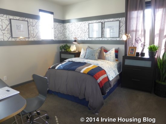
The two secondary bedrooms are to the left when you come upstairs. Both face the front of the house; each also has one window looking to the side. Bedroom 2 has a standard, two-door closet and is shown with upgraded crown molding and pendant lights. Bedroom 3 is slightly larger and has a walk-in closet, again shown with upgraded crown molding and also with stereo speakers. There is a linen cabinet between the two bedrooms. Each bedroom has plenty of space to furnish it without feeling overcrowded.
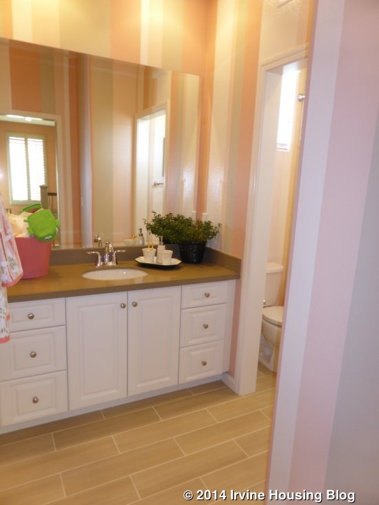
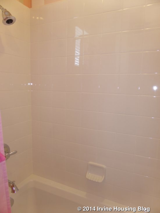
The upstairs bathroom is across from the stairs. It only has one sink, but there is a decent amount of counter, cabinet and drawer space. It is shown with an upgraded Caesarstone countertop with 4” backsplash. A door separates the sink area from the shower/tub combo and toilet. Everything else in the bathroom is standard, including the cabinetry, sink, shower/tub tile, faucets and light fixture.
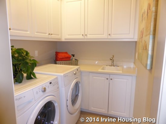
There is a laundry room next to the bathroom. It has space for side by side machines and includes a sink. All of the cabinetry, the counter, backsplash, sink and faucet show the included features.
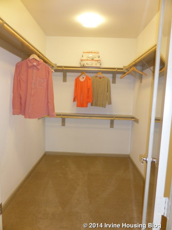
The master suite takes up the entire back half of the second floor. A small foyer leads into the suite. As you step through the door, the walk-in closet is immediately to your left. The mirrored door is an upgrade, but the closet shows the included wood shelf and pole. The closet isn’t as big as in many other masters, but there is definitely ample space.
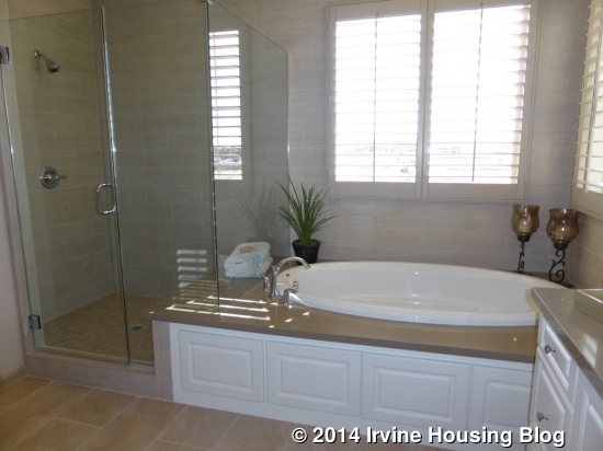
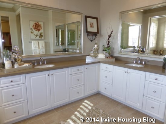
On the right of the entry is the master bath. The room is open and spacious. The shower is immediately to the left when you enter. It is a good size and includes a seat that is part of the tub surround. The tiles are an upgrade, as is the Frameless clear glass enclosure. The upgraded jetted tub sits beneath two windows and also shows an upgraded deck and splash. The sink and counter areas are laid out in an L-shape, leaving plenty of counter and cabinet space for each one. The counters and backsplash are upgraded. The cabinets, sinks, faucets and framed mirrors all show the standard features.
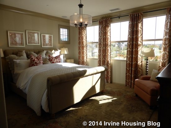
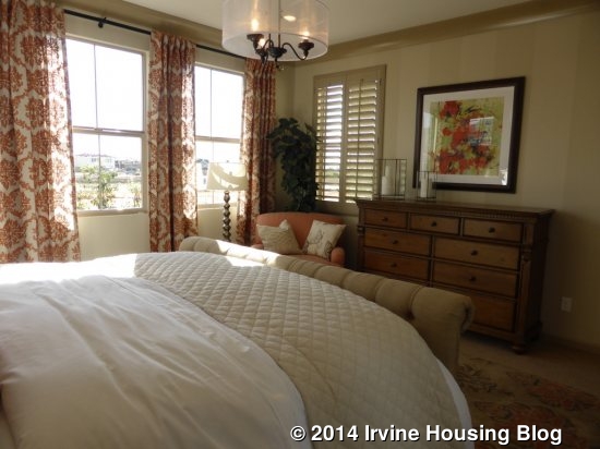
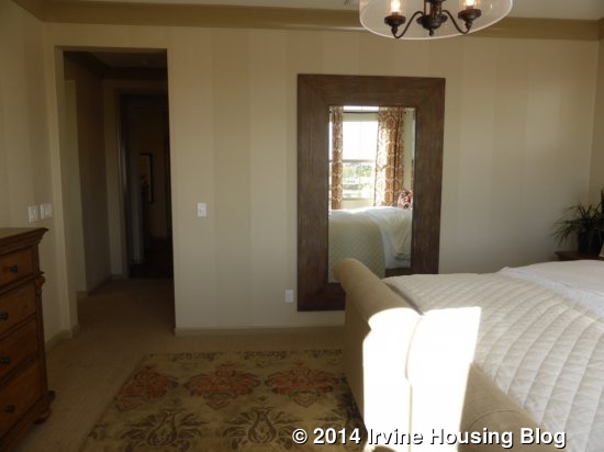
The master bedroom is at the very back of the house. Windows on three sides allow light to enter at almost any time of day. The room is an ok size, but isn’t as big as some. It is shown with upgraded recessed lights, crown molding and a light fixture.
I liked the layout of this house, including the extra sitting room downstairs. I think the three-car garage will be appealing, even though it includes a tandem spot. As always, the downstairs bedroom is popular among many buyers. Those who can secure a spot in phase one will enjoy some of the biggest yards I’ve seen in all of Irvine’s new construction in the last several years. Residence One doesn’t have a lot of options in terms of layout; all of the rooms are set as modeled and cannot be converted to something else. The fireplace in the great room and accordion doors leading out to the retreat are the only real options aside from decorative features.
Residence Two
2,648 – 2,825 square feet
4 Bedrooms, 4.5 Baths
Home Management Center, Optional Dining Room with Butler’s Pantry, Optional Super Great Room, Optional Extended Outdoor Retreat (select homesites)
Base Price: $1,060,900 ($400/sq ft if 2,648 square feet)
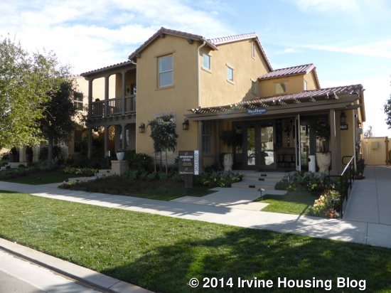
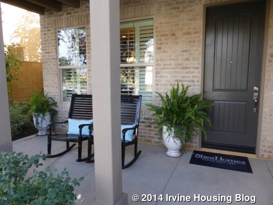
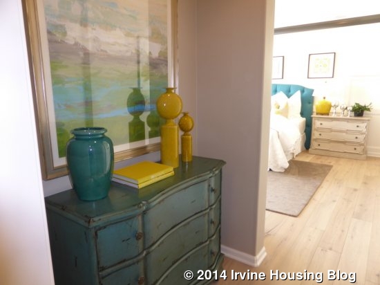
Residence Two is modeled in the Monterey style, with Craftsman and Santa Barbara as the other options. All three models have a balcony accessible from the two secondary bedrooms on the second floor. Each home also has a front porch on the main level. The sales office is located where the tandem three-car garage would normally be. Throughout the model, there is upgraded paint, flooring, window coverings, window wrap, solar panels and painted cabinetry.
A small entryway opens to a larger foyer. On the right side, a door leads to the downstairs bedroom. The room has a window overlooking the front and another facing the side of the home. It includes a two-door standard closet and an en-suite bathroom. The bath has a single sink and a shower, but no tub. Currently, the bedroom is part of the sales office and I wasn’t able to get a photo of the bathroom. For those who see it in person, the cabinets, backsplash, shower tiles and floor are all upgraded.
Beyond the bedroom, a hallway leads to an under-the-stairs closet and access to the garage.
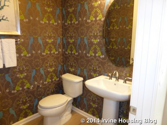
On the left side of the foyer, there is a home management center and a powder room. The bathroom has a single, pedestal sink and is modeled without any upgrades.
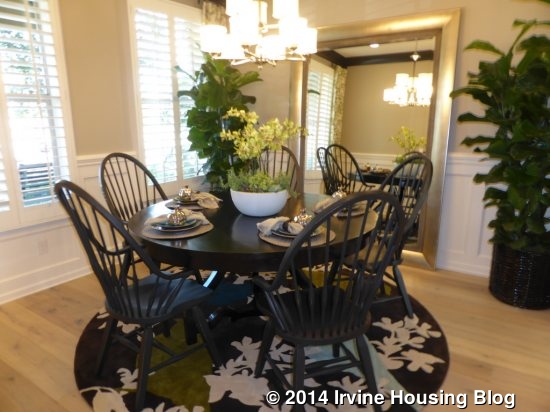
The home management center is modeled as a formal dining room and includes the optional butler’s pantry that connects it directly to the kitchen. The room has a window facing the side and two overlooking the front porch. It is shown with decorative wainscoting, crown molding, recessed lights, a light fixture and room of stereo.
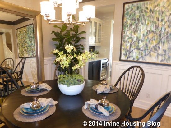
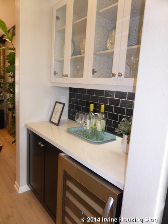
The butler’s pantry replaces a standard walk-in pantry. It includes white Thermofoil cabinets and standard granite color, but is modeled with painted shaker cabinets, a Caesarstone deck, marble backsplash, glass uppers and an optional wine chiller. It isn’t particularly large, but is a nice space if you want a formal dining room. Eliminating the wine chiller would create more storage.
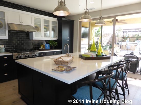
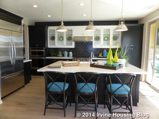
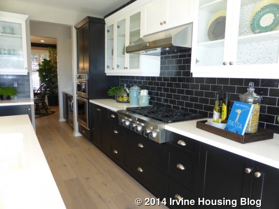
If you didn’t have the butler’s pantry, the foyer opens up to the kitchen and great room, with the dining area directly in front when you walk in and the kitchen on the left. The kitchen is dominated by a large island that includes bar seating, the sink and the dishwasher. As in Residence One, the stove is directly across from the sink, with storage drawers underneath and cabinets and counter space on both sides. The oven and microwave are on the closer side, adjacent to the butler’s pantry. The refrigerator is also on the close side, next to the pantry entry. Basically everything in the kitchen is an upgrade, including the cabinets, counters, backsplash and the Kitchenaid Professional Style appliance package. There is one set of pantry height cupboards at the far end of the main counter.
The dining area is quite wide. There is plenty of space for a big table and a china hutch. The model even shows two big armchairs flanking the window. The recessed lights are included.
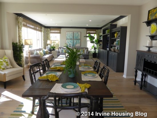
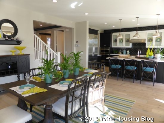
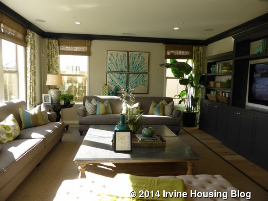
This home is modeled with an optional super great room. The extra indoor space eliminates the tandem spot in the garage. If you choose the super great room, the architecture of the wall creates a definition between the dining room and great room. In the standard option, the two rooms flow completely together. The great room includes three windows facing the backyard; the super great room has three additional windows on the side of the house. Both have the option of a fireplace in the center of the main wall. The model shows a built-in unit here instead. The recessed lights, crown molding and surround sound are all upgrades.

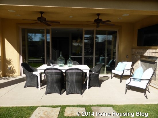
The kitchen has sliding doors that lead to the outdoor retreat. As in Residence One, there is an option for an extended retreat. The model shows the standard size plus the included fireplace and recessed lights.
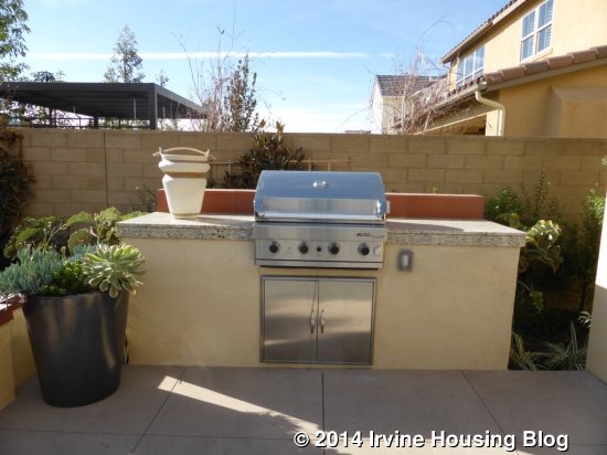
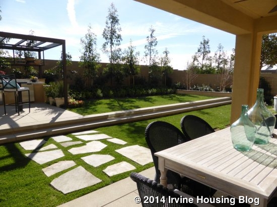
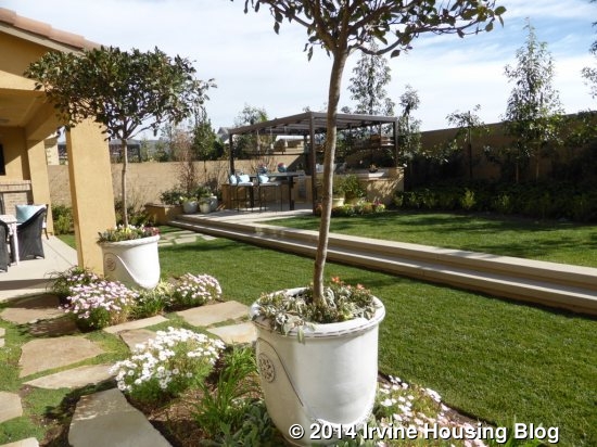
The backyard of this home shows the true difference between the lot sizes. Phases 1-5 will have yards the same size as in the model, which shows a two-level grassy yard and smaller patio with a built-in barbecue. Phases 6-11 will have yards only as big as the lower portion of this one. The back wall would be where the two stairs are. The difference is significant.
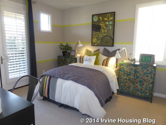
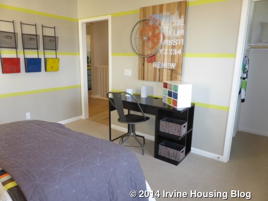
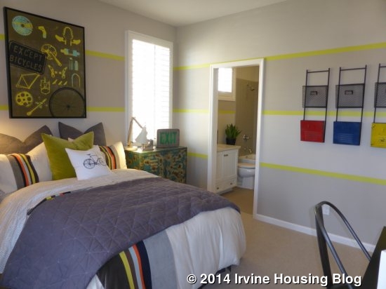
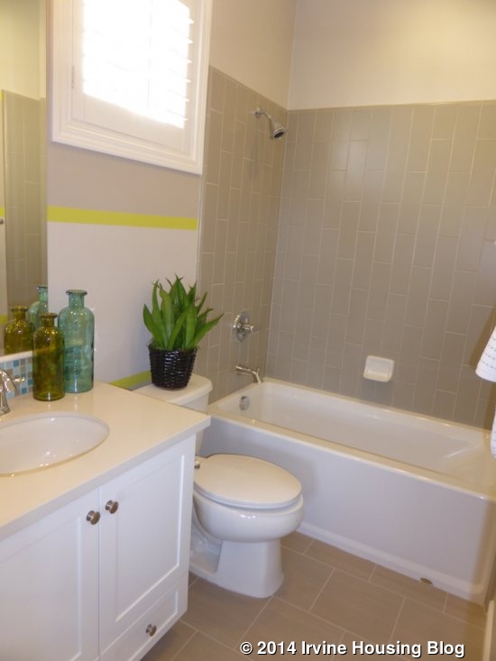
Upstairs, there are two secondary bedrooms and the master suite. Both secondary bedrooms are at the front of the house. Each has an en-suite bathroom with a single sink and a shower/tub combo. Each also has a walk-in closet. Bedroom 2 is slightly larger. It also feels bigger because of its setup. When you walk in, the bathroom is to your left and the closet to the right, and then the full room opens up behind it. This gives the room a lot of wall space and flexibility. There is an upgraded Single Lite French door in one corner leading to the shared balcony. This room also has upgraded crown molding and speakers.
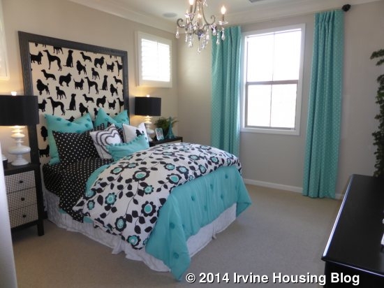
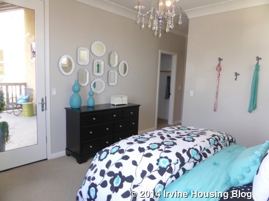
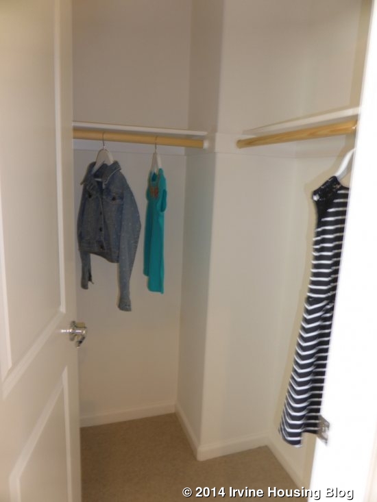
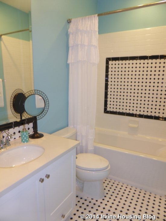
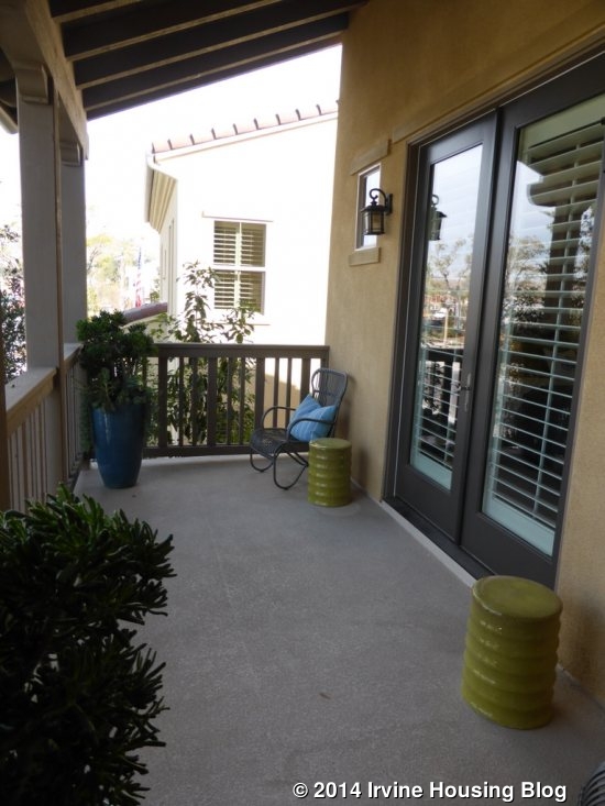
Bedroom 3 is directly in front of you when you come upstairs. The room is still plenty large, but the doors to the bathroom, closet and balcony do take up space. The balcony stretches across the front of the room. The recessed lights are an upgrade. Both bathrooms have an optional tile backsplash, upgraded tile at tub walls and optional painted white shaker cabinets.
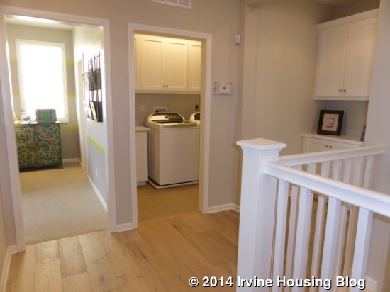
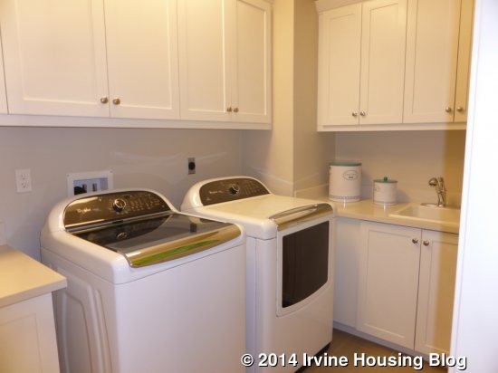
The laundry room is adjacent to Bedroom 3. It has side by side machines, a sink, and two small counter areas. There are numerous upper cabinets, again with the optional painted shaker style. Outside the laundry room, there is additional linen storage. From here, a small foyer leads into the master suite.
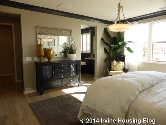
The master bedroom is much larger in Residence Two than One. Again, windows on three sides bring in light throughout the day. As in many of the rooms, the lighting, crown molding, wainscoting and speakers are upgrades.
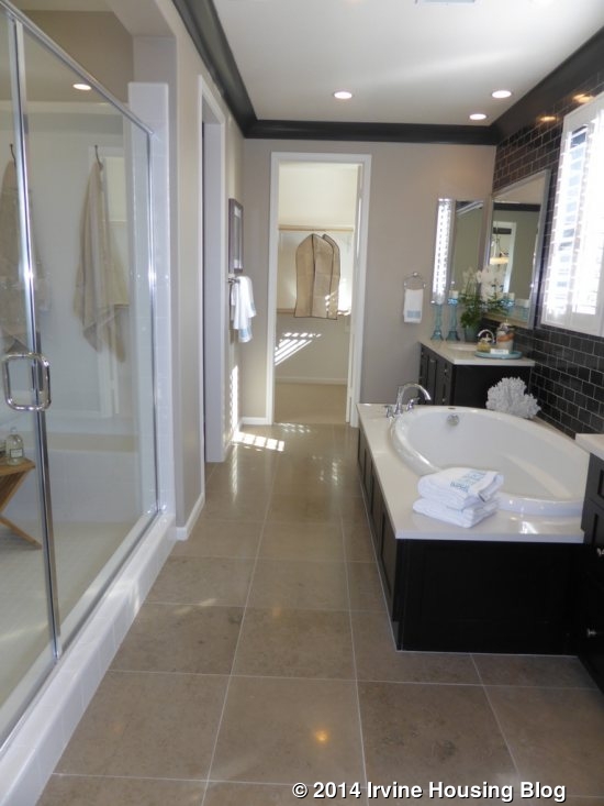
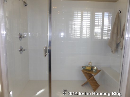
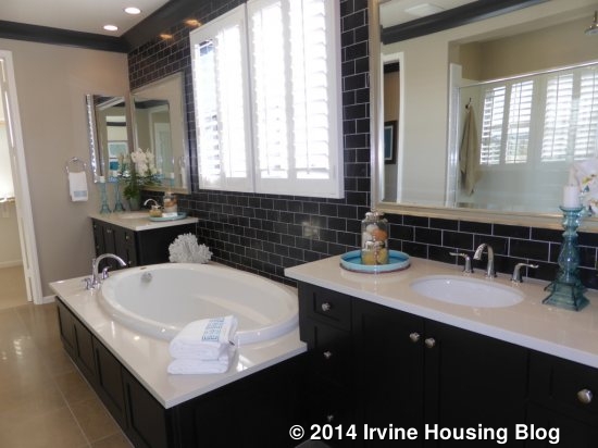
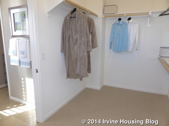
The master bath is set up quite differently than in the first home. This one has a very large shower directly on the left when you enter the bathroom. It has a small seat and is modeled with the standard tile and enclosure. The rain can shower head is an upgrade. The opposite side of the bathroom has two sinks with a tub between them. The EStone tub deck, full height splash and painted shaker cabinets are upgrades, but the countertops, sinks and framed mirrors are standard. The walk-in closet is at the back of the room and shows an optional double sided mirrored door. The closet is a lot larger than in Residence One.
I liked this home, too. I think the option for the butler’s pantry creates nice flexibility downstairs. The super great room is a wonderful feature for buyers who don’t care about the three-car garage. All of the bedrooms are a really good size. I like how the backyard is set up to show the differences in lot size. I do miss the extra sitting room downstairs that Residence One has, but otherwise, everything in this home is a step up from that one.
Residence Three
2,941 square feet
4 Bedrooms, 4.5 Baths
Entertainment Room, Optional 5th Bedroom at Entertainment Room, Optional Kitchenette at Guest Suite, Optional Extended Outdoor Retreat (select homesites)
Base Price: $1,060,900 ($400/sq ft if 2,648 square feet)
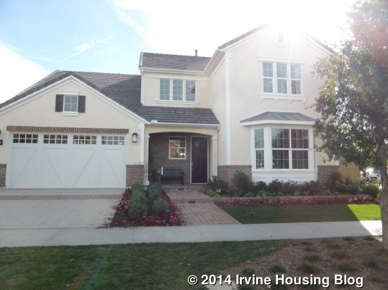
Residence Three is the biggest model in Sagewood and is shown in the East Coast style, with Craftsman and Santa Barbara as the other elevations. Throughout the house, the paint colors, flooring, cabinets and the stainless steel hardware package are all upgrades. Like the others, this home has a downstairs bedroom, but this one is actually a complete living suite. There is an option to include a private door from the front porch directly into the suite.
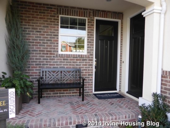
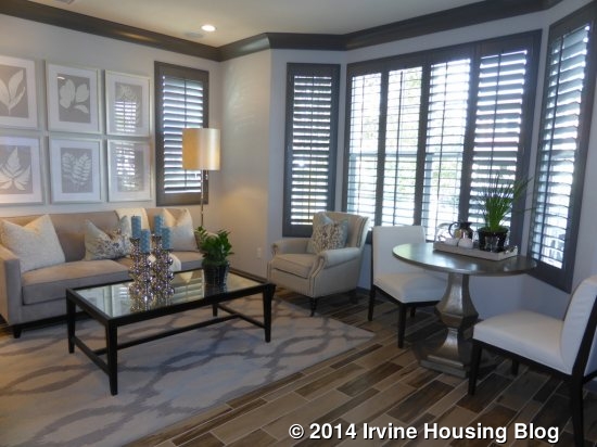
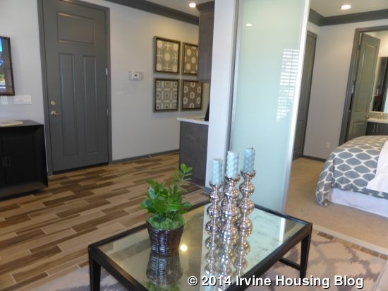
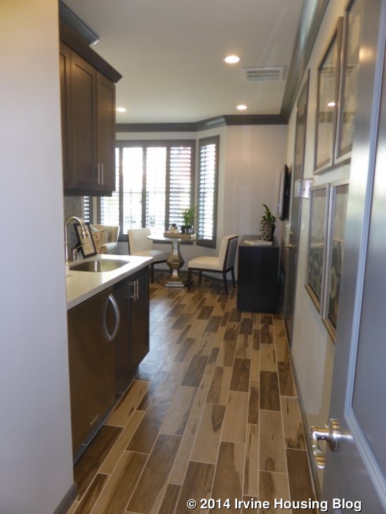
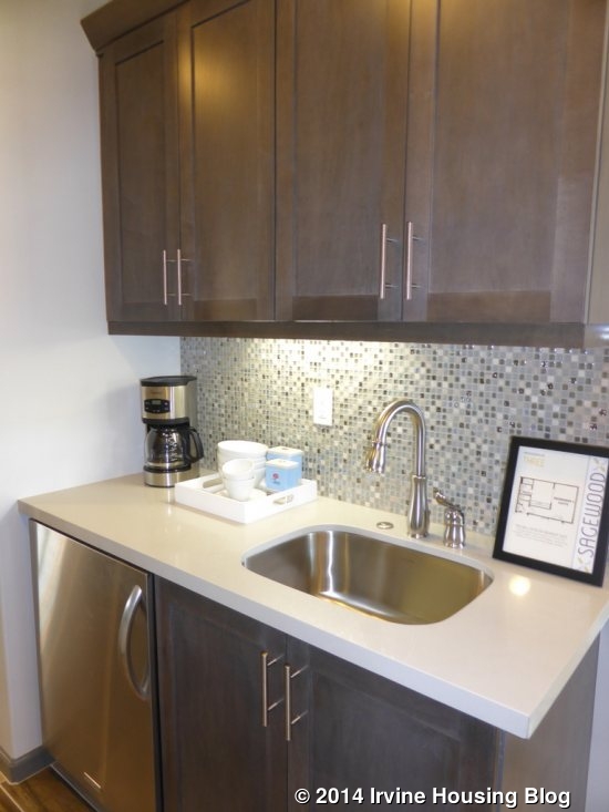
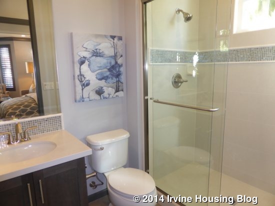
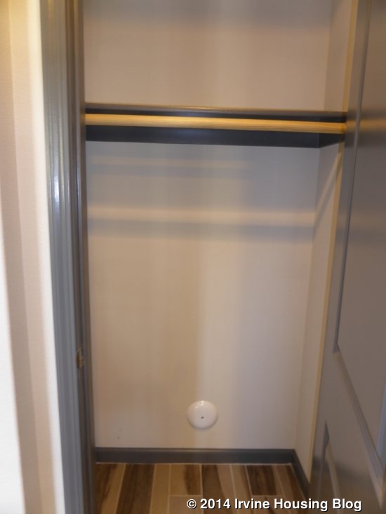
The living suite consists of a living room, bedroom, full bath and an optional kitchenette. The door from the porch would lead into the living area. A large window facing the front of the house creates a nice nook for a breakfast table. The room is a good size with a cozy feel. The model shows upgraded crown molding, speakers and TV prewiring. The model also includes the kitchenette, located in a narrow hallway that connects the suite to the rest of the house. It only has a sink and a mini fridge, along with cabinet and counter space. The countertop, backsplash and cabinet color are all upgraded. Optional glass panel divider doors separate the bedroom from the living room. The bedroom is pretty small and has a two-door closet. If you don’t include a kitchenette, the bedroom closet doubles in size and stretches the full length of the wall. The attached bathroom has a single sink, without much counter space, and a good-sized shower. Virtually everything in the bathroom is upgraded.
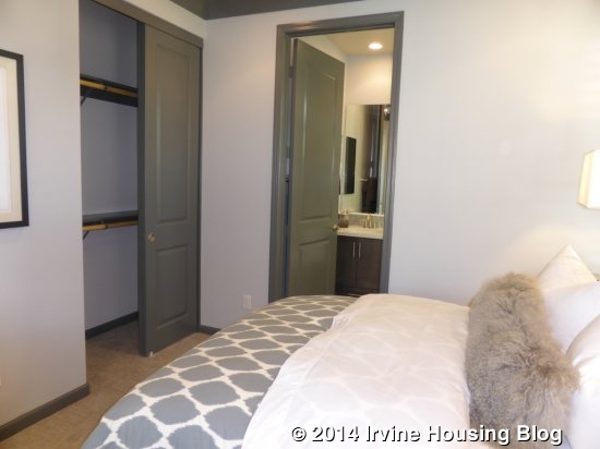
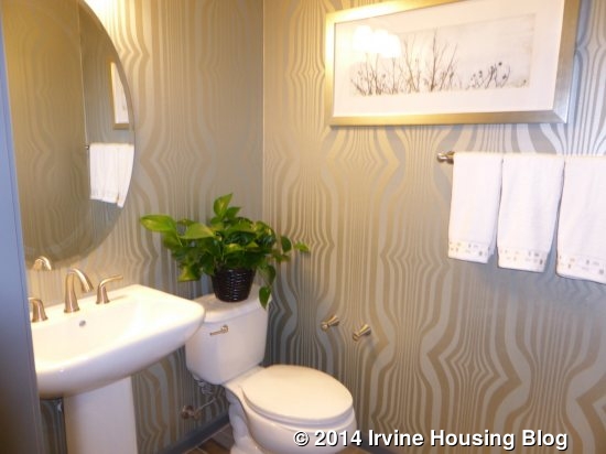
In the main house, the stairway is immediately to the left when you walk in the door. A small hallway on the right leads to a small coat closet, a powder room, and the door to the private suite. The powder room has a pedestal sink that comes standard and is shown with upgraded hardware.
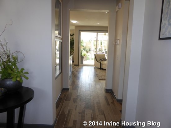
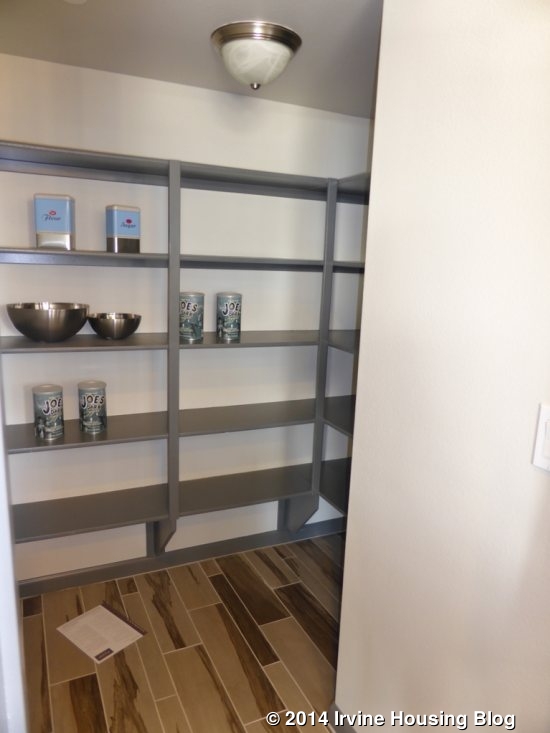
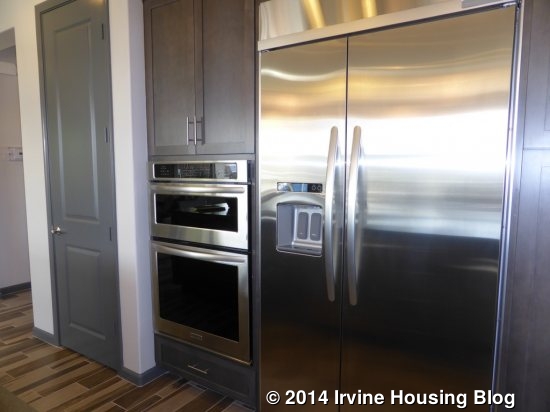
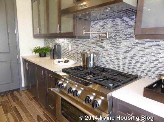
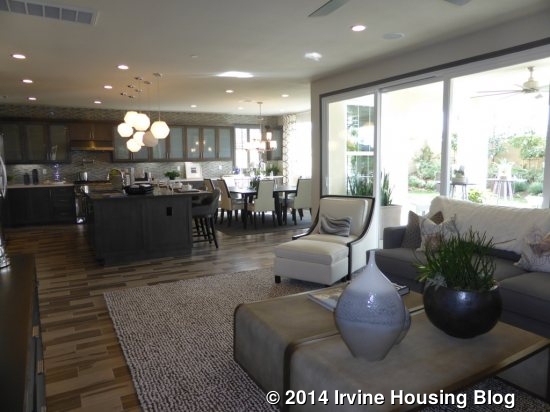
Beyond the entry, the house opens up to the kitchen, dining room, and great room. The kitchen is also shown with numerous upgrades, including the appliance package, cabinets and doors, countertops, backsplash, sink and faucet. It feels bigger than the kitchens in the other models, partly because the cabinets stretch all the way through the dining room as well. The walk-in pantry is just to the left when you enter the room; the microwave/oven and refrigerator are next to the pantry door. On the far side of the fridge is the door to the garage. Residence Three is the only Sagewood home where the garage entry is immediately off the kitchen, a feature that I really dislike. The kitchen island is big, with ample room for four bar stools on one side. Like the other models, the sink and dishwasher are in the island. The far wall of the kitchen is completely lined with upper and lower cabinets and a long counter. The stove sits there as well, across from the island. In this home, they included a full range (stove and oven) rather than just a cooktop.
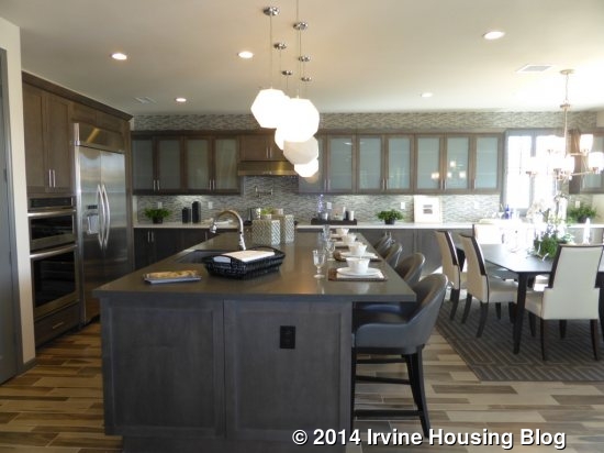
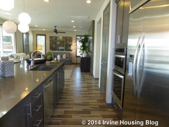
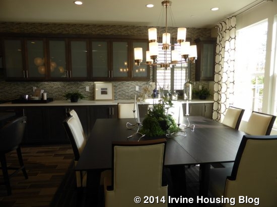
The dining room sits at the back of the kitchen. It is a good size and has windows on three walls looking out to the backyard and outdoor retreat. Because the kitchen cabinets go all the way to the end, there isn’t really room for a china hutch; however, you don’t really need one since you already have built in cabinets.
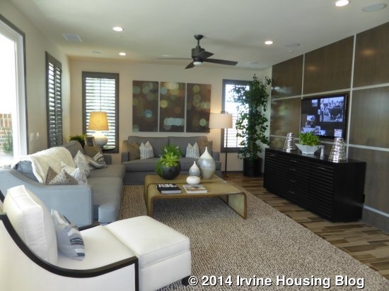
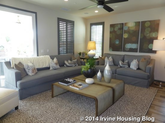
The great room is next to the kitchen. This home doesn’t show it, but there is an option for a fireplace on the wall at the side of the house, between the windows. This room is a good size and shows upgraded recessed lights, surround sound and a wood wall. Large, sliding doors lead out to the retreat.
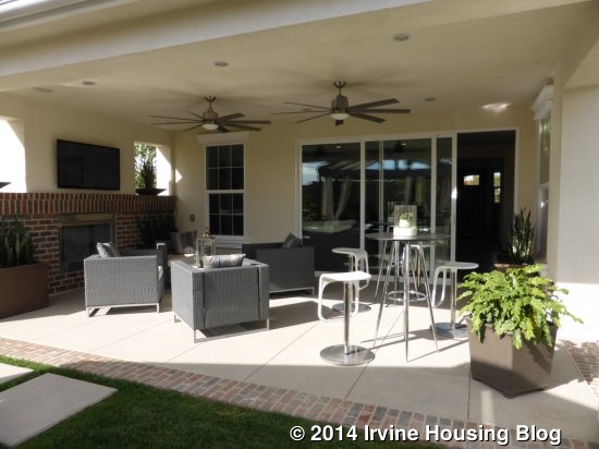
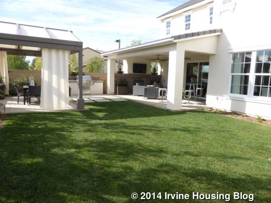
The outdoor retreat shows the optional extension, which adds a few extra feet to the room. It includes the standard fireplace and has the optional TV outlet and speakers. The yard is a good size. In addition to the retreat, it includes a built in barbecue, covered patio area for dining, and a big grassy area.
Residence Three is the only Sagewood home with four rooms upstairs. In addition to the master suite and two secondary bedrooms, there is an entertainment room that could be a fifth bedroom instead. This room is at the top of the stairs and is modeled as the entertainment room. It shows optional built in cabinets with desk, bench seating, frosted glass barn doors, recessed lights and wiring for data and TV. I really like the setup with all of the built-ins. If you chose a bedroom instead, the two-door closet would be in the back corner where the shorter part of the bench is.
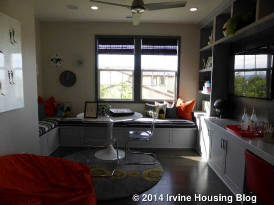
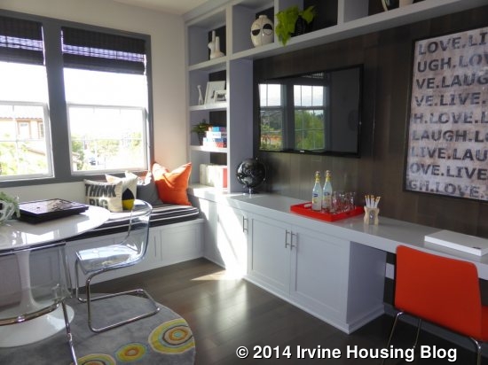
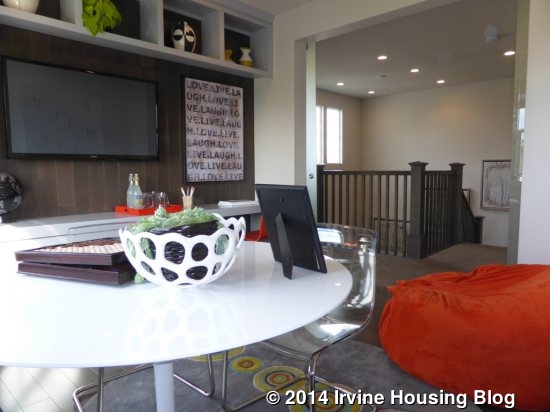
Bedroom 3 is at the front of the house. The rectangular room has numerous windows facing both the front and side of the house, bringing in lots of light. It is a big room and includes a standard, two-door closet. This room has an en-suite bathroom that includes a shower/tub combo and a single sink, with an option to include a second sink. The tile backsplash, tile at tub walls, cabinets and hardware are all upgraded. There is also an option to put in a door to the hallway in addition to the one from the bedroom. As there isn’t a separate hallway bath upstairs, buyers may like this feature so that people can easily access it from the entertainment room. If you opt for a bedroom in lieu of the entertainment room, this bathroom automatically has two sinks, includes a door separating the sinks from the toilet and tub, and does not have a door to the bedroom, but only a door to the hall.
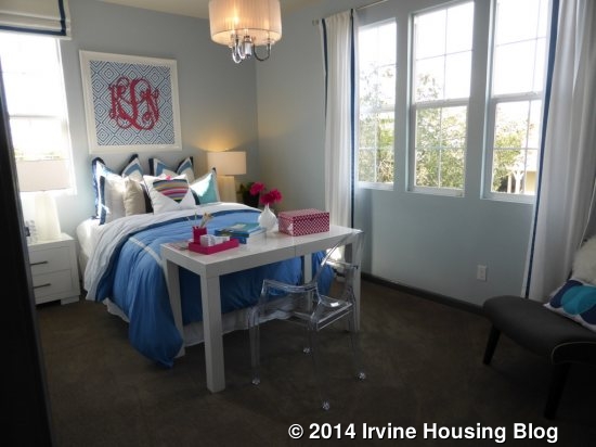
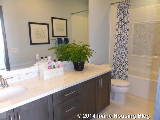
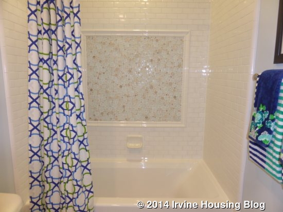
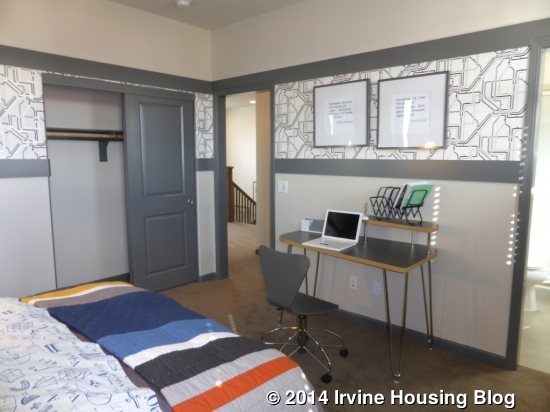
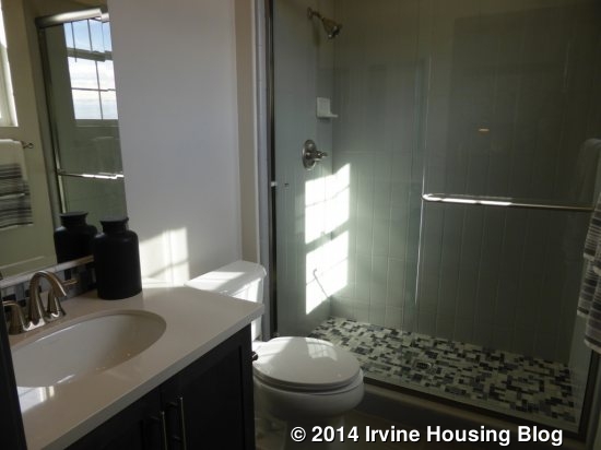
Bedroom 2 is in the back corner of the house, adjacent to the entertainment room. It is also a really good sized room and includes a two-door closet. There are windows overlooking the backyard and side of the house. This room also has an en-suite bathroom. It includes a single sink and a shower, but does not have an option for a bathtub. As in the other bathroom, the tile, cabinets and hardware are all upgraded.
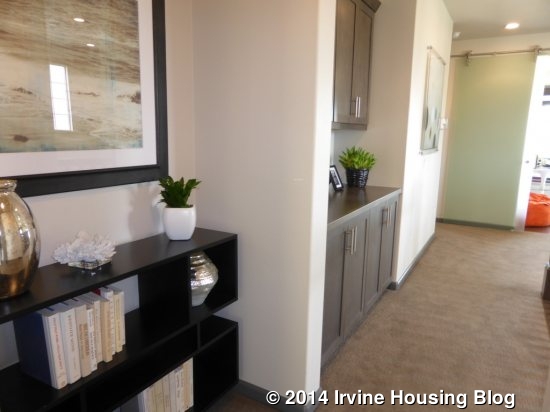
The laundry room is across from Bedroom 2. Like the other Sagewood homes, it has side by side machines, a sink, a counter and numerous cabinets. The cabinets are upgraded. There are additional sets of linen cabinets just outside the laundry room and just outside the master bedroom.
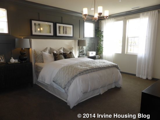
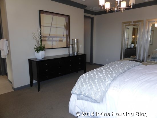
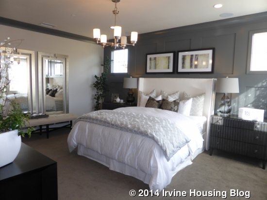
The master suite has a very small foyer and the room itself is pretty big. The East Coast elevation has windows on the side and back of the room, while the other two elevations also include three windows looking to the front.
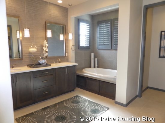
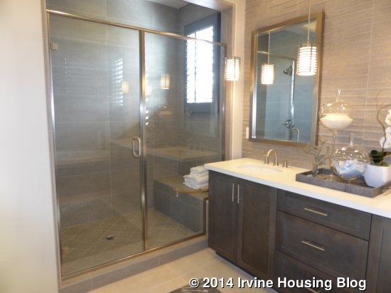
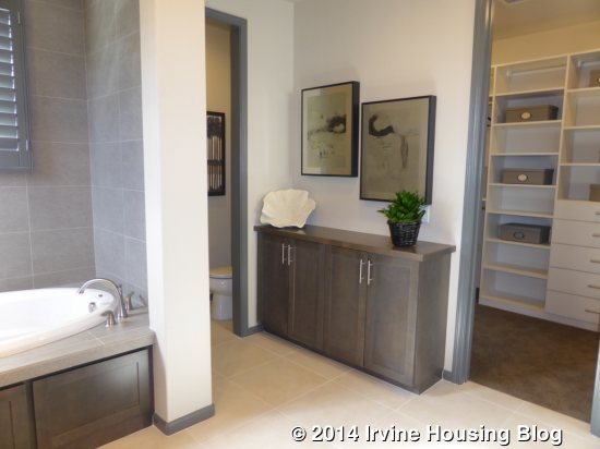
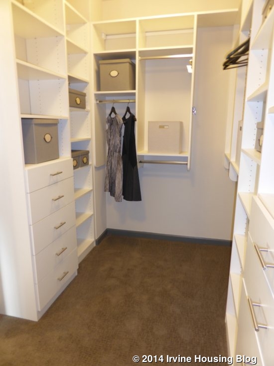
The master bath has two sinks on a shared counter. The shower is on one side and the tub is on the other. The shower is a nice size and includes a built-in seat. The tub is tucked into an alcove with higher windows around it. Outside the doors to the water closet and walk-in closet is another set of cabinets. The Caesarstone counter and tub deck, full height tiles, shower floor, stainless steel hardware, shower enclosure and Jboxes for pendant lights are all upgrades. The large, walk-in closet also shows an upgraded organizer.
Overall, I really like the Sagewood models. I think they have good floor plans and spacious bedrooms. I believe that the downstairs bedroom and three-car garage featured in each home are very appealing. While most of the homes in the first five phases are probably already sold, I definitely think that the larger lot size makes these homes superior to those in phases 6-11. My primary concern is with the price. While the price isn’t out of line with other Irvine homes, it is a lot higher than Pavilion Park’s Whistler collection, despite being very similar in size and layout (all Whistler homes have just a two-car garage). It will be very interesting to compare sales in the two collections.
Discuss on Talk Irvine: http://www.talkirvine.com/index.php/topic,11292.0.html