The Melrose collection in Pavilion Park (the first of the Great Park Neighborhoods), has the community’s largest – and most expensive – homes. The three models feature rooms often not seen in new construction these days. They have formal dining rooms and two downstairs living spaces, rather than just a great room. Built by Ryland Homes, each house has the option for a downstairs living suite plus a three car garage. The models didn’t offer lists outlining the upgrades, but I will list some of the standard features and try to note upgrades when I can. Once you express serious interest in purchasing, the information about upgrades is available.
See the rest of The Melrose Collection Overview and Review of Residence 1 here.
See a Review of Residence 2 here.
Residence Three
4,223 Sq Ft
5 Bedrooms, 5.5 Bathrooms, 3 car garage, downstairs master suite
Base Price from $1,588,205 ($376/sq ft)
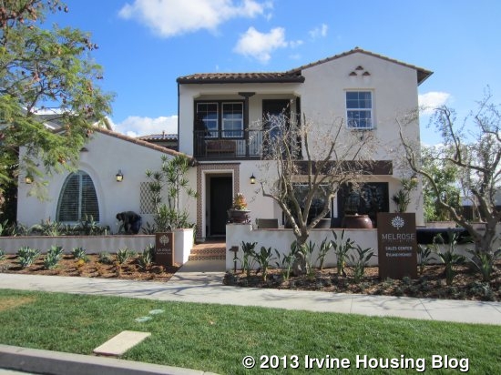
Residence Three is the La Jolla home, modeled in the Spanish style and also available in Monterey and Farmhouse elevations. The model is shown with a reversed floor plan. Like Residence One, there are a variety of alternative room arrangements. This model houses the main sales office, so I couldn’t see the real garage. In the printed floor plan, it appears to be a much larger garage then in Residence One, as it is the full width almost the entire way back.
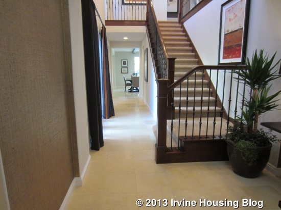
In this home, the view from the entry is a long hallway toward the back of the house, with the staircase just a few feet back from the door. To the left of the entry, there is a small powder room (shown highly upgraded), linen storage, and the downstairs master suite.
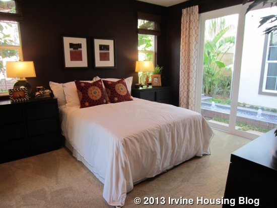
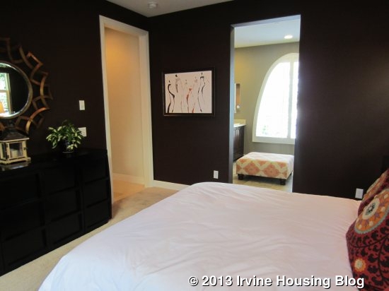
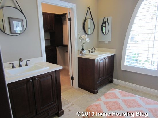
The downstairs master is a nice room, but over 100 square feet smaller than the upstairs master. It is closer in size to the secondary bedrooms upstairs (one of which is actually much bigger). It has sliding doors that lead to an inner courtyard, plus two more windows on another wall. The carpet appears to be the standard, plush carpet that comes with the home. The master bath has split sinks, with the door to the walk-in closet between them. The built-in organizers are shown in an upgraded finish that matches the vanities. This room has a somewhat small shower and no bathtub. It also has a big window facing the street, which doesn’t give the bathroom a lot of privacy.
For those who prefer something other than a master suite, there are two alternatives. The first is a den and bedroom. In this scenario, the original master bedroom is converted to a den and made a little bit smaller. The extra square footage taken from the den, plus the former master bath, are converted to a bedroom with a sliding closet and an en suite bath with a shower/tub combo and single sink. Both the den and bedroom are accessible from the hallway just outside the powder room (which is unchanged). The linen cabinets are eliminated.
The other option is for a private living suite. Again, the powder room remains untouched and access to the suite is just outside of it. You enter the living room, which is smaller than the original bedroom, but bigger than the den in the other alternative plan. It does not appear to have an optional kitchenette. A doorway leads into the bedroom, which is also slightly bigger than the bedroom in the last plan but smaller than the original master. It has a mini hallway that leads to a sliding closet and a bathroom identical to the one in the den/bedroom plan. The suite seems to have a regular door (as opposed to sliders) that leads to the inner courtyard, but doesn’t seem to have private access directly from the street. This is definitely not as nice as the suites in the other residences.
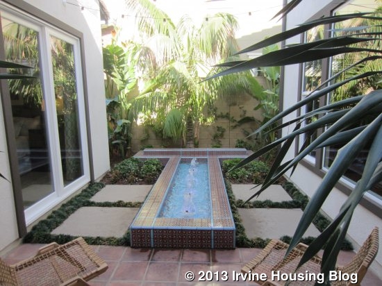
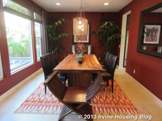
Moving back down the main hallway of the home, I passed more sliding doors leading to the courtyard, which has a nice fountain and small patio area for seating. Just beyond it is the formal dining room. This room is very rectangular (those in Residences One and Two were more square-shaped). It has big windows facing the inner courtyard and a door to the kitchen.
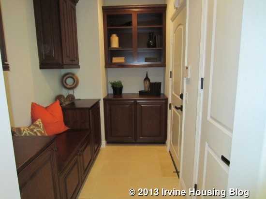
Across the hall from the dining room, there is a coat closet under the stairs plus a built in bench, and linen storage with an option for additional upper cabinets. The garage access is here as well, making a nice spot for a drop zone. Though I mentioned earlier that the garage is almost like a four-car garage, there does seem to be an option to turn part of it into a den. If you do that, it looks like the drop zone area will be more of a regular hall and the garage will then be a true three-car garage with one half having tandem spaces. It is a little hard to tell on the brochure, but it looks like the den can
have a built-in unit that would be back-to-back with the family room’s built-in.
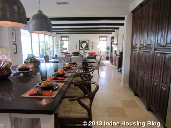
The hallway opens at the end to the “morning room,” which is a large dining area between the kitchen and family room.
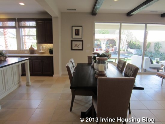
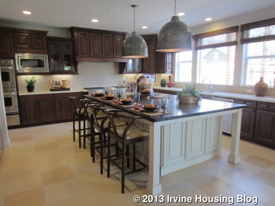
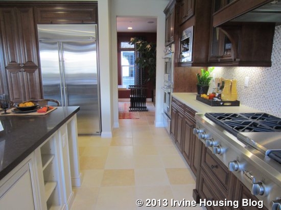
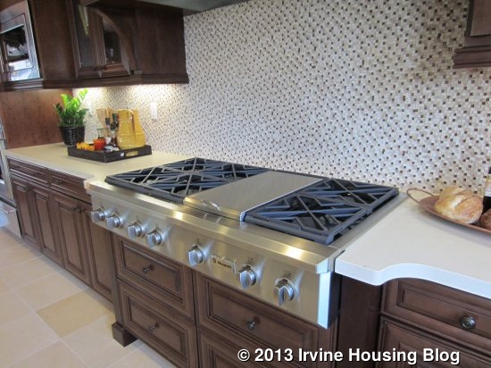
The kitchen is on the left and includes a very wide island. Seating on two sides allows for six to sit comfortably. One side has several cabinets and an optional wine cooler. Unlike the other two models, the sink and dishwasher are actually located on the counter behind the island, rather than in it. The wall on the far side of the island has numerous cabinets, plenty of counter space, and the cooktop. This is the only residence that shows the actual 6-burner cooktop that comes standard with the Melrose homes. At the end of that wall, next to the dining room, are the two built-in ovens and the built-in microwave. The third wall has the fridge and several pantry-height cabinets. While the model does have upgraded cabinets, it is nice to see the standard appliances and tile flooring.
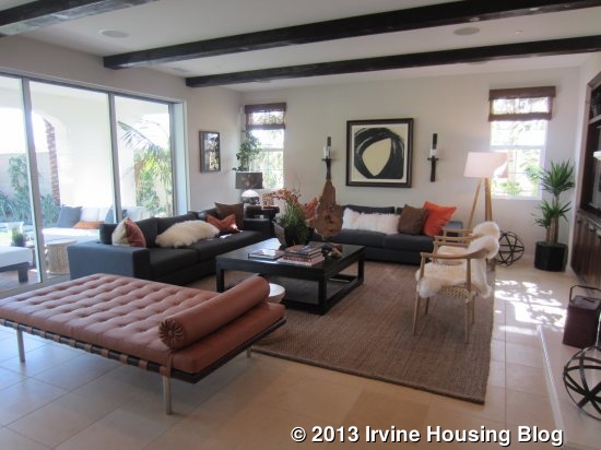
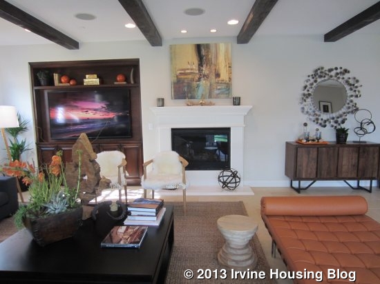
The family room is on the other side of the morning room. It has a small fireplace in the center of one wall and a built-in unit next to it. The side wall has two windows and the entire back wall (stretching into the morning room) has sliding doors to the yard. Three different California Rooms are available – two are the same size but appear to have slight differences in the thickness and decorative style of the walls. The third is about half as wide. The morning room can also have optional stackable doors.
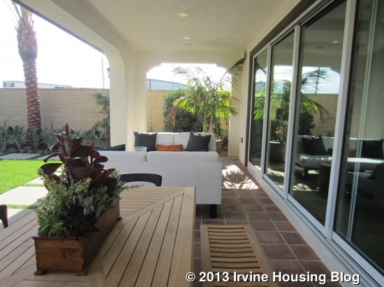
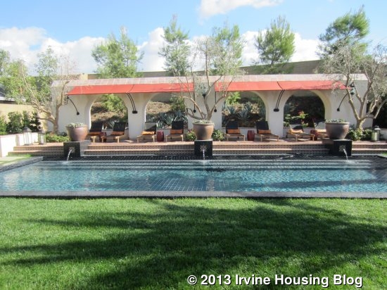
When you walk into the backyard, you might think you have stepped into a tropical resort. A lawn area with palm trees at both ends stretches across the width of the yard and the elegant pool behind it is just as wide. At the back of the yard is a covered patio area lined with lounge chairs that face the pool. Sadly, this yard is nothing like the real yards in most Melrose homes.
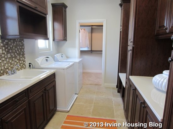
Upstairs, numerous optional doors create a bit of a maze. I found myself confused until I stopped to look at the printed floor plan. The laundry room is just to the left of the stairs. It has a sink, side by side machines, numerous cabinets, and plenty of counter space. A door at the far side led to what seemed to be a very large, L-shaped extra closet. However, as I stepped through the closet and into an elegant bathroom, I realized I had actually entered the master suite through the laundry room (this door/access is optional).
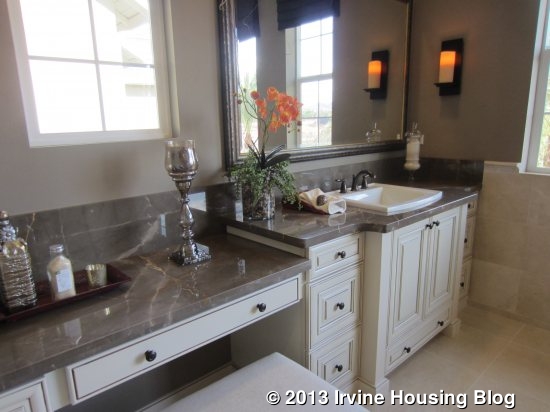
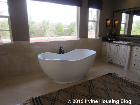
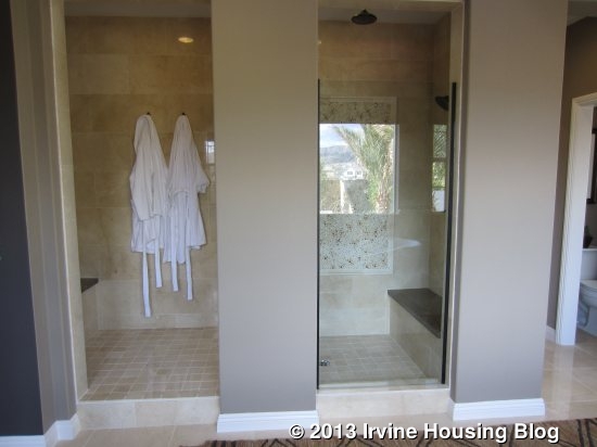
The closet led me to the spacious master bath. Sinks on either side are shown with upgrades; one side has the standard, attached vanity area as well. The standard, built-in tub is replaced by a kidney-shaped, free-standing tub. Windows above the tub overlook the backyard. Across from the tub is a big, walk-in style shower with benches at both ends.
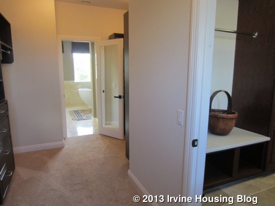
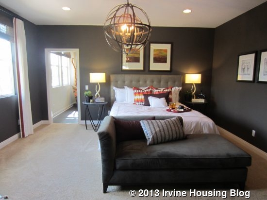
The master bedroom is big, but a little smaller than those in Residences One and Two. It still has plenty of room for standard bedroom furniture and a seating area. The entryway from the main hall (which happens to be at the top of the stairs) has a niche, multiple linen cabinets and an optional, small fridge. On the far side of the master though, is another door, continuing the maze of rooms upstairs.
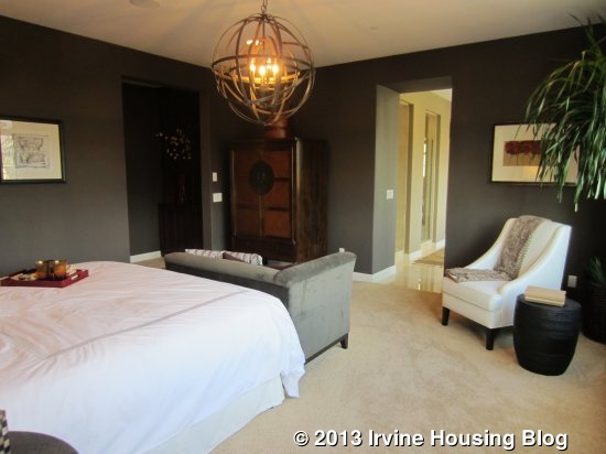
Through the door, I entered what appears to be the optional Flex Room. This door could be sealed off instead. The flex room in this home contains a sauna and has a Zen-like atmosphere. I’m sure the flex room could be used for anything. The standard arrangement for this space is actually a bedroom (bedroom 4) with a sliding closet and en-suite bathroom (shower/tub combo). Bedroom 4 is the smallest in the house. Even with the bedroom, you can still have an optional door to the master, so this could be a great nursery space.
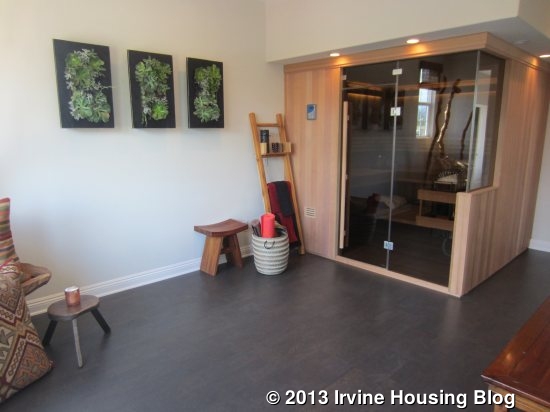
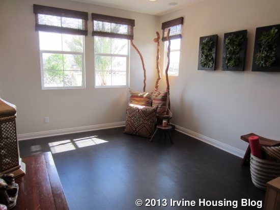
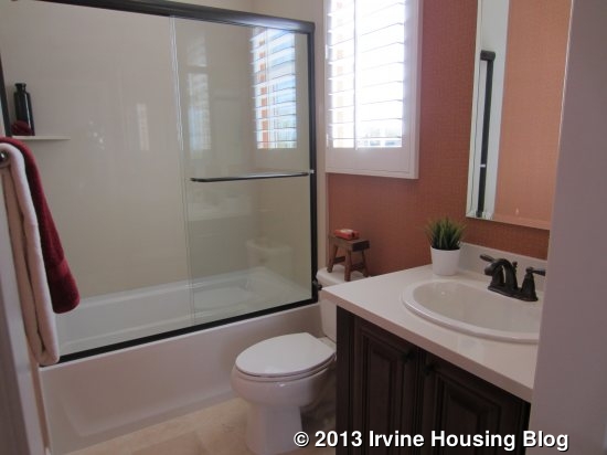
I left the flex room and finally found myself back in the main hall. Directly across from me was Bedroom 3. This one is medium sized and sandwiched in the middle of two other rooms, so it has windows only facing the side of the house. Like bedroom 4, it has a sliding closet and a bathroom with a single sink and shower/tub combo. The bathroom shows a variety of upgrades.
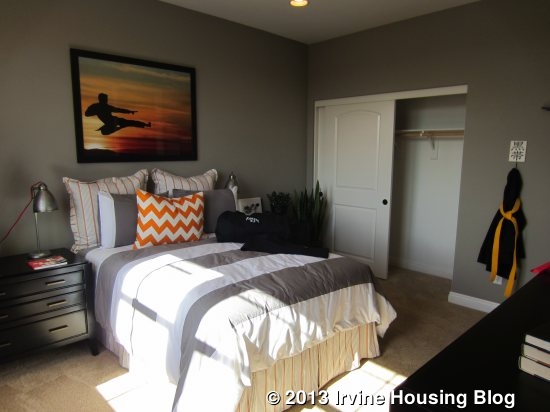
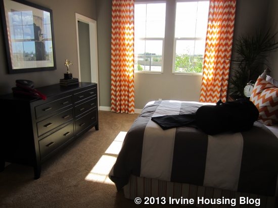
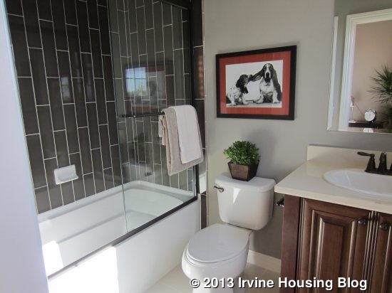
The hall wraps around the stairs to the front of the house, where there is another bedroom and a loft. Bedroom 2 is the biggest secondary room and is incredibly spacious (over 60 square feet bigger than the downstairs master). It has a walk in closet and a private bath similar to those in the other upstairs bedrooms. The bedroom has a private door to the outdoor, covered deck. In the Spanish and Farmhouse elevations, the room sticks out as far as the deck. In the Monterey elevation, the bedroom is recessed and the deck actually runs all the way across the loft and the bedroom.
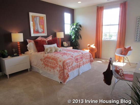
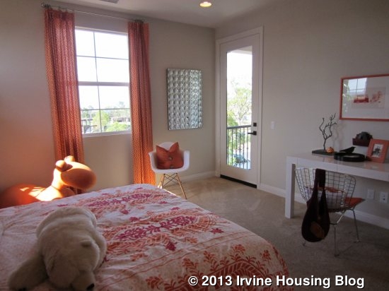
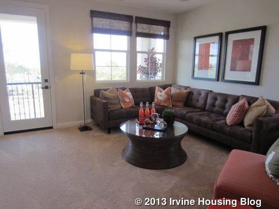
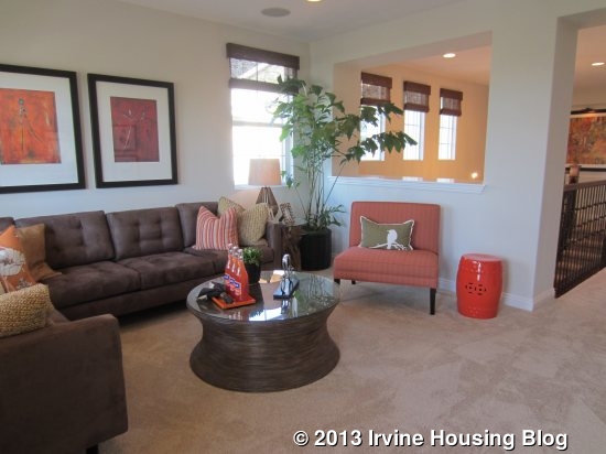
The loft is the final room upstairs. It is big and bright, with access to the deck and is partially open to the hall. The room is big and offers plenty of flexibility.
I think Residence 2 (Pasadena) is my favorite of the bunch. I like the layout the best and think it has the nicest downstairs living suite. I don’t really like how bedrooms 2, 3, and 4 are all in a row in Residence 3 (though I do love the size of bedroom 2). The Melrose homes are all a little too big for me, but they are great for someone who needs or wants a lot of space. They also boast one of the best locations in Pavilion Park. Their base price is actually on the lower side per square foot than many areas of Irvine. With many options for indoor/outdoor entertaining and multi-generational living, those in search of a large home will appreciate the value of the Melrose Collection.