This week, I am going to bring you one of the Great Park Neighborhoods bigger home collections. Hawthorn is the 7th largest and the first one whose base prices start at over $1,000,000. Built by Pulte homes, this is one of only two collections (Beachwood is the other) to offer a single story model. In addition, the master bedroom is downstairs in all three residences, allowing for single-story living even in a two-story home. All homes have a two-car garage with additional storage space and a covered patio in the backyard. The homes range from 3 – 5 bedrooms, 2.5 – 4.5 baths and feature covered patios, game rooms (two models only) and options in some for private suites. Hawthorn has a total of 46 home sites, including the models. They are close to the current main entrance to Pavilion Park off of Irvine Blvd, with the closest homes directly across from the park and the rest stretching back toward the 133 toll road.
Some of the standard amenities in all homes include granite kitchen countertops with 6” backsplash and full cooktop backsplash; stainless steel undermount sinks; Kitchenaid appliances, including 36” gas cooktop, 30”oven, wall microwave and Energy Star dishwasher; under cabinet lighting ; and maple wood recessed cabinetry in a dark sasparilla finish. In the bathrooms, there are marble countertops with square undermount sinks and tile shower surround in the owner’s baths; and 6 x 6” tile countertops with undermount sinks and fiberglass tubs in the secondary baths. Ceramic tile (12”) comes standard in the entries, kitchen, nook, laundry room, and powder bath while other areas have plush designer carpet. In keeping with the Neighborhood’s commitment to sustainability, the homes have sustainable wall and ceiling insulation; vinyl windows with dual-paned, low-E glass; 80% energy efficient gas furnaces; 13 SEER air conditioning system; and tankless water heaters.
All Pavilion Park homes are currently slated to attend Canyon View Elementary, Jeffrey Trail Middle and Northwood High Schools, all part of IUSD. However, a new K-8 school is slated to open in the Great Park Neighborhoods in 2016 and there are also plans for a new high school in the area.
Basic Neighborhood Financial Information
Approximate HOA Dues: $138 – 193 per month
Approximate Tax rate: 1.1%
Approximate Mello Roos (aka Community Facilities District tax): ranges from $5,902 – $8,352 (based on the square footage of the home) and subject to a 2% increase each year
Base Prices were not listed in any of the documents I received, but per the website, the collections prices start from the low $1,000,000s.
Residence One
2,488 Sq Ft
3 Bedrooms, 2.5 – 3 Bathrooms, Den
Optional: Dual Owner’s Suite, Living Suite, Guest Suite with Den or Bedroom, Walk-in Shower at Owner’s Bath, Extended Covered Patio
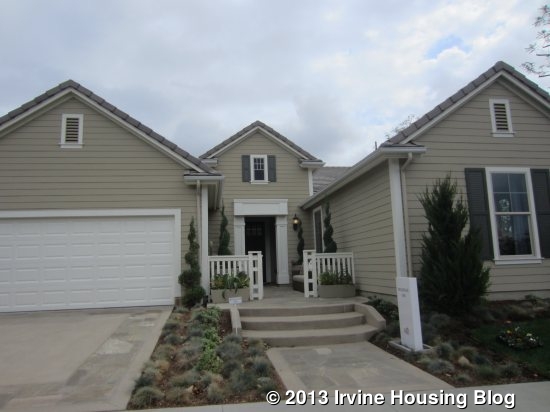
Residence 1 is the collection’s single story home. Hawthorn refers to the master bed and bath as the “Owner’s Suite” though I may still refer to it as the master in my review. The basic floor plan includes the master, two secondary bedrooms, and a den. However, I will discuss the options for changing the configuration of the den and secondary bedrooms. The model actually depicts the layout that they call “optional guest suite with den.” The model shows the American Traditional elevation, with the other options being Spanish and Monterey. Currently, 15 of the collection’s 46 homes are slated for Residence One.
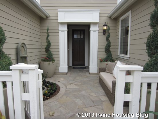
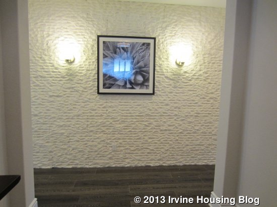
The home has a nice front porch area with a small fountain and space for seating. Apparently the rain gutters on the home are an optional feature that isn’t included in the base model. When you walk in the home, you are immediately faced with a wall (upgraded with the decorator’s stone wall detailing). I didn’t like this aspect of the house, as it didn’t create a sense of openness when I first entered. There is upgraded flooring throughout the home. All of the common areas are to the left of the entry while the bedrooms and den are to the right.
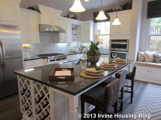
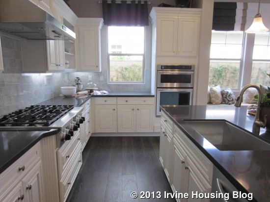
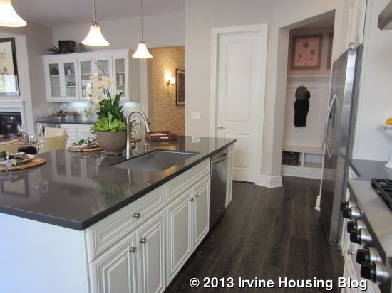
The kitchen has a long, rectangular island with bar seating. The sink and dishwasher are also located on the island, along with cabinets and an optional (upgraded) built-in wine rack. There is also an option for a second dishwasher in the island. The sink is one large, rectangular basin without a divider. Across from the island, a long wall includes the refrigerator, stove and numerous cabinets and storage drawers. The L-shaped counter continues along the side wall with more cabinets, drawers, and the double oven/microwave. There is ample space throughout for both storage and food preparation. Several windows and upgraded pendant lighting brighten the room. There is also a walk-in pantry with plenty of shelving. Upgrades shown in the model include Diamond Premier Cabinetry in white, furniture island with wine rack, cabinet hardware, open shelving upper cabinets, a Kitchenaid SS refrigerator, quartz countertops and an upgraded backsplash.
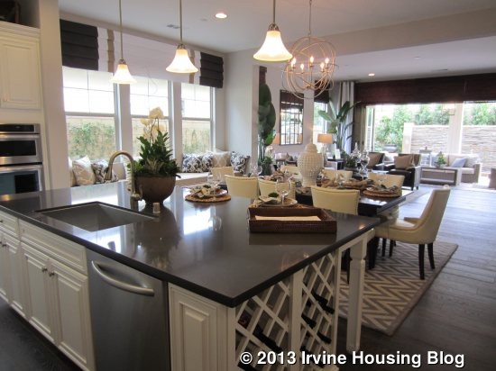
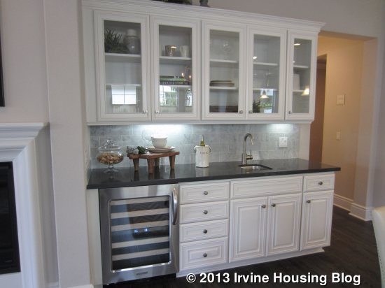
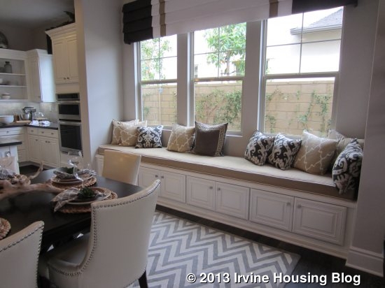
Adjacent to the kitchen is what Pulte refers to as the “café,” better known as a dining area or breakfast nook. It is a big space with plenty of room for a large dining table. One wall has an optional wet bar with upper and lower cabinetry, a tiny sink and a wine rack. The wine rack and the glass-front upper cabinets are upgrades. The opposite wall shows an upgraded, built-in window seat that I absolutely loved. It sits beneath three windows that look to the side of the house and it has built-in cabinets underneath. These cabinets could be a great place to store kitchen linens and rarely used items.
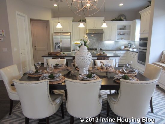
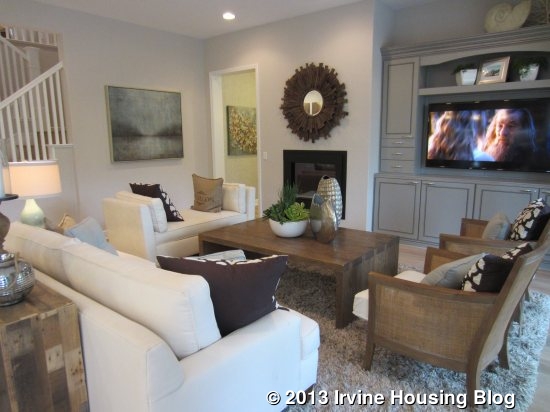
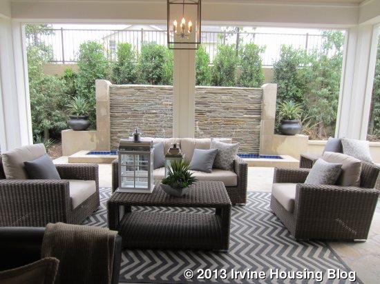
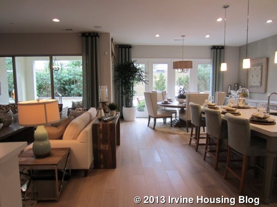
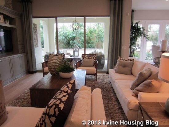
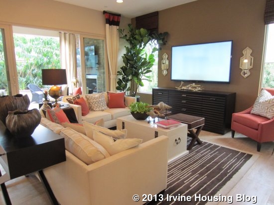
Just beyond the café is what Pulte calls the “gathering room,” aka a great room or family room. It is a very big room, and the included 10’ ceilings make it seem even more open. This room normally comes carpeted, but like the other rooms, has the upgraded wood floors. It also shows the upgraded built-in media center and can light package. The media center is white, to match the kitchen, and has numerous cabinets and shelves surrounding the large TV niche. A fireplace sits between the media center and the wet bar, bringing the family and dining rooms together. While the gathering room comes standard with a big window and sliding door to the backyard, the model shows the upgraded full-wall folding door. This allows the outdoor, covered patio to truly feel like an extension of the indoor living space.

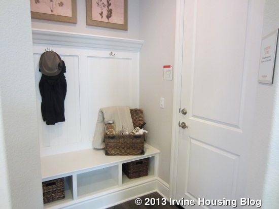
Just off the kitchen, a small area called the “Everyday Entry” leads out to the garage. It comes standard with a bench that has built-in cubbies and coat hooks above. It makes a great space for stashing coats, backpacks and shoes without cluttering up the rest of the house.
The opposite side of the house has all of the bedrooms and a den. When you come from the home’s main entry, the den is in front of you, the owner’s suite is to the back and the secondary bedrooms are toward the front of the home. The laundry room and a small powder room are here as well. The laundry room is quite long and includes a sink. The counter and cabinets are upgrades.
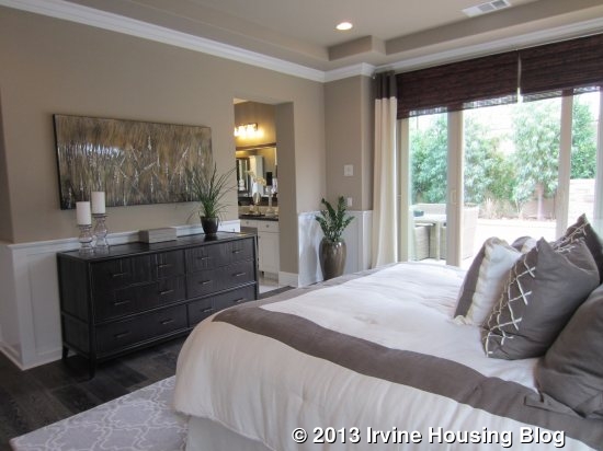
The master bedroom is a good-sized room at the back of the house with access to the backyard. A big, sliding door plus windows on another wall provide natural light. The room doesn’t offer many options in how to set it up, but does have ample room for furnishings.

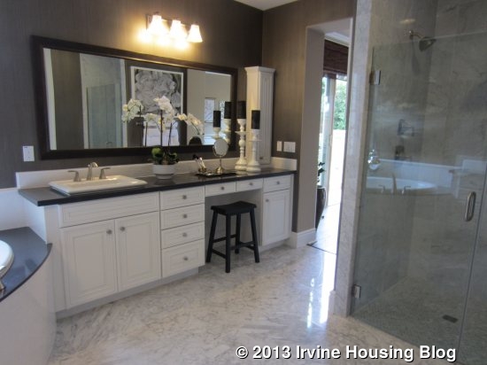
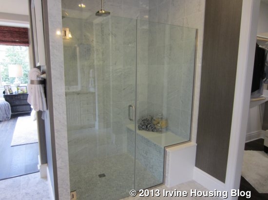
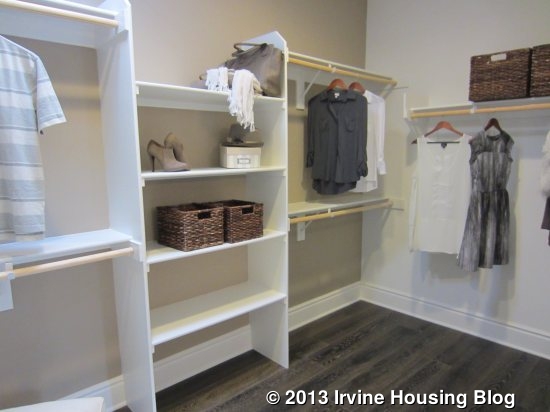
The master bath has split sinks in an L-shape, separated by a tub in the corner. The sink closer to the bedroom also has a vanity seating area. Since that is the main walkway into the bathroom, I actually think it would have been better to put the vanity with the other sink so the stool wouldn’t block the entry. The counters and cabinets are upgraded to match those in the kitchen, but the top mount sinks are standard. The sink areas also include optional “apothecary” cabinets, which are tall, skinny cabinets that sit atop the counter. The standard shower includes a seat as modeled, though this one does have an upgraded low threshold. As an alternative, you could select a walk-in shower that has a small entry way into the shower itself. Doing this would shrink the size of the master closet. The closet is at the back of the bathroom and is quite big without feeling unnecessarily huge.
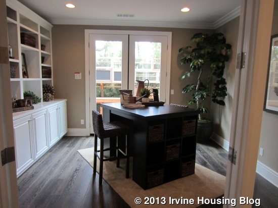
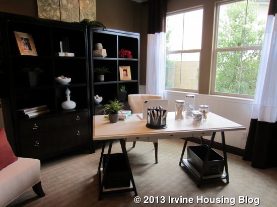
The den is a nice-sized room that makes a great office or sitting room. The model shows upgraded French doors at the entry and out to the side yard, upgraded can lights, and an upgraded, built-in wall of cabinets and shelves. The base plan includes a walk-in closet/storage area in the den, but isn’t shown in the model. The traditional powder room is next to the den, but is shown expanded in the model in lieu of the den closet.
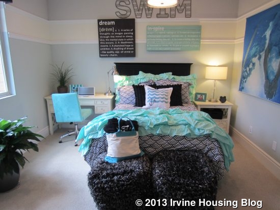
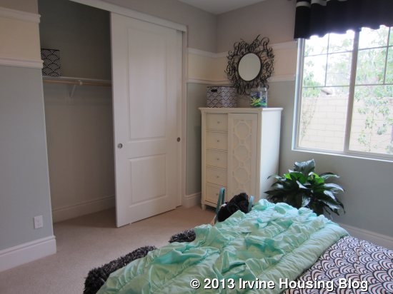
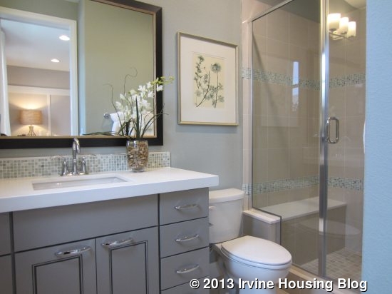
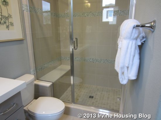
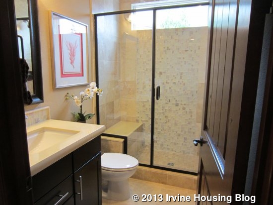
Both secondary bedrooms are a good size and come standard with standard, sliding closet doors. One (called bedroom 2) has a single window facing the side of the house and the other (bedroom 3) has a small window to the side and large window looking out to the front. Each has ample space for furniture. In the standard model, the two bedrooms share a Jack and Jill bathroom. It would have two sinks and, through a separate door, a toilet and shower/tub combo (optional shower only). As I mentioned earlier, the model actually depicts the alternate layout known as “Optional Guest Suite with Den.” In this model, the front bedroom has a private bath with a single sink and a shower with a built-in seat. The other bedroom (bedroom 2) uses a detached, extended bathroom (in lieu of the powder room) that also has a single sink and a shower/tub combo or optional shower only. This bathroom is the only bathroom accessible from the house without being attached to a bedroom, so it is the one that any visitors to the home would use. The bathrooms shown in the model include upgraded counters, shower surround, and framed mirrors.
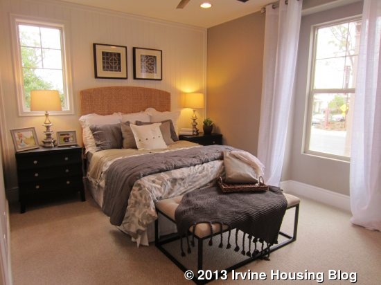
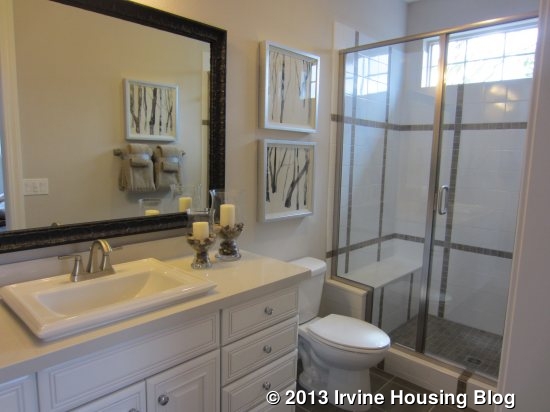
There are three other optional layouts affecting the setup of the den, secondary bedrooms, and bathrooms. All but one still include a standard coat closet and linen closet, plus an additional, optional linen storage. In addition, they all have the full bathroom shown in the model in lieu of the powder room and den storage that come standard in the house. The first option is called “Dual Owner’s Suite.” It eliminates the den and puts bedroom 2 there instead. In place of both standard secondary bedrooms, there is a complete master suite. This has a larger bedroom, a bath with two sinks, a large, combined tub and shower with seat, and a big walk-in closet. The second option is called “Living Suite.” Again, it puts bedroom 2 where the den was and has the adjacent full bath. The rest of these rooms are created as a separate suite, with private access from the front porch and from inside the house. It includes a living room where the standard bedroom 2 is, a bedroom at the front, and a bathroom between the two rooms with a single sink and shower with built-in seat. The living area in this version can include a wet bar with cabinets, a sink and a small fridge. The final option is called “Guest Suite with Bedroom 3,” and is the only option that creates an additional bedroom. In this version, the den becomes a bedroom with a sliding closet and is labeled Bedroom 3. Bedroom 2 stays as modeled and shares a hallway bath that, again, looks as modeled. The front bedroom is now known as “guest suite” and is the same as modeled, with a private bath.
Buyers will like the flexibility of these rooms, as it allows them to create extra bedrooms or living space as needed. The private living suite and dual master suite options will appeal to multi-generational families.
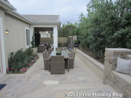
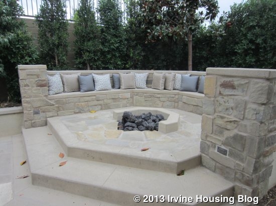
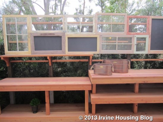
The backyard of the home is long and narrow. As I mentioned, the covered patio portion sits just outside the gathering room. An extended cover is available as an option, but if included would eliminate all open space. The third segment of the yard is raised with a built-in stone bench surrounding a fire pit. A raised garden box spans the entire back wall. Around the side, a narrow yard is accessible from the den and is shown with a very small patio and garden shelves. This is a yard for sitting or dining, but doesn’t really have any space for children to play.
Overall, I think this house provides a lot of flexibility and is a great option for someone who wants a single-story home, especially since most houses in Pavilion Park (and really, all of Irvine) are two levels. None of the bedrooms felt too small and the main living area is quite spacious. My biggest complaint is with the bathrooms. I wish that there was a powder room closer to the living area so that visitors to the home didn’t have to go over to the bedroom side. Similarly, I wish that all of the optional setups still included a powder room, in addition to a third full bath, so visitors could still have a space to use that wasn’t primarily for the bedrooms. The only other downfall to the house is the size of the backyard. While a few of Hawthorn’s lots are bigger (and I’m sure priced much higher), the majority of them appear comparable in size to the models. I’ve already heard several people who say that the single-story home is very appealing and imagine that they will sell well.
Residence Two
3,105 Sq Ft
4 Bedrooms, 4.5 Bathrooms, Suite, Game Room
Optional: High Heat Kitchen, Super Laundry, Exercise Room, Wet Bar, His/Hers Walk-in Closets
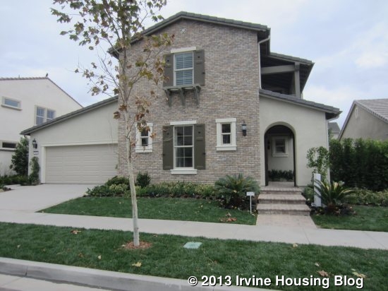
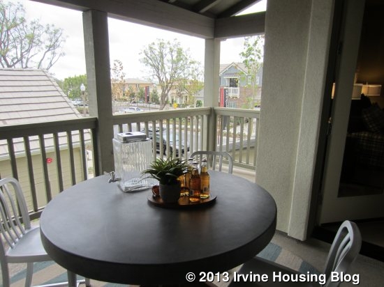
This home is much larger than Residence 1, with over 600 more square feet. As in the first house, there are numerous options available, many of which eliminate the storage space in the garage. Others affect the kitchen pantry and hall storage closet. There are no variations available on the second floor. The home is modeled in the Monterey Elevation, with a combination of brick and stucco on the outside. As with Residence 1, there is a nice front porch for sitting, but it is less visible from the street, so it doesn’t offer as much social opportunity as the neighborhood tries to promote.
This house has a more open foyer, with rooms coming off all four sides. To the right, there is a short hallway with linen cupboards at the back and a powder room off to the side. The pedestal sink is included, though you can upgrade to base cabinets with an undermount sink.
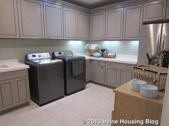
To the left of the foyer are the laundry room and the Everyday Entry with access to the garage. The everyday entry has optional cabinets and the standard laundry room has a sink and optional uppers on two walls. However, the house is modeled with the “Super Laundry 2 in lieu of Laundry/Garage Storage.” Basically, the original laundry room is converted to a big closet and the entire garage storage area is now an enormous laundry room. It includes a sink, a big counter, optional uppers and an optional refrigerator, plus several lower cabinets and plenty of floor space. Personally, I would rather have the flexibility of garage storage, but the super laundry is nice if all you really want is more closet space.
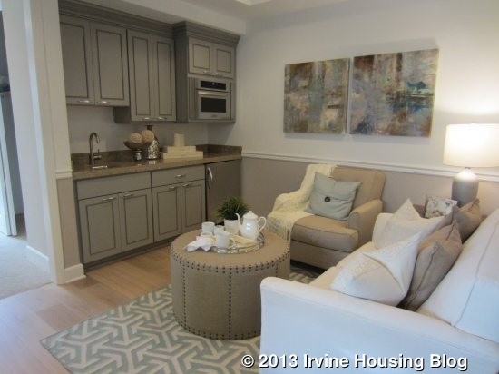
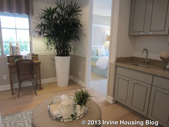
Off the foyer going toward the front of the house is a private living suite, which has an option for a separate entry off the front porch. The suite includes a sitting room with and optional kitchenette and a bedroom with an en suite bathroom. The sitting room is a nice size, but if you do include the kitchenette, there isn’t a great way to set it up if you want a TV. There is room for a couch and a comfy chair though. The wet bar can have a very small sink, microwave, small refrigerator, and/or upper cabinets. A door between the foyer and sitting room is optional, giving you the choice of having a complete private living quarters or creating an open den plus a downstairs bedroom.
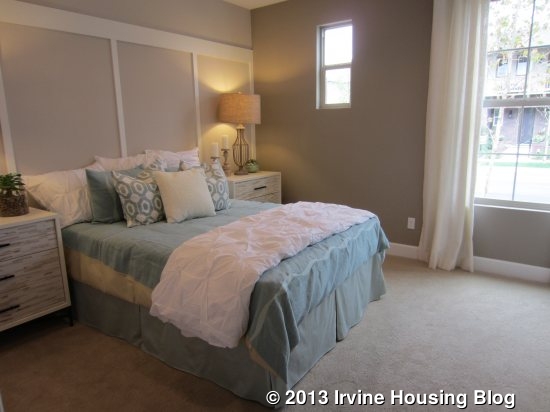
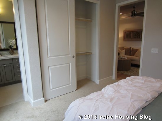
The bedroom is pretty big with two windows overlooking the street. The two-door sliding closet is a little smaller than average. The en suite bathroom has a single sink with a good amount of counter space and comes standard with a shower/tub combo, though the model shows the optional shower with seat. Most of what you see in this bathroom is upgraded.
Finally, if you walk through the foyer toward the back of the house, you find the main living areas of the home. The hallway has a coat closet with a big storage space under the stairs and comes standard with a second storage closet with optional shelves that isn’t shown in the model. There are three different options for the space that I will describe below with the kitchen. The stairs are located at the end of the hall, which then opens up to the gathering room, kitchen and café (dining area).
The gathering room doesn’t feel quite as big as the one in Residence 1, but I like the layout more. A nook in one corner offers an optional built-in media center, which sits next to the fireplace. The model shows an upgraded finish around the fireplace and upgraded can package. Again, 10’ ceilings really help open up the room. As in Residence 1, most rooms downstairs have upgraded flooring, though the standard family room would include carpet. Sliding doors (shown in an upgraded version) lead to the covered patio.

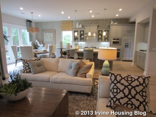
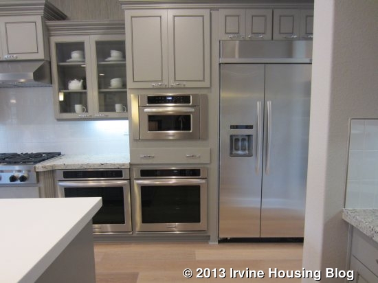
The kitchen has an island similar to Residence 1 with bar seating, a single basin sink, and the dishwasher, with an option for a second dishwasher. All of the cabinets and counters are upgraded, as are the backsplash and appliances. In this model, the island has a different countertop than the rest of the kitchen. The appliances, counter and cabinets all line up along one wall, with the refrigerator, double ovens, microwave and stove all grouped together at one end. There isn’t any counter space that can be reached from the refrigerator, so you would have to walk back and forth to the island if you were taking out multiple items at once or loading up the fridge after a trip to the market. The second oven in this kitchen is an upgraded feature. Another wall of the kitchen has a small counter with upper and lower cabinets.
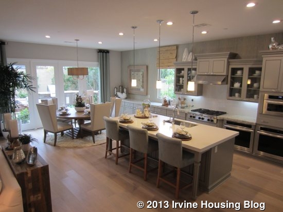
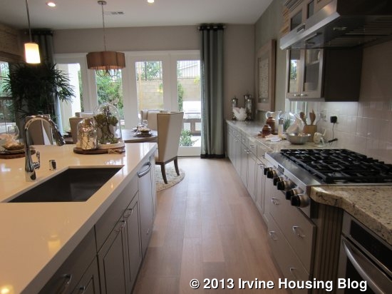
The standard kitchen has a big walk-in pantry next to the refrigerator and, as previously mentioned, a storage closet accessible from the hall. However, three different options change the setup of this space. The model shows the “High Heat Kitchen” option, which uses the pantry space and some of the storage space to create a kitchen designed for cooking stir fry or other foods at high heat that may create a lot of grease splatter. It includes a single stove burner, a sink, and plenty of cabinetry and counter space. There is a pantry accessible through the high heat kitchen, though it is smaller than the standard one. Another option for this space is a “Prep Kitchen,” which has the same footprint as the high heat kitchen. The main difference is an oven/range and dishwasher instead of only a single stove burner. The final option (“Wet Bar” keeps the walk-in pantry as originally designed, but eliminates the storage closet. Instead, that area becomes a wet bar with a sink, counter overlooking the great room and an optional wine fridge.
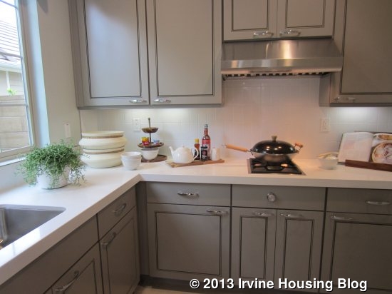
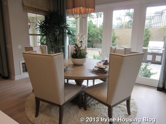
At the back of the kitchen is the “café” or breakfast nook. Because it is set back, it feels more like a nook than the big, open space did in Residence 1. The model includes the optional cabinetry that extends the kitchen counters all the way to the back of the house. It also includes the optional French doors leading to the backyard and both optional French and doggy doors leading to the covered patio.
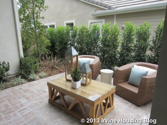
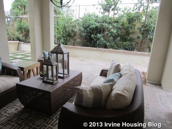
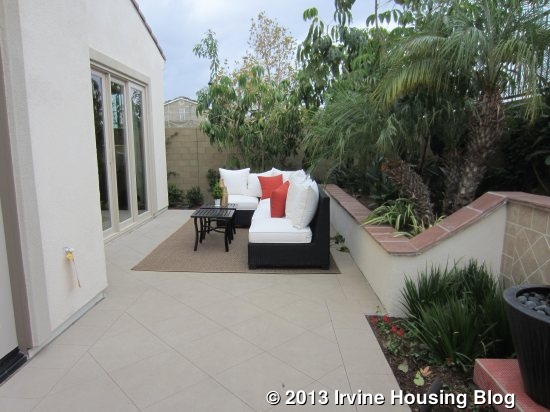
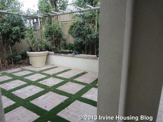
The standard covered patio is in the center of the backyard, but could extend all the way across the entire yard. Again, the yard is long and narrow without much room to play. The model shows brick hardscaped with a built-in bbq and bar seating at one end. There is plenty of space for a table in addition to the furnishings in the covered patio. On the opposite side, the model just shows open space with a combination of brick and grass.
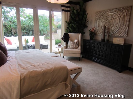
The master bedroom is also downstairs. A doorway off the family room leads to a small foyer and into the master (aka owner’s) suite. Its proximity to the family room eliminates the feeling of privacy that many master bedrooms have. It is a square-shaped room with small windows looking to the side and sliding doors to the backyard.
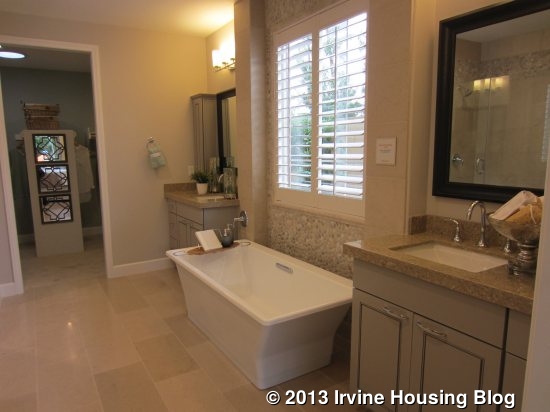
The master bath has dual sinks split by the bathtub, which is shown with the freestanding tub option in the model, rather than the standard built-in tub. I thought the vanities were a little too small and that a master should offer more counter space. A separate vanity area (no sink) is across from the first sink. The shower is across from the tub and has a built-in seat. One option for the bathroom eliminates the extra vanity and instead includes a walk-in shower. The walk-in closet is at the back of the bathroom and has a partial divider right in the center that utilizes some of the open space. The bathroom has upgraded quartz countertops, shower surround, apothecaries, framed mirrors and can lights.
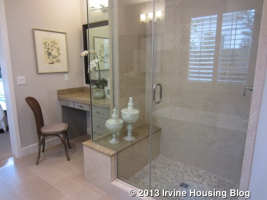
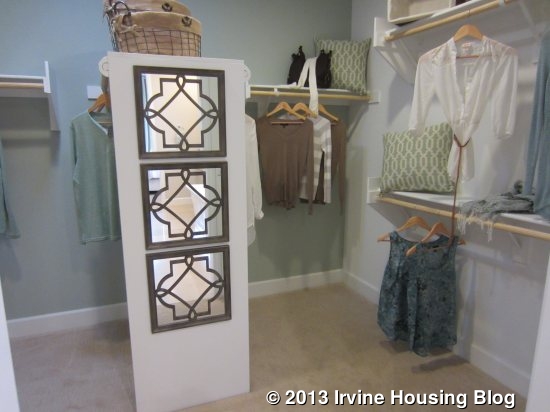
In addition to the super laundry room that eliminates the garage storage, two different layouts in the master bath can also replace that space. The first replaces it with his/hers walk-in closets. The original closet (“his”) is shrunk to make room for the water closet and doorway to the new (“hers”) closet, which is quite large as it takes the entire garage storage space. The second alternative also cuts into the walk-in closet to make room for the water closet and puts an exercise room in lieu of the garage storage. In addition to the access from the master bath, you can put a door to the exercise room in the foyer between the gathering room and master bedroom.
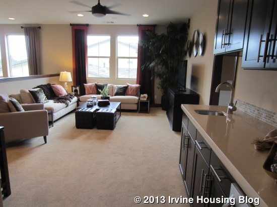
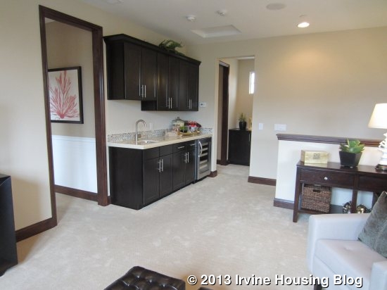
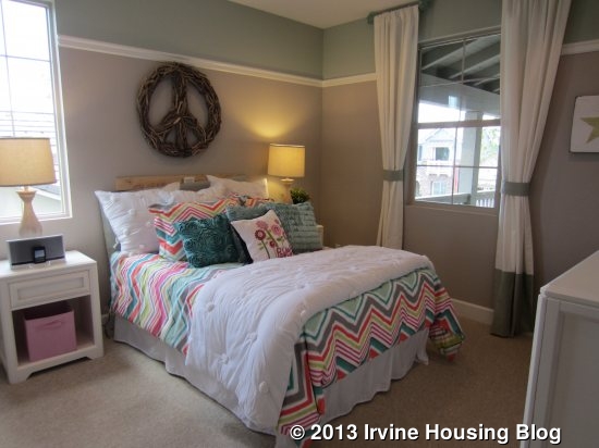
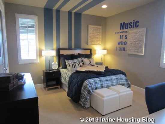
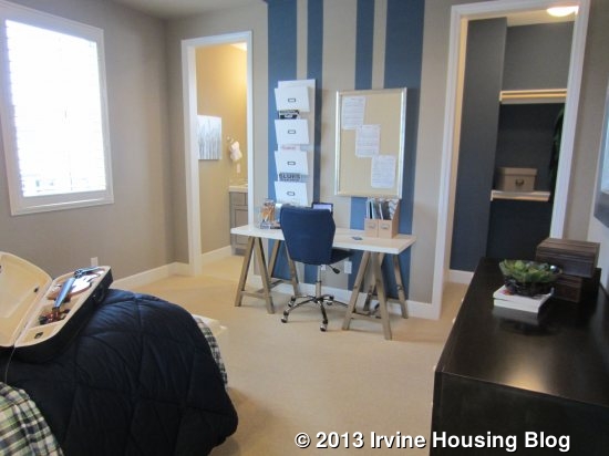
Upstairs, there are a game room and two bedrooms. No alternative layouts exist, though the American Traditional elevation of the home eliminates the outdoor deck. The second floor may be particularly appealing to teenagers, as they have a private space to hang out that is separate from the space used by their parents. The game room is a big, open space at the top of the stairs that includes the plush carpet that comes standard in the home. It has a closet and an option for a built-in desk (shown in the model). It also includes the upgraded can lights and pre-wiring for a ceiling fan. Three small windows sit high on one wall and a sliding door to the deck is on another. The built-in media niche is an upgraded “decorator item.”
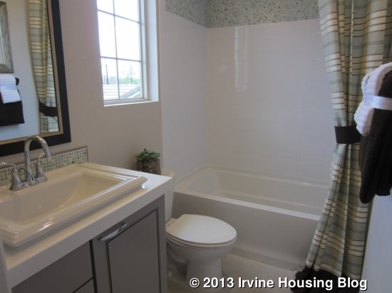
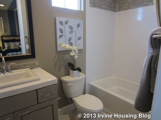
The first bedroom is just across from the stairway and has a linen cupboard and bathroom outside of it. The bathroom includes a single sink and shower/tub combo with an option for just a shower. The bedroom is a good size, with a two-door, standard closet and optional door to the deck (not shown). The second bedroom is bigger and includes a walk-in closet and en-suite bathroom. This bath is basically the same as the other one upstairs. The bedroom does include the optional door to the deck. In the Spanish elevation, there is a small balcony overlooking the street off of this bedroom.
I really like the upstairs area in this house. I think it’s a good set up and a great way for kids to have some privacy without being closed in their room all day. The downstairs suite is also a nice touch, whether you choose to make it a private suite or a general sitting area and bedroom. I don’t love the setup of the kitchen or the location of the master bedroom, though I do see the appeal of a downstairs master. I wish the yard was bigger and I don’t love the look from the outside of any of the elevations.
Residence Three
3,486 Sq Ft
5 Bedrooms, 4.5 Bathrooms, Den, Suite, Game Room
Optional: Living Suite 1 or 2, Bedroom 6, Super Laundry 1 or 2, Expanded Game Room, Expanded Covered Patio

This house is 1000 square feet bigger than Residence 1 and nearly 400 bigger than Residence 2. The model depicts the Spanish elevation and currently includes the rental office in place of the garage. I like the look of this house much more on the outside than either of the other two residences. It has a big front porch that is visible from the street but still covered. There are a lot of different options in this home, but I will do my best to explain each layout.
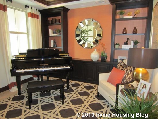
The foyer is open in this plan as well, with rooms coming off three sides. The standard home, as modeled, has a den just to the left that is open to the foyer, though doors are available if desired. It is basically a traditional living room and makes a great sitting area. There is an option to make it a bedroom instead, which would have a standard closet and a full bathroom accessible from the hall that would replace the standard powder room.
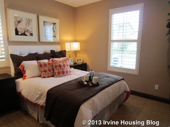
To the right of the foyer are two more rooms off of a short hallway with a full bathroom between them. The basic arrangement is for two bedrooms, each with a standard closet and a shared, full bathroom accessible only from the hallway (single sink, shower/tub combo, option for just a shower). The model depicts this set up, with Bedroom 3 being at the front of the house and Bedroom 2 farther back. Though it is designed as a bedroom, they put den furniture in Bedroom 2 to help show the flexibility of the space. Two of the alternate plans use Bedroom 2 as an actual den, eliminating the closet and adding a door to the main hallway. In these setups, there is not access from the shorter hallway currently between the two rooms. The only difference in the two den options is what type of door you have; French doors or a barn door are available.
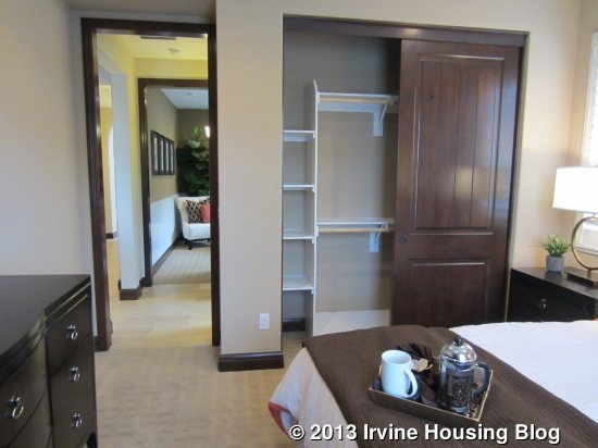
Two other options for this area create combine the two rooms to create a complete living suite. In each one, there is a living room/den and a bedroom with a walk-in closet. The bathroom is still accessible only from the suite’s hall area, with the hall having an optional door separating it from the foyer. The bathroom is laid out differently but still has only one sink. It cannot have a bathtub and instead has a shower with seat. In Living Suite 1, the living room space is at the front of the house (Bedroom 3) and can have an optional kitchenette with cabinets, a sink, and a wine fridge. The room farther back (Bedroom 2) is a standard bedroom with a walk-in closet. In this set up, there is an option for a door leading from the front porch directly into the private living room. If you go with Living Suite 2, the rooms are reversed, with Bedroom 3 becoming the only bedroom at the front and the back room (formerly Bedroom 2) set up as a living room without a closet or kitchenette. In this option, you cannot have access to the front porch but have optional access to the main hallway and/or the side yard. Again, the versatility of this space will be a big selling point to buyers who need something different than a traditional house set up.
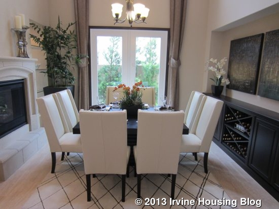
From the main foyer, a hallway leads back to the rest of the house. Along the way, you pass a powder room, linen closet, and coat closet (with under the stairs storage) on the left. It opens to a formal dining room with soaring ceilings and options for French doors to the side yard, built-in shelves, and/or a dual fireplace that is open to both the dining and family rooms. The model shows a built-in wine rack and counter along one wall that is not listed as an upgrade, so I’m not sure if that is a standard feature or just an accidental omission from the upgrade list. The room comes standard with carpet, though most people I know prefer some sort of wood or tile in their dining rooms. Overall, it is a very pretty room and a great space for those who prefer a house with a formal dining room.
Beyond the dining room, a doorway leads to the gathering room and kitchen; there is also a hallway to one side with another door leading directly to the kitchen. The gathering room is a big, square room with windows on one side and doors to the covered patio on another (various door options available). A third wall has the fireplace, which comes standard in the family room with the option for the dining room side. Two openings flank the fireplace to see through into the dining room; the model shows them with upgraded shelves inside.
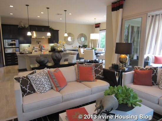
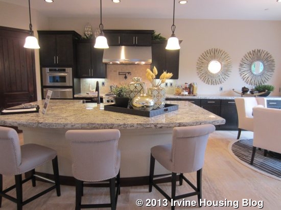
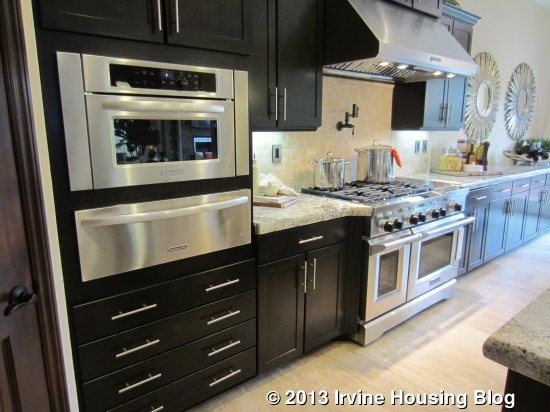
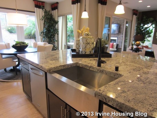
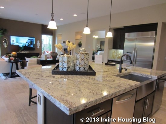
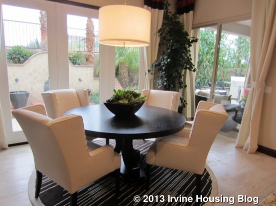
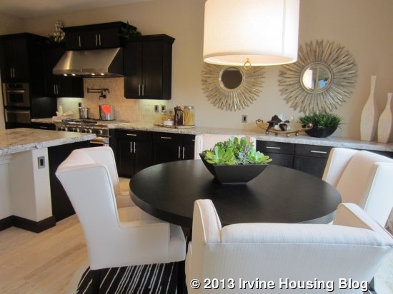
The kitchen is right next to the family room and has a very wide island with one rounded side with bar seating that divides the space. One wall has the refrigerator with a small counter and cabinets next to it. The other wall has everything else, with the oven and microwave on the end and the range in the middle. There are only a few upper cabinets and many of the lower cabinets are optional, so you’d pretty much have to include the extra cabinets to have enough storage and counter space. The island has the sink and shows both dishwashers (one is an upgrade). There is a walk-in pantry built into the corner shown with upgraded shelving. This kitchen shows upgraded granite and a gourmet appliance package, but seems to have the standard cabinetry and backsplash. There is a breakfast nook at the back of the kitchen with optional French doors to the backyard.
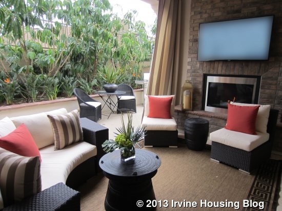
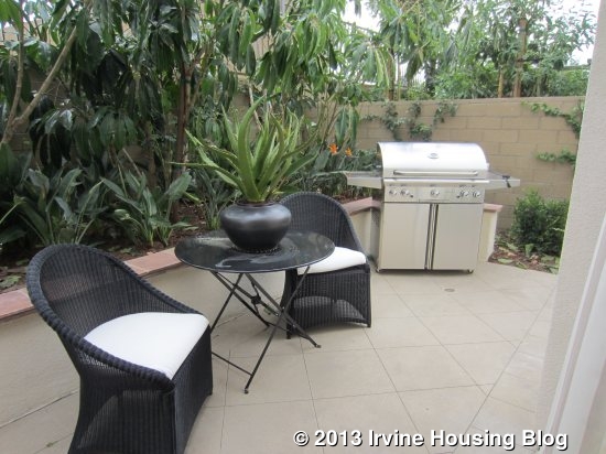
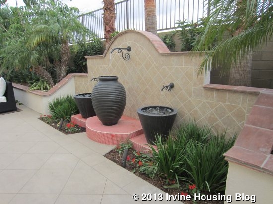
Again, the backyard is small, long and narrow. The covered patio is directly behind the gathering room and is shown with a fireplace and wall-mounted TV. A space to the right of it has room for a grill and small table. The center area has a fountain and is the widest space, but still quite narrow. The far end has room for another sitting area but, again, doesn’t have room to play.

The everyday entry and laundry room are off the hallway across from the kitchen. In the basic model, the everyday entry is small with optional cabinets. The laundry room is long and narrow with an optional sink. Two alternative plans for this area eliminate the garage storage space. The first one enlarges both the everyday entry and the laundry, with a lot more cabinet storage options in both spaces. The second one turns the entire area into a gigantic laundry room without a separate everyday entry. As in residence 2, this laundry room could have a refrigerator and it would also add a small storage closet with optional shelves. The model is using the space as their office, so none of these options are actually shown.
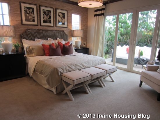
As in Residence 2, the master bedroom is downstairs, farther down the hall from the laundry room and kitchen. The bedroom is pretty much identical to the one in the other home, with two small windows on one wall and doors leading out to the yard. The room is a good size with plenty of space to furnish it.

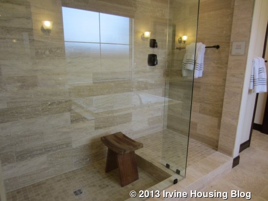
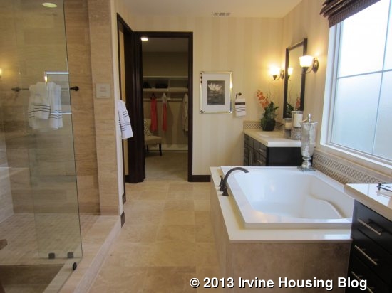
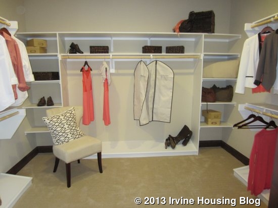
The master bath is set up with one of the alternate designs rather than the standard model, showing a walk-in shower rather than the basic shower with seat. If you choose this option, you lose a vanity area. Either way, the opposite wall still has two sinks separated by a tub. The model shows the standard, built-in tub but a freestanding tub option is available. The walk in closet is one big, open square.
Another way that this home is similar to Residence 2 is the upstairs. Residence 3 also has a game room with two bedrooms and a deck in some elevations. The game room is at the top of the stairs and is pretty big, though there is an option to create an expanded game room. If you opt for this, the extra space would be over the dining room, so that room would no longer have the soaring ceilings. The game room has a storage closet in one corner that could be a wet bar instead. The bar in the model has a small sink and wine cooler, plus several cabinets.


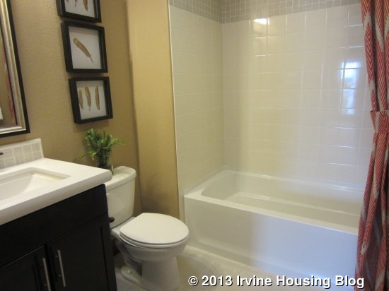
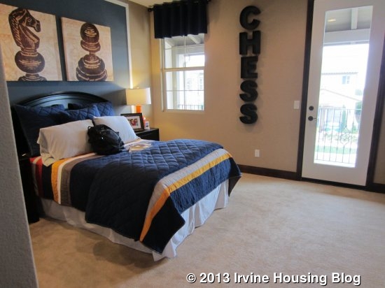
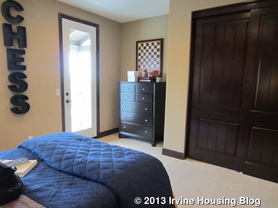
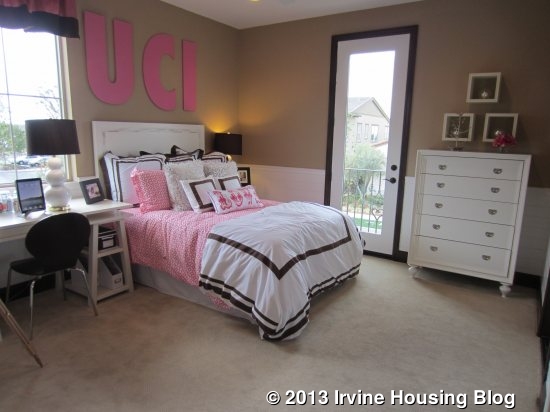
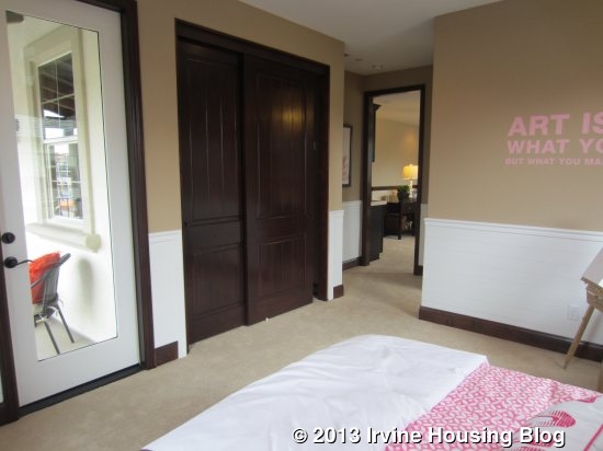
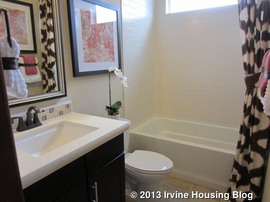
Both upstairs bedrooms are at the front of the house, accessible from the game room. One (bedroom 4) has a hallway bath with a single sink and shower/tub combo with an option for just a shower. This room is really big, with a lot of floor space, a niche for a desk or dresser, and a two-door closet. There is an optional door to the large deck overlooking the street and one other window on the same wall. The other bedroom (bedroom 5/suite) is even bigger. It has a door to the main deck and, in the Spanish elevation, a separate small balcony also facing the street. The en-suite bathroom is set up exactly like the other one.
This is a really big house. If you’re looking for a lot of space, a lot of flexibility, and the availability of a downstairs master’s suite, it’s definitely worth taking a look.
Overall, I really like the Hawthorn collection. The homes are spacious and well laid out. The numerous options make them suitable for almost any type of family. I like the location of the tract, as it is close to the common area. I’m disappointed by the lot sizes, but that seems to be the trend in most new homes.
Discuss on Talk Irvine: http://www.talkirvine.com/index.php/topic,10976.0.html