As I mentioned last week, I am reviewing 87 Long Meadow this week, another condo located just a couple of blocks from the one I reviewed last week (67 Great Lawn). Though the locations are comparable, the similarities end there.
The basics:
Asking Price: $598,000
Bedrooms: 3
Bathrooms: 3
Square Footage: 1,526
Lot Size: N/A
$/Sq Ft: $392
Days on Market: 13
Property Type: Condo
Year Built: 2005
Community: Woodbury
There are two sets of HOA dues, totaling $290 per month and there are Mello Roos taxes.
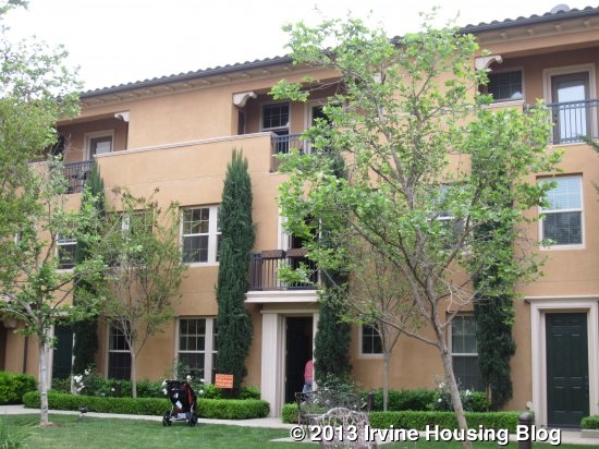
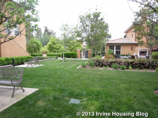
This three-story condo is on Long Meadow, one of the main entrance points to Woodbury. Like the property on Great Lawn, this one is also quite close to the intersection at Sanctuary. While it has the bonus of being a very short walk to the park, pools, Commons, and Woodbury Elementary School, it is a busy street. This condo, however, is set much farther back from the street and actually looks out onto an attractive courtyard. The courtyard has tables and chairs, benches, a fireplace, and a huge grassy lawn for kids to play in. Because the unit doesn’t have a yard, having this courtyard right outside the front door is a big plus.
While the outside is very attractive, the inside of the unit definitely needs some TLC. The walls definitely need new paint throughout the entire unit and the floors are pretty scuffed up in parts.
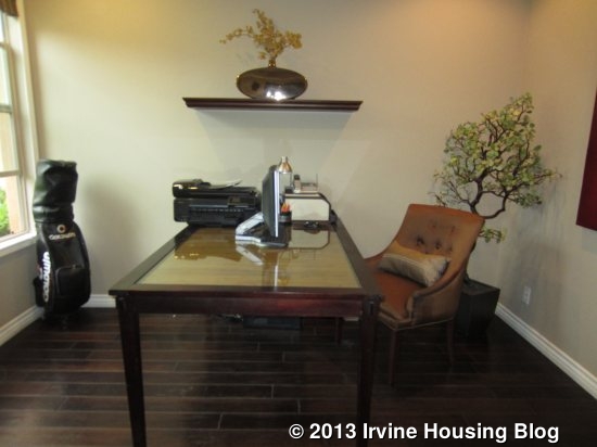
When you walk in, the lower level actually has just a single room, bathroom, laundry room and garage access. Though it’s marketed as a three bedroom, the downstairs room doesn’t have a closet. It’s also a pretty small room.
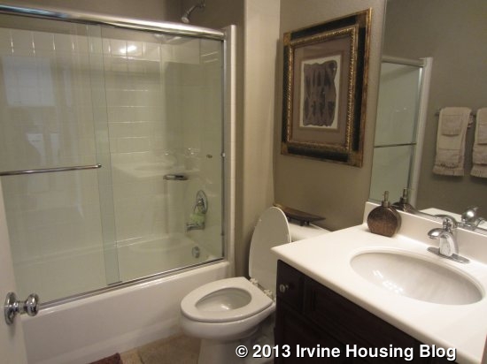
The downstairs bath has a single sink with white counters, dark cabinets, and a shower/tub combo done in simple white tile. The adjacent laundry room has overhead cabinets and access to the two car garage.
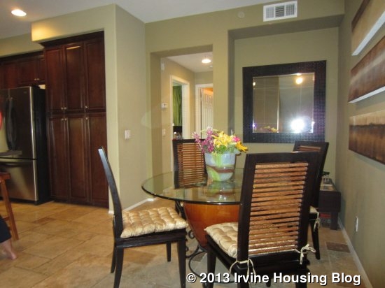
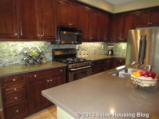
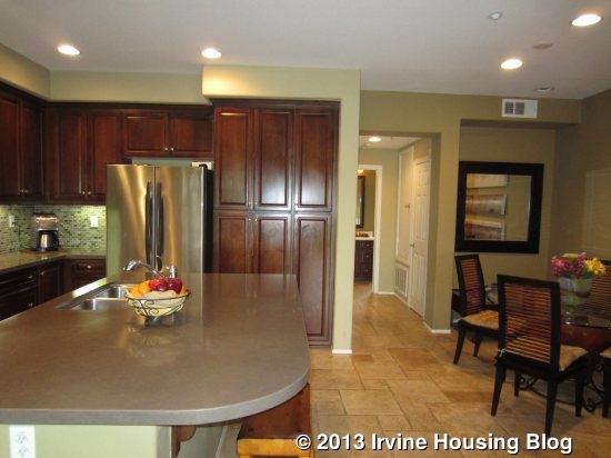
The second floor is actually the main floor and has the kitchen, living room and another bedroom and bath. I thought the staircase was a bit steep. Right at the top of the stairs is the dining area. It can probably fit six comfortably, but any more would be a tight squeeze. Extra guests could sit at the island’s bar seating just a few feet away. The island, like the rest of the counters, is made from rather drab, gray Caeserstone. I also didn’t love the travertine floors and thought the kitchen, as a whole, wasn’t very attractive. It does have stainless steel appliances, including a combination range with a four burner stove and oven. It has three pantry-height cupboards and plenty of additional cabinet and counter space. I did like the tile backsplash and thought it was the nicest part of the room.
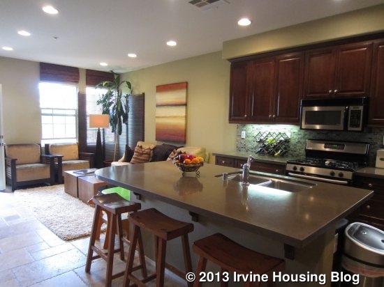
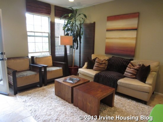
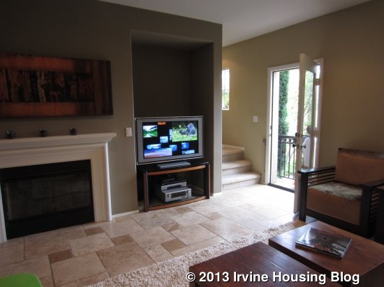
The kitchen flows directly into the living room, creating a true great room. Because the unit is sandwiched between two others, all the natural light in the room comes from the front side of the house, where there are two windows and French doors leading to a tiny, unusable balcony. The room is an average size with a white fireplace (no hearth) and a small cutout area for the TV. New owners could put built-ins there if they desired.
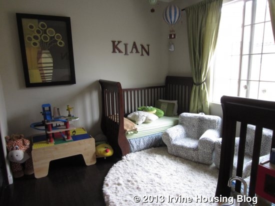
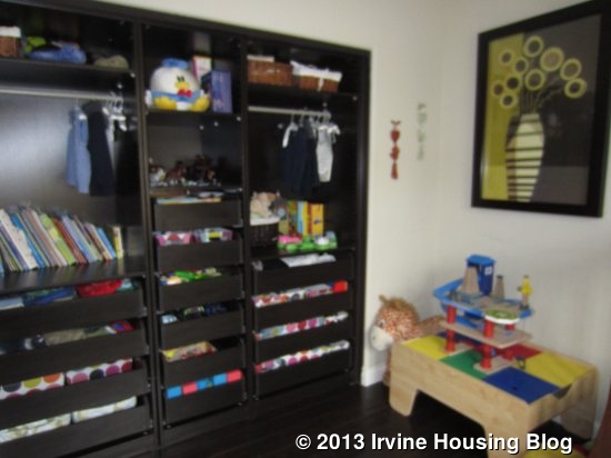
The bedroom and bathroom are down a hallway on the other side of the kitchen. The bathroom is nearly identical to the one downstairs, though flipped the other way. The bedroom is a nice size with a large window overlooking the back of the property. It has hardwood floors matching those downstairs. Rather than a traditional closet, one wall is almost entirely taken up by espresso-colored built-ins that include numerous drawers but only a very small hanging area. It works well for young children, but might not be ideal for older kids and teens.
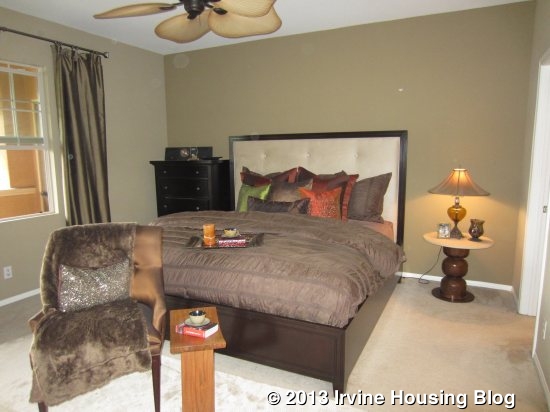
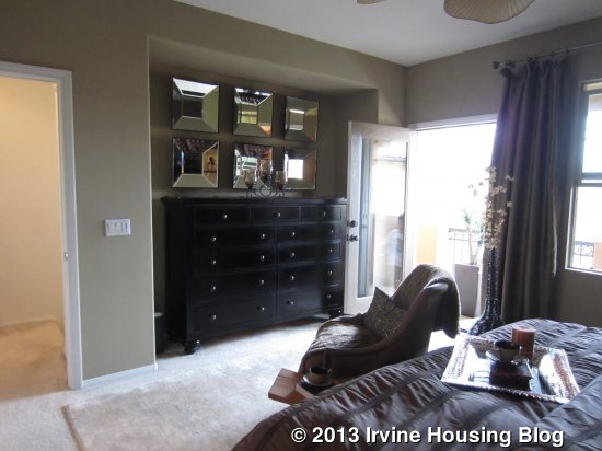
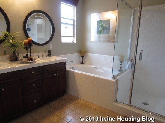
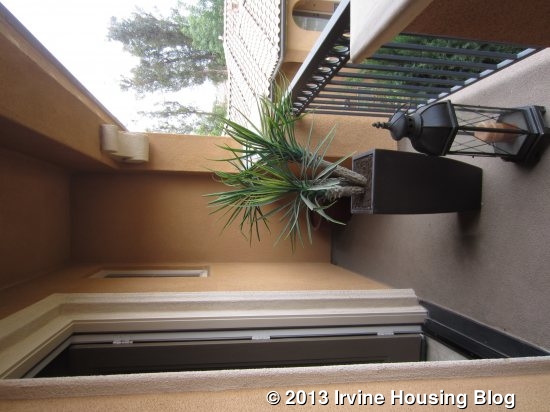
A stairway in a corner of the living room leads to the third floor, which houses the master bedroom. It isn’t particularly large, but a cutout area provides a nice place for a dresser and many may appreciate the privacy of being on the upper floor. This room is carpeted and has a ceiling fan. It has a big walk-in closet and a very spacious bathroom. The bath has travertine floors and plain white tiles surrounding the dual sinks, stall shower, and separate tub. A long, narrow balcony overlooks the central courtyard and could have room for a couple of small chairs.
Personally, I don’t like the layout of this home. Having the kitchen and living room on the second floor is inconvenient and I don’t like that each bedroom is on a different floor. I didn’t think it was as nicely upgraded as most other newer homes and it needs a little TLC. While it is nicely offset from the street and doesn’t back to either Long Meadow or Sanctuary, it is still a busy location. I have seen nicer condos and don’t think I’d put my money on this one. Would you?
Discuss on Talk Irvine: http://www.talkirvine.com/index.php/topic,3760.0.html