Recently I was driving through the Laguna Niguel community. I was on my way to a friend’s house, but decided to take a detour and scope out some of the neighborhoods. As I poked around several neighborhoods, I noticed the friendly atmosphere. People waved at me as I drove by. They smiled—even though I was a complete stranger. I know they didn’t recognize my car, but they still made me feel welcome. It was an amazing feeling that I haven’t felt since I was a kid growing up in the Orange Hills area. Neighbors interacted with each other—it was a novel concept. I’ve lived in Irvine for nearly fifteen years, and not once did I really know my neighbors. Most of the time I didn’t want to know my neighbors (and I’m a highly sociable gal). This got me to thinking: what is so different about Portola Springs versus this little neighborhood in Laguna Niguel? My answer was simple: The neighbors weren’t on top of each other. There may not have been a lot of space in between the houses, but there was enough comfortable distance that created privacy. Some neighborhoods in Irvine have this aura—but Portola Springs seems lacking.
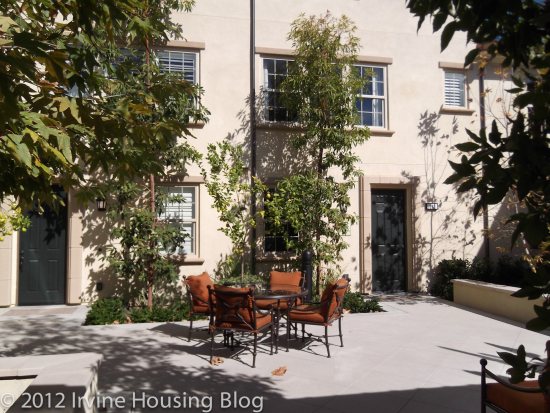
I visited San Carlos Court (Overview) on the same day which reaffirmed my observations. San Carlos Court at Portola Springs is a collection of eight different residences centered around a common courtyard. The set up in theory would be cute and has the potential to be family oriented, but my primary concern was privacy. It felt too close for comfort. If anyone remembers the television show Melrose Place back in the 90s, the residents could never seem to hide secrets from each other. That’s how I imagine these places—particularly since new developments seem to be built with paper thin walls. Hopefully you’ll have mild mannered neighbors and this won’t be a problem, but I’m guessing that you’ll be able to hear every party, every dog barking, and every stereo blasting within the walls.
Residence C1:
Price: $474,990
Estimated Tax Rate: 1.05%
Square Footage: 1,736 square feet
Bedrooms: 2
Bathrooms: 2
Garage: 2 car
HOA dues: $306 per month (WOW!!!!)
CFD’s/ Mello Roos: $3,390 per year
The model is the only the residence left of the C1 floorplan. I think it is one of my favorite designs, and would suit me well. However, I’d say upfront that it’s over-priced, so I would not choose to live there. The entry way splits the kitchen and the dining room. You have a clear view to the entrance of the living room. It’s different than I’ve seen in previous floorplans, so I rather liked the layout. The dining room was very spacious with lots of windows. The model features an optional buffet/desk that you can have built under one of the windows. I think it added a practical feature and I would choose the upgrade.
I won’t lie—the kitchen is small and the layout is in an “L” shape. The cooking appliances are set up in the typical “triangle” space. Only the stove and dishwasher are included with the house. The granite countertops are standard, which is a plus. There’s a nice pantry, big enough to accommodate a single person or two people.
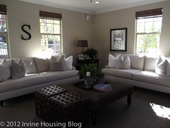
I really loved the living room. It was big and completely separate from the kitchen/dining rooms. Off the living room is a patio—C2 is the only residence that has an outdoor patio. Included in the living room is a closet. The model features the upgrades—a fireplace and built in media center. It’s very nice.
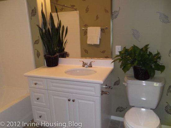
The hallway is ADA compliant, which makes it feel less cramped. To the left is the second bathroom which is nicely designed. It has a tub/shower combo, a small vanity and a toilet in between the tub and vanity. It’s a square space, and one of the best designed second bathrooms that I’ve seen.
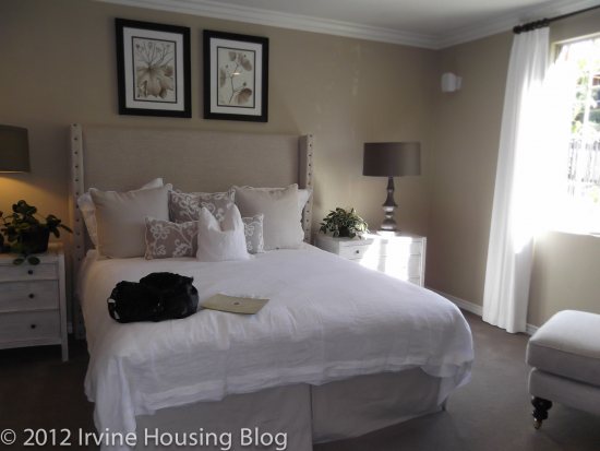
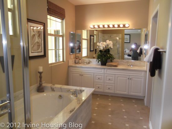
The master bedroom and bath are fantastic. If the price of the house was $100K less (and the taxes weren’t about $9000 per year), I would’ve considered buying. The master bedroom is huge. It’s more than I imagined for a house this size. The master bath sold me on this property. It was everything I wanted. It was large, with a separate tub and shower. There was a separate toilet, an ample walk-in closet and a dual sink vanity. I fell in love with the bathroom, and it is the only plan that offers this design. The only thing I didn’t like was the vanity light fixture which cheapened the space.
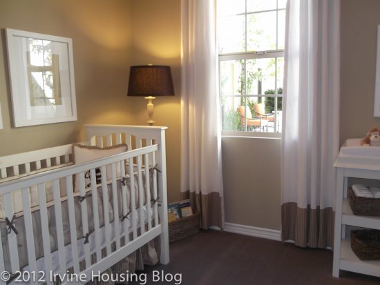
The second bedroom—or what is considered the second bedroom is small. I’d consider turning it into an office, because fitting bedroom furniture would be a stretch. It can be done, but it is cramped. It is located directly across from the master bedroom, so I hope those walls have an appropriate sound barrier.
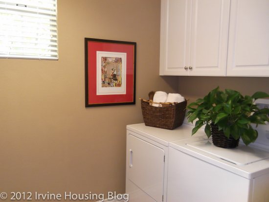
At the end of the hallway is the laundry room with access to the garage. I liked having a separate space for the laundry, hidden at the back of the house.
Overall, my impressions were positive of this model. It seems smaller than 1,736 square feet. I would’ve rather had a smaller living room and dining room in exchange for a larger second bedroom. I can see how noise might carry in the house, but if you’re single without a family it would suffice. It’s not ideal for a roommate situation.
Residence C2:
Price: $442,990
Estimated Tax Rate: 1.05%
Square Footage: 1,901 square feet
Bedrooms: 2
Bathrooms: 2
Garage: 2 car
HOA dues: $306 per month
CFD’s/ Mello Roos: $3,390 per year
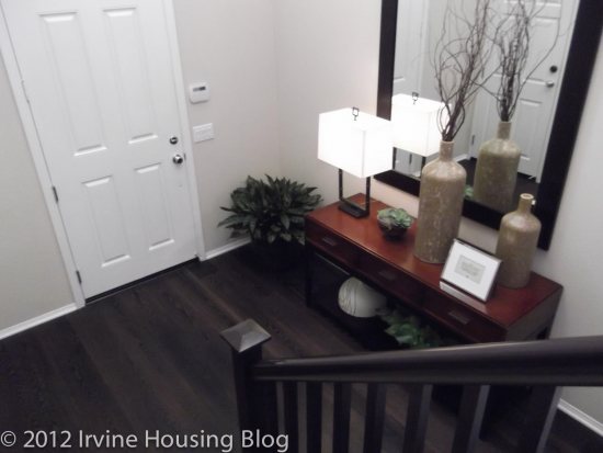
I loved the entry way in C2. It was nice to have the living area viewable at the top of the stairs. It created a welcoming effect. I know in other models I complained that having stairs directly off the entry way wasn’t ideal, in C2 this design worked. There’s a huge closet under the stairs that wraps around for extra storage.
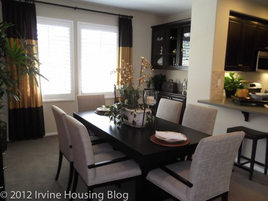
The dining room was spacious. It’s rectangular in design and I think you could fit a six to eight seater table in the space. The dining room was separated by one of the kitchen countertops, which made food within reach of the dining table.
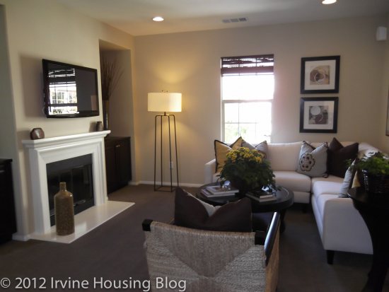
The living room was smaller than C1. It was just “ok” for me. It’s basically a square space, so fitting typical furniture wouldn’t be an issue. You can have an optional media and fireplace built into the house and I would opt to add these features. I have a piano, and I’m not sure that I could fit it plus my furniture in the living room. I might have to put it in one of the bedrooms, or squeeze it in the optional buffet area located in the dining room, which would leave less space for a table.
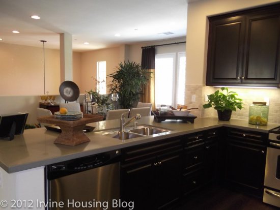
The kitchen is great. It’s a perfect size and highly functional. I appreciated the large pantry and lower cabinets. I felt like there was enough counter space to accommodate my cooking habits.
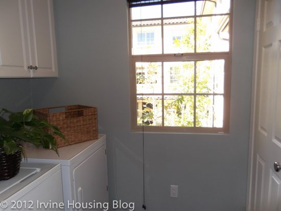
The laundry room was a decent size. It fits a full size washer/dryer and it had some storage.
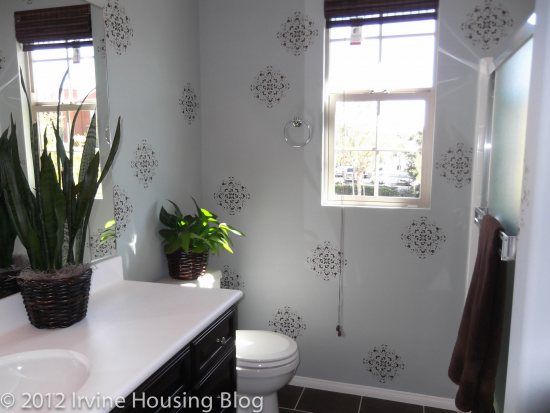
The guest bath is small. The vanity has counter space, but it is not a dual sink set up. The tub is extremely narrow and disappointing. It felt like there was shower room only. The bathroom does have a handy linen closet, which I can appreciate.
The second bedroom is acceptable, but I was wondering where to put the television because the bed faces the glass closet mirror doors. I wish it could accommodate both the closet and television. Maybe you’re more creative than me, but I didn’t immediately see a resolution to this problem.
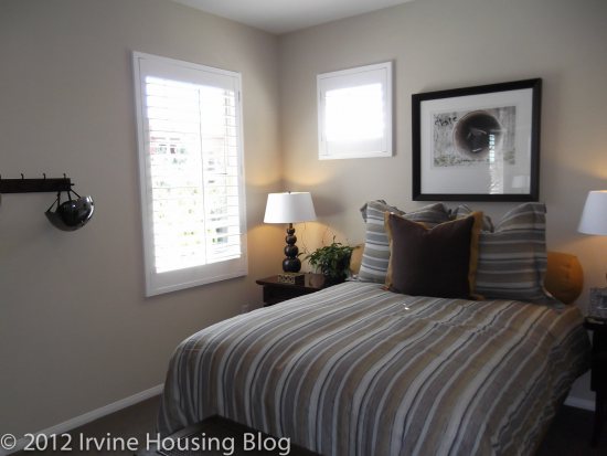
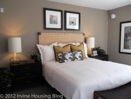
The master bedroom is a decent size, but suffers from the same television problem. Instead of facing a closet, it faces some windows. It seemed rather impractical.
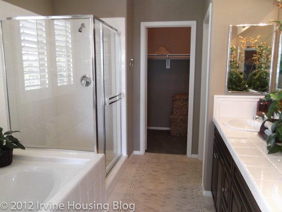
The master bathroom was narrow like a hallway. It was nice, but smaller than I hoped. It contains a long and narrow walk-in closet, which was probably the best feature in the room. The shower is separate from the tub and the toilet is in a separate room.
If someone gave Residence C2 to me I wouldn’t refuse it. It’s a house that I could live in if I could resolve the television situation in the bedrooms.
Residence BR: (Townhome Living)
Price: $352,990
Estimated Tax Rate: 1.05%
Square Footage: 1,293 square feet
Bedrooms: 2
Bathrooms: 2
Garage: 2 car
HOA dues: $306 per month
CFD’s/ Mello Roos: $3,390 per year
Residence BR was terrible. I didn’t like anything about it. Residence BR has a large entry, but the laundry room is the first thing you see. This seemed like a very unwelcoming clinical entrance to the house. As you climb your way up the stairs, you’re confronted with a blocked view of the living space by a short narrow hallway with an ugly utility closet that houses your water heater. It was truly awful.
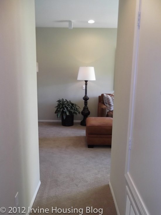
Once you get past the blockage, you see the unimpressive living room, which runs into the apartment style dining room. This set up is exactly what you’d find in an apartment. I’m definitely not shelling out the money for apartment style living.
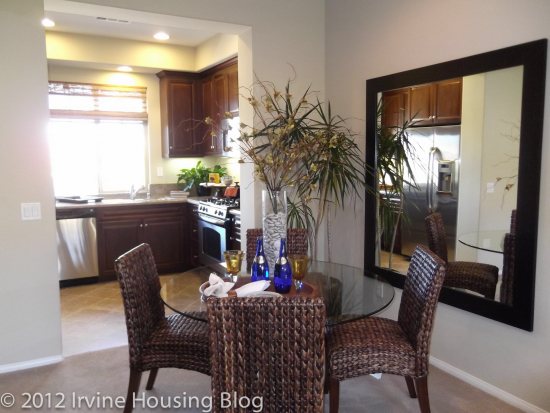
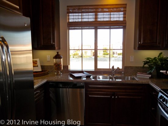
The kitchen was a deal breaker for me. It was tiny—smaller than the kitchen in my 860 square foot apartment. There was no counter space and nowhere to move. The pantry was located in the dining room and you wouldn’t be able to fit more than a four-seater table in the dining space. There was also no microwave, and since counter space is nearly non-existent I’m not sure where I’d heat up my left over spaghetti.
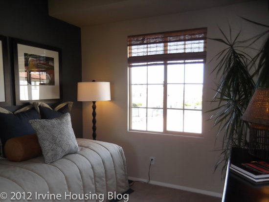
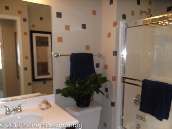
Around the corner from the kitchen is the second bedroom. It was really small—Laguna Altura small. I’m not quite sure where you’d stick the television. It would have to be wall mounted. A child would easily outgrow this room. The adjoining bathroom wasn’t much bigger. The vanity had no counter space and the tub was narrow.
The master bedroom was located on the third level. The ceilings were low and I felt claustrophobic. It was smaller than I expected. The only thing I liked about the master bedroom was that it was on a different floor than the second bedroom. However, the bedroom door is at the top of the stairs, which creates a basement effect. It didn’t appeal to me in the least. The master bathroom is disappointing and small. It’s a rectangular space with nowhere to move. The vanities are separate from each other and didn’t have adequate counter space. At least the toilet was located in a separate area.
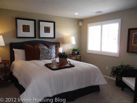
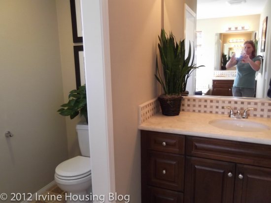
One word to describe Residence BR: UNSATISFACTORY!
Residence D
Price: $433,990
Estimated Tax Rate: 1.05%
Square Footage: 1,720 square feet
Bedrooms: 3
Bathrooms: 3
Garage: 2 car
HOA dues: $306 per month
CFD’s/ Mello Roos: $3,390 per year
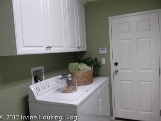
Residence D is a rectangular floorplan, so I entered the house with nightmare flashbacks of Casero. Just like Residence BR, the laundry room was located on the first floor. Off the entry is the third bedroom. It was “petite” to say the least. Obviously you can’t do your laundry during sleeping hours. I liked that the third bedroom had an ensuite, even though the bathroom was small. It’s adequate for guests, but I wouldn’t put my children down here, particularly because they are close to the front door and the master bedroom is on the third floor.
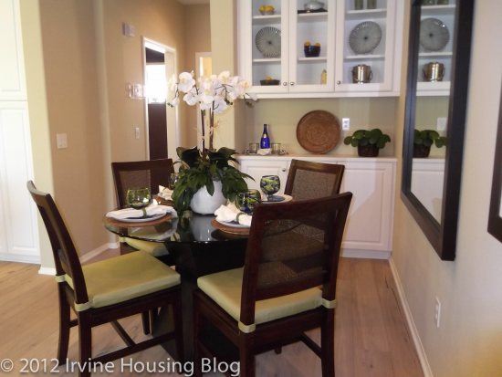
As you walk up the stairs, you immediately see the dining room. The space is just “ok.” I don’t imagine more than a 4-6 seater table since it’s located directly off the stairs.
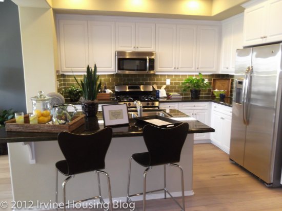
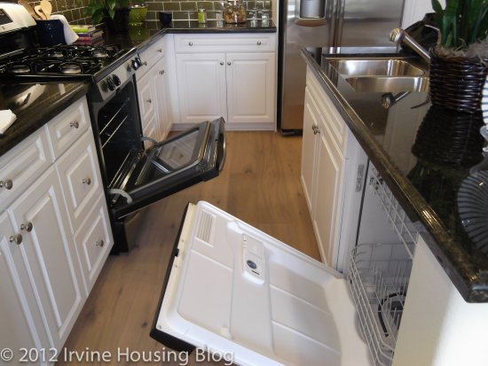
The kitchen at first glance appears larger than it actually is. There’s plenty of cabinet space, but counter space is a precious commodity that isn’t in abundance. If you want to open your oven or dishwasher, be prepared to navigate around a small space. The island creates a narrow walkway. If you’re not careful, you could fall over your oven door. This is annoying, but not a deal breaker.
I liked the living room. Although it practically stems off the kitchen, there is a decorative scalloped wall that defines the space. The model shows a large area rug that helps distinguish the space between the kitchen and living room. The size of the living room was excellent. It wasn’t too big, nor was it too small—for being a rather rectangular floorplan it was just right.
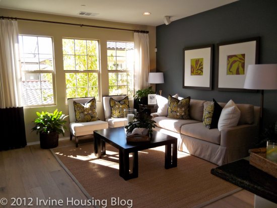
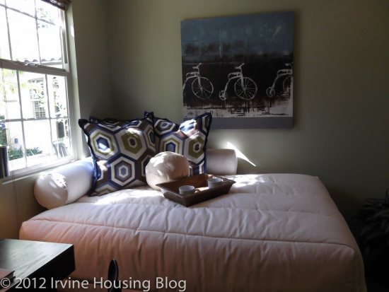
The second bedroom was typical of the other plans. It felt cramped, but might work for a teenager who doesn’t have a lot of stuff (what teenager doesn’t?). You could only fit a Full bed, and I think a daybed would better suit the space. Surprisingly the closet was fairly decent and I don’t think fitting a child’s wardrobe in the closet would be an issue. The bathroom is adjacent to the second bedroom and is your typical size guest bath: small tub, small vanity, toilet wedged between both. Nothing special.
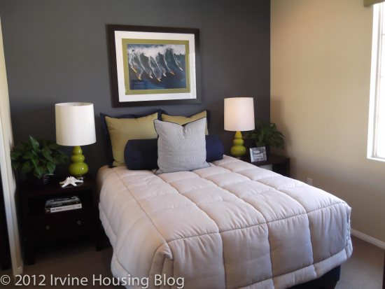
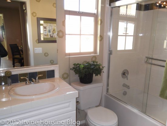
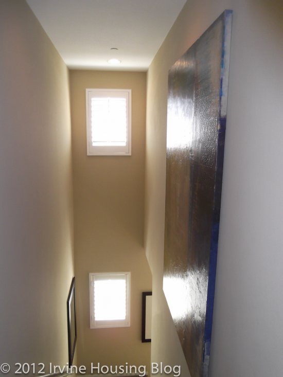
The master bedroom was huge, and I loved it. You have to walk up another flight of stairs to get to it, and I still felt like I was walking up basement stairs, but on the whole I’d consider it livable. I wish that the bathroom was larger. The vanity was smaller than I hoped. The tub is nearly flush up against the vanity. How disappointing. I’d like to mention that upon exiting the master bedroom you’re confronted with a high, narrow view that I found intimidating. It made me feel like I was going to fall. It’s a long way down.
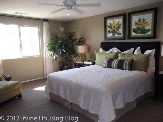
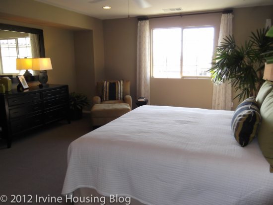
Residence D was not without its faults. I feel like I’d have to make a lot of compromises if I was purchasing Residence D. I didn’t see any deal breakers, and would classify the minuses as a minor inconvenience. I think for the price I’d rather search for another property, particularly since this is a “townhouse living” property. I’m not convinced it’s worth it.
Discuss below or on the Talk Irvine thread.
“…the second bedroom. It was really small – Laguna Altura small.” Ha ha – that made me laugh, Wendy.
They just took itty-bitty to a whole new level 🙂