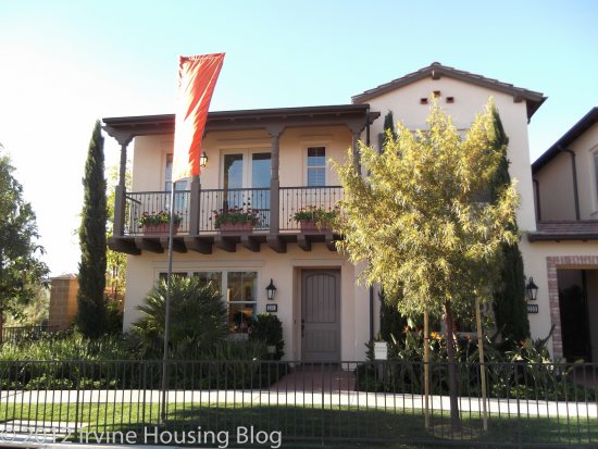
Santa Maria is the second smallest tract in the Village of Stonegate. These residences are considered townhomes. I’m going to come right out and say it: I didn’t really like these floor plans. If I had to choose between Santa Maria and Santa Clara, I’d choose Santa Clara. The Santa Maria properties are larger, but I thought that they lacked charm and were overpriced.
Estimated Property Taxes and Special Assessments:
Base Property Tax: 1.05% of sales price
AD Tax: $1,607 per year
CFD Tax: $1,700 per year
Other Taxes: $156 per year
Overall Effective Tax Rate: Approximately 1.8%
Residence 1
Number of bedrooms: 2 bedrooms + den
Number of bathrooms: 2
Square footage: 1,386 sq. ft.
Garage: 2 cars
Base price: $432,000
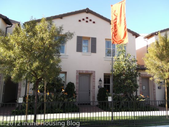
The Residence 1 model had a most unwelcoming entrance. The model displayed a feature where you had to be buzzed in through a door. Once inside door 1, you see the front door. I felt like I was trapped in between the two doors and the walls extend up so high that it made the entrance dark. I was expecting a portcullis to drop down and be taken prisoner in the castle. This is not how I want to welcome guests into my home.
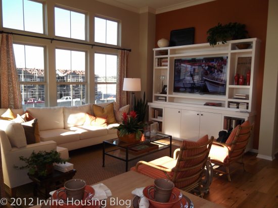
When you enter Residence 1 you’re greeted by three doors. I felt like Alice in Wonderland wondering which door to choose: laundry, garage or coat closet. Walking up the stairs was a big disappointment, because I was immediately confronted by the deal breaker—you must choose between a butcher block island or a dining room table. Granted, the island is large enough to function as a table and that’s how the model presents it. You’re almost forced to choose the island. If you opt for a table instead of the island, you’re losing counter space and your table is smack dab in the center of the kitchen. I give this floor plan the big NO.
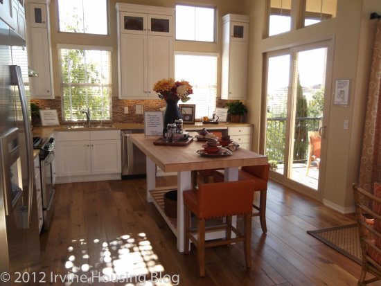
The kitchen has tall cabinets. I was satisfied with the storage capacity. You have an optional built in desk that you can select in lieu of more cabinetry. I envision this desk becoming a junk collector and I’m not sure it belongs in the kitchen. Needless to say, my review of the kitchen is two thumbs down. I can’t get past the island—butcher blocks require maintenance and I just don’t like the concept of having my food prep area the same as where I eat. Unacceptable.
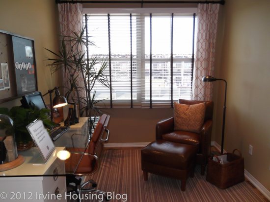
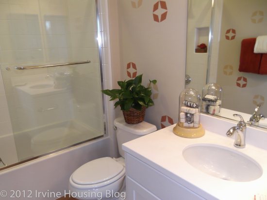
The den is petite. You would definitely have to turn it into an office. The guest bathroom is sufficient. It reminds me a little of a hotel. The vanity isn’t full sized, and it only has two drawers. It’s a tub/shower combo. It serves its purpose with no bells and whistles.
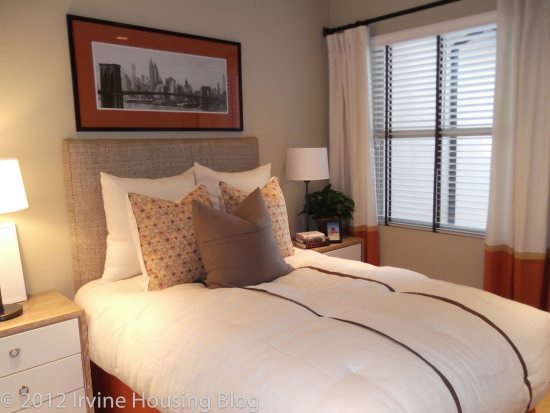
I found the second bedroom small, but it wasn’t surprising after seeing Santa Clara’s floor plans. The closet isn’t big, but perhaps you can fit a child’s wardrobe in it. The closet has hanging wooden doors that slide on a track. I had this closet setup in my last apartment and I hated it. Maybe I had a bad experience that turned me off of sliding doors forever.
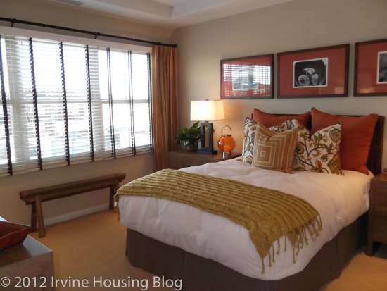
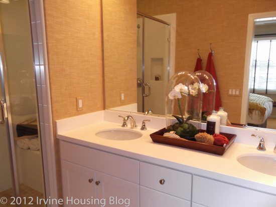
The master bedroom is a decent size. I actually really liked the master bedroom. The walk-in closet is ok. I don’t think there’s enough bar space, but you can always configure your hardware to suit your needs. I thought the master bathroom was small. The dual vanity is acceptable space-wise, and the toilet is in a separate area. There’s a nice walk-in shower, but no tub.
Final Thoughts:
Overall I think that the floor plan was poorly designed. I wouldn’t live here.
Residence 2
Number of bedrooms: 2 bedrooms
Number of bathrooms: 2.5
Square footage: 1,483 sq. ft.
Garage: 2 cars
Base price: $458,000
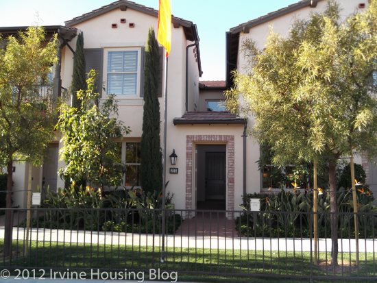
When you walk into Residence 2, you have an open view of the kitchen and great room. The great room is spacious and you can easily define the living room from your dining space. The model showcases an optional hutch in the dining room area, and I think I’d choose this upgrade for the house. It helps extend the kitchen.
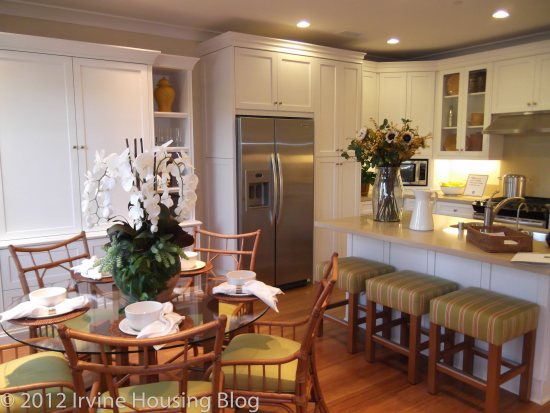
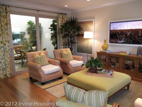
I wasn’t impressed with the kitchen. It felt a little small and short on counter space. It had plenty of cabinet storage. The microwave, however, was built into a corner between the cabinets and countertop. It seemed like such a waste of space and it was a very awkward placement. It’s the first thing I saw when I walked through the door…an oddly configured microwave.
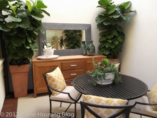
There is an enclosed outdoor atrium. Perhaps they were trying to mimic the Roman villas with the atrium in the center of the household. I’m not quite sure how I feel about this space. On the one hand, it is kind of cool. On the other hand, you’re walled in. When you look up at the extended walls it gives off the vibe that you’re in the bottom of an endless pit—but at least you can see a patch of blue sky. Private or claustrophobic? You decide.
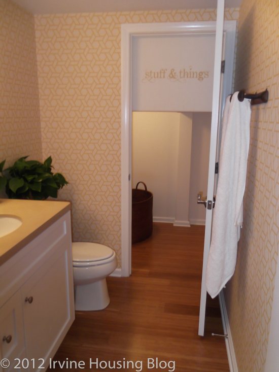
The downstairs powder room contains a toilet, vanity and miniature door leading to a storage area. I think that having an under the stairs storage space is a bonus to the house, it just looks odd in the bathroom and once again I felt like I was wandering through an Alice in Wonderland house.
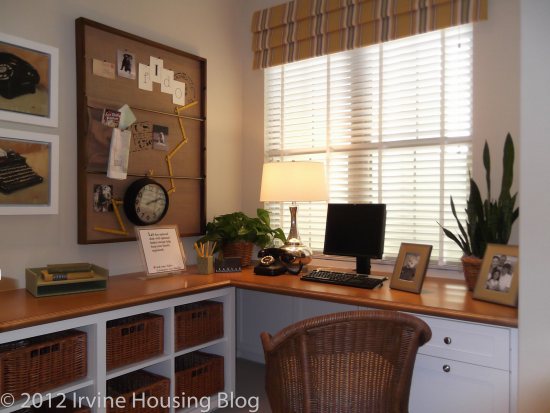
Down the hallway past the powder room are the stairs. The model showcases an optional basket storage/home management desk in the landing. I actually liked the basket storage and home management setup. I’d consider adding this feature. I think it’s a great place for it. There’s a lot of linen cabinet space down the hallway, which is very nice.
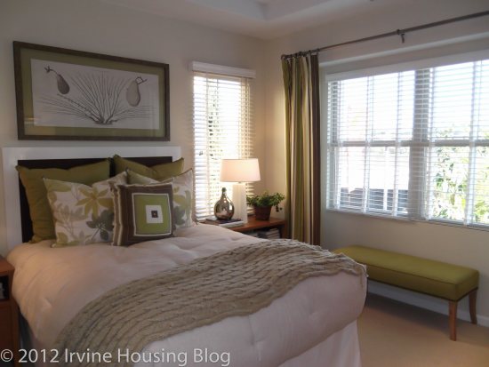
I wasn’t disappointed in the second bedroom. I think it could easily accommodate a Full bed, although a Queen might be a stretch. Every square foot counts! There is a very tiny ensuite in this bedroom. It has a shower/tub combo and a small vanity. I couldn’t live in this space, but a child could.
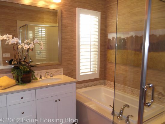
The master bedroom was suitable. It had a nice walk-in closet and showcased the optional organizer. The master bathroom had a tub separate from the stand alone shower. The toilet is in a separate room, which is a huge plus in my book. The dual vanity is standard and would accommodate my arsenal of beauty products. The master bedroom with ensuite passed my inspection.
Final Thoughts:
After my initial walk through of Residence 2 I decided that it wasn’t for me. The storage, atrium and tub in the master bathroom are unique features, but not enough to win me over.
Residence 3
Number of bedrooms: 3 bedrooms (or optional den at bedroom 3)
Number of bathrooms: 3
Square footage: 1,614 sq. ft.
Garage: 2 cars
Base price: $505,000
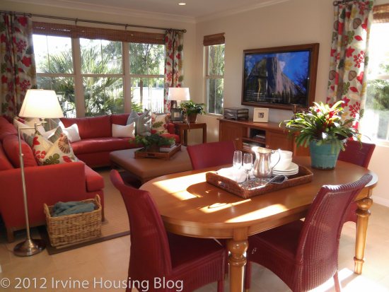
When you walk into Residence 3, you have an open concept view of the great room and kitchen. The first thing I noticed in the model was the awkward placement of the dining room table. It’s sandwiched between the kitchen and the living room. I feel like it blocks the flow of traffic. On the flip side, instead of eating your meals at the coffee table so you can watch television, you can now actually sit at your kitchen table and enjoy your quality programming.
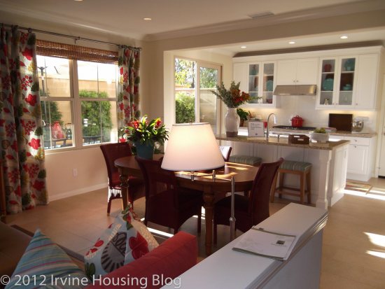
The kitchen was suitable, and I don’t have any complaints. The island has a lot of surface area, there’s plenty of counter space and lots of cupboard storage. If I had one piece of advice to tell the builders, I would recommend that they offer a double oven in the kitchens. Maybe they could make it optional, but around the holidays a double oven is always appreciated.
The courtyard, or patio, is accessed off the kitchen. The homebuyer can make it into a decent space. It’s large enough to have some patio furniture, including a 6 seater table, and a grill. Remember, the courtyard will come pre-packaged as a mound of dirt, and you’re probably looking between $3000-$5000 to make the courtyard into the pretty paradise showcased in the model.
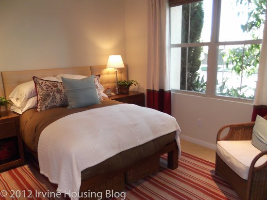
Residence 3 offers a bedroom on the first floor. You have the option of turning it into a loft, which I would recommend. I won’t lie: I don’t like having a bedroom on the first floor, just off the entry. I don’t feel like it’s private and I have an issue with security. However, in this floor plan I will admit that it is nice to have a full bathroom across from the downstairs bedroom. The bathroom is tiny, but it has everything you need—with the exception of a tub!
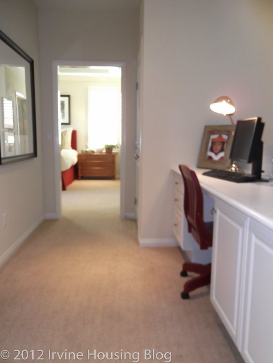
At the top of the stairs is an optional desk with low linen storage unit. I don’t think there’s really much else you can do with this space, so you may want to think about opting for the upgrade.
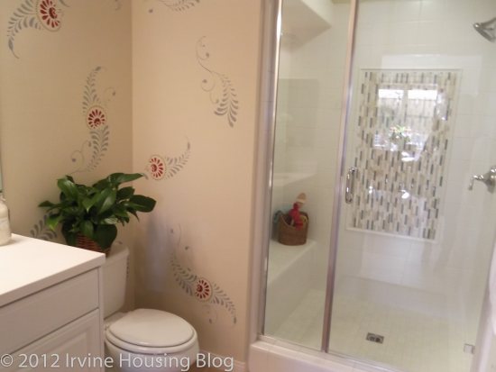
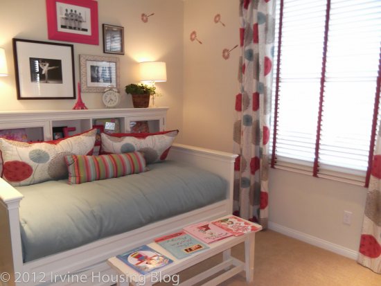
The second bedroom can accommodate a twin or daybed. The closet is acceptable. It would be a challenge to fit my wardrobe in there, but for a child it could work. I liked that the second bedroom had an ensuite. It’s a shower tub combo with a medium-sized vanity. It looks like your typical apartment bathroom. It passes the test.
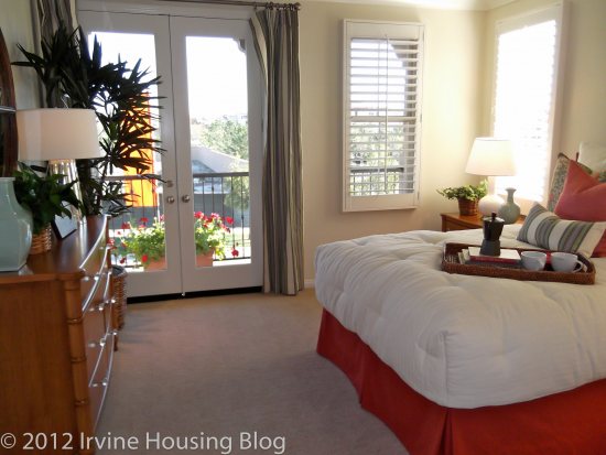
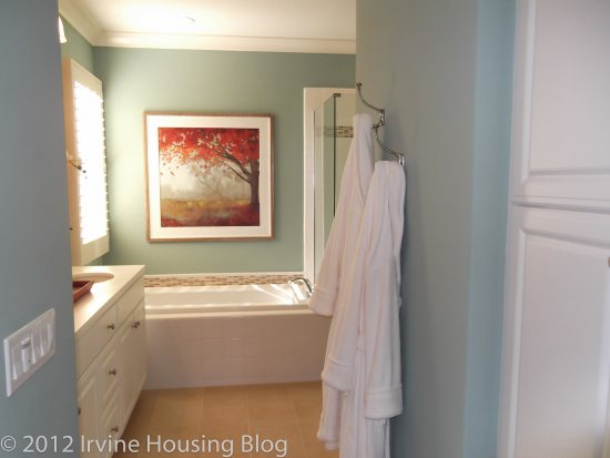
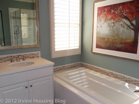
I was pleasantly surprised with the master bedroom. It’s a decent size, and the model showcased an optional recessed crown moulding in the ceiling. It adds depth to the room and makes it unique, so you may want to consider upgrading. There are glass double doors that lead to the deck. It’s not a huge deck, but it might be nice to walk out there on early Summer mornings. The walk-in closet is enough to house my clothes, so I’m satisfied with the space. The ensuite has a double sink vanity and a stand-alone shower adjacent to a spacious tub. The toilet is in a separate room and you can choose to have extra storage cabinet built in. I like the large linen cabinet in the master bathroom. I’d rather see a linen closet in a common area, but if you opt to have the low linen cupboard built in the landing at the top of the stairs, that would solve the problem of having others come in your bathroom to snatch a towel or set of sheets.
Final Thoughts:
I strongly feel that this model felt like apartment living. It’s very chic, but I just couldn’t get attached to it. I didn’t like the cramped dining area, and I’d be forced to turn the 3rd bedroom into a den because I prefer not to have a bedroom on the first floor. I can’t justify paying $500,000+ for a townhome I wouldn’t be happy in.
Discuss below or at Talk Irvine.