Las Ventanas (Community Overview) is the first tract I’m reviewing in the Portola Springs Villages. Portola Springs is bordered by the Great Park and the Irvine Ranch Land Preserve in a seemingly remote pocket in Irvine. The closest schools are Stonegate Elementary, Sierra Vista Middle School and Northwood High School. The villages have direct access to the 133 and 241 toll roads with the 5 freeway nearby. Residents living in the Portola Springs Villages are privy to community parks, a lighted soccer field, playgrounds, basket ball and tennis courts, as well as access to hiking trails. It’s truly a self contained private community that appears to be far removed from the busier areas in Irvine. Las Ventanas will have a total of 86 homes in the development.

I instantly saw the huge contrast between Stonegate and Portola Springs. It’s almost as if the builders (Taylor Morrison) fixed all my complaints about Stonegate and Laguna Altura. The ambiance in all three tracts was inviting and I immediately felt like I was “home,” which is important to me. Unlike Stonegate, I was highly receptive to Las Ventanas. Portola Springs is a family oriented neighborhood. In fact, most of the visitors viewing the models were young couples with small children, or very pregnant women looking to move into a larger space to accommodate a new baby. I am none of the above, so these homes were too large for me, but I’m still excited to share with you my observations about the properties.
Base Property Tax: 1.05% of the sales price
AD Tax: $3,197 per year
CFD Tax: $1,700 per year
Other Taxes: $169 per year
Total Effective Tax: 1.75%
HOA: $150 per month
Residence 1
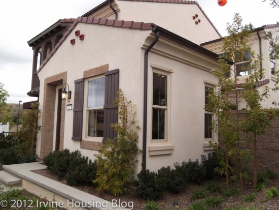
Price: From $634,900
Bedrooms: 3 + den
Bathrooms: 2.5
Garage: 2 car
Square Footage: 1,871 sq ft
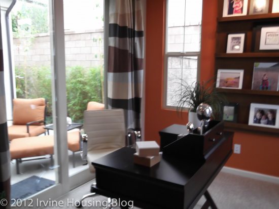
Upon entering Residence 1 you’re immediately greeted on the right by the den. The windows in the den face the outside of the house, bringing in an abundance of light. The model showcased the space as an office. My only concern is that if you turn this space into an office, you’ll have to keep it clean because it’s the first thing you and your guests will see when entering the house. The feature I really enjoyed in the den was the sliding glass doors (optional French doors) leading to a small square courtyard between the kitchen and den. It was unique and cozy. I could imagine myself sipping some lemonade on a lounge chair during the Summer. I didn’t expect a sweet surprise so early in the floorplan. It made me excited to see the rest of the house.
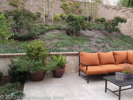
The backyard was much larger than what you’d get at Stonegate. You’ll inherit a lump of dirt in the backyard and you’ll have to landscape it how you’d like. There’s enough room in the backyard for grass, and you can plant some bushes or flowers on the slope. I’m not keen on landscaping, so I’d choose to lay brick or some kind of flooring instead of grass and plant low maintenance shrubs/bushes for the elevated slope. I cringe at the thought of yard work, so for me simple and easy is the way to go. There are tons of options to customize the backyard and make it your own. I’d put lots of seating and a manly barbeque in the backyard. If you have animals, there’s enough space for them to roam. Just a word of caution for cat owners–you are in a nature preserve so beware of coyotes.
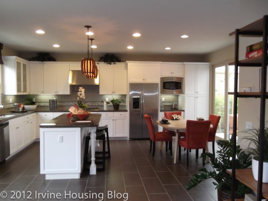
The kitchen and dining areas feed into each other in a large rectangular formation. The dining room table in the model sits in front of the doors to the courtyard, giving you a pleasant view. There’s enough space for a six-seater table, but it is somewhat close to the cabinetry. It’s not a deal breaker, and could be resolved with a table suitable for the space. I’d choose to upgrade to the recessed lighting in this area. The kitchen includes stainless steel appliances, with the exception of the counter-depth stainless steel refrigerator. That was kind of a bummer. You are almost forced to upgrade. I think the kitchen has adequate counter space, particularly if you include the extended island. There’s plenty of cabinet storage and a full pantry. You can customize your backsplash if you upgrade, and I’d consider this option if the price is right. I like having choices.
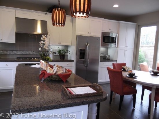
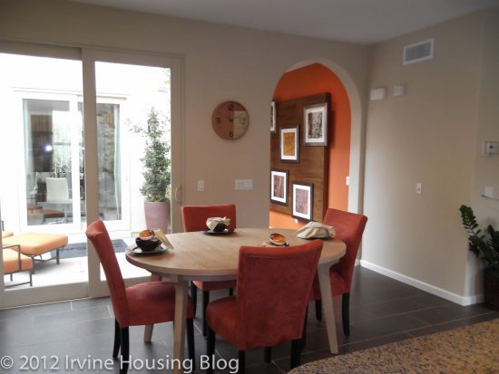
The great room is square-ish and you’d have no trouble fitting an L-shaped sofa and perhaps a couple of chairs. You have the option to include a fireplace–which is a must for me. I actually like having a square space because it makes it easier to place furniture. I really like the feel of the great room and enjoyed the open concept. I think it adds a lighter feel to the downstairs.
There’s a powder room located at the base of the stairs. It’s tiny, but you have everything you need to get the job done: a toilet and sink. I didn’t like the location of the powder room. It’s too close to the kitchen and I don’t like the idea of having potential odors wafting from the toilet into the kitchen. That was a negative for me. Maybe an air freshener would alleviate this problem.
The size of the bedrooms are impressive compared to Laguna Altura and Stonegate. They are much more spacious and have more practical closets. The bedrooms are square and offer room for children to grow. If I was a mother I’d feel comfortable planting my roots in this house knowing that my children wouldn’t outgrow their rooms. The first bedroom has access to a small balcony. The second bedroom has it’s own walk-in closet and charming windows.
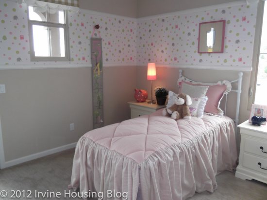
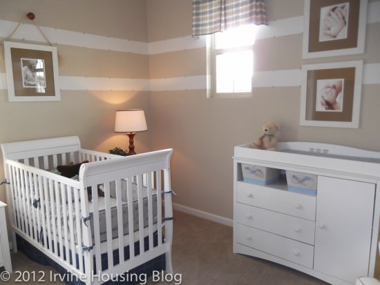
The master bedroom is spacious enough to suit my tastes and I think that it allows the homeowner the opportunity for personalization. It’s a lovely space with lots of light. I’d be happy sleeping there! For our regular readers you know how particular I am about my master bathrooms. Well, brace yourself: This passed the Wendy inspection! There’s a stand-alone shower and large tub. The toilet is sectioned off in a separate room, and the vanity has enough counter space for my morning routine of make-up, hair dryer and straightening iron. Although the master bathroom was smaller than I’d like to have, it is a workable space. My impression of the master bedroom package was very positive. What a relief and a breath of fresh air compared to Laguna Altura and Stonegate.
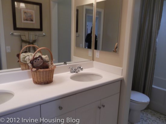
The second bathroom is small and narrow, creating the familiar hallway effect. It’s a squeeze, but functional with a dual sink vanity. The toilet is almost flush up (no pun intended) against the shower/tub combo. If I were to offer a critique of the bathroom, the close proximity of the tub to the toilet would be my only complaint.
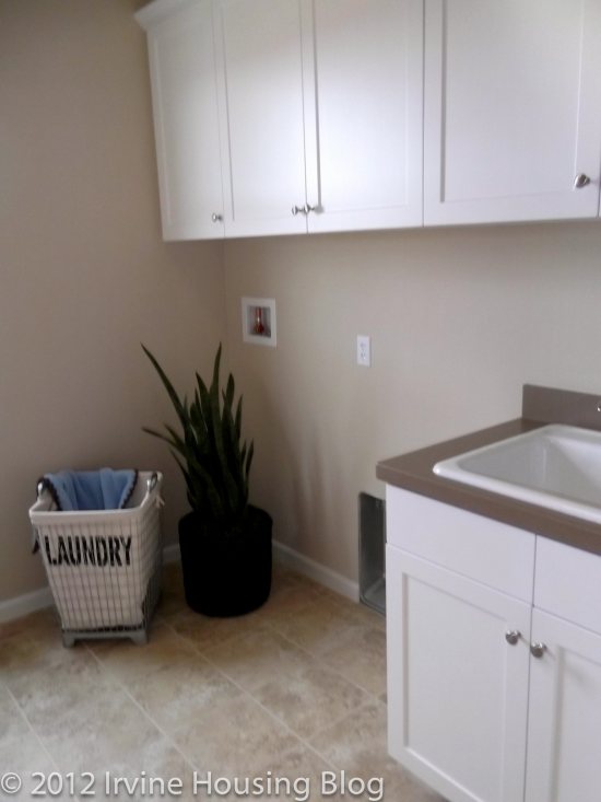
The upstairs features a full size laundry room with cabinets, a marble counter and optional sink. There’s plenty of space in the laundry room to store cleaning supplies, hampers or any additional items the homeowner would like to hide from view. If I had a cat this is probably where I’d put the litter box.Yes I know, a litter box in the laundry room–just keep the clean clothes separate from the box and don’t leave laundry baskets around for the cat to jump in!
Although Residence 1 is the smallest floorplan of the 3, I think a family could comfortably live here. My impression was really positive and I felt like the house factored in practical living habits–like the need for larger closets in the bedrooms. However, with tract housing, one big concern in my mind is the noise barrier. We’re all very smooshed here in California, and I like my quiet. So it bothered me that I was able to hear the voices from the sales office through the walls within the house. The sales office is attached to the house, but being able to hear a downstairs conversation in the sales office while in an upstairs bedroom makes me very suspicious. It made me wonder if I could hear an upstairs toilet flush while lounging in the great room downstairs. I call this phenomenon the “hotel effect” because that’s something you would expect to hear in a three star hotel room. I think I’m going to have to add the “toilet test” to my review criteria.
Residence 2
Price: From $671,905
Bedrooms: 4
Bathrooms: 3
Garage: 2 car
Square Footage: 2,075 sq ft
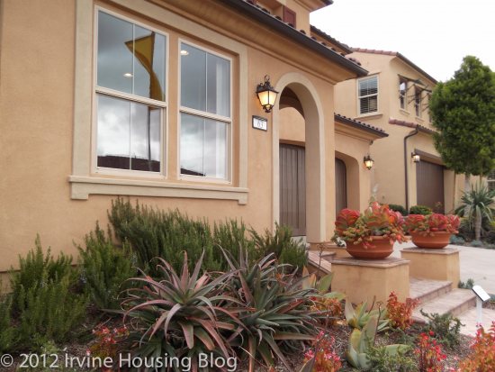
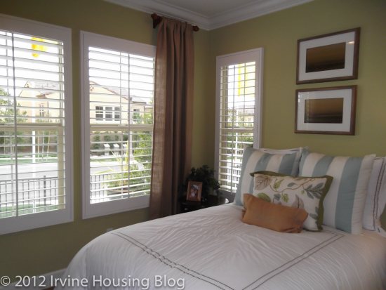
Residence 2 has a bedroom immediately off the entry way. The model features the space as a den. I’d hesitate turning the space into a bedroom because it’s located on the ground level, right off the front door. I don’t like the idea of having a bedroom window facing the sidewalk. There is a petite half bathroom located just off the bedroom which is a nice feature. Perhaps this could work for a roommate situation. Either that or you could stick your guests in that room–which might not be such a bad thing.
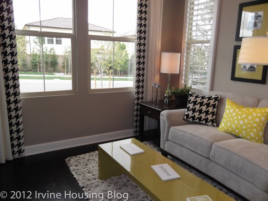
When I entered Residence 2 I felt like I was home. The structure strongly appealed to me, perhaps because the design elements reflect my personal tastes making it feel more comfortable. I was keen on the layout and compared to the other models I’ve toured this is the best one I’ve come across. However, many of the features in the model are upgrades: the flooring, built-ins, window coverings, crown moulding (in some areas), and enlarged base boards. I kept thinking of the increasing dollar signs.
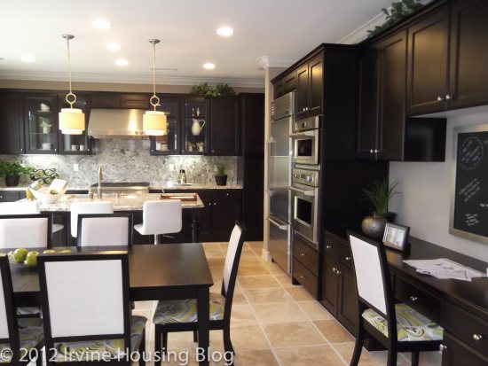
The kitchen was beautifully designed and I loved the Maple espresso cabinetry. The homeowner obviously has the option to choose their design elements, but the dark wood made the space chic, clean and modern. The cabinet space was just right. I think Laguna Altura and Stonegate have too much cabinetry in their kitchens, and I felt like I was sacrificing full-length pantry space in those tracts. This kitchen was much more proportionate and didn’t haphazardly place their microwaves in the middle of the cupboards like Stonegate. The homeowner has the opportunity to upgrade the stainless steel appliances. There’s a lovely kitchen window that faces the backyard which makes the space feel open and light. There’s plenty of space to fit a 6-8 seater dining room table.
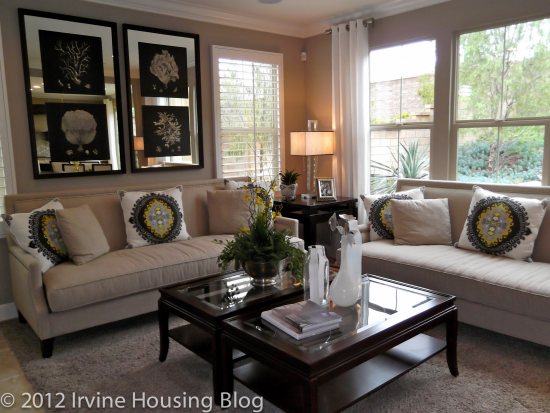
Much like Residence 1 sitting in the living room is like being in a big square. You have the option for a fireplace–part of me is miffed that the fireplace isn’t included. There’s a media niche so you can mount your flat screen television, which I thought was a nice element. It makes the room more streamlined.
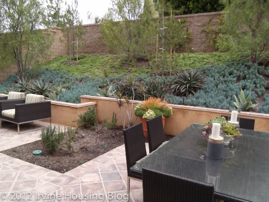
I loved the backyard. It’s Wendy-sized. I’d feel comfortable having a couple of dogs–or kids. If you entertain often, you can easily create a pleasant atmosphere out there. As I said with Residence 1, landscaping would be a concern for me, so I’d opt to keep it as simple as possible or have someone come and maintain it for me. I wouldn’t lay sod–storing a mower for such as small space would seem like a waste.
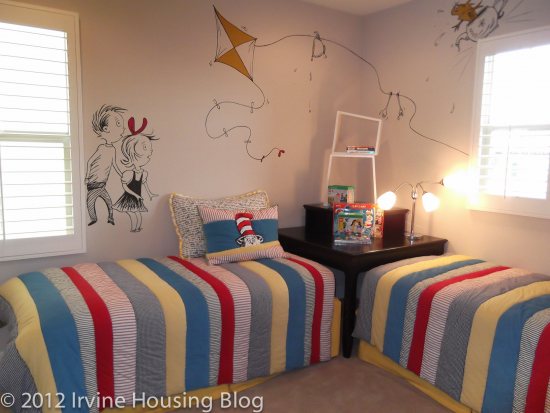
The upstairs bedrooms are acceptable, and probably similar in size to the master bedroom in my apartment. Bedrooms 2 and 3 share a wall.
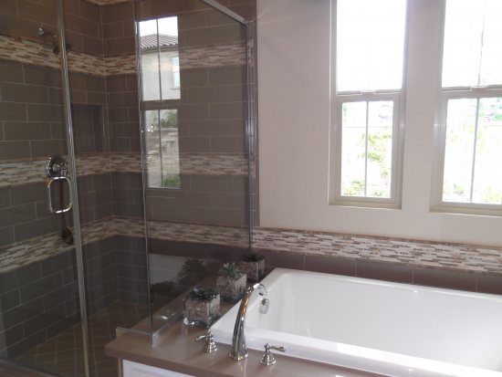
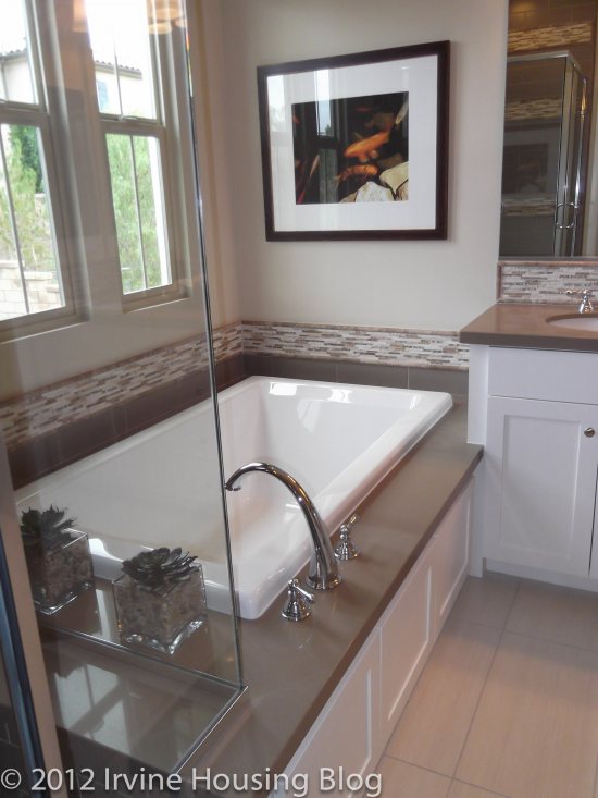
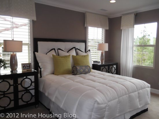
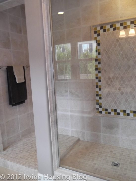
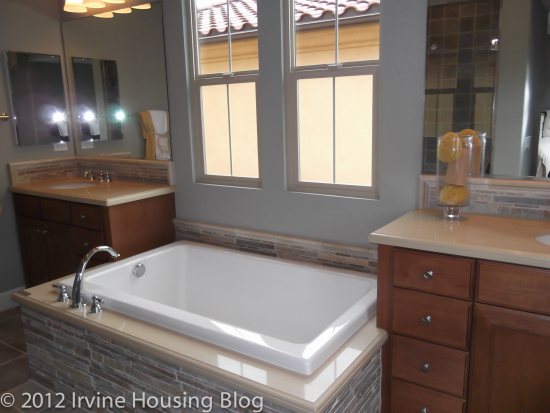
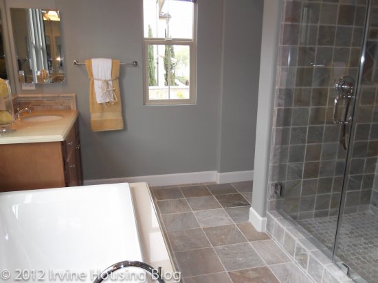
It’s a big plus that the master bedroom is separated from the other rooms. The master bedroom is not overly large, but sufficient for its purpose. I think I slobbered a bit when I entered the master bathroom. Part of me didn’t believe my eyes. It was absolutely lovely. The walk-in shower is huge. There’s a ton of custom design in the model. It looks very chic, but I’m suspicious of the price tag for the upgrades. The only downside to having a large shower is more to clean, particularly if you have grouting from the upgrades. If you have a lot of toiletries in the shower, you have nowhere to hide them since the shower is encased in glass. This also creates less privacy. Additionally, the vanity mirror faces the shower, so if someone is getting ready at the vanity while another person is showering you’ll have a free peep show. This may be a good or bad thing! However, the two vanities are separated by the tub, and the second vanity mirror doesn’t have a direct view of the shower. My only critique is the layout of the shower/vanity. Otherwise I was very happy with the bathroom.
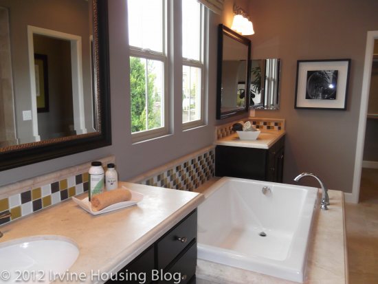
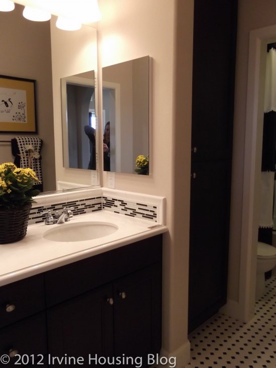
The second bath was decent. There is a nice linen closet. The shower/tub and toilet are located in a separate room. The only thing that I didn’t like was the layout in regards to the hallway. The bathroom is off the hallway and if you’re getting ready at the vanity, people can walk by and see you (unless you close the door). It’s not that big of a deal, but because the bathroom is narrow, I almost felt like it was an extension of the hallway. Maybe that’s what bothered me the most.
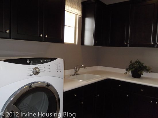
The laundry room is similar to Residence 1, with the option to upgrade to the Maple Espresso cabinets and laundry sink. I personally am not sure that I need a sink in the laundry room. It’s not at the top of my upgrade list. I’ll admit, having a decent sized laundry room is a bonus. I’d almost feel spoiled.
Out of the three residences, Residence 2 spoke to me. I liked practically everything in the house and didn’t find too much to critique. There were no deal breakers for me and I didn’t feel like I was sacrificing anything.
Residence 3
Price: From $707,790
Bedrooms: 4 + den (optional loft in lieu of bedroom 4)
Bathrooms: 3
Garage: 2 car
Square Footage: 2,304 sq ft
Residence 3 is the largest floor plan in Las Ventanas, and it’s also the most expensive. Just like Residence 2 there’s a small bedroom with a half bath on the first floor. I loved the open concept. The floor plan was more like a wrap around layout. The living room is visible upon entering Residence 3 and if you turn the corner a bit, you’ll find yourself in the dining and kitchen area.
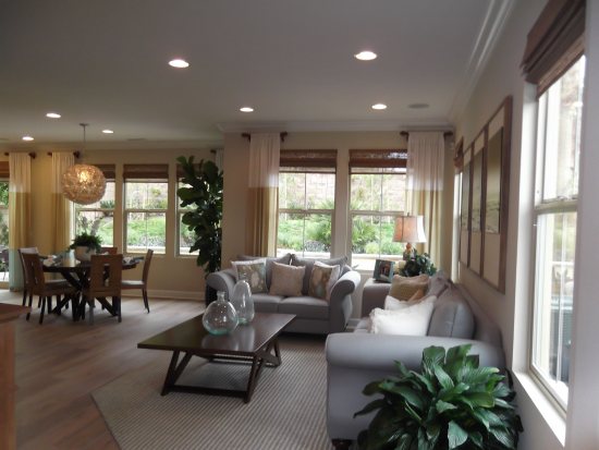
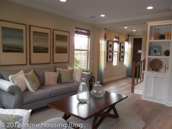
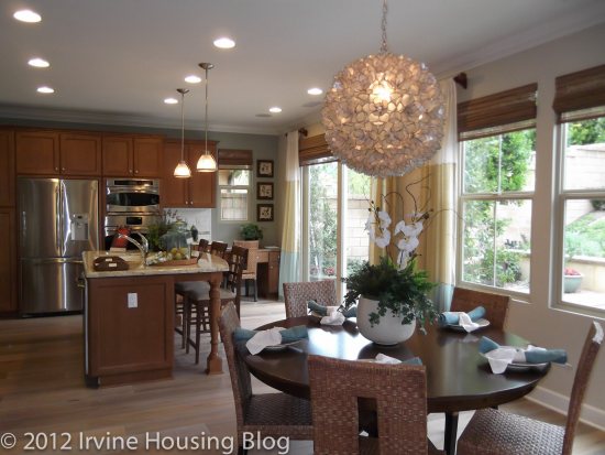
Like the other two models, the kitchen has a nice flow to it, and there’s a larger, more distinct space for the dining room. What I liked about the kitchen was that there was plenty of lower cabinet space.
Residence 3 offers a loft and “tech center” at the top of the stairs. The loft is perfect for an entertainment room and I wouldn’t make it into a bedroom. It shares a wall with the master bedroom and it’s a bit small. I really liked the tech center. It’s a built in desk that wraps around in an “L” shape around the wall. The reason I liked it so much is that the office space is located upstairs, hidden from view of house guests (unless they go upstairs).
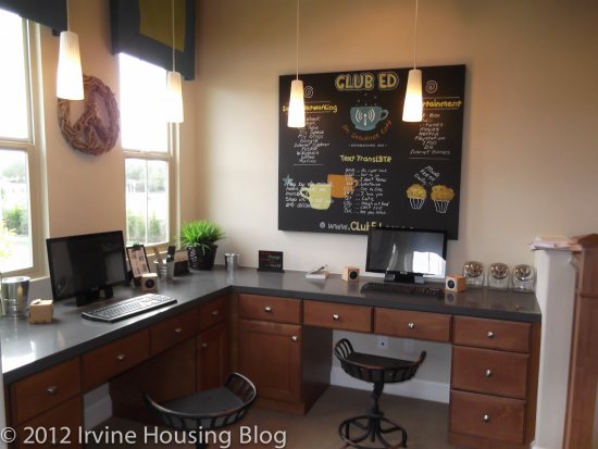
What was unique about this floorplan was the split space off the staircase. On one side you have the two upstairs bedrooms sectioned off by a small common area, and on the opposite side is the master suite. I thought this was a very well done for privacy. It can work for roommates and families. There’s a deck located off of bedrooms 2 and 3, but it is only accessible from the common area between the two bedrooms.
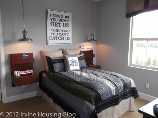
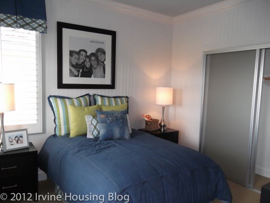
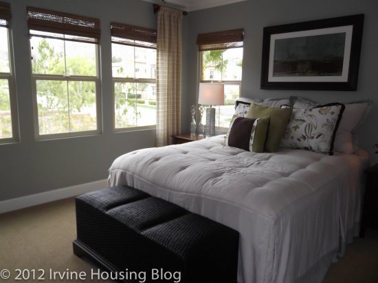
The master bedroom is a decent size. The master bathroom is smaller than Residence 2, but I can’t complain about it. The bathroom separates the vanities, and you still have a full view of the shower like Residence 2.
When all was said and done, I was pleased with the floorplan. The tech center and loft were pluses for me. My sister has two boys who do nothing but play video games, and as I think about their growing household an entertainment room would be a selling point for her family.
After reviewing my first tract in Portola Springs I can’t wait to see the rest. I’m hoping to be pleasantly surprised. The pricing is hard for me to stomach, but compared to house in Turtle Rock that I reviewed last week (18711 Paseo Picasso), which was built in 1973 and offered at $675,000 I’d rather invest in the Portola Springs property. I suppose it’s all about perspective.
Discuss below or on our companion thread at Talk Irvine.
You’ve piqued my interest, Wendy. Maybe I’ll have to swing by those models and take a peek. My biggest hesitation on Portola Springs is the location. Although it’s close to the toll road, it’s not convenient to the 5, 55, or 405 and I have to wonder if the landfill over in that neck of the woods will be a little more apparent on a hot or windy day.
When you live in LV:
You can see the 133 toll road above you.
You can hear road noise from Portola blvd.
and you can smell the odor from the land fill just over the hill.
I think it is OK to buy if you are blind, deaf, and have anosmia.
You’re correct about being super close to the 133. There’s basically a wall between the models and the toll road. The noise wasn’t too bad for me, but I went on the weekend when there aren’t as many cars. I didn’t smell the landfill, but I’m sure on windy days your sniffer will get a whiff!
One thing needs to be noticed: their model home has much larger (almost 1000sqrt) lot size than real homes, especially those in the middle.
I visited Las Ventanas many times in the last 6 months… Love the plan 2, except
The backyards in those models are very deceiving. I think Las Ventanas is #1 on the most “phantom” representation of what the actual property line looks like compare to all the other new model homes in Irvine.
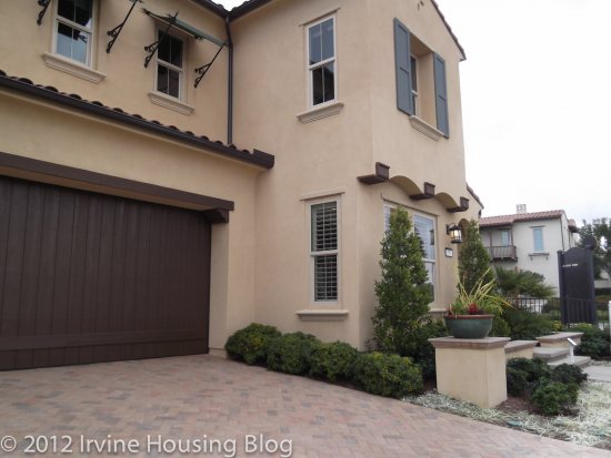
You don’t get a slope but a brick wall. If you don’t get a brick wall, you are back against a main road. At the end of the day, the backyard feels like a detach condo in Woodbury. It is only the curb appeal and the driveway that makes this a SFR.
With a 650k budget, I might as well save some money and get a motorcourt. If I toss Irvine out the window, Foothill Ranch is just minutes away.
The yard, together with the pricepoint and location, it is just difficult (at least for me) to bite the bullet…
You would rather have a motorcourt?
You undervalue the benefit of a driveway:
1. A more presentable front eleveation
2. A sidewalk with space for you or your guests to park
3. Distance from the street and the front door of your neighbor
Location aside, not many Irvine motorcourt detached condos can match the value of Las Ventanas (and some of those are even in the same location).
This is one of the few tracts that are selling homes while many TIC projects are not (Laguna Wok… err… Altura).